DORFic UI design style
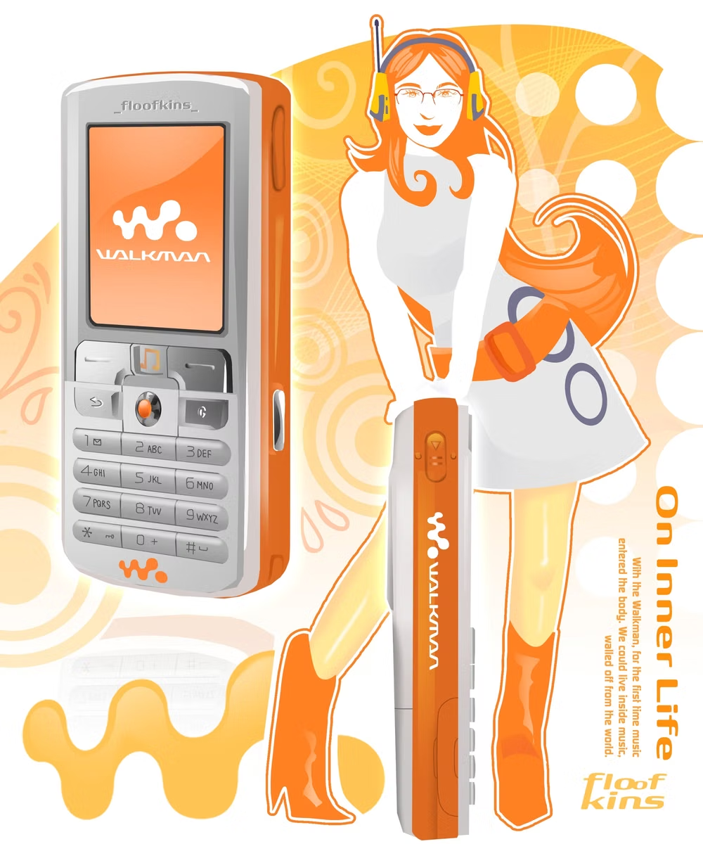
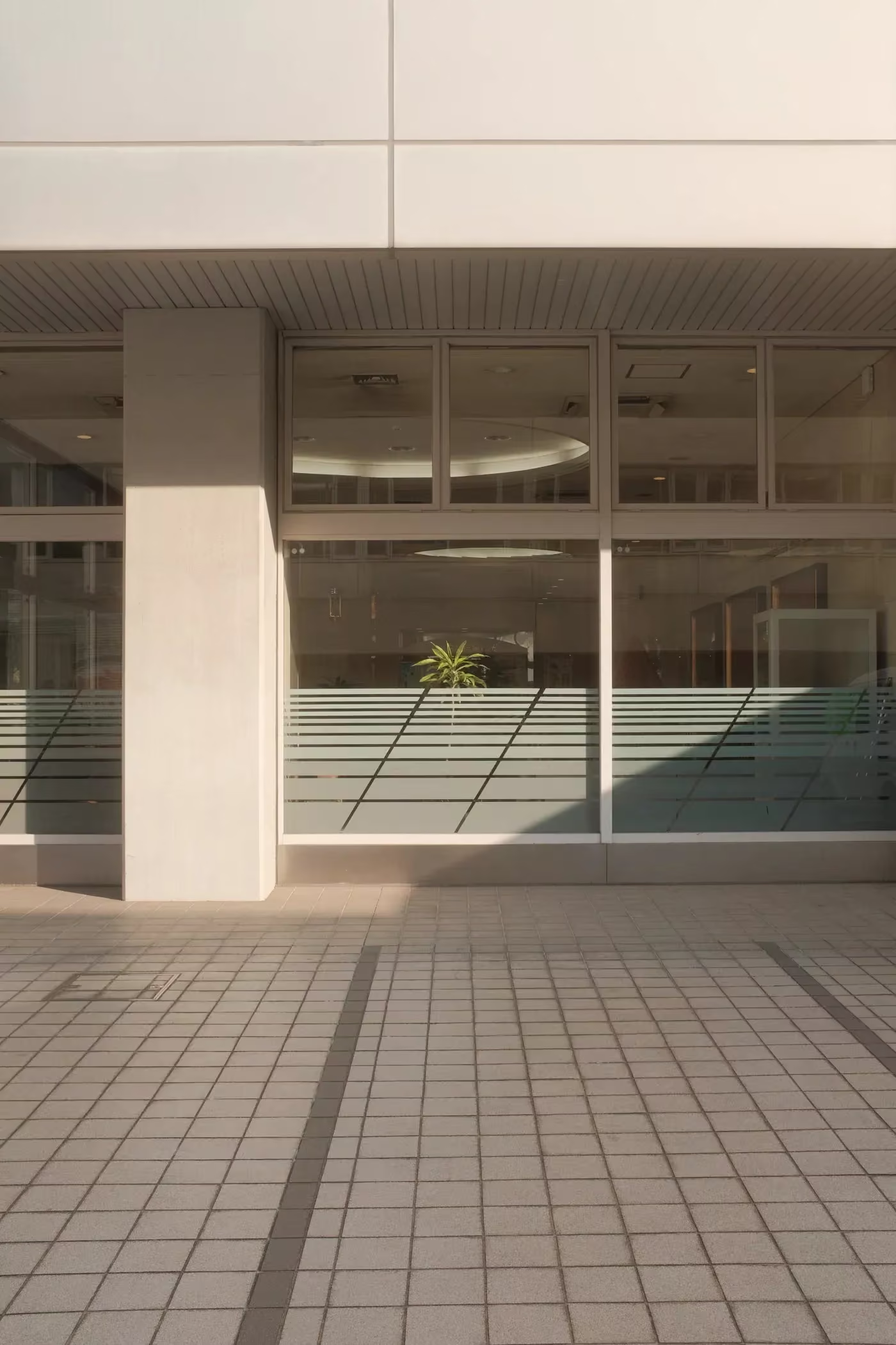
Daylight, orange, red, futurism, and graphic design define this mid-2000s-to-mid-2010s industrial style of stark white spaces, clean technology, and geometric motion.
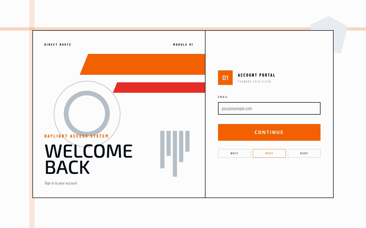
Design overview
- Signature elements
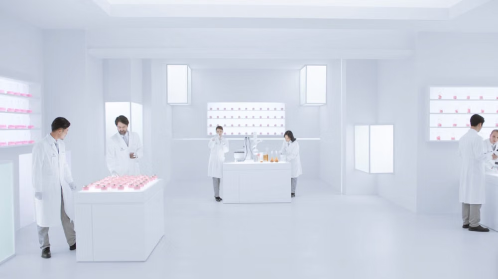
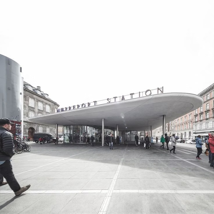
- sun-bleached white cityscapes, orange-red wayfinding, glass and steel, parallel geometry, abstract tech patterns, sanitized industrial spaces
- Best suited to
- Technology, mobility, fitness, games, workplace tools, product launches, science communication, and retro-futurist campaigns.
- Layout principles
- Build a rigid or symmetric grid around broad white fields and one clear forward route, using orange-red bars, numbered modules, and cropped industrial diagrams to make actions instantly scannable.
History and origins
A fact-checked account of where this visual language came from, with links to the references used.
- Period
- Mid-2000s–mid-2010s source material; term coined in 2023
- Origin
- Retrospective online classification of technology and industrial graphics
DORFic is a very recent archive term for an older abstract-tech look built from white space, gray infrastructure, daylight, and orange or red accents. The name was created on Aesthetics Wiki in April 2023, so no designer in the 2000s could have worked under that label; it is useful as a search category, not evidence of a historical movement.
Moodboard and visual references
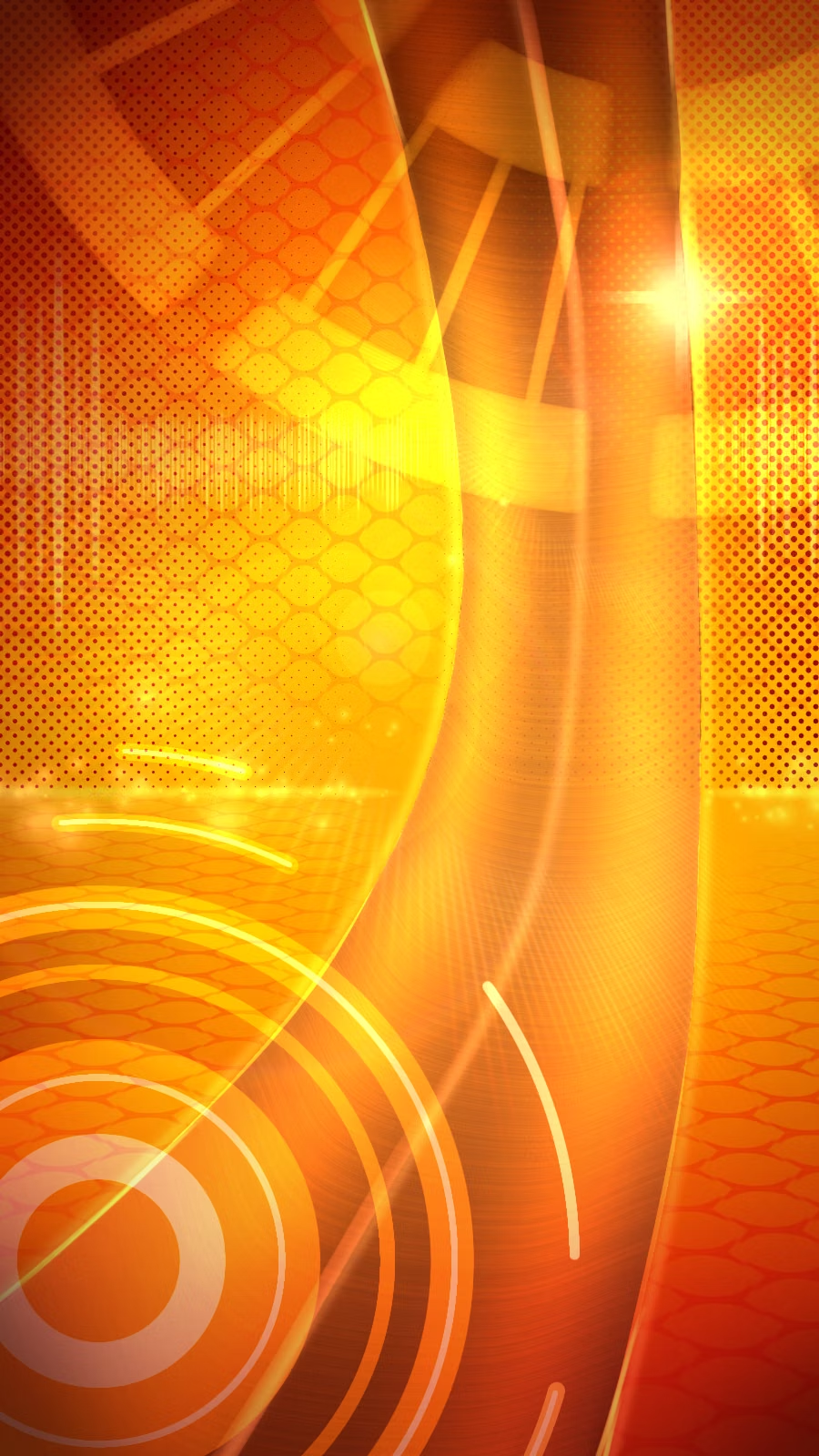
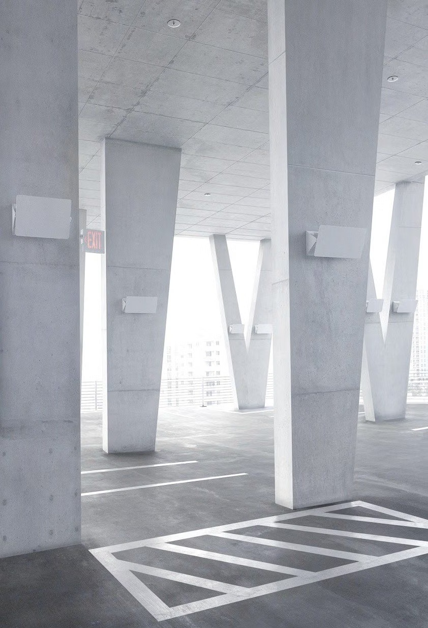
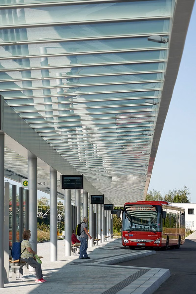
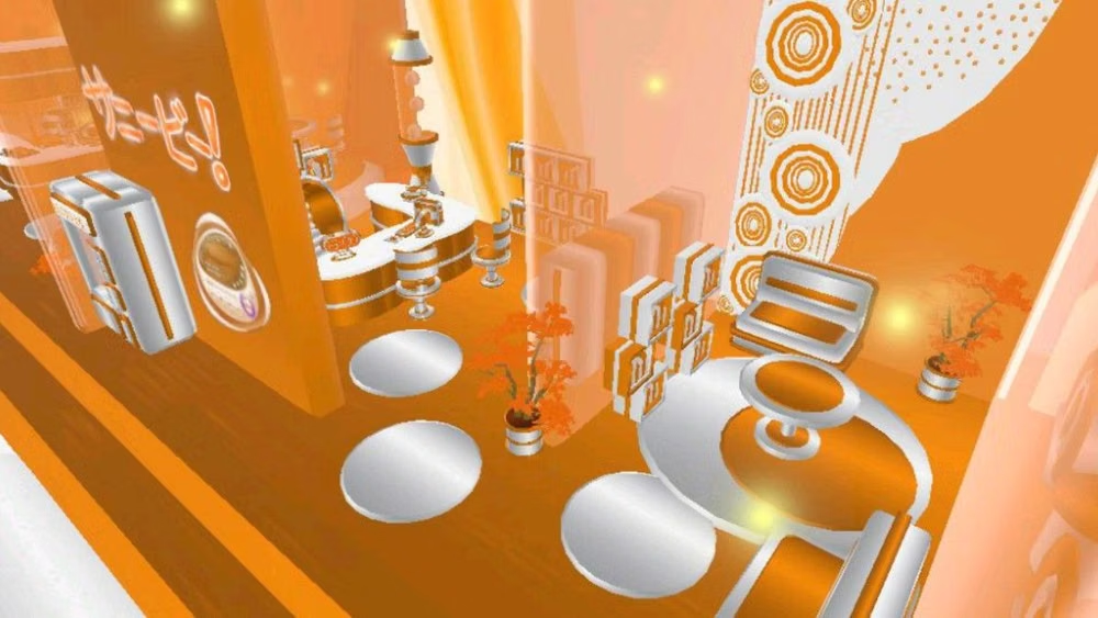
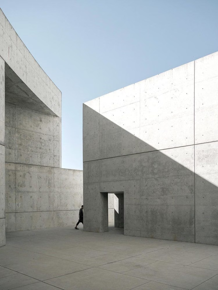
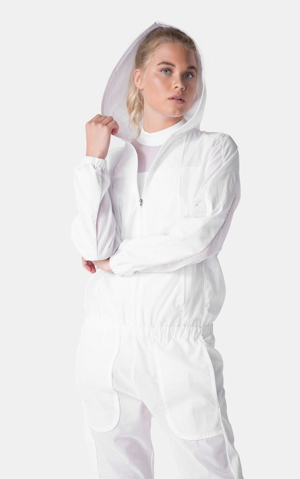
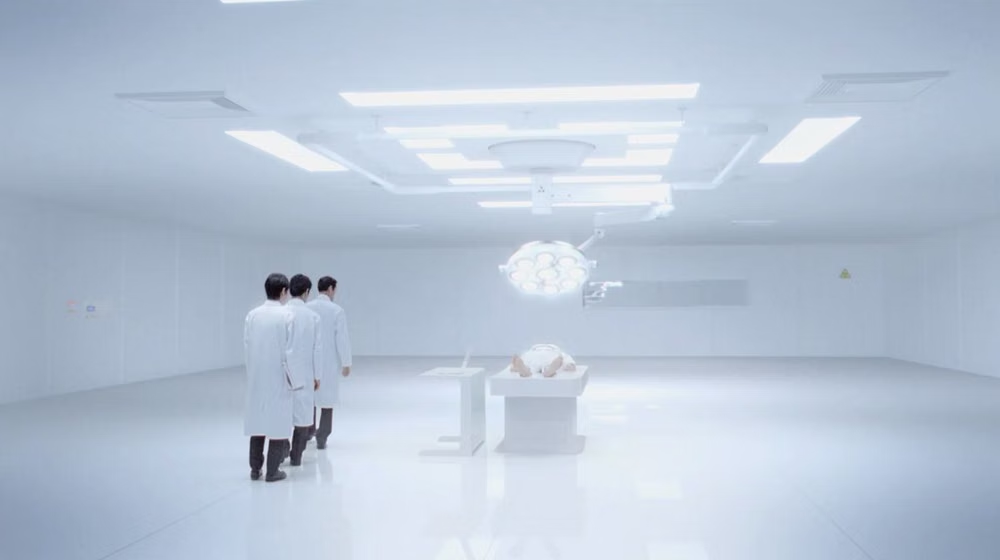
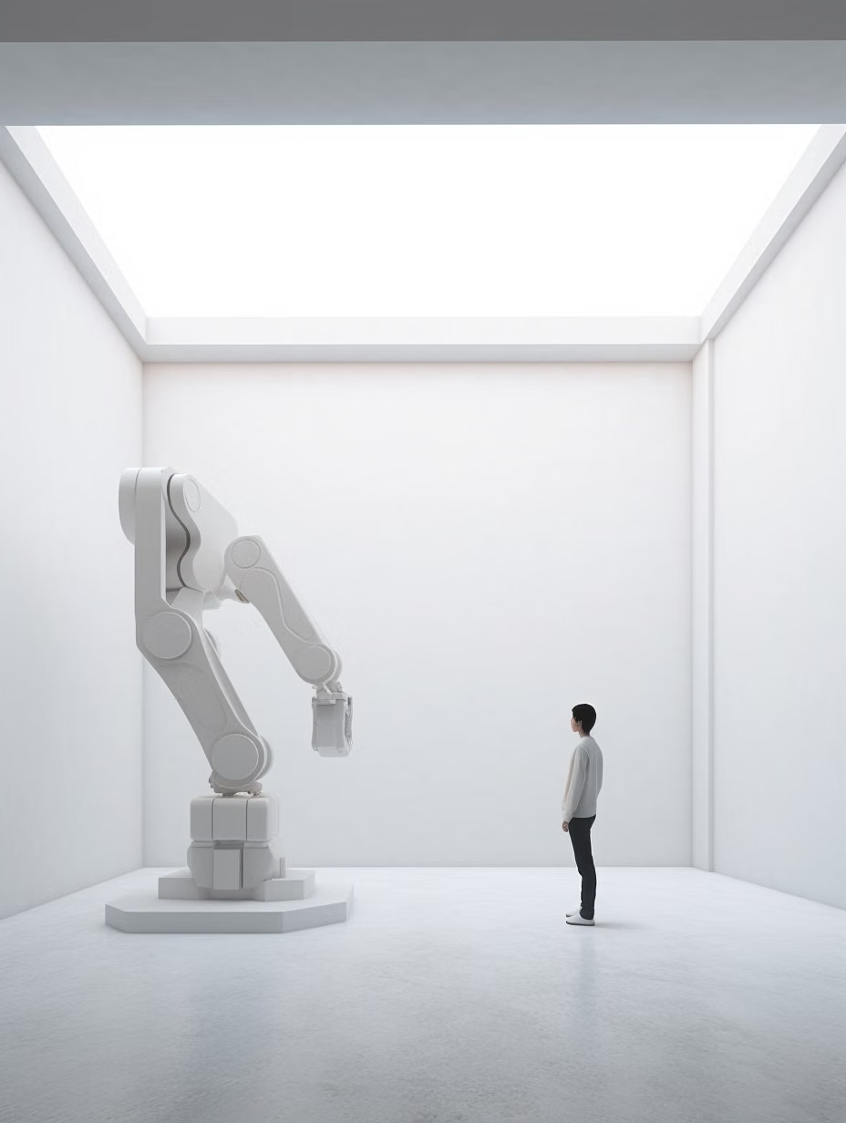
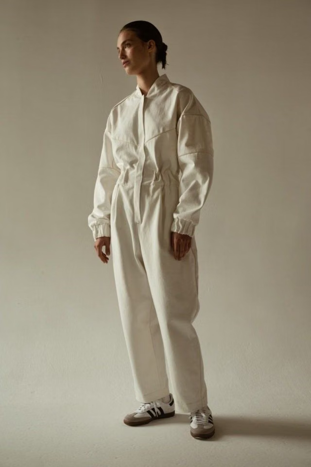
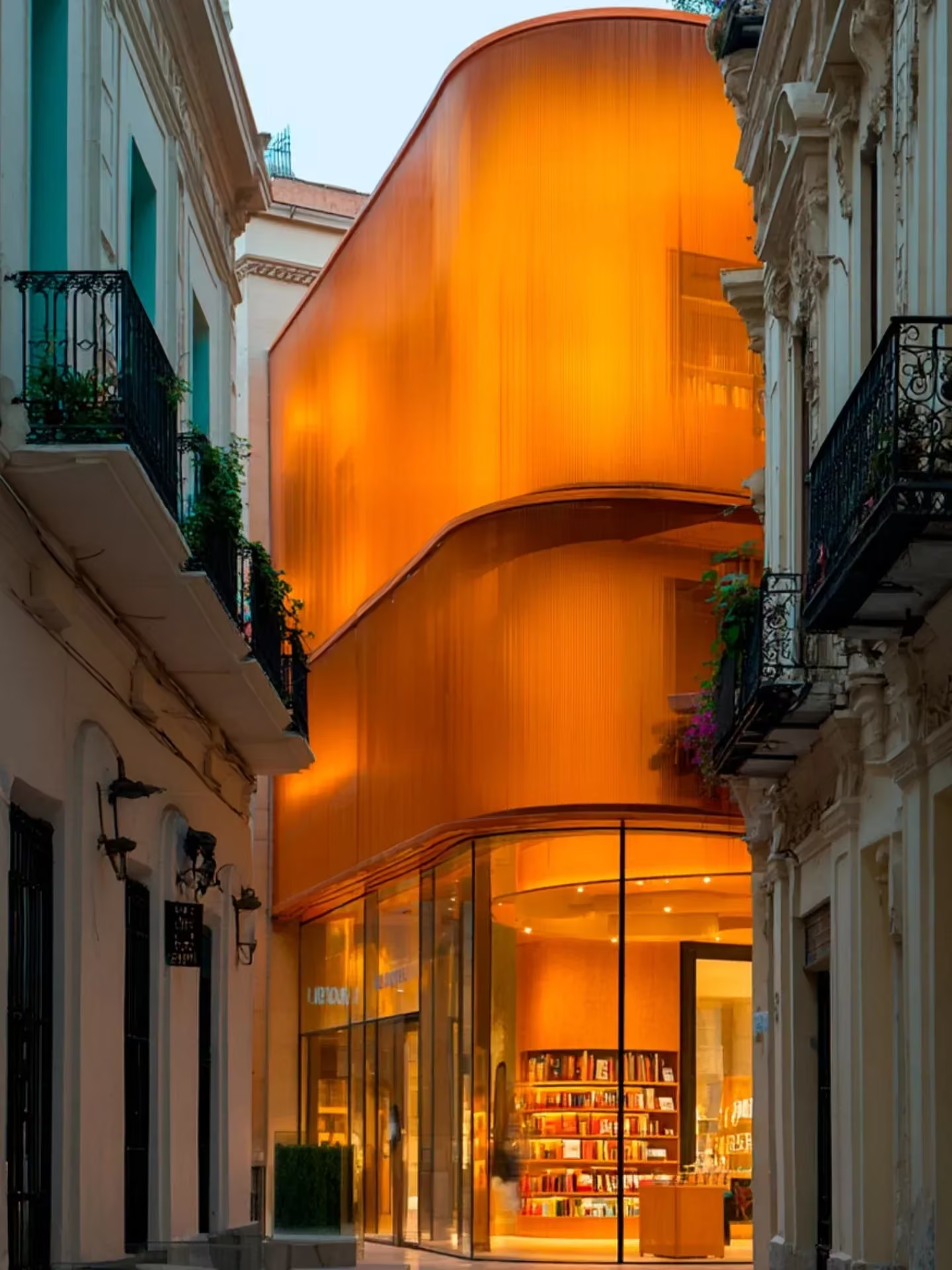
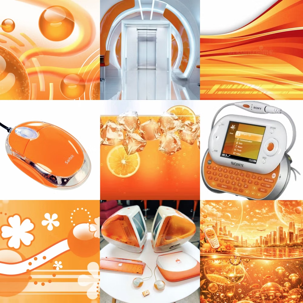
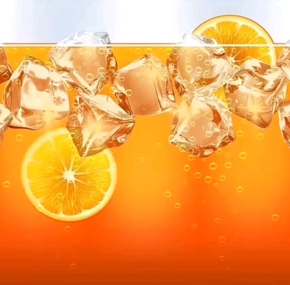
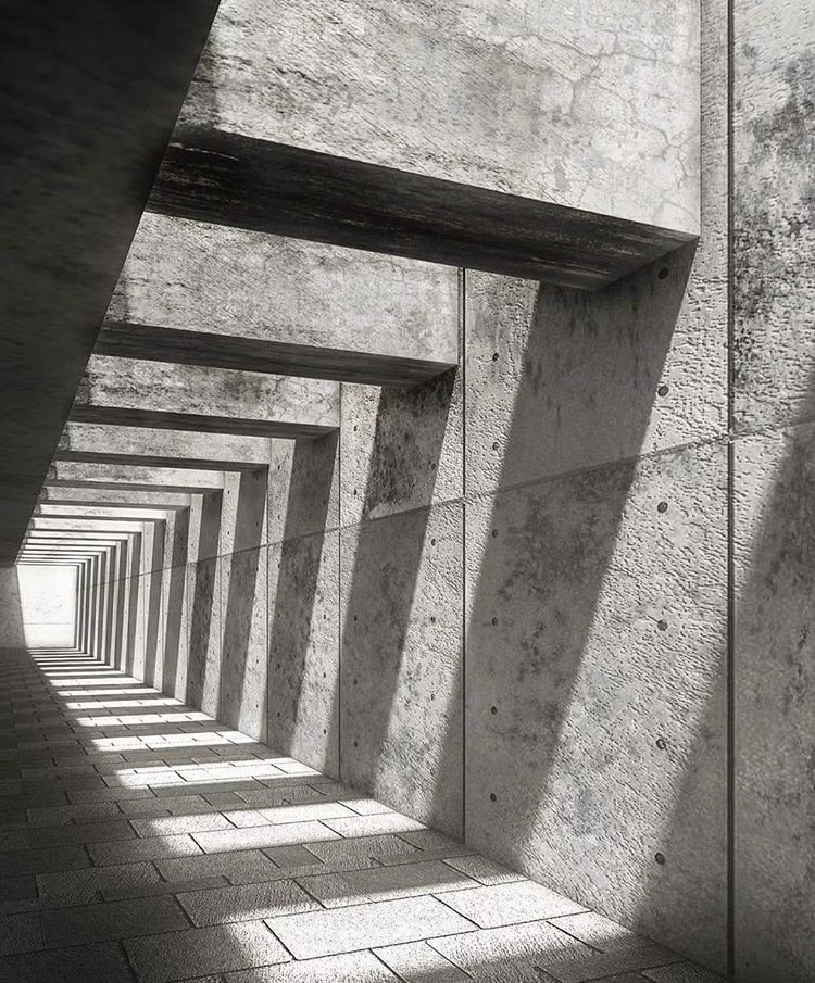
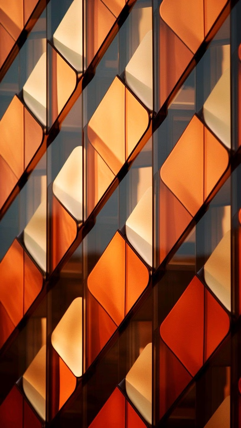
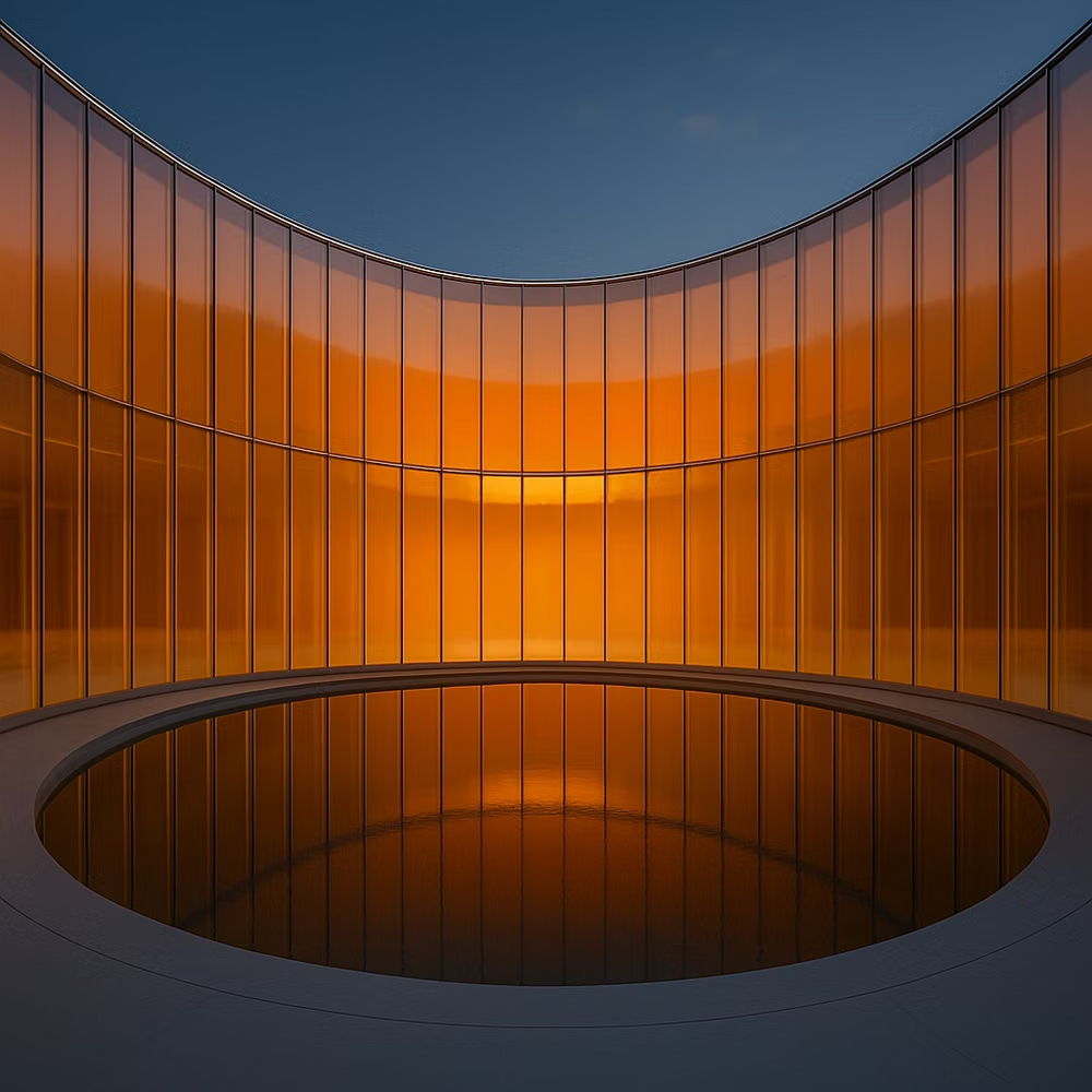
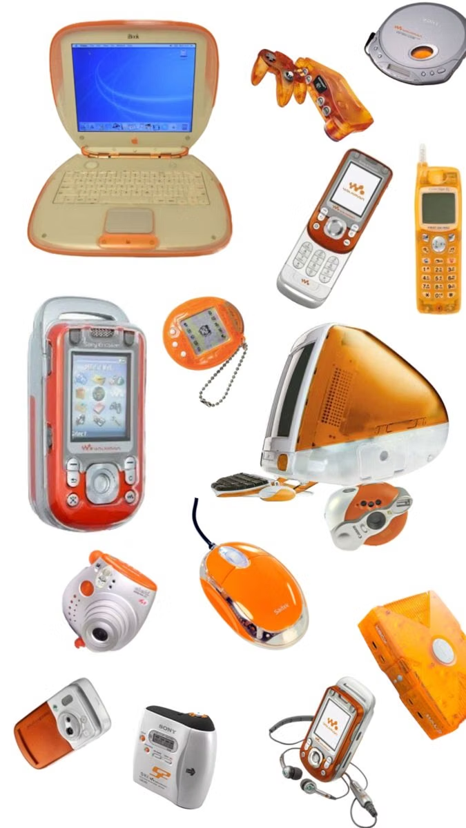
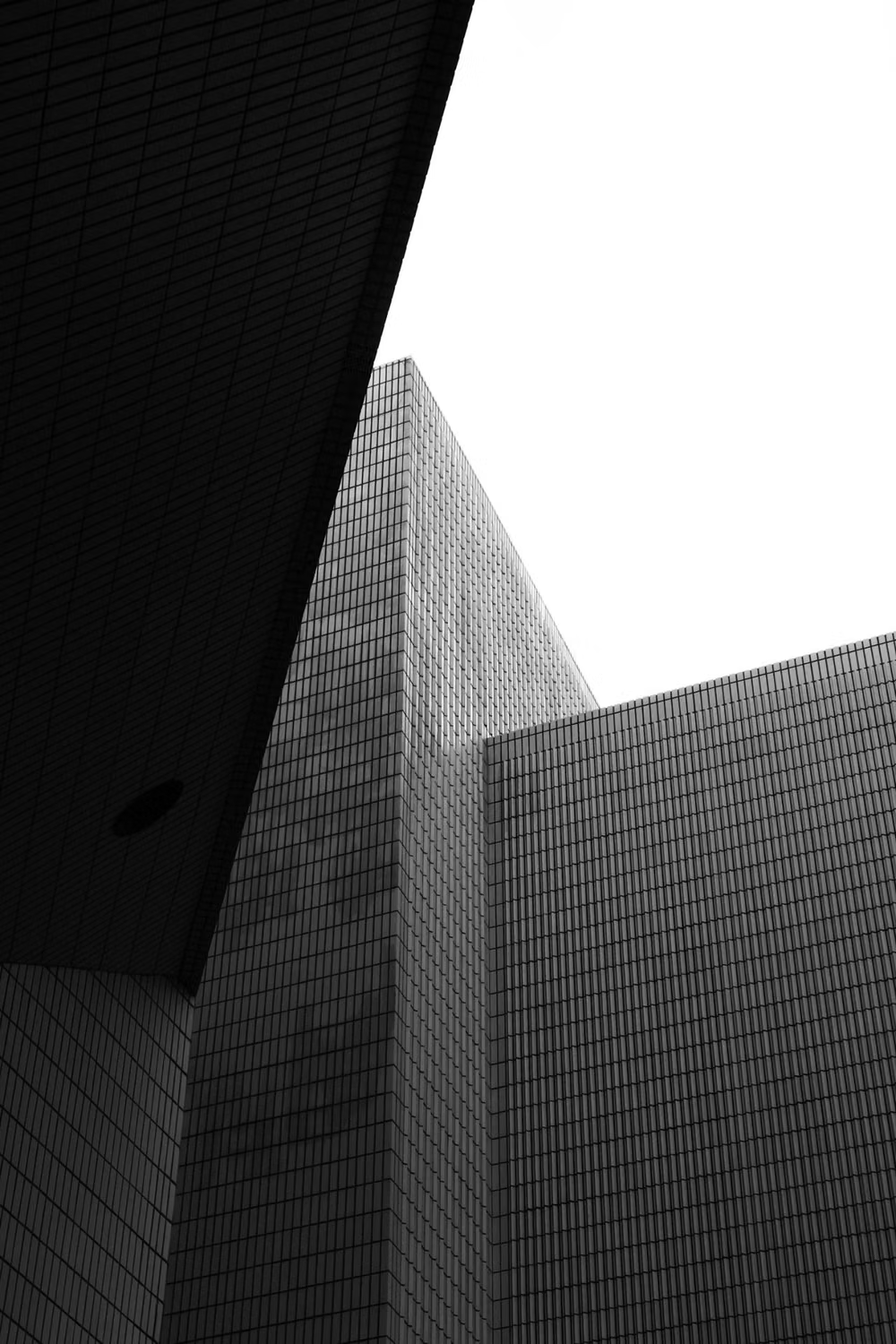
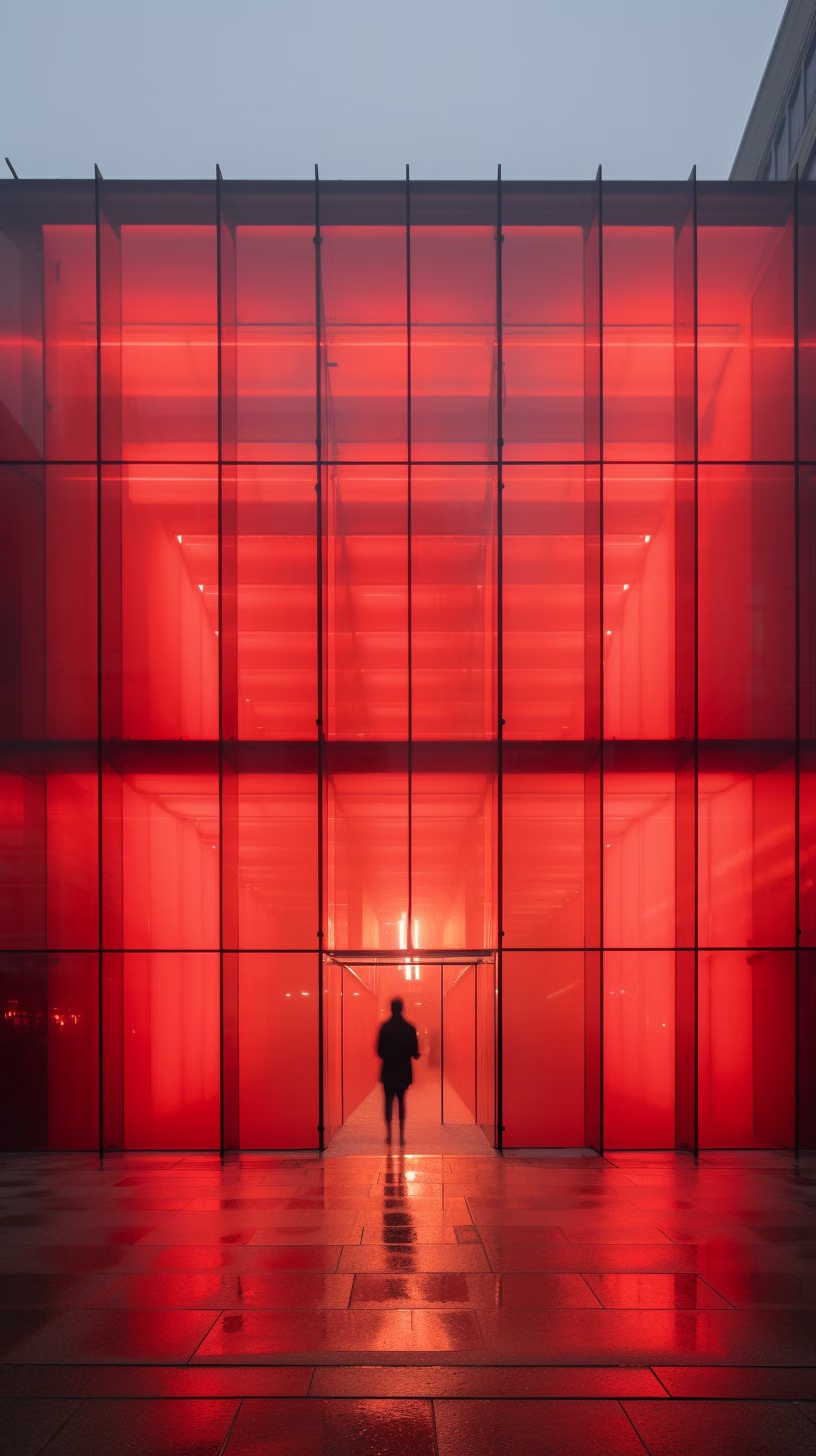
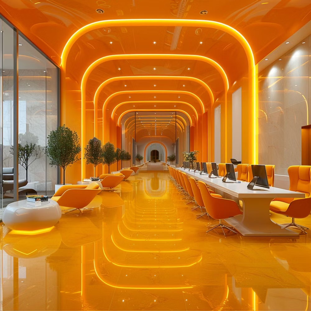
A visual study of the forms, inspirations, materials, colors, type, and cultural references associated with this UI design style.

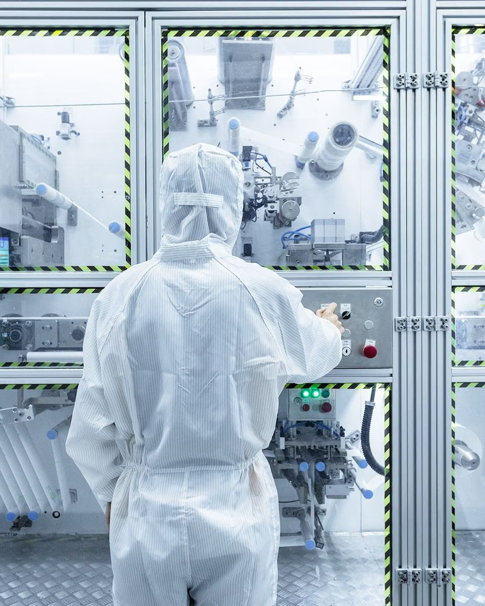
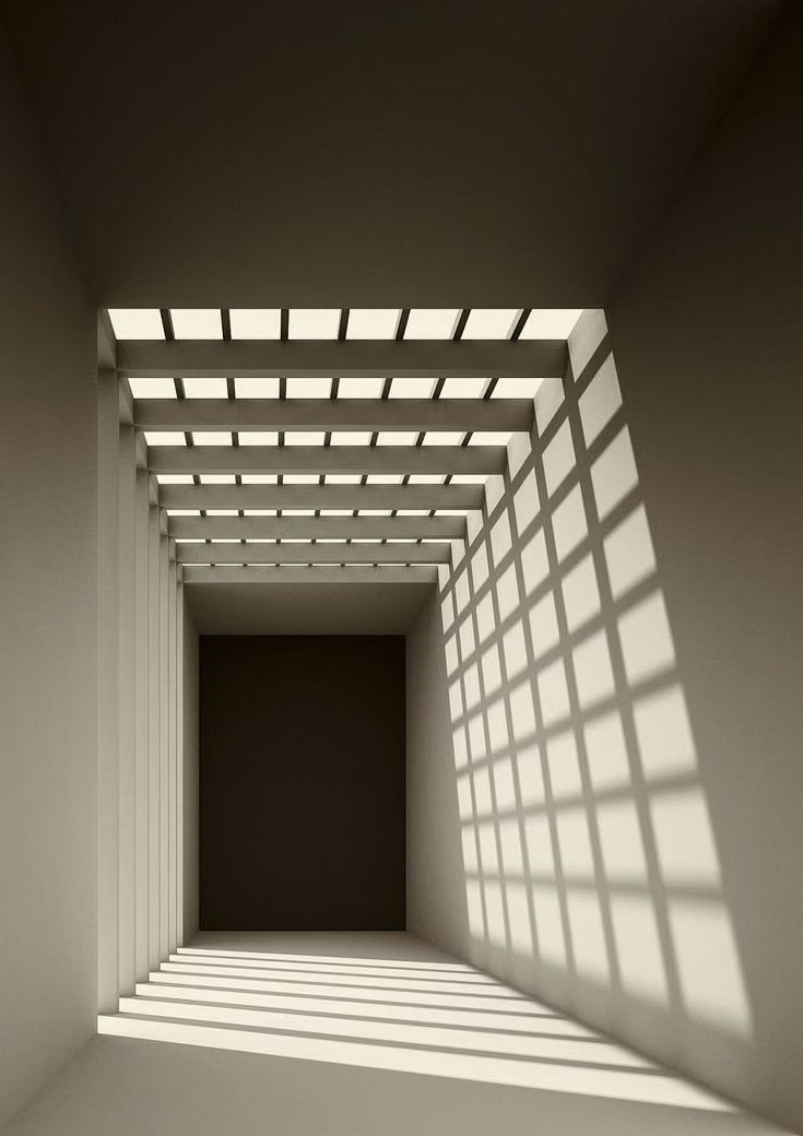
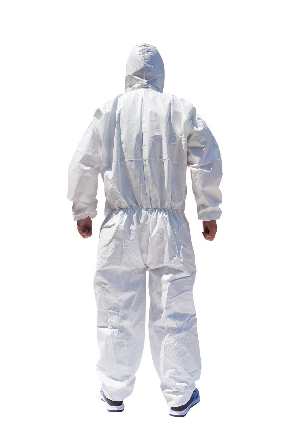
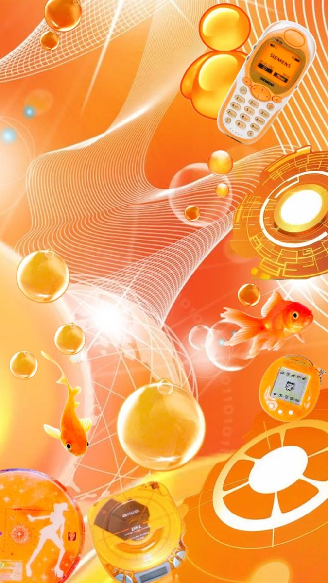
Design principles and implementation
Use these principles to write a focused AI UI design prompt instead of asking for a vague visual treatment.
Color direction
Let white dominate, use orange as the primary accent, reserve red or yellow for urgent and kinetic signals, ground machinery in gray, silver, or black, and add cool blue sparingly. In a daisyUI theme, use orange for `primary`, restrained cool blue for `secondary`, and assign white, pale machine gray, and silver gray to `base-100`, `base-200`, and `base-300`.
Imagery direction
Show hard daylight, glass offices, white concrete cities, robotics, clean factories, transit systems, techwear, protective gear, and low-poly bursts without lush nature or grimy cyberpunk clutter.
Content density
Keep density medium, balancing wide empty fields with compact aligned control or data clusters and one unmistakable accent-colored path through each view.
Motion direction
Snap parallel panels along fixed axes, trace orange route lines, rotate faceted structures, and use clean camera rushes or explosive polygon transitions without neon glitches.
Shape language
Use parallel bands, symmetric frames, wedges, shards, faceted clusters, circles, clipped rectangles, and thin industrial lines with crisp edges. In daisyUI themes, set the `--radius-*` variables to `0` or `0.25rem`.
Typography rules
Use a clean condensed or geometric sans-serif, uppercase technical labels, wide tracking, and large numerals; keep long copy dark and reserve orange or red type for signals.
Suggested Typfaces
Barlow Condensed
Fresh daisies glow in warm sunlight
Fresh daisies glow in warm sunlight
1 2 3 4 5 6 7 8 9 0
Rajdhani
Fresh daisies glow in warm sunlight
Fresh daisies glow in warm sunlight
1 2 3 4 5 6 7 8 9 0
Exo 2
Fresh daisies glow in warm sunlight
Fresh daisies glow in warm sunlight
1 2 3 4 5 6 7 8 9 0
IBM Plex Sans
Fresh daisies glow in warm sunlight
Fresh daisies glow in warm sunlight
1 2 3 4 5 6 7 8 9 0
Roboto Condensed
Fresh daisies glow in warm sunlight
Fresh daisies glow in warm sunlight
1 2 3 4 5 6 7 8 9 0
Build a DORFic interface with daisyUI
The live example translates this direction into daisyUI components and semantic theme tokens.
To generate a full page in the same visual language, give the style name and the design rules above to Blueprint MCP.
Related UI design styles
Compare nearby visual languages that share typography, shapes, use cases, or signature elements.
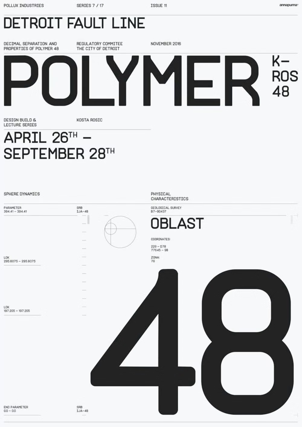
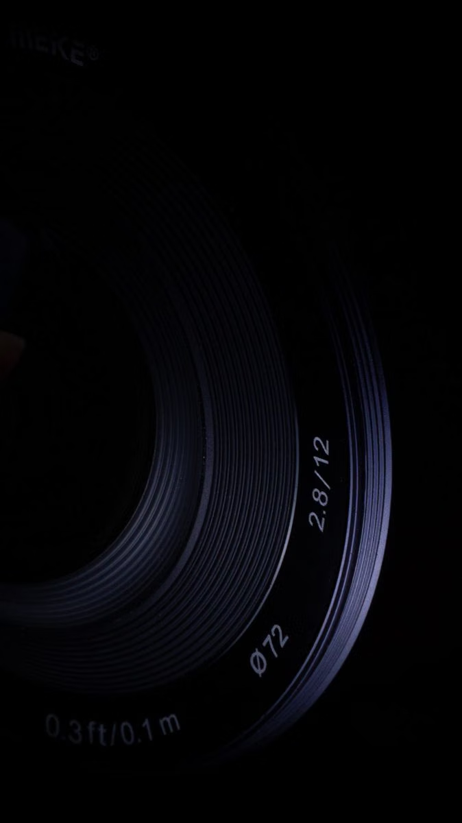
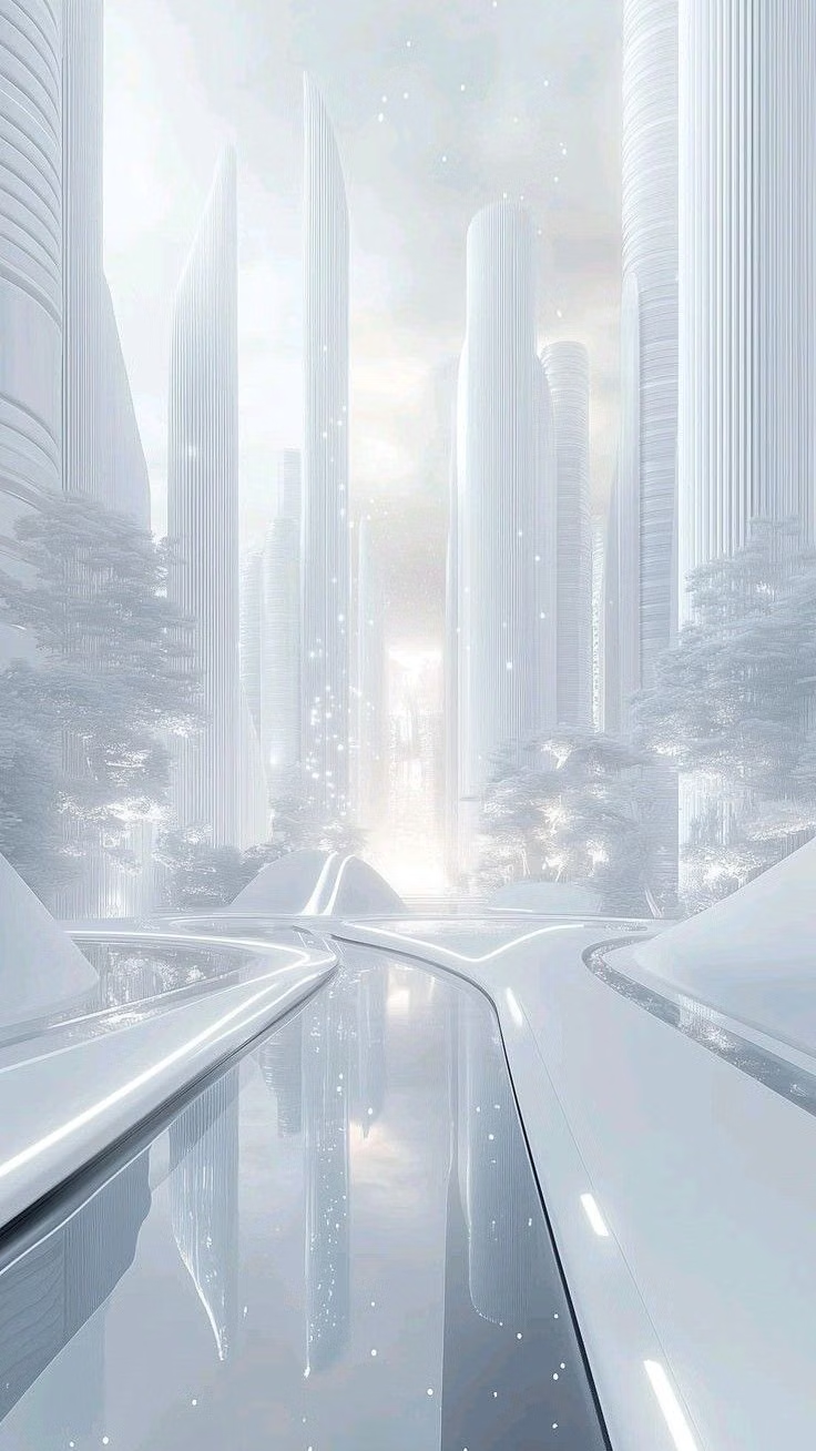
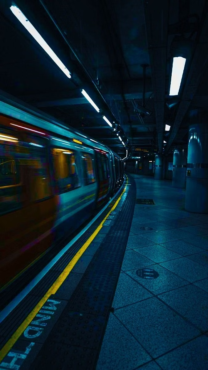
Cyberminimalism UI design style
Late-2010s hyper-minimal tech design reduces interfaces to black or white fields, large grotesque type, strict grids, sparse geometry, and an occasional controlled gradient or premium render.
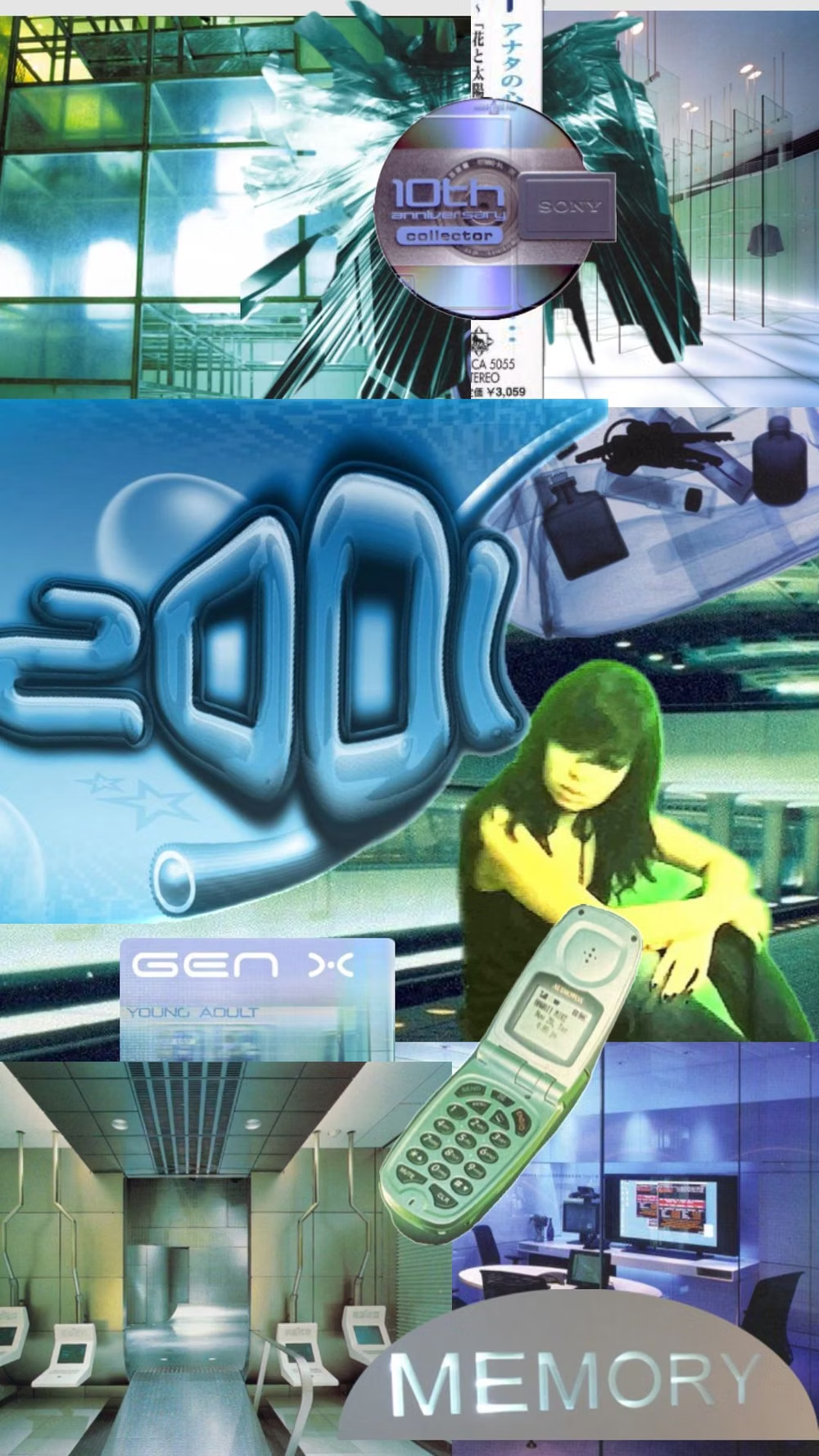
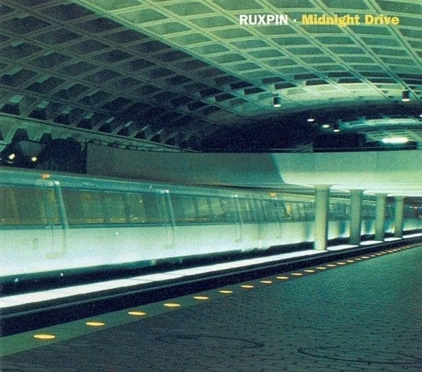
Gen-X Soft Club UI design style
Late-1990s and early-2000s urban futurism softens Y2K gloss through muted color, minimalist typography, blurred photography, and a sterile-meets-organic mood.
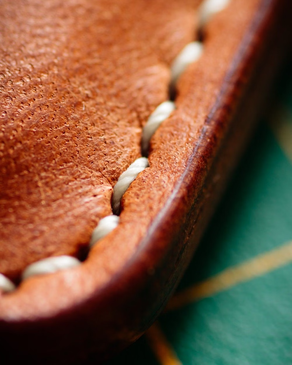

Skeuomorphism UI design style
Photorealistic or softly modeled interfaces use material depth, mechanical controls, and analog-equipment cues, often combining industrial nostalgia with clean retro-futurist geometry.