Editorial and art-inspired UI design trends
Typography, composition, and art history lead these interfaces. They work well when content needs an authored rhythm, a cultural point of view, or a strong visual hierarchy.
14 UI design trends
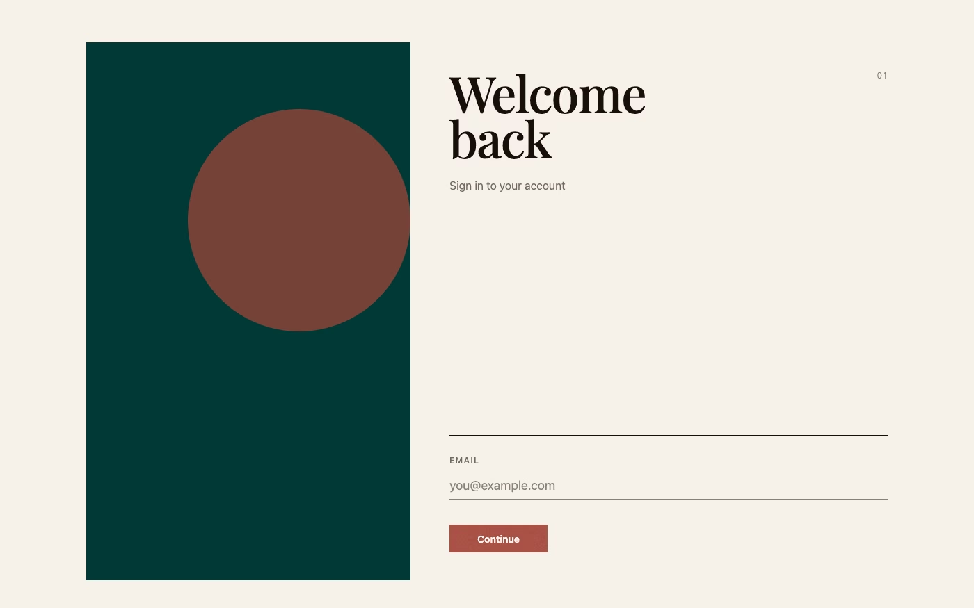
Editorial Design UI design style
Magazine-inspired layouts with dramatic typography, art-directed imagery, columns, captions, and deliberate pacing.
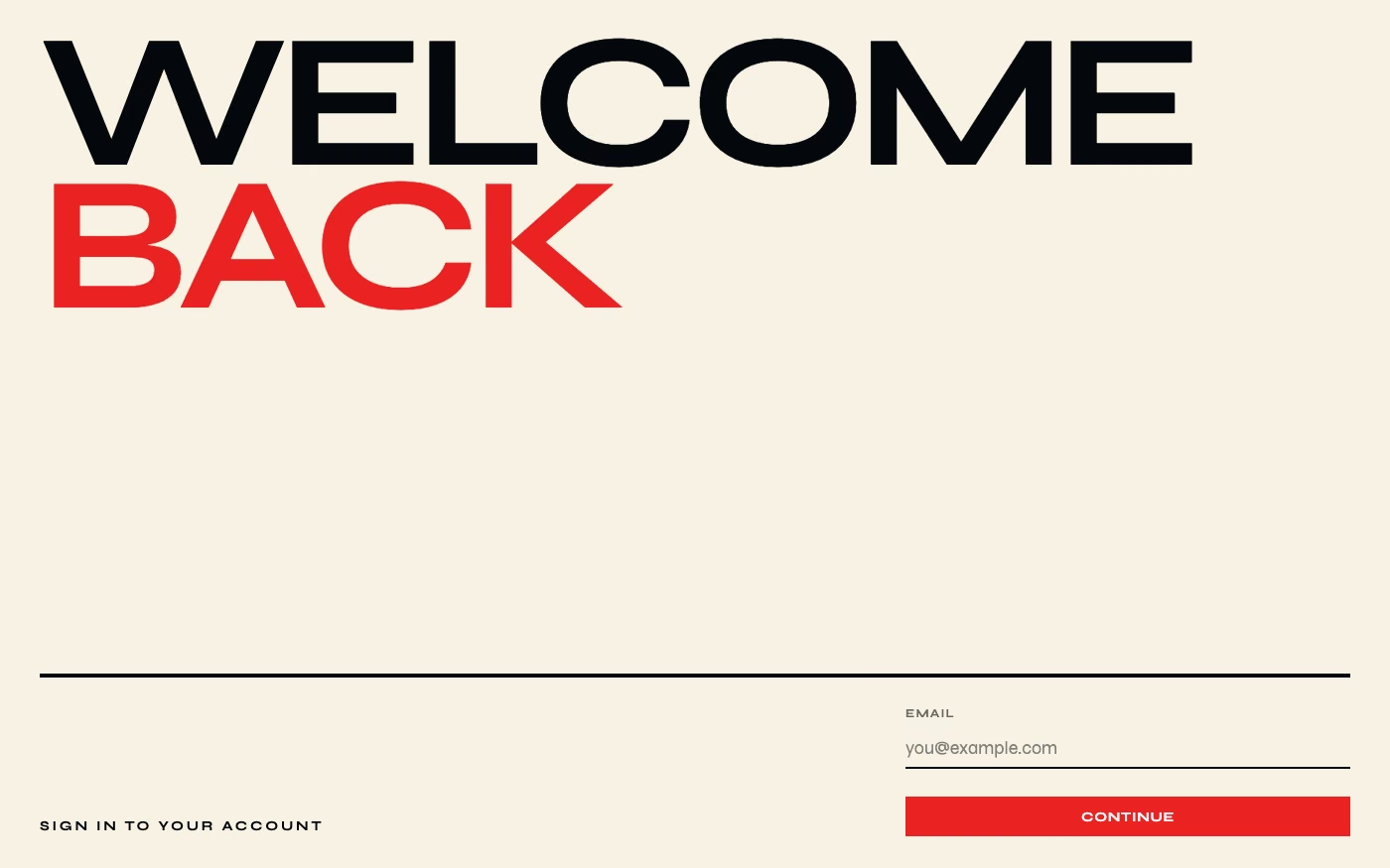
Type-First Design UI design style
Oversized or expressive typography acts as the primary visual element, with imagery and controls playing supporting roles.
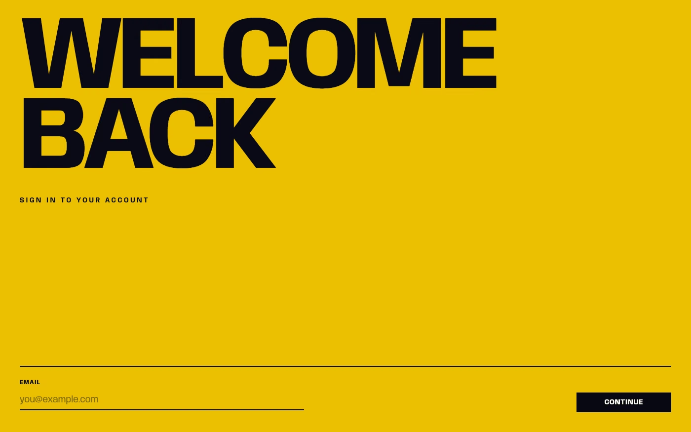
Kinetic Typography UI design style
Animated text changes position, scale, weight, shape, or rhythm to communicate tone and guide attention.
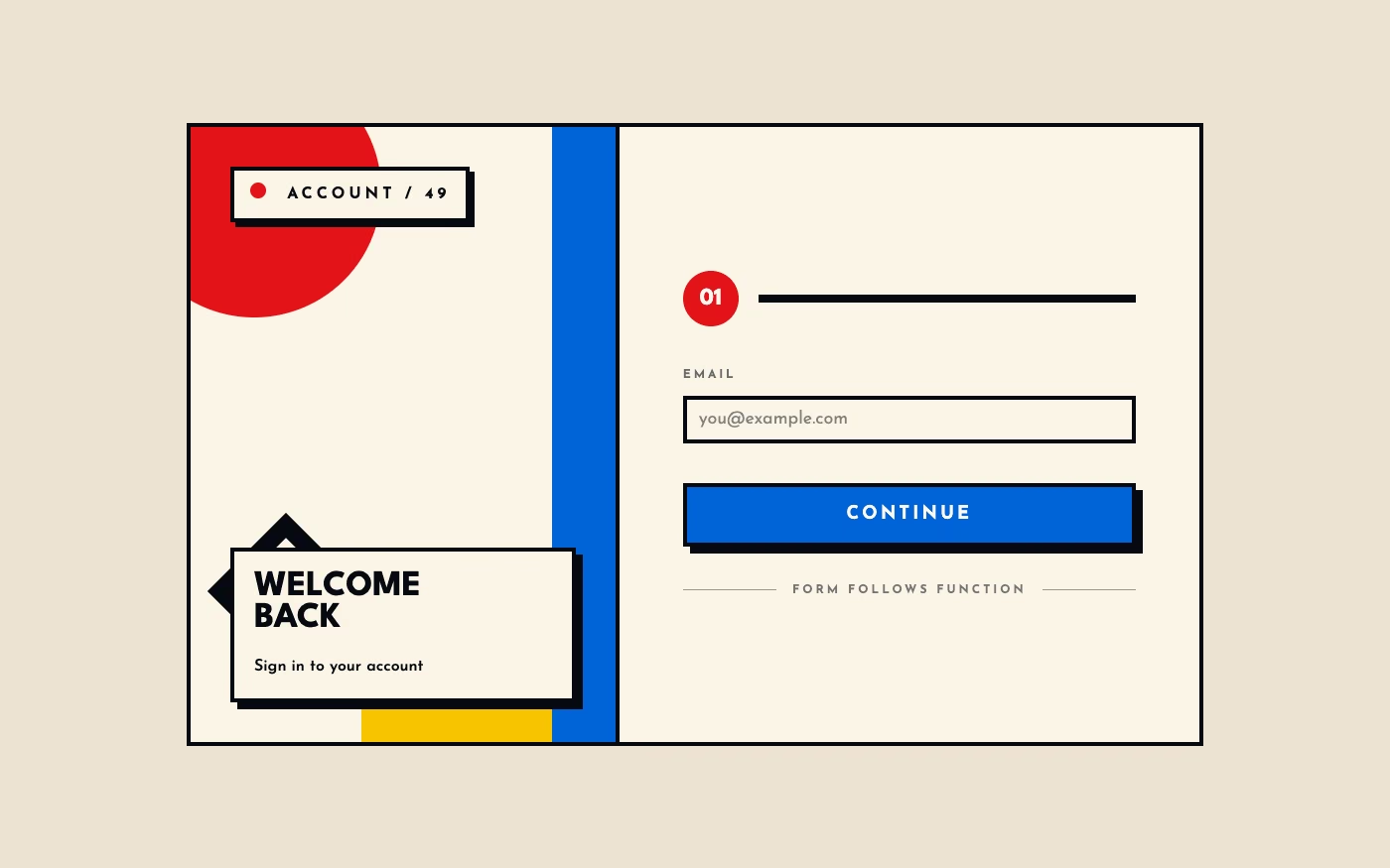
Bauhaus UI design style
Functional compositions use primary colors, geometric forms, strong typography, and visibly organized structure.
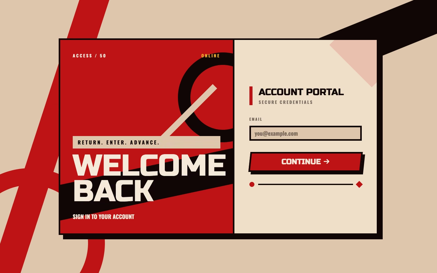
Constructivism UI design style
Dynamic diagonals, photomontage, bold sans-serif type, limited red-black palettes, and propagandistic visual force.
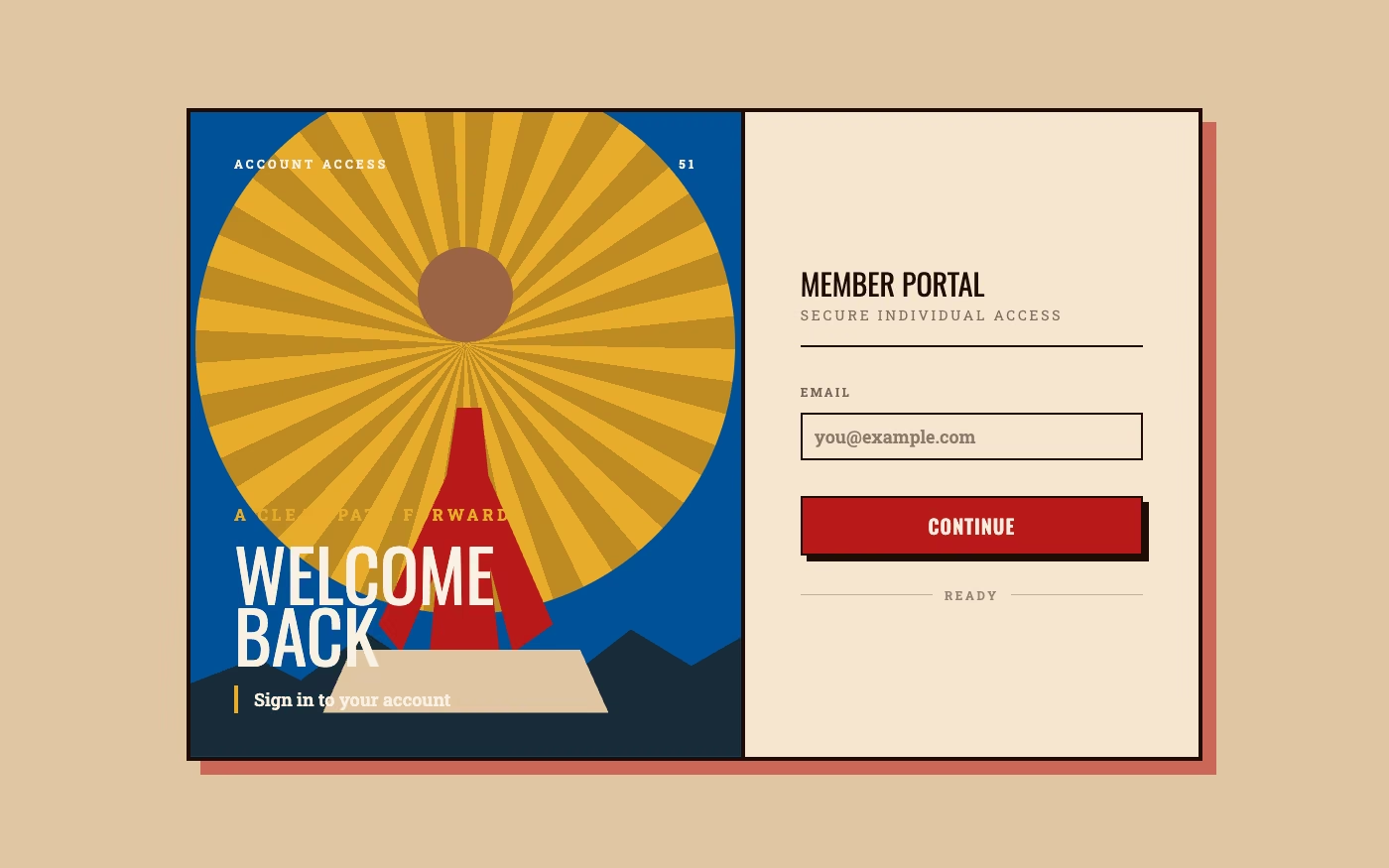
Heroic Realism UI design style
Idealized naturalistic figures become monumental symbols of strength, labor, unity, and progress in the legible, emotionally direct language of twentieth-century propaganda art.
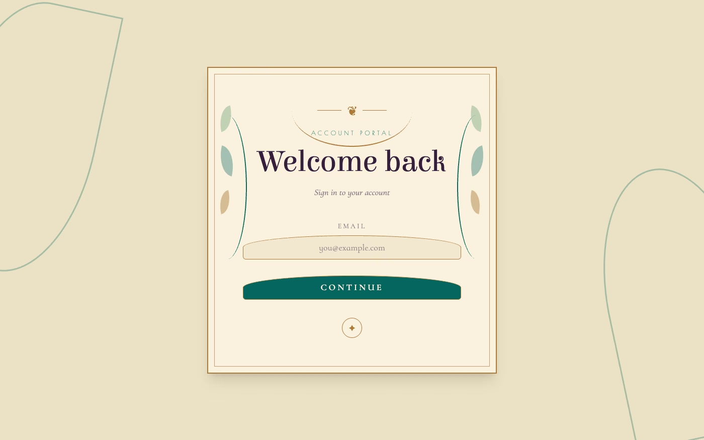
Art Nouveau UI design style
Flowing botanical lines, decorative frames, elegant lettering, natural motifs, and integrated ornament.
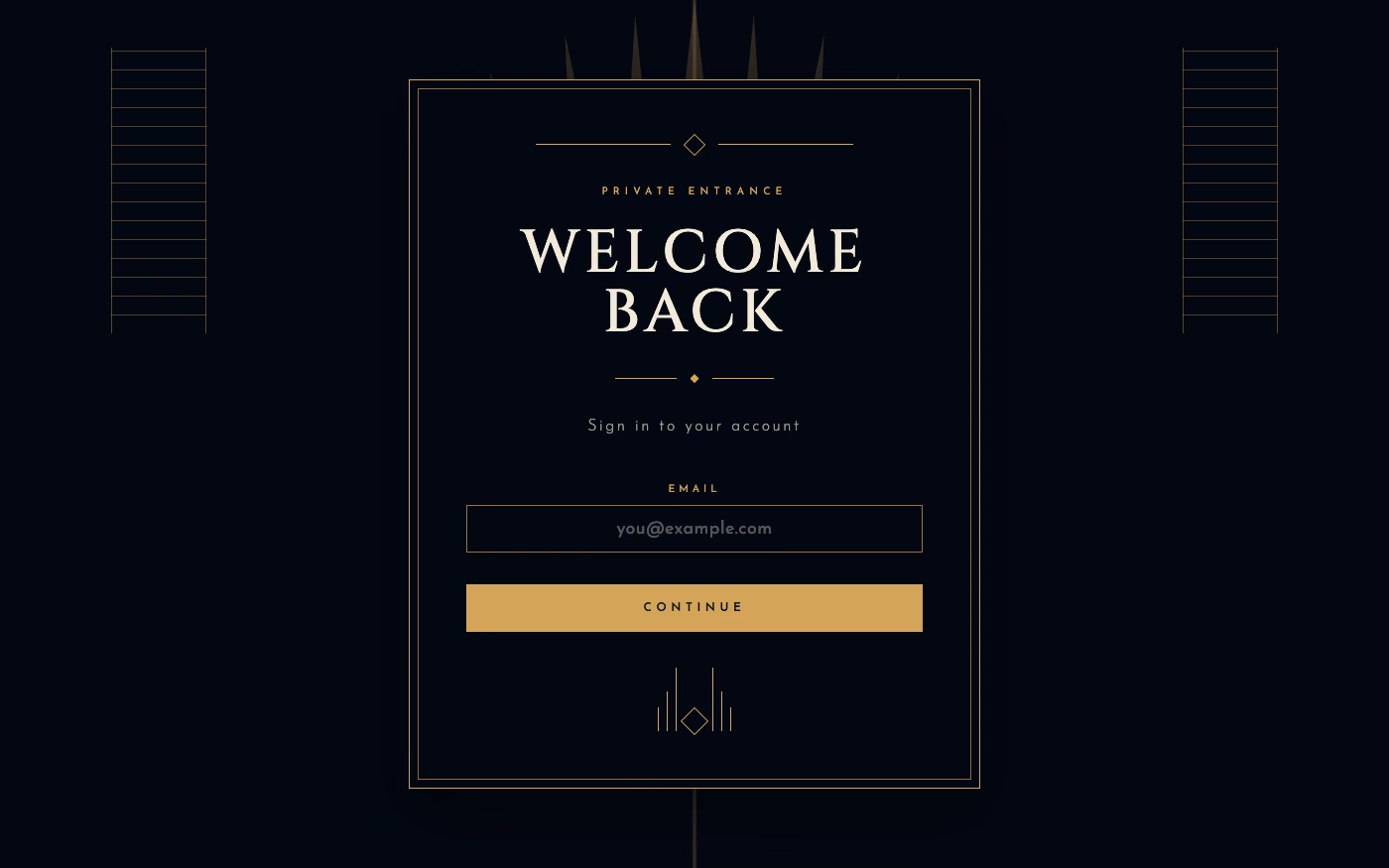
Art Deco UI design style
Symmetrical geometry, stepped forms, luxurious metallic accents, dramatic contrast, and ornamental typography.
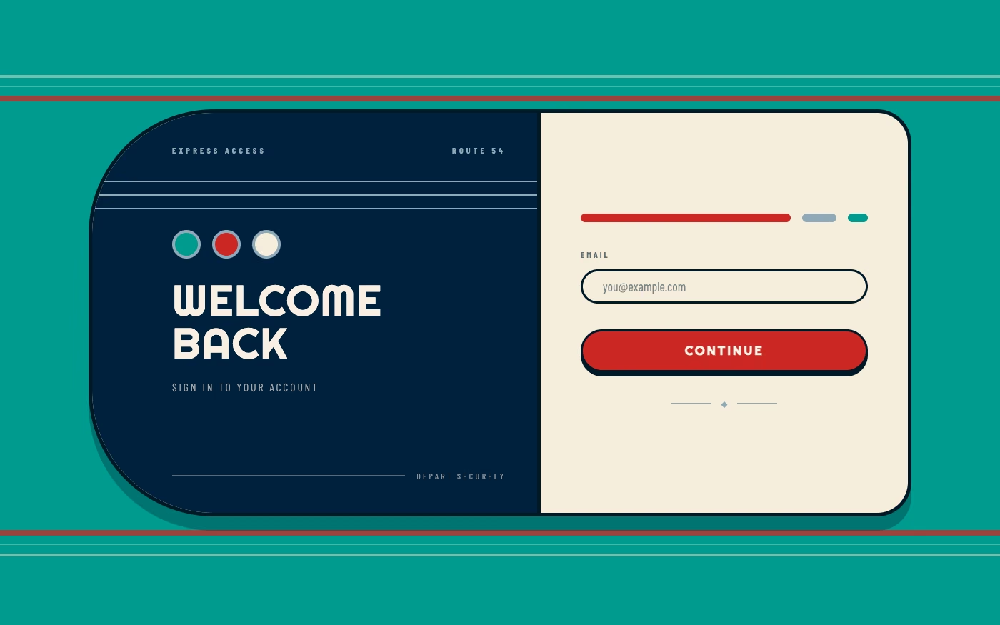
Streamline Moderne UI design style
Aerodynamic curves, horizontal bands, chrome, rounded corners, and machine-age speed simplify Art Deco ornament.
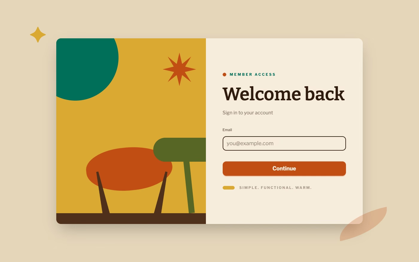
Mid-Century Modern UI design style
Clean geometry, warm muted colors, humanist illustration, functional layouts, and optimistic postwar simplicity.
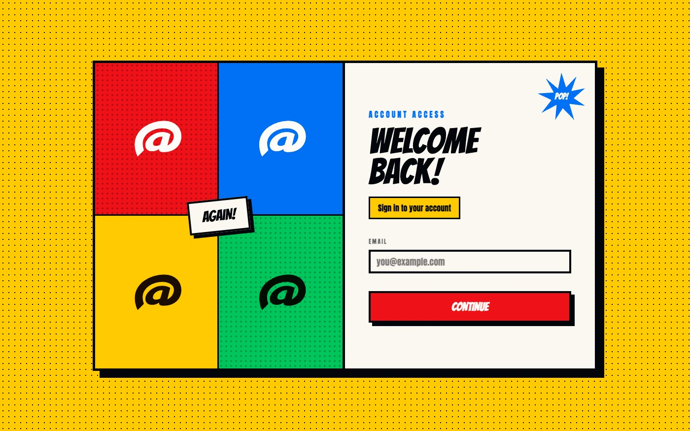
Pop Art UI design style
Commercial imagery, bold outlines, repetition, bright primary colors, and mass-media references become graphic spectacle.
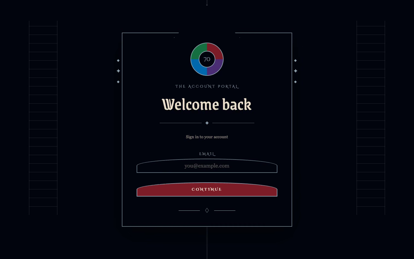
Gothic / Neo-Gothic UI design style
Pointed forms, blackletter or dramatic serif type, dark contrast, tracery, religious ornament, and medieval atmosphere.
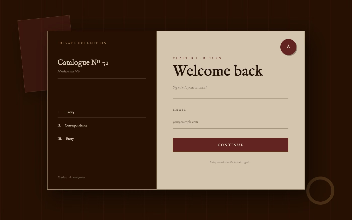
Dark Academia UI design style
Moody scholarly visuals use serif typography, parchment, dark wood, muted earth tones, and archival details.
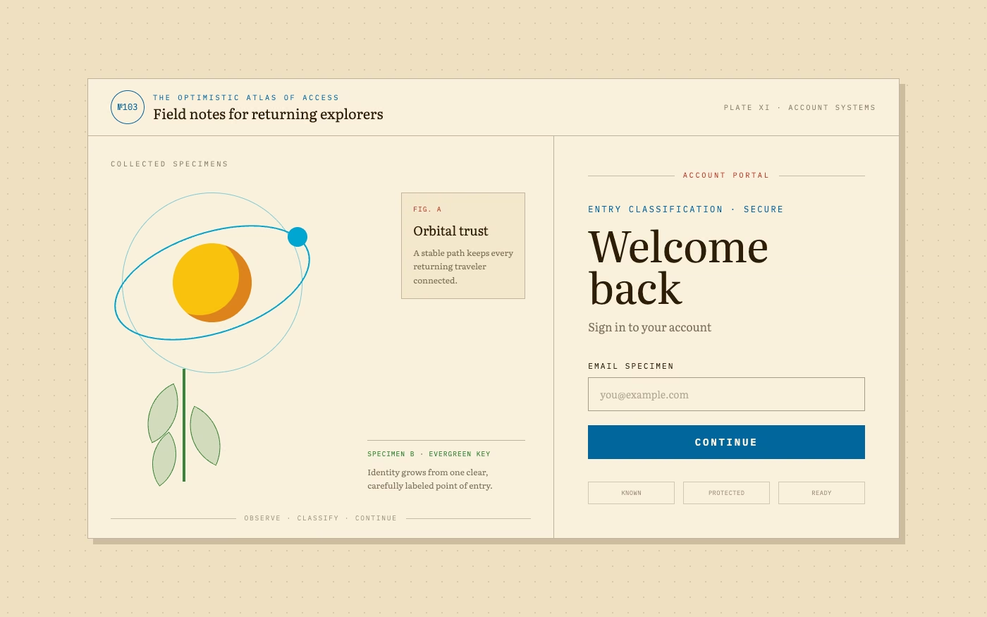
Utopian Scholastic UI design style
Encyclopedic collage, scientific specimens, planets, animals, diagrams, classical type, and optimistic educational imagery.
Explore other UI trend categories
Compare three other visual families before choosing a direction.

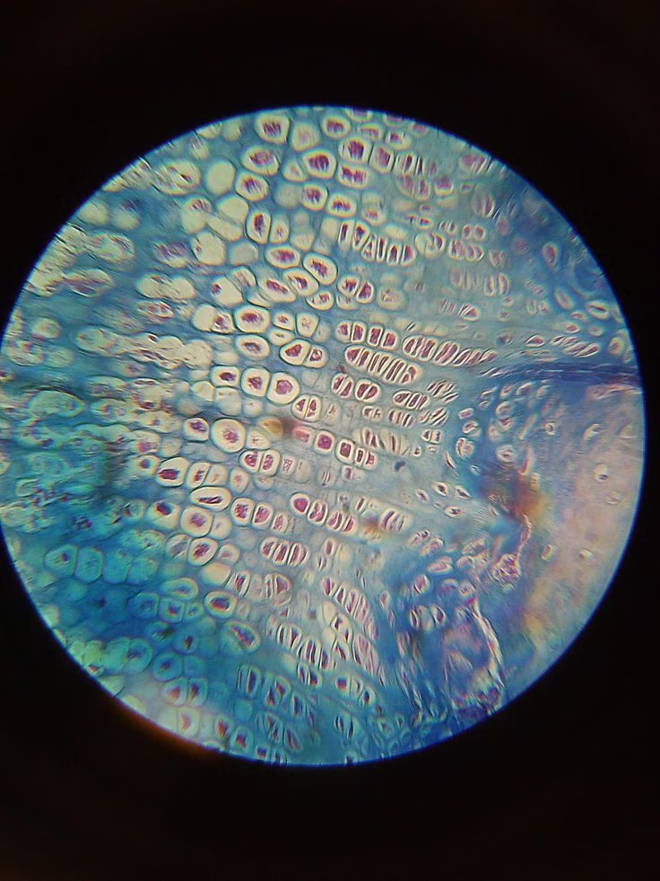

Organic and atmospheric UI design trends
Natural forms, environmental cues, soft atmosphere, and place-based imagery shape this group. These trends can make digital products feel calmer, warmer, or more connected to a physical setting.

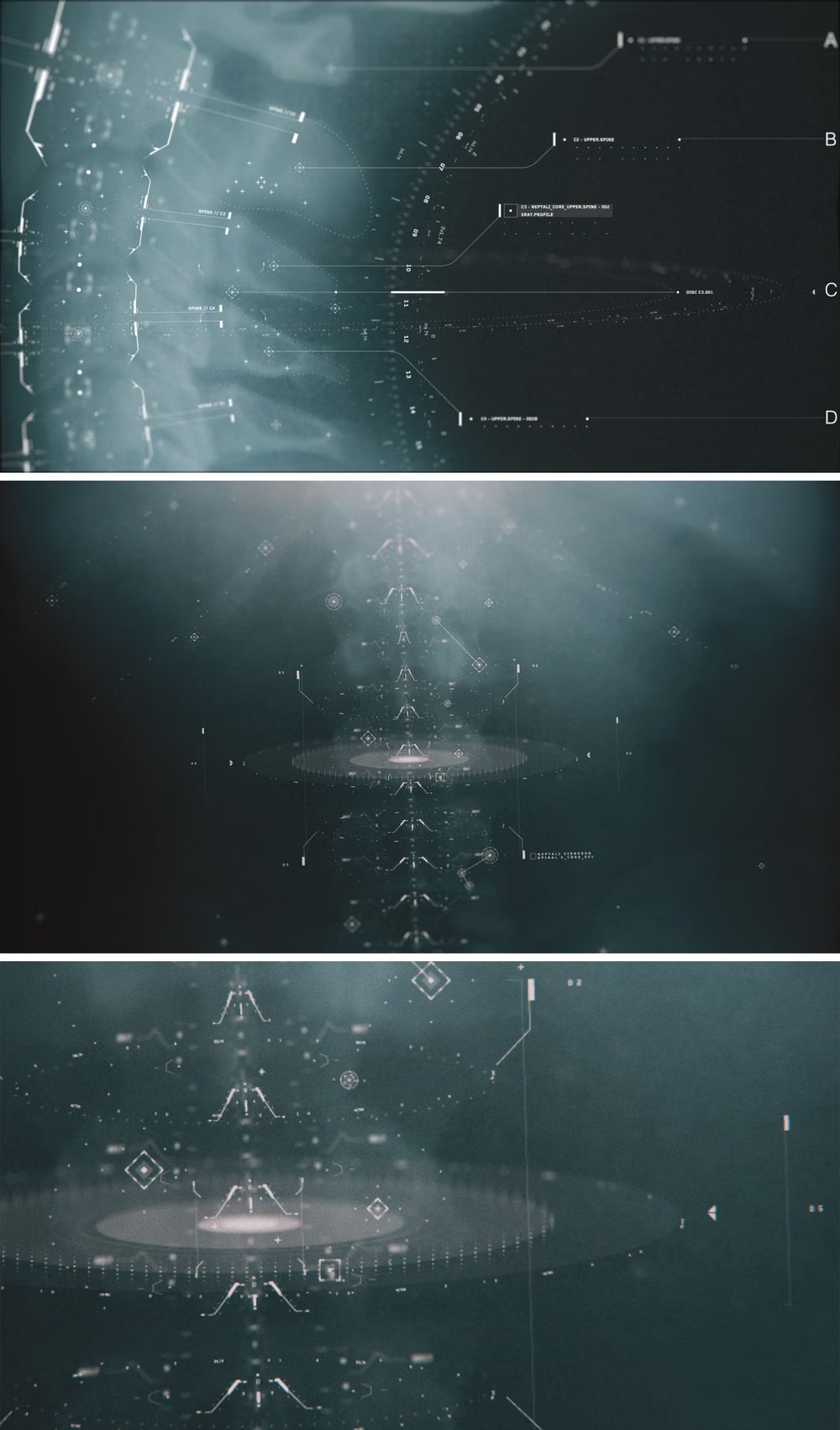
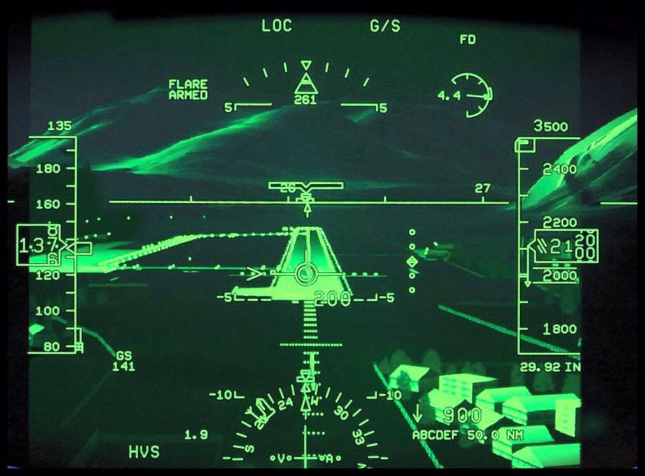
Futuristic and sci-fi UI design trends
Speculative worlds, fictional systems, and imagined technology drive these interfaces. Each trend offers a different answer to how tools, dashboards, and digital environments can feel beyond the present.
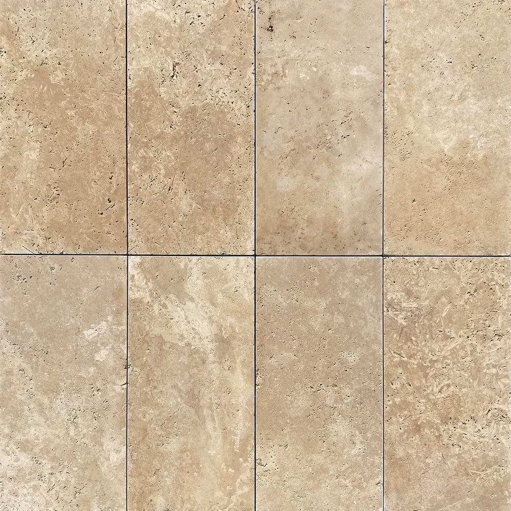
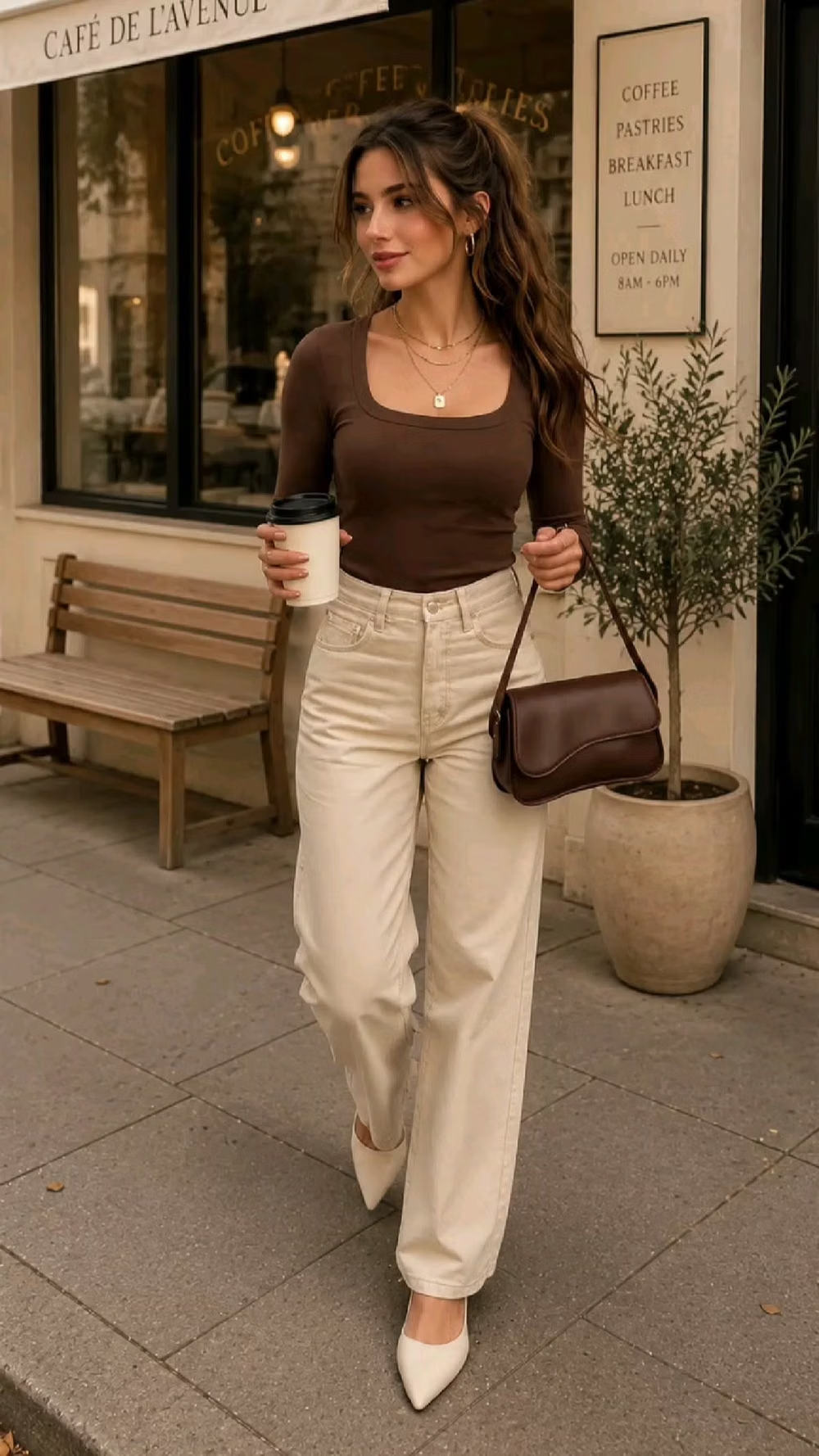
Minimal and functional UI design trends
These interface styles reduce visual noise through clear grids, disciplined spacing, restrained color, and direct information hierarchy. They range from calm product surfaces to compact expert tools.
Turn a visual direction into working UI
Study a trend's design rules, then write a prompt with enough structure for an AI coding agent to apply it consistently.