Skeuomorphism UI design style
Photorealistic or softly modeled interfaces use material depth, mechanical controls, and analog-equipment cues, often combining industrial nostalgia with clean retro-futurist geometry.
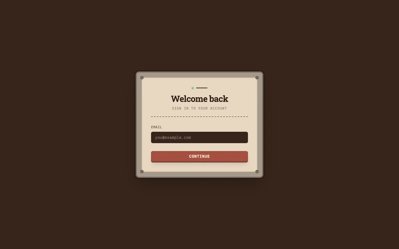
Design overview
- Signature elements
- layered control panels, raised buttons, recessed slots, rotary controls, toggle switches, indicator lights, realistic material finishes, beveled edges, calibration markings, stitched or perforated seams, taped or pinned notes, folded paper corners, fasteners, and layered cast shadows. In daisyUI themes, set `--noise: 1;` and `--depth: 1;`.
- Best suited to
- Music tools, simulations, games, creative software, and interfaces built around physical metaphors.
- Layout principles
- Model the interface as a believable instrument, desk, console, folio, or container; organize compact modules on a precise physical grid, then use functional asymmetry to place controls where their real counterparts would naturally sit and operate. Attach small construction details such as tape, pins, stitches, screws, tabs, and folded corners only at believable junctions instead of distributing ornament uniformly.
History and origins
A fact-checked account of where this visual language came from, with links to the references used.
- Period
- 1980s precedents; dominant in consumer UI during the 2000s
- Origin
- Early graphical computing, especially consumer desktop and mobile interfaces
Skeuomorphism describes new objects that retain cues from older materials or mechanisms. Graphical interfaces used the approach from early desktop metaphors onward, and richly textured versions became especially visible in Apple’s early iPhone era; the broad shift toward flat design around 2012–2013 reduced those textures without eliminating familiar metaphors such as folders and trash cans.
Moodboard and visual references
A visual study of the forms, inspirations, materials, colors, type, and cultural references associated with this UI design style.


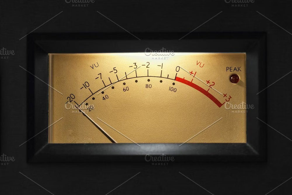
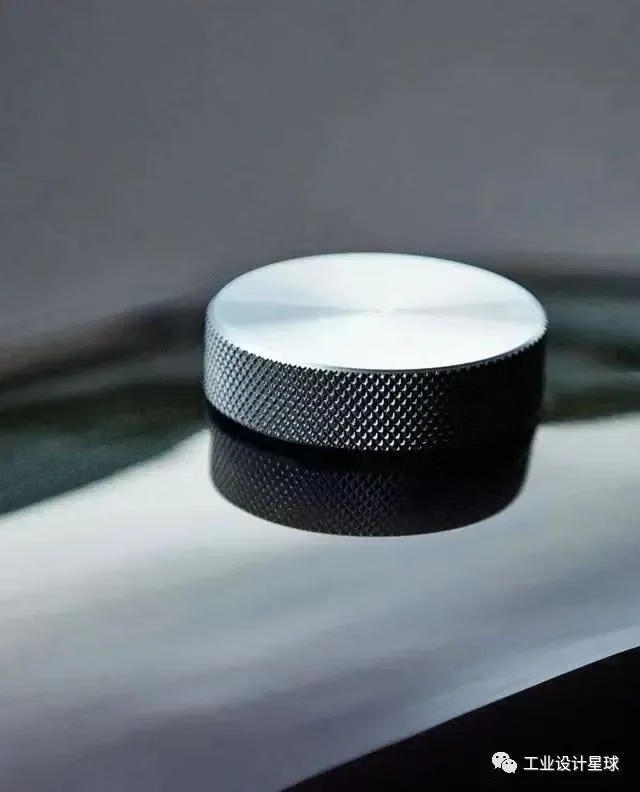

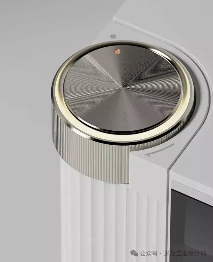
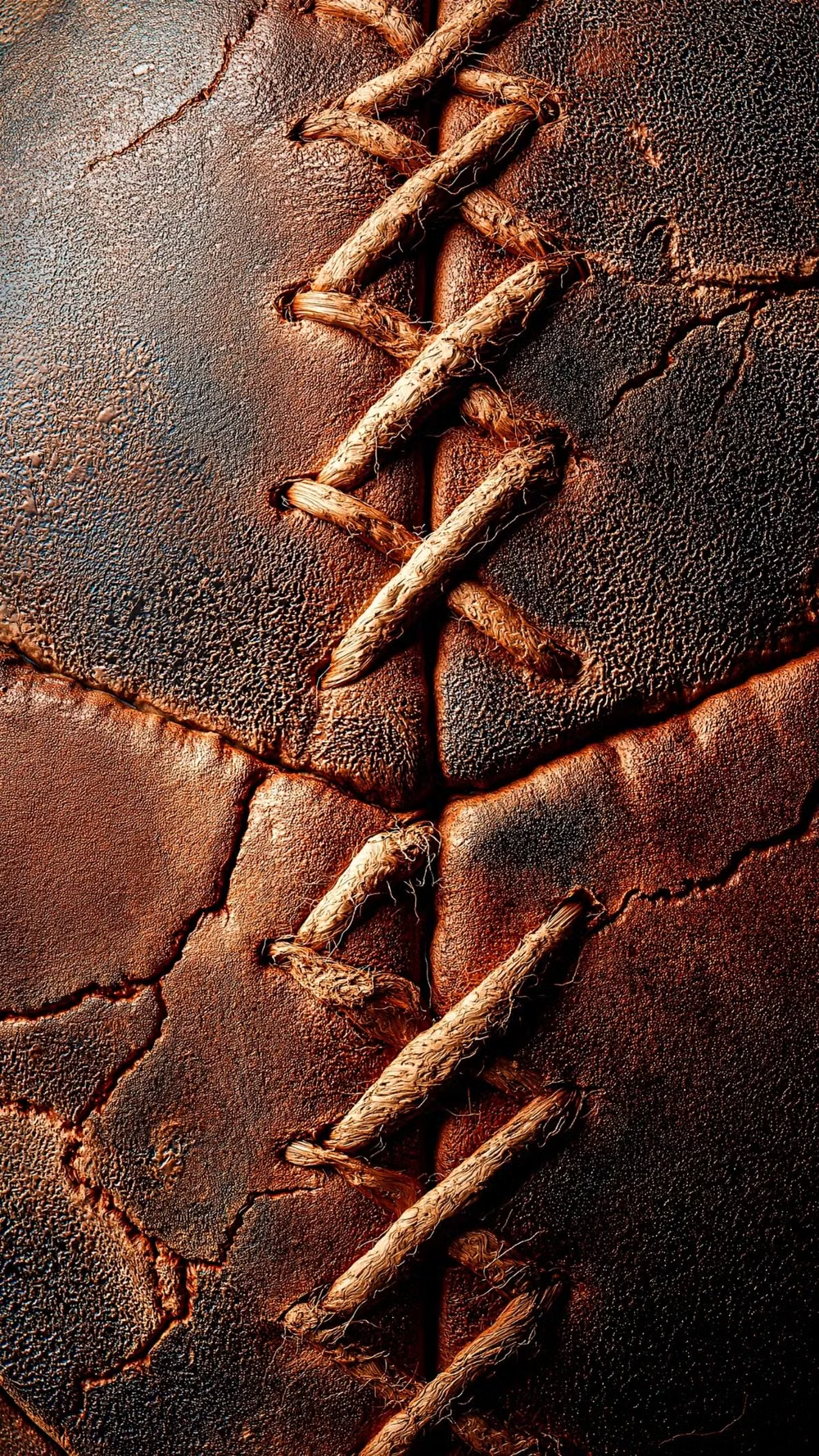
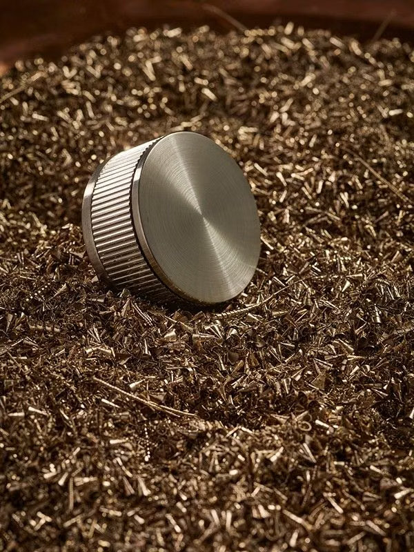
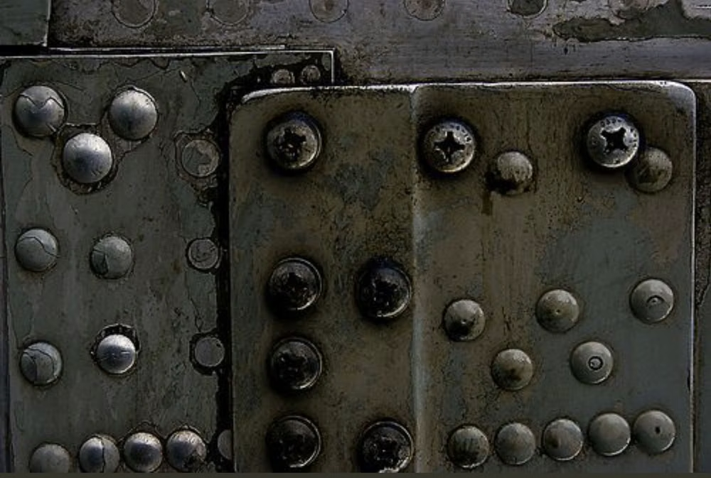
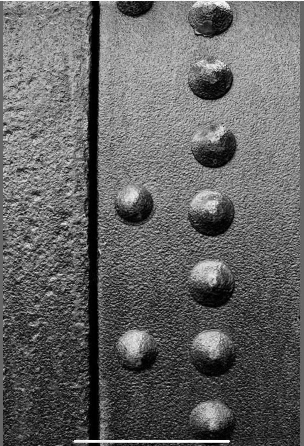
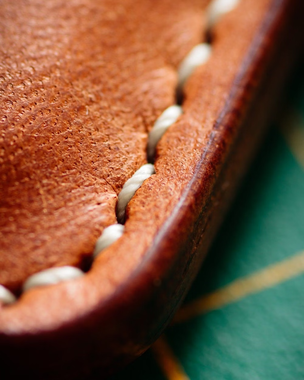
Design principles and implementation
Use these principles to write a focused AI UI design prompt instead of asking for a vague visual treatment.
Color direction
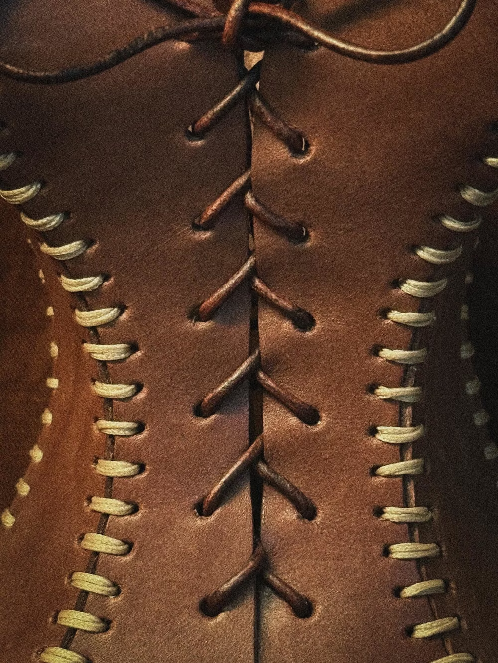
Derive color from machined, molded, painted, worn, or brushed materials such as walnut, steel, leather, enamel, and glass; combine realistic shadow temperature and wear with focused indicator lamps or restrained futuristic illumination. In a daisyUI theme, use the dominant painted-enamel or leather hue for `primary`, an indicator-lamp color for `secondary`, and derive `base-100`, `base-200`, and `base-300` from the material's lit, midtone, and shadow colors.
Imagery direction
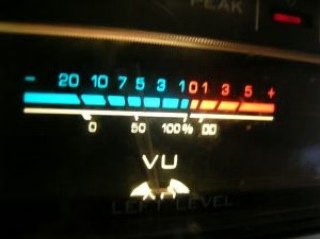
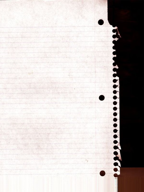
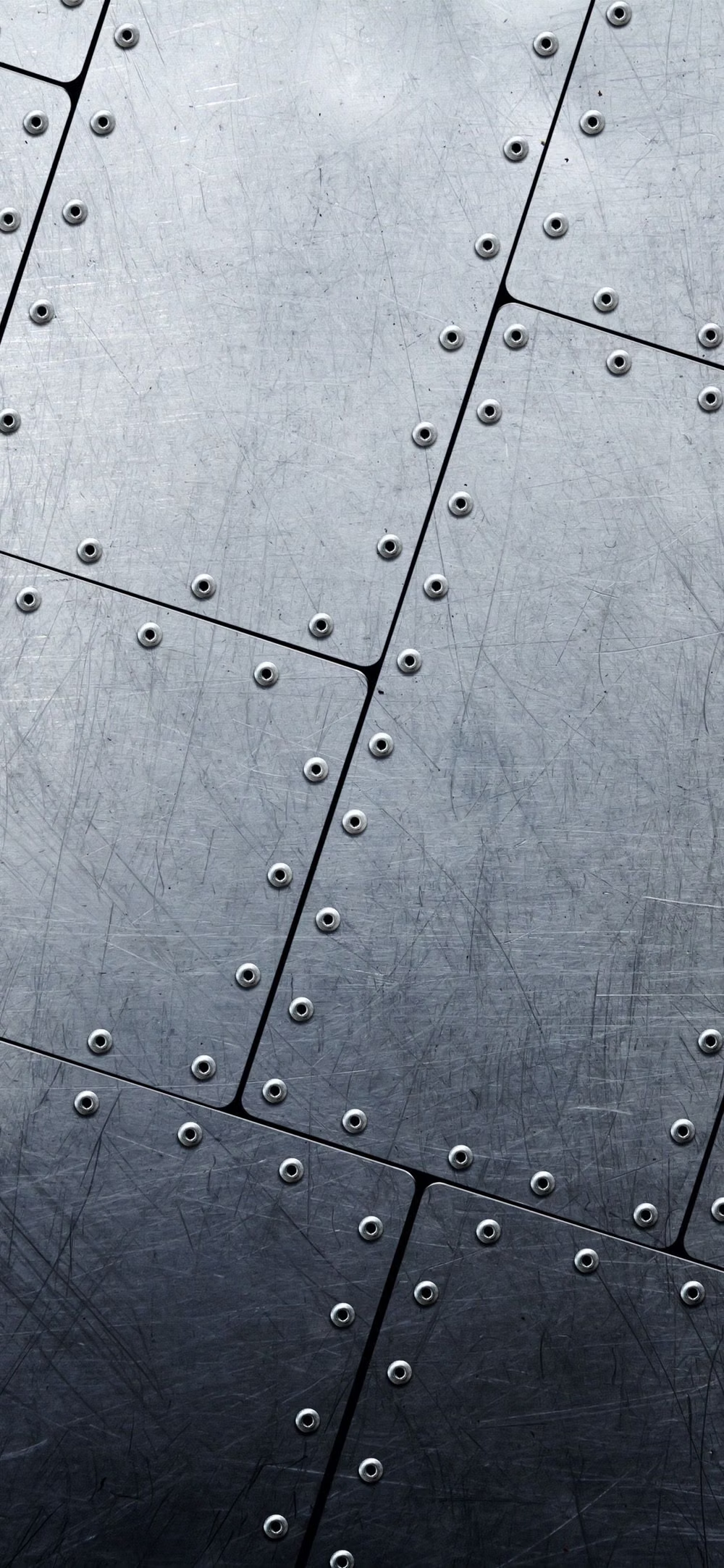
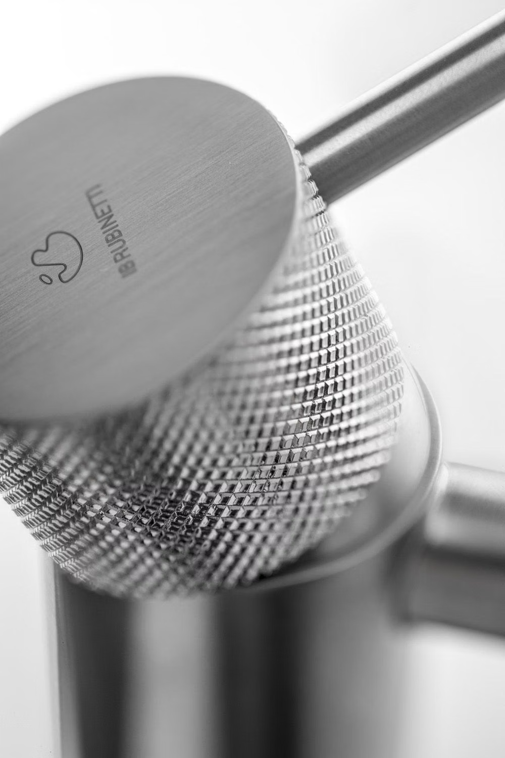
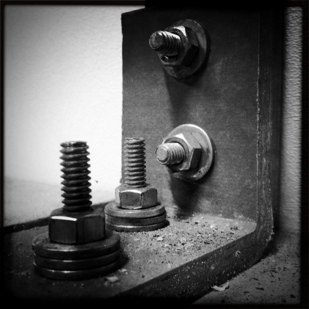
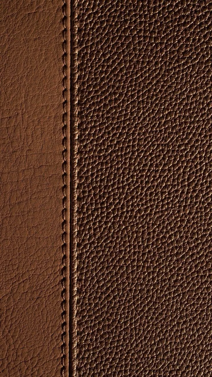
Use high-resolution textures, photographed objects, rendered hardware, or generated surface patterns with consistent lighting and perspective. Suggest leather grain, paper fibers, ruled sheets, perforation, brushed metal, or fine dust without reducing legibility; show panel thickness, seams, fasteners, engraved markings, reflections, inner shadows, and ambient occlusion as part of the construction.
Content density
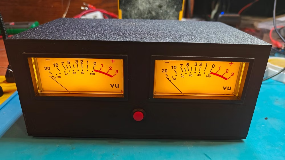
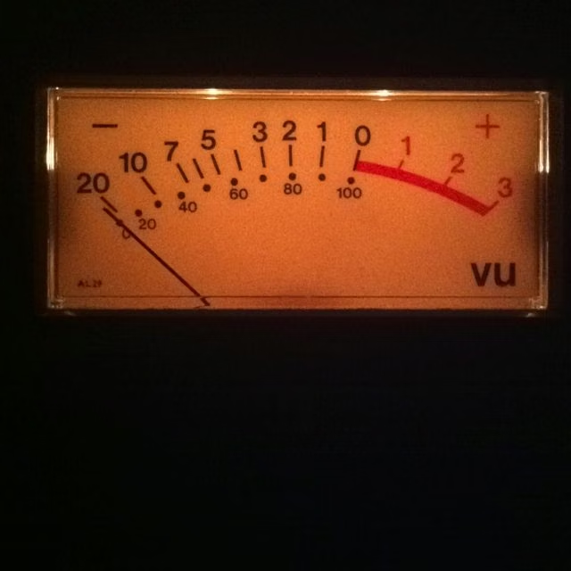
Favor compact, information-dense control clusters with rotary controls, switches, readouts, calibration ticks, and technical micro-labels; separate functions through layered panel modules instead of minimalist uniformity or generic cards. Use the `*-sm` size variants for daisyUI components to preserve this compact working density.
Motion direction
Give each control a material response: buttons travel and rebound, knobs rotate, needles sweep, switches snap, indicator lamps warm up, drawers open, and softly modeled surfaces compress or recess with believable inertia. Keep tape, stitches, screws, and other attachment details visually anchored unless the interaction explicitly manipulates them.
Shape language
Establish one light direction and preserve it across cast shadows, inset shadows, bevel highlights, reflective edges, and overlapping layers. Use stacked panels with realistic thickness, stitched or dashed seams, taped paper, folded corners, beveled housings, recessed slots, raised buttons, rotary controls, molded handles, exposed screws, and tactile contours; cleaner variants may soften the depth into gently raised and inset forms while preserving clear affordances. In daisyUI themes, set the `--radius-*` variables between `0.25rem` and `1rem`.
Typography rules
Pair functional instrument labels with material-appropriate display lettering, engraved legends, compact technical microcopy, fine calibration marks, and aligned monospaced measurements that read like real equipment.
Suggested Typfaces
IBM Plex Sans
Fresh daisies glow in warm sunlight
Fresh daisies glow in warm sunlight
1 2 3 4 5 6 7 8 9 0
IBM Plex Mono
Fresh daisies glow in warm sunlight
Fresh daisies glow in warm sunlight
1 2 3 4 5 6 7 8 9 0
Barlow Condensed
Fresh daisies glow in warm sunlight
Fresh daisies glow in warm sunlight
1 2 3 4 5 6 7 8 9 0
Roboto Slab
Fresh daisies glow in warm sunlight
Fresh daisies glow in warm sunlight
1 2 3 4 5 6 7 8 9 0
Bitter
Fresh daisies glow in warm sunlight
Fresh daisies glow in warm sunlight
1 2 3 4 5 6 7 8 9 0
Build a Skeuomorphism interface with daisyUI
The live example translates this direction into daisyUI components and semantic theme tokens.
To generate a full page in the same visual language, give the style name and the design rules above to Blueprint MCP.
Related UI design styles
Compare nearby visual languages that share typography, shapes, use cases, or signature elements.
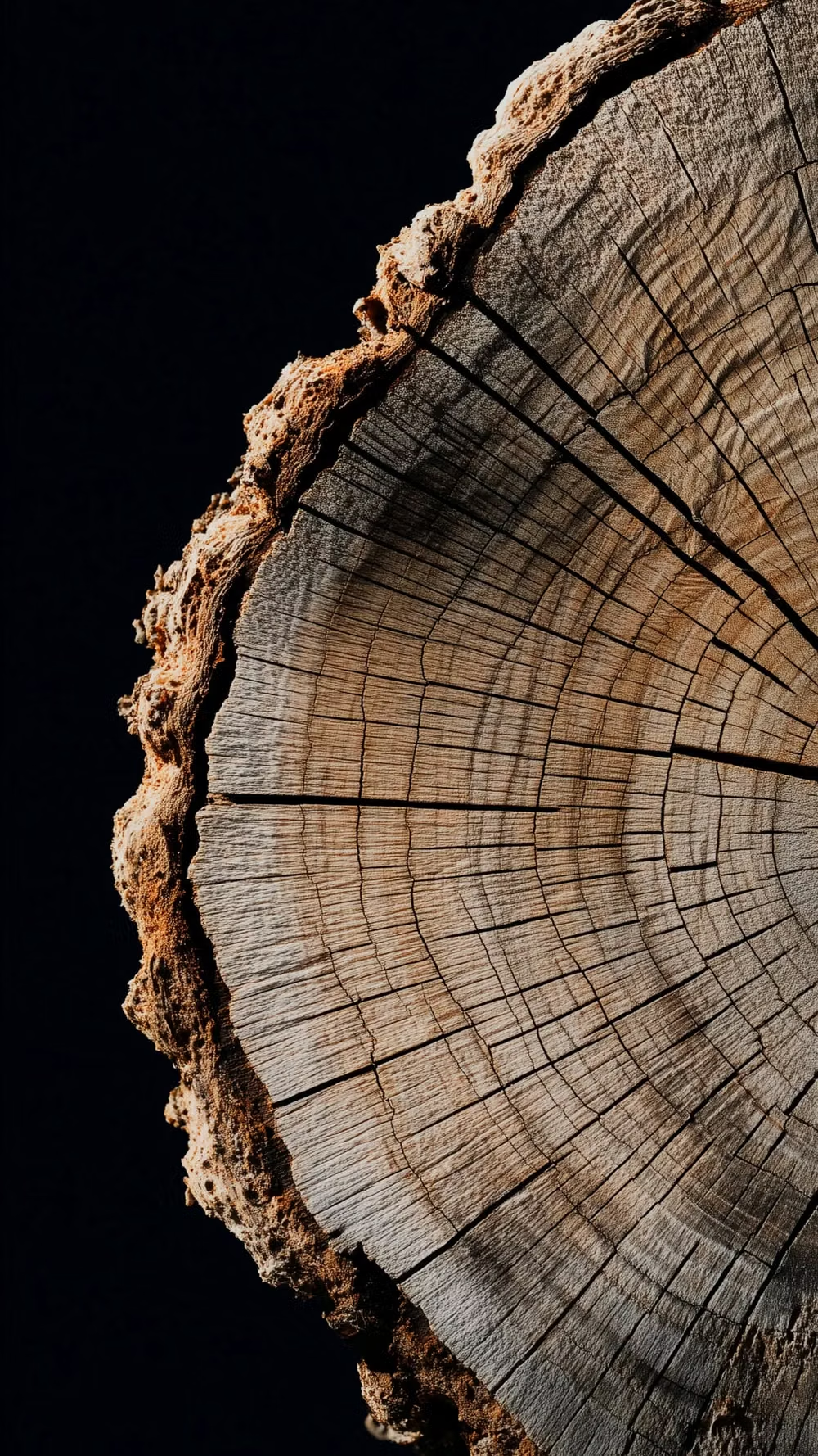
Real-Wood Skeuomorphism UI design style
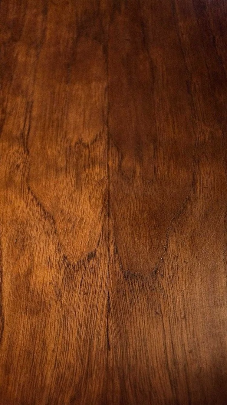
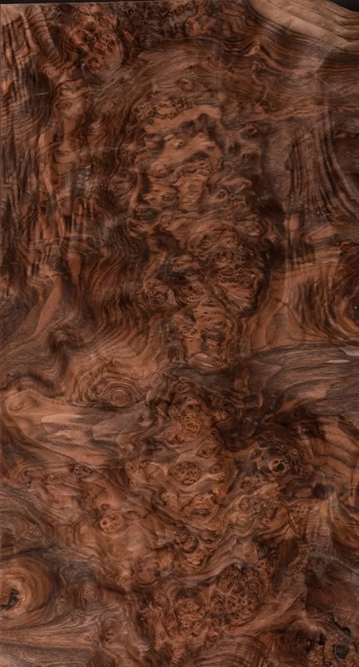
A tactile skeuomorphic style that constructs interfaces from highly realistic wood surfaces, making digital controls resemble carved, assembled, polished, or weathered wooden objects.
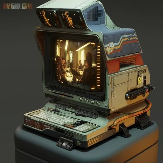
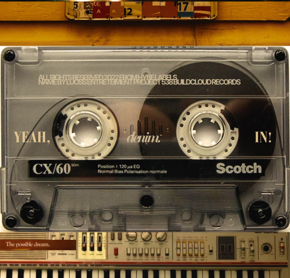
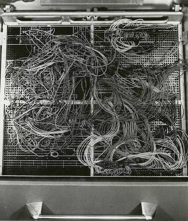
Cassette Futurism UI design style
Chunky analog controls, CRT displays, industrial panels, physical switches, amber or green screens, and late-20th-century science-fiction technology.

Steampunk UI design style
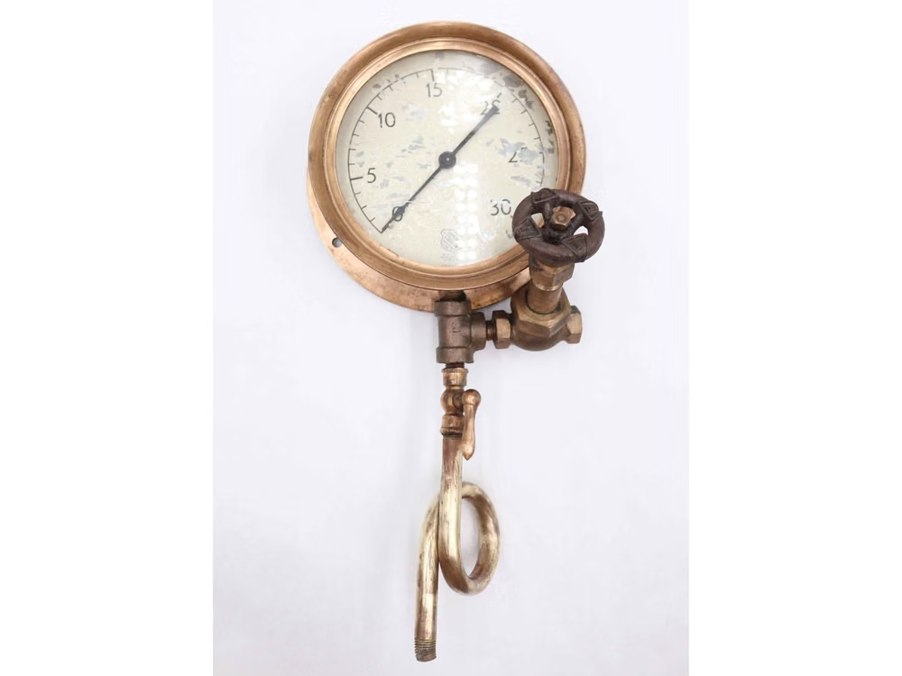
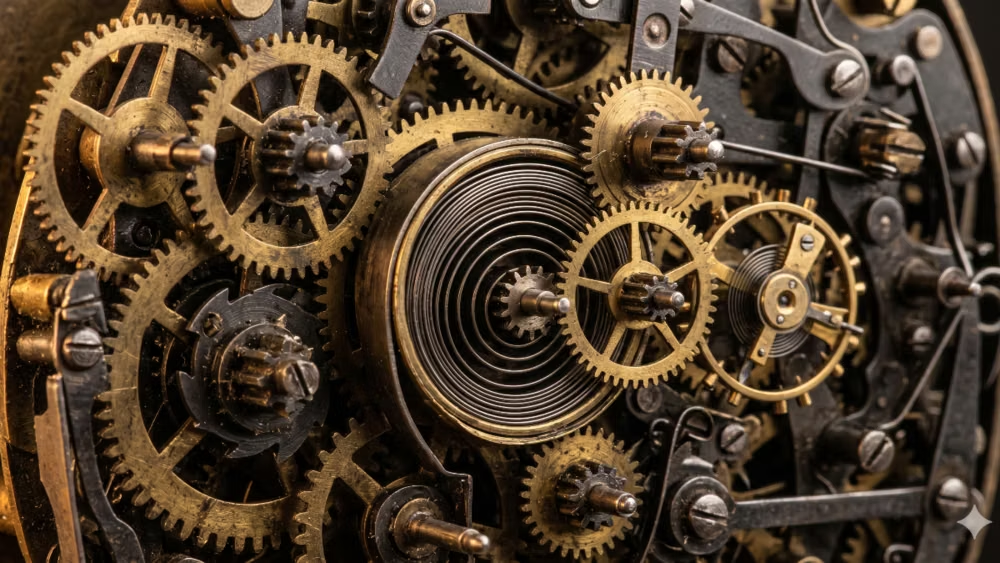
A hyper-skeuomorphic Victorian machine aesthetic turns the interface into a worn, theatrical artifact built from brass, iron, leather, parchment, glass, and enamel.