Geometric Abstract UI design style
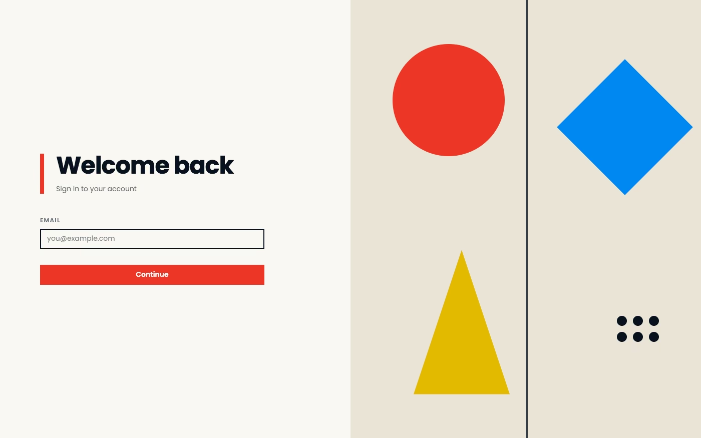
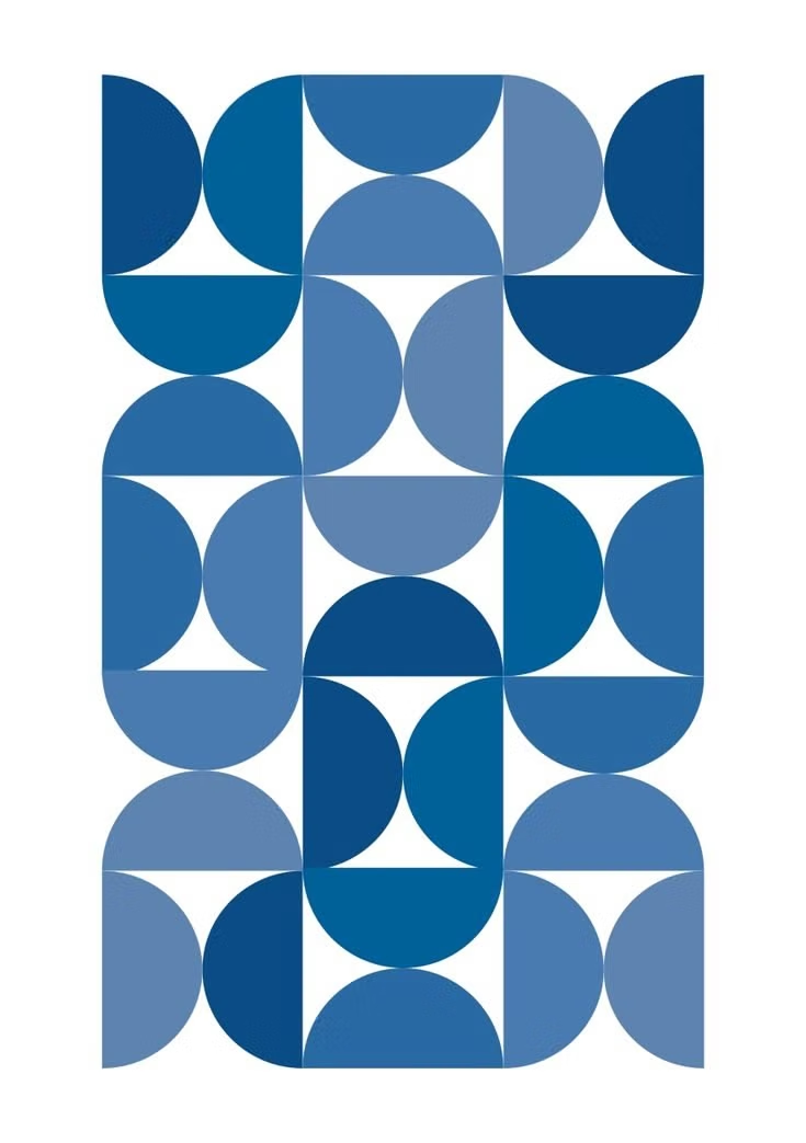
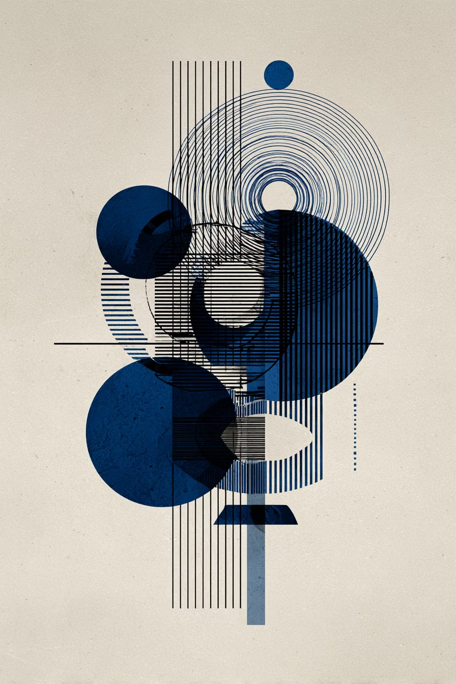
Circles, lines, polygons, modular forms, and bold spatial relationships create a nonrepresentational visual system.
Design overview
- Signature elements
- circles and polygons, modular geometry, bold color blocks, line systems, repeated forms, nonrepresentational composition
- Best suited to
- Technology branding, agencies, cultural events, portfolios, and contemporary editorial products.
- Layout principles
- Construct a repeatable geometric system on a visible or implied grid, balancing large anchor forms with smaller repeated units around the content.
History and origins
A fact-checked account of where this visual language came from, with links to the references used.
- Period
- 1910s–present
- Origin
- European avant-garde movements, later international
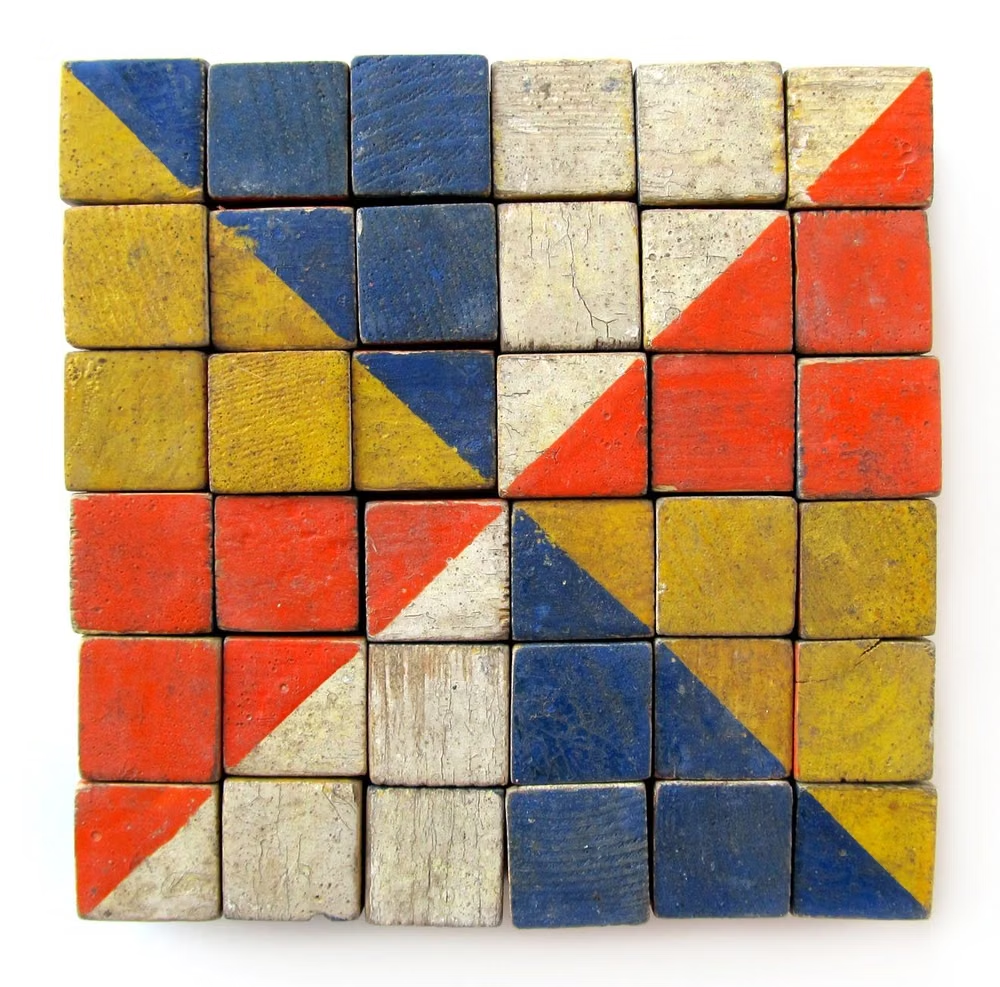
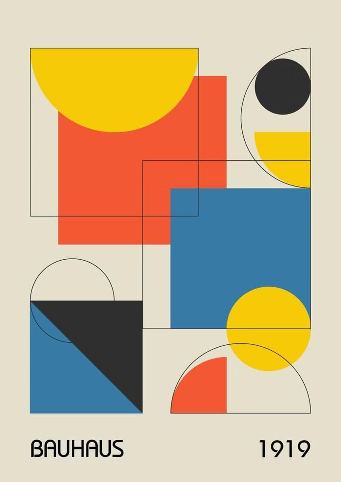
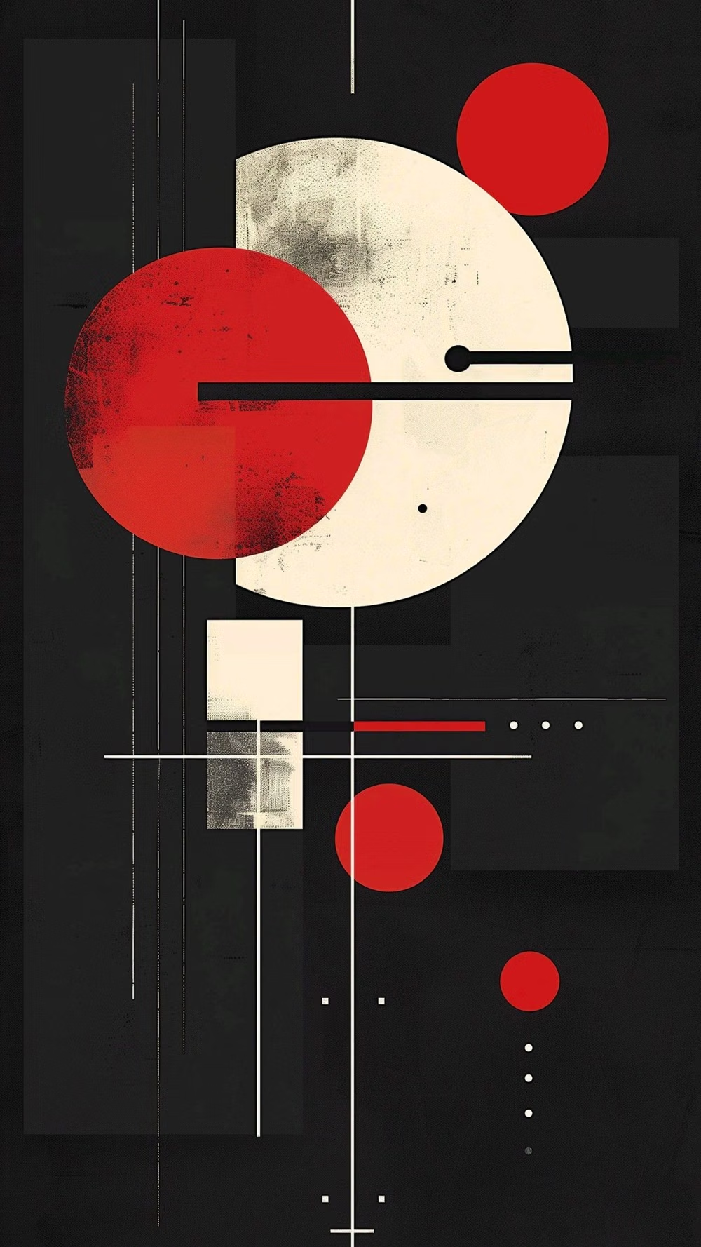
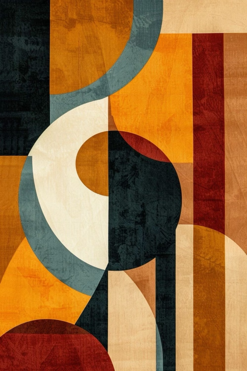
Geometric abstraction developed through several early-20th-century movements rather than one studio or country. Constructivism, De Stijl, Suprematism, and later concrete art treated line, plane, shape, and color as autonomous material; interface designers inherit that vocabulary whenever circles, grids, and primary geometry organize a screen without representing physical objects.
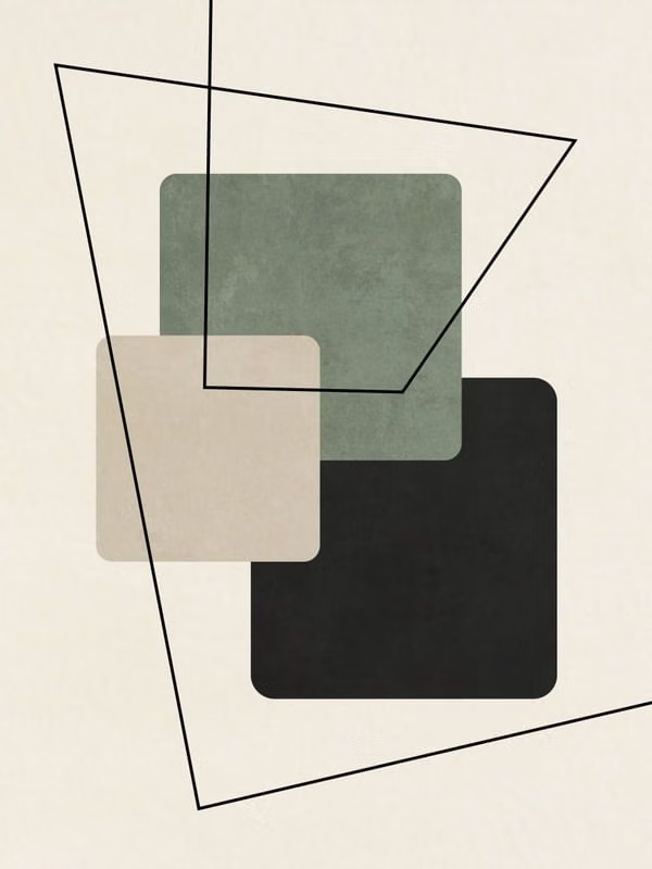
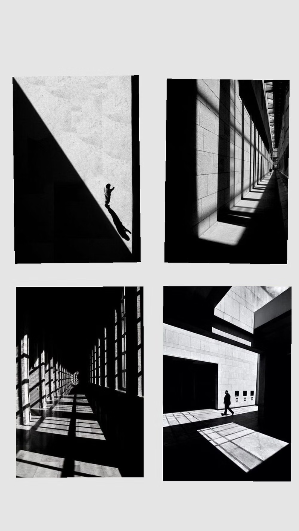
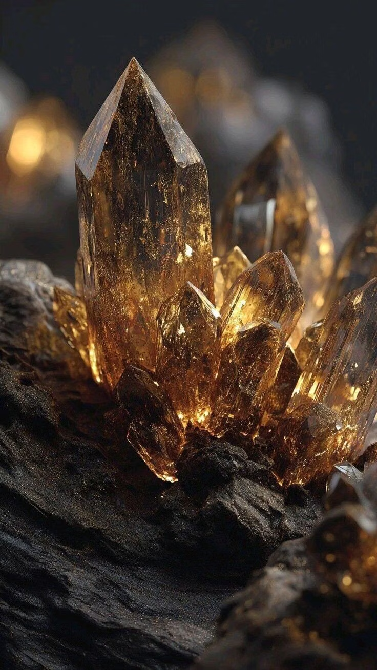
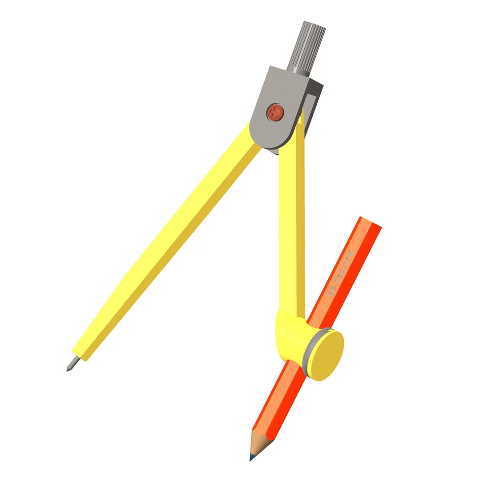
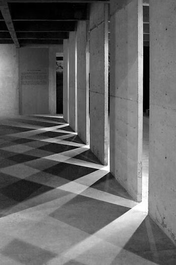
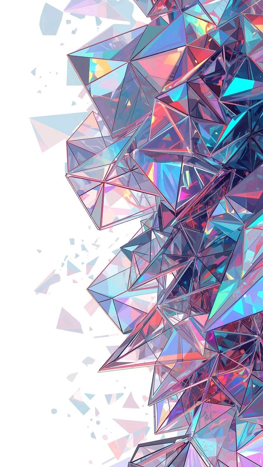
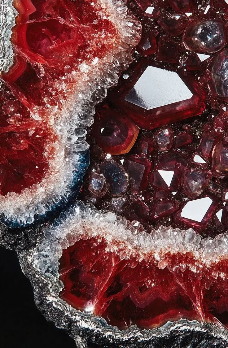
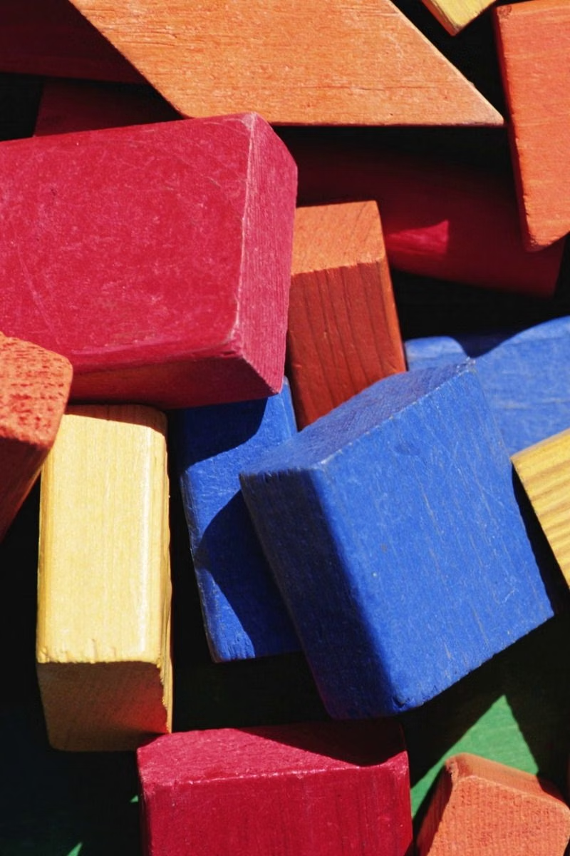
Moodboard and visual references
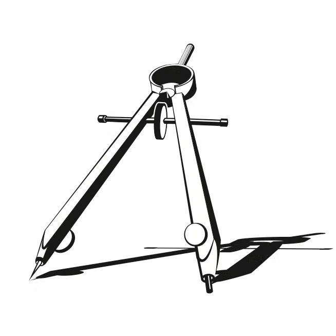
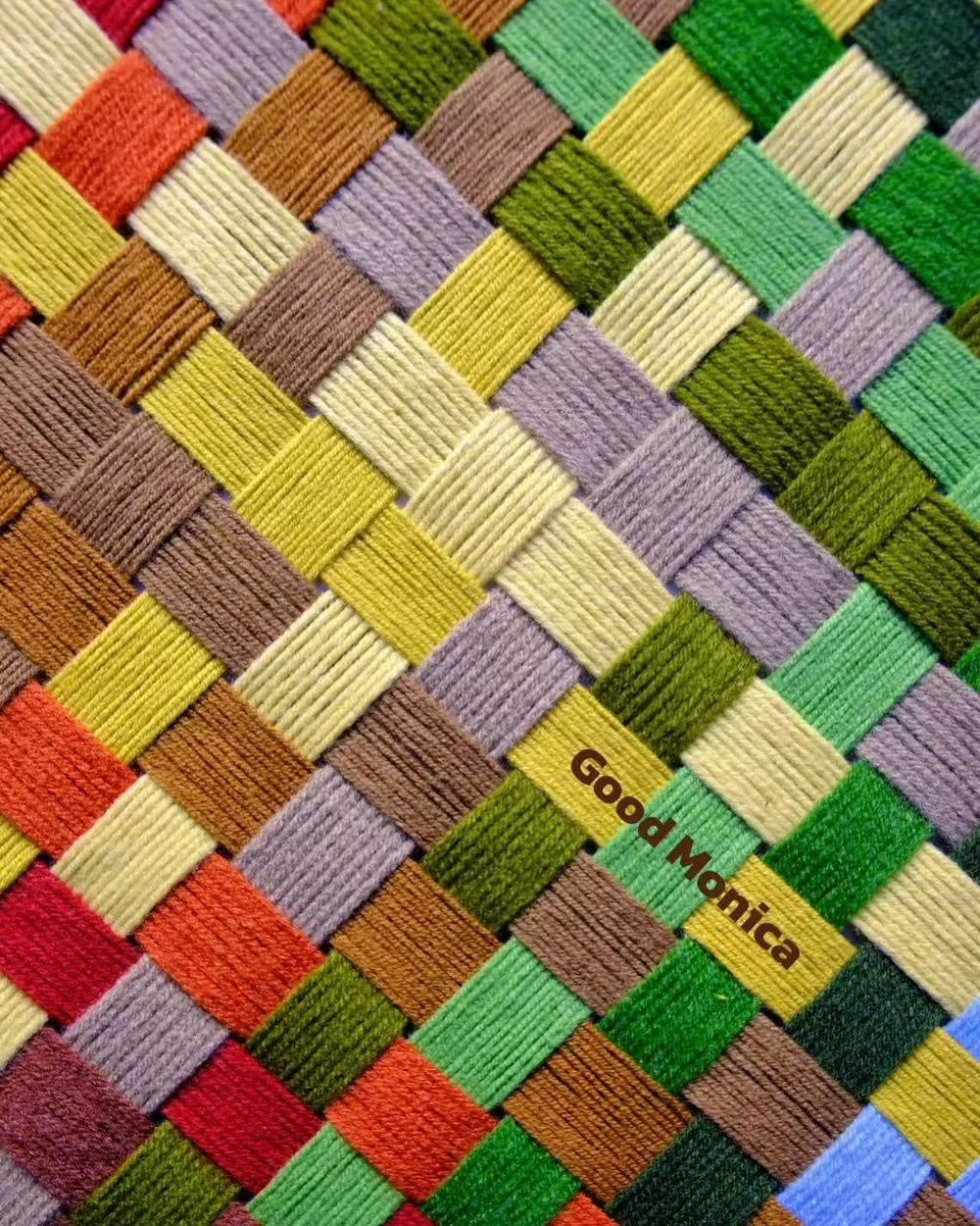
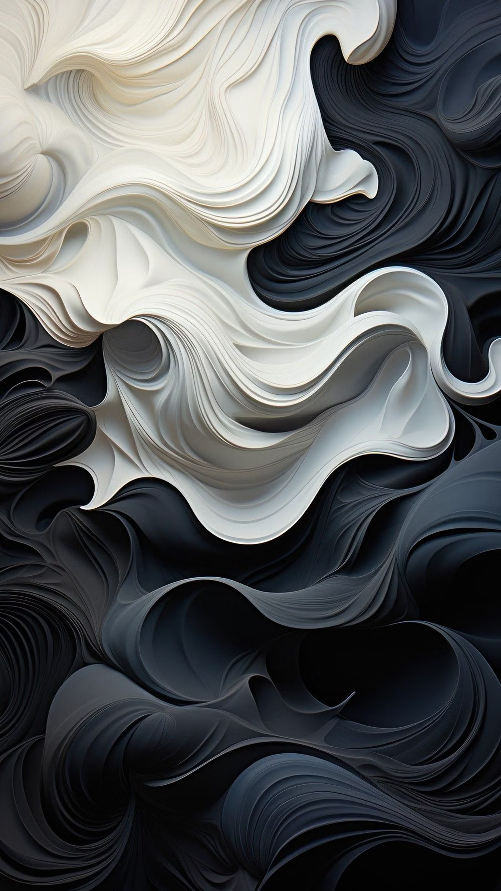
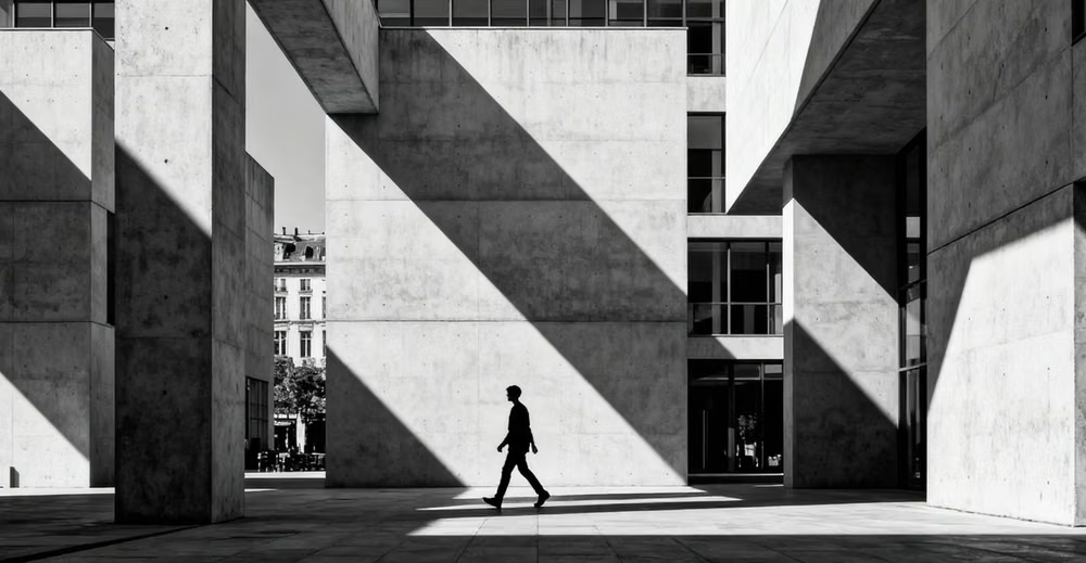
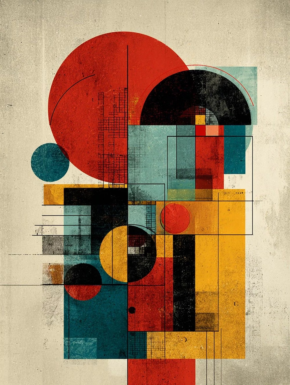
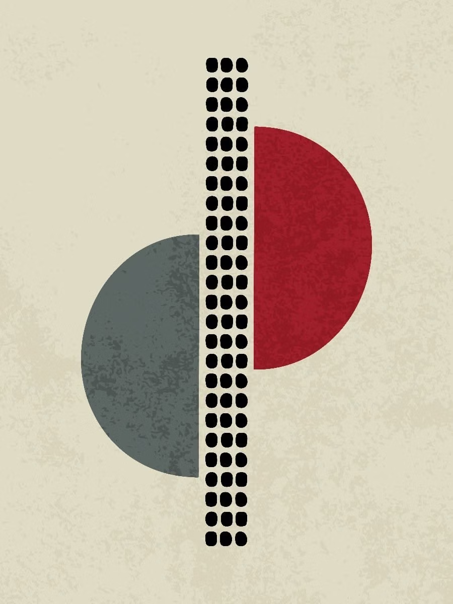
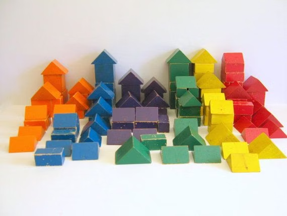
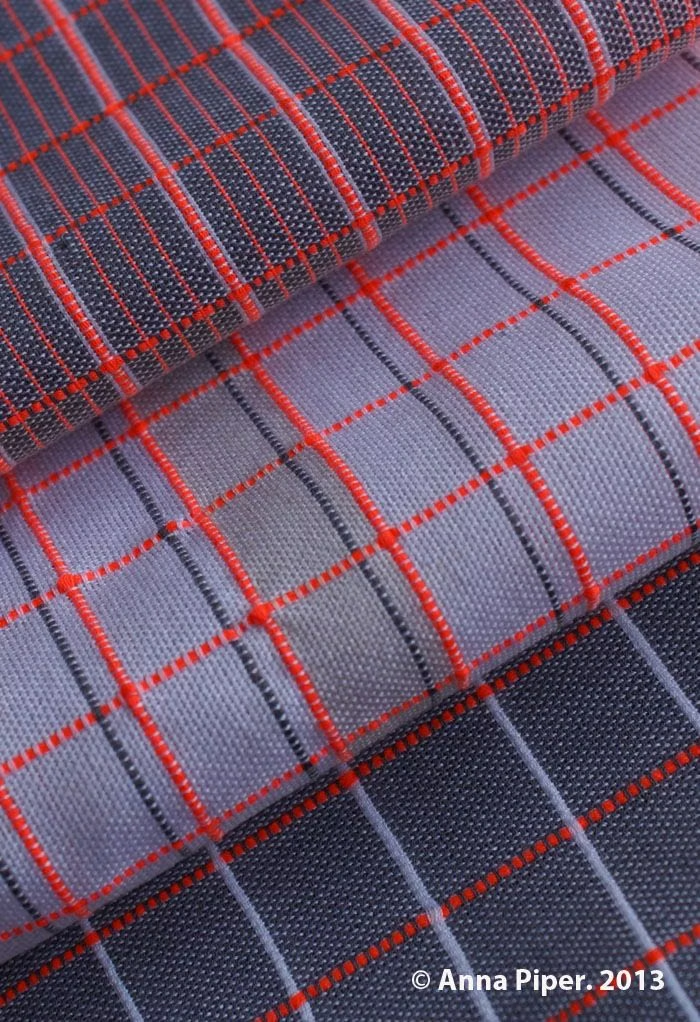
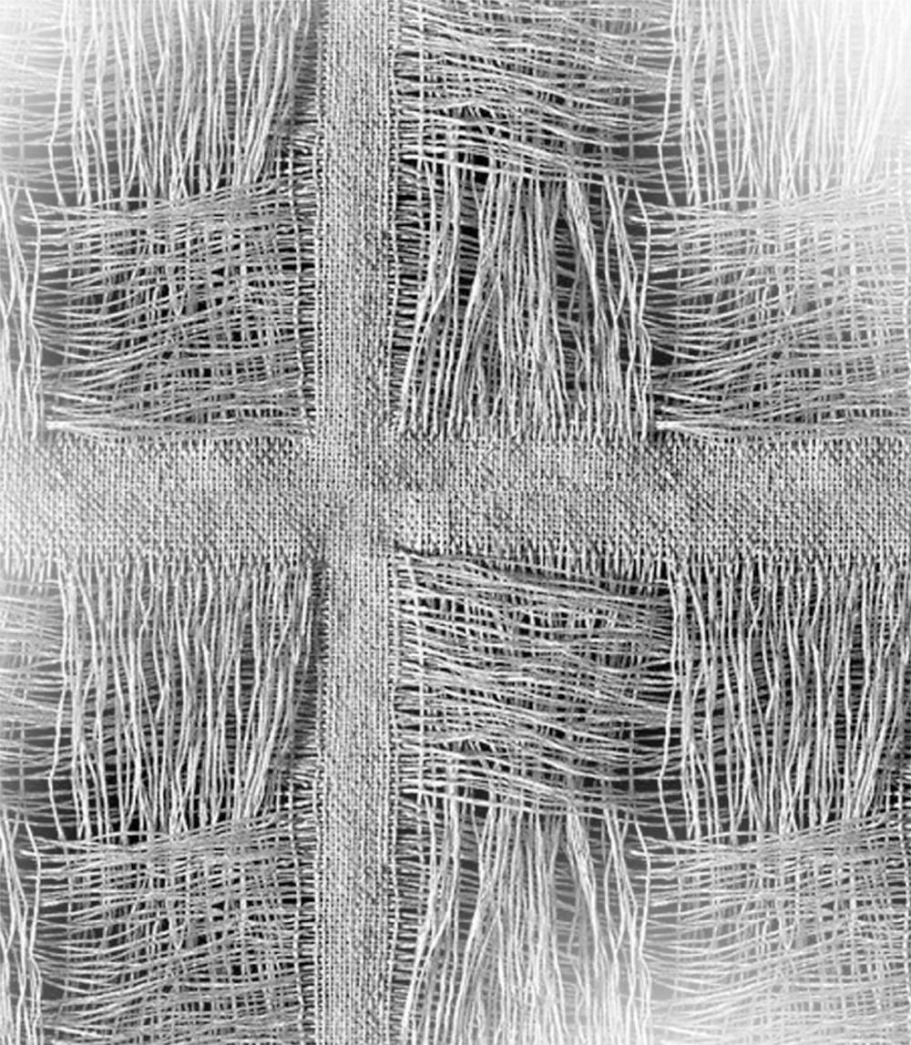
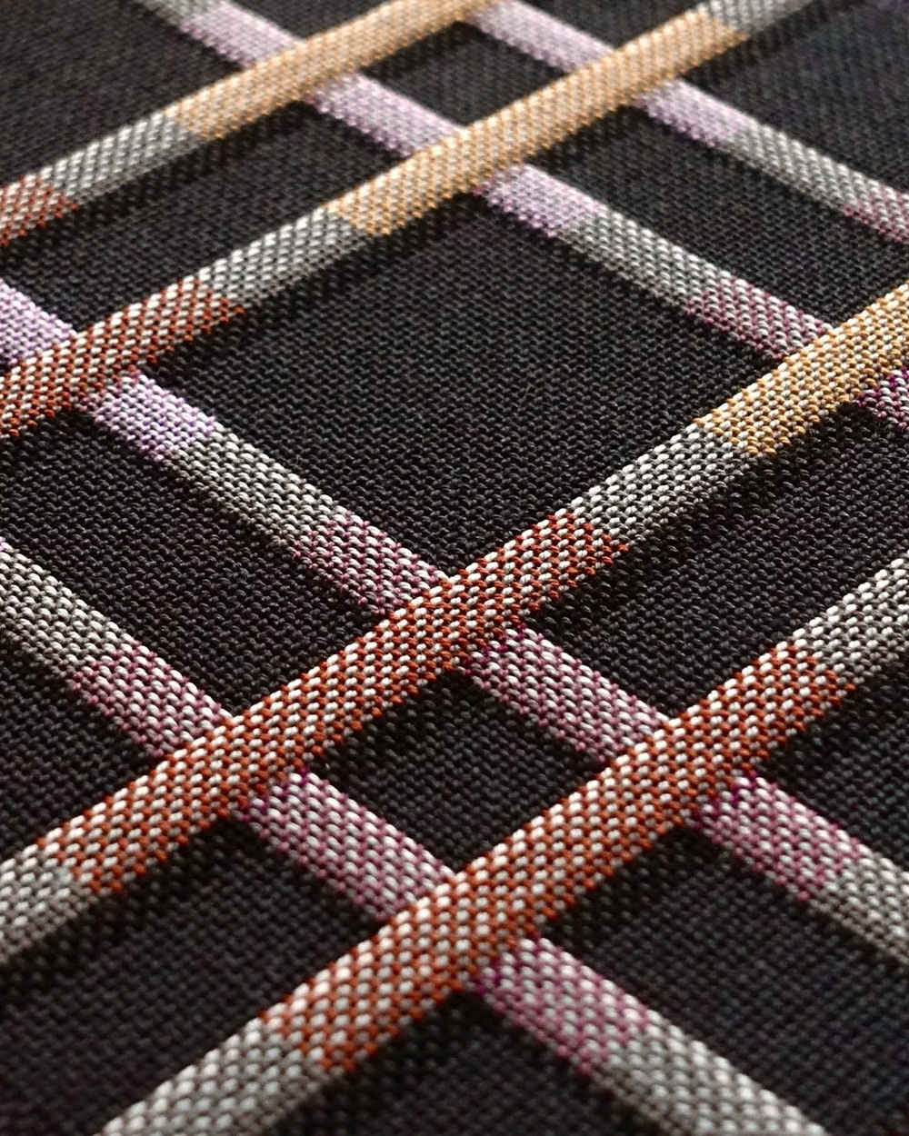
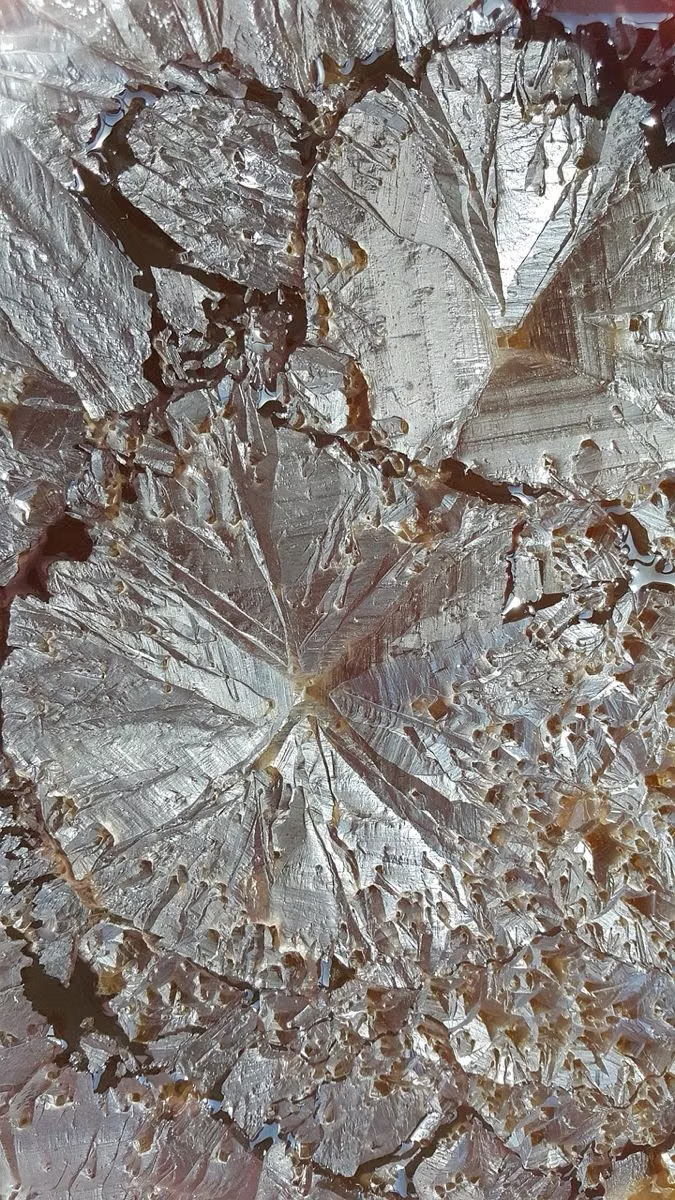
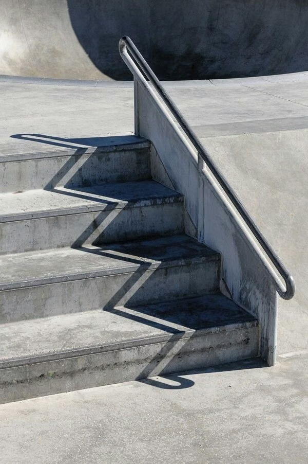
A visual study of the forms, inspirations, materials, colors, type, and cultural references associated with this UI design style.
Design principles and implementation
Use these principles to write a focused AI UI design prompt instead of asking for a vague visual treatment.
Color direction
Select a limited set of bold flat colors plus a neutral field, assigning recurring hues to recurring geometric roles. In a daisyUI theme, use the dominant geometric hue for `primary`, the recurring contrast hue for `secondary`, and reserve white, pale gray, and a slightly deeper neutral for `base-100`, `base-200`, and `base-300`.
Imagery direction
Use nonrepresentational circles, lines, polygons, and modular diagrams as the visual language, with photography limited to tightly controlled geometric crops.
Content density
Maintain medium density, letting empty grid cells and repeated intervals keep complex arrangements from becoming visual noise.
Motion direction
Rotate, translate, tile, and recombine forms through exact keyframes, preserving their grid relationships and crisp edges.
Shape language
Commit to a defined family of circles, polygons, line weights, and intersections rather than mixing unrelated decorative geometry. In daisyUI themes, set the `--radius-*` variables to `0` or `0.25rem`.
Typography rules
Use a geometric sans-serif with disciplined alignment, echo shape proportions through type scale, and avoid expressive lettering that competes with the system.
Suggested Typfaces
Poppins
Fresh daisies glow in warm sunlight
Fresh daisies glow in warm sunlight
1 2 3 4 5 6 7 8 9 0
Jost
Fresh daisies glow in warm sunlight
Fresh daisies glow in warm sunlight
1 2 3 4 5 6 7 8 9 0
Montserrat
Fresh daisies glow in warm sunlight
Fresh daisies glow in warm sunlight
1 2 3 4 5 6 7 8 9 0
Raleway
Fresh daisies glow in warm sunlight
Fresh daisies glow in warm sunlight
1 2 3 4 5 6 7 8 9 0
Josefin Sans
Fresh daisies glow in warm sunlight
Fresh daisies glow in warm sunlight
1 2 3 4 5 6 7 8 9 0
Build a Geometric Abstract interface with daisyUI
The live example translates this direction into daisyUI components and semantic theme tokens.
To generate a full page in the same visual language, give the style name and the design rules above to Blueprint MCP.
Related UI design styles
Compare nearby visual languages that share typography, shapes, use cases, or signature elements.
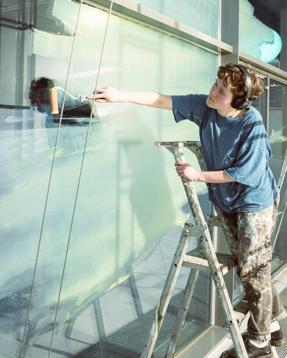
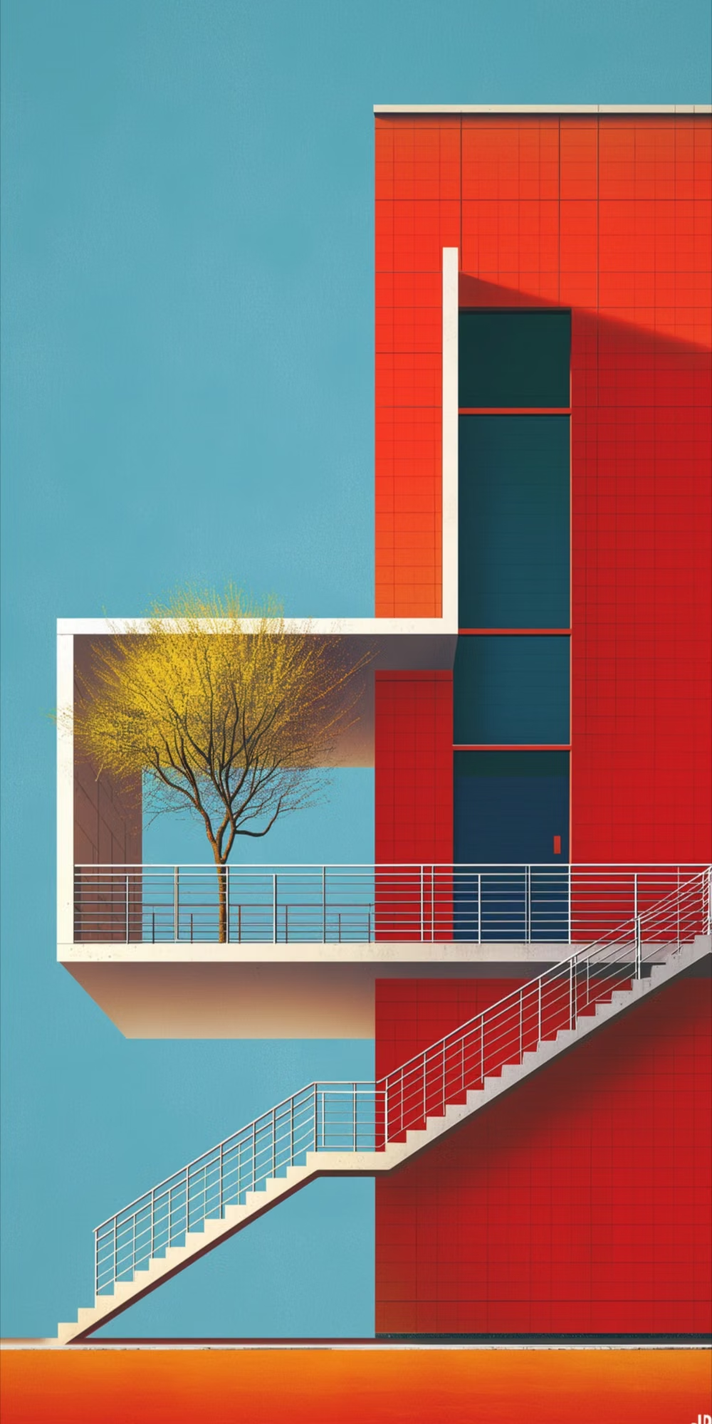

Bauhaus UI design style
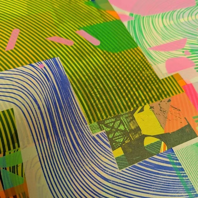
Functional compositions use primary colors, geometric forms, strong typography, and visibly organized structure.
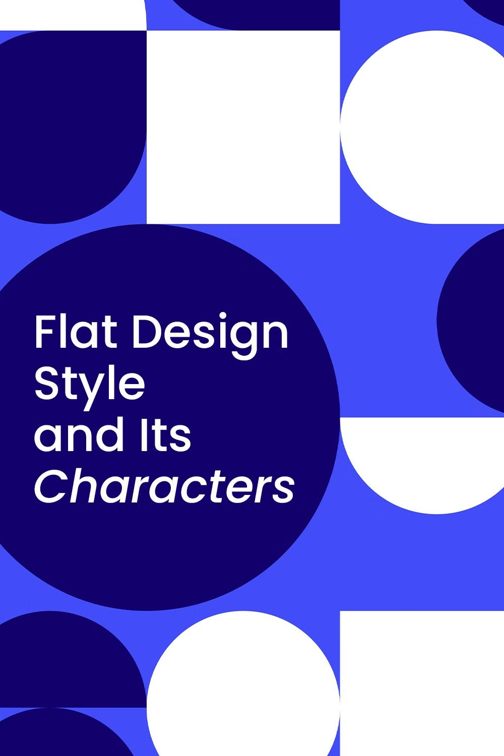
Flat Design UI design style
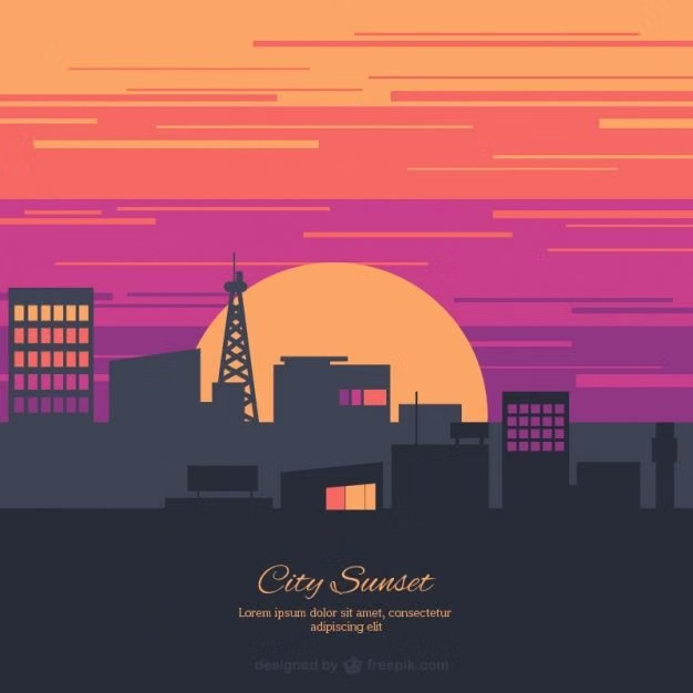
Simple two-dimensional shapes, solid colors, clean icons, and little or no simulated depth.
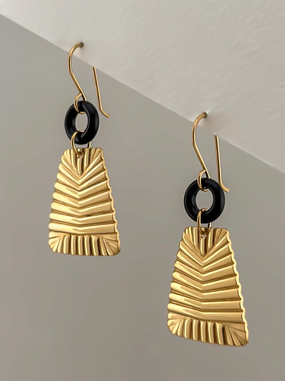
Art Deco UI design style
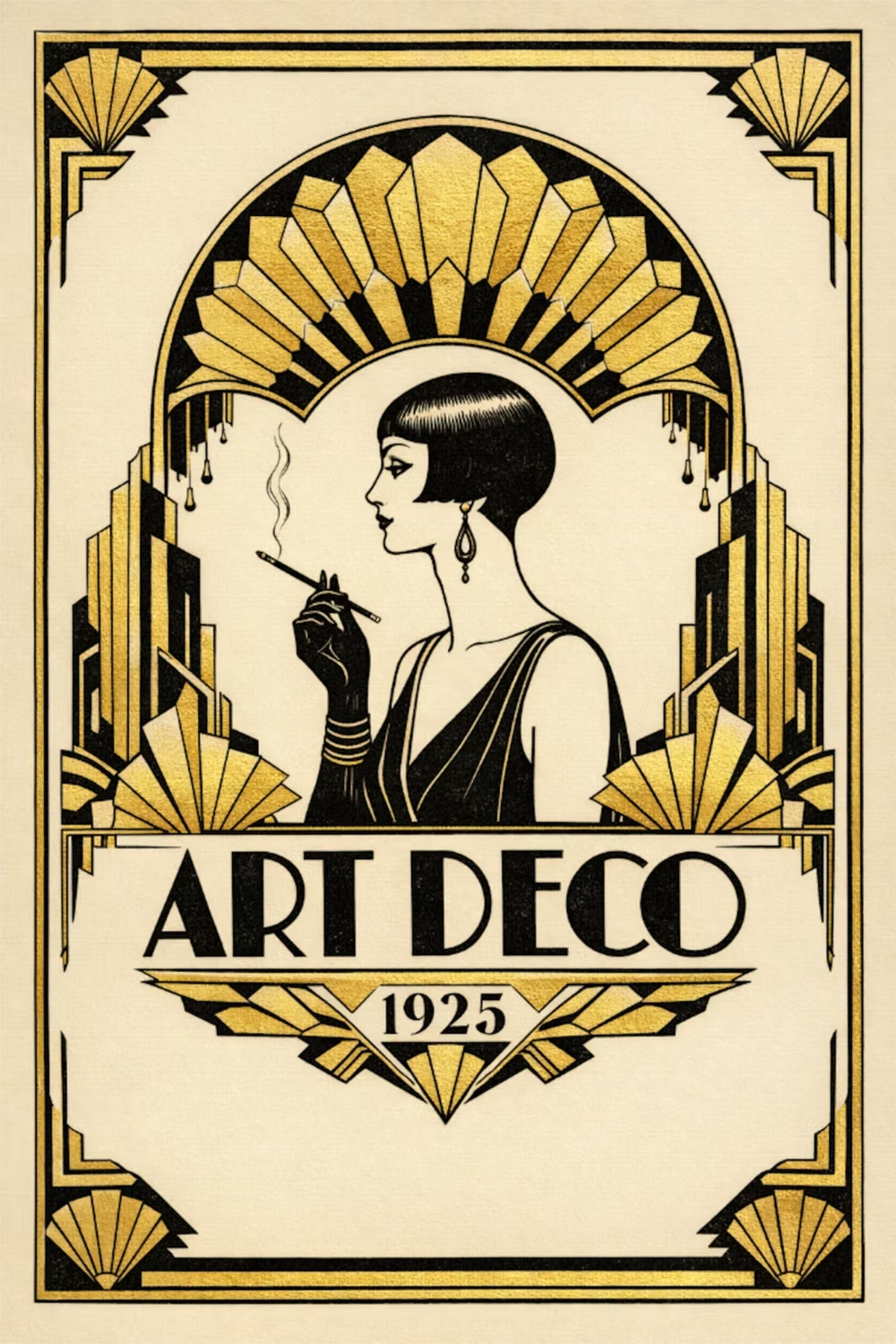
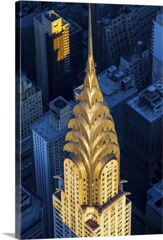
Symmetrical geometry, stepped forms, luxurious metallic accents, dramatic contrast, and ornamental typography.