Bauhaus UI design style
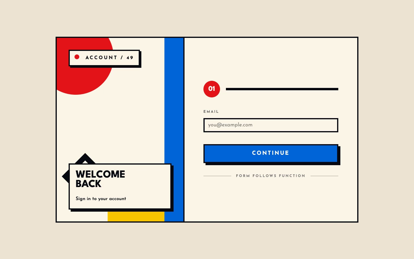
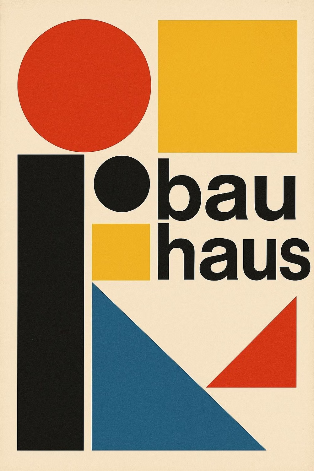
Functional compositions use primary colors, geometric forms, strong typography, and visibly organized structure.
Design overview
- Signature elements
- primary colors, circles and rectangles, functional geometry, asymmetric balance, sans-serif typography, visible structure
- Best suited to
- Architecture, cultural institutions, portfolios, education, and design-focused products.
- Layout principles
- Organize content through functional asymmetric balance, making circles, bars, images, and text visibly participate in one rational spatial construction.
History and origins
A fact-checked account of where this visual language came from, with links to the references used.
- Period
- 1919–1933
- Origin
- Weimar, Dessau, and Berlin, Germany
Architect Walter Gropius founded the Bauhaus school in Weimar in 1919, seeking to reconnect art, craft, architecture, and industrial production. The school moved to Dessau and later Berlin before closing under Nazi pressure in 1933; its teachers and students dispersed internationally, helping its functional typography, geometric experiment, and workshop model shape modern design education.
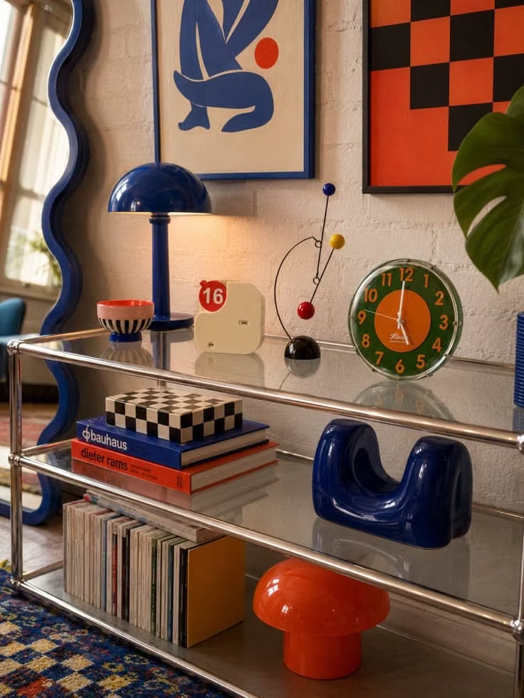
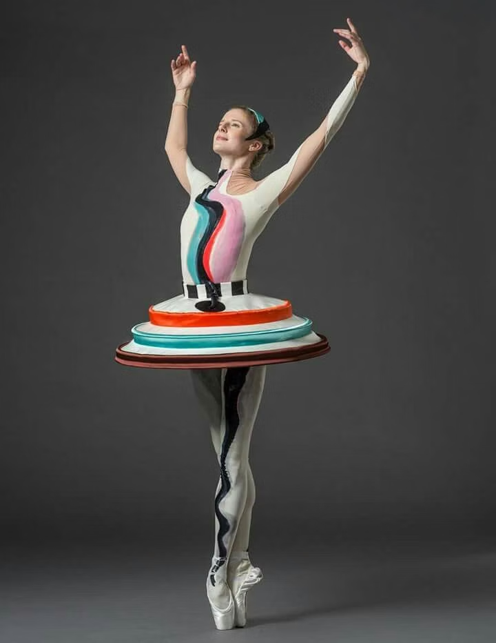
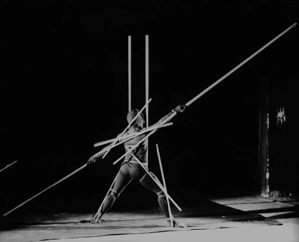
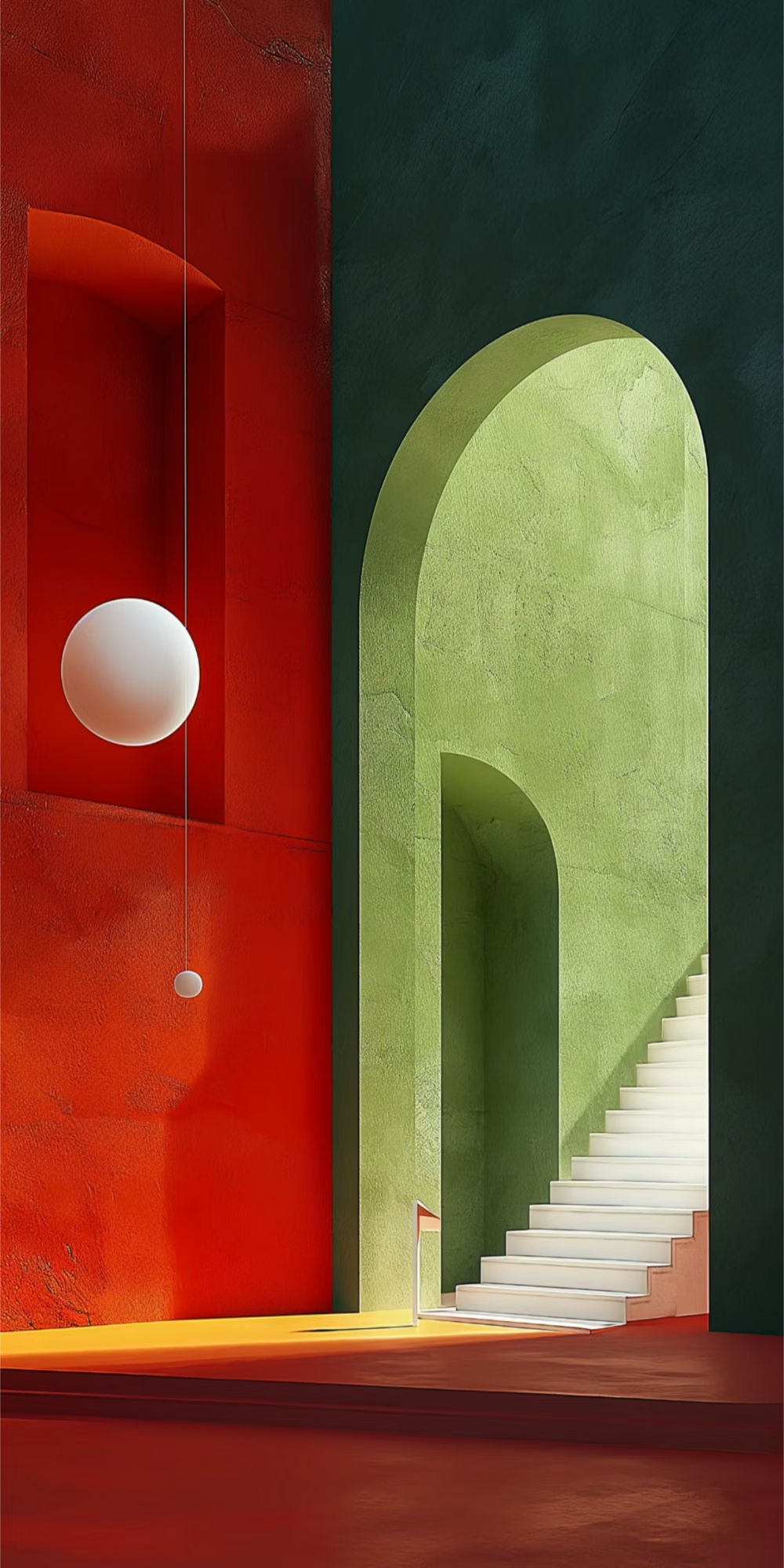
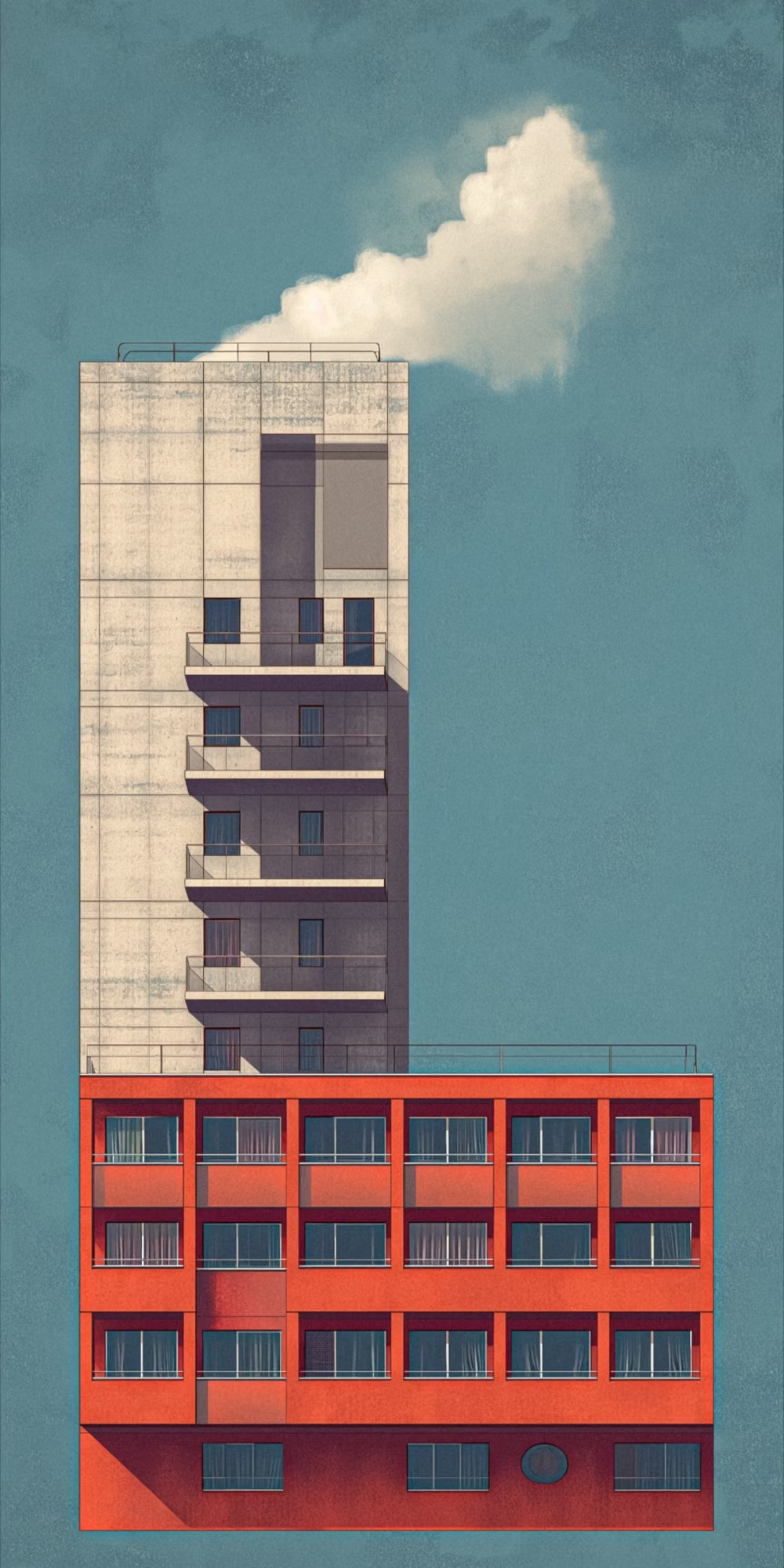
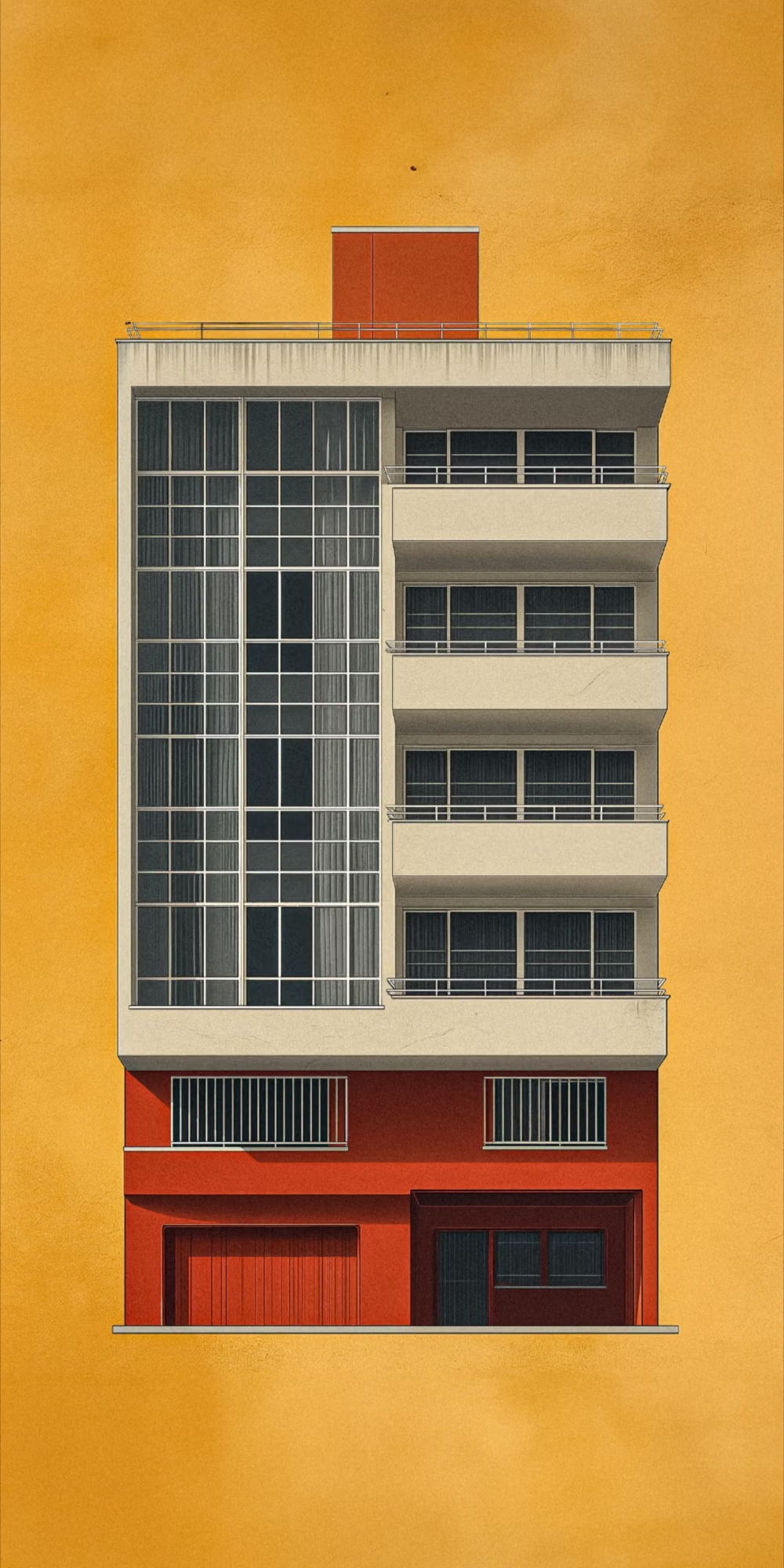
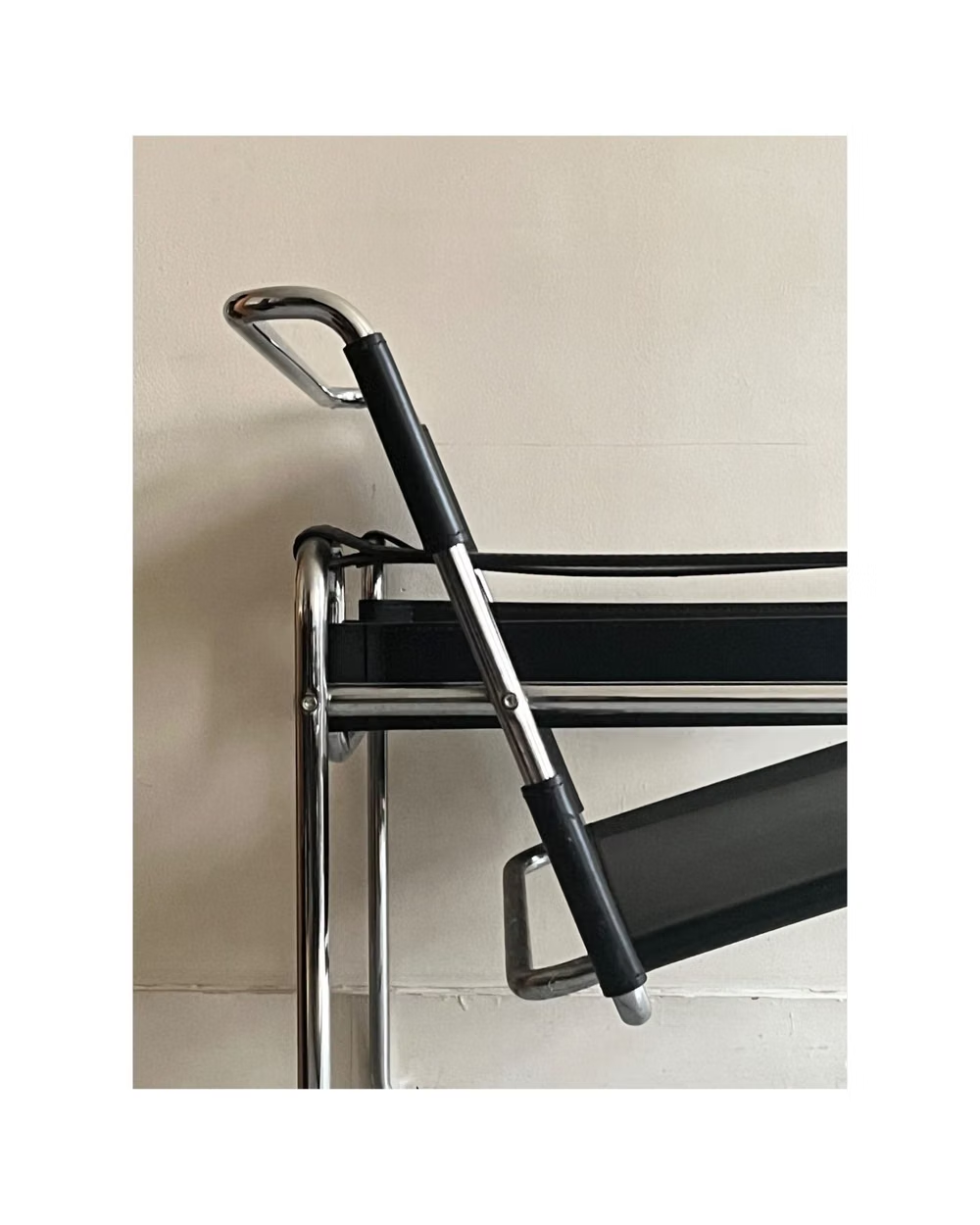
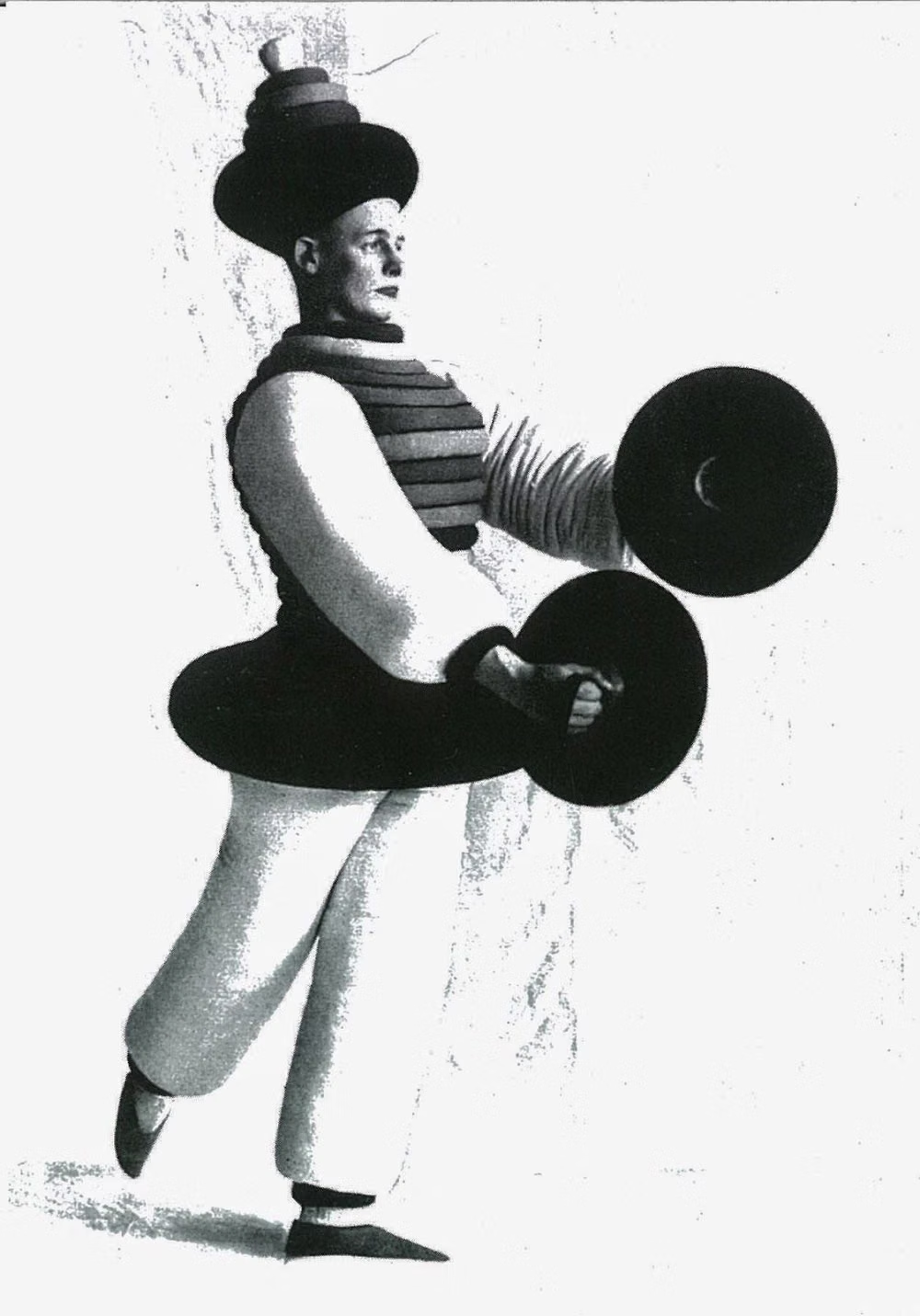
Moodboard and visual references
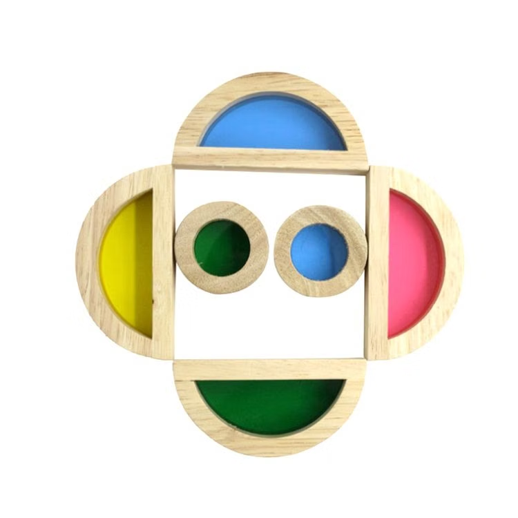
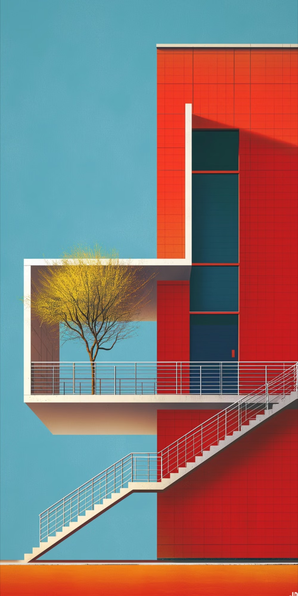
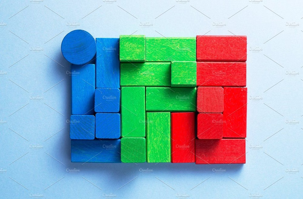
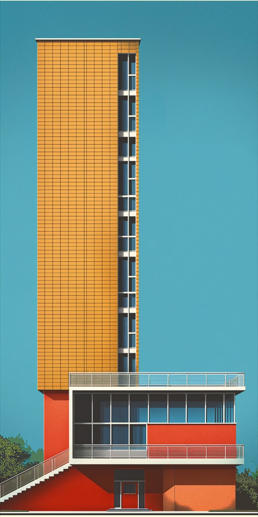
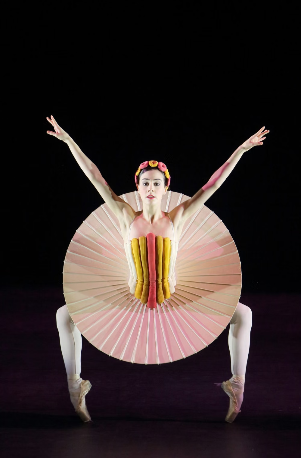
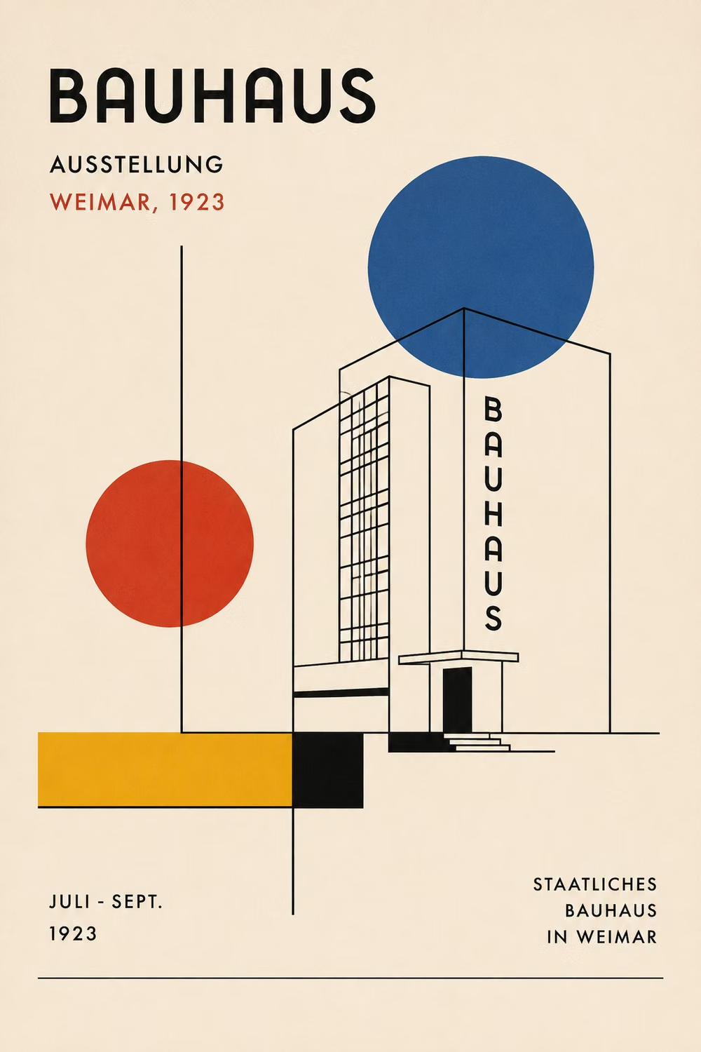
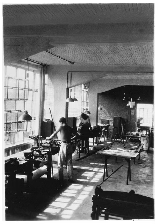
A visual study of the forms, inspirations, materials, colors, type, and cultural references associated with this UI design style.











Design principles and implementation
Use these principles to write a focused AI UI design prompt instead of asking for a vague visual treatment.
Color direction
Use red, yellow, and blue as purposeful primary signals against black, white, and warm paper neutrals, never as random decorative confetti. In a daisyUI theme, use Bauhaus red for `primary`, cobalt blue for `secondary`, and assign warm paper, off-white, and light neutral gray to `base-100`, `base-200`, and `base-300`.
Imagery direction
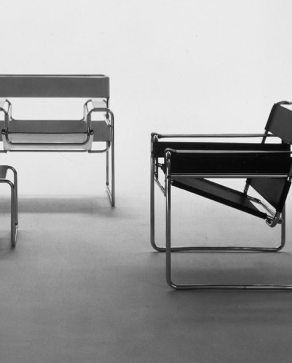
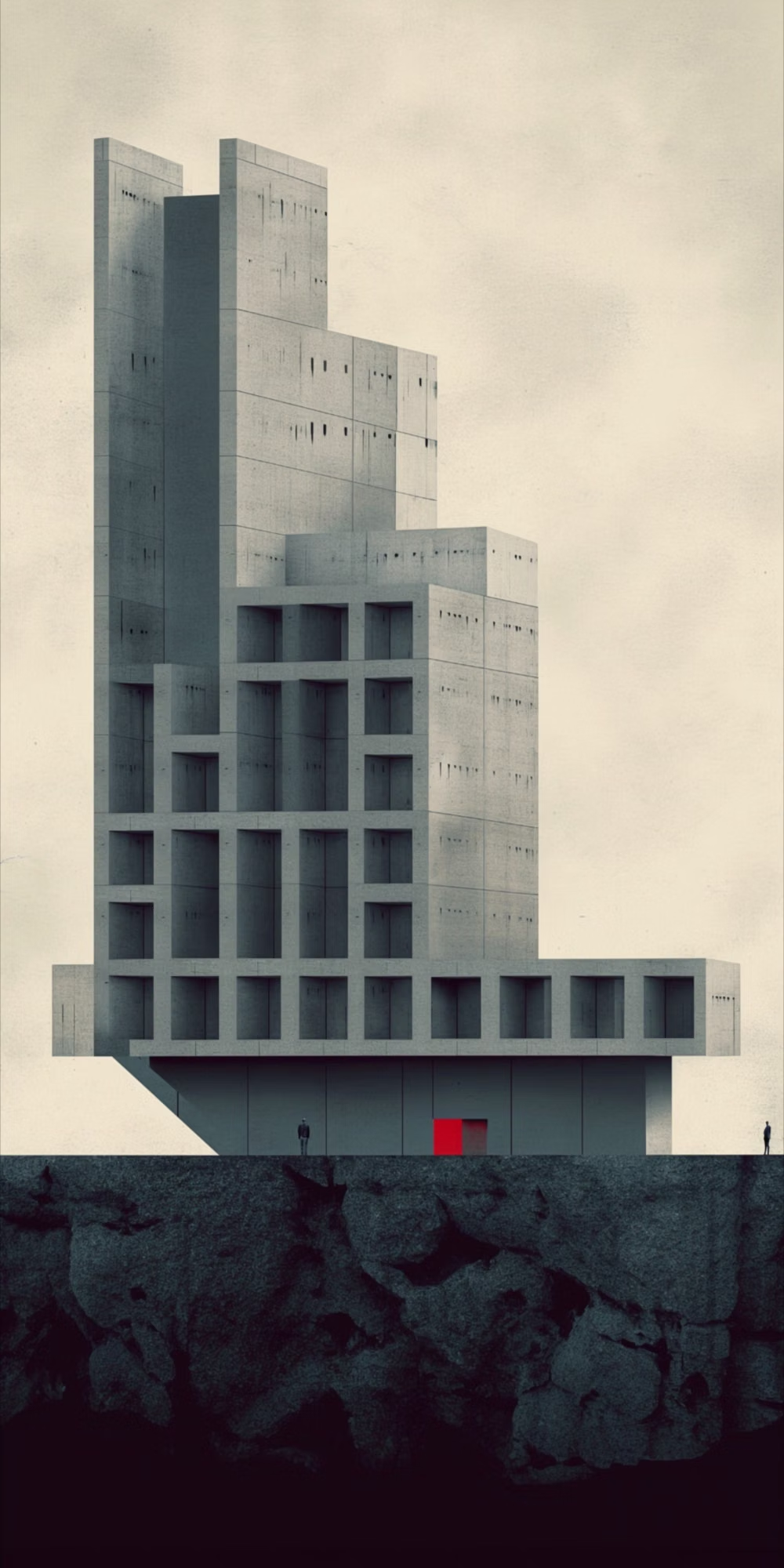
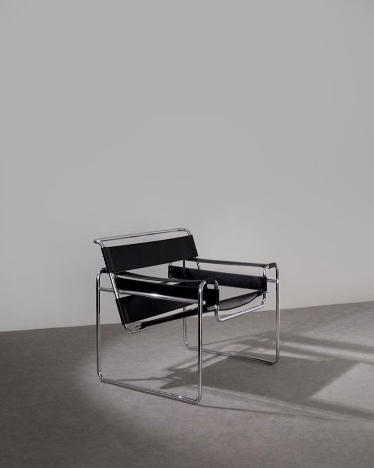
Choose architectural photography, photograms, workshop objects, diagrams, and geometric illustration that reveal material, process, or structure.
Content density
Maintain medium density with clearly bounded teaching or information groups and enough open field for each geometric relationship to register.
Motion direction
Translate, rotate, and reconfigure geometric parts to explain function or sequence, using direct mechanical timing without ornamental easing.
Shape language
Build from the circle, square, triangle, bar, and line, assigning each form a repeated compositional or semantic purpose. In daisyUI themes, set the `--radius-*` variables to `0` or `0.25rem`.
Typography rules
Use a geometric sans-serif with strong scale contrast, short declarative headings, and disciplined alignment that integrates type into the construction.
Suggested Typfaces
Josefin Sans
Fresh daisies glow in warm sunlight
Fresh daisies glow in warm sunlight
1 2 3 4 5 6 7 8 9 0
Jost
Fresh daisies glow in warm sunlight
Fresh daisies glow in warm sunlight
1 2 3 4 5 6 7 8 9 0
League Spartan
Fresh daisies glow in warm sunlight
Fresh daisies glow in warm sunlight
1 2 3 4 5 6 7 8 9 0
Raleway
Fresh daisies glow in warm sunlight
Fresh daisies glow in warm sunlight
1 2 3 4 5 6 7 8 9 0
Montserrat
Fresh daisies glow in warm sunlight
Fresh daisies glow in warm sunlight
1 2 3 4 5 6 7 8 9 0
Build a Bauhaus interface with daisyUI
The live example translates this direction into daisyUI components and semantic theme tokens.
To generate a full page in the same visual language, give the style name and the design rules above to Blueprint MCP.
Related UI design styles
Compare nearby visual languages that share typography, shapes, use cases, or signature elements.
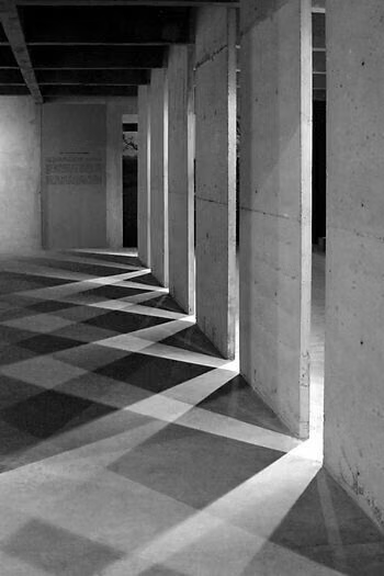
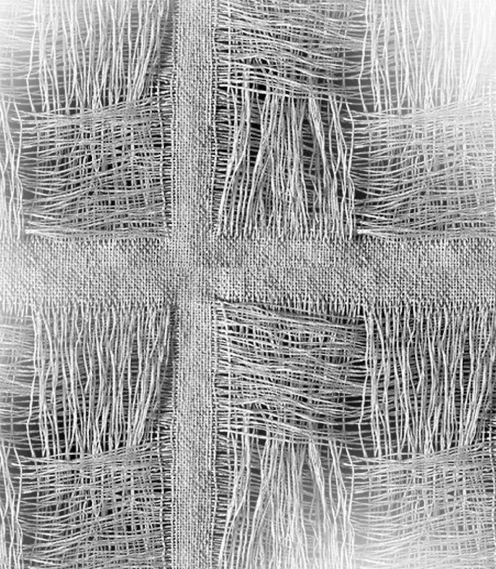

Geometric Abstract UI design style
Circles, lines, polygons, modular forms, and bold spatial relationships create a nonrepresentational visual system.

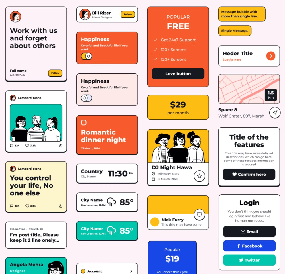
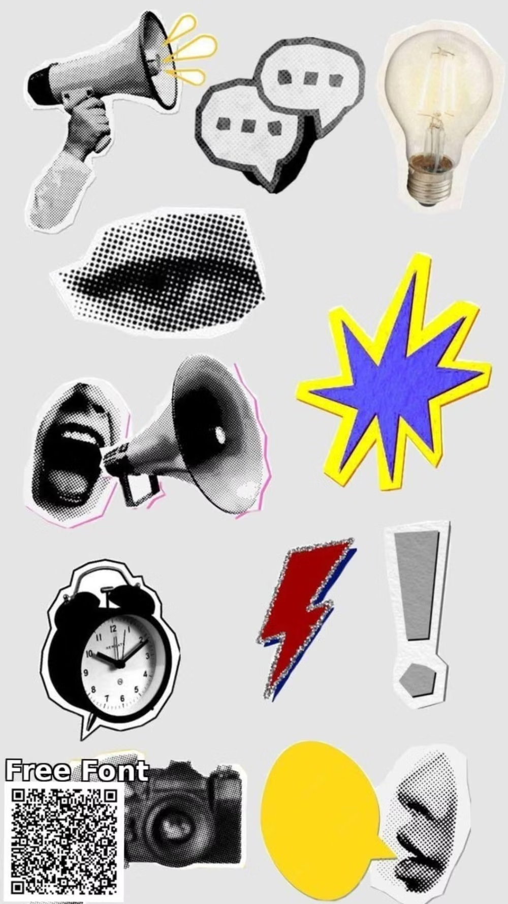
Neubrutalism UI design style
Also called Neo Brutalism or Neo Memphis, this late-2010s and 2020s digital style wraps conventional UX in loud geometric blocks, dark outlines, hard offset shadows, flat color, and exaggerated type.
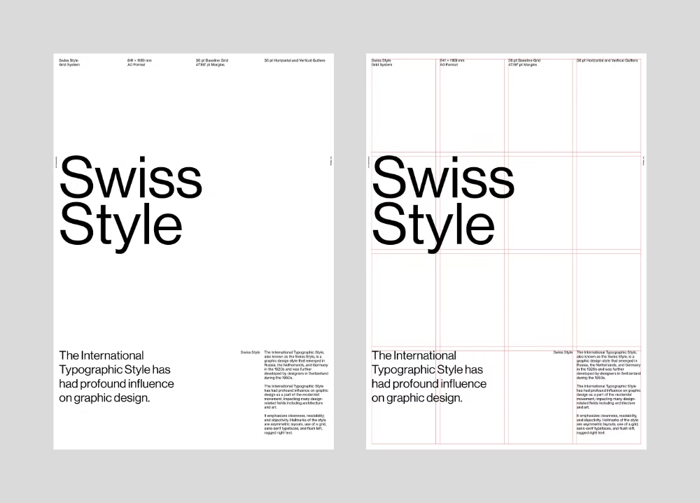
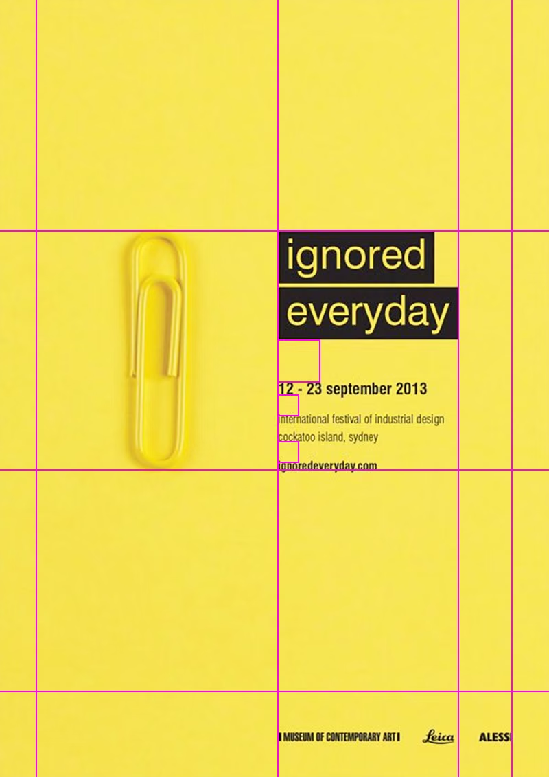

Swiss Style UI design style
Strict grids, generous whitespace, sans-serif typography, asymmetry, and objective information hierarchy.