Kawaii UI design style
Cute characters, rounded shapes, soft colors, expressive icons, and cheerful decorative details.
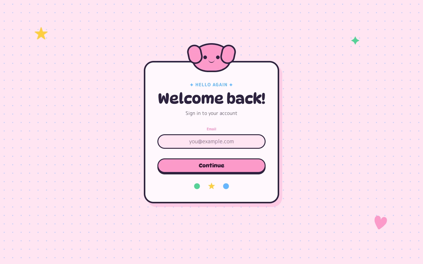
Design overview
- Signature elements
- rounded characters, pastel colors, sparkling accents, expressive faces, tiny decorative motifs, pill-shaped controls
- Best suited to
- Games, social apps, stationery, children’s products, and playful lifestyle brands.
- Layout principles
- Use centered stacked flows, collectible item clusters, and friendly framed scenes, keeping essential actions large and free from surrounding decoration.
History and origins
A fact-checked account of where this visual language came from, with links to the references used.
- Period
- Modern commercial form from the 1970s; global digital expansion from the 1990s
- Origin
- Japan
Kawaii means cute, but the modern commercial culture around it took recognizable form in 1970s Japan through youthful handwriting, character goods, and changing consumer culture. Sanrio introduced Hello Kitty in 1974, and character branding, games, emoji, stickers, and mobile culture subsequently carried kawaii visual language worldwide.
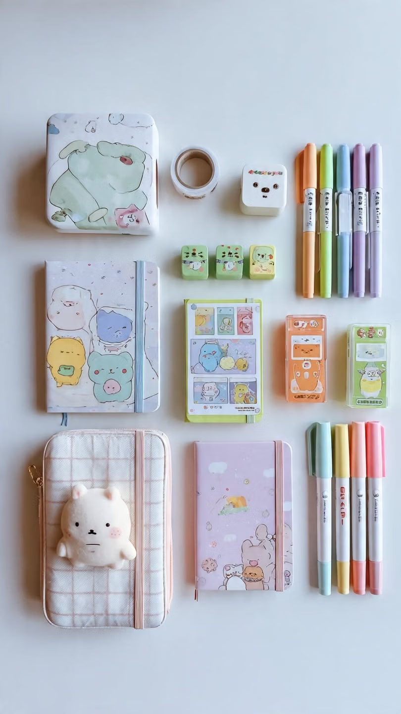
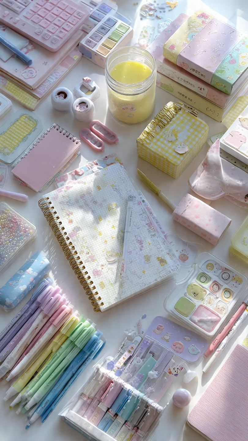
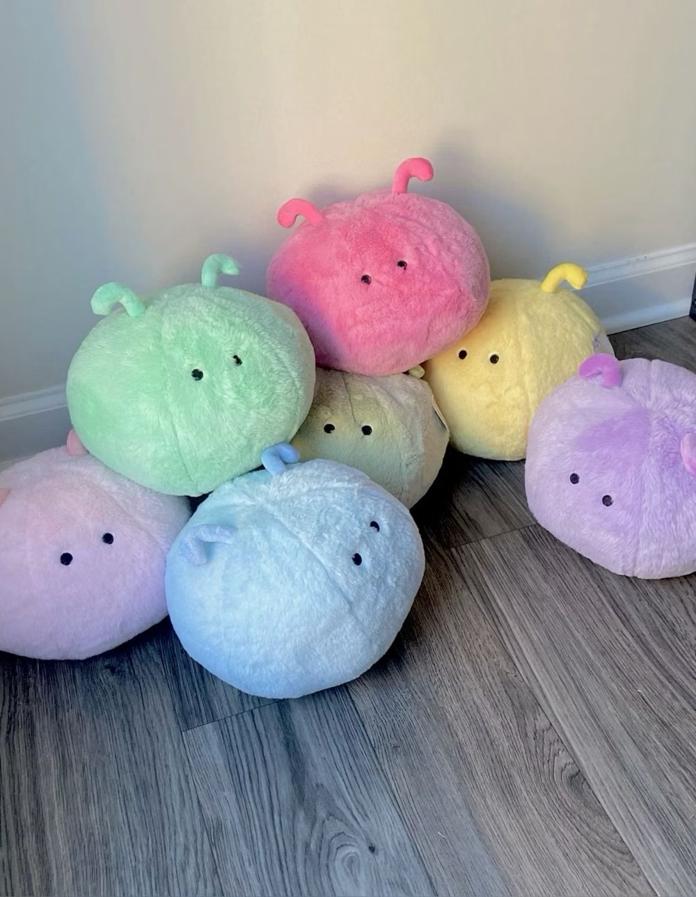
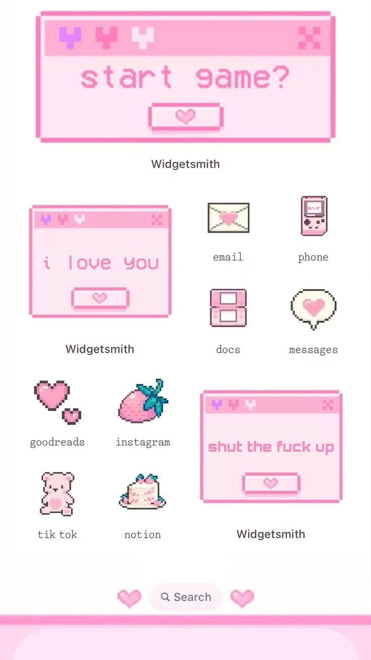
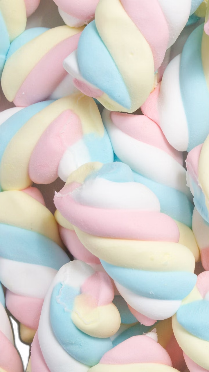
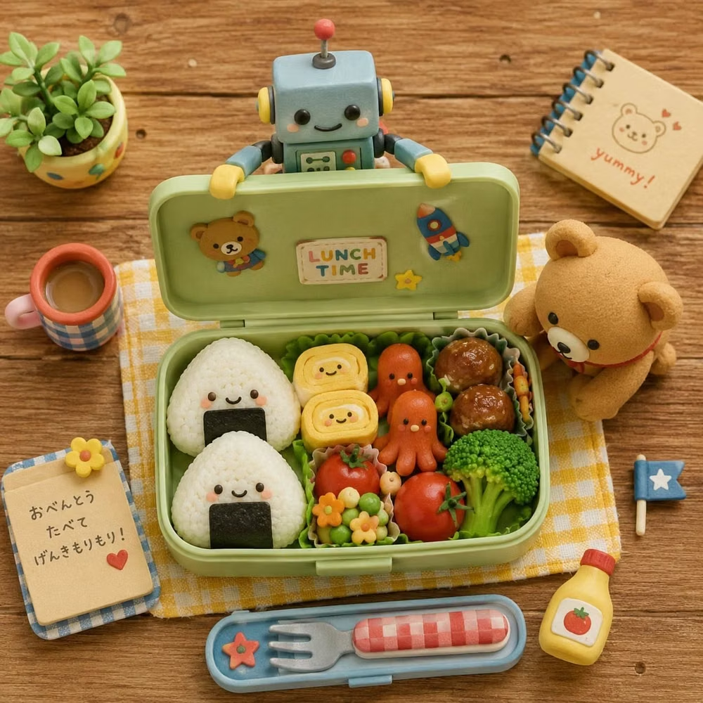
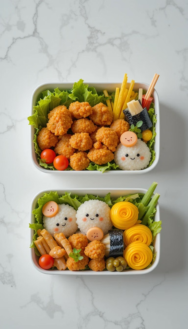
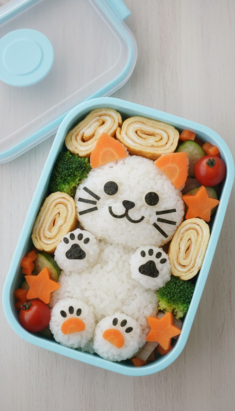
Moodboard and visual references
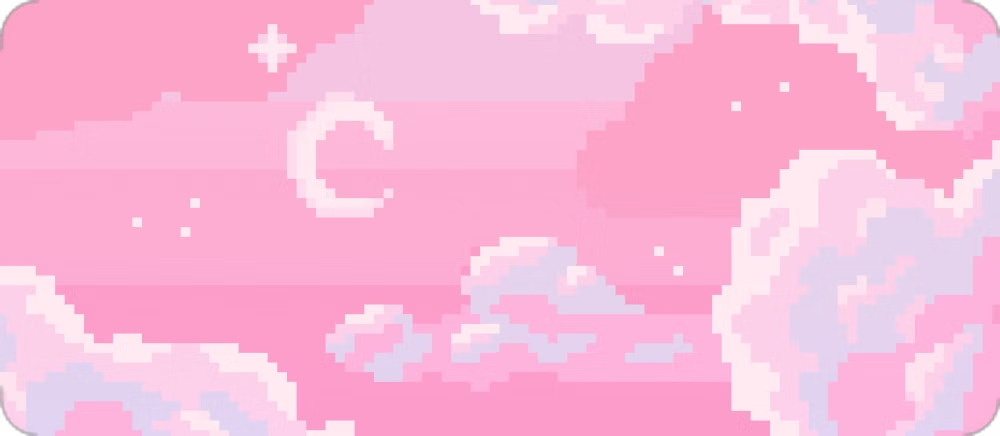
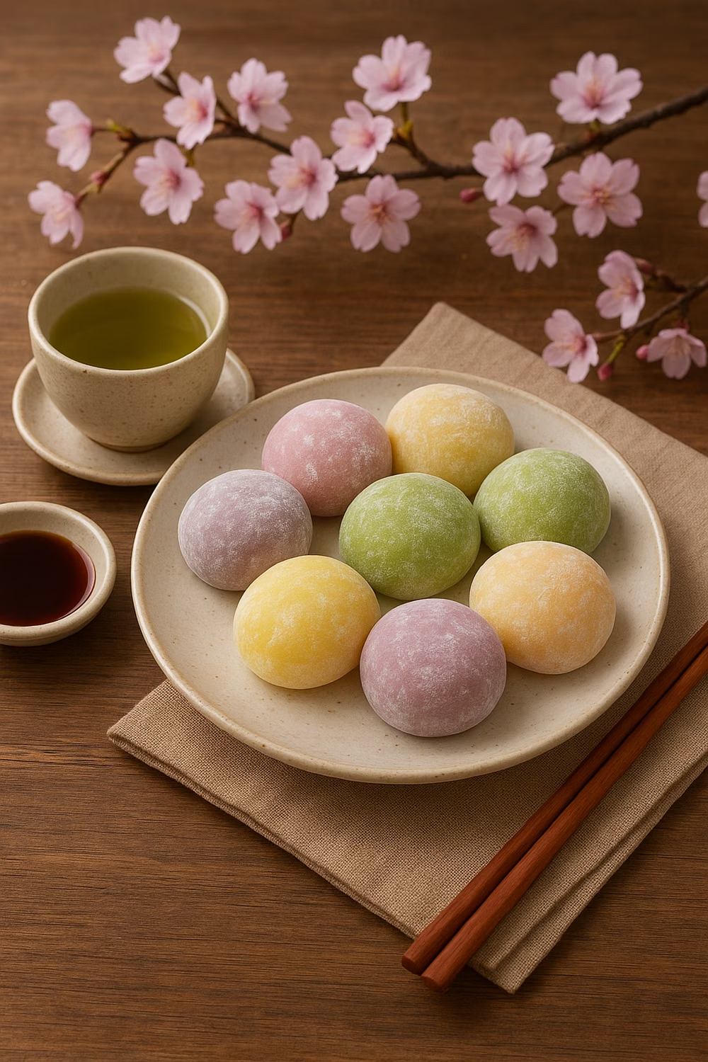
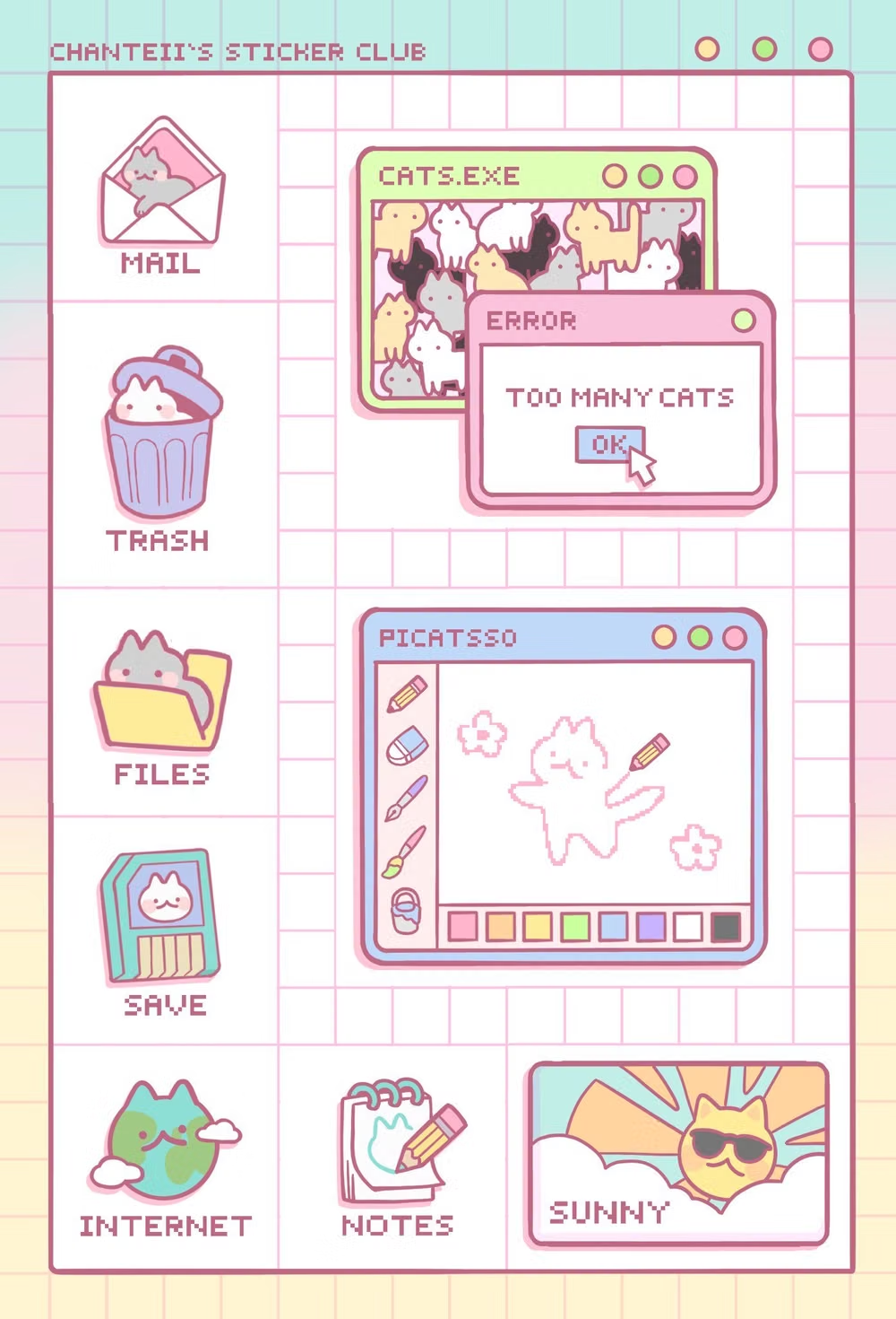
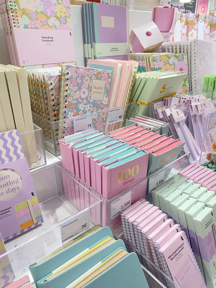
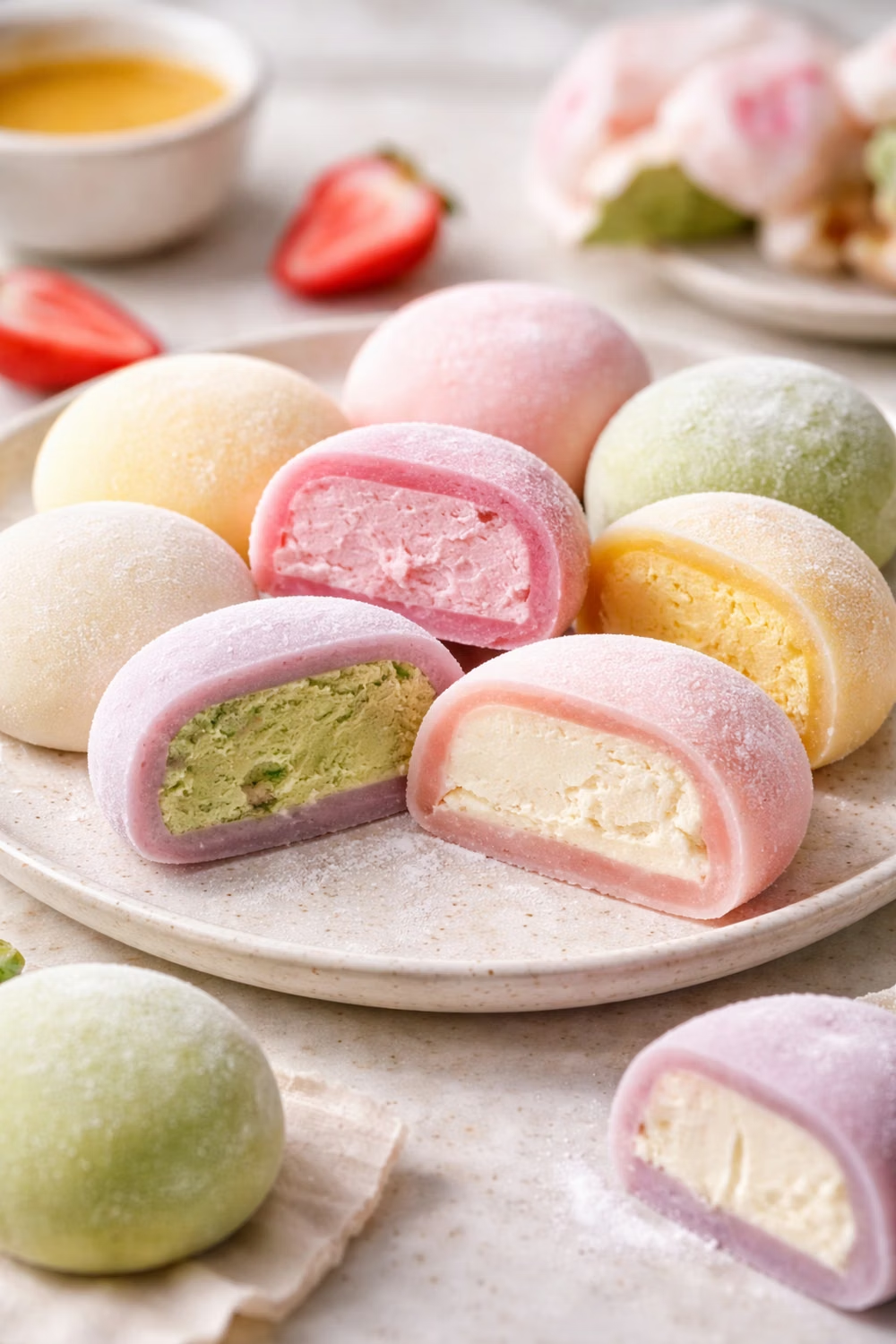
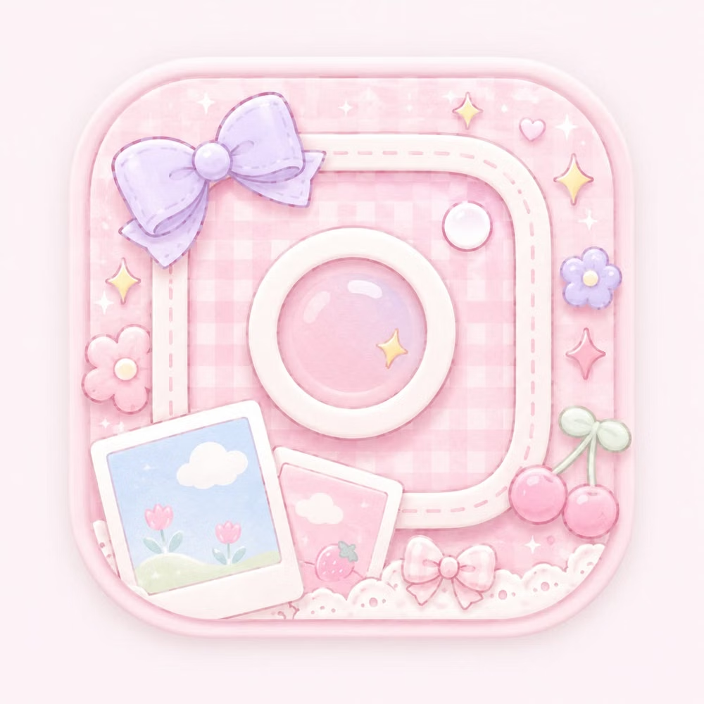
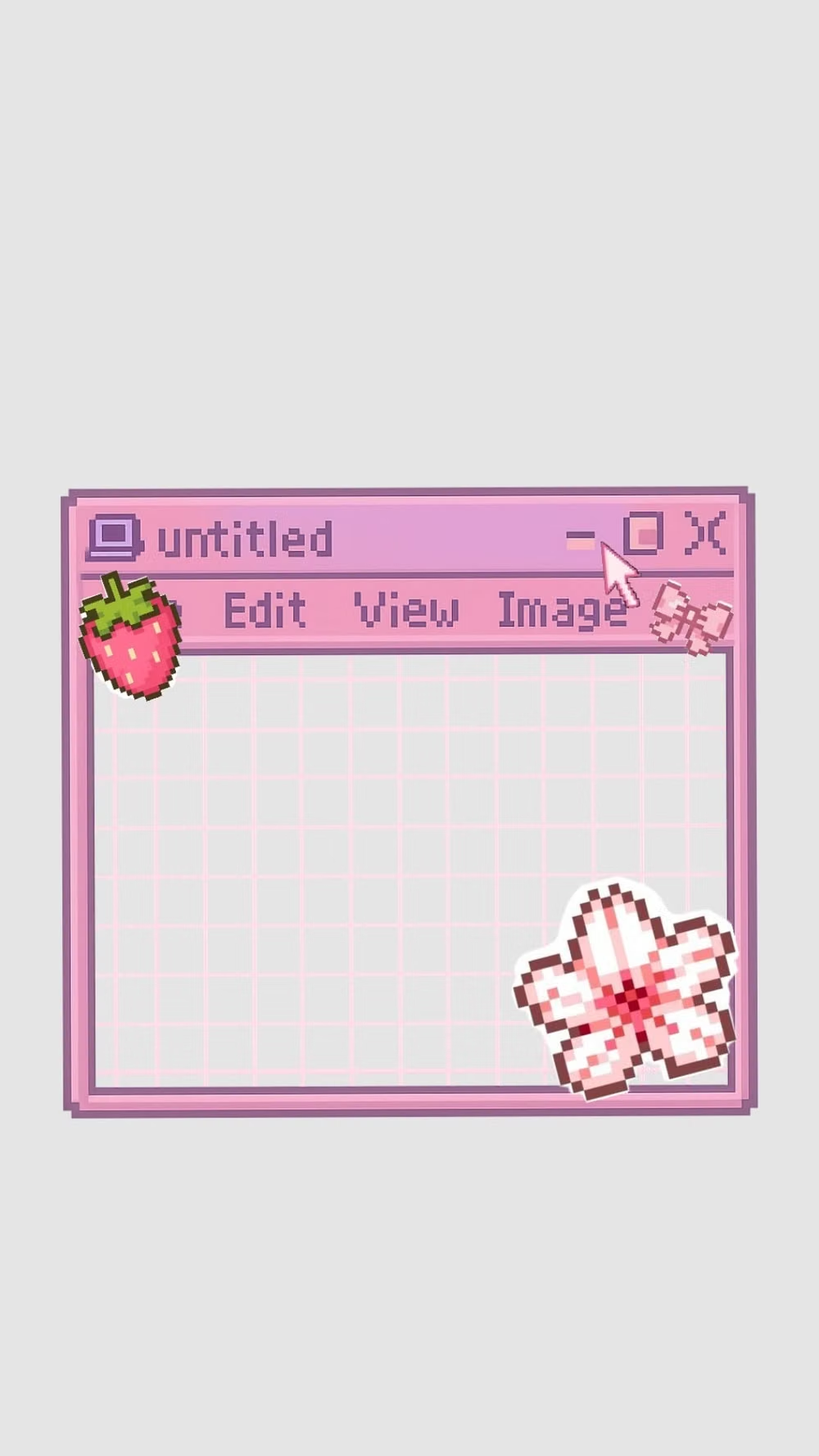
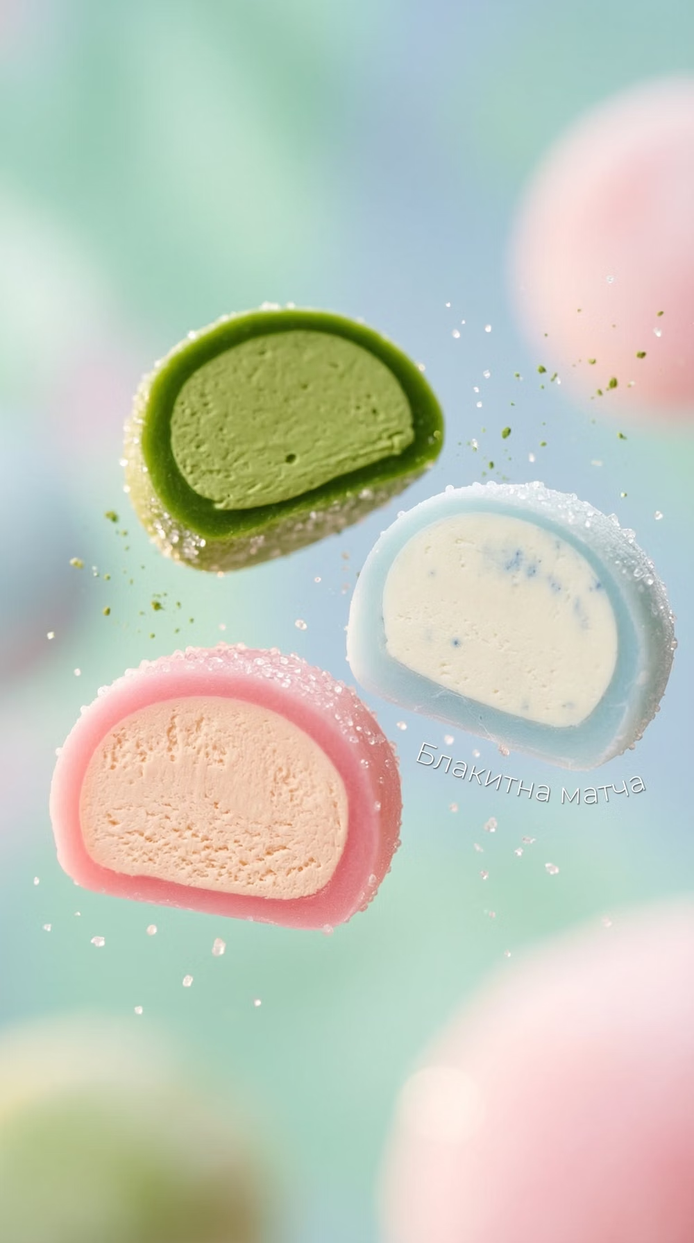
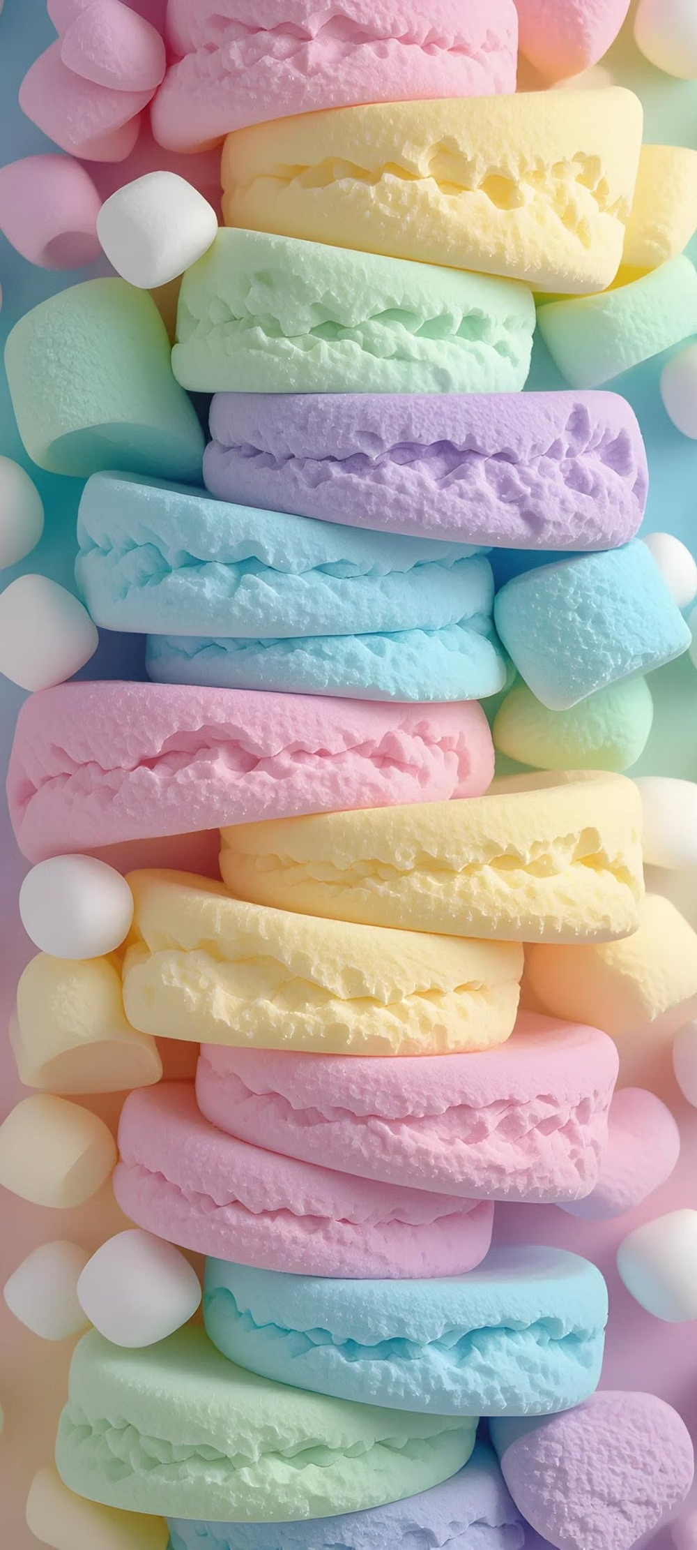
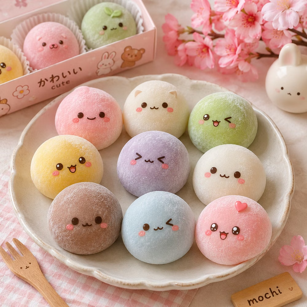
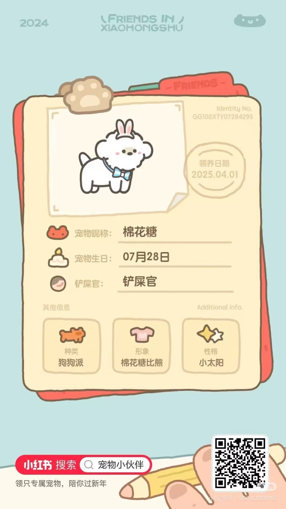
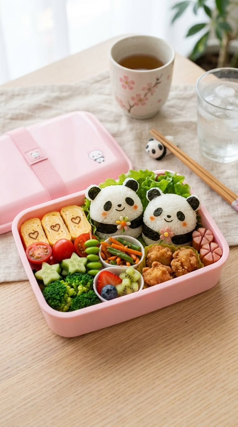
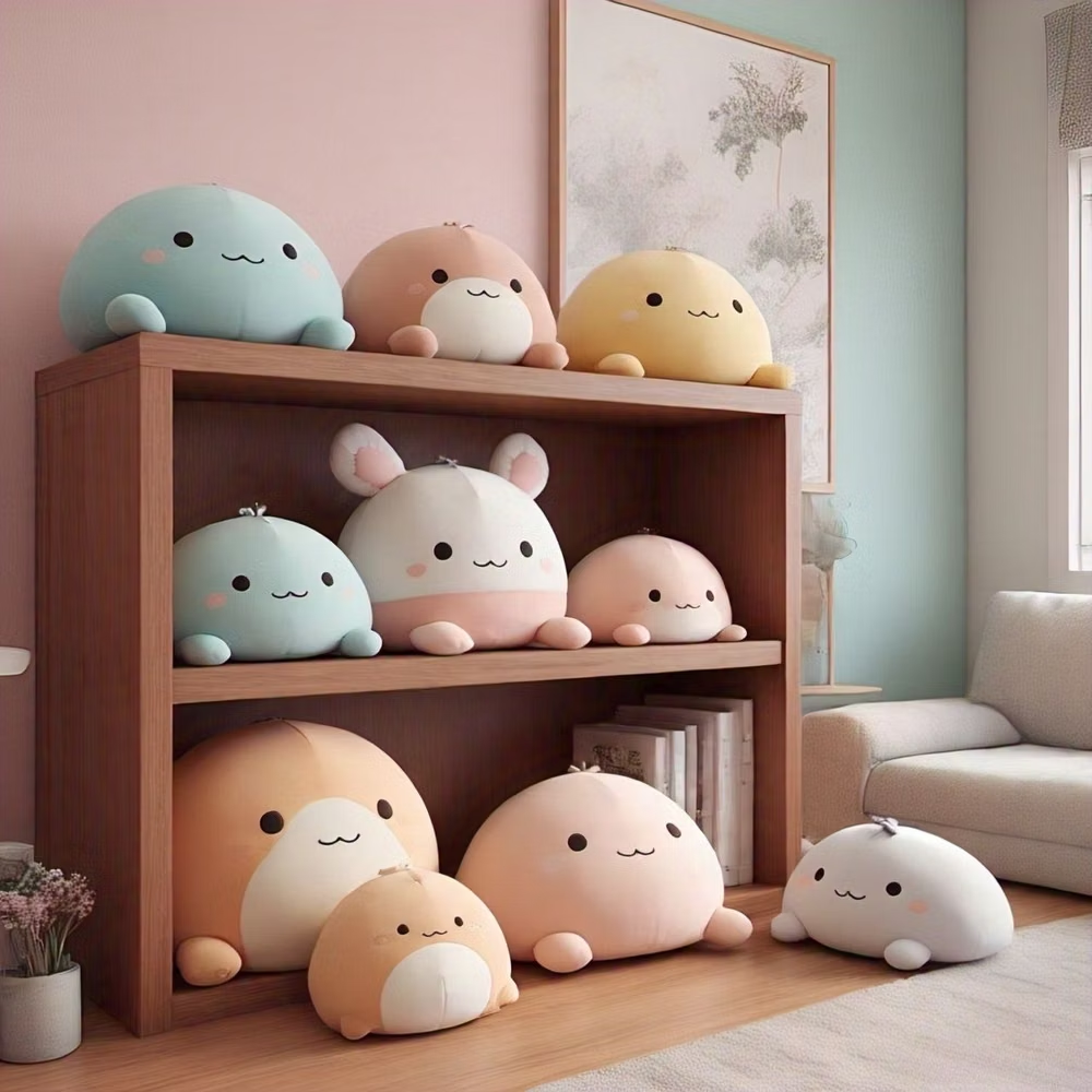
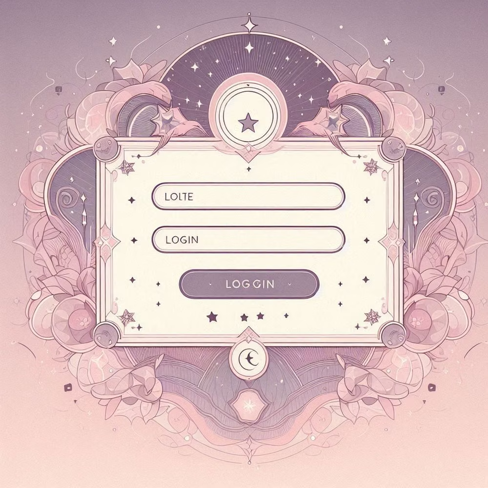
A visual study of the forms, inspirations, materials, colors, type, and cultural references associated with this UI design style.
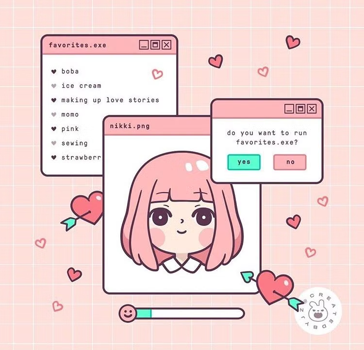
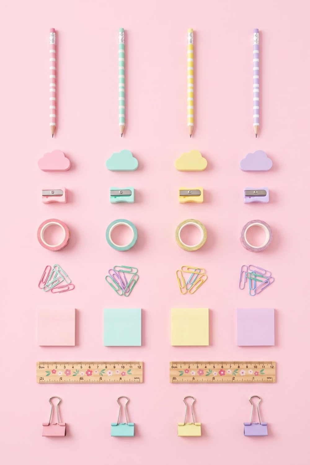
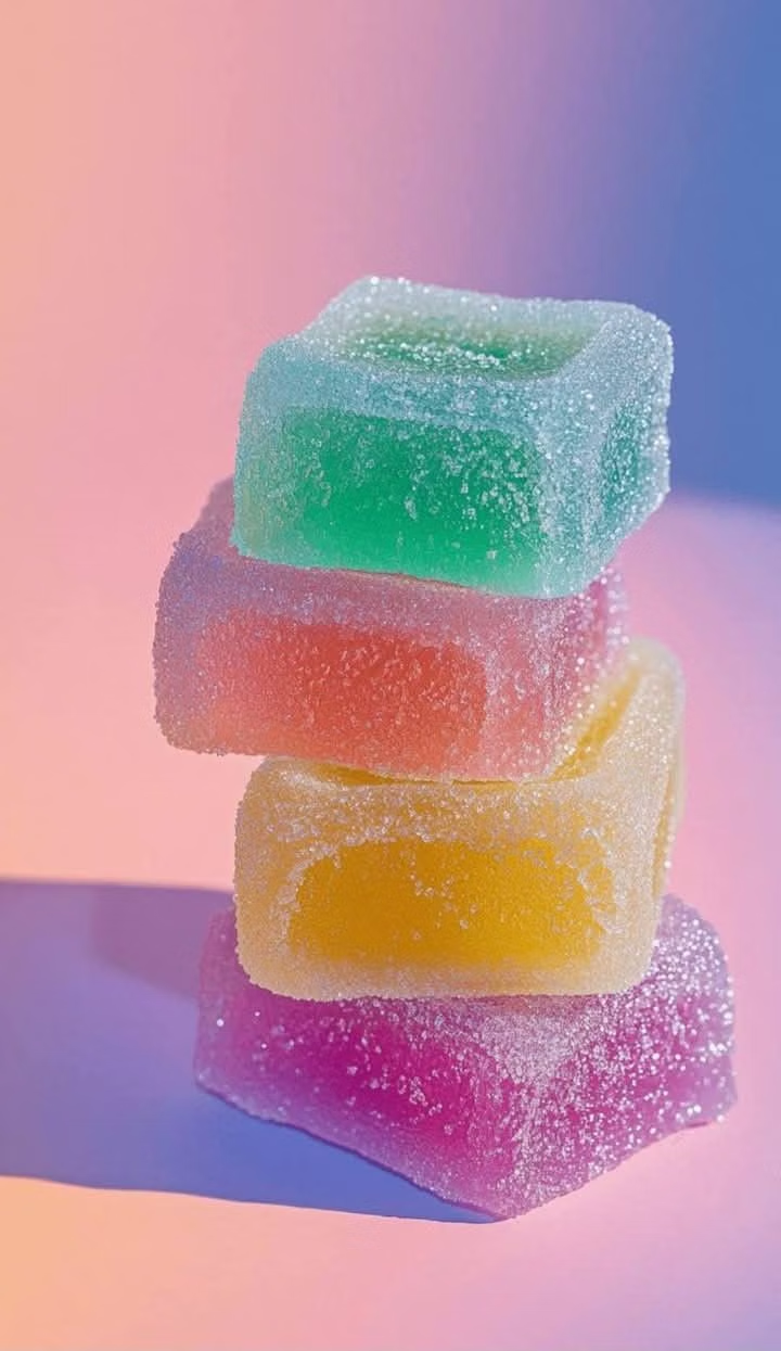
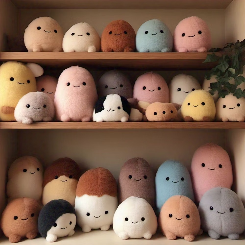
![small rounded plush toys pastel photograph - Создайте гиперреалистичный 3D-рендер [эмодзи] в виде невероятно милой, мягкой плюшевой игрушки, напоминающей детскую плюшевую игрушку, которую так приятно обнимать. Игрушка должна быть круглой, пухлой формы с пушистой, гладкой шерсткой, излучающей тепло и невинность. Используйте мягкое, равномерное освещение, чтобы подчеркнуть её уютную текстуру, и разместите её на чистом белом фоне для создания чистого, современного образа. Используйте нежные и игривые цвета, а слегка приглушённую палитру — для создания нежной, мечтательной атмосферы. Стиль должен быть очень детализированным, но при этом мягким, с акцентом на максимальную миловидность и игрушечную эстетику.](../../moodboards/kawaii-ui/21-inspiration-rounded-plush-toys.avif)
Design principles and implementation
Use these principles to write a focused AI UI design prompt instead of asking for a vague visual treatment.
Color direction
Choose a pastel base with candy-bright accents, dark cocoa or navy outlines, and tiny sparkle colors that never replace readable state contrast. In a daisyUI theme, use candy pink or lavender for `primary`, mint or sky blue for `secondary`, and step `base-100`, `base-200`, and `base-300` through cream, pale blush, and a slightly deeper pastel tint.
Imagery direction
Use chibi characters, expressive objects, food or animal motifs, and tiny decorative faces drawn with consistent rounded proportions.
Content density
Keep density low to medium, concentrating small decorative details at edges while preserving clean space around text and controls. Use the `*-lg` size variants for daisyUI components to reinforce the chunky, informal scale.
Motion direction
Use blinks, tiny hops, squashy button presses, sparkle bursts, and cheerful success reactions with quick, light timing.
Shape language
Favor circles, hearts, stars, clouds, rounded pills, scalloped frames, and soft character silhouettes with thick clean outlines. In daisyUI themes, set the `--radius-*` variables between `1rem` and `2rem`.
Typography rules
Use rounded display lettering for short cheerful headings, pair it with a simple readable body face, and avoid cramming complex scripts into tiny badges.
Suggested Typfaces
M PLUS Rounded 1c
Fresh daisies glow in warm sunlight
Fresh daisies glow in warm sunlight
1 2 3 4 5 6 7 8 9 0
Zen Maru Gothic
Fresh daisies glow in warm sunlight
Fresh daisies glow in warm sunlight
1 2 3 4 5 6 7 8 9 0
Mochiy Pop One
Fresh daisies glow in warm sunlight
Fresh daisies glow in warm sunlight
1 2 3 4 5 6 7 8 9 0
DynaPuff
Fresh daisies glow in warm sunlight
Fresh daisies glow in warm sunlight
1 2 3 4 5 6 7 8 9 0
Coiny
Fresh daisies glow in warm sunlight
Fresh daisies glow in warm sunlight
1 2 3 4 5 6 7 8 9 0
Build a Kawaii UI interface with daisyUI
The live example translates this direction into daisyUI components and semantic theme tokens.
To generate a full page in the same visual language, give the style name and the design rules above to Blueprint MCP.
Related UI design styles
Compare nearby visual languages that share typography, shapes, use cases, or signature elements.
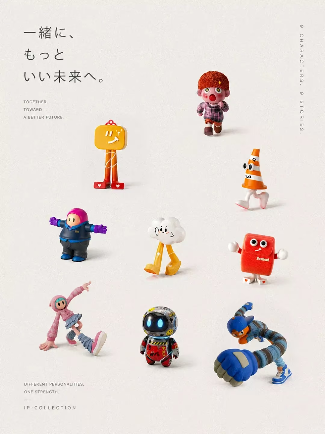
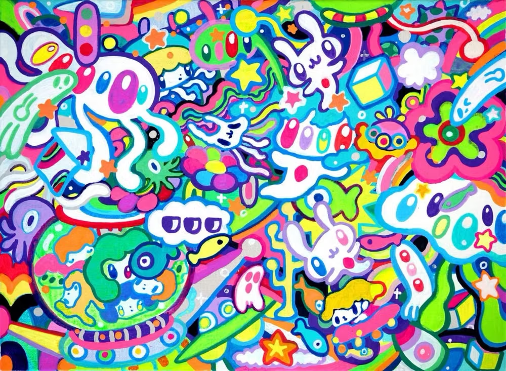
Superflat Pop UI design style
Extremely flat perspective, bright candy color, dense cartoon motifs, polished outlines, and Japanese pop-cultural energy.
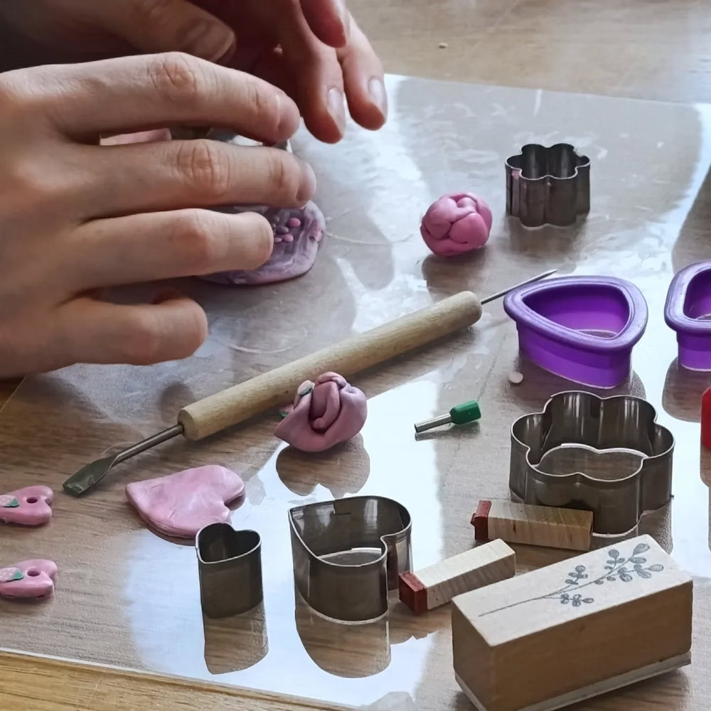
Claymorphism UI design style
Inflated, clay-like components with pastel colors, large radii, soft shading, and playful dimensional shadows.

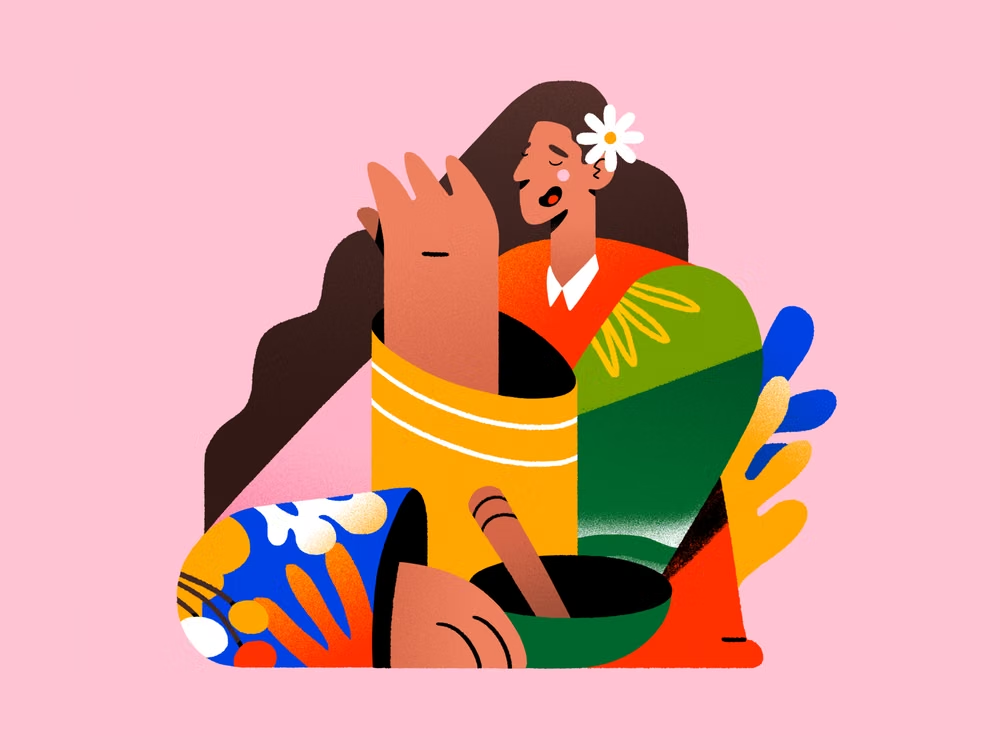
Corporate Memphis UI design style
Flat vector scenes with bright solid colors, geometric environments, and simplified people with exaggerated proportions.