Kinetic Typography UI design style
Animated text changes position, scale, weight, shape, or rhythm to communicate tone and guide attention.
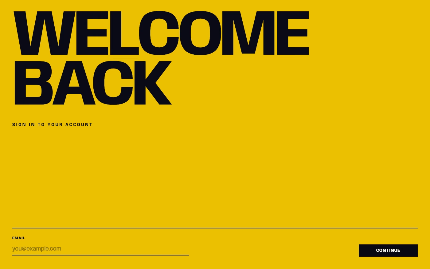
Design overview
- Signature elements
- animated letterforms, variable font axes, rhythmic timing, text morphing, scrolling type, scale transitions
- Best suited to
- Music, entertainment, product launches, explainers, storytelling, and motion-led brand experiences.
- Layout principles
- Sequence text across stable stage areas, keep navigation and body copy anchored, and design each motion beat around one phrase the viewer can fully read.
History and origins
A fact-checked account of where this visual language came from, with links to the references used.
- Period
- Film-title precedents in the 1950s; digital expansion from the 1990s
- Origin
- Film title design and motion graphics
Moving type has early experimental-film precedents, but modern kinetic typography is strongly associated with mid-century title design. Saul Bass’s titles for Alfred Hitchcock’s North by Northwest in 1959 made animated letterforms part of the film’s spatial drama; television, music video, and later browser and app animation expanded the method into a routine digital design tool.
Moodboard and visual references
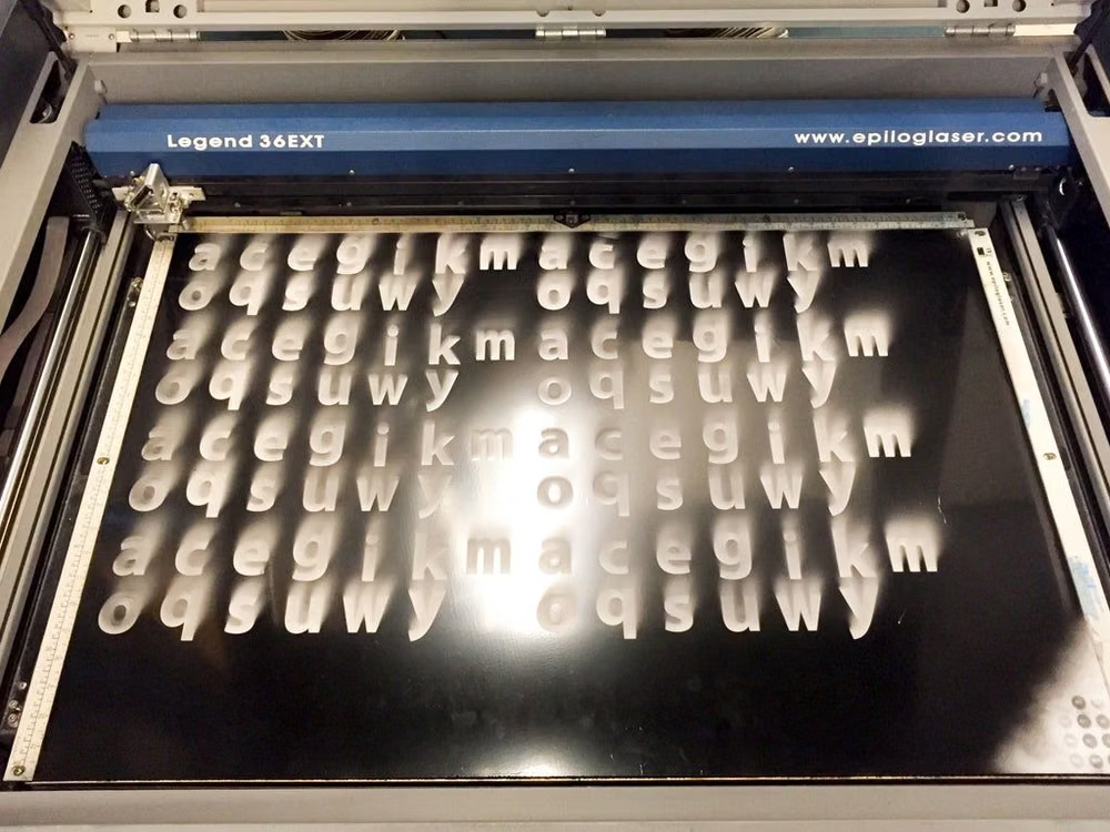
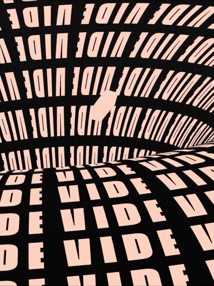
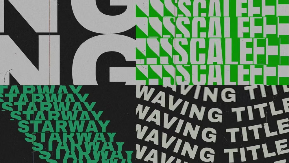
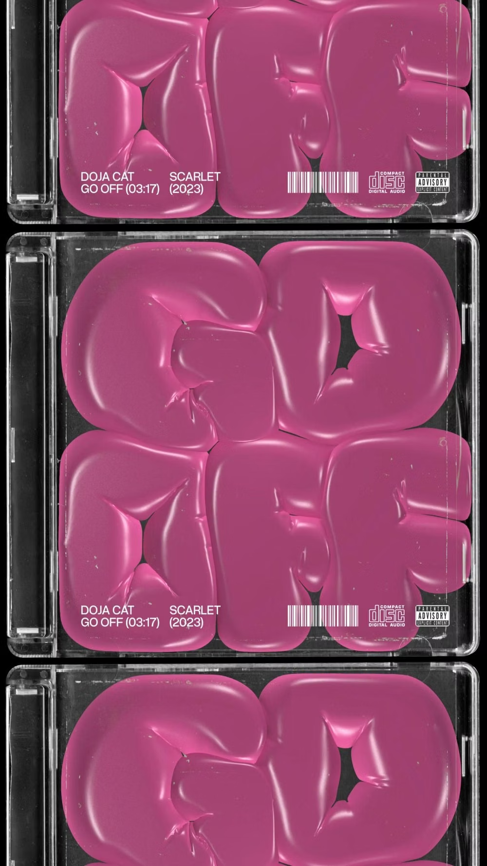
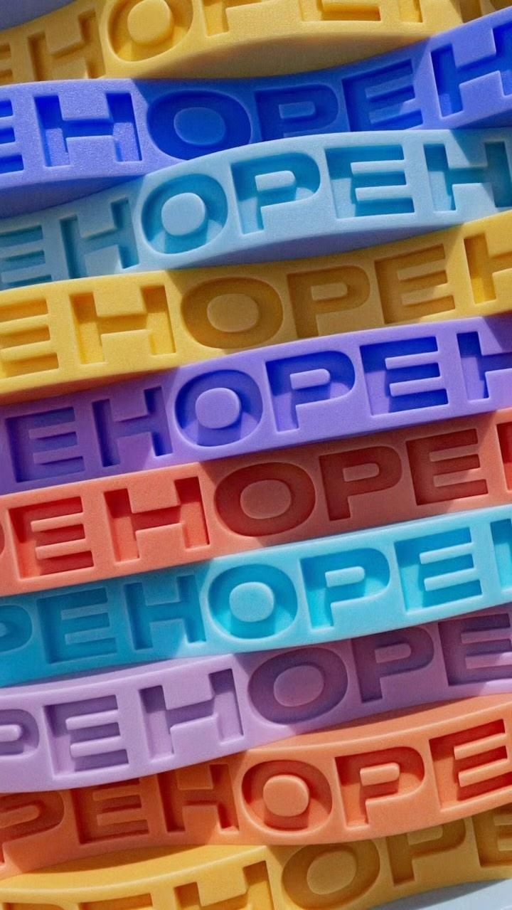
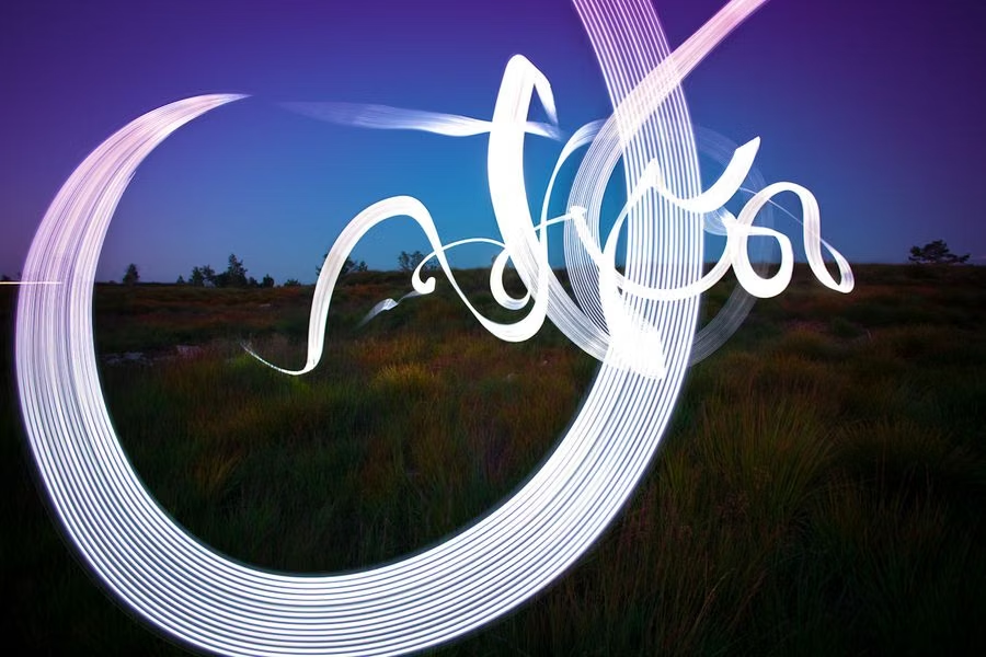
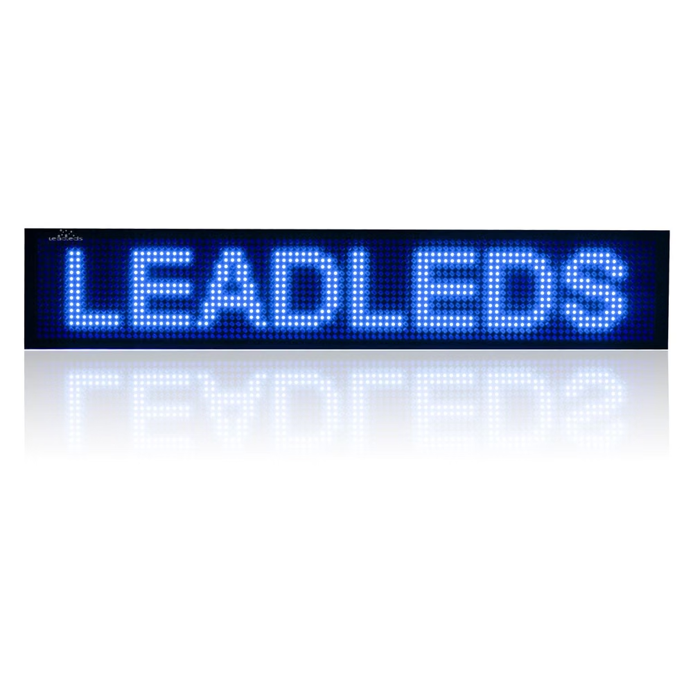
A visual study of the forms, inspirations, materials, colors, type, and cultural references associated with this UI design style.
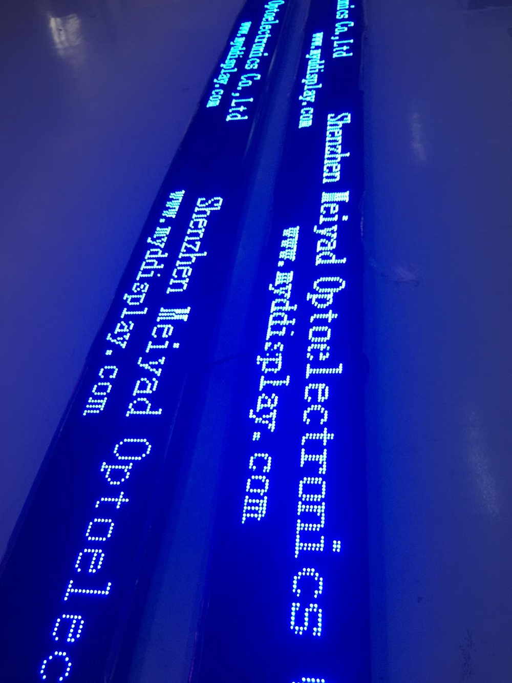
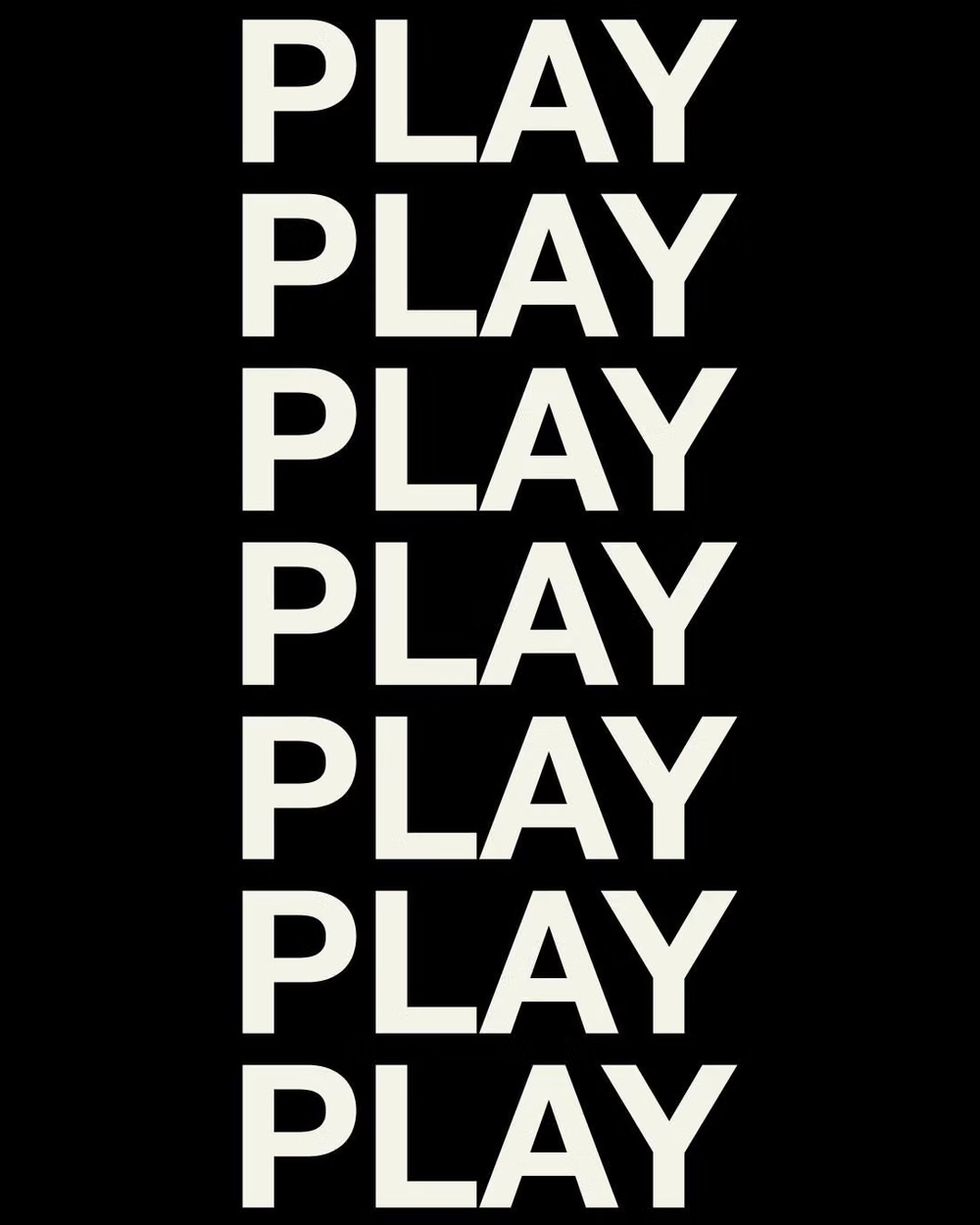
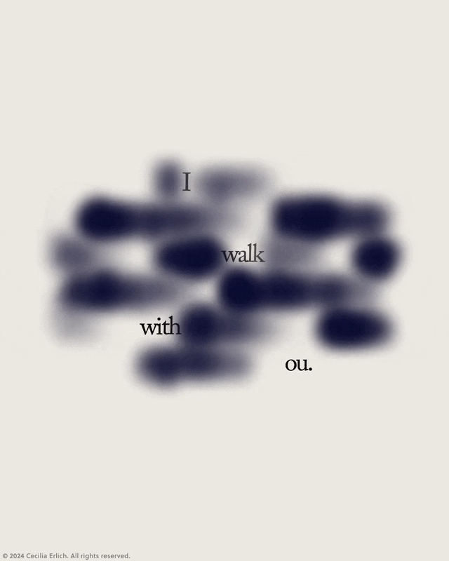
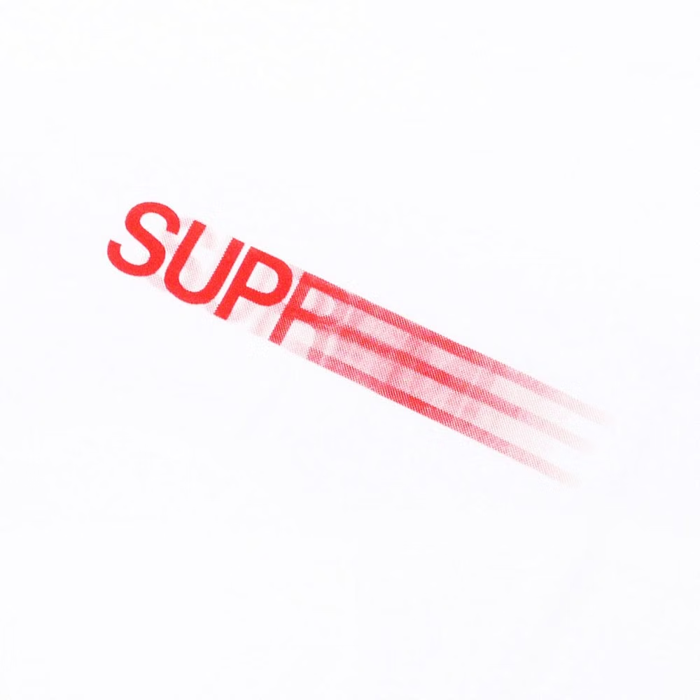
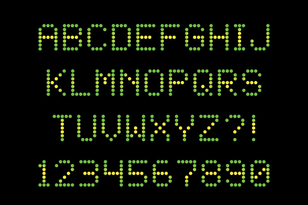
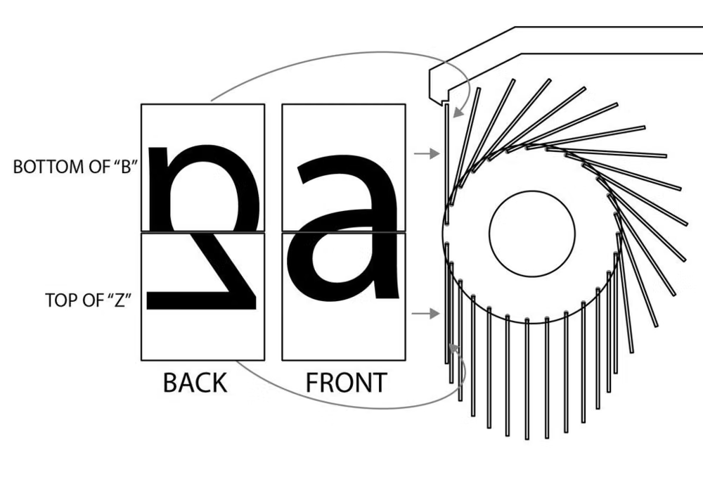
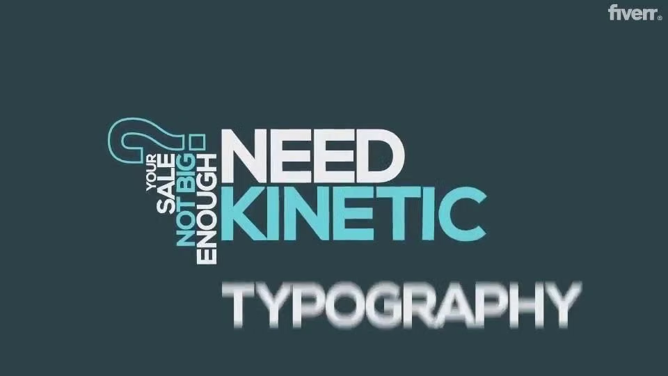
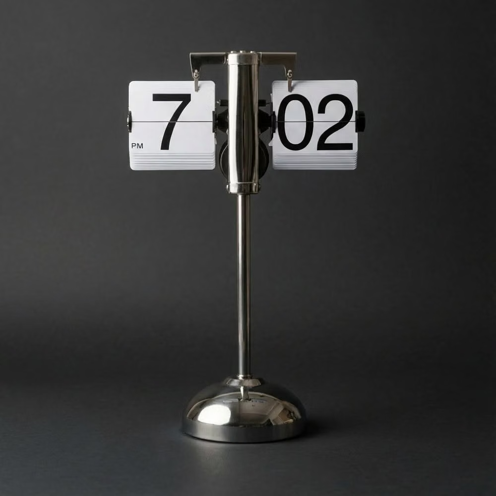
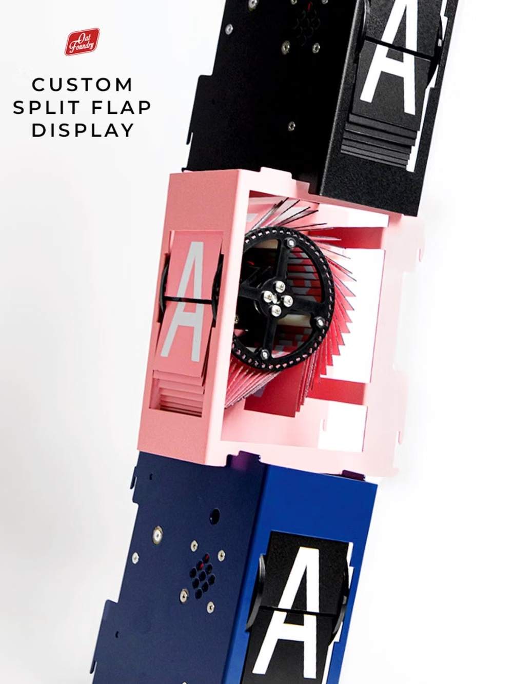
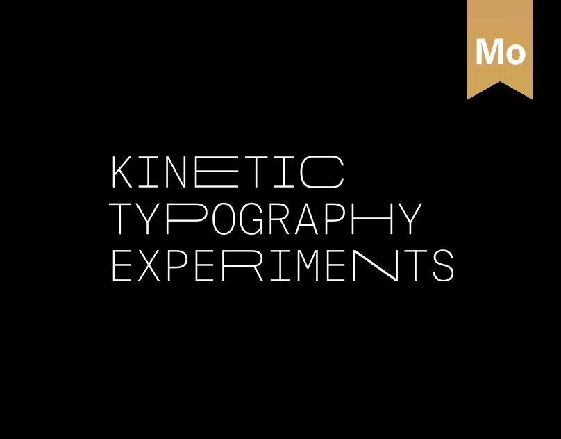
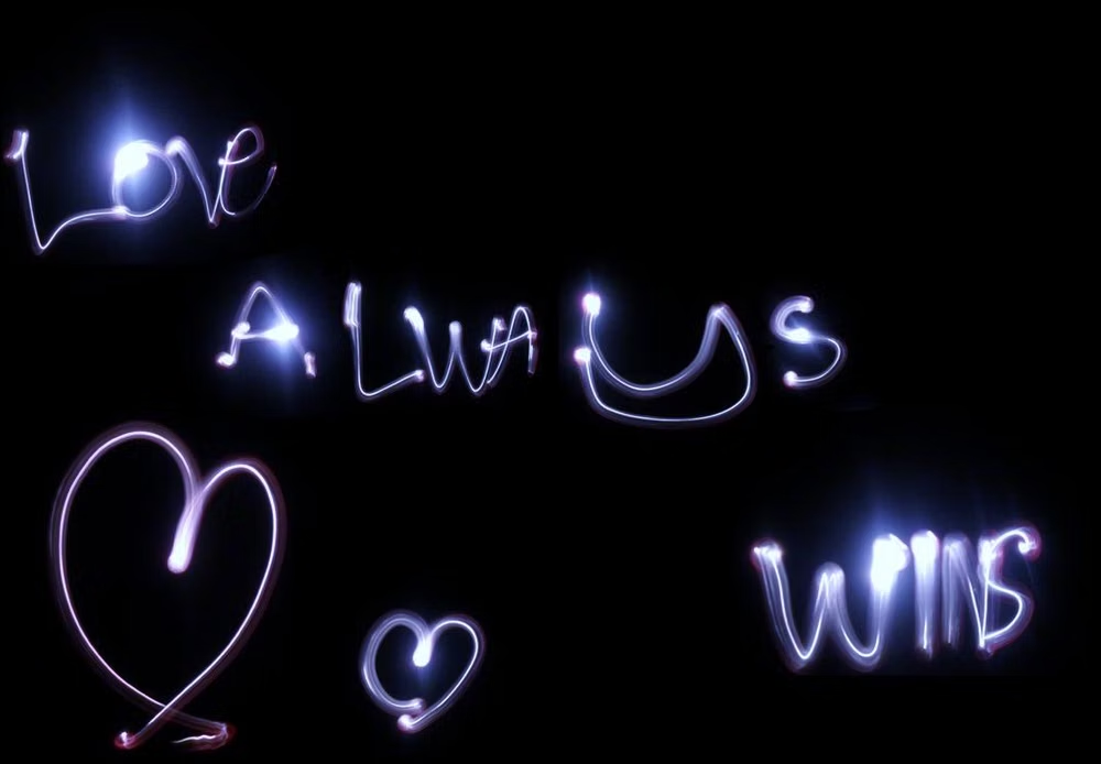
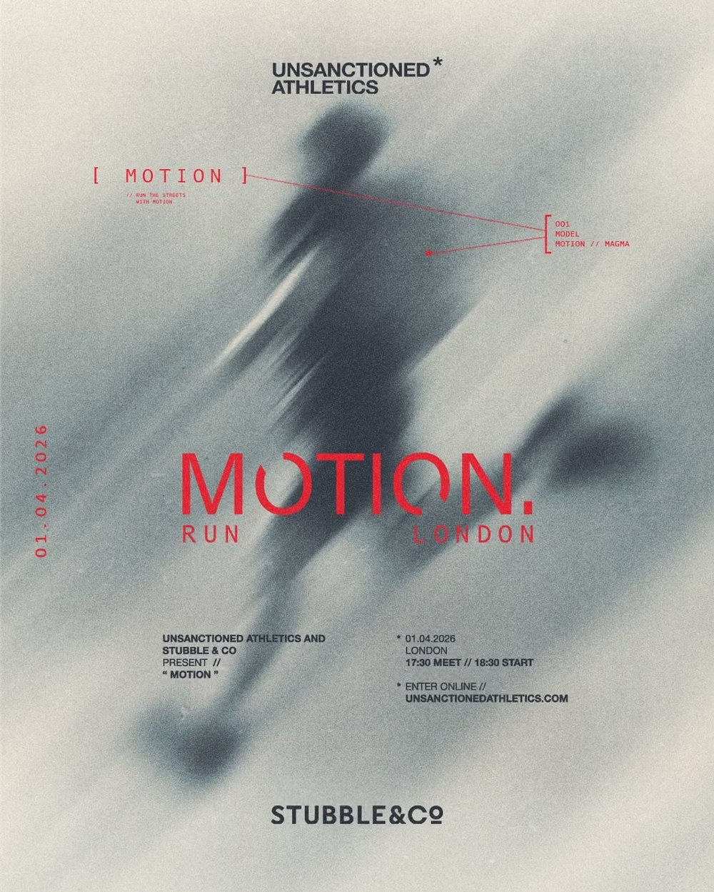
![Kinetic Typography aesthetic - KINETISM VOL 1 — 66 Type Animated templates in after effects to bring your animations to a top tiene level motion designer. [motion design, motion, type, animated type, typography]](../../moodboards/kinetic-typography/05-kinetic-typography.avif)
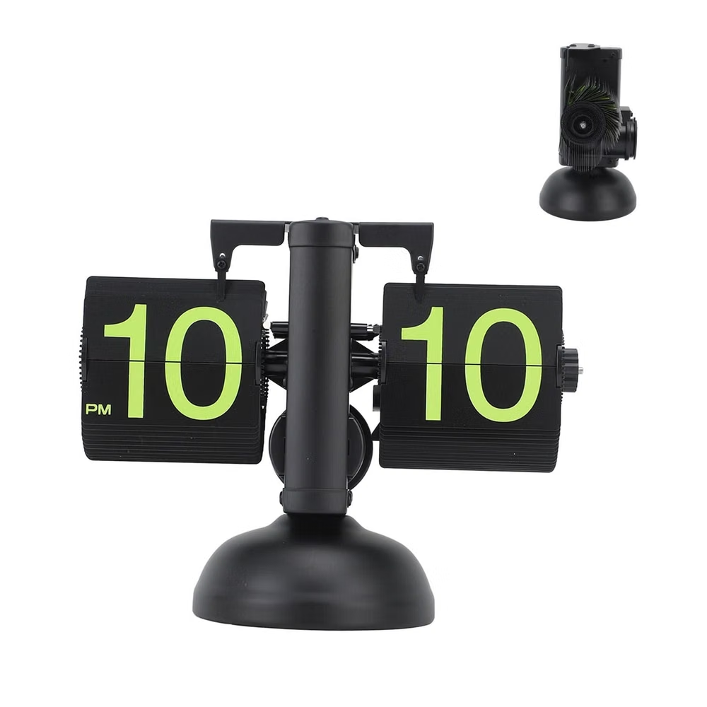
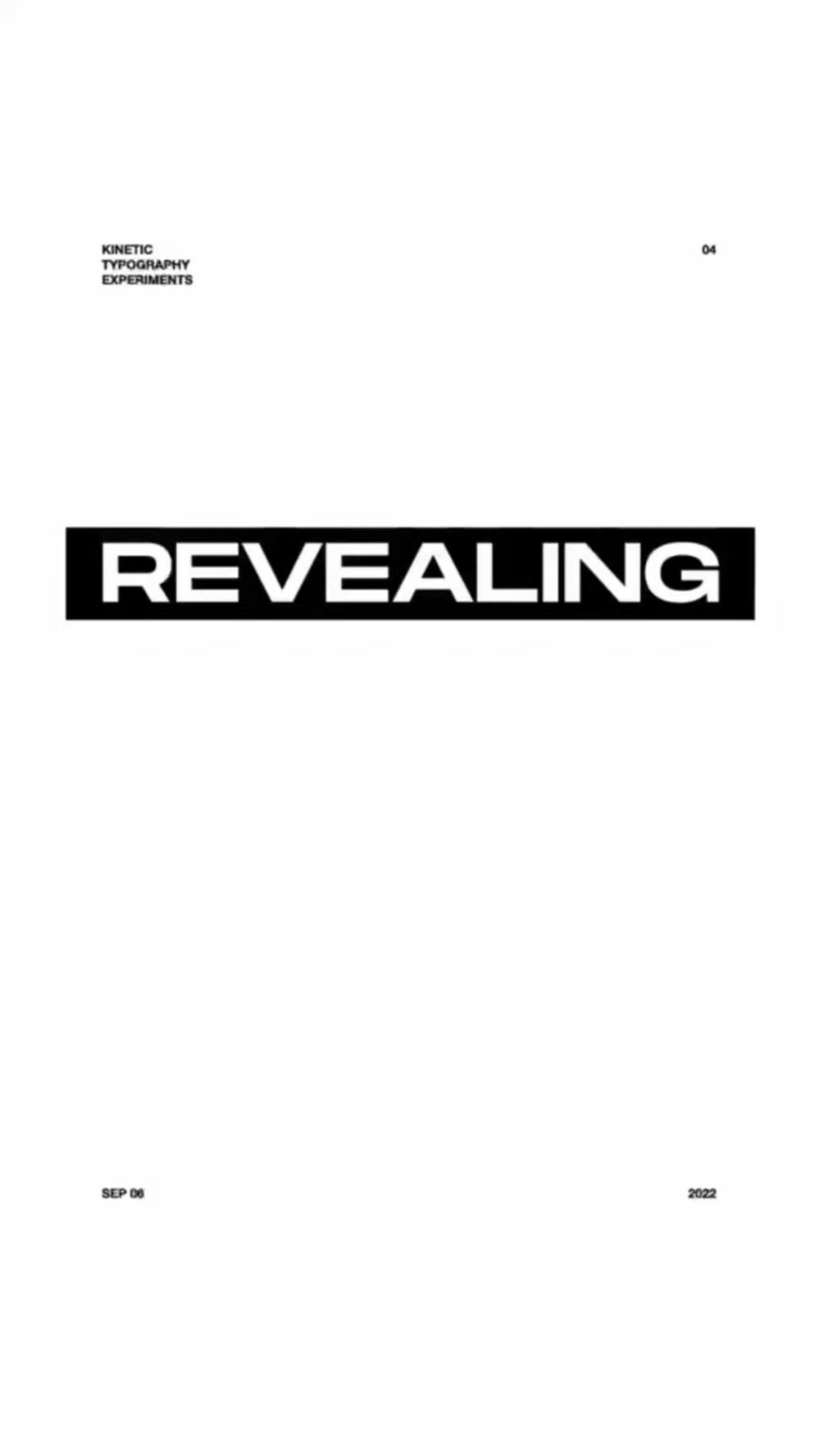
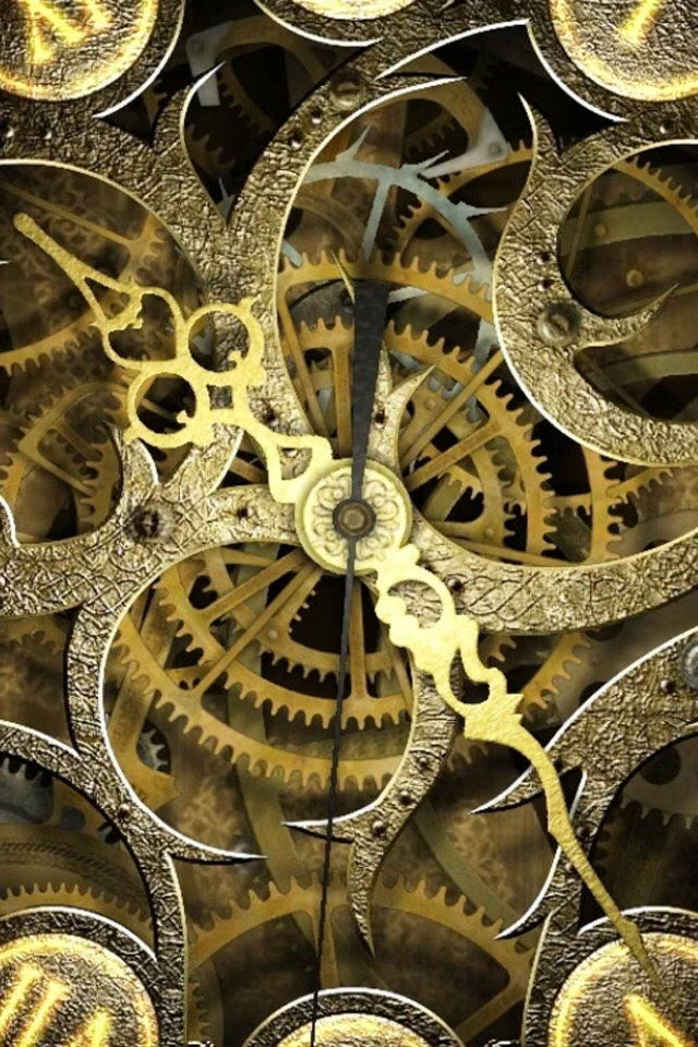
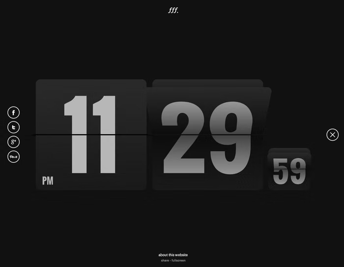
Design principles and implementation
Use these principles to write a focused AI UI design prompt instead of asking for a vague visual treatment.
Color direction
Use a limited high-contrast palette that keeps moving words legible, changing color only to mark rhythm, speaker, emphasis, or narrative phase. In a daisyUI theme, use the active-word color for `primary`, the alternate speaker or rhythm color for `secondary`, and choose still, high-contrast neutral steps for `base-100`, `base-200`, and `base-300`.
Imagery direction
Let photography, video, or abstract footage respond to the text cadence as a background layer, never obscuring the active phrase.
Content density
Keep each animated beat sparse, with one short statement at a time and static transcripts or summaries available for detailed content.
Motion direction
Drive weight, width, slant, scale, tracking, and position from speech or musical rhythm, with controlled entrances, readable holds, and decisive exits.
Shape language
Derive frames, paths, and masks from baselines, glyph counters, and text trajectories so supporting graphics feel born from the words. In daisyUI themes, set the `--radius-*` variables to `0` or `0.25rem`.
Typography rules
Choose variable families with stable interpolation, preserve recognizable glyph forms during motion, and provide a complete static reduced-motion state.
Suggested Typfaces
Anybody
Fresh daisies glow in warm sunlight
Fresh daisies glow in warm sunlight
1 2 3 4 5 6 7 8 9 0
Roboto Flex
Fresh daisies glow in warm sunlight
Fresh daisies glow in warm sunlight
1 2 3 4 5 6 7 8 9 0
Recursive
Fresh daisies glow in warm sunlight
Fresh daisies glow in warm sunlight
1 2 3 4 5 6 7 8 9 0
Unbounded
Fresh daisies glow in warm sunlight
Fresh daisies glow in warm sunlight
1 2 3 4 5 6 7 8 9 0
Climate Crisis
Fresh daisies glow in warm sunlight
Fresh daisies glow in warm sunlight
1 2 3 4 5 6 7 8 9 0
Build a Kinetic Typography interface with daisyUI
The live example translates this direction into daisyUI components and semantic theme tokens.
To generate a full page in the same visual language, give the style name and the design rules above to Blueprint MCP.
Related UI design styles
Compare nearby visual languages that share typography, shapes, use cases, or signature elements.
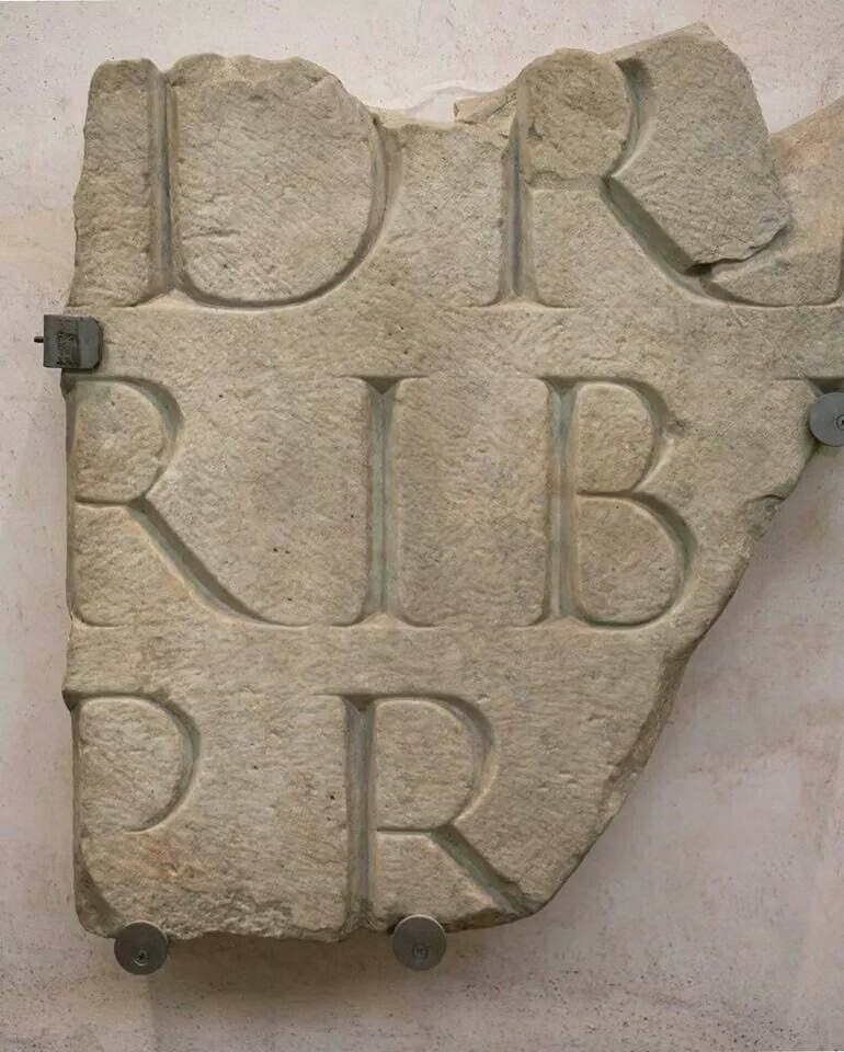
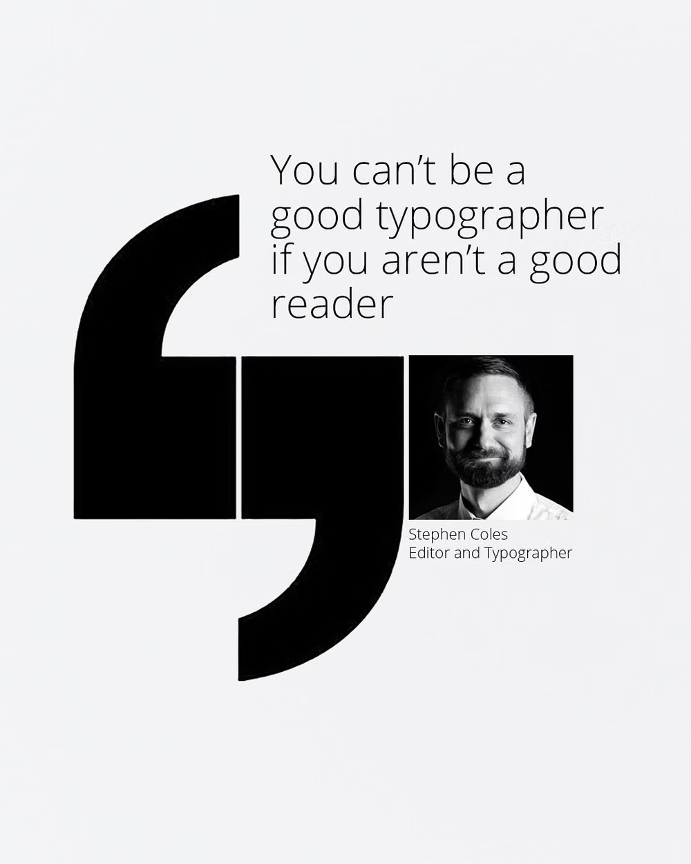
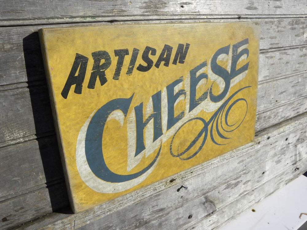
Type-First Design UI design style
Oversized or expressive typography acts as the primary visual element, with imagery and controls playing supporting roles.
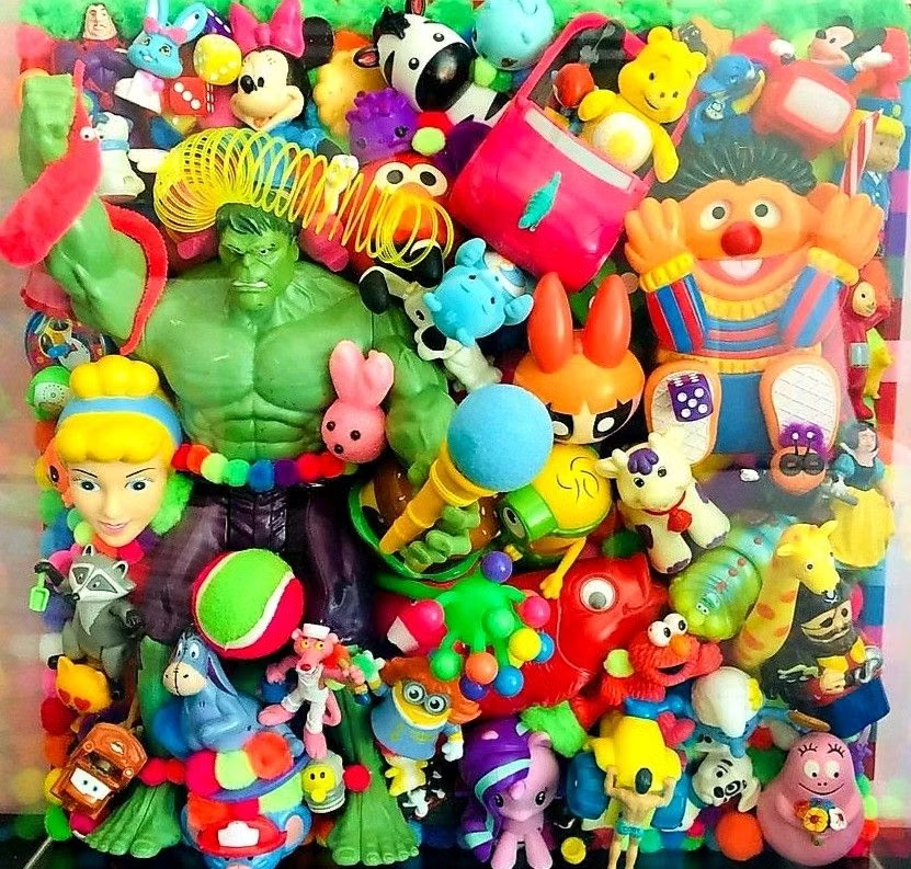
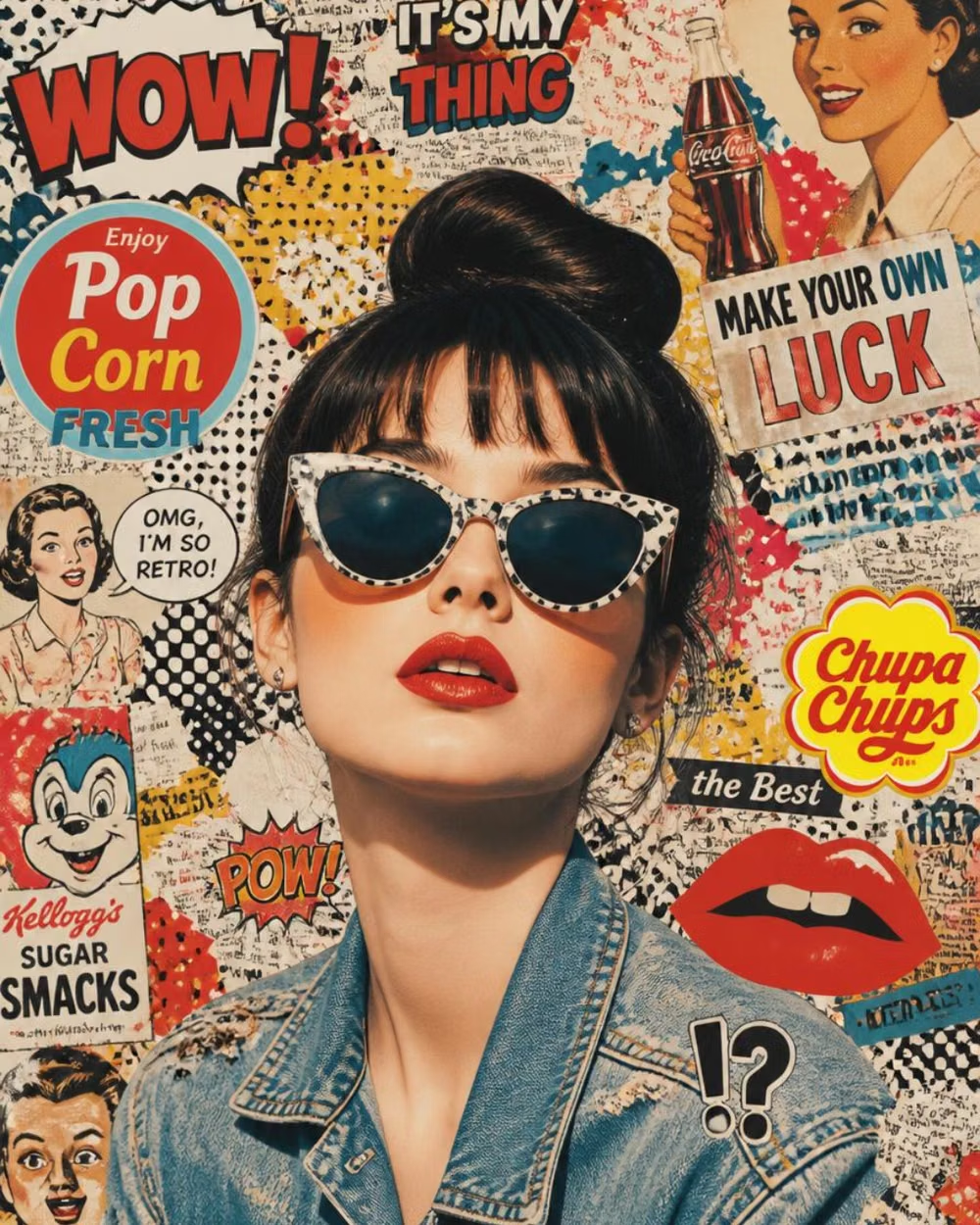
Pop Art UI design style
Commercial imagery, bold outlines, repetition, bright primary colors, and mass-media references become graphic spectacle.
2K1 UI design style
This 2001–2004 transitional pop-cultural look mixes late-Y2K clarity with dirtier hip-hop, sports, nu-metal, teen-comedy, and early-McBling attitude.