Pop Art UI design style
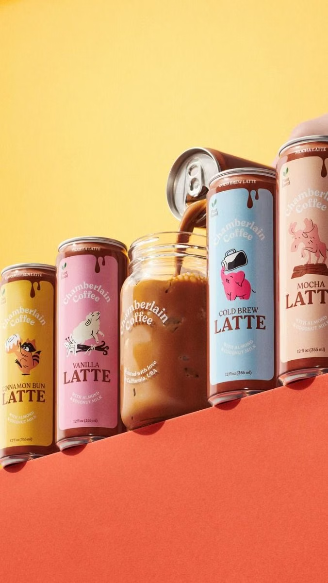
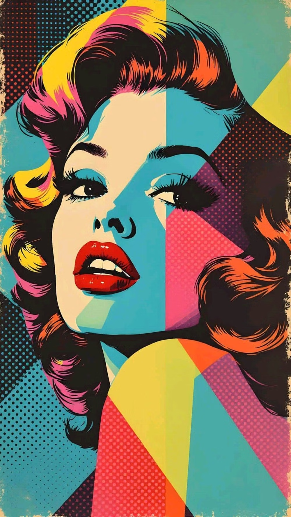
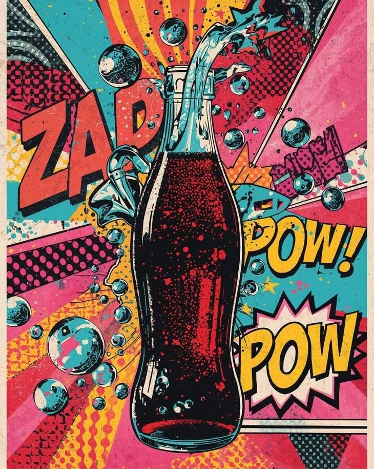
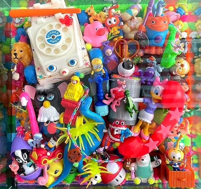
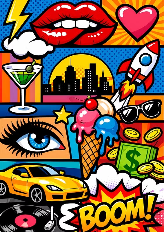
Commercial imagery, bold outlines, repetition, bright primary colors, and mass-media references become graphic spectacle.
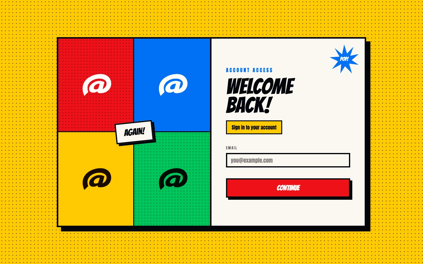
Design overview
- Signature elements
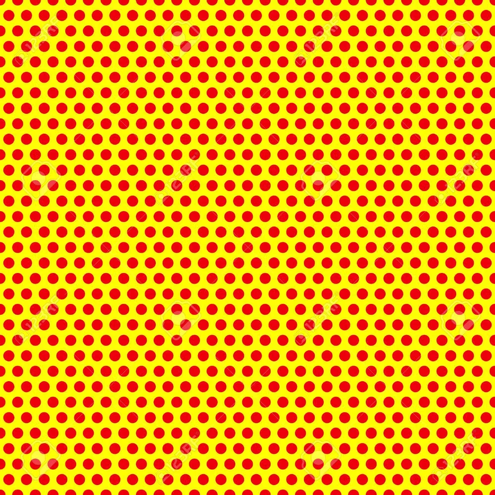
- comic dots, commercial imagery, bold outlines, primary colors, repeated motifs, oversized slogans. In daisyUI themes, set `--noise: 1;`.
- Best suited to
- Retail, entertainment, music, youth campaigns, editorial, and energetic brand activations.
- Layout principles
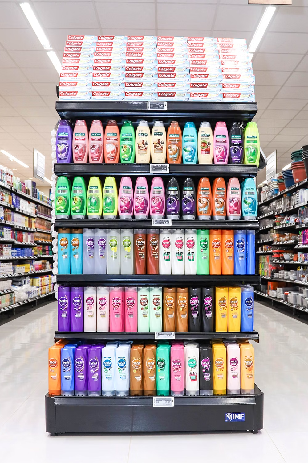
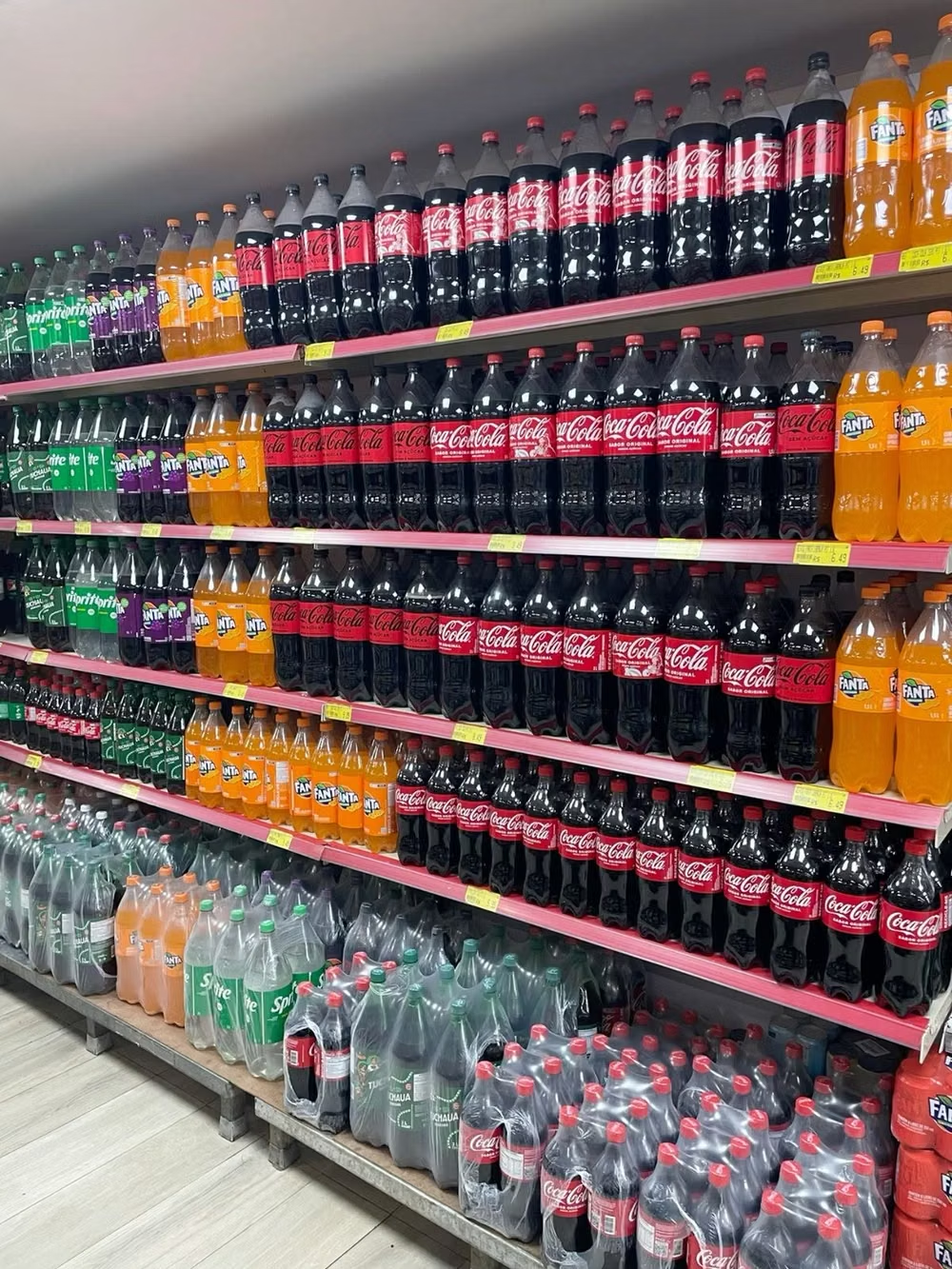
- Compose like a commercial poster or comic spread, repeating products or portraits in grids and breaking the pattern with one oversized slogan or crop.
History and origins
A fact-checked account of where this visual language came from, with links to the references used.
- Period
- Mid-1950s–1960s
- Origin
- Britain, then the United States
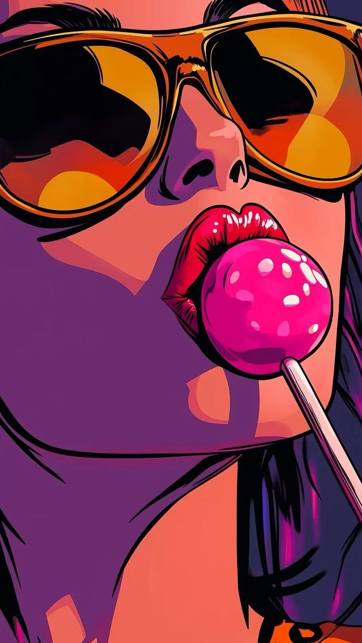
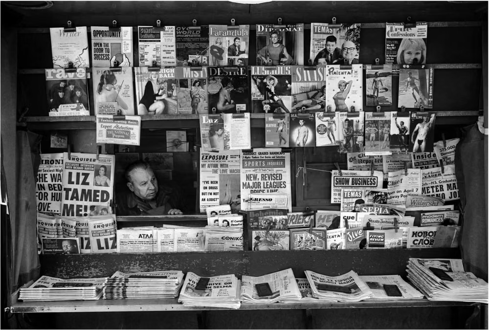
Pop Art began with British artists examining mass media and consumer culture in the 1950s, then became a major American movement in the 1960s. Artists appropriated comics, advertising, television, celebrity, packaging, and commercial reproduction methods, making its flat color, repetition, and enlarged print marks an enduring source for interface graphics.
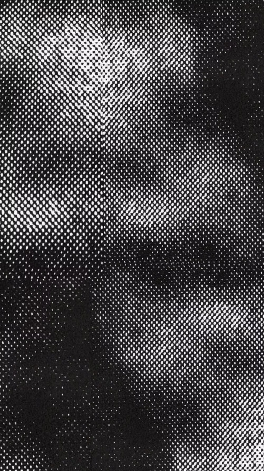
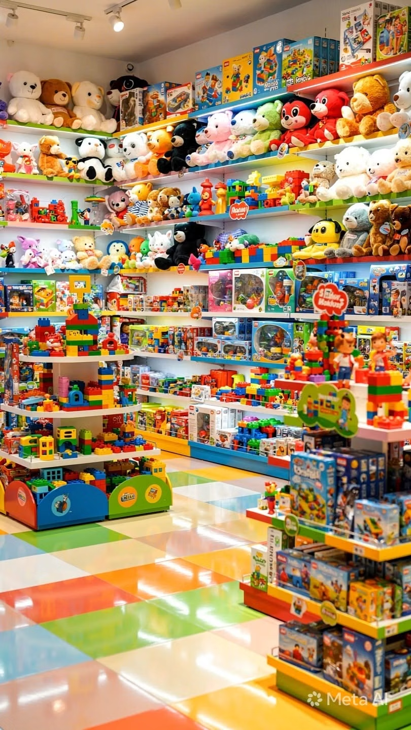
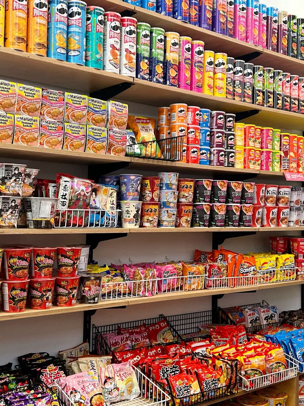
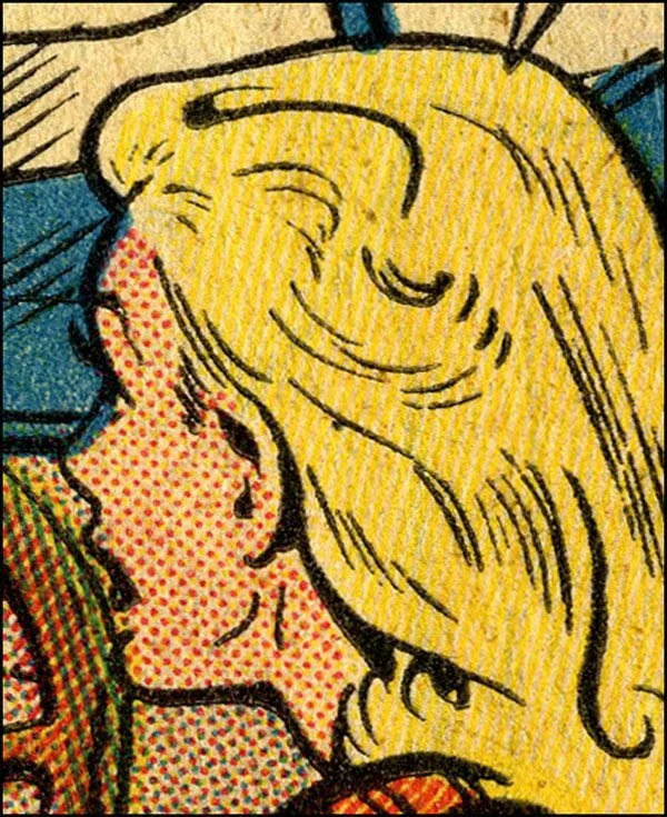
Moodboard and visual references
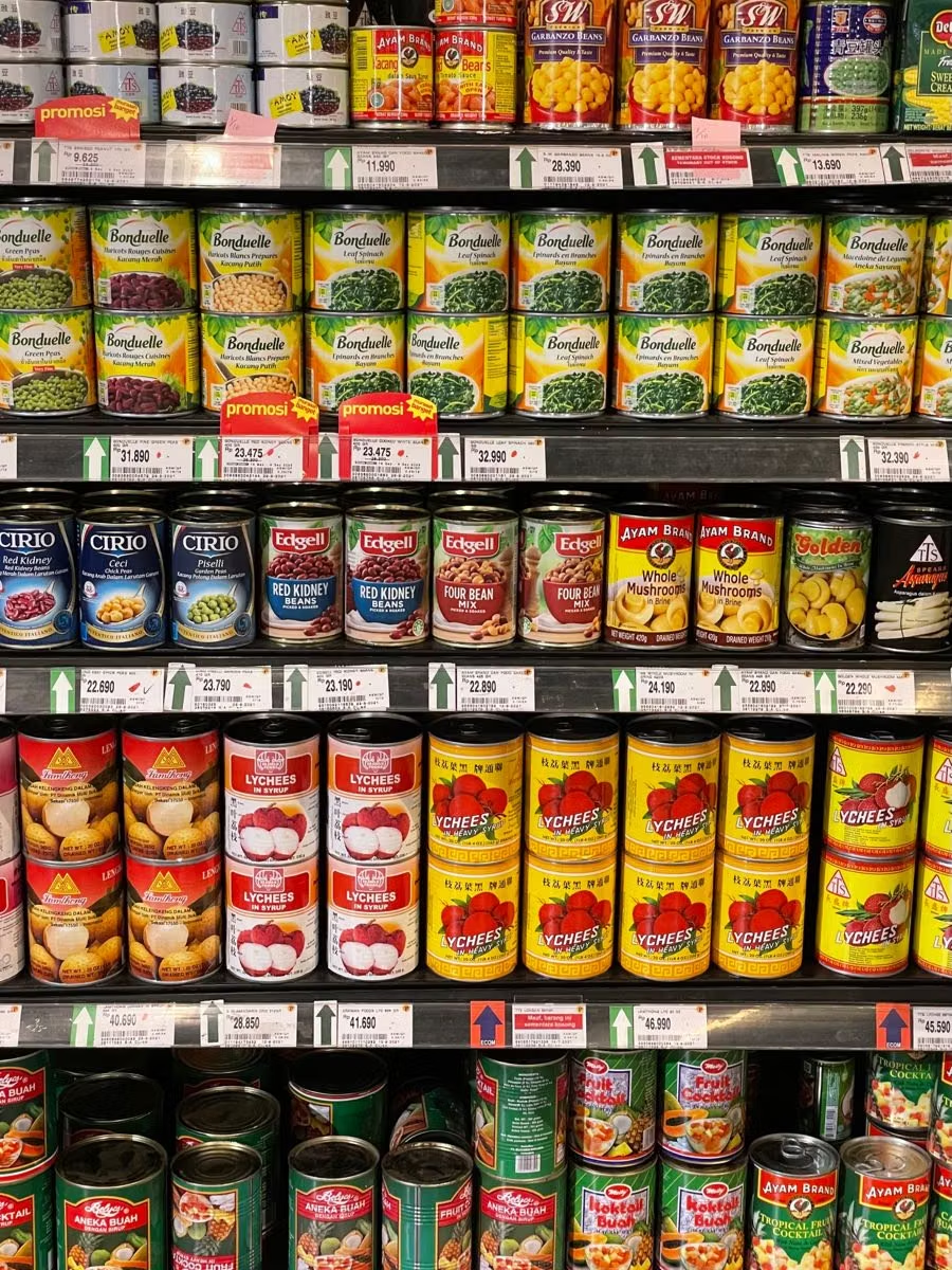
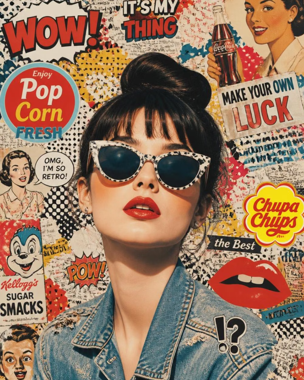
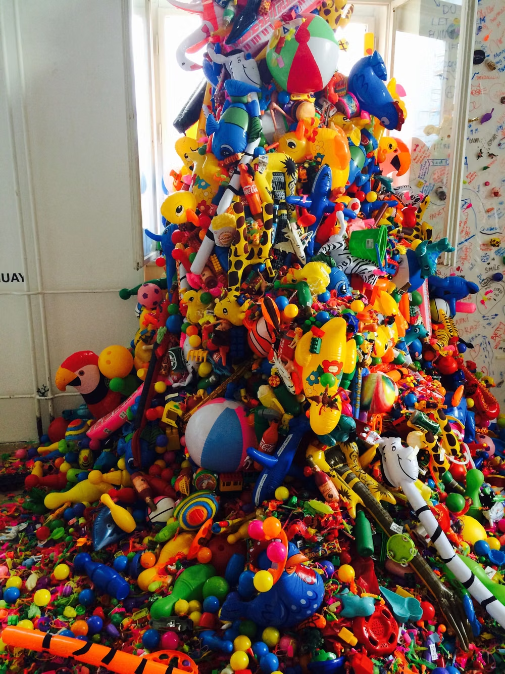
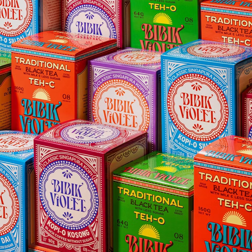
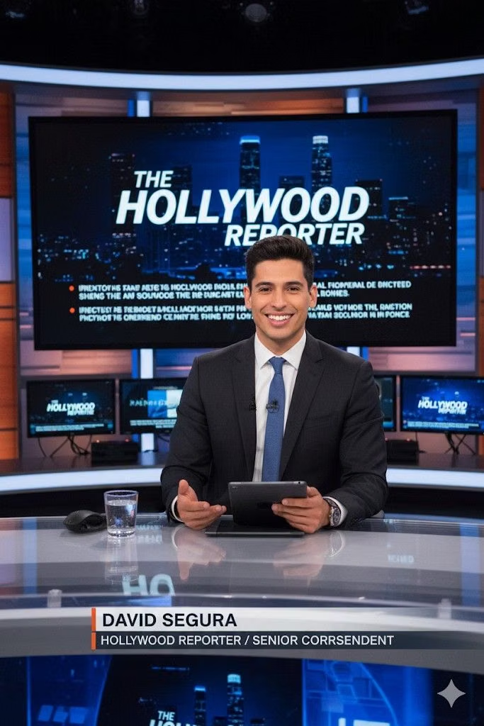
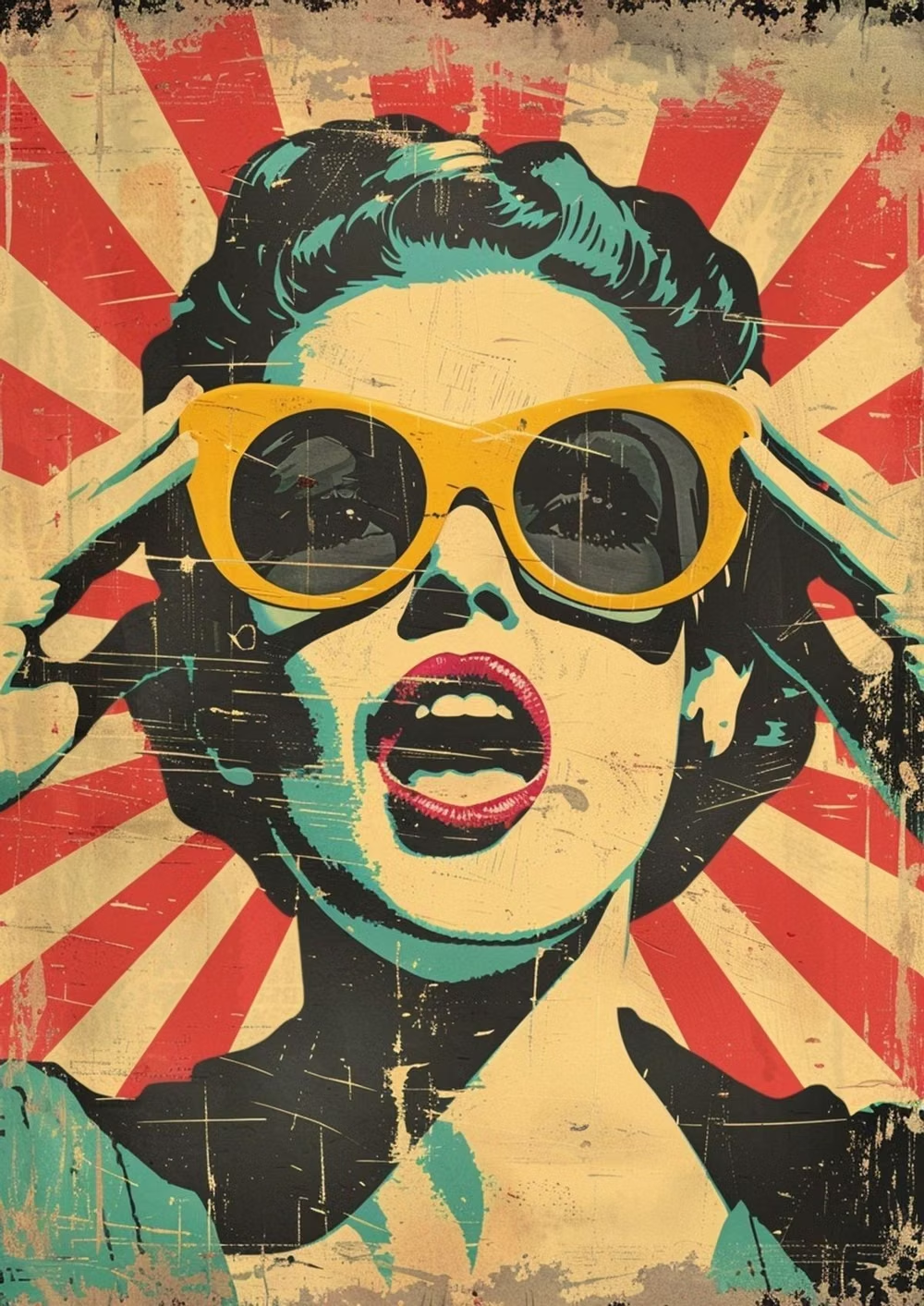
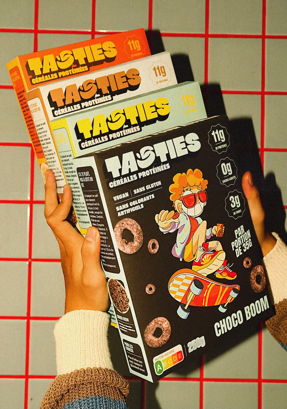
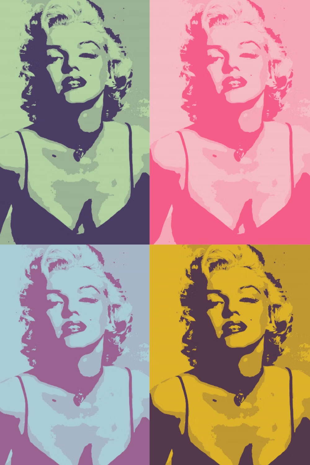
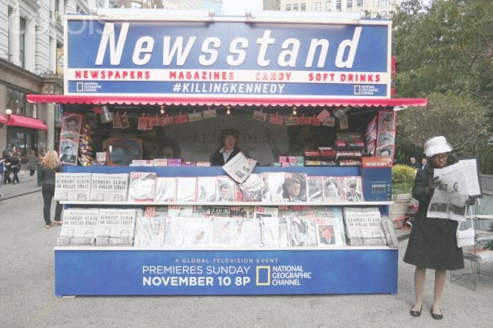
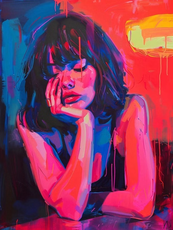
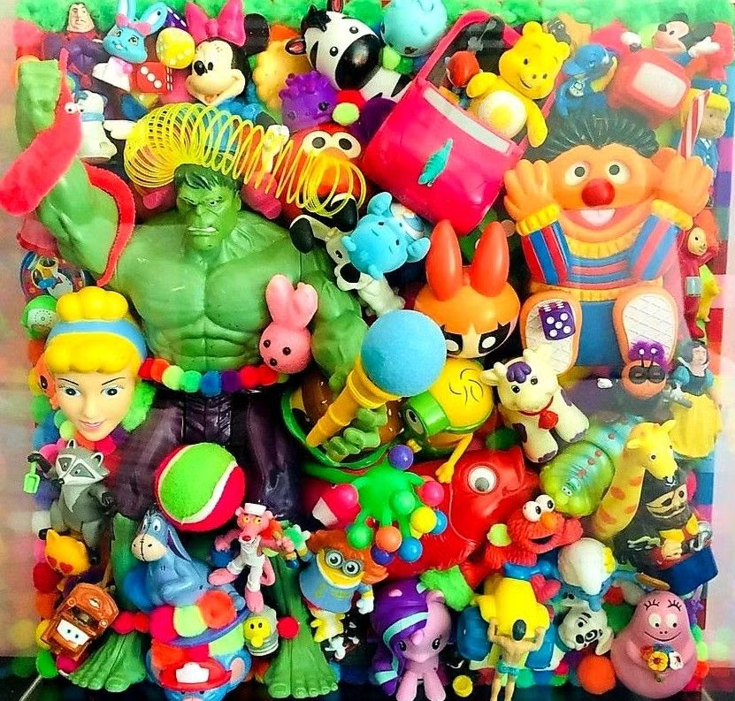
A visual study of the forms, inspirations, materials, colors, type, and cultural references associated with this UI design style.
Design principles and implementation
Use these principles to write a focused AI UI design prompt instead of asking for a vague visual treatment.
Color direction
Use bright primary and secondary inks with black outlines and white punch-outs, applying flat color swaps across repeated imagery. In a daisyUI theme, use print red or cobalt for `primary`, yellow or cyan for `secondary`, and assign white, off-white, and light cool gray to `base-100`, `base-200`, and `base-300`.
Imagery direction
Choose consumer products, celebrity portraits, comic fragments, advertising symbols, and silkscreened photographs with bold contour and repetition.
Content density
Use high visual impact with low to medium copy, repeating short phrases and images instead of filling the page with explanation.
Motion direction
Cycle colorways, repeat tiles, smash-zoom focal objects, and pop speech-like messages into place with abrupt graphic timing.
Shape language
Use thick outlines, circles, product silhouettes, comic panels, target motifs, and hard rectangular crops at exaggerated scale. In daisyUI themes, set the `--radius-*` variables to `0` or `0.25rem`.
Typography rules
Set oversized heavy sans-serif or comic display type in short slogans, using a plain compact face for prices, dates, and functional details.
Suggested Typfaces
Bangers
Fresh daisies glow in warm sunlight
Fresh daisies glow in warm sunlight
1 2 3 4 5 6 7 8 9 0
Bowlby One SC
Fresh daisies glow in warm sunlight
Fresh daisies glow in warm sunlight
1 2 3 4 5 6 7 8 9 0
Anton
Fresh daisies glow in warm sunlight
Fresh daisies glow in warm sunlight
1 2 3 4 5 6 7 8 9 0
Luckiest Guy
Fresh daisies glow in warm sunlight
Fresh daisies glow in warm sunlight
1 2 3 4 5 6 7 8 9 0
Alfa Slab One
Fresh daisies glow in warm sunlight
Fresh daisies glow in warm sunlight
1 2 3 4 5 6 7 8 9 0
Build a Pop Art interface with daisyUI
The live example translates this direction into daisyUI components and semantic theme tokens.
To generate a full page in the same visual language, give the style name and the design rules above to Blueprint MCP.
Related UI design styles
Compare nearby visual languages that share typography, shapes, use cases, or signature elements.
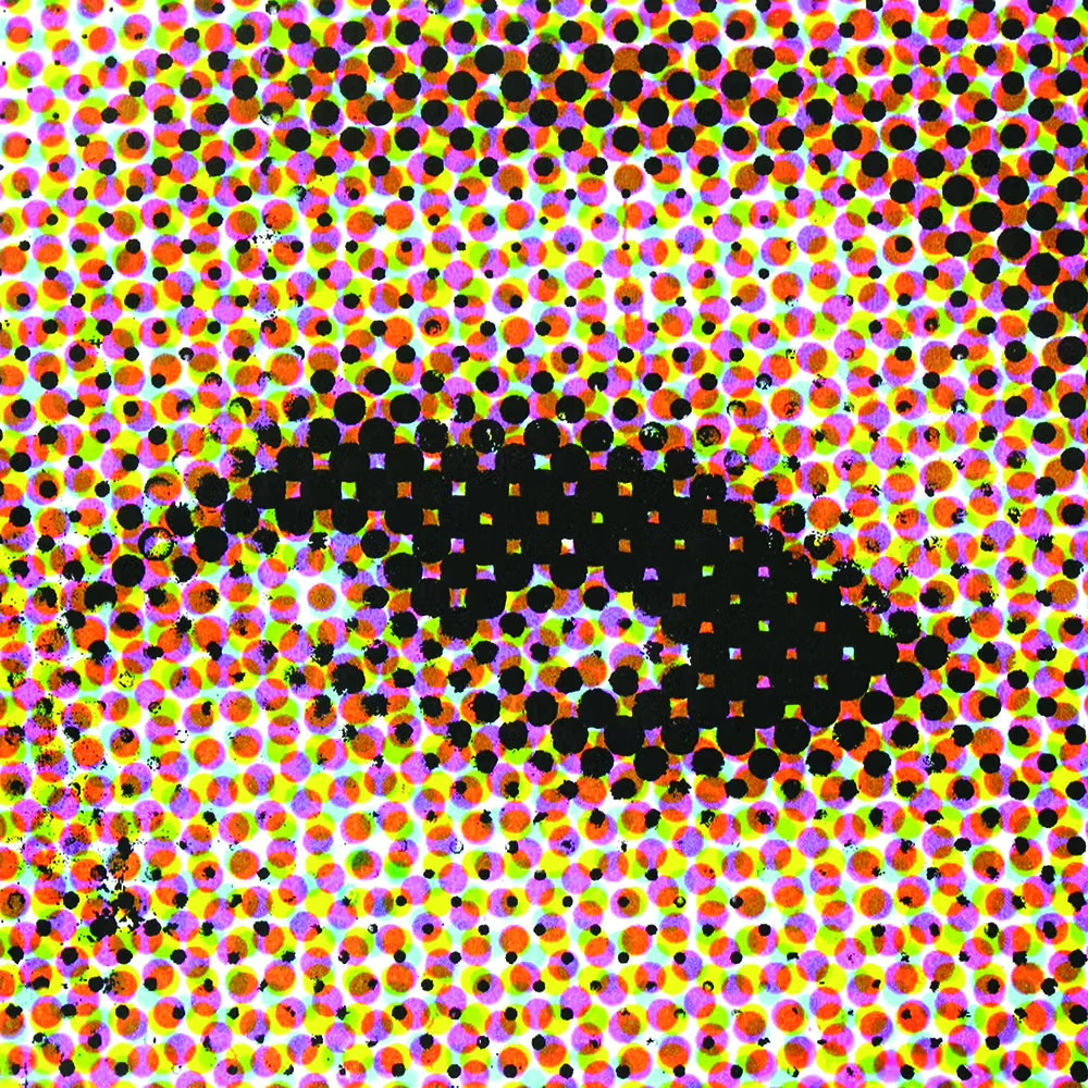
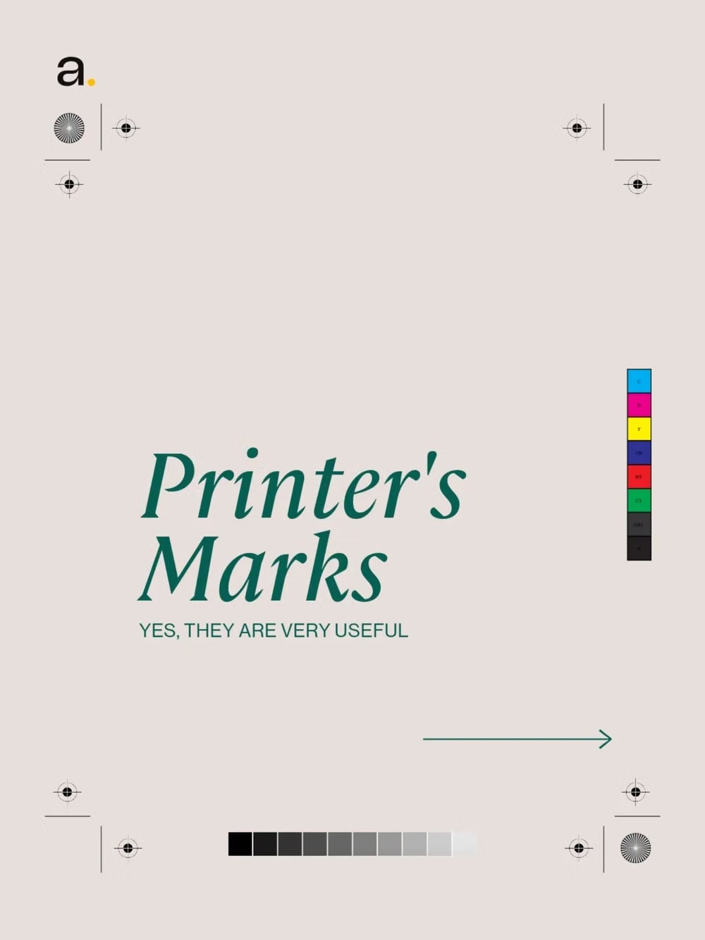
Halftone / Comic Book UI design style
Dot screens, ink outlines, speech devices, panel logic, action marks, and punchy print colors.
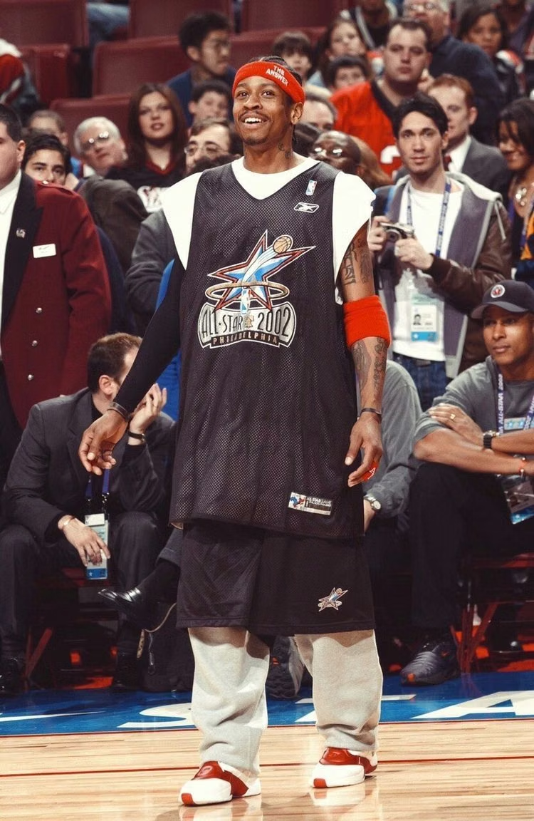
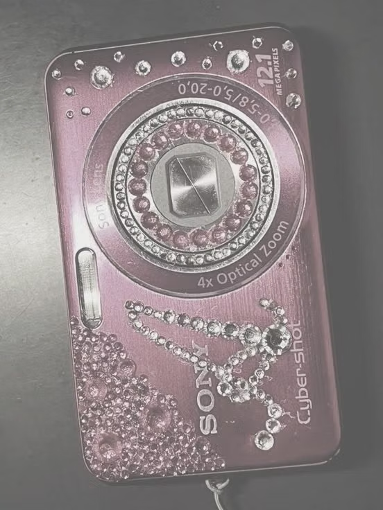
2K1 UI design style
This 2001–2004 transitional pop-cultural look mixes late-Y2K clarity with dirtier hip-hop, sports, nu-metal, teen-comedy, and early-McBling attitude.


Constructivism UI design style
Dynamic diagonals, photomontage, bold sans-serif type, limited red-black palettes, and propagandistic visual force.