Minimalism UI design style
Deliberate reduction leaves only the content, controls, imagery, and structure needed for one focused experience.
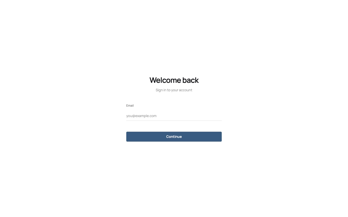
Design overview
- Signature elements
- dominant negative space, very few elements, restrained palette, single focal point, plain typography, minimal ornament
- Best suited to
- Focused tools, landing pages, portfolios, premium commerce, reading experiences, and single-purpose products.
- Layout principles
- Center each view on one task or message, eliminate secondary containers, and use large uninterrupted areas to isolate the primary action.
History and origins
A fact-checked account of where this visual language came from, with links to the references used.
- Period
- 1960s art; recurring in digital design since the 1990s
- Origin
- New York art, with wider modernist precedents
Minimalism was named for an American art movement that emerged in New York in the early 1960s, favoring literal form, industrial fabrication, repetition, and reduced composition. Digital designers later borrowed reduction and negative space as interface strategies, but a sparse interface is an adaptation of those ideas rather than the historical art movement itself.
Moodboard and visual references
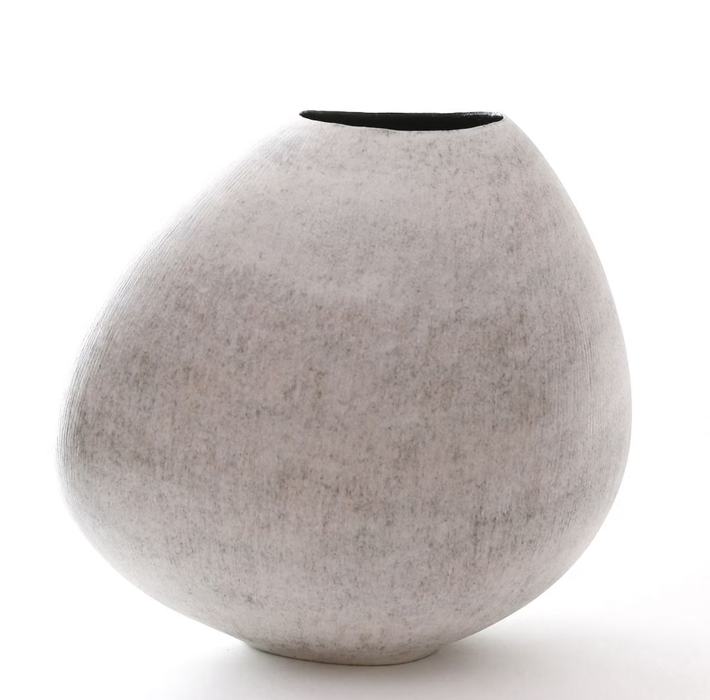
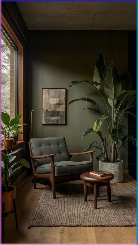
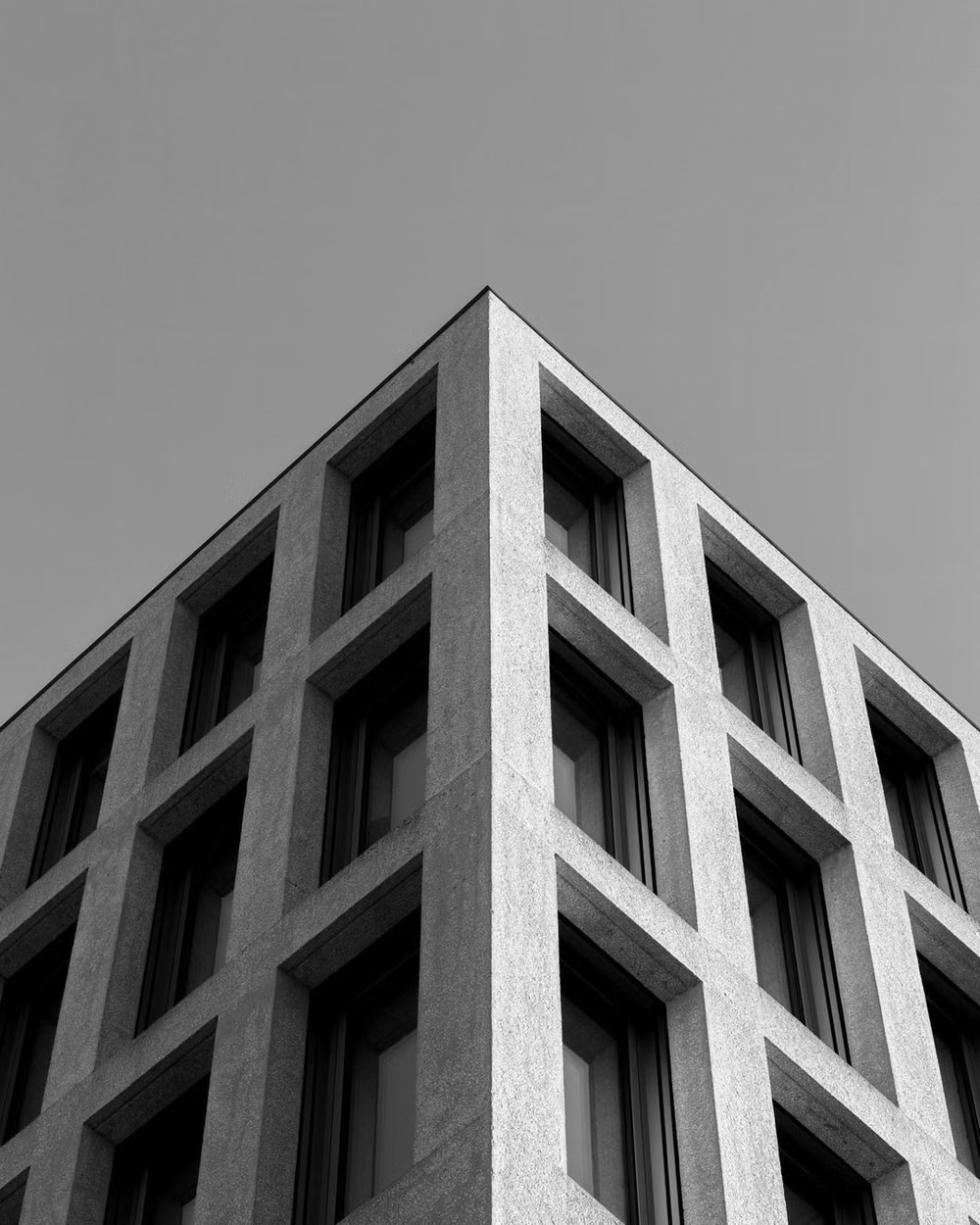
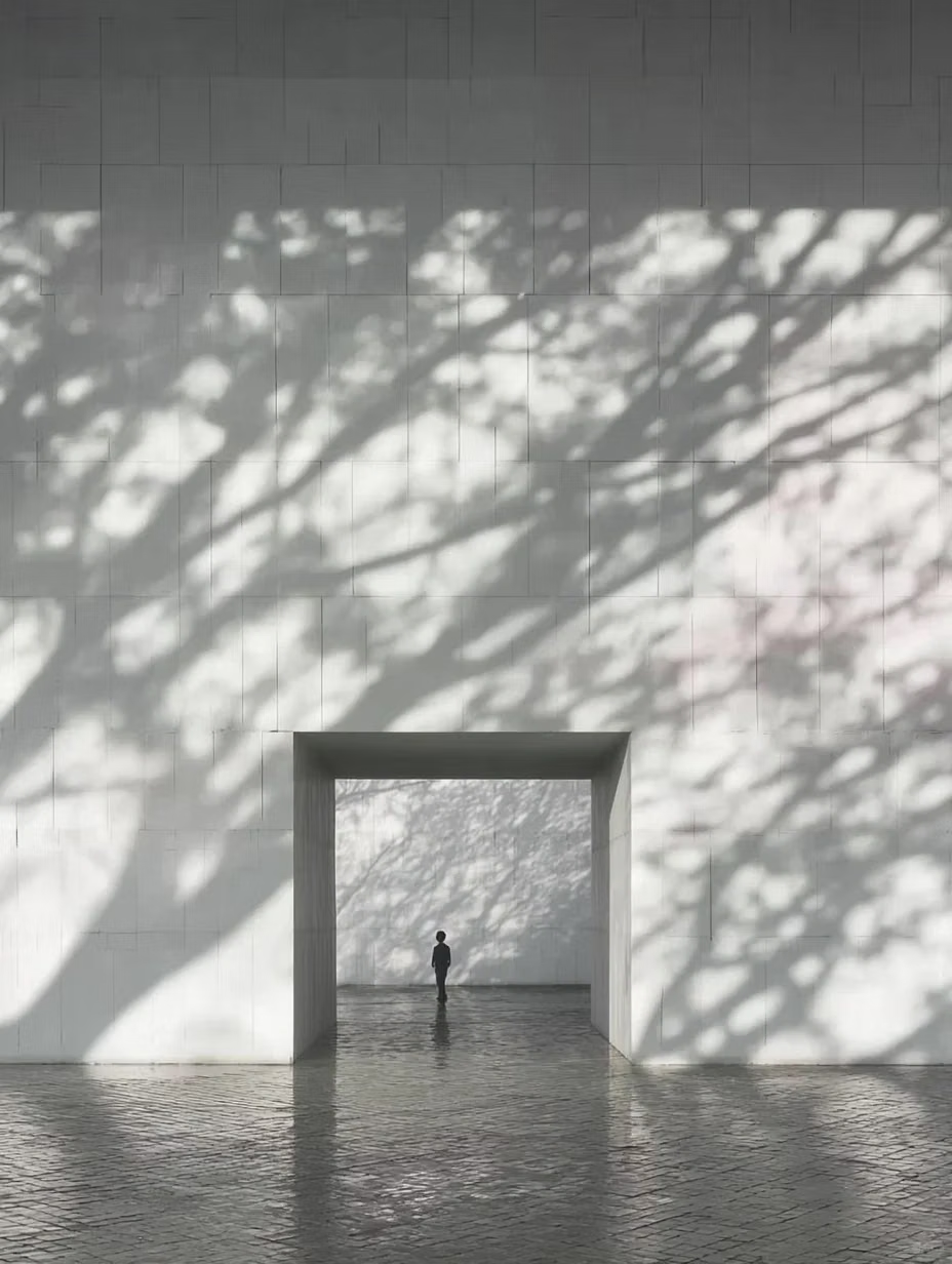
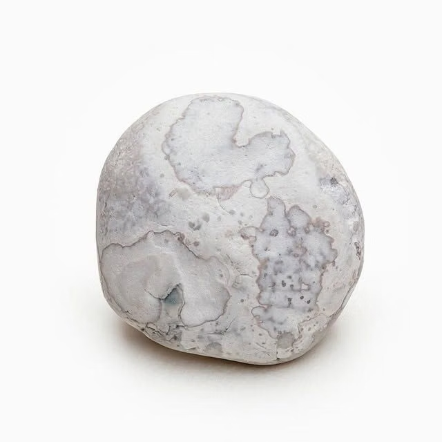
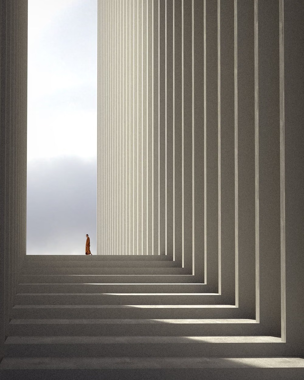
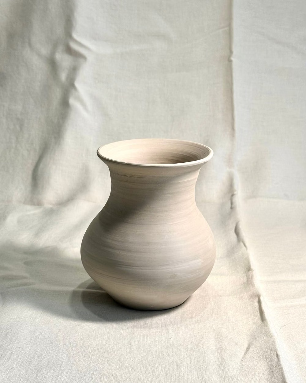
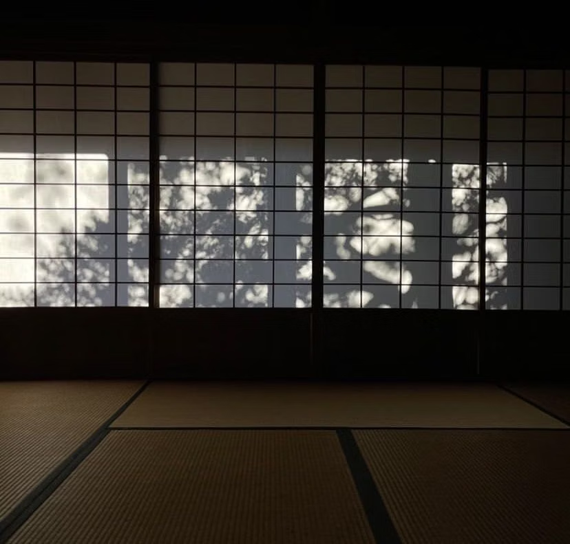
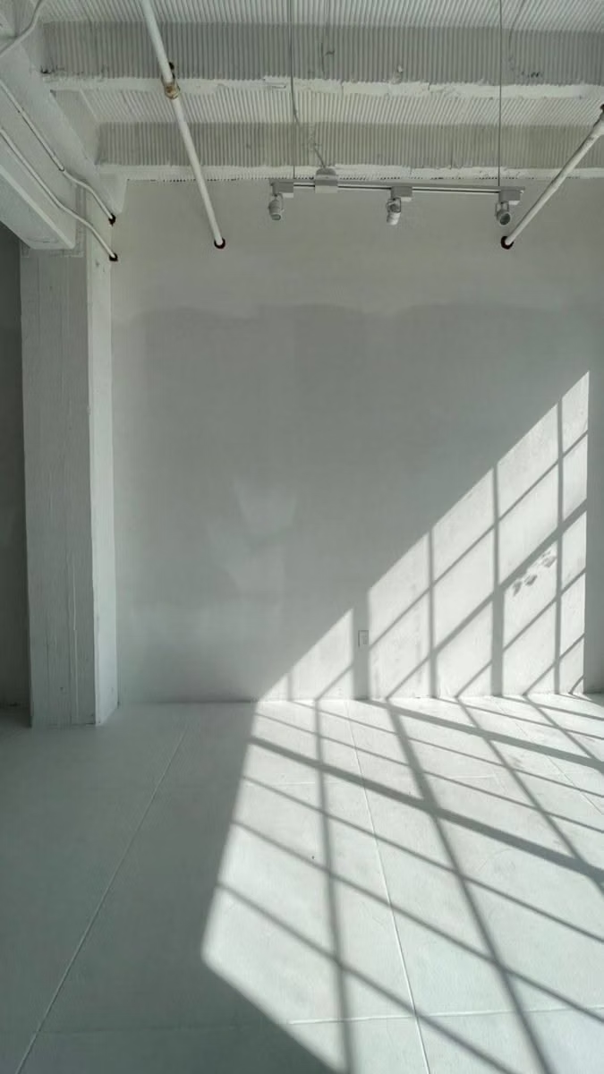
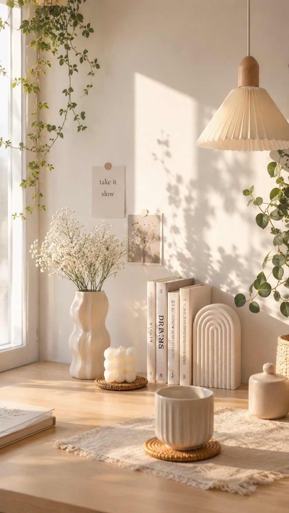
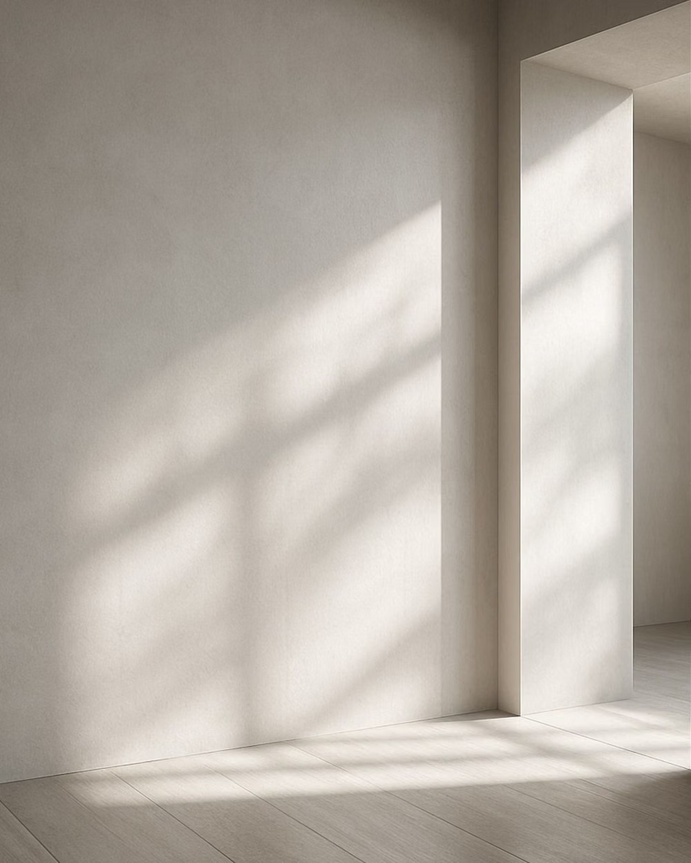
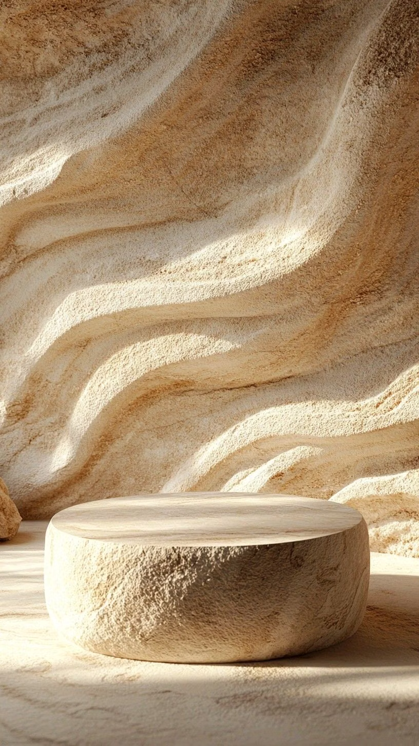
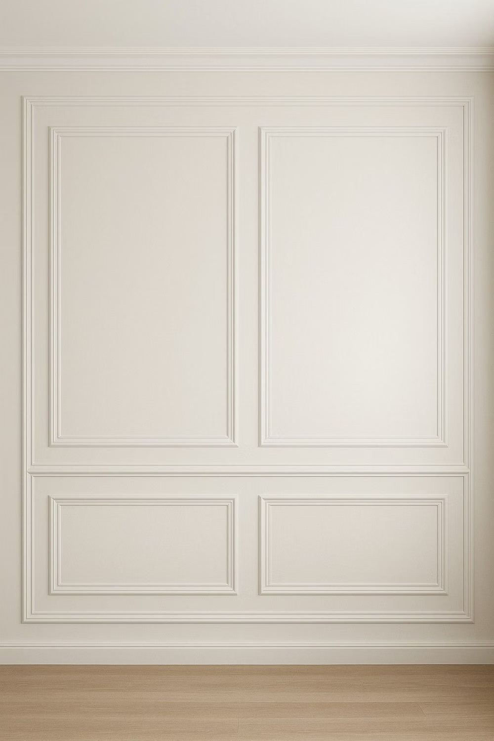
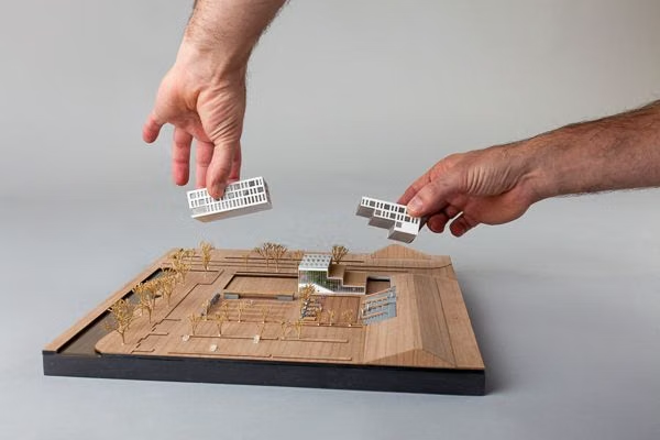
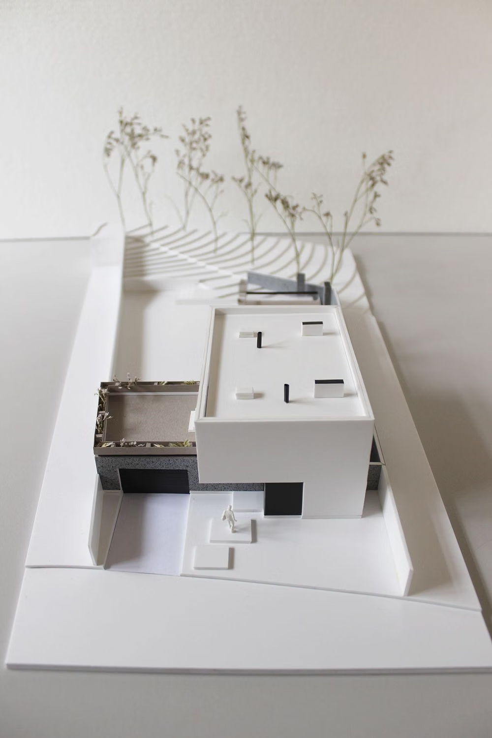
A visual study of the forms, inspirations, materials, colors, type, and cultural references associated with this UI design style.

















Design principles and implementation
Use these principles to write a focused AI UI design prompt instead of asking for a vague visual treatment.
Color direction
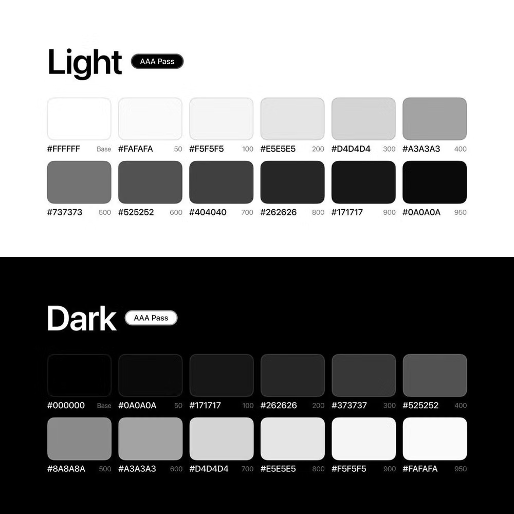
Limit the palette to neutrals and one restrained accent, using color for focus or state instead of dividing every content group. In a daisyUI theme, use the single restrained accent for `primary`, a low-chroma tonal neighbor for `secondary`, and keep `base-100`, `base-200`, and `base-300` within a tight white-to-gray or near-black tonal range.
Imagery direction
Use one purposeful image or none, give it a quiet setting, and exclude any visual that does not strengthen the central message or decision.
Content density
Keep density intentionally low, shorten visible choices, and defer supporting detail until the user requests or needs it.
Motion direction
Use motion only to explain state or continuity, favoring short fades and direct transitions with no ambient decorative loops.
Shape language
Use few containers, plain rectangles, modest radii, unembellished icons, and only the borders or dividers needed to clarify interaction. In daisyUI themes, set the `--radius-*` variables between `0.25rem` and `1rem`.
Typography rules
Use one neutral family, a sparse type scale, concise copy, and generous line spacing, creating hierarchy through size and weight alone.
Suggested Typfaces
Inter
Fresh daisies glow in warm sunlight
Fresh daisies glow in warm sunlight
1 2 3 4 5 6 7 8 9 0
Manrope
Fresh daisies glow in warm sunlight
Fresh daisies glow in warm sunlight
1 2 3 4 5 6 7 8 9 0
Instrument Sans
Fresh daisies glow in warm sunlight
Fresh daisies glow in warm sunlight
1 2 3 4 5 6 7 8 9 0
DM Sans
Fresh daisies glow in warm sunlight
Fresh daisies glow in warm sunlight
1 2 3 4 5 6 7 8 9 0
Source Sans 3
Fresh daisies glow in warm sunlight
Fresh daisies glow in warm sunlight
1 2 3 4 5 6 7 8 9 0
Build a Minimalism interface with daisyUI
The live example translates this direction into daisyUI components and semantic theme tokens.
To generate a full page in the same visual language, give the style name and the design rules above to Blueprint MCP.
Related UI design styles
Compare nearby visual languages that share typography, shapes, use cases, or signature elements.
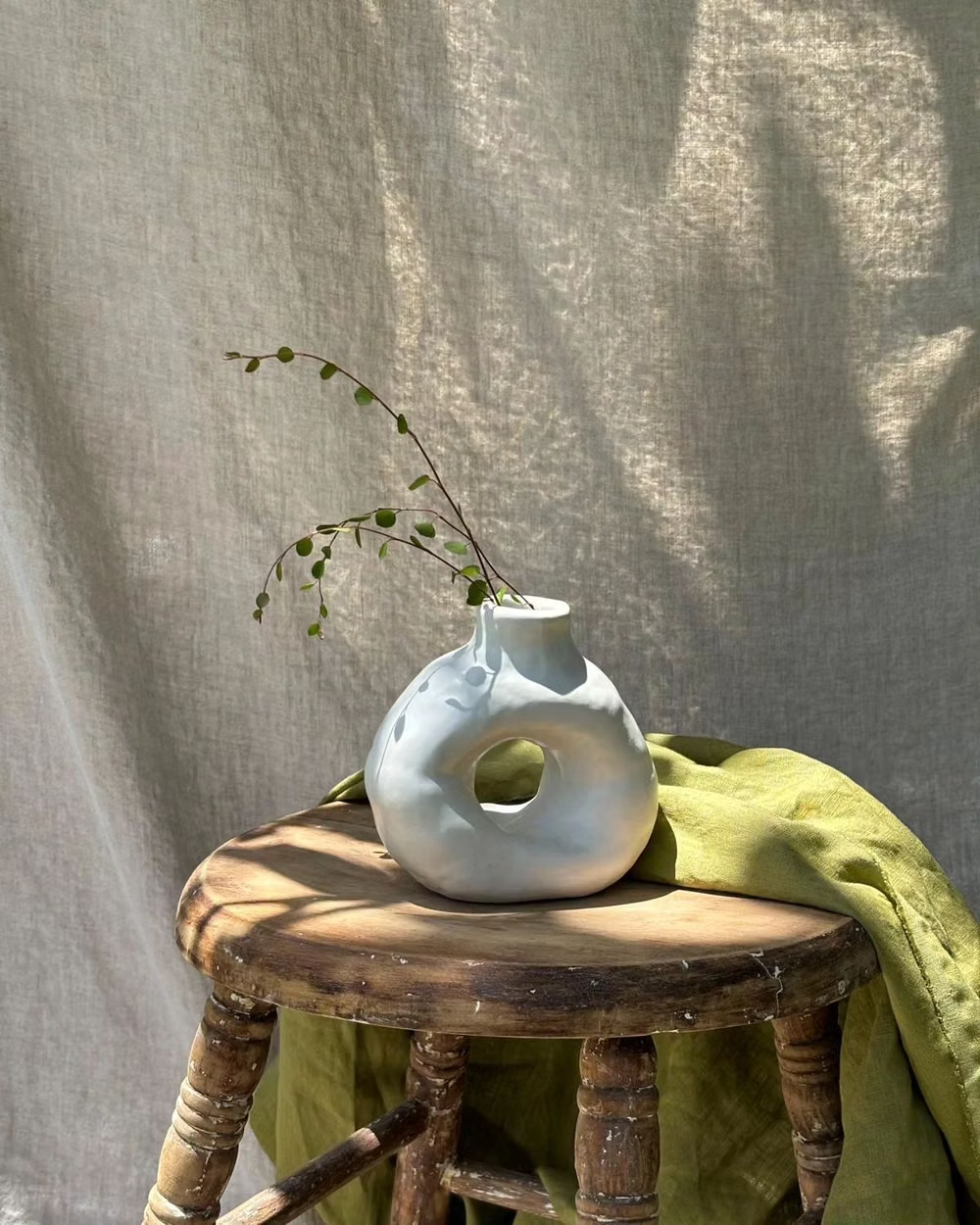

Millennial Beige UI design style
A calm tonal aesthetic layers cream, tan, sand, taupe, and greige with tactile natural details, soft contrast, and intentional empty space.

Clean UI design style
An engineered interface language pairs tightly controlled spacing, measured grids, layered neutral surfaces, and precise micro-details so dense information feels calm, airy, and aligned.

Monochrome UI design style
A single hue or neutral family creates hierarchy through tone, scale, texture, and contrast rather than varied color.