Millennial Beige UI design style
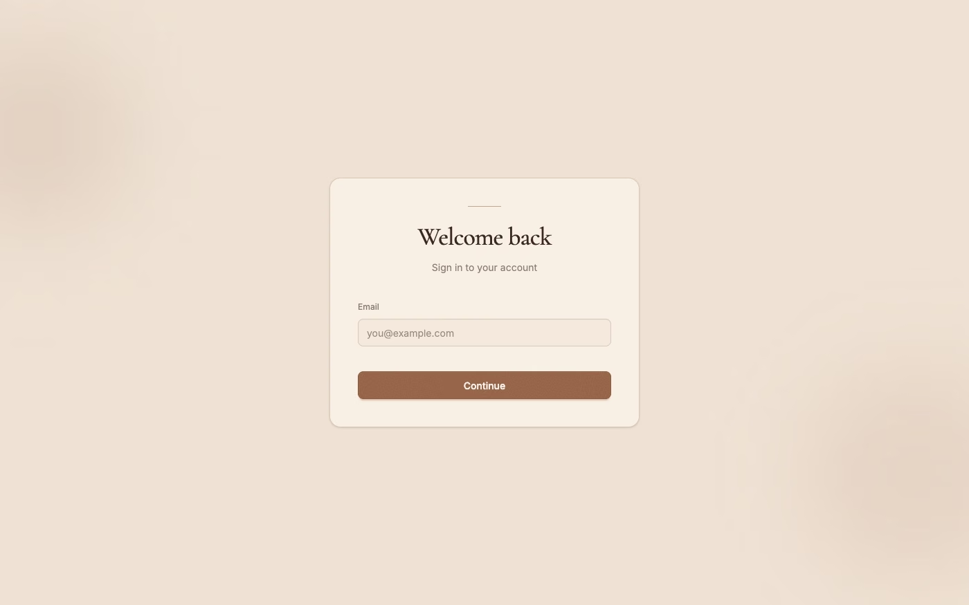
A calm tonal aesthetic layers cream, tan, sand, taupe, and greige with tactile natural details, soft contrast, and intentional empty space.
Design overview
- Signature elements
- layered warm neutrals, intentional empty space, serif display type, quiet sans-serif copy, faint natural texture, soft daylight, restrained organic forms. In daisyUI themes, set `--noise: 1;`.
- Best suited to
- Wellness, skincare, home and lifestyle commerce, hospitality, portfolios, calm productivity tools, and refined consumer services.
- Layout principles
- Build a restrained grid with broad margins and a few generously spaced content groups, allowing one product, message, or action to anchor each section without making functional controls hard to find.
History and origins
A fact-checked account of where this visual language came from, with links to the references used.
- Period
- Late 2010s–2020s
- Origin
- Global lifestyle branding, social media, and interiors
Millennial Beige is an informal retrospective label, not a movement with a single founder or documented birthplace. It describes the warm-neutral interiors, direct-to-consumer branding, and restrained lifestyle imagery that became especially visible online in the late 2010s, overlapping with the contemporaneous “Austurbane” preference for beige, stone, fabric, and carefully staged natural materials.
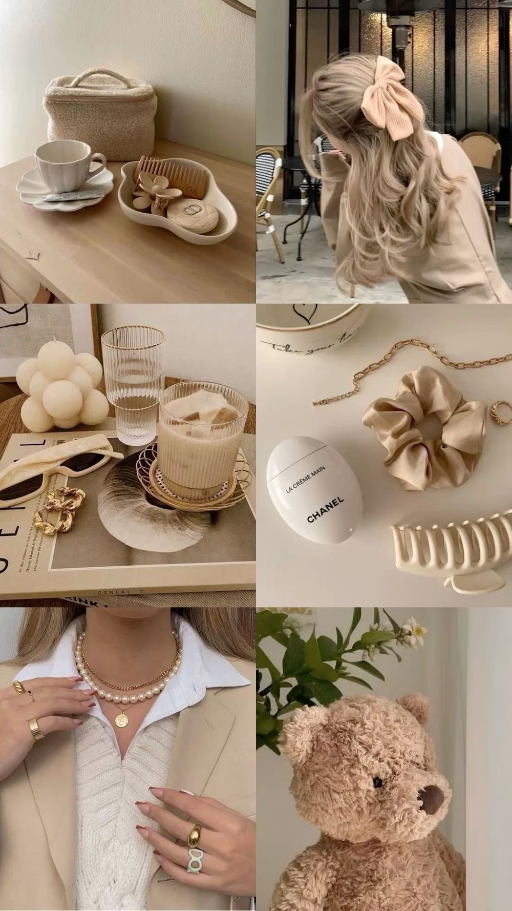
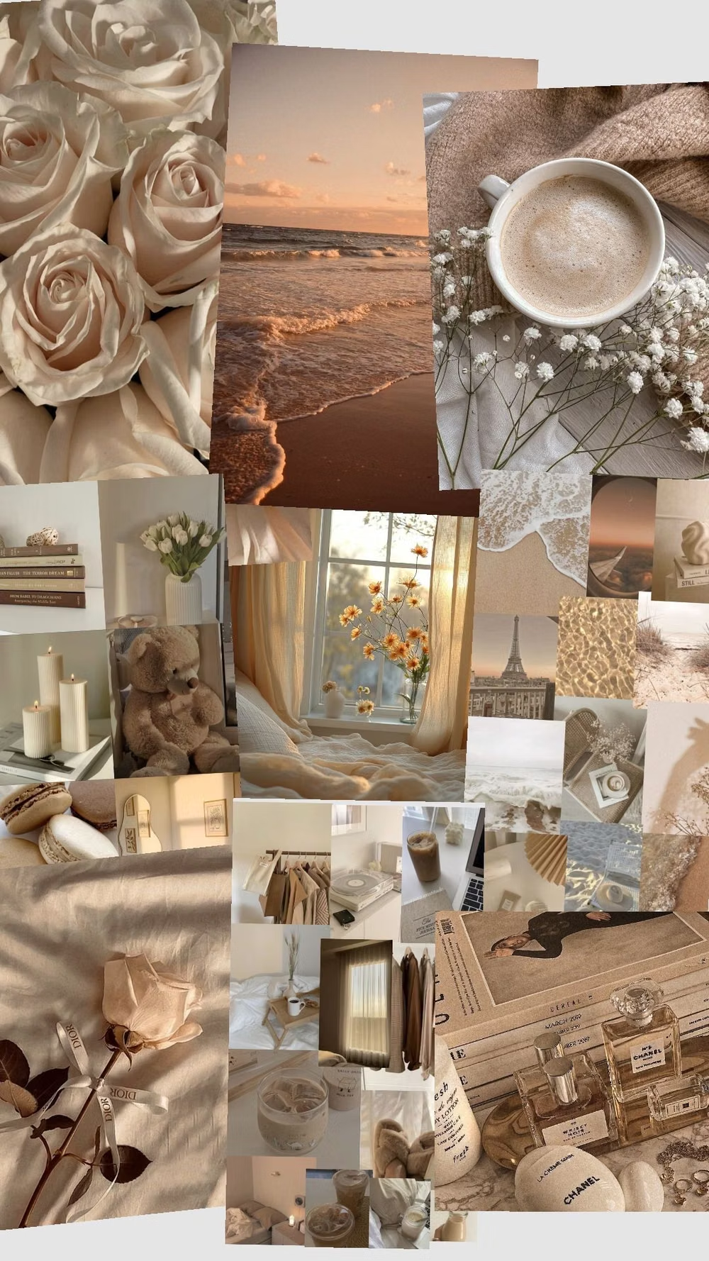
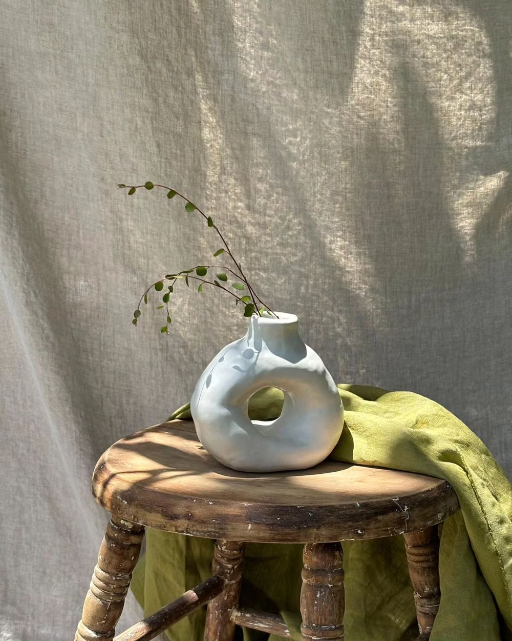
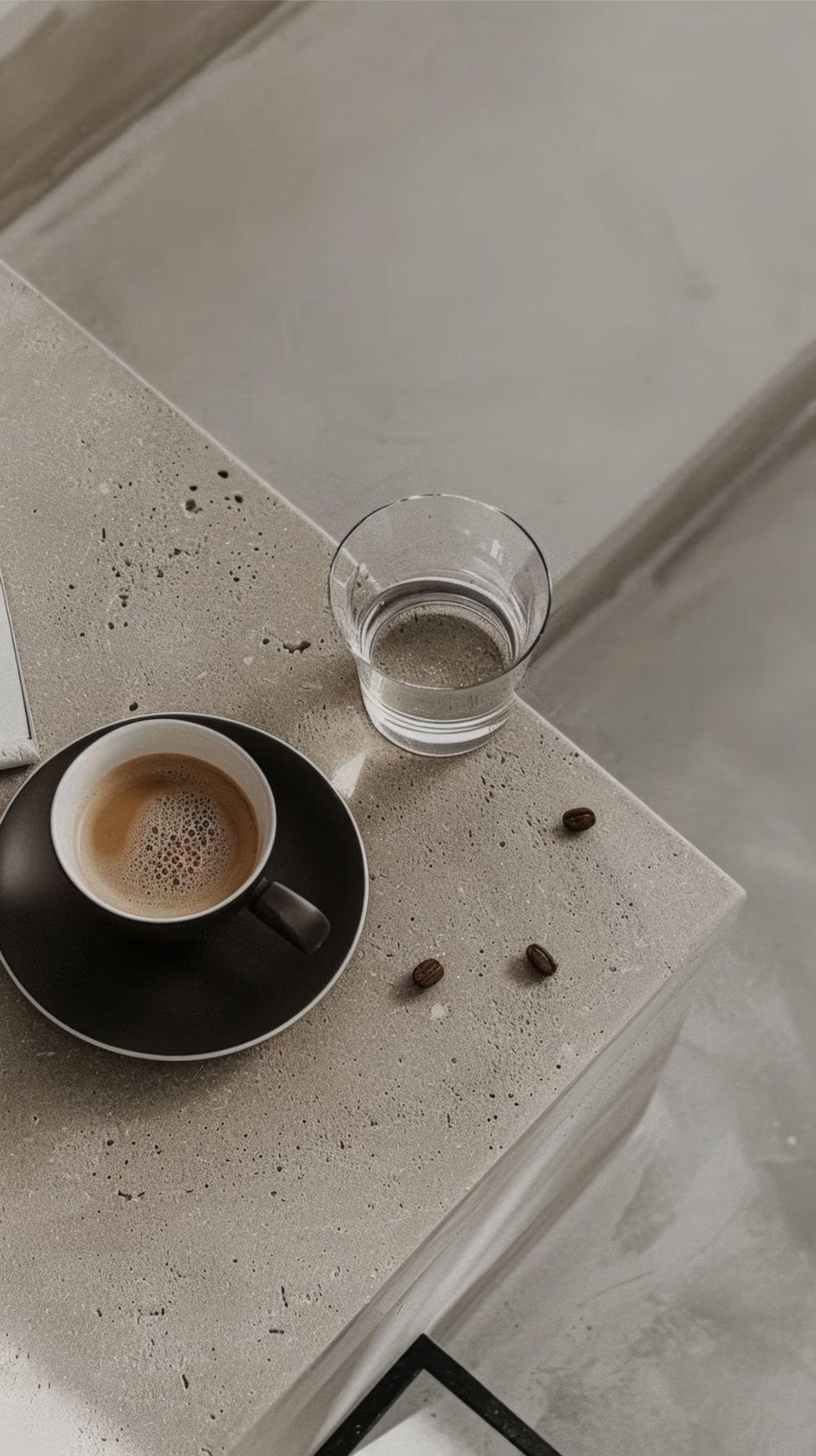
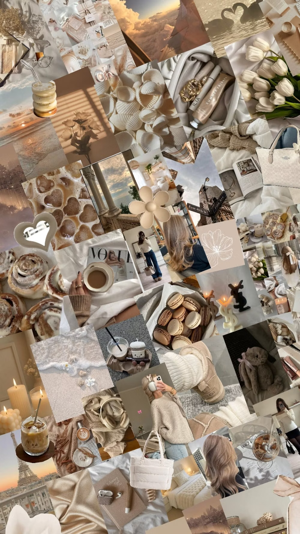
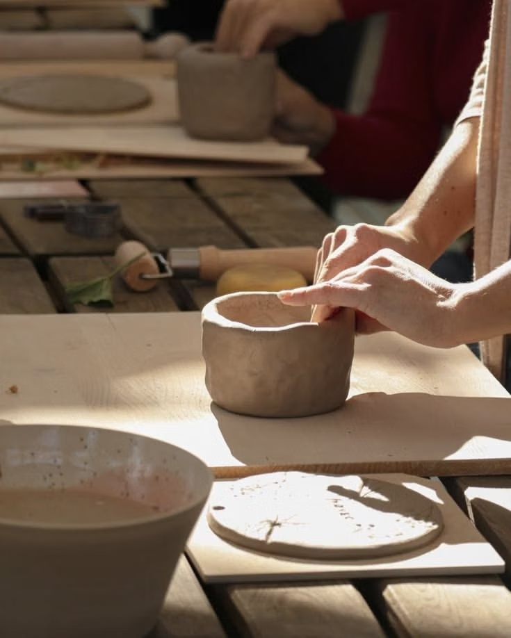
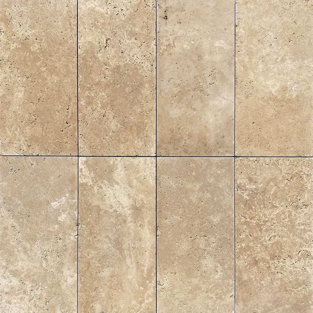
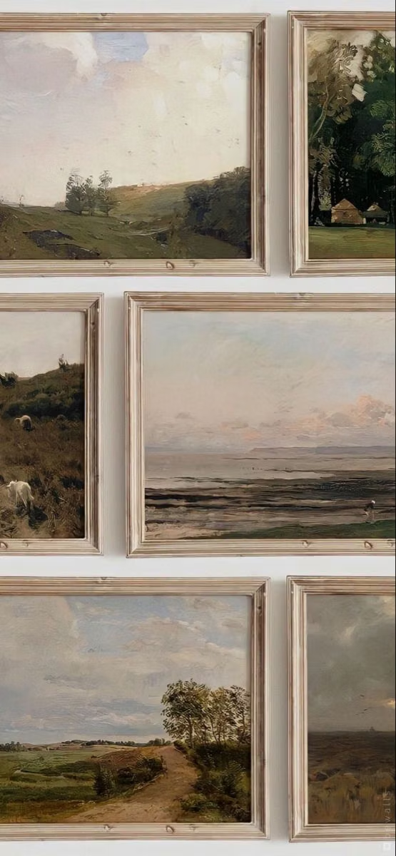
Moodboard and visual references
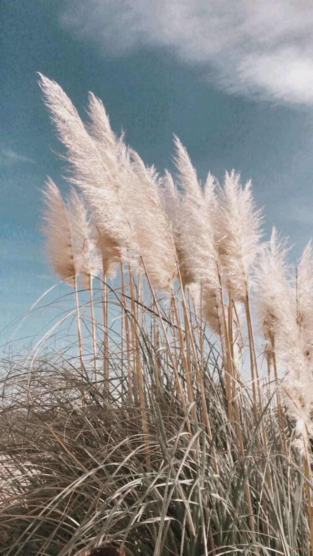
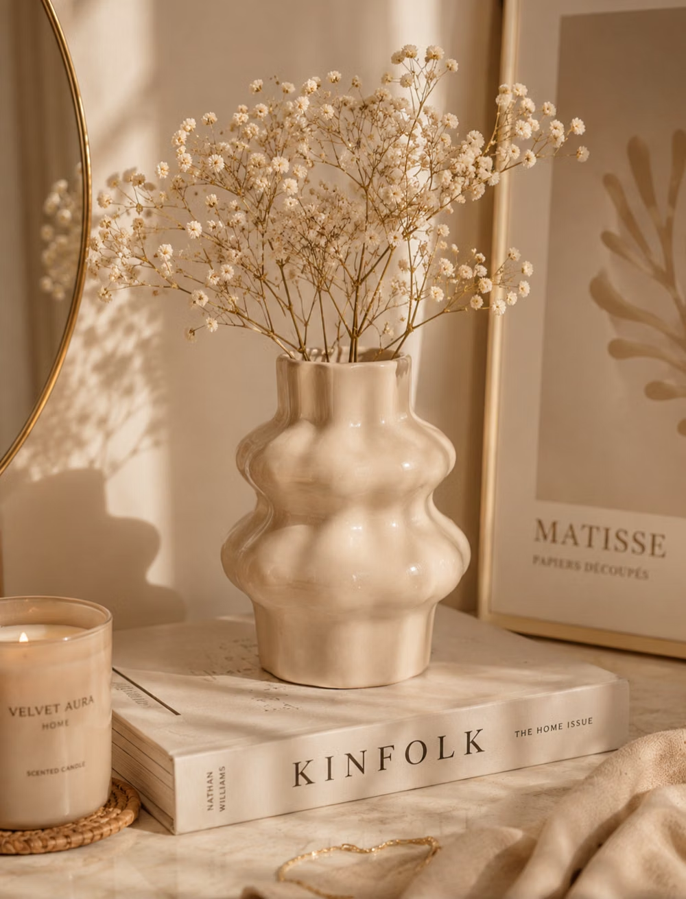
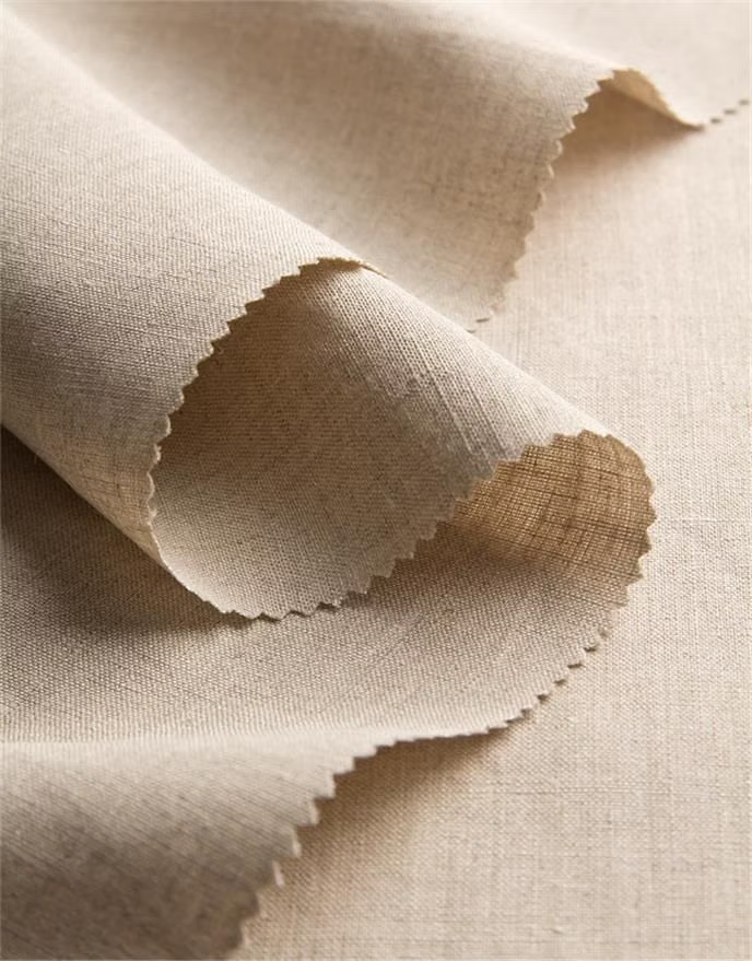
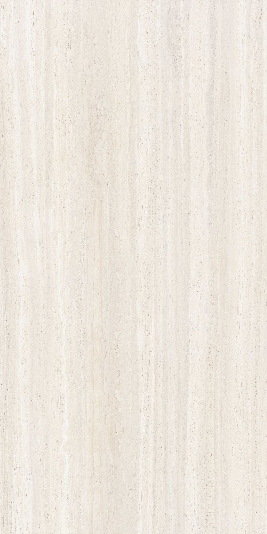
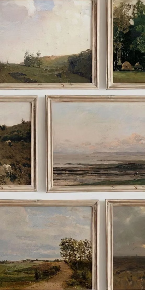
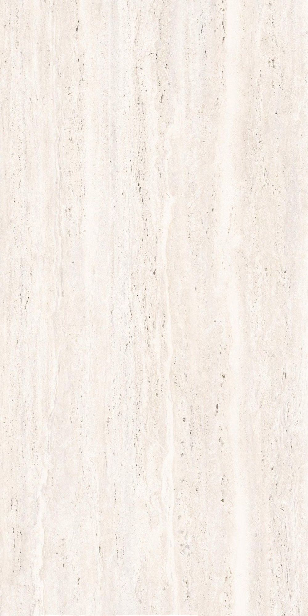
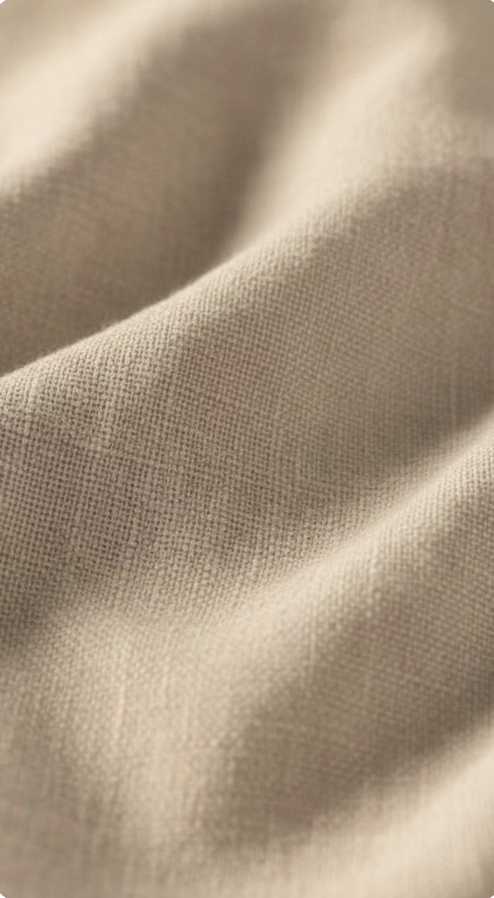
A visual study of the forms, inspirations, materials, colors, type, and cultural references associated with this UI design style.

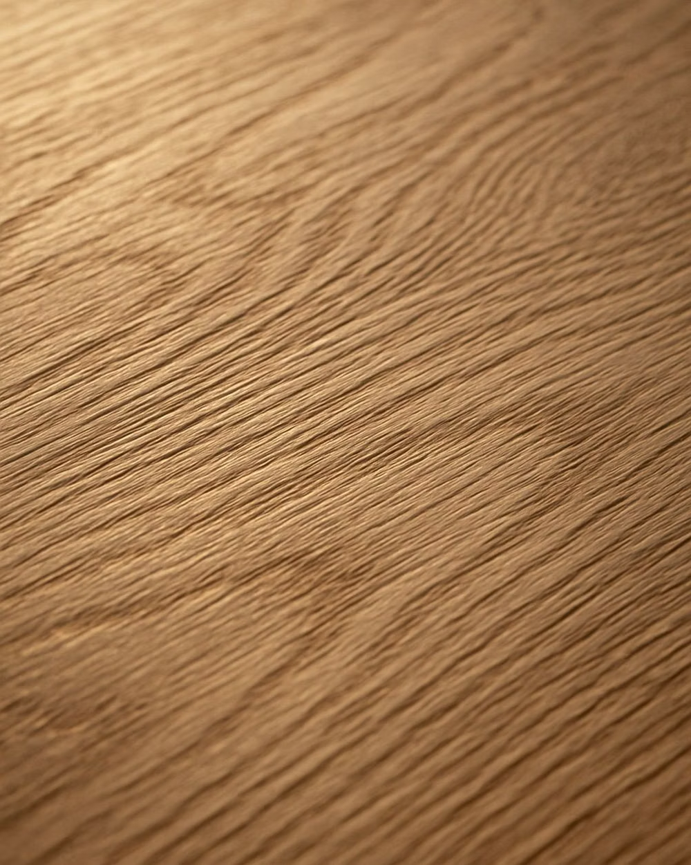

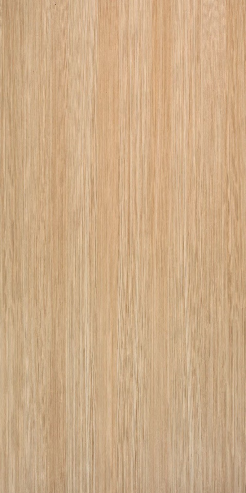

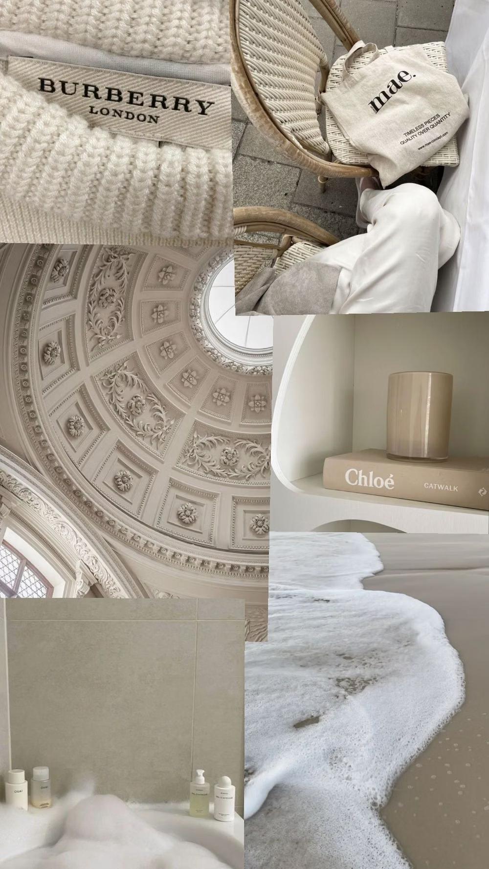
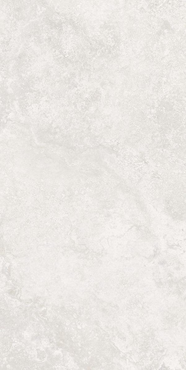
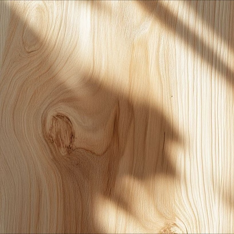
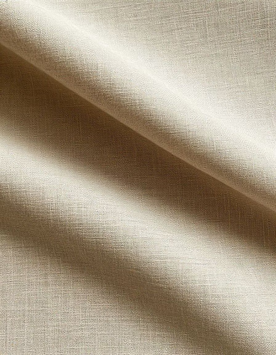
![pale oak wood grain close up photograph - [WOOD] IWA2501 : BIRCH : 국내재고운영리스트](../../moodboards/millennial-beige/24-inspiration-pale-oak.avif)
Design principles and implementation
Use these principles to write a focused AI UI design prompt instead of asking for a vague visual treatment.
Color direction
Layer cream, tan, sand, taupe, and warm greige as distinct background and surface roles; use espresso or deep umber for readable text, then reserve caramel or muted clay for rare accents. In a daisyUI theme, use muted clay or caramel for `primary`, dusty taupe for `secondary`, and step `base-100`, `base-200`, and `base-300` from warm cream through pale sand to greige.
Imagery direction
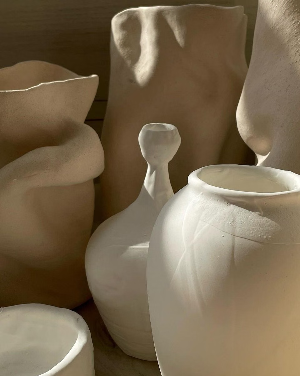
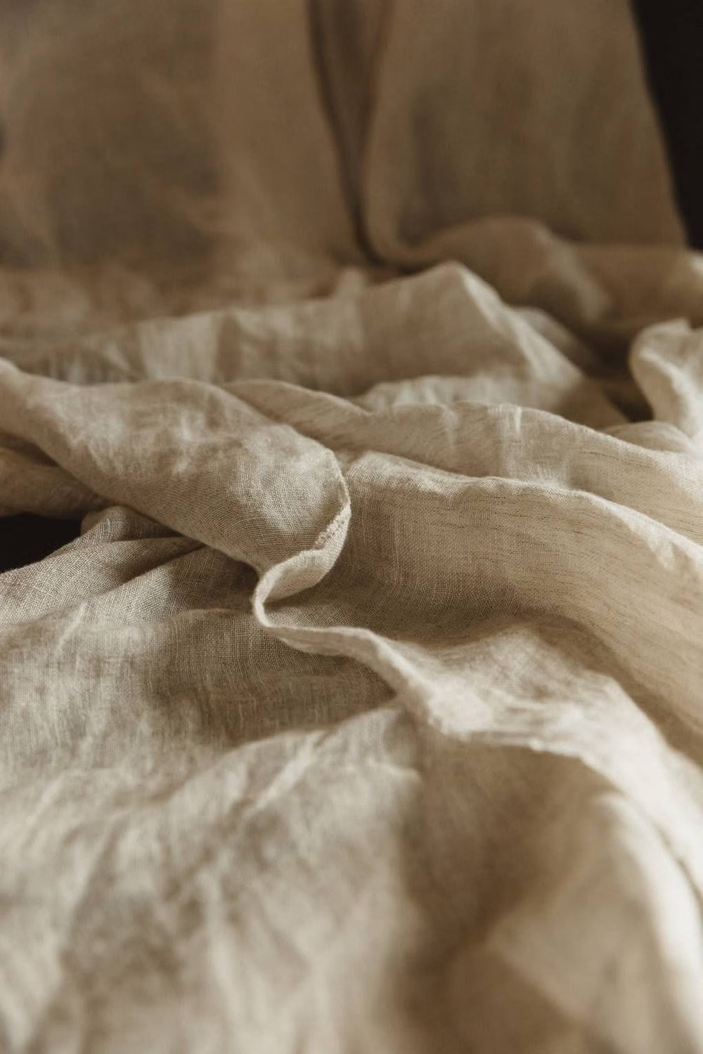
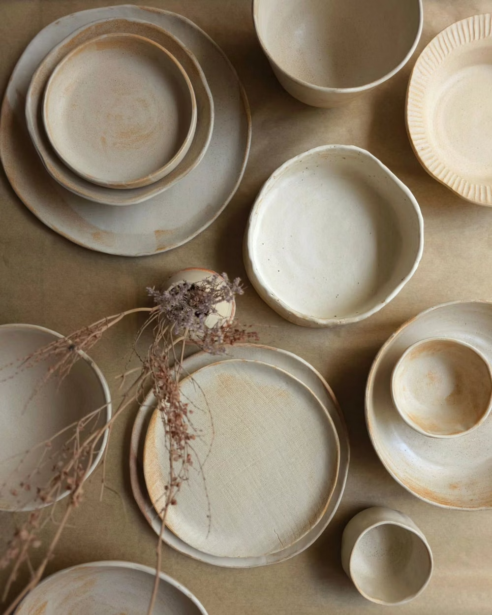
Use softly lit editorial photography with linen, pale wood, ceramics, stone, handmade objects, or warm skin tones; preserve grain and material variation so the neutral palette feels tactile rather than flat.
Content density
Keep density low to moderate with deliberate breathing room, concise copy, and clearly grouped forms or products; avoid both crowded card grids and empty space that obscures the next action.
Motion direction
Use unhurried fades, gentle vertical reveals, soft image dissolves, and subtle tonal hover changes; avoid bounce, rapid parallax, glossy effects, and looping spectacle.
Shape language
Favor broad rectangles, modest rounded corners, thin warm-taupe borders, shallow tonal elevation, and occasional arches or softly irregular organic silhouettes. In daisyUI themes, set the `--radius-*` variables between `0.25rem` and `1rem`.
Typography rules
Set every title and display heading in a refined serif, and set body copy, labels, navigation, controls, and data in a restrained sans-serif; use relaxed line spacing and a clear weight hierarchy.
Suggested Typfaces
Cormorant Garamond
Fresh daisies glow in warm sunlight
Fresh daisies glow in warm sunlight
1 2 3 4 5 6 7 8 9 0
Lora
Fresh daisies glow in warm sunlight
Fresh daisies glow in warm sunlight
1 2 3 4 5 6 7 8 9 0
DM Serif Display
Fresh daisies glow in warm sunlight
Fresh daisies glow in warm sunlight
1 2 3 4 5 6 7 8 9 0
Inter
Fresh daisies glow in warm sunlight
Fresh daisies glow in warm sunlight
1 2 3 4 5 6 7 8 9 0
Manrope
Fresh daisies glow in warm sunlight
Fresh daisies glow in warm sunlight
1 2 3 4 5 6 7 8 9 0
Build a Millennial Beige interface with daisyUI
The live example translates this direction into daisyUI components and semantic theme tokens.
To generate a full page in the same visual language, give the style name and the design rules above to Blueprint MCP.
Related UI design styles
Compare nearby visual languages that share typography, shapes, use cases, or signature elements.
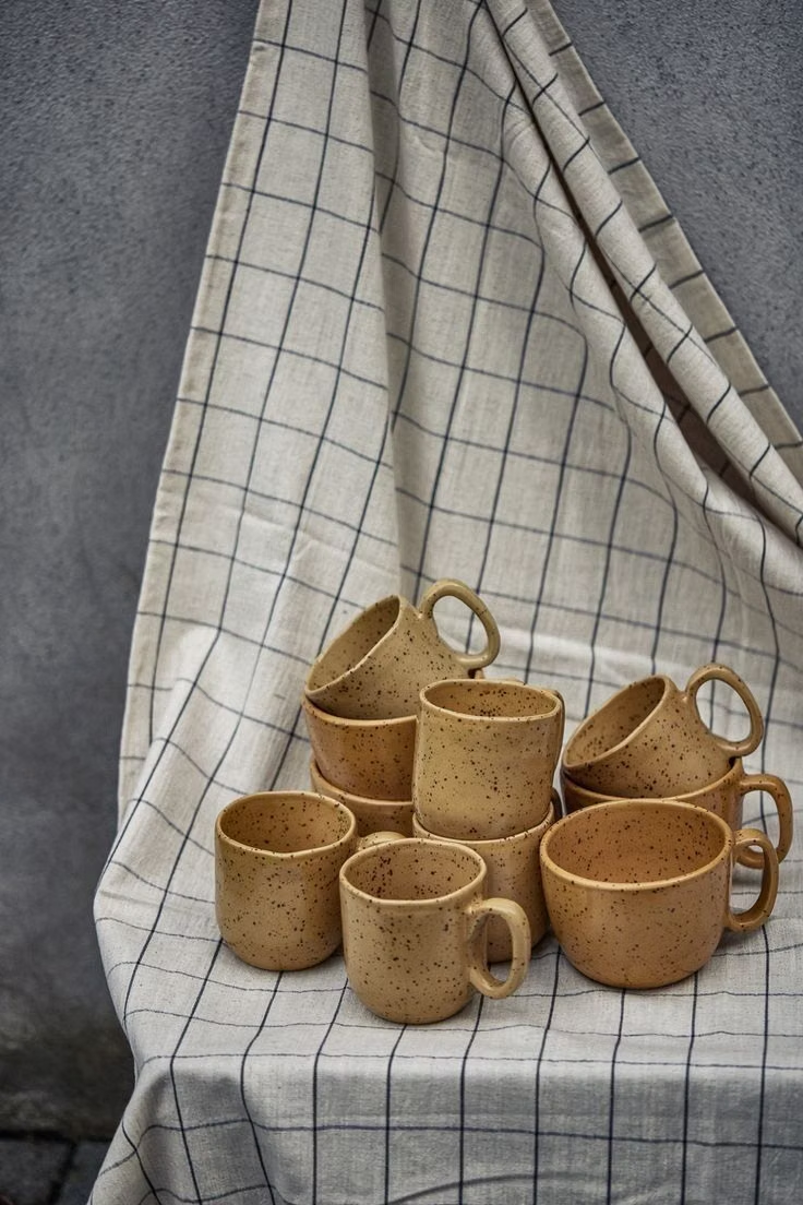
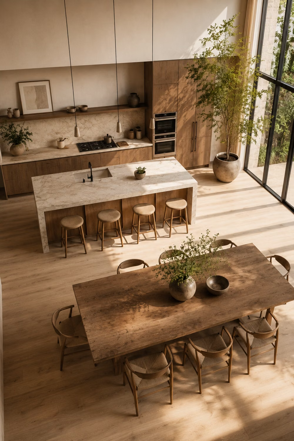

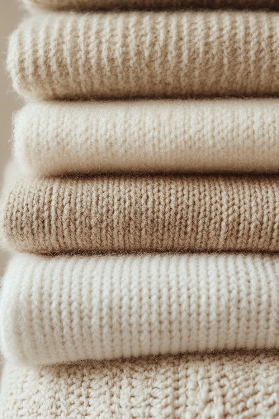
Scandinavian Modern UI design style
Functional simplicity, light palettes, warm natural materials, clean lines, and friendly human-centered restraint.
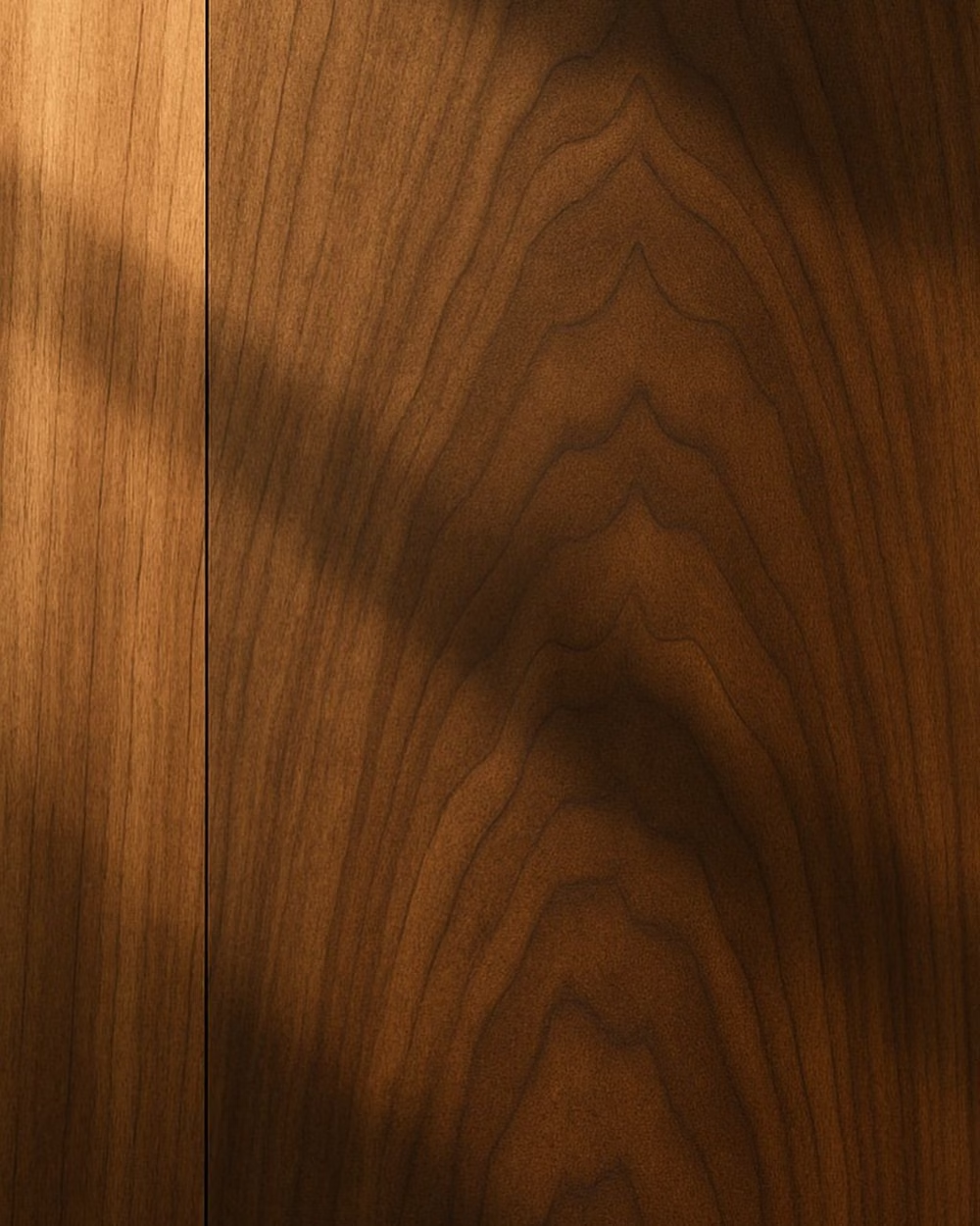
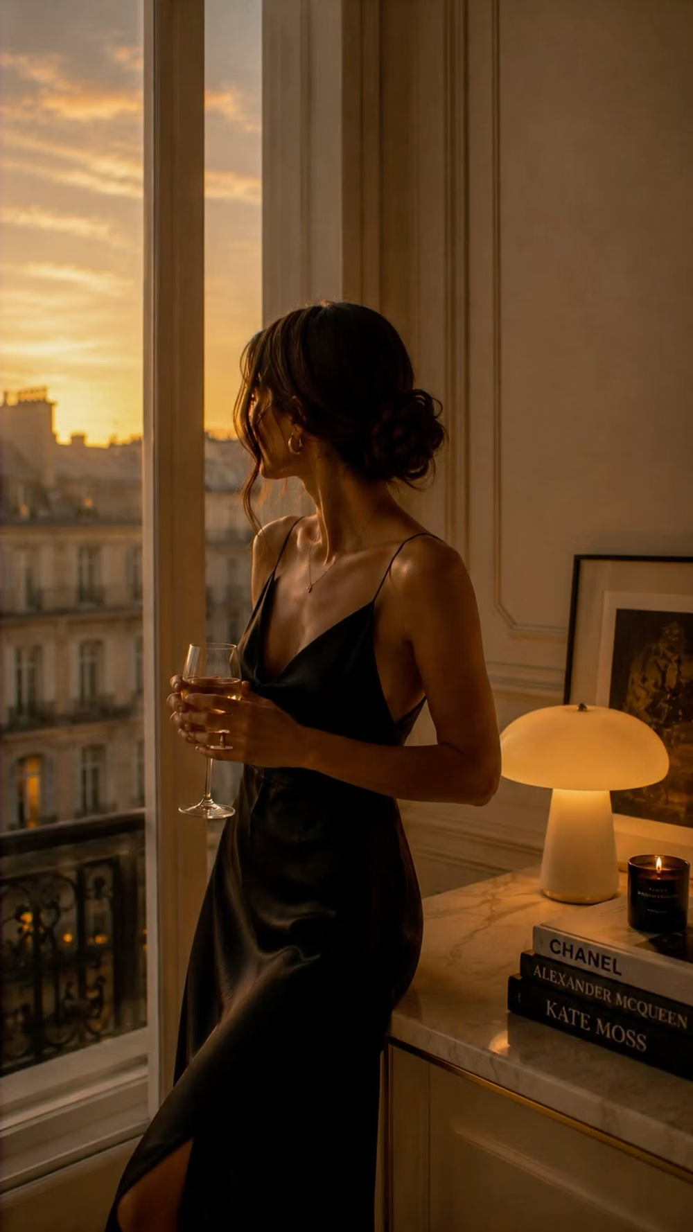
Quiet Luxury UI design style
Restrained palettes, refined serif or neo-grotesque type, generous space, subtle motion, and meticulous premium detail.
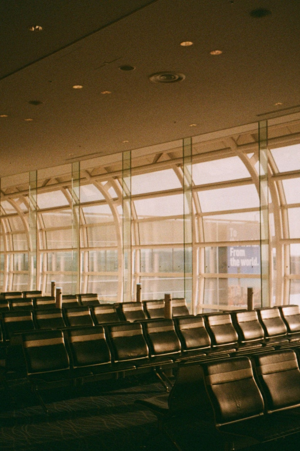
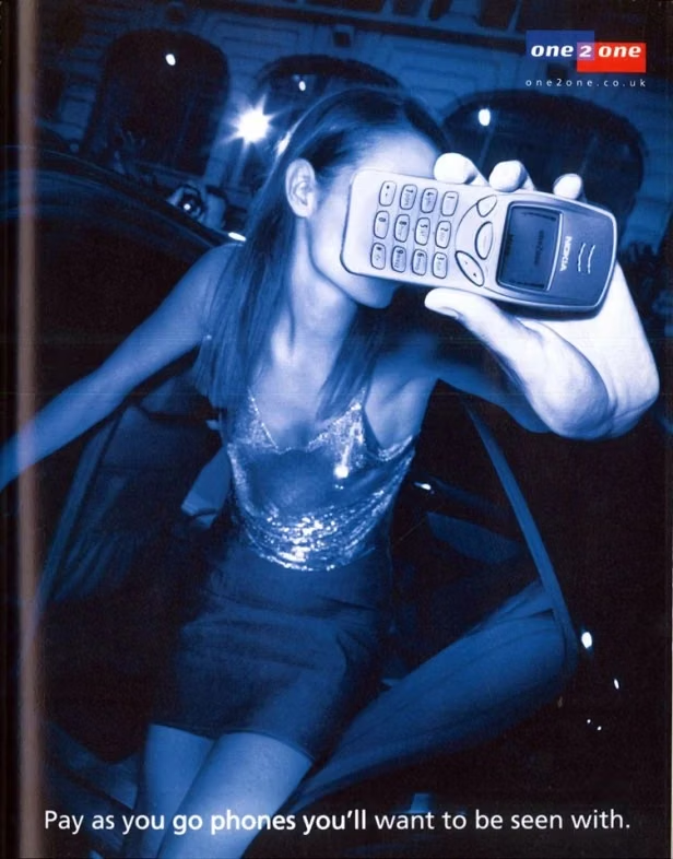
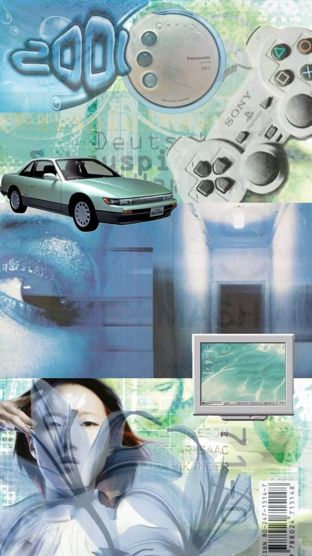
Gen-X Soft Club UI design style
Late-1990s and early-2000s urban futurism softens Y2K gloss through muted color, minimalist typography, blurred photography, and a sterile-meets-organic mood.