Neubrutalism UI design style
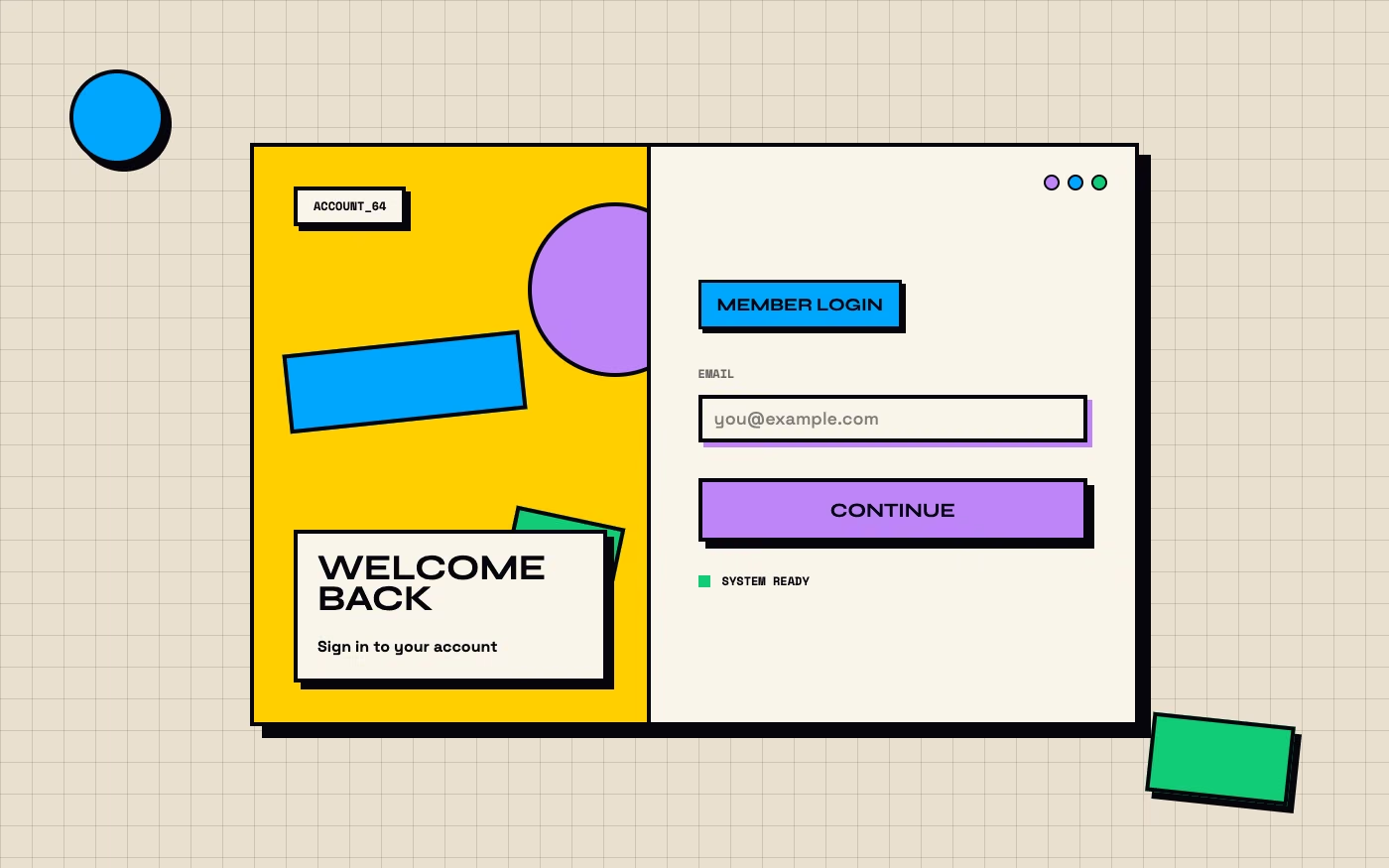
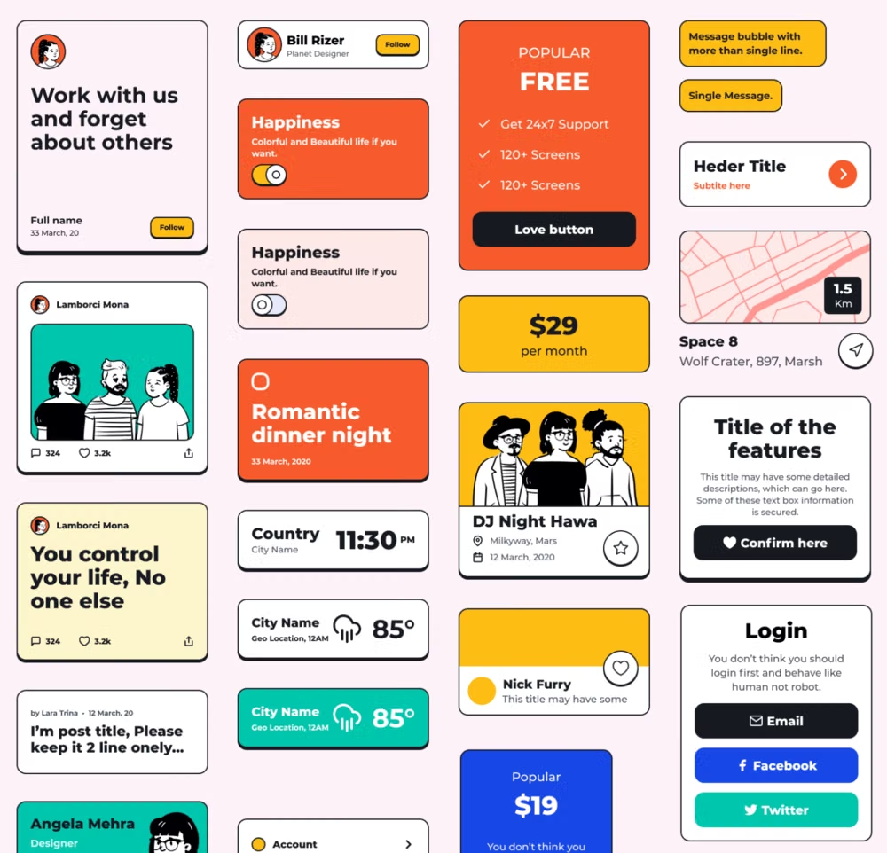
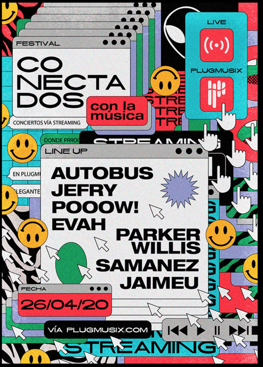
Also called Neo Brutalism or Neo Memphis, this late-2010s and 2020s digital style wraps conventional UX in loud geometric blocks, dark outlines, hard offset shadows, flat color, and exaggerated type.
Design overview
- Signature elements
- dark heavy outlines, zero-blur offset shadows, clashing flat colors, oversized grotesque type, geometric blocks, playful exposed structure. In daisyUI themes, set `--depth: 1;`.
- Best suited to
- Startup sites, creator products, portfolios, cultural projects, youth brands, and expressive marketing pages.
- Layout principles
- Keep navigation and task flow conventional beneath an irregular modular grid, using visibly bordered regions, oversize controls, occasional overlap, and controlled imbalance for personality.
History and origins
A fact-checked account of where this visual language came from, with links to the references used.
- Period
- Early 2020s–present
- Origin
- Contemporary web and product design communities
Neubrutalism is a recent UI language distinct from historical Brutalist architecture. It follows the raw-web revival catalogued by Pascal Deville’s Brutalist Websites from 2014, but usually keeps conventional product usability while adding thick outlines, flat bright color, block typography, and offset hard shadows; the current label crystallized across design platforms in the early 2020s.
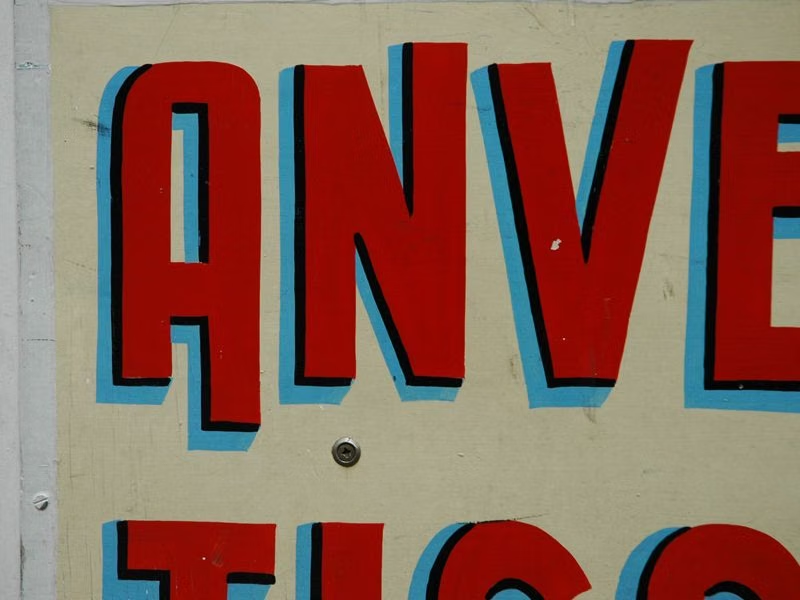
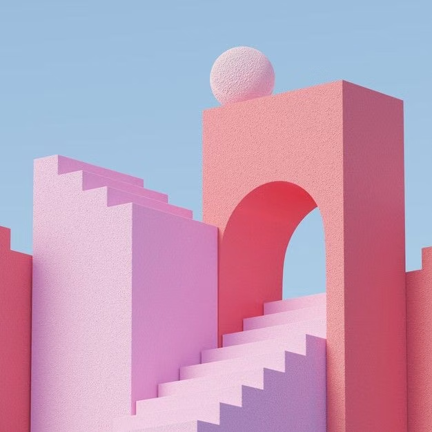
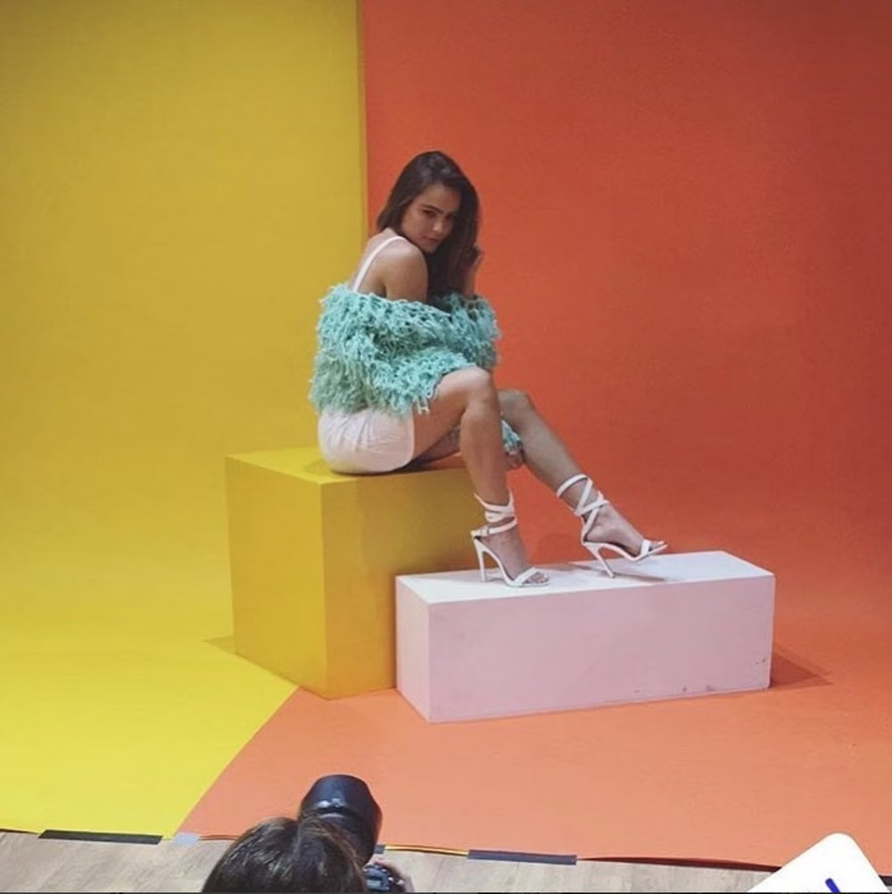
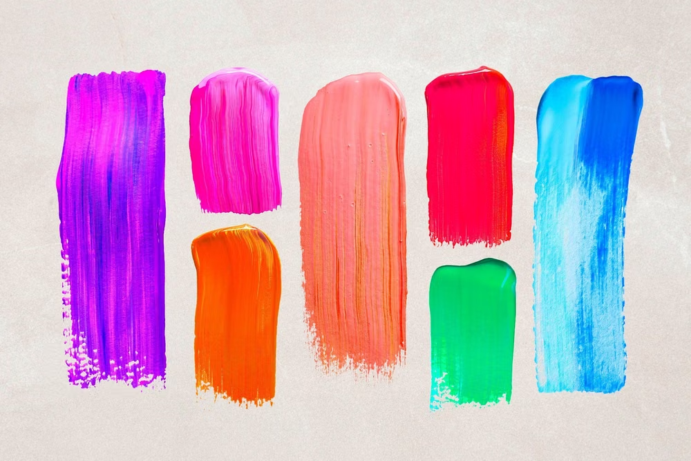
Moodboard and visual references
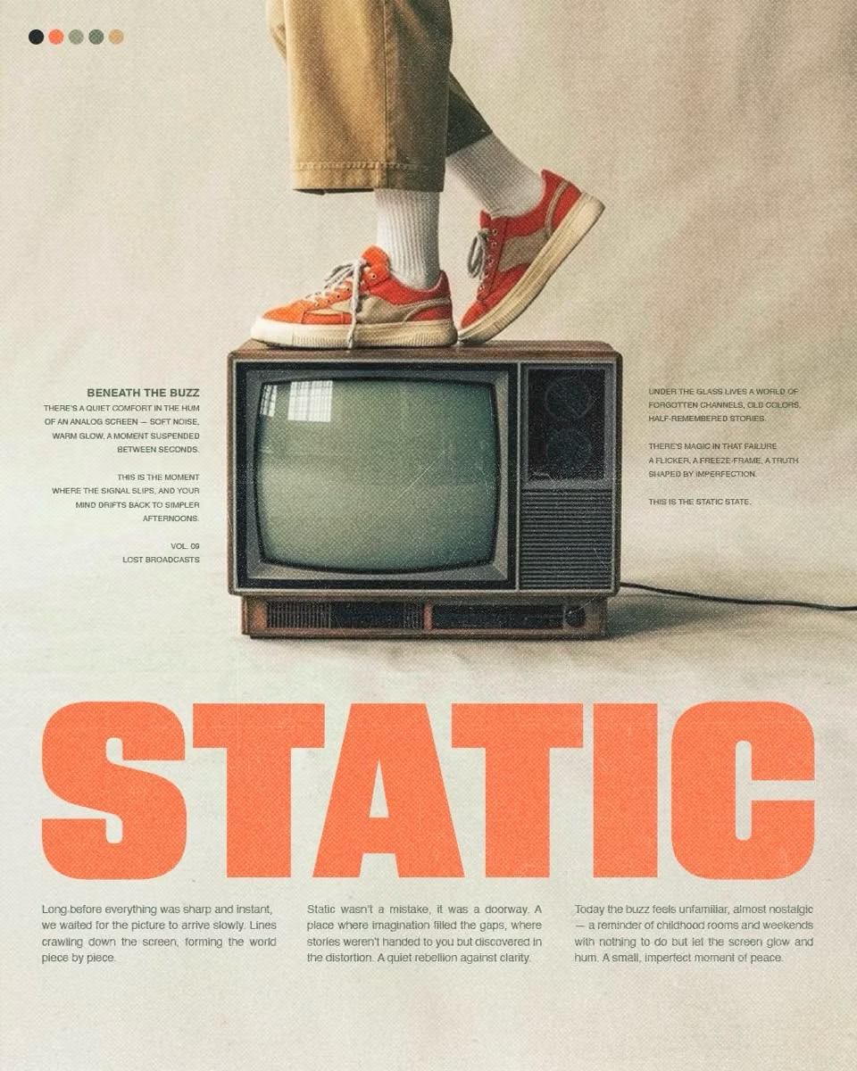
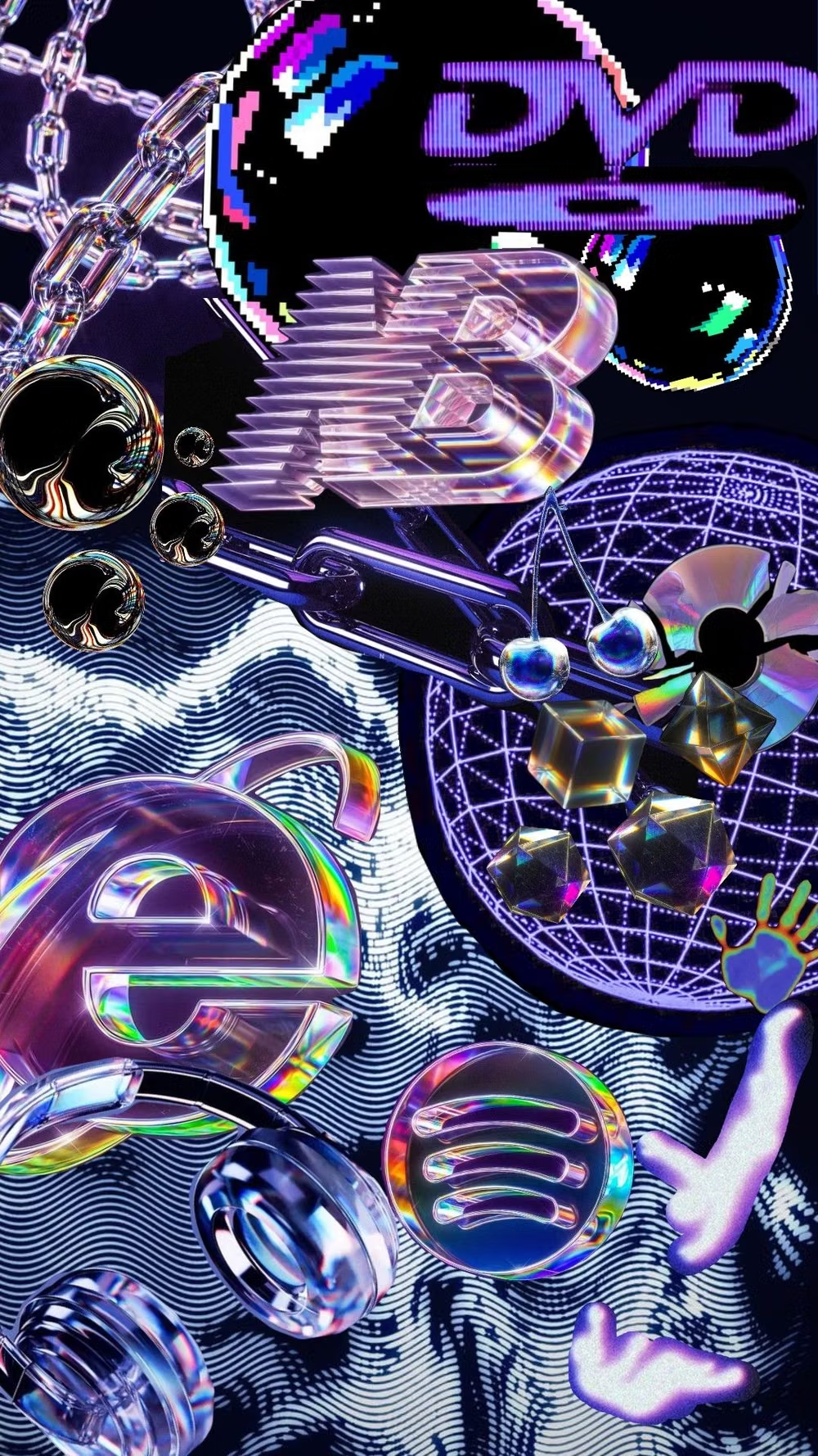
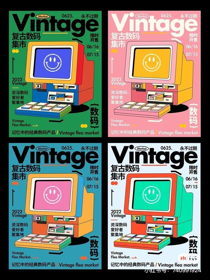
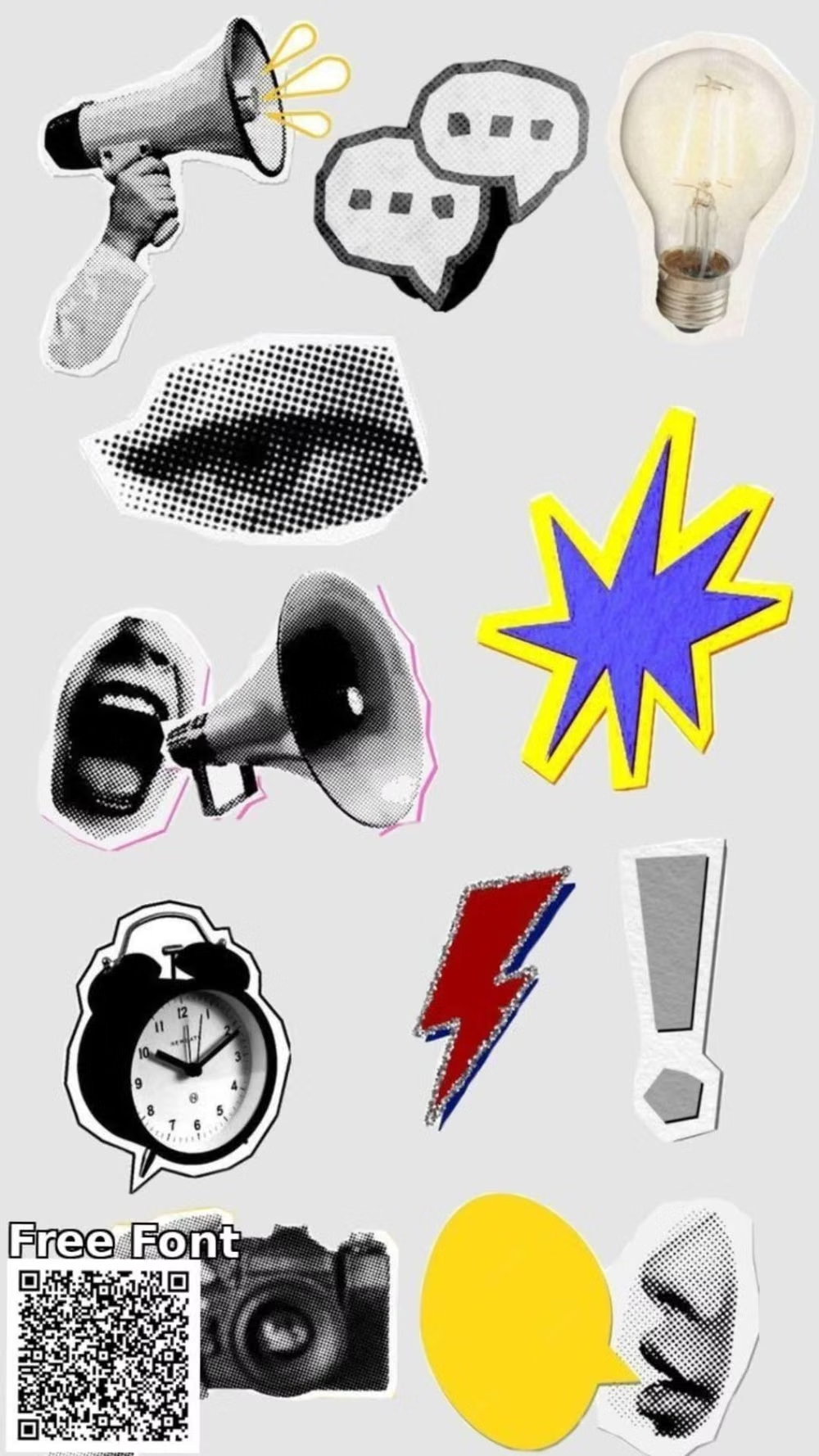
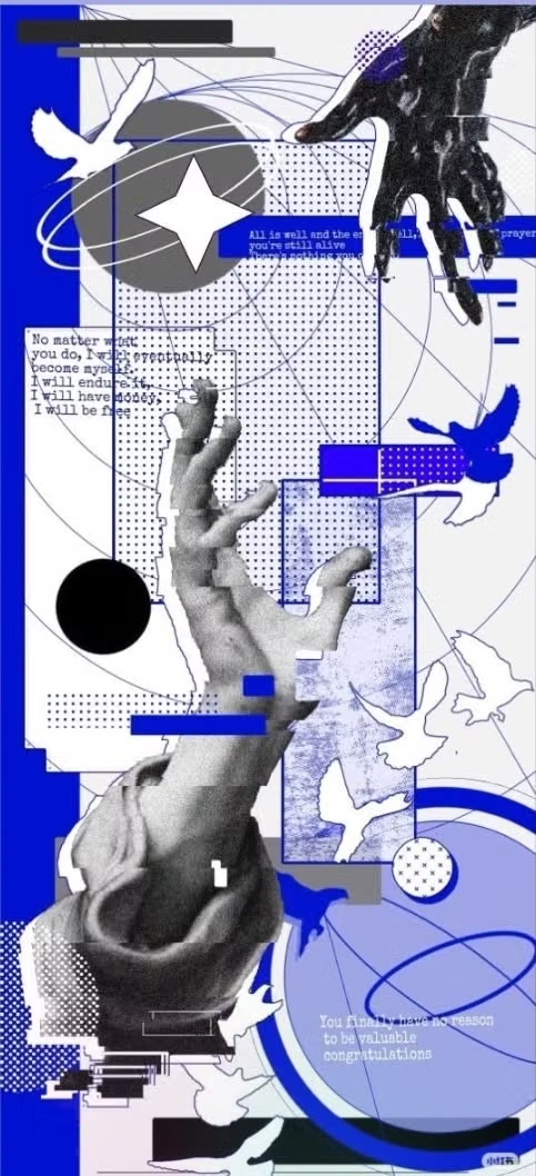
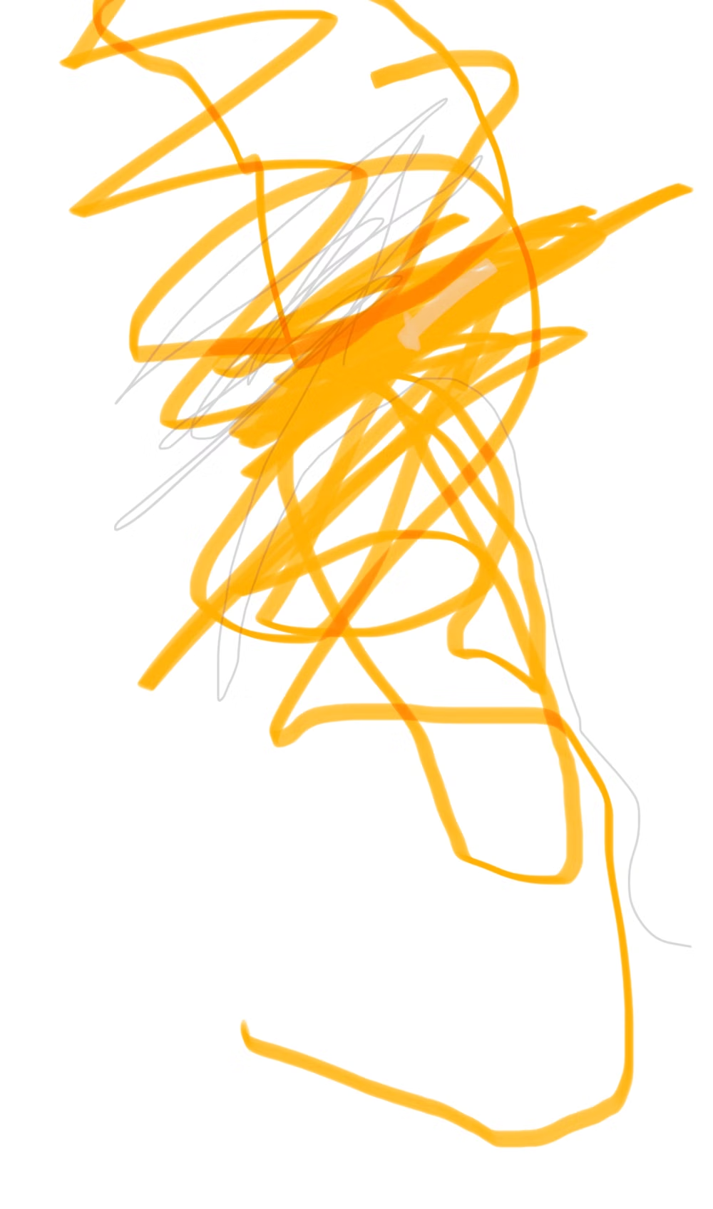
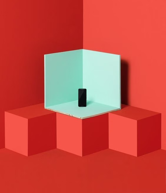
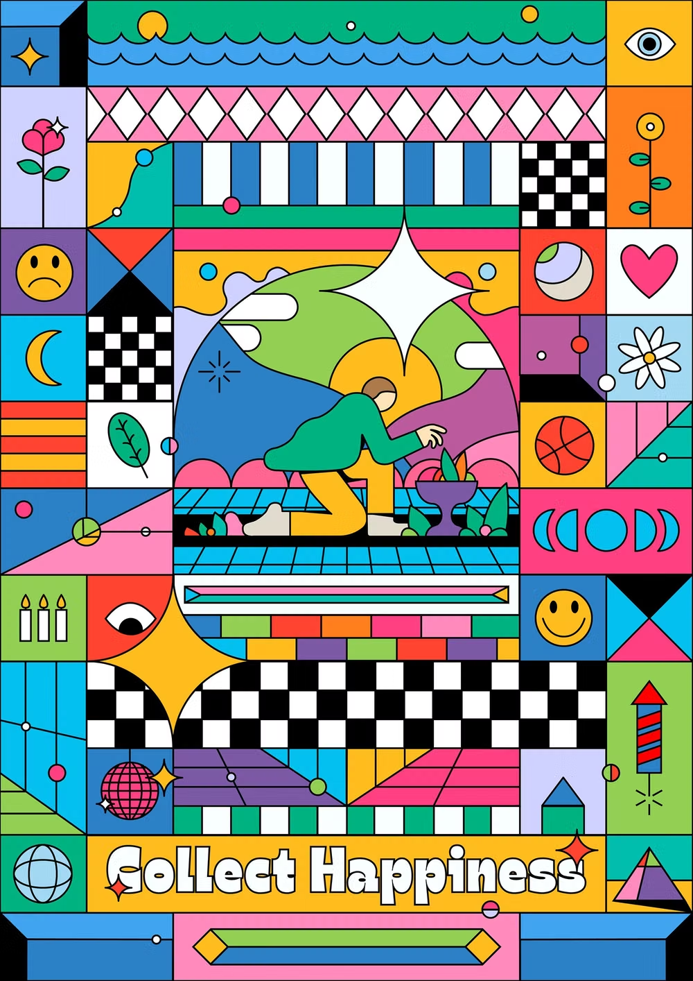
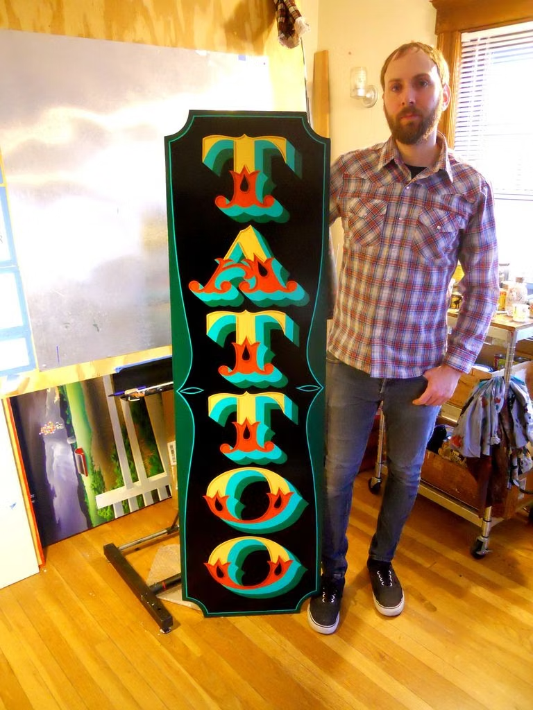
A visual study of the forms, inspirations, materials, colors, type, and cultural references associated with this UI design style.

Design principles and implementation
Use these principles to write a focused AI UI design prompt instead of asking for a vague visual treatment.
Color direction
Start with black and off-white, add one to three categorical saturated accents such as yellow, coral, blue, green, or lavender, and avoid gradients or blurred atmospheric color. In a daisyUI theme, use yellow or coral for `primary`, blue, green, or lavender for `secondary`, and assign off-white, pale beige, and light gray to `base-100`, `base-200`, and `base-300`.
Imagery direction
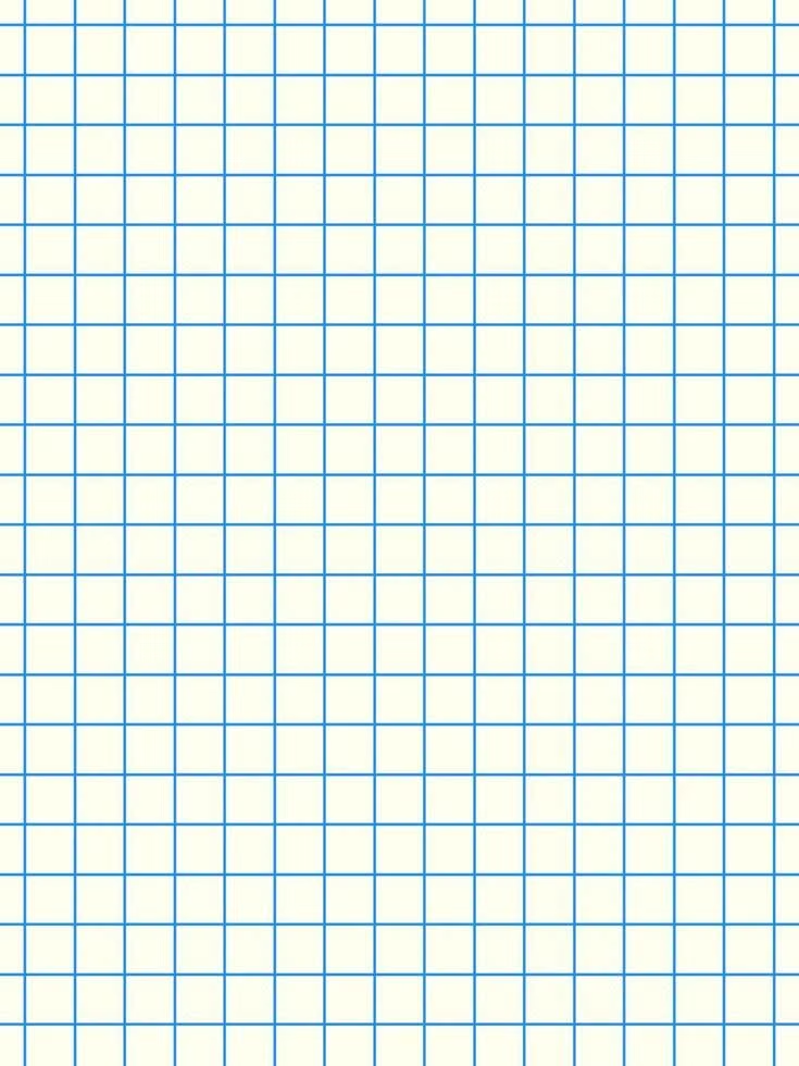
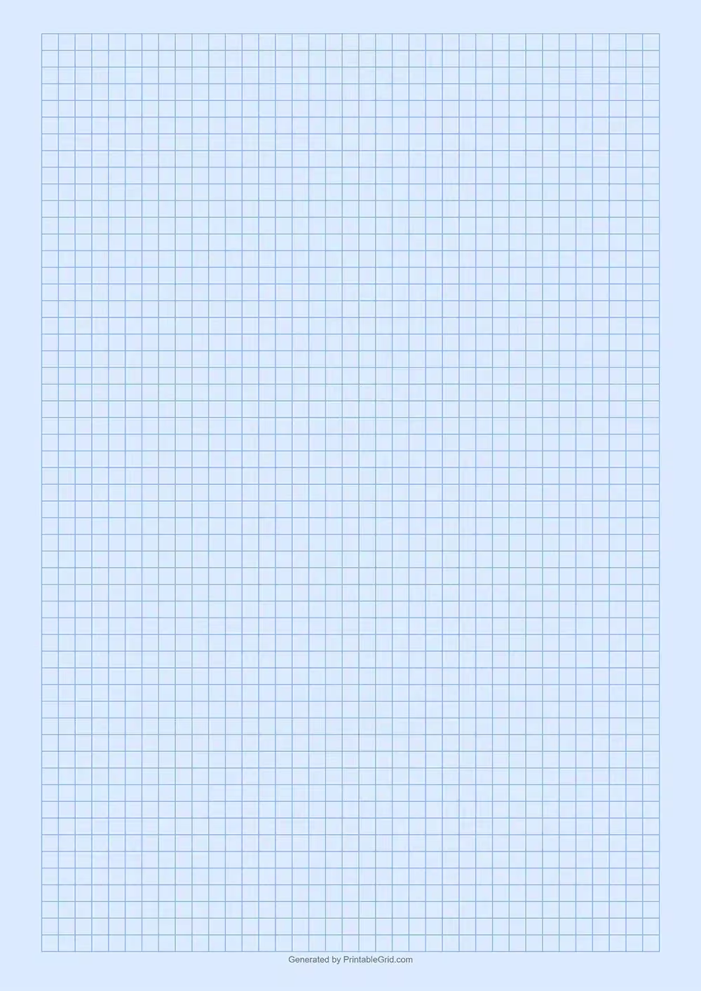
Use flat outlined illustrations, pseudo-three-dimensional objects, direct portraits, graph-paper motifs, browser-window fragments, and simple static characters with deliberately conspicuous framing.
Content density
Hold density at a readable medium level, separating loud modules with clear space and giving each panel one message, data group, or action. Use the `*-lg` size variants for daisyUI components to reinforce the chunky, informal scale.
Motion direction
Lift elements by increasing their hard shadow, press controls by translating them into the shadow, and use abrupt slides, stamps, or tilts with short direct timing.
Shape language
Favor square-cornered blocks, heavy strokes, hard shadow slabs, simple circles, zigzags, grid cells, and occasional chunky pills whose geometry stays explicit. In daisyUI themes, set the `--radius-*` variables to `0` or `0.25rem`.
Typography rules
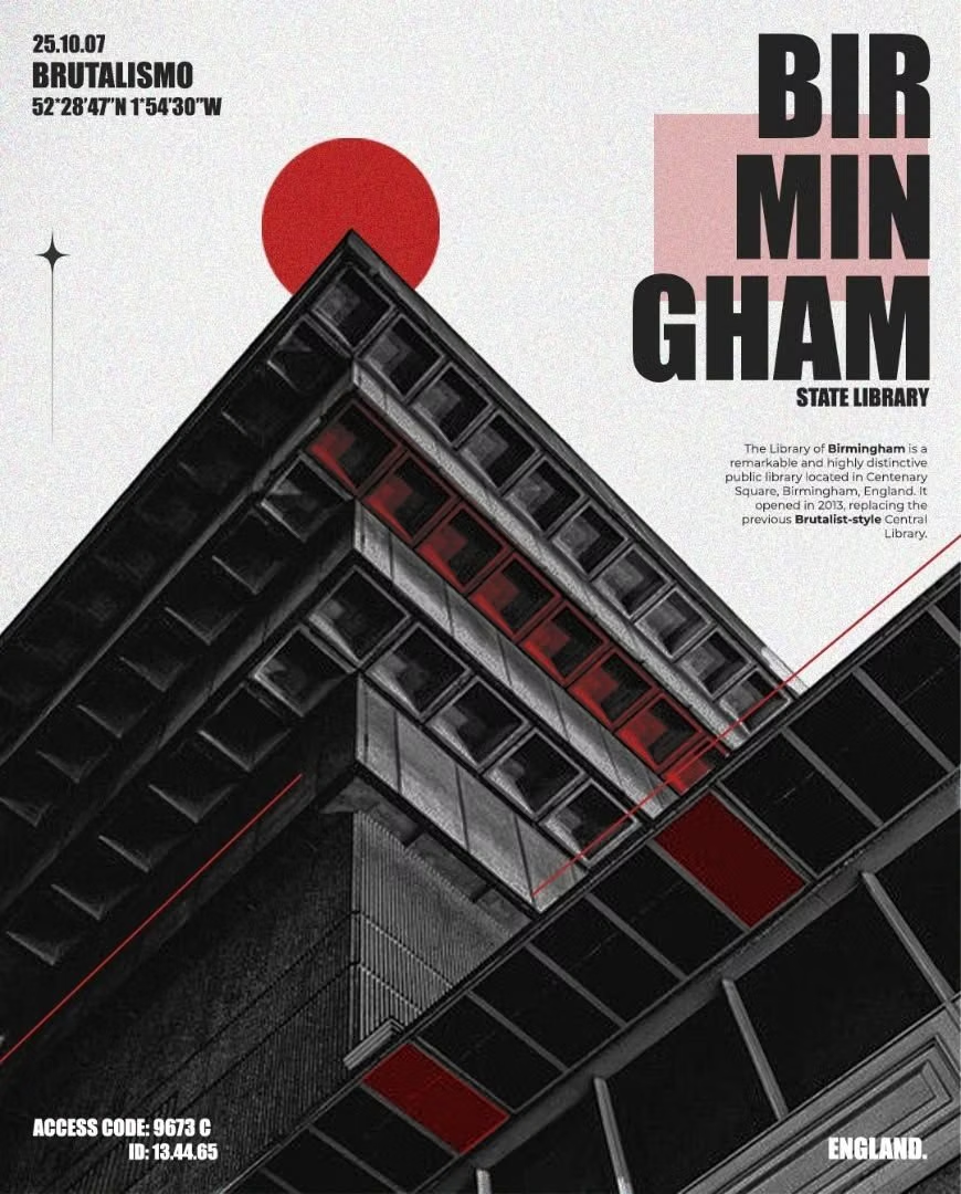
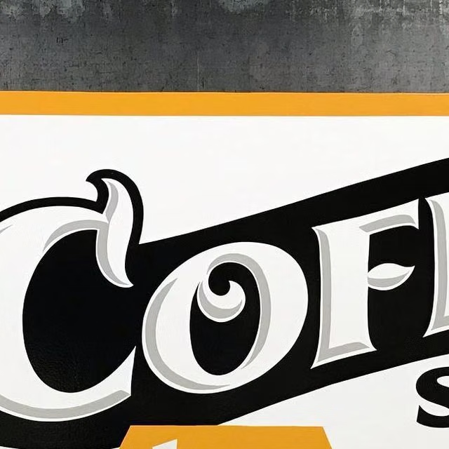
Use an unusual heavy grotesque, stretched display face, or uppercase headline at large scale, then stabilize body copy and functional labels with a calm sans-serif or mono.
Suggested Typfaces
Syne
Fresh daisies glow in warm sunlight
Fresh daisies glow in warm sunlight
1 2 3 4 5 6 7 8 9 0
Archivo Black
Fresh daisies glow in warm sunlight
Fresh daisies glow in warm sunlight
1 2 3 4 5 6 7 8 9 0
Space Grotesk
Fresh daisies glow in warm sunlight
Fresh daisies glow in warm sunlight
1 2 3 4 5 6 7 8 9 0
DM Sans
Fresh daisies glow in warm sunlight
Fresh daisies glow in warm sunlight
1 2 3 4 5 6 7 8 9 0
Space Mono
Fresh daisies glow in warm sunlight
Fresh daisies glow in warm sunlight
1 2 3 4 5 6 7 8 9 0
Build a Neubrutalism interface with daisyUI
The live example translates this direction into daisyUI components and semantic theme tokens.
To generate a full page in the same visual language, give the style name and the design rules above to Blueprint MCP.
Related UI design styles
Compare nearby visual languages that share typography, shapes, use cases, or signature elements.
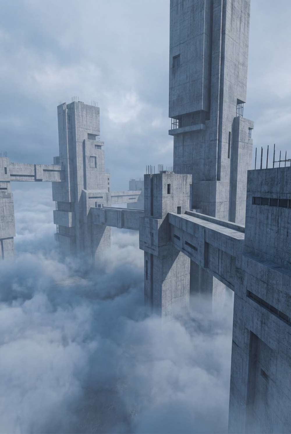

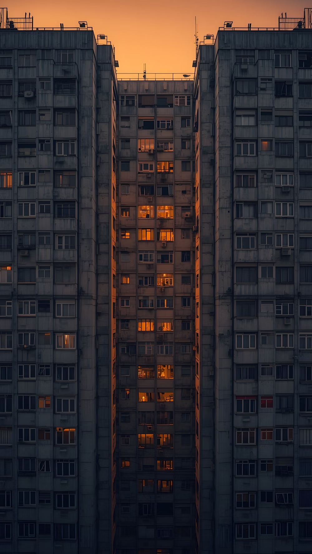
Brutalism UI design style
Raw typography, exposed structure, sharp edges, stark contrast, default-like controls, and intentionally unpolished layouts.
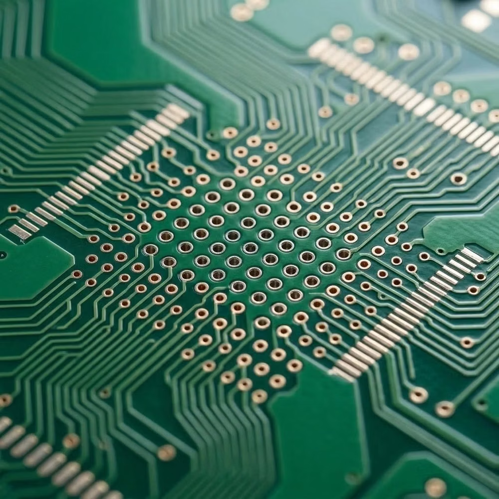
Cyberminimalism UI design style
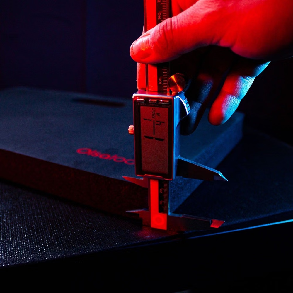
Late-2010s hyper-minimal tech design reduces interfaces to black or white fields, large grotesque type, strict grids, sparse geometry, and an occasional controlled gradient or premium render.
Bauhaus UI design style
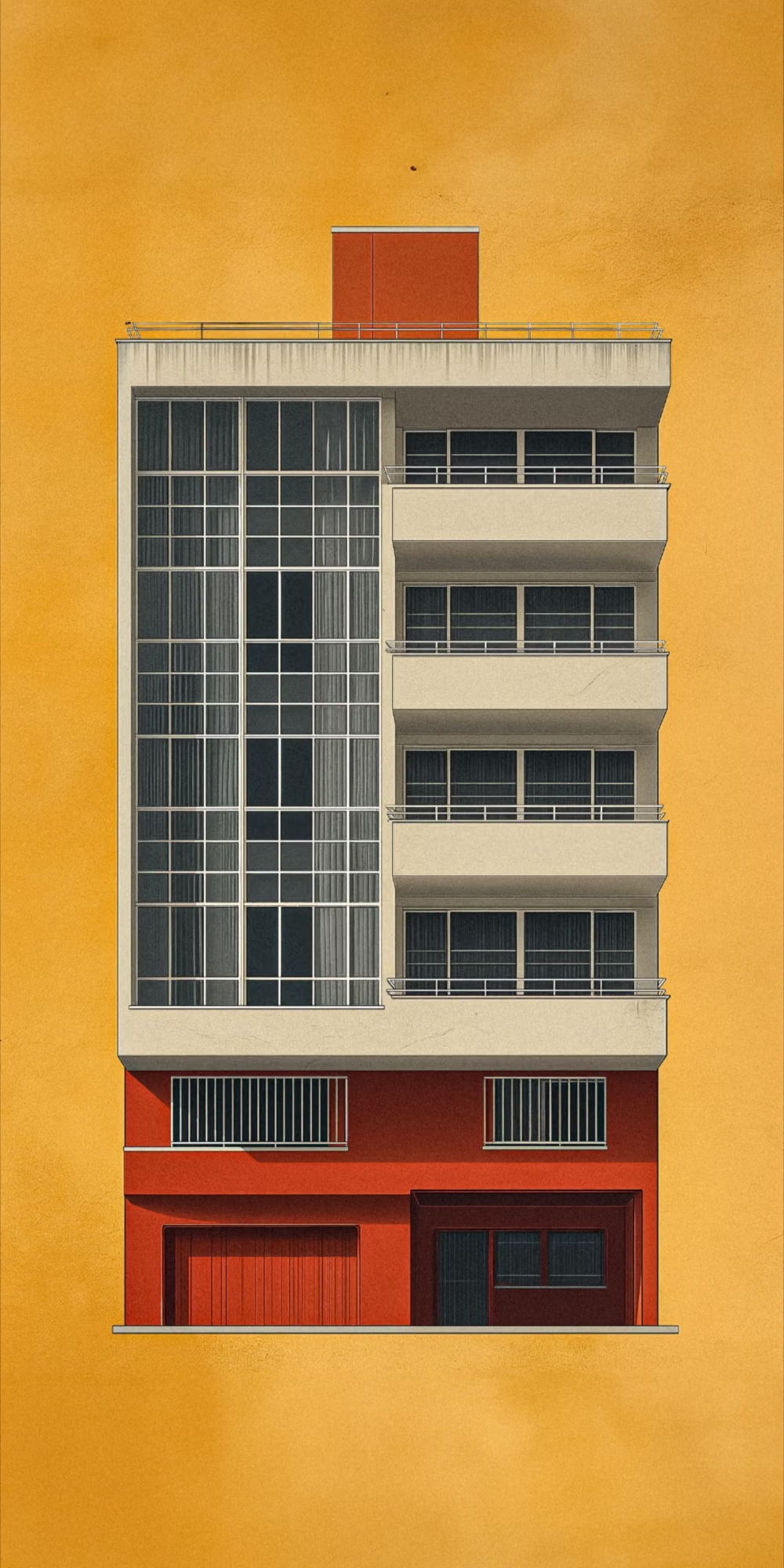
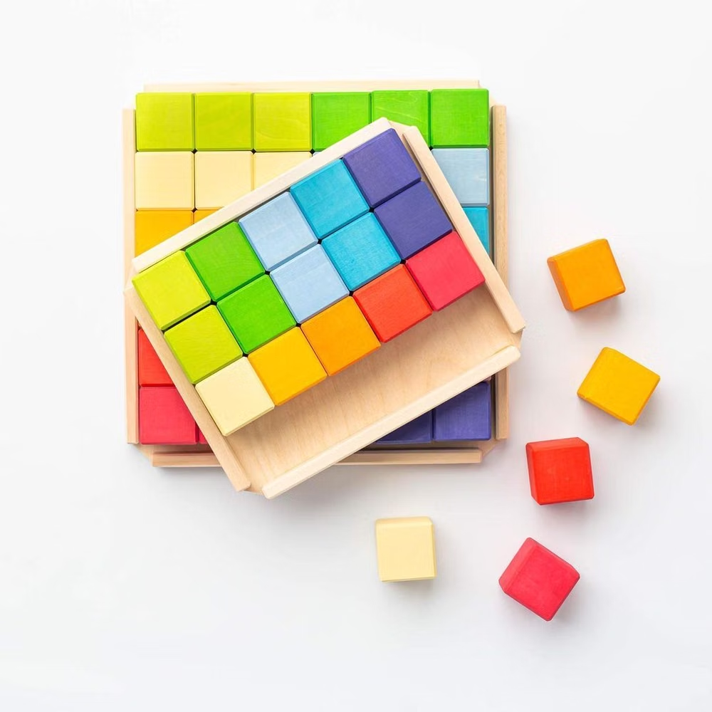
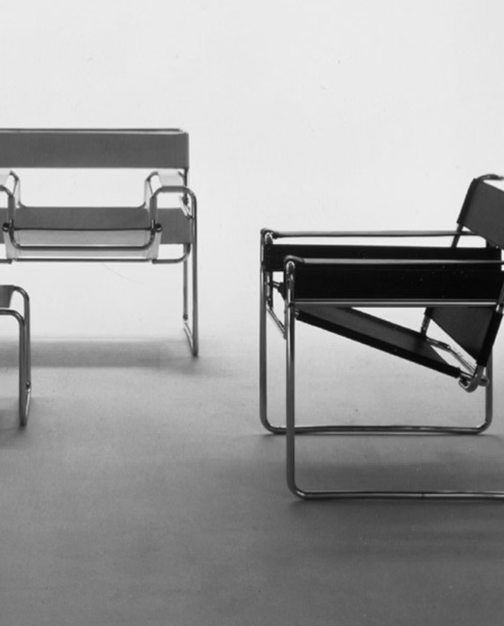
Functional compositions use primary colors, geometric forms, strong typography, and visibly organized structure.