RPG Pixel Art UI design style
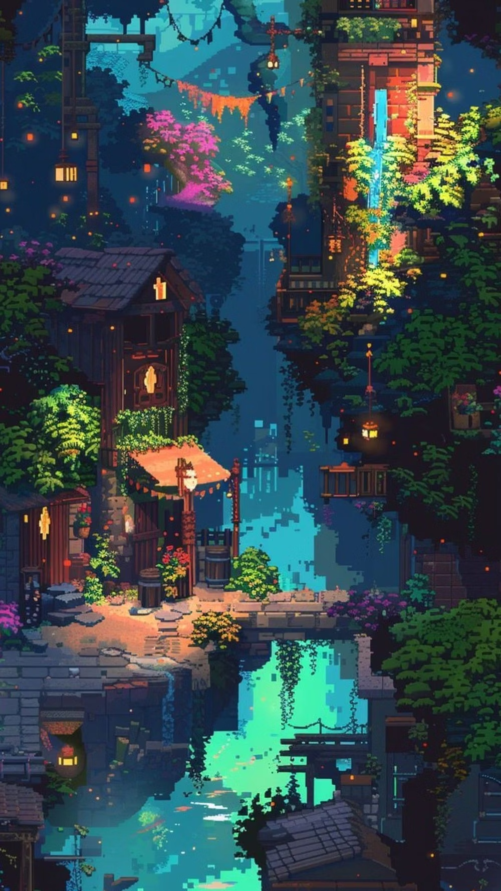
Classic 8-bit and 16-bit role-playing games combine top-down tile maps, expressive party sprites, framed dialogue, inventory menus, and readable battle effects.
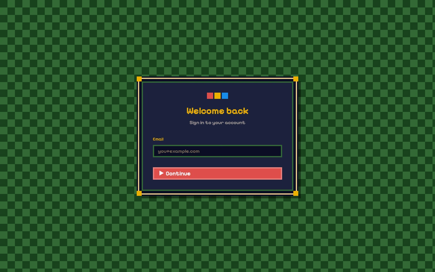
Design overview
- Signature elements
- top-down tile maps, party sprites, ornate dialogue boxes, inventory grids, fantasy item icons, turn-based battle effects
- Best suited to
- Games, interactive storytelling, fantasy products, game communities, gamified learning, and playful progress trackers.
- Layout principles
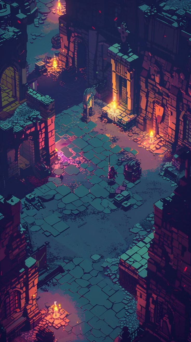
- Keep the explorable tile map or battle stage as the main canvas, attaching dialogue, commands, party status, and inventory to predictable perimeter panels that preserve the current scene.
History and origins
A fact-checked account of where this visual language came from, with links to the references used.
- Period
- 1980s–1990s game roots; continuing revival
- Origin
- Japanese and Western computer and console role-playing games
RPG Pixel Art is a genre-specific branch of pixel art rather than a separate art movement. Memory, palette, and resolution limits in 1980s and 1990s role-playing games encouraged tile maps, sprite sheets, icon inventories, dialogue windows, and compact status panels; contemporary UI reuses that grammar even when hardware no longer requires it.
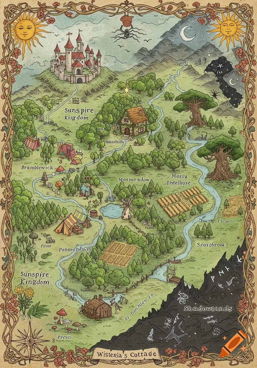
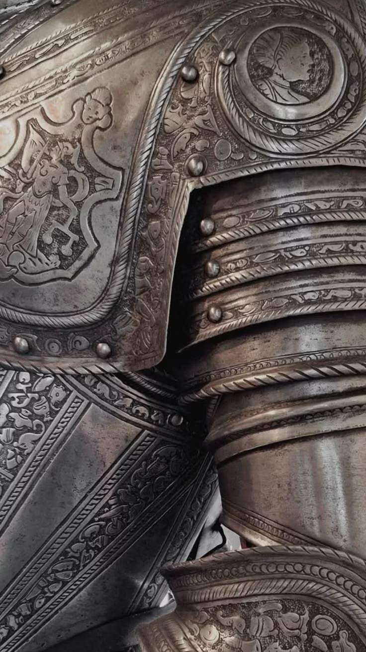
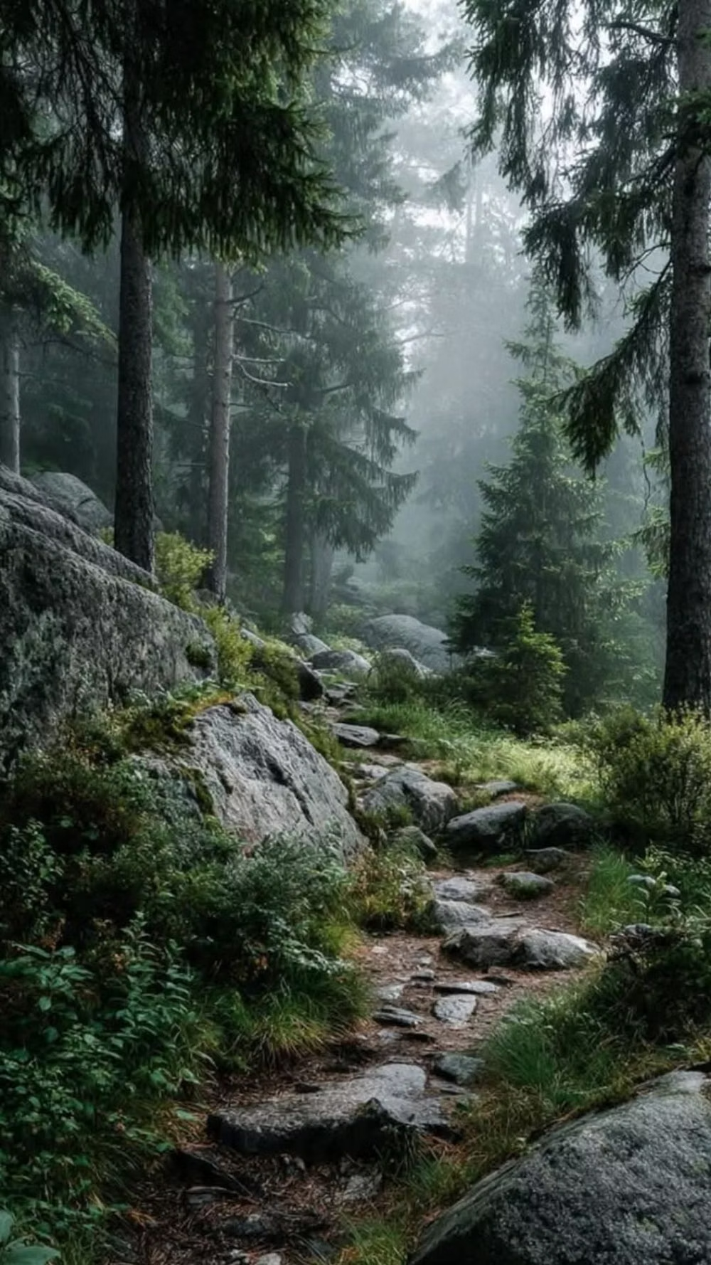
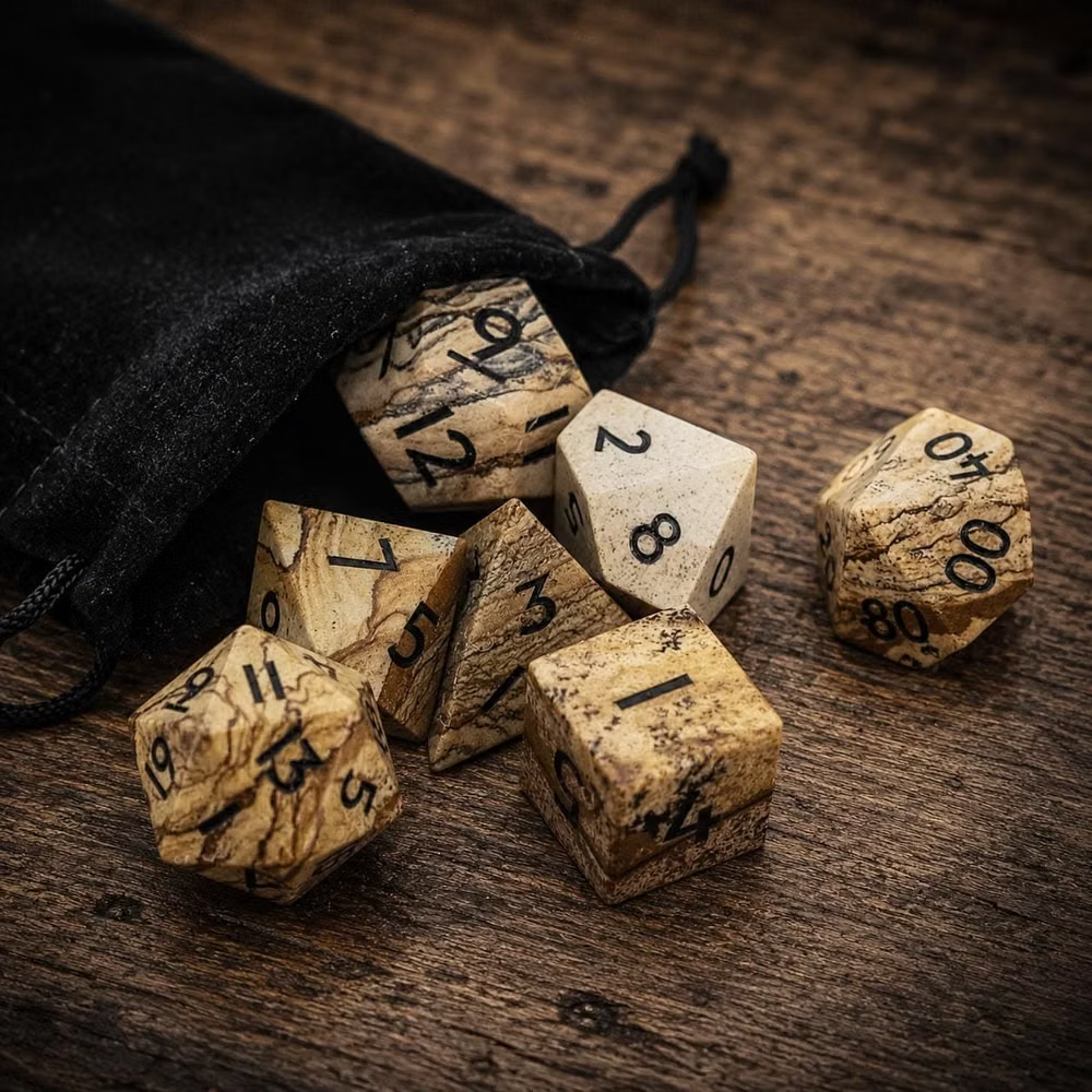
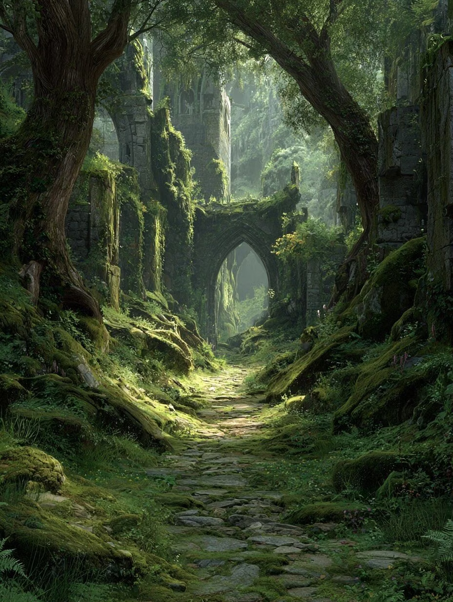
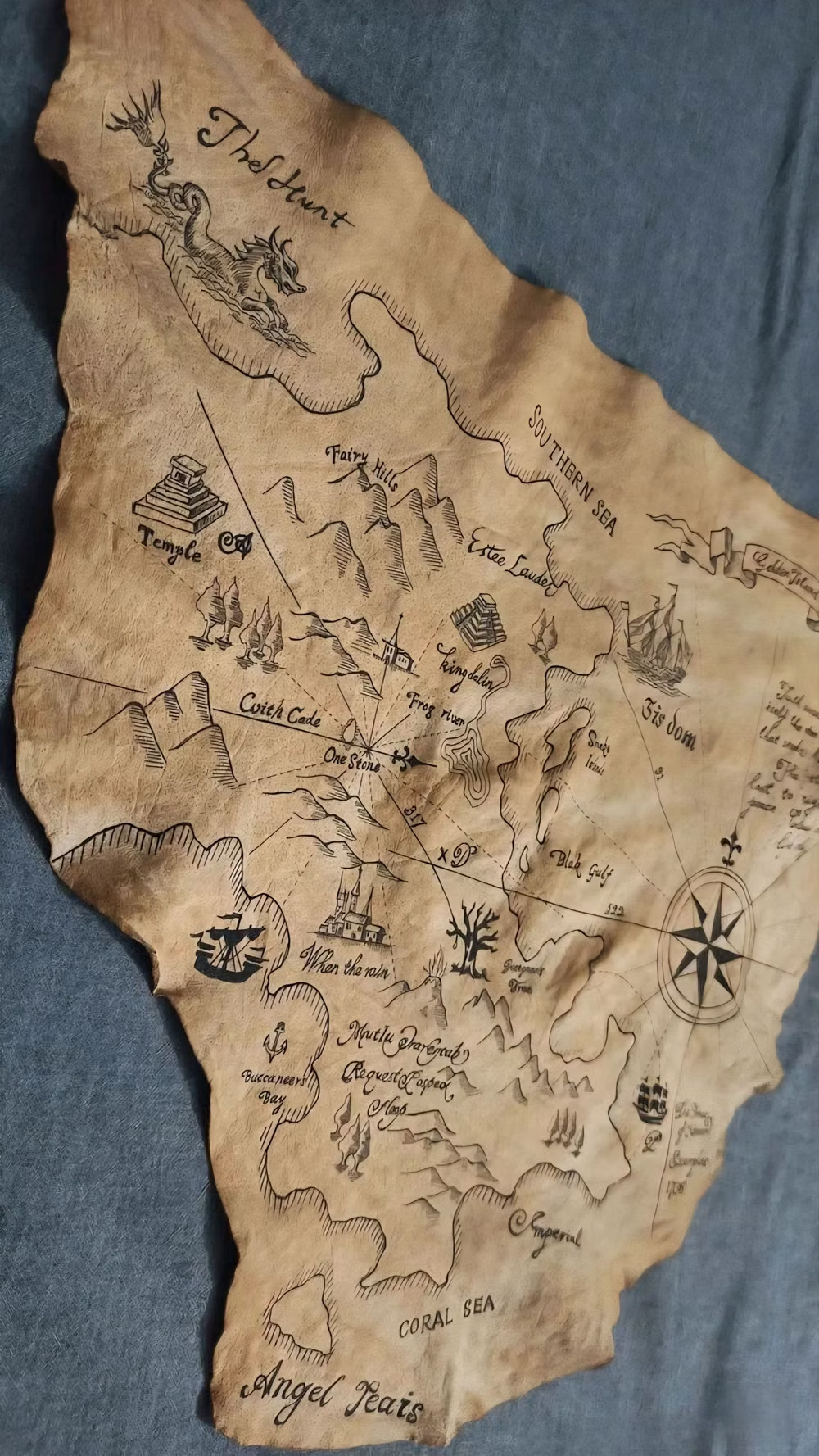
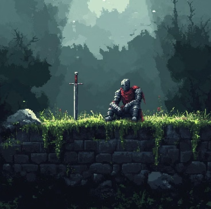
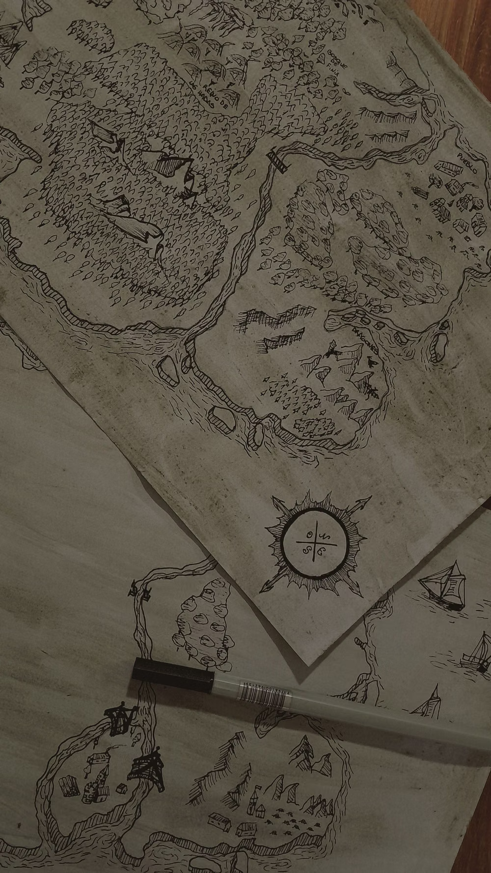
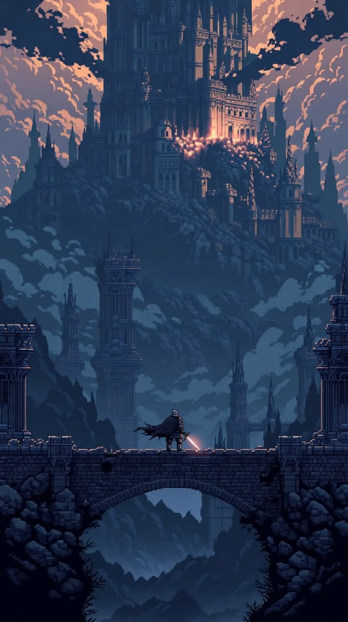
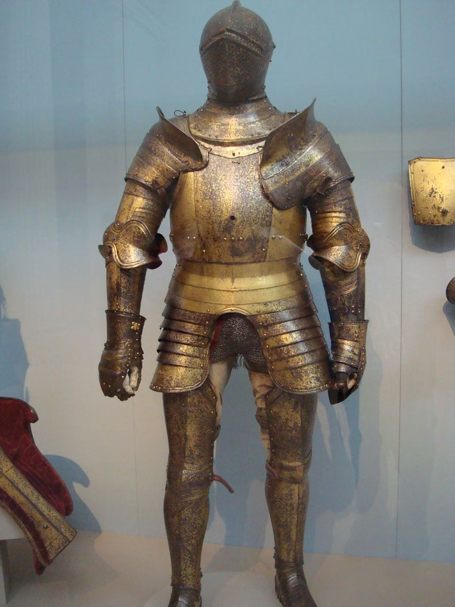
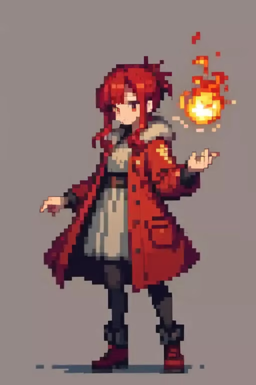
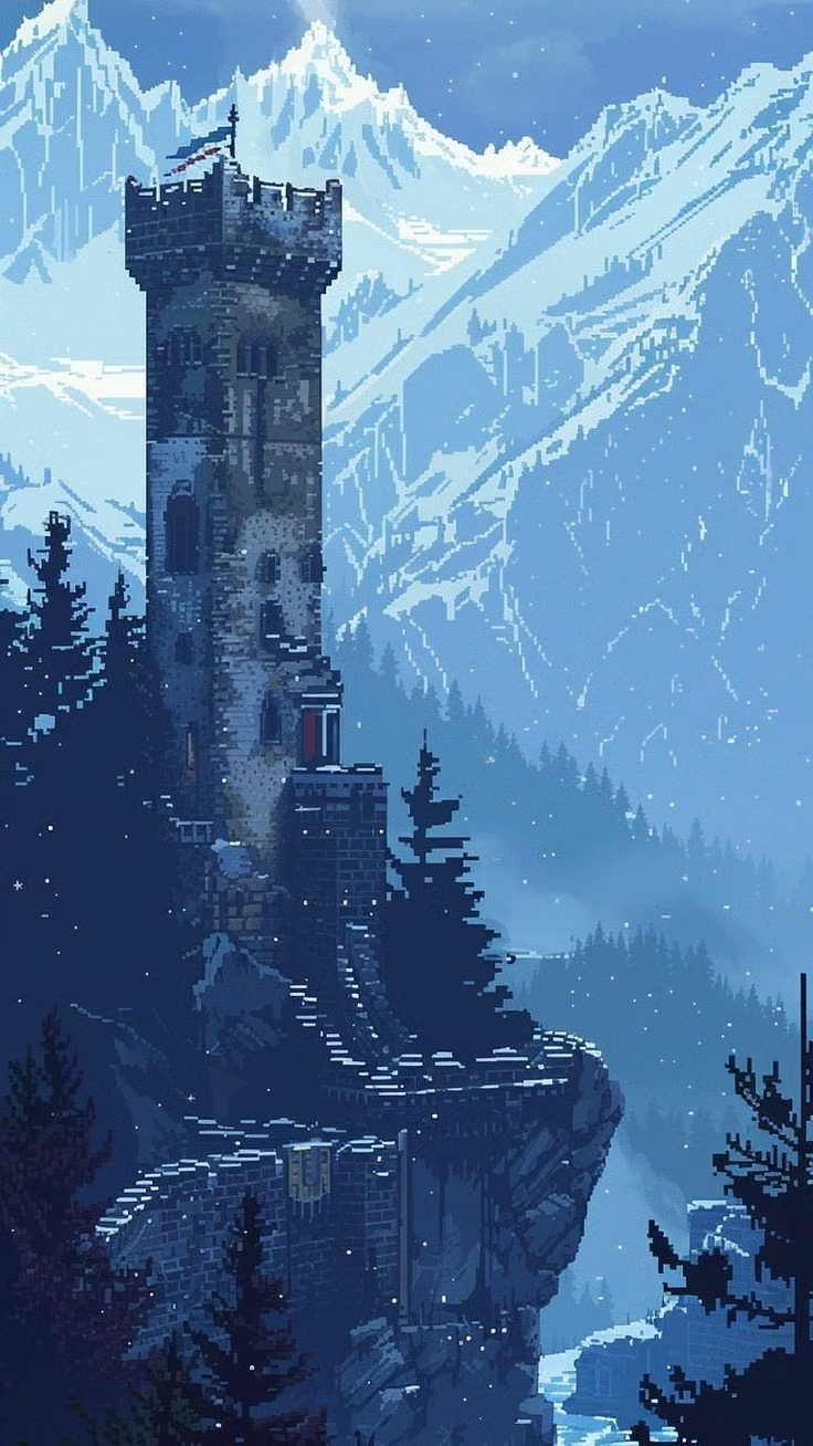
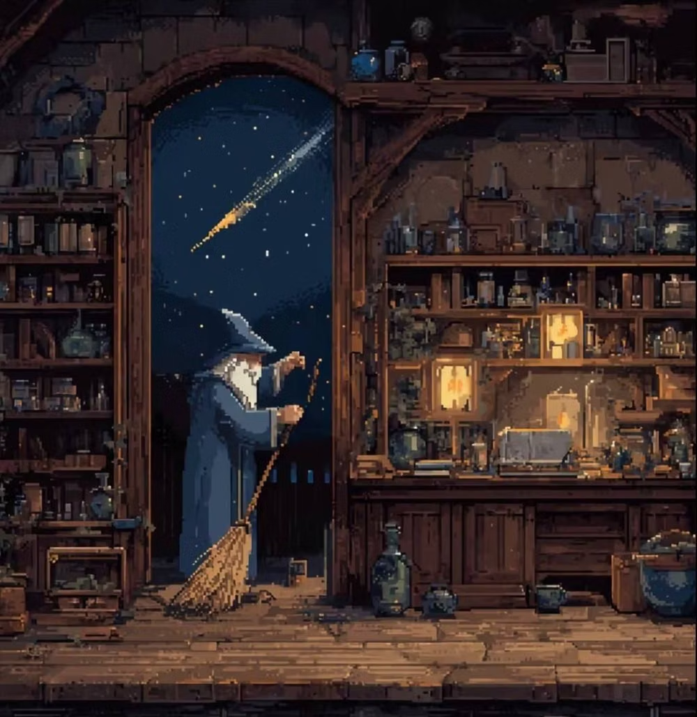
Moodboard and visual references
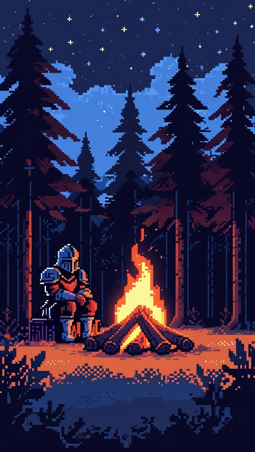
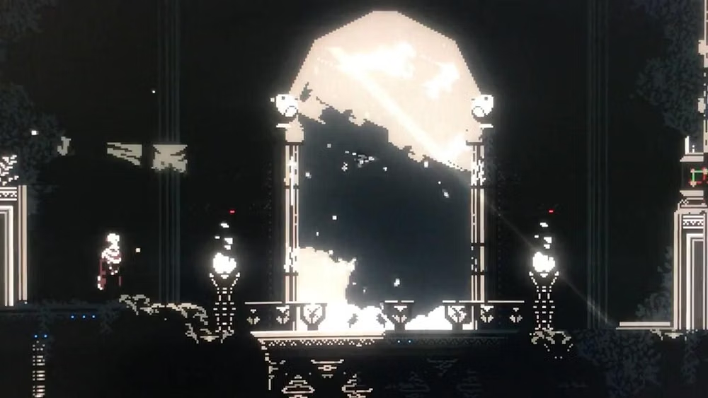
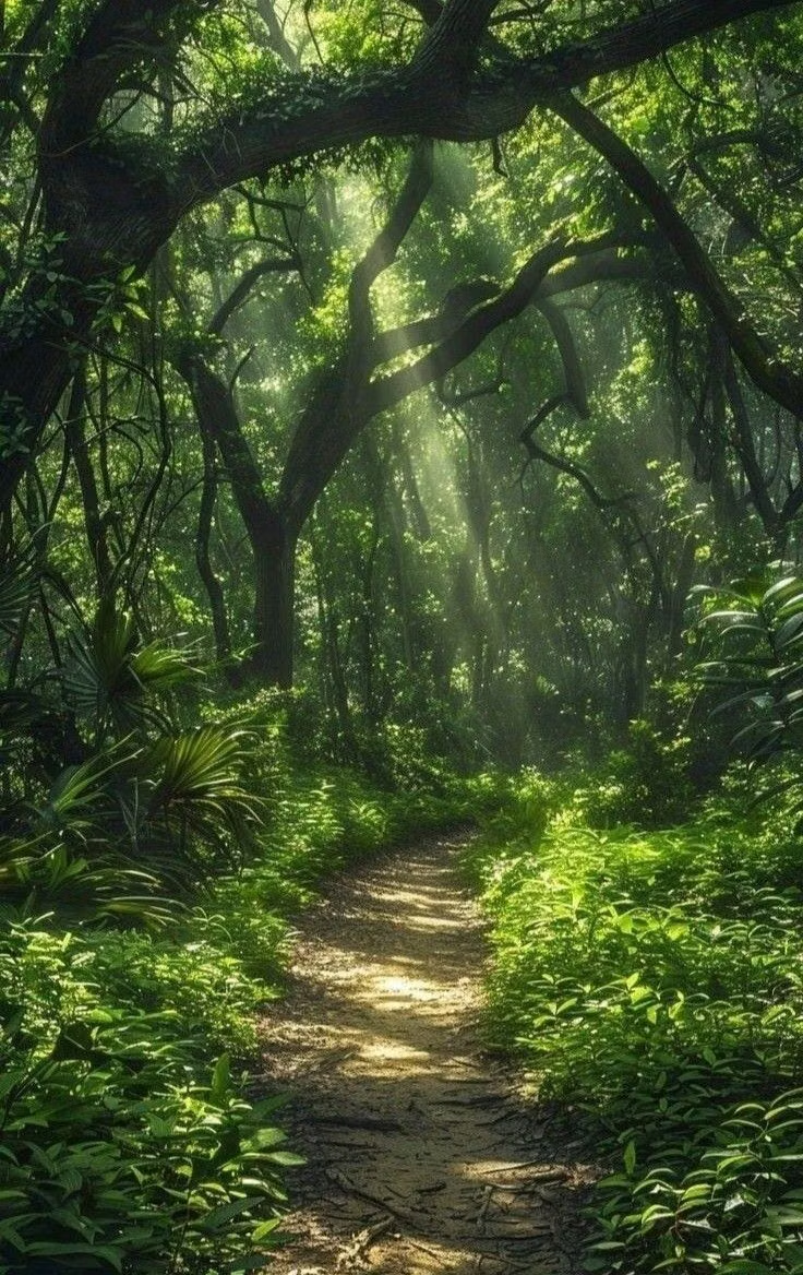
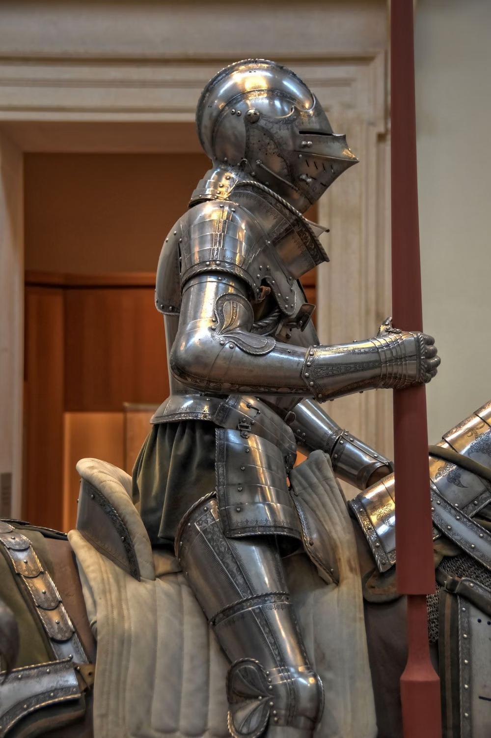
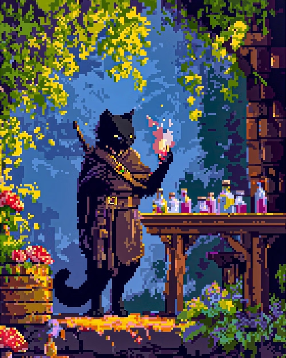
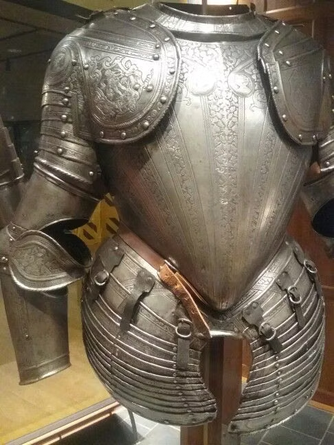
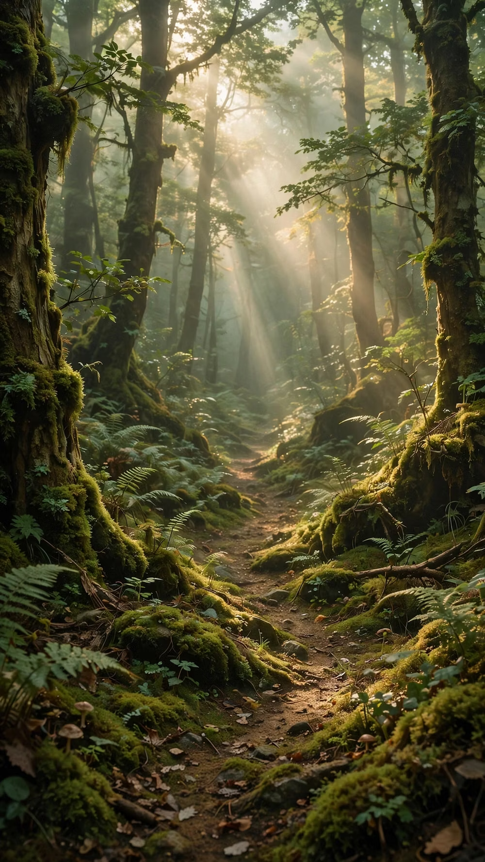
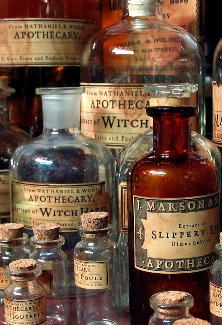
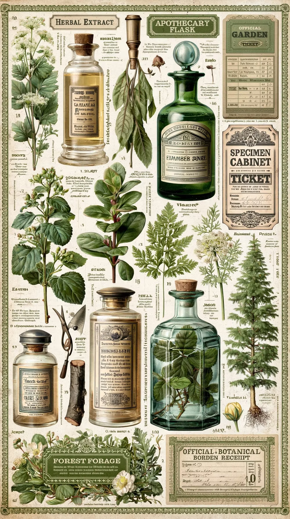
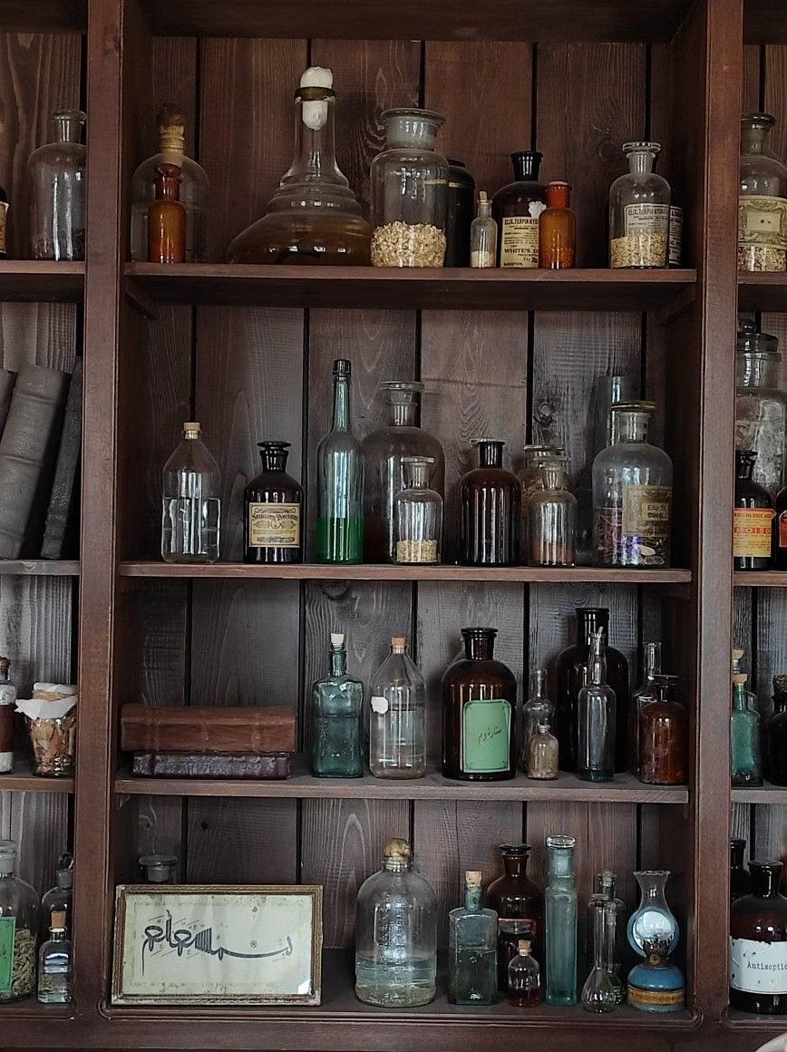
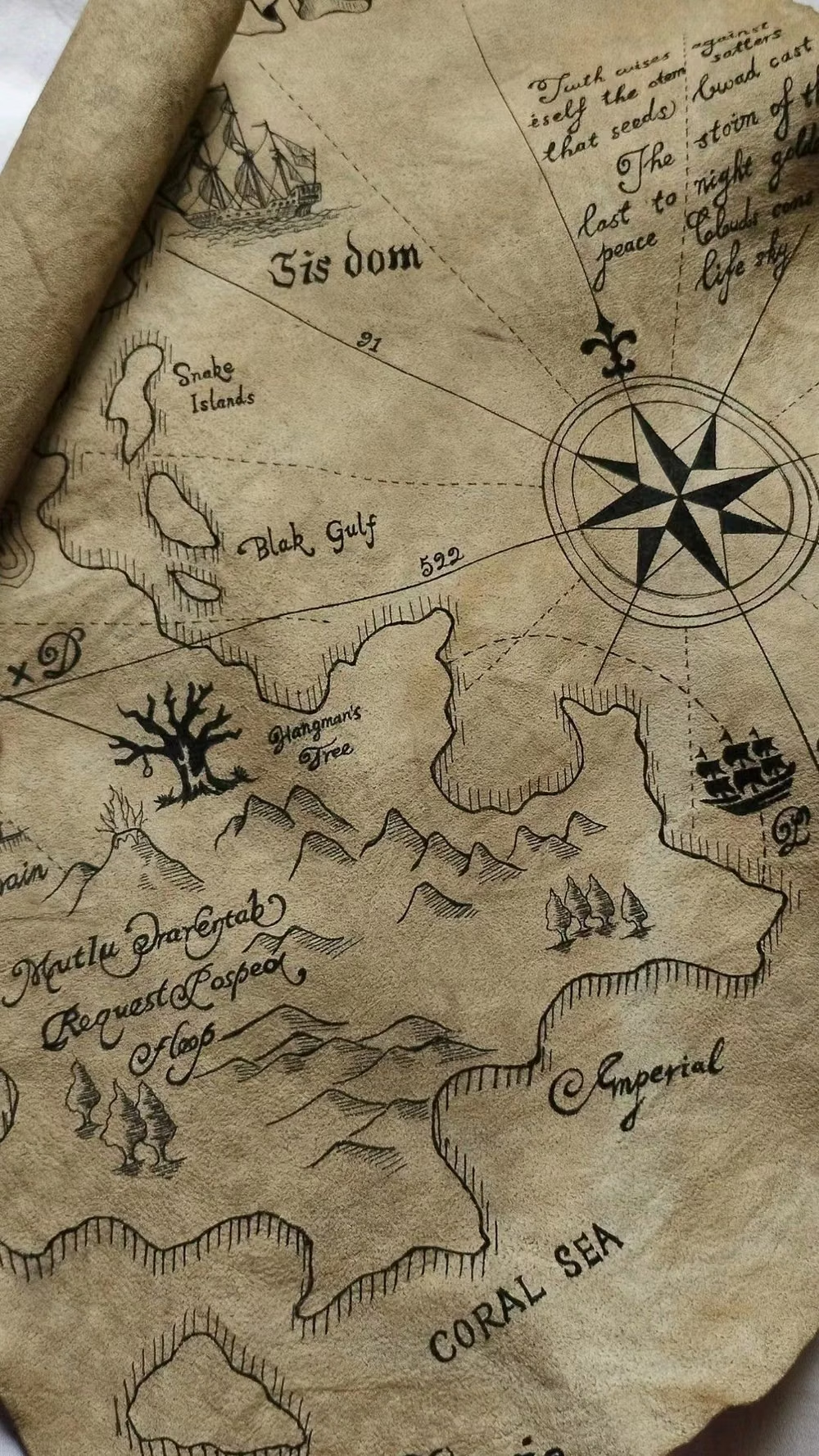
A visual study of the forms, inspirations, materials, colors, type, and cultural references associated with this UI design style.

Design principles and implementation
Use these principles to write a focused AI UI design prompt instead of asking for a vague visual treatment.
Color direction
Build compact color ramps for each biome, material, character, and spell school, reserving the clearest contrasts for party members, interactable objects, health, and status. In a daisyUI theme, use the party or interaction highlight for `primary`, a spell-school or biome counter-color for `secondary`, and assign three exact dark menu-panel swatches to `base-100`, `base-200`, and `base-300`.
Imagery direction
Use chibi or small-proportion character sprites, repeatable terrain tiles, monsters, item icons, portraits, and spell effects drawn at one coherent pixel density and perspective.
Content density
Support medium scene density and high menu density, but preserve walkable routes, targets, selections, and party state as instantly distinguishable pixel clusters. Use the `*-sm` size variants for daisyUI components to preserve this compact working density.
Motion direction
Use authored walk cycles, battle anticipation and impact frames, stepped damage numbers, palette flashes, spell bursts, and short victory poses.
Shape language
Construct environments from repeatable square tiles and frame menus with pixel corners, inset borders, inventory slots, health bars, and small heraldic ornaments. In daisyUI themes, set the `--radius-*` variables to `0` or `0.25rem`.
Typography rules
Render a highly legible bitmap face at integer scale, give dialogue generous line height, and reserve compact capitals for commands, stats, and item abbreviations.
Suggested Typfaces
Micro 5
Fresh daisies glow in warm sunlight
Fresh daisies glow in warm sunlight
1 2 3 4 5 6 7 8 9 0
DotGothic16
Fresh daisies glow in warm sunlight
Fresh daisies glow in warm sunlight
1 2 3 4 5 6 7 8 9 0
Silkscreen
Fresh daisies glow in warm sunlight
Fresh daisies glow in warm sunlight
1 2 3 4 5 6 7 8 9 0
Pixelify Sans
Fresh daisies glow in warm sunlight
Fresh daisies glow in warm sunlight
1 2 3 4 5 6 7 8 9 0
IBM Plex Mono
Fresh daisies glow in warm sunlight
Fresh daisies glow in warm sunlight
1 2 3 4 5 6 7 8 9 0
Build a RPG Pixel Art interface with daisyUI
The live example translates this direction into daisyUI components and semantic theme tokens.
To generate a full page in the same visual language, give the style name and the design rules above to Blueprint MCP.
Related UI design styles
Compare nearby visual languages that share typography, shapes, use cases, or signature elements.
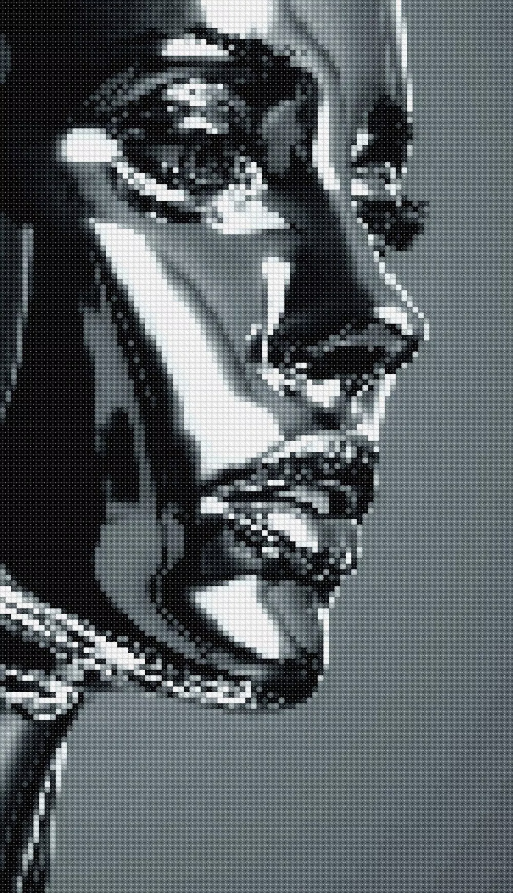
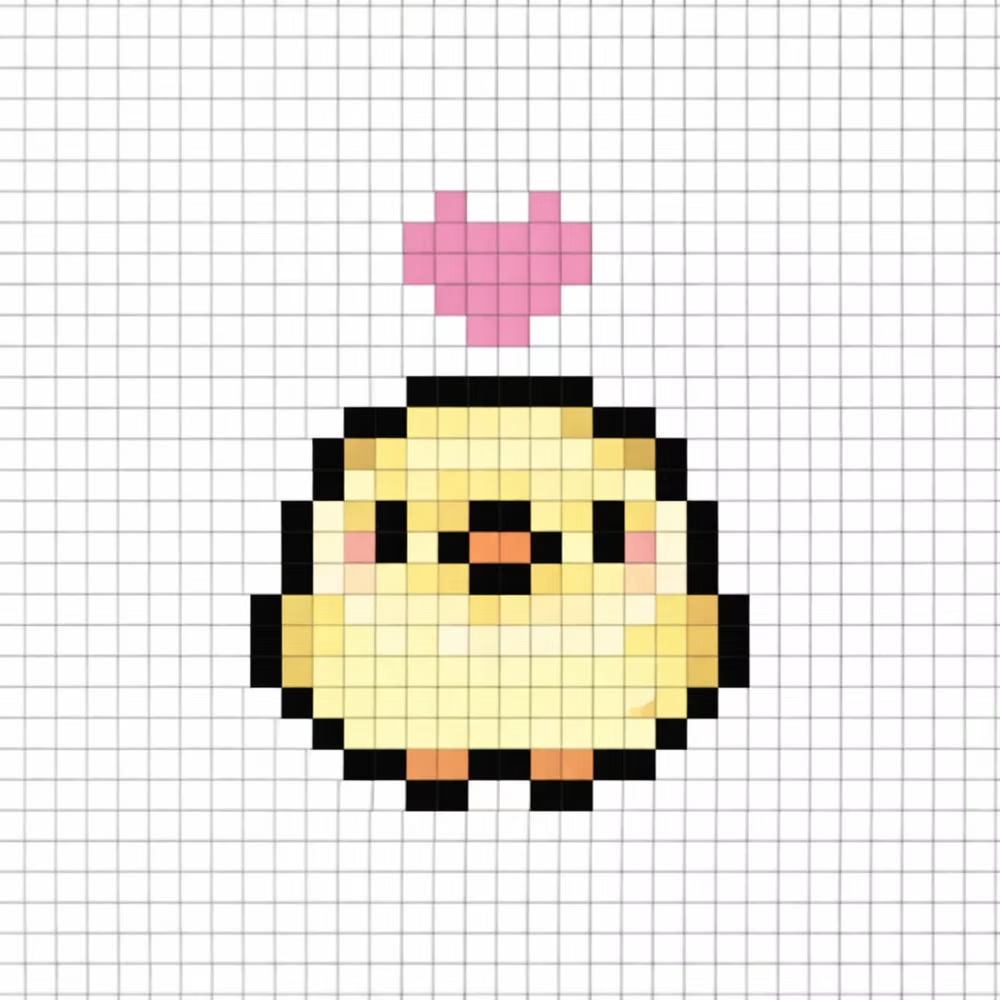
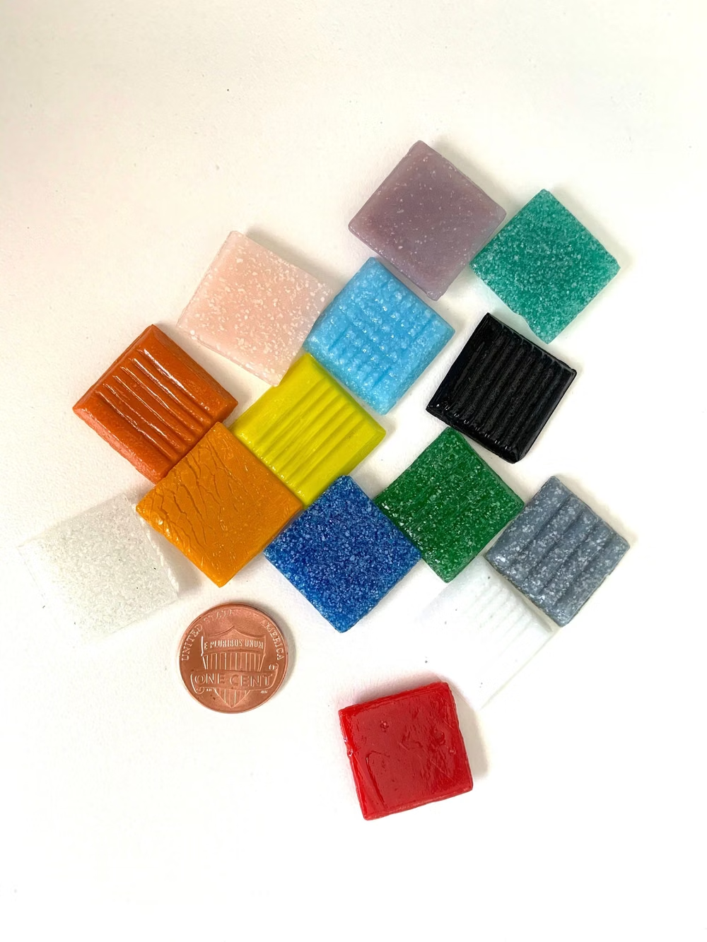
Pixel Art UI design style
Low-resolution graphics, limited palettes, blocky typography, and game-inspired interface details.
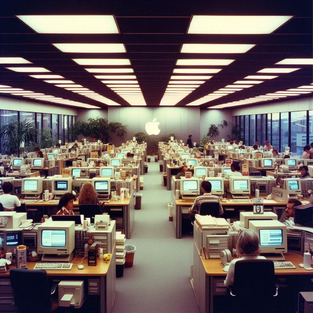
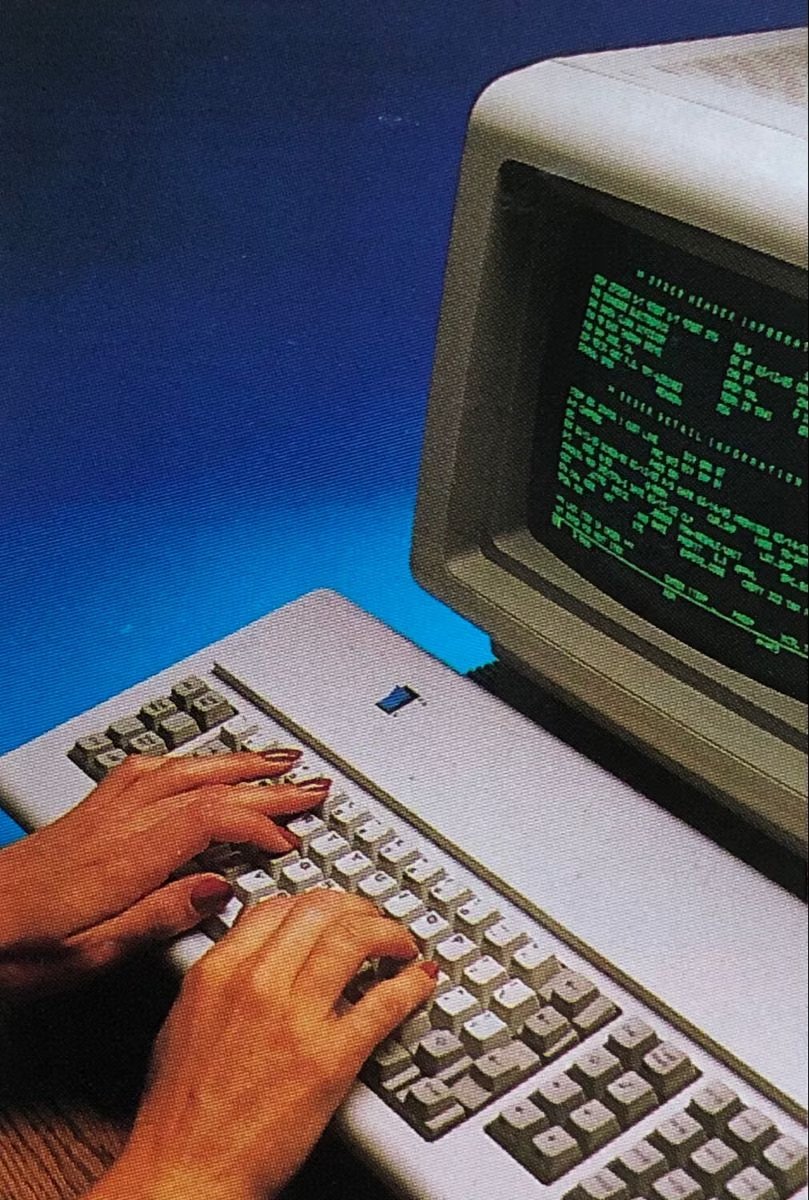
Retro Computing UI design style
CRT glow, bitmap fonts, window chrome, limited palettes, scanlines, floppy-disk motifs, and vintage operating-system conventions.
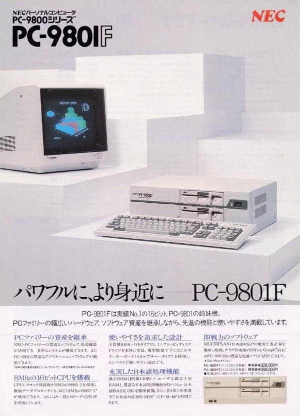
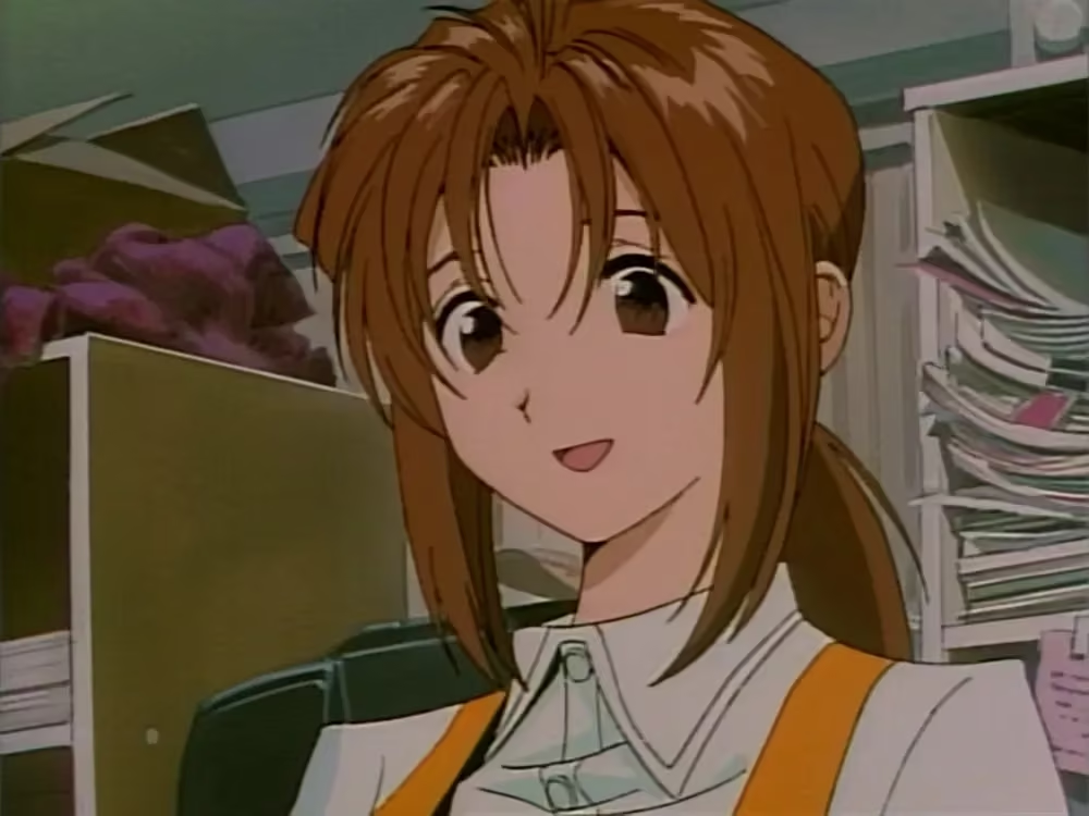
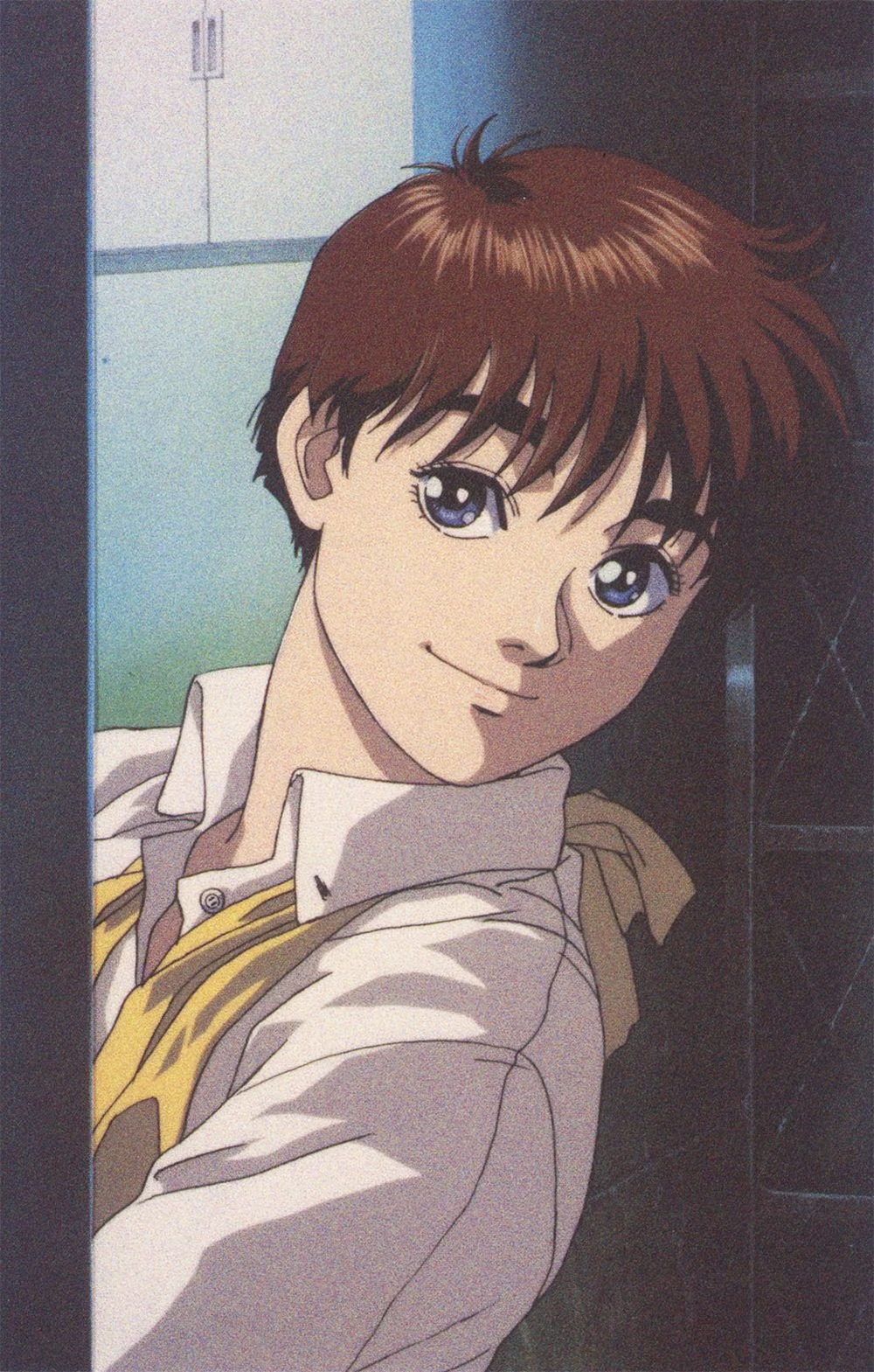
PC-98 UI design style
NEC PC-9800-era Japanese games pair relatively high-resolution 640×400 scenes with tightly limited color, meticulous dithering, detailed anime portraits, and compact visual-novel or adventure-game interfaces.