Retro Computing UI design style
CRT glow, bitmap fonts, window chrome, limited palettes, scanlines, floppy-disk motifs, and vintage operating-system conventions.
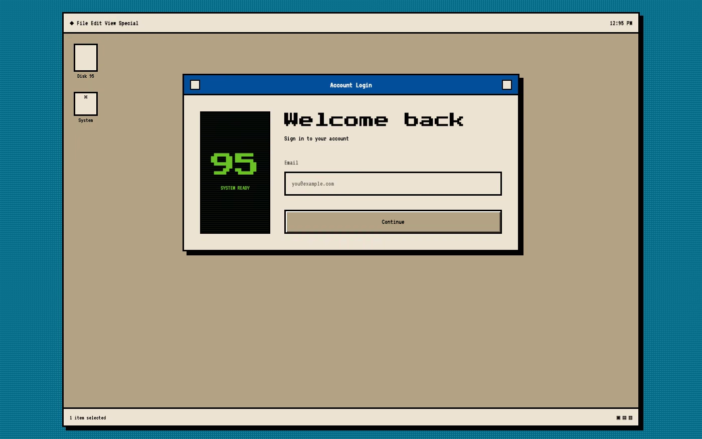
Design overview
- Signature elements
- CRT glow, bitmap fonts, window chrome, limited palettes, scanlines, floppy-disk icons. In daisyUI themes, set `--noise: 1;` and `--depth: 1;`.
- Best suited to
- Developer tools, games, music software, portfolios, emulators, and technology museums.
- Layout principles
- Structure the interface as a vintage operating-system desktop with overlapping windows, menu bars, icon grids, dialogs, and persistent status regions.
History and origins
A fact-checked account of where this visual language came from, with links to the references used.
- Period
- Source hardware from the 1970s–1990s; preservation and revival ongoing
- Origin
- Home-computer, workstation, arcade, and software cultures worldwide
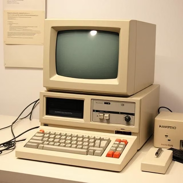
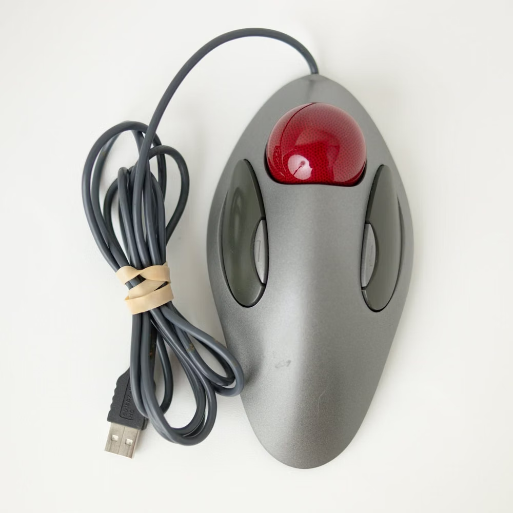
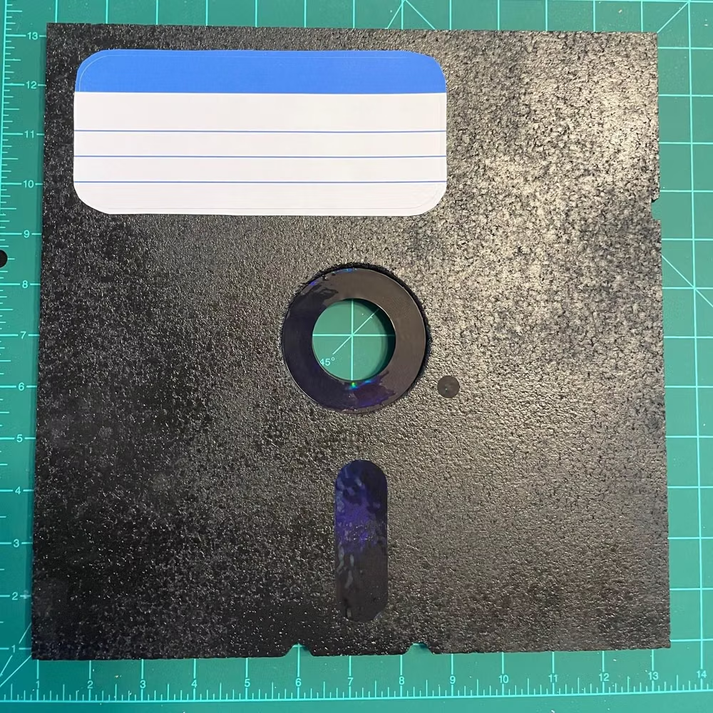
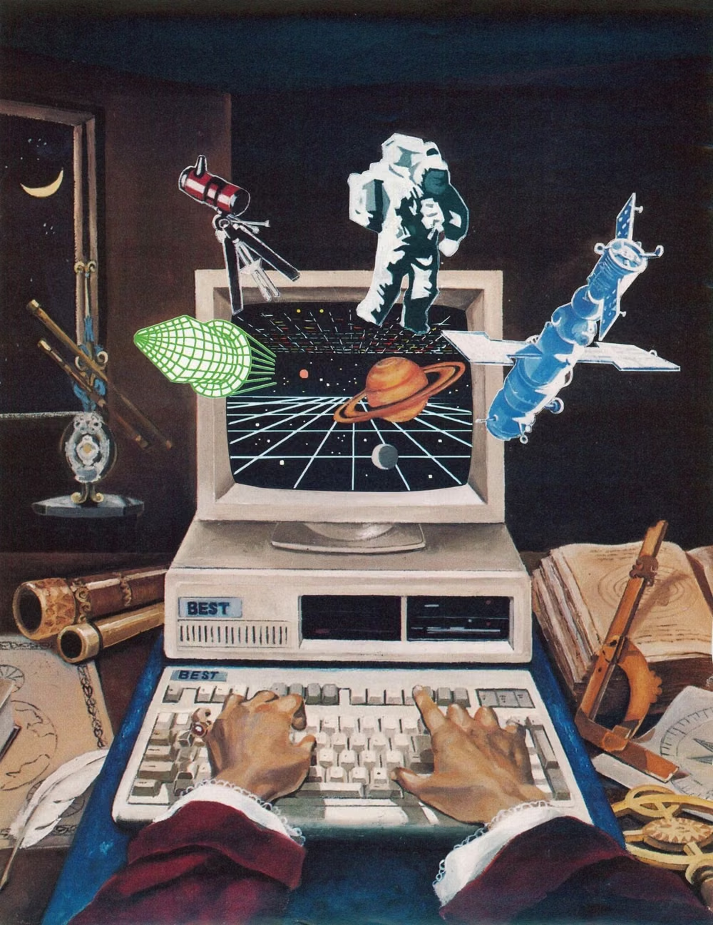
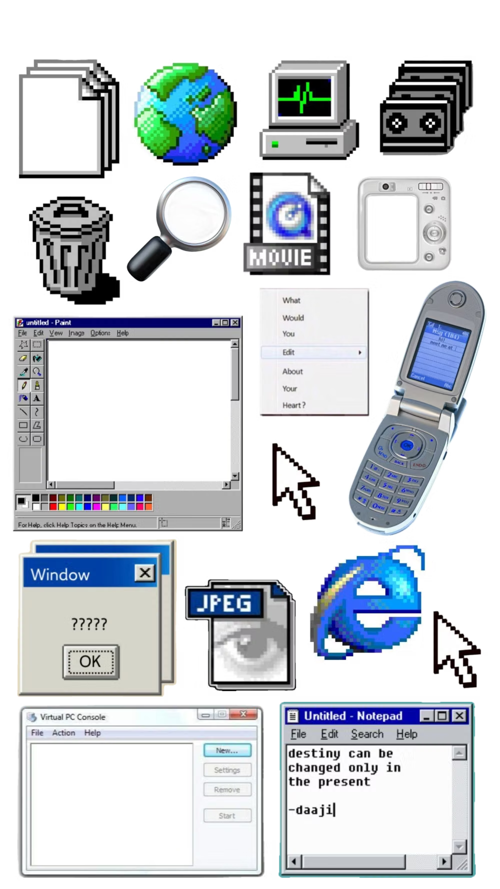
Retro Computing is both a preservation practice and a visual category. Enthusiasts maintain and emulate older computers, operating systems, games, displays, and peripherals, while designers selectively reuse bitmap fonts, window chrome, beige hardware, scanlines, and constrained palettes; because it spans many incompatible platforms and decades, it has no single visual origin.
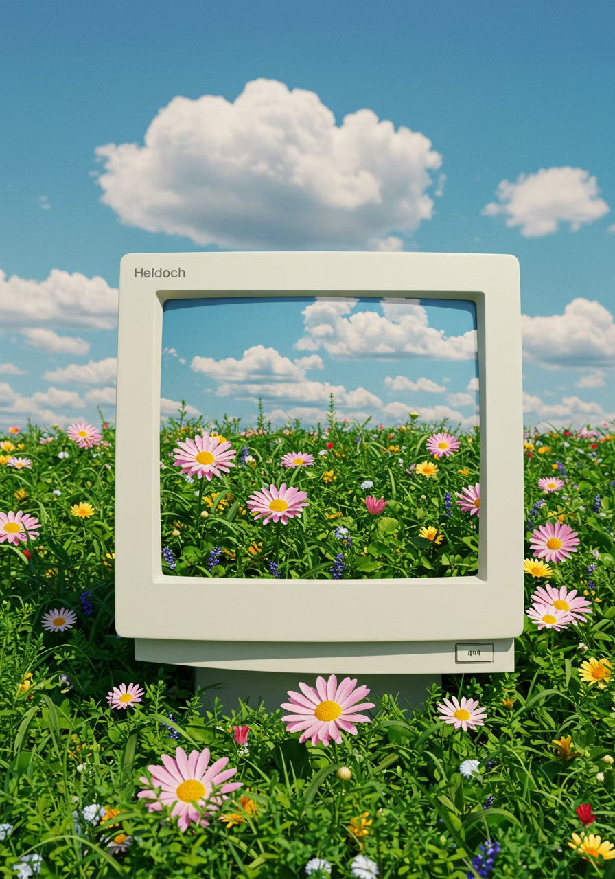
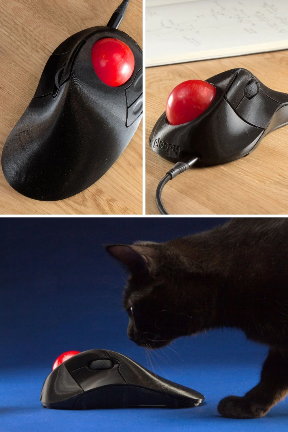
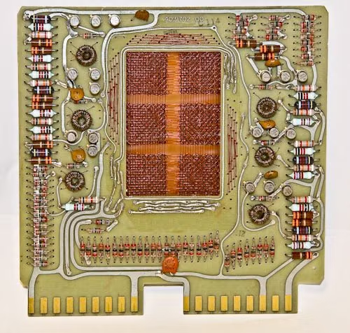
Moodboard and visual references
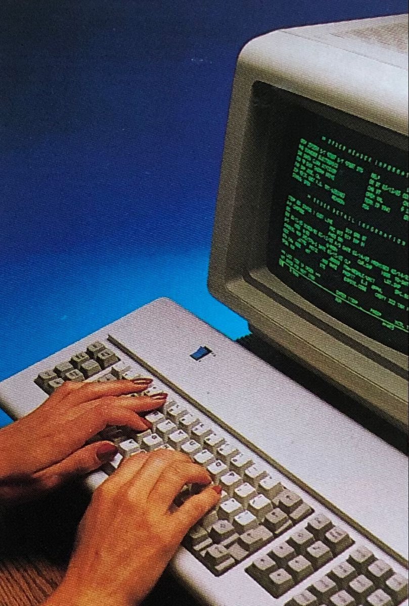
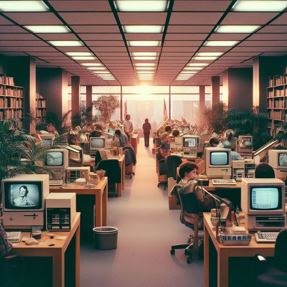
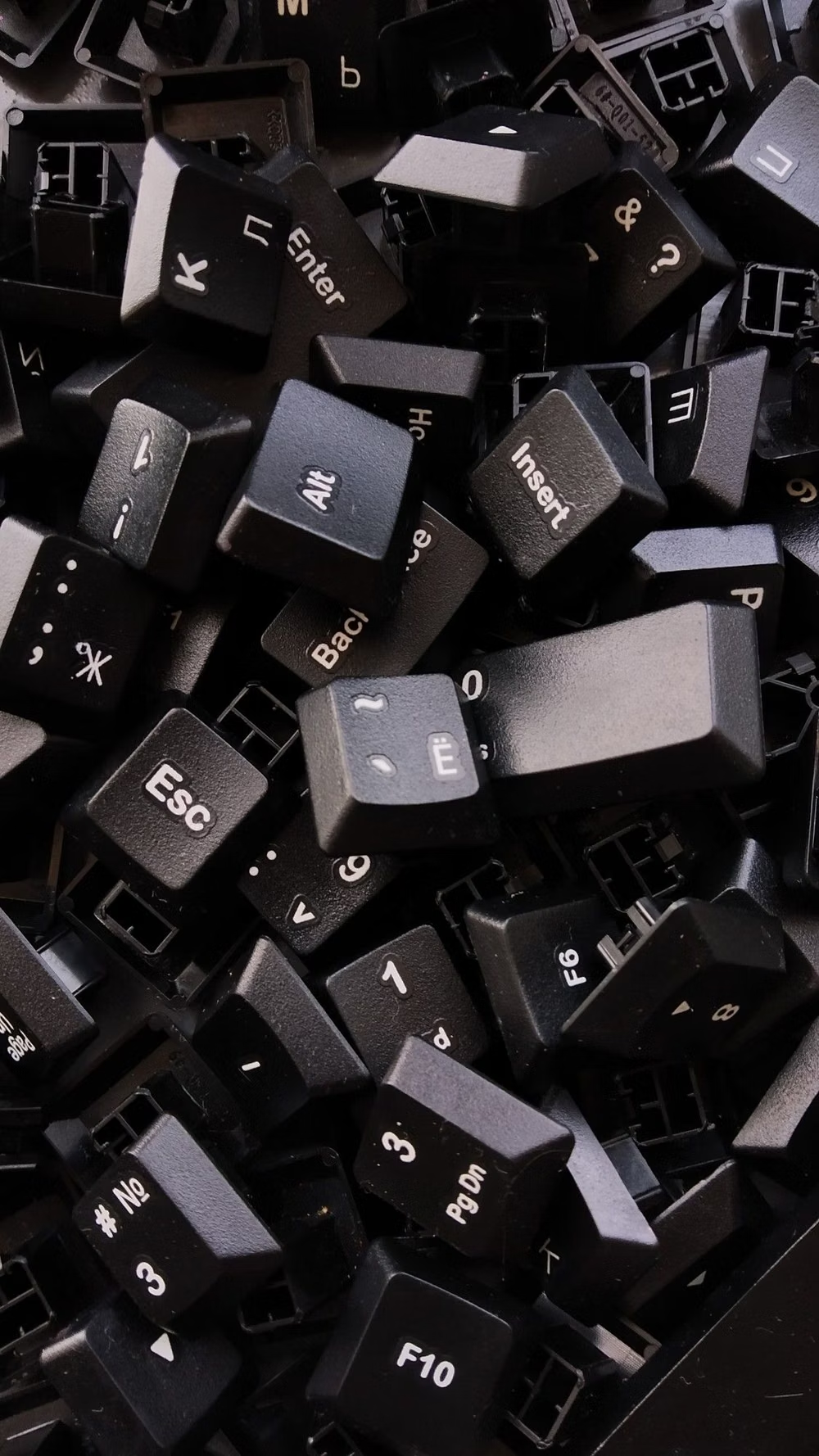
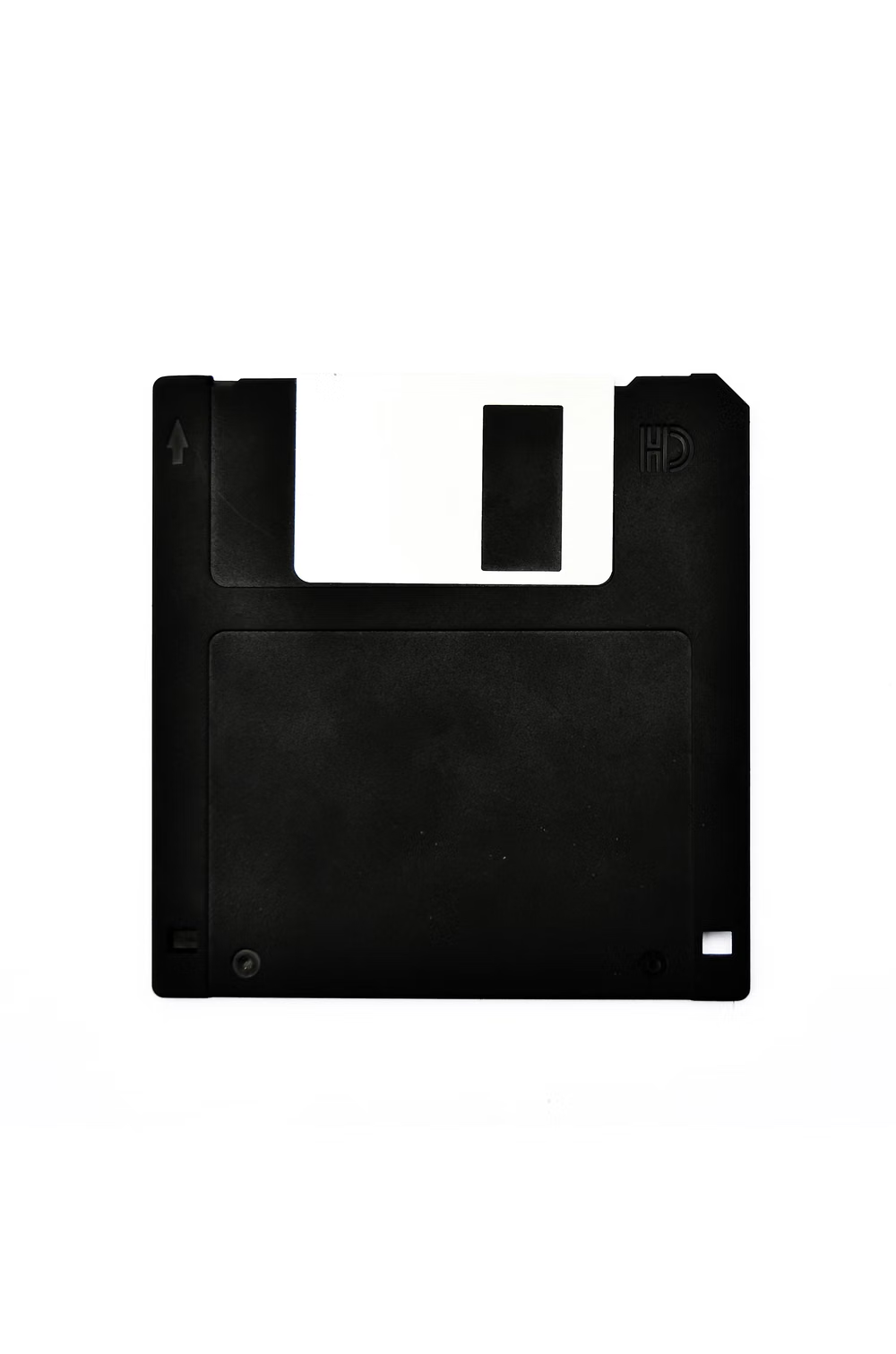
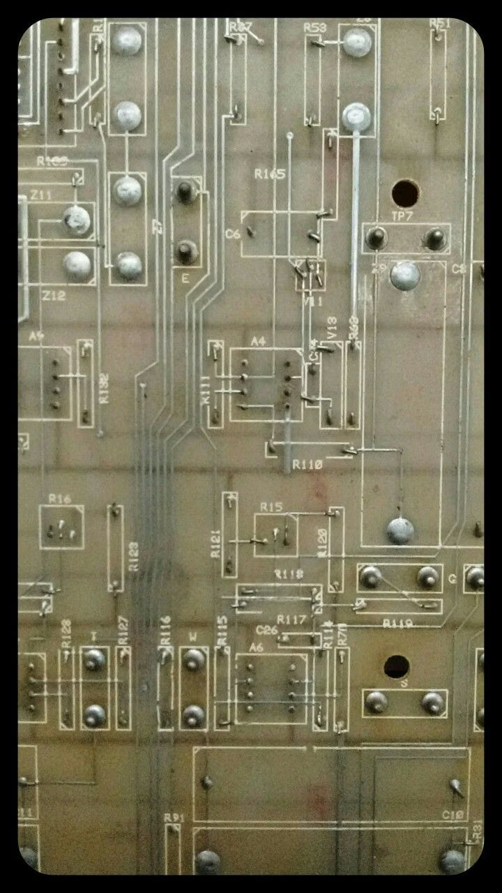
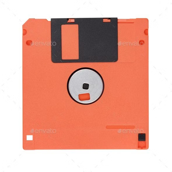
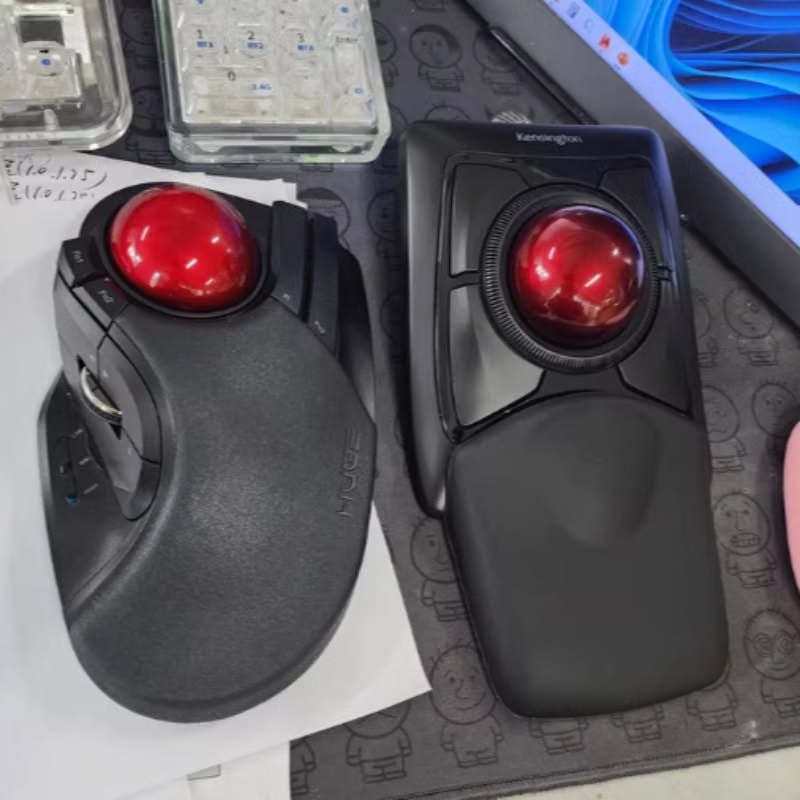
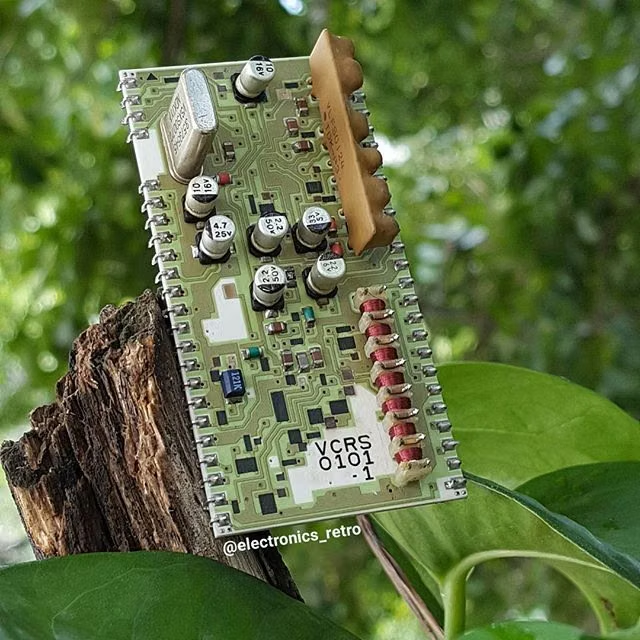
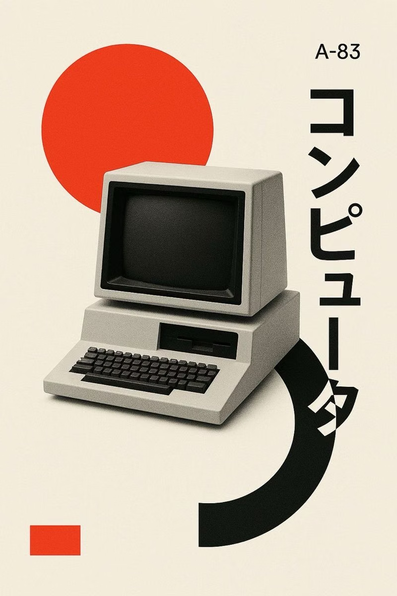
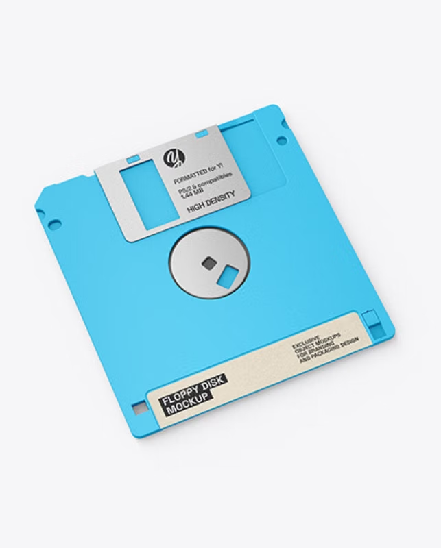
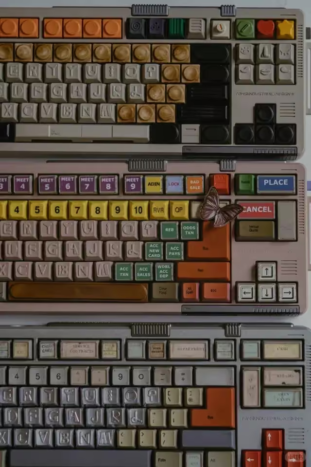
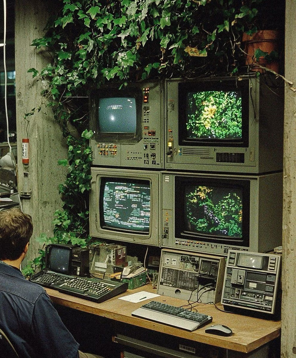
A visual study of the forms, inspirations, materials, colors, type, and cultural references associated with this UI design style.
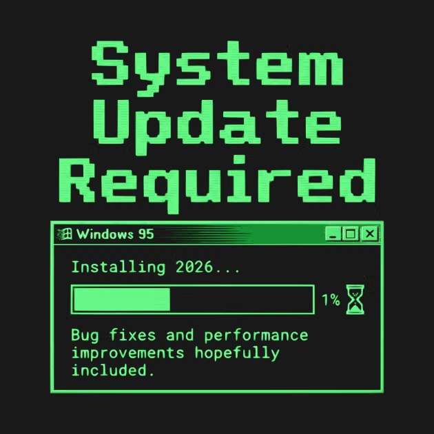
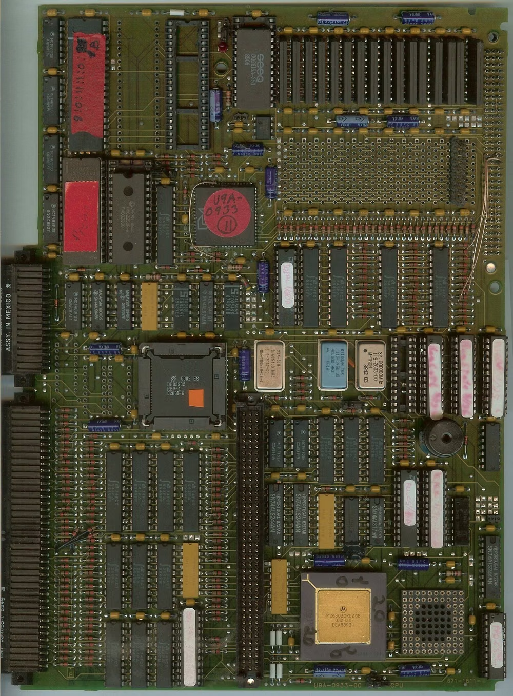
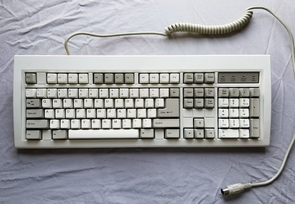
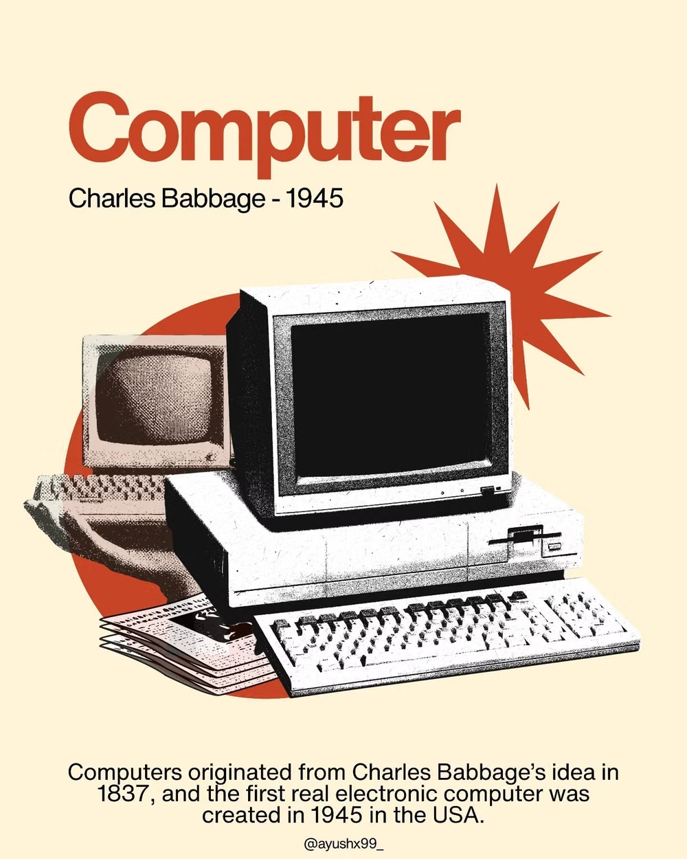
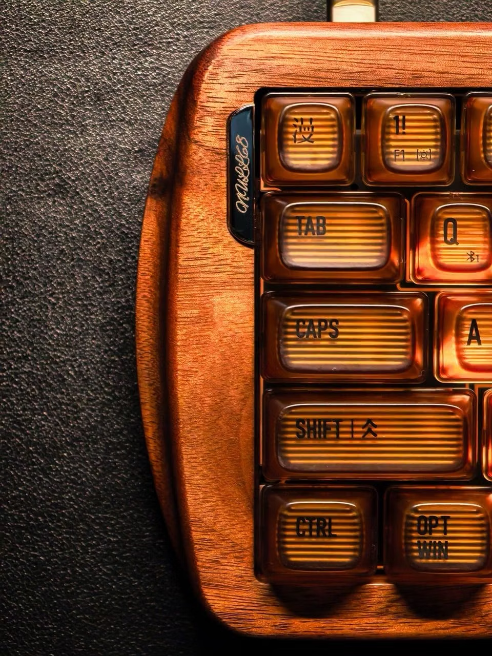
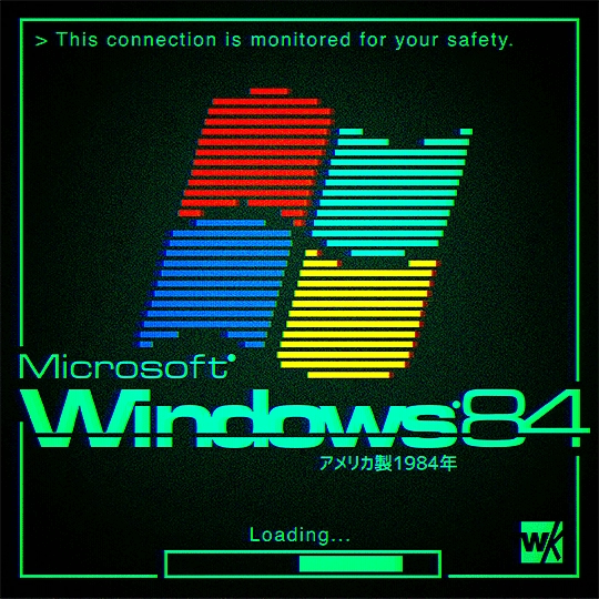
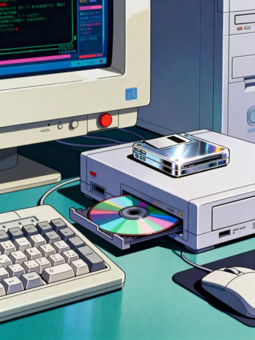
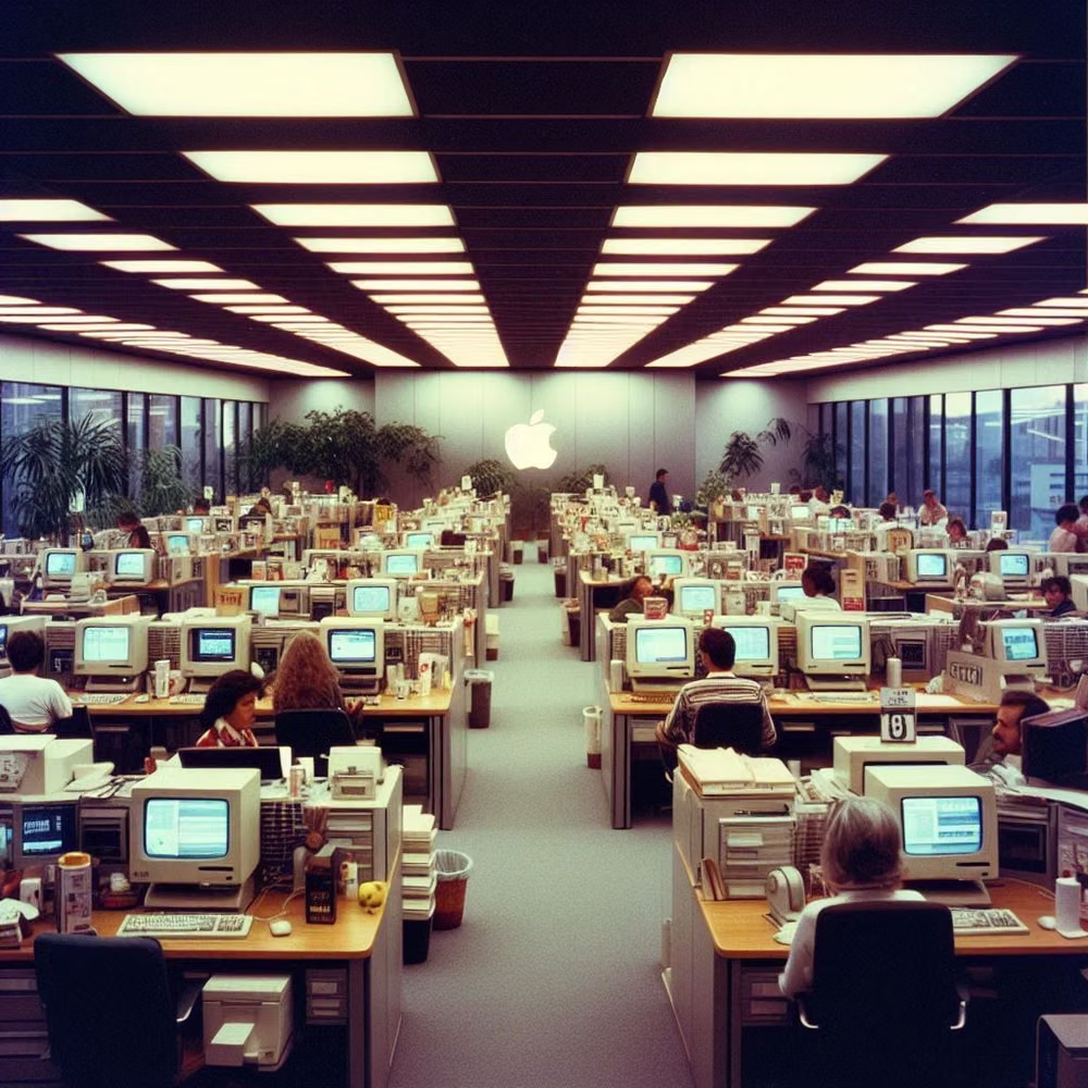
Design principles and implementation
Use these principles to write a focused AI UI design prompt instead of asking for a vague visual treatment.
Color direction
Choose one historically coherent system palette such as beige and navy, grayscale Macintosh, or phosphor black, keeping color depth deliberately limited. In a daisyUI theme using a beige-and-navy palette, use navy for `primary`, muted teal for `secondary`, and assign monitor beige, putty, and darker case beige to `base-100`, `base-200`, and `base-300`.
Imagery direction
Use CRT screens, floppy disks, bitmap icons, old peripherals, window captures, pixel cursors, and authentic software or hardware details.
Content density
Use medium to high desktop density with compact menus, lists, and dialogs, preserving clear focus and z-order among overlapping windows. Use the `*-sm` size variants for daisyUI components to preserve this compact working density.
Motion direction
Use window open and close steps, hourglass or watch cursors, disk activity, CRT boot, and discrete progress changes instead of fluid app motion.
Shape language
Favor pixel window chrome, square icon wells, one-pixel rules, inset panels, title bars, and hard-edged buttons from the selected system era. In daisyUI themes, set the `--radius-*` variables to `0` or `0.25rem`.
Typography rules
Use period-appropriate bitmap, system, or monospace type at native integer sizes, keeping every control label crisp and historically consistent.
Suggested Typfaces
VT323
Fresh daisies glow in warm sunlight
Fresh daisies glow in warm sunlight
1 2 3 4 5 6 7 8 9 0
Press Start 2P
Fresh daisies glow in warm sunlight
Fresh daisies glow in warm sunlight
1 2 3 4 5 6 7 8 9 0
IBM Plex Mono
Fresh daisies glow in warm sunlight
Fresh daisies glow in warm sunlight
1 2 3 4 5 6 7 8 9 0
Silkscreen
Fresh daisies glow in warm sunlight
Fresh daisies glow in warm sunlight
1 2 3 4 5 6 7 8 9 0
Pixelify Sans
Fresh daisies glow in warm sunlight
Fresh daisies glow in warm sunlight
1 2 3 4 5 6 7 8 9 0
Build a Retro Computing interface with daisyUI
The live example translates this direction into daisyUI components and semantic theme tokens.
To generate a full page in the same visual language, give the style name and the design rules above to Blueprint MCP.
Related UI design styles
Compare nearby visual languages that share typography, shapes, use cases, or signature elements.
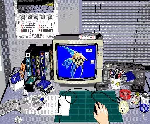
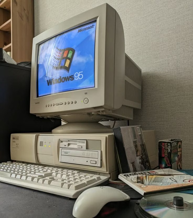
PC-98 UI design style
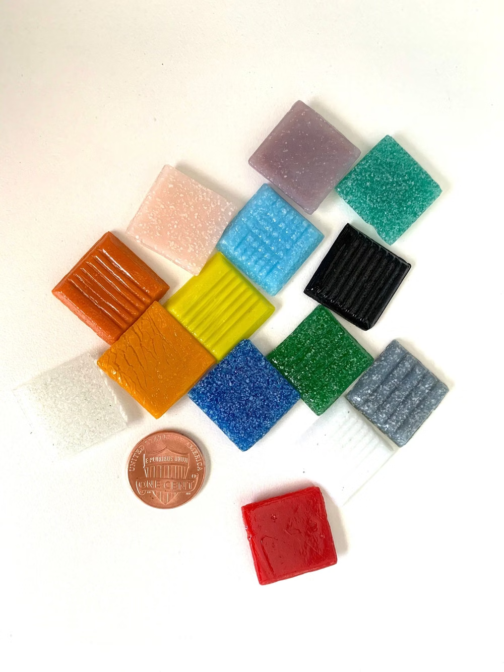
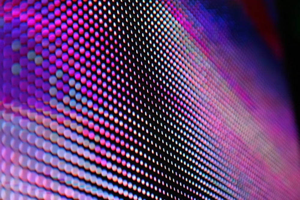
NEC PC-9800-era Japanese games pair relatively high-resolution 640×400 scenes with tightly limited color, meticulous dithering, detailed anime portraits, and compact visual-novel or adventure-game interfaces.

Pixel Art UI design style
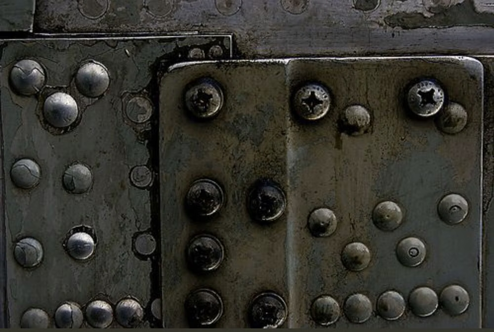
Low-resolution graphics, limited palettes, blocky typography, and game-inspired interface details.

Skeuomorphism UI design style
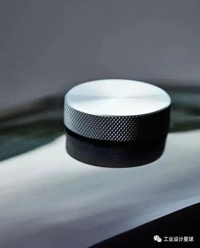
Photorealistic or softly modeled interfaces use material depth, mechanical controls, and analog-equipment cues, often combining industrial nostalgia with clean retro-futurist geometry.