Neumorphism UI design style
Low-contrast monochromatic surfaces with controls that appear softly raised from or pressed into the background.
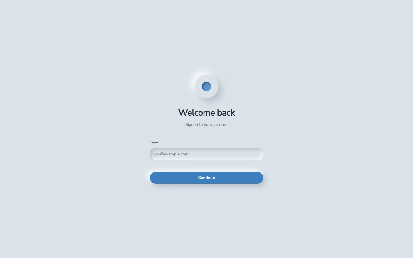
Design overview
- Signature elements
- monochromatic surfaces, soft outer shadows, inset shadows, low contrast, rounded controls, embossed appearance. In daisyUI themes, set `--depth: 1;`.
- Best suited to
- Wellness apps, calculators, smart-home controls, and low-density utilities.
- Layout principles
- Place a small number of controls directly on one continuous base surface, leaving wide gaps so paired light and dark shadows remain visually distinct.
History and origins
A fact-checked account of where this visual language came from, with links to the references used.
- Period
- Late 2019–early 2020s
- Origin
- Online UI design community
Neumorphism is a short-lived digital style that fused minimal surfaces with soft skeuomorphic relief. The naming record is unusually traceable: Jason Kelley used “Neuomorphism” in December 2019, and Michał Malewicz’s “Neumorphism” formulation spread soon afterward; accessibility criticism followed because low-contrast controls can be difficult to perceive.
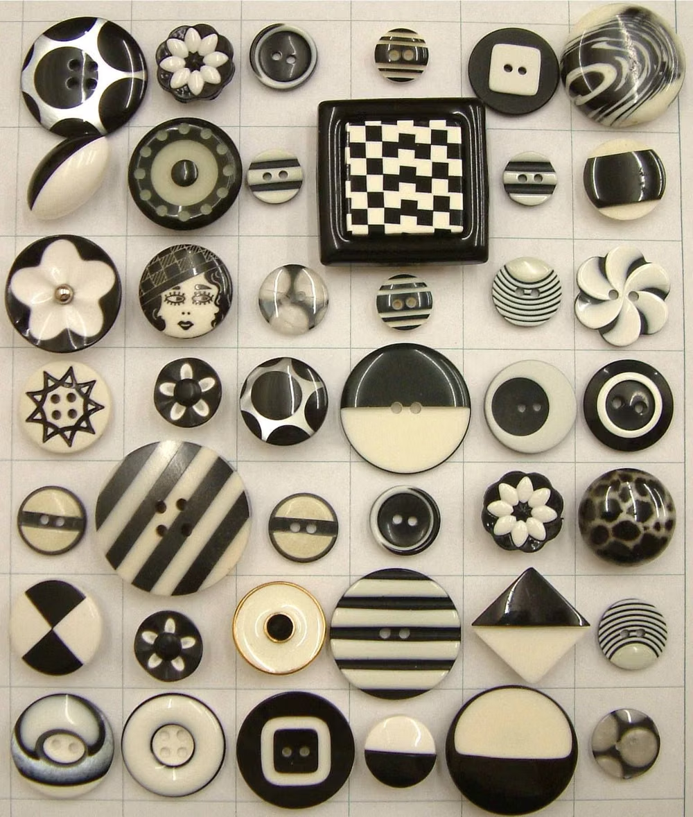
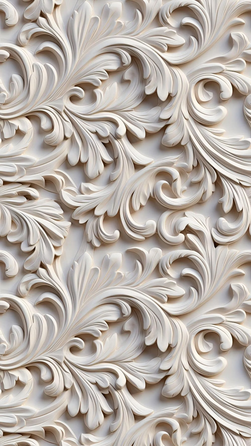
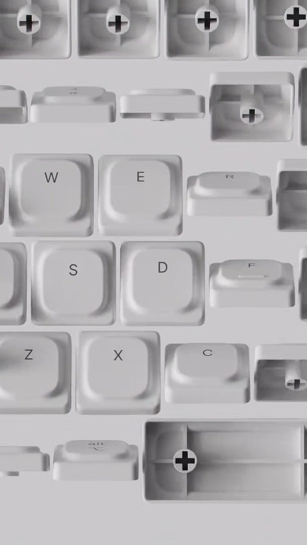
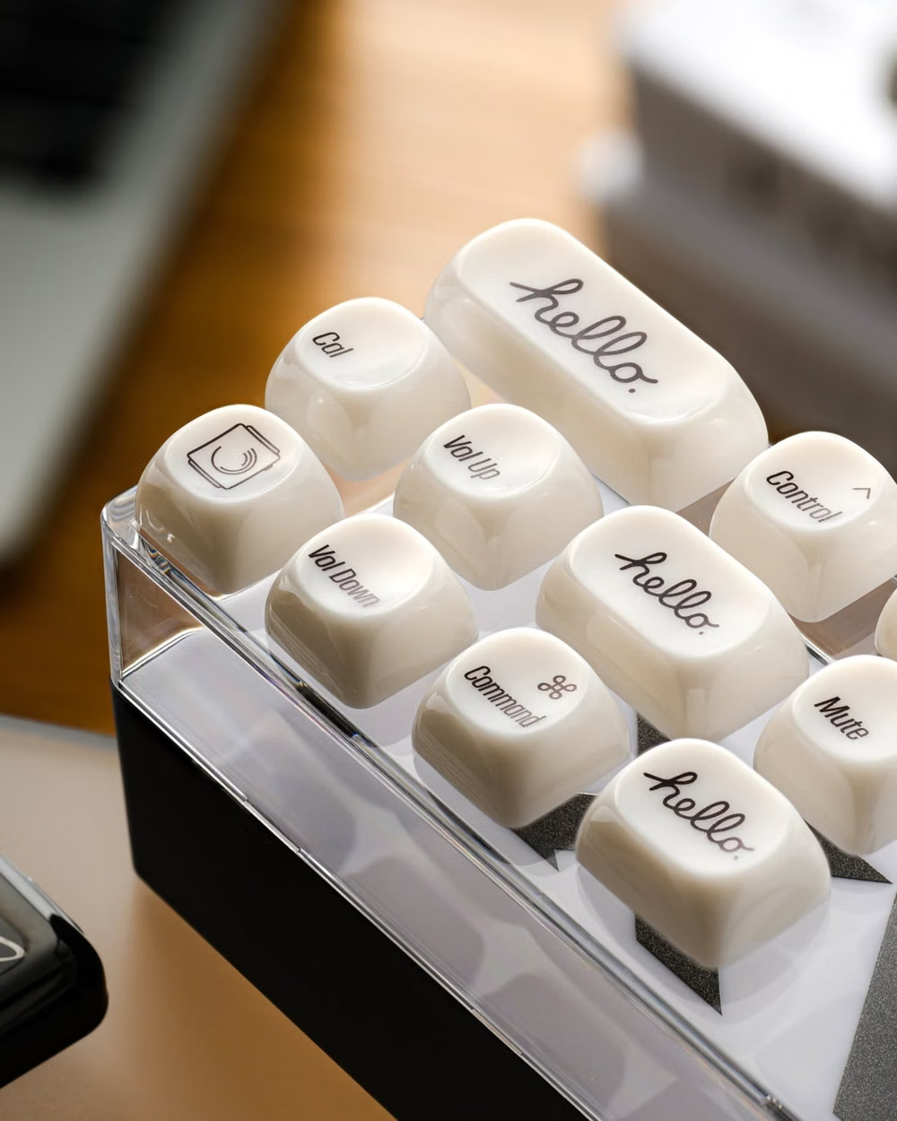
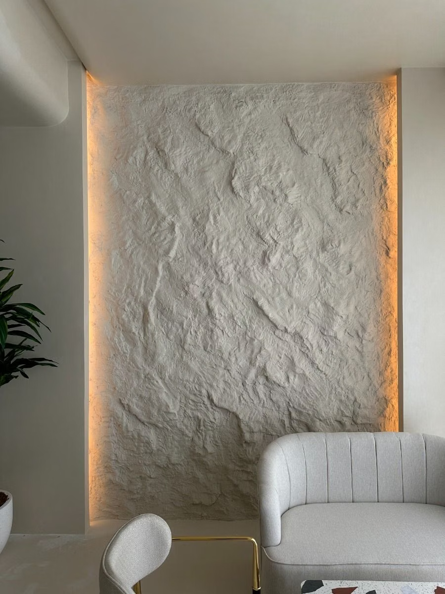
Moodboard and visual references
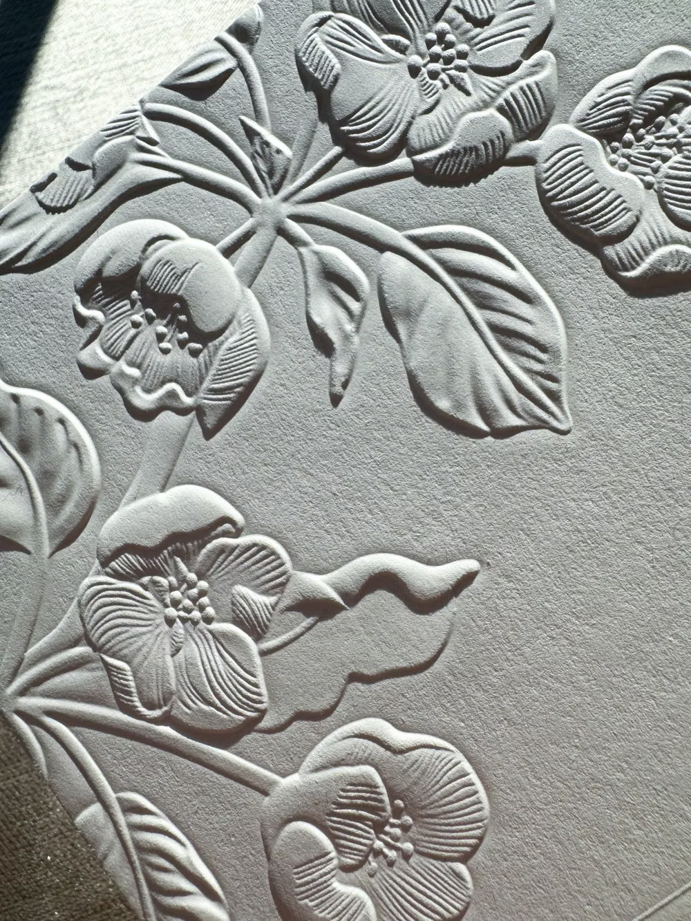
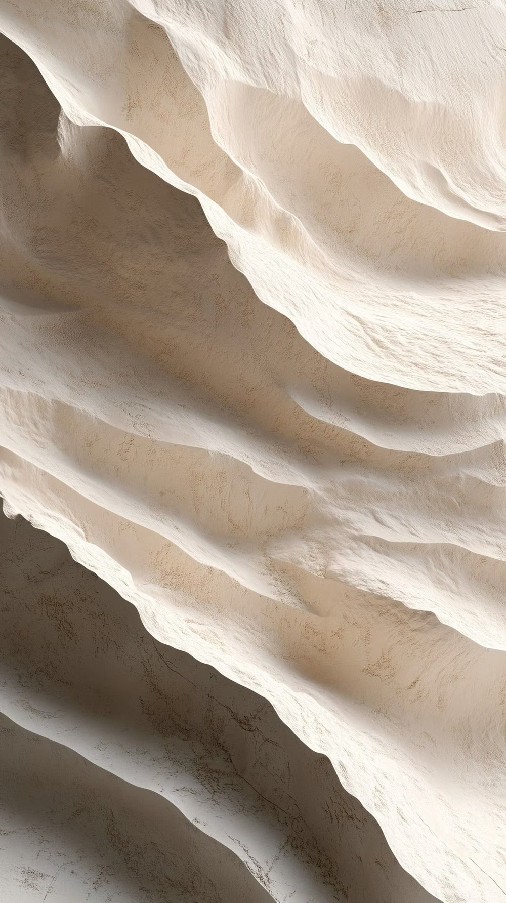
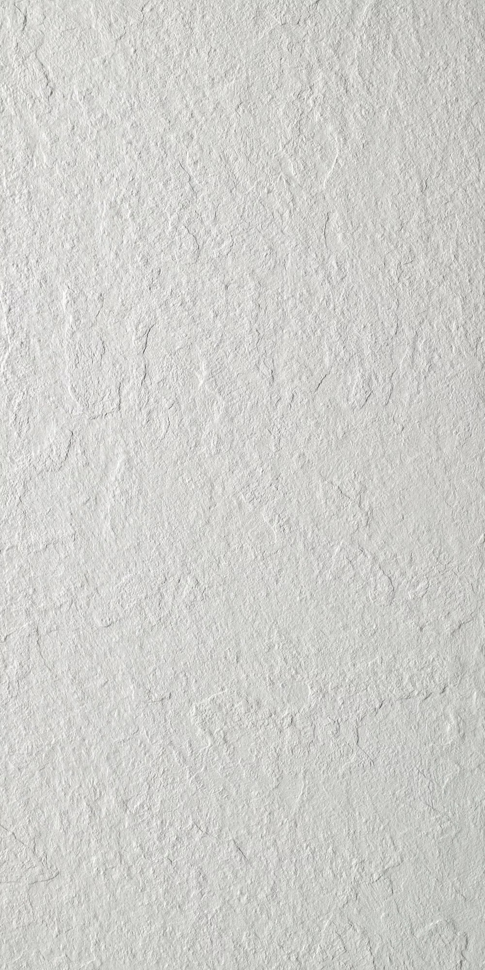
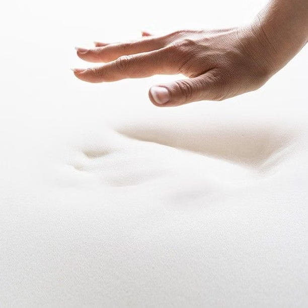
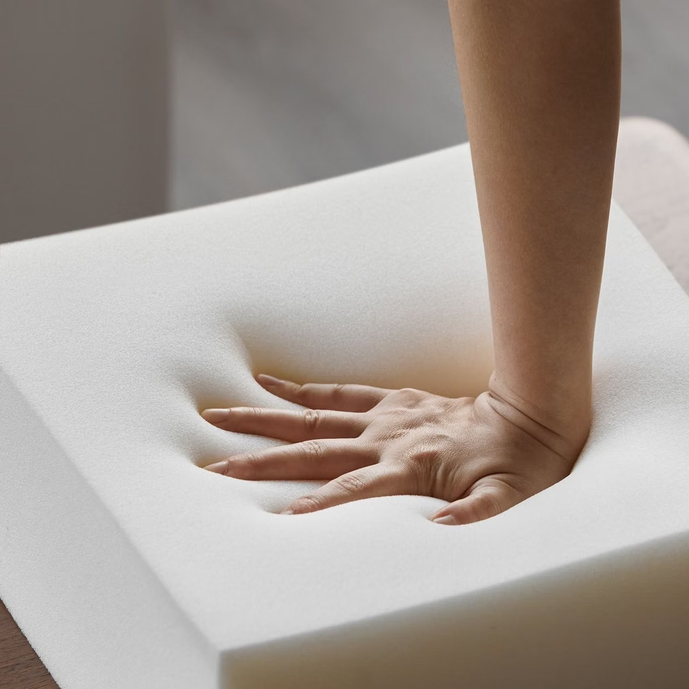
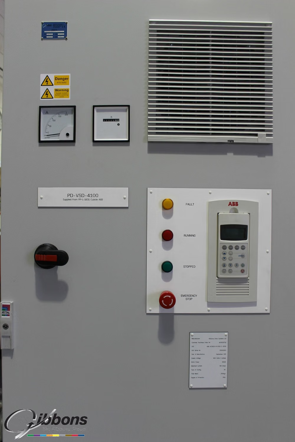
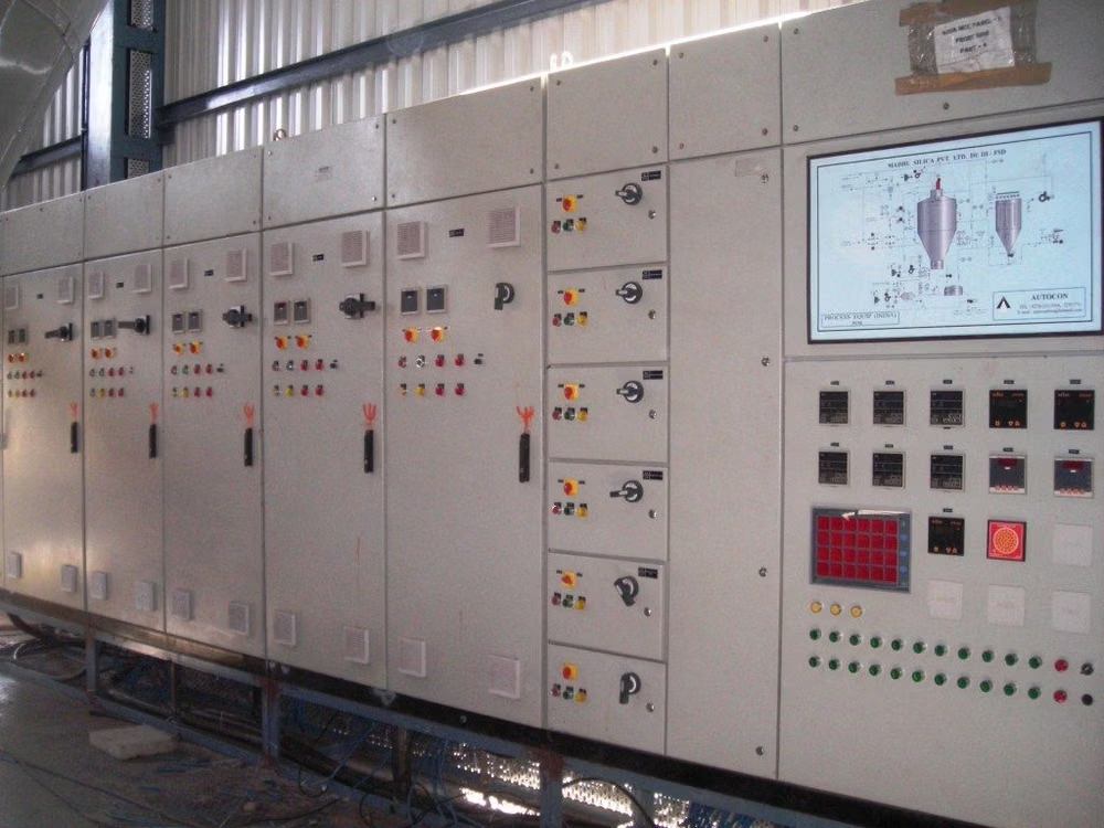
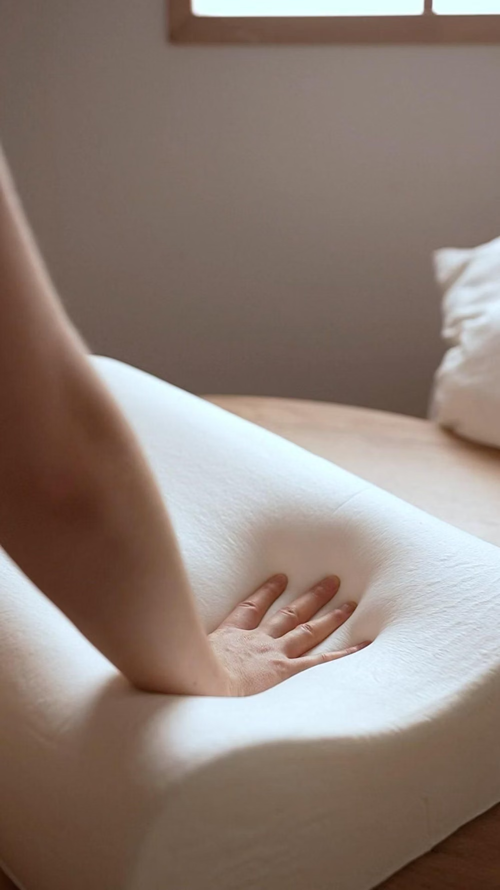
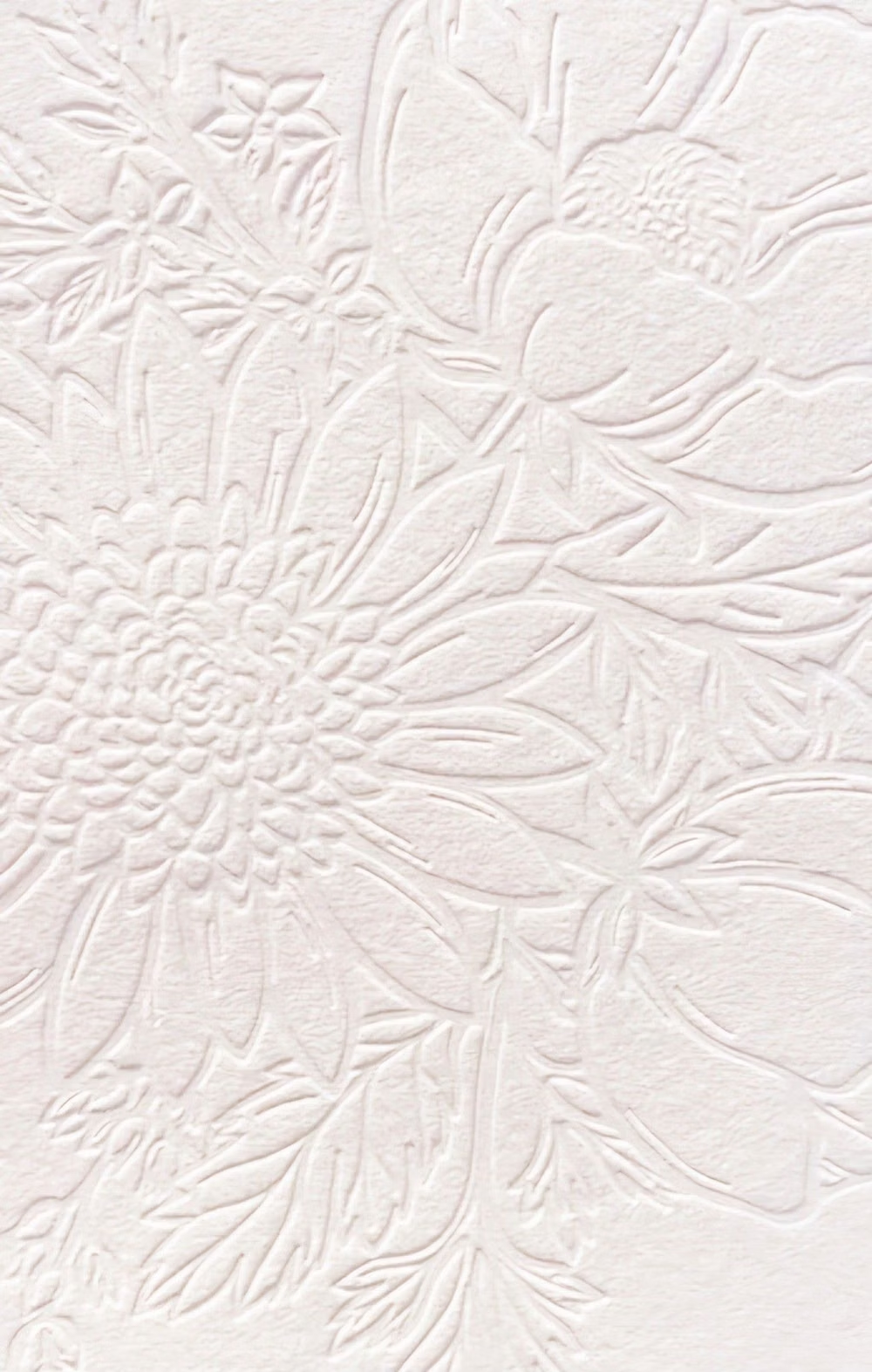
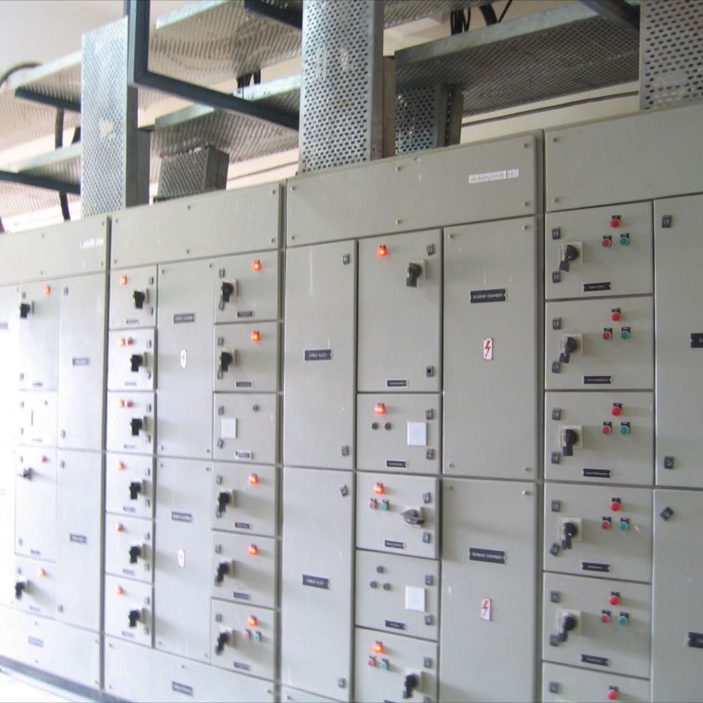
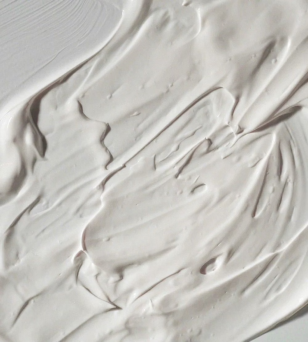
A visual study of the forms, inspirations, materials, colors, type, and cultural references associated with this UI design style.
Design principles and implementation
Use these principles to write a focused AI UI design prompt instead of asking for a vague visual treatment.
Color direction
Use a narrow monochromatic range around a mid-light base, then add accessible dark text and one restrained accent for active or safety-critical states. In a daisyUI theme, use the restrained active-state hue for `primary`, a darker low-chroma version for `secondary`, and keep `base-100`, `base-200`, and `base-300` as clearly distinguishable steps within the same pale monochromatic family.
Imagery direction
Keep imagery rare; use softly embossed glyphs, monochrome product cutouts, or low-detail illustrations that share the surface lighting.
Content density
Keep density low, with one control cluster per region and no dense tables, long forms, or deeply nested panels.
Motion direction
Reverse outer shadows into inset shadows on press, use gentle spring release, and keep feedback slow enough for the material change to register.
Shape language
Favor circular dials, rounded rectangles, and broad pills with consistent extrusion depth and a single upper-left light direction. In daisyUI themes, set the `--radius-*` variables between `0.75rem` and `1.5rem`.
Typography rules
Use a rounded sans-serif at medium weight, increase contrast beyond the surrounding relief, and avoid thin gray labels on the base color.
Suggested Typfaces
Nunito Sans
Fresh daisies glow in warm sunlight
Fresh daisies glow in warm sunlight
1 2 3 4 5 6 7 8 9 0
Quicksand
Fresh daisies glow in warm sunlight
Fresh daisies glow in warm sunlight
1 2 3 4 5 6 7 8 9 0
Varela Round
Fresh daisies glow in warm sunlight
Fresh daisies glow in warm sunlight
1 2 3 4 5 6 7 8 9 0
Manrope
Fresh daisies glow in warm sunlight
Fresh daisies glow in warm sunlight
1 2 3 4 5 6 7 8 9 0
Urbanist
Fresh daisies glow in warm sunlight
Fresh daisies glow in warm sunlight
1 2 3 4 5 6 7 8 9 0
Build a Neumorphism interface with daisyUI
The live example translates this direction into daisyUI components and semantic theme tokens.
To generate a full page in the same visual language, give the style name and the design rules above to Blueprint MCP.
Related UI design styles
Compare nearby visual languages that share typography, shapes, use cases, or signature elements.
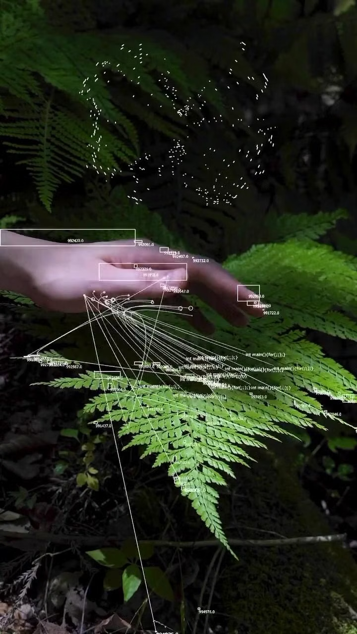

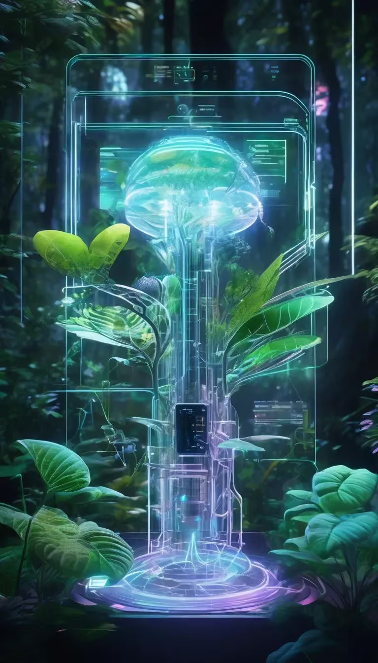
Luminous Eco-Skeuomorphism UI design style
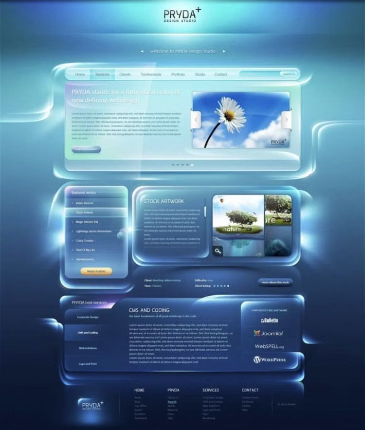
A glossy, tactile interface style that combines early-2010s skeuomorphism with futuristic ecological-tech aesthetics. Controls resemble illuminated physical hardware, with intense inner glows, radiant edges, and soft light bloom making interactive elements appear electrically powered.
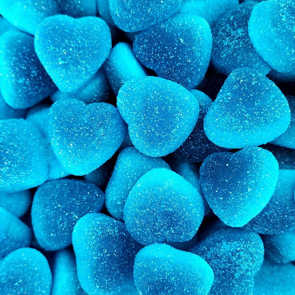
Aqua UI design style
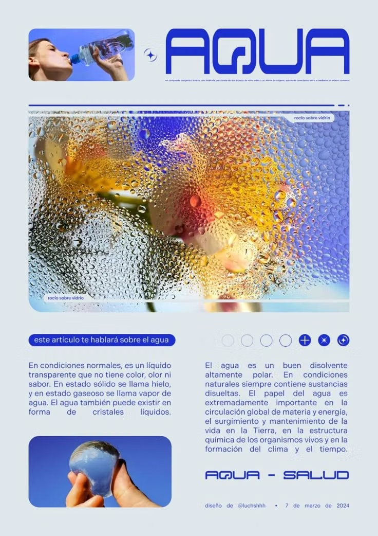
Glossy gel-like controls, candy colors, translucent highlights, pinstripes, and vivid dimensional icons.
Clean UI design style
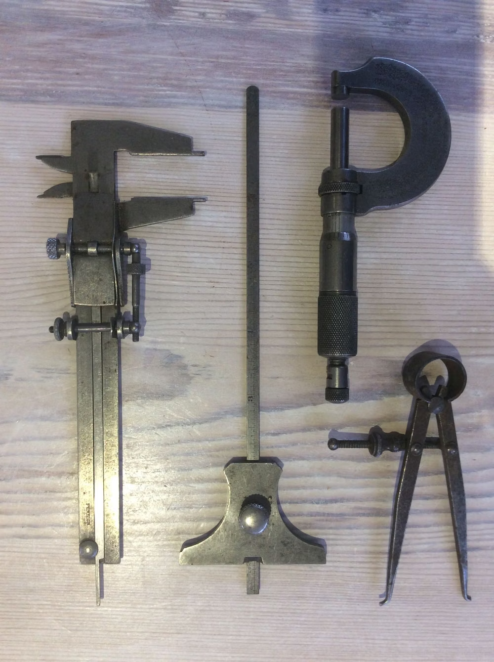
An engineered interface language pairs tightly controlled spacing, measured grids, layered neutral surfaces, and precise micro-details so dense information feels calm, airy, and aligned.