Y2K UI design style
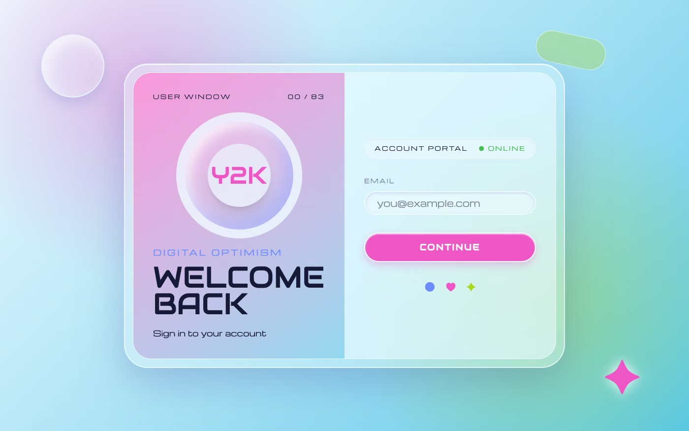
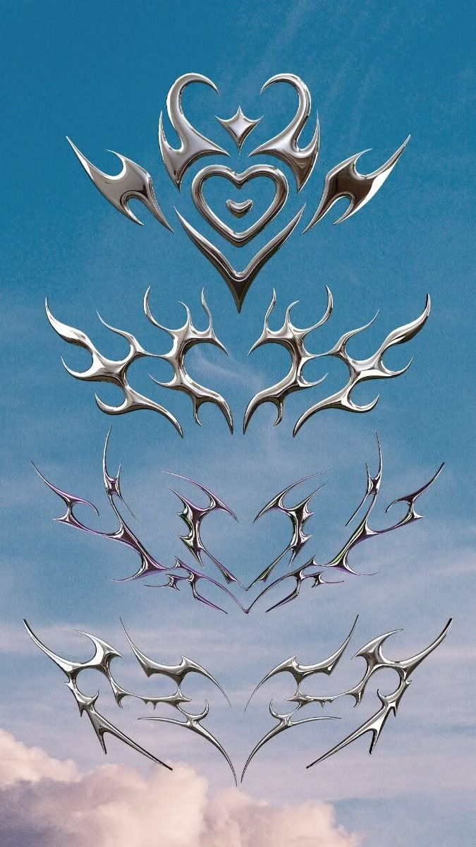
Glossy chrome, translucent plastics, bubble typography, metallic gradients, compact devices, and turn-of-the-millennium digital optimism.
Design overview
- Signature elements
- chrome gradients, translucent plastic, bubble lettering, lens flares, compact-device motifs, glossy icons. In daisyUI themes, set `--depth: 1;`.
- Best suited to
- Fashion, beauty, music, social products, and youth brands.
- Layout principles
- Arrange compact device-like windows, floating bubbles, product cutouts, and small interface chrome in a layered turn-of-the-millennium desktop composition.
History and origins
A fact-checked account of where this visual language came from, with links to the references used.
- Period
- Mid-1990s–around 2001 as a source style; major revival from the late 2010s
- Origin
- Global fashion, music, technology advertising, clubs, film, and graphic design
The original Y2K visual language formed around the approach of the year 2000 and the mix of technological optimism and anxiety surrounding the millennium bug. Chrome, translucent plastic, wraparound forms, cyber imagery, and late-1990s club culture defined much of the source period; in the 2020s, “Y2K” broadened into a looser label for early-2000s fashion, so contemporary usage is not always historically precise.
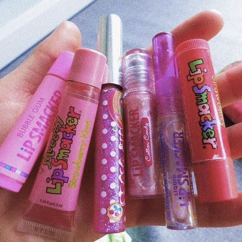
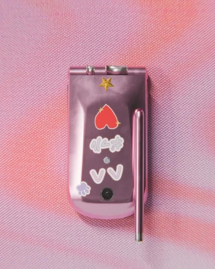
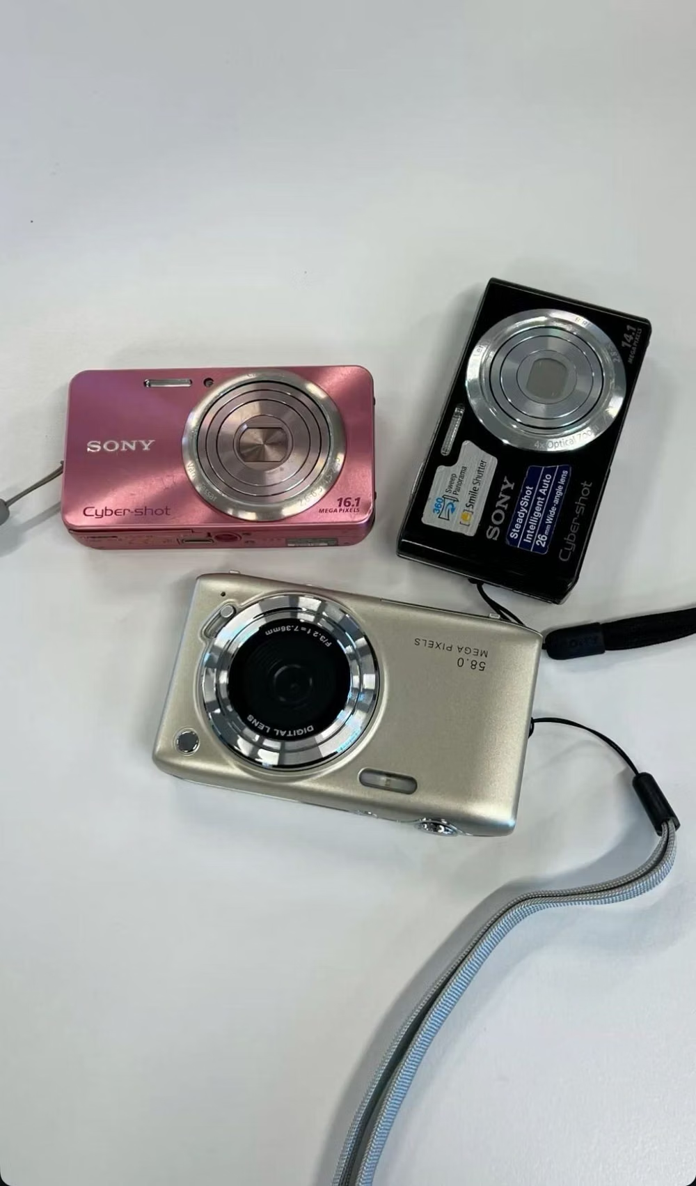
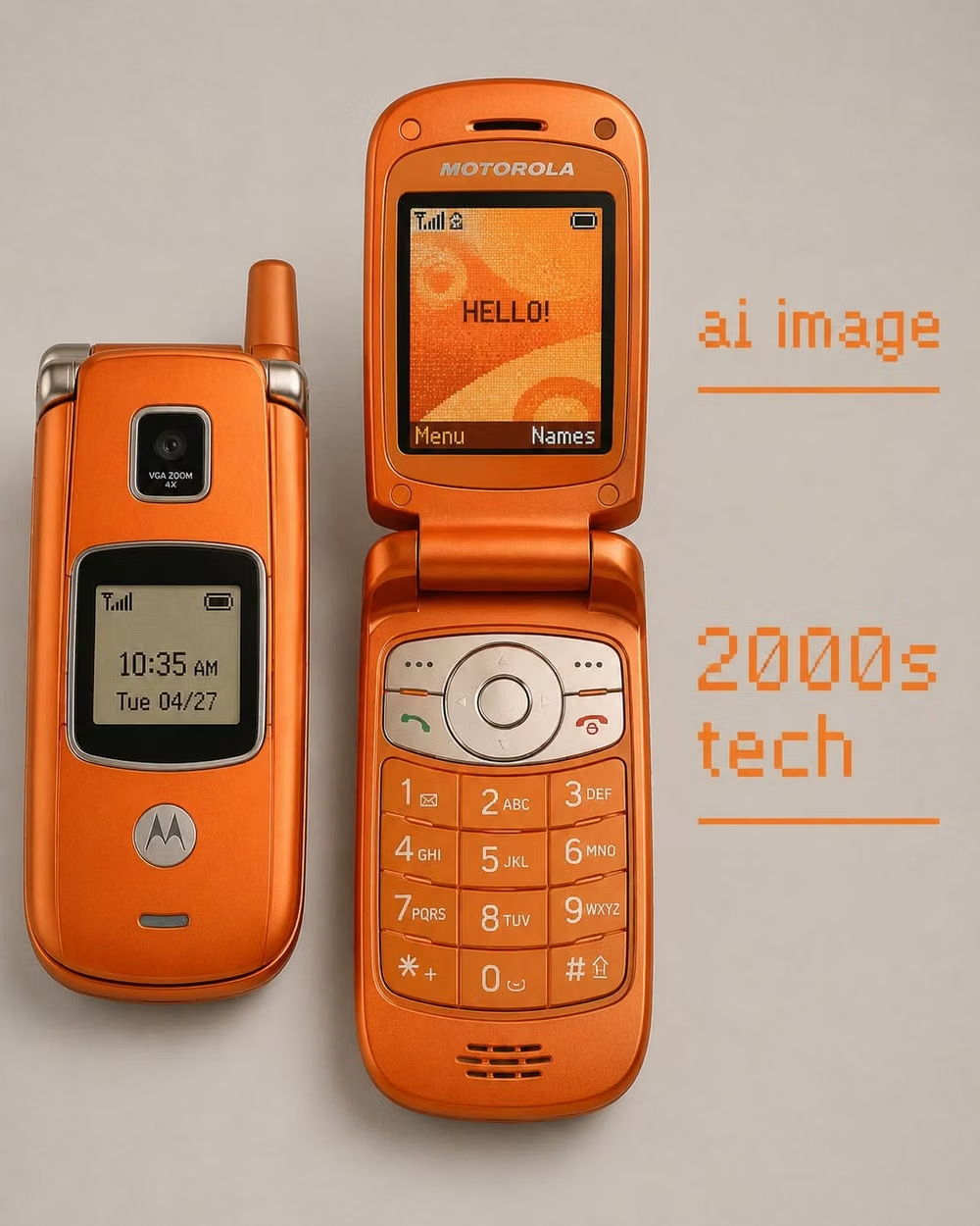
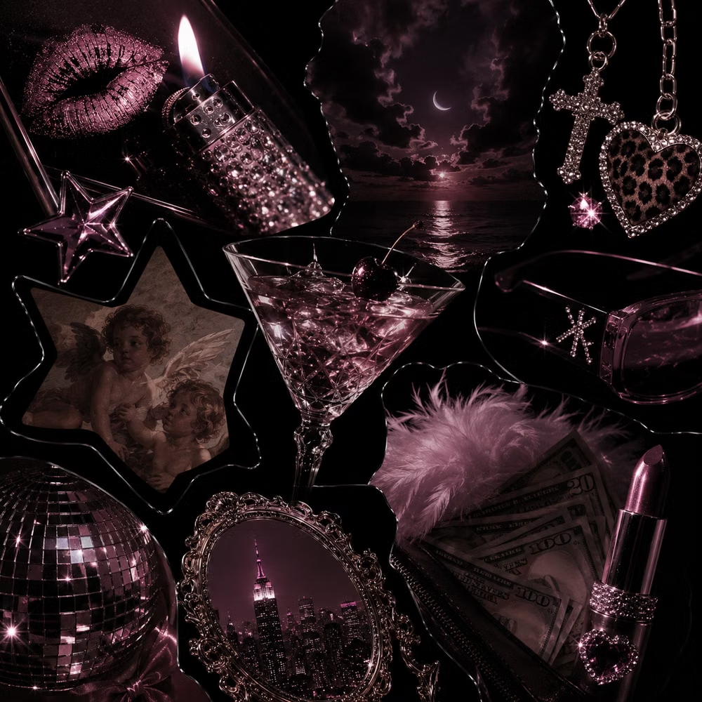
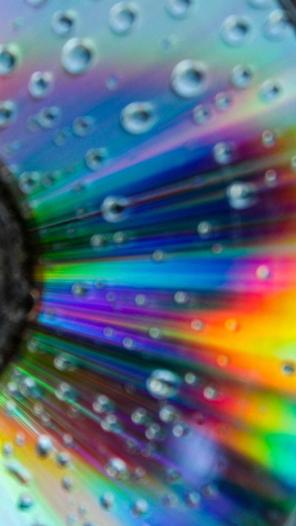
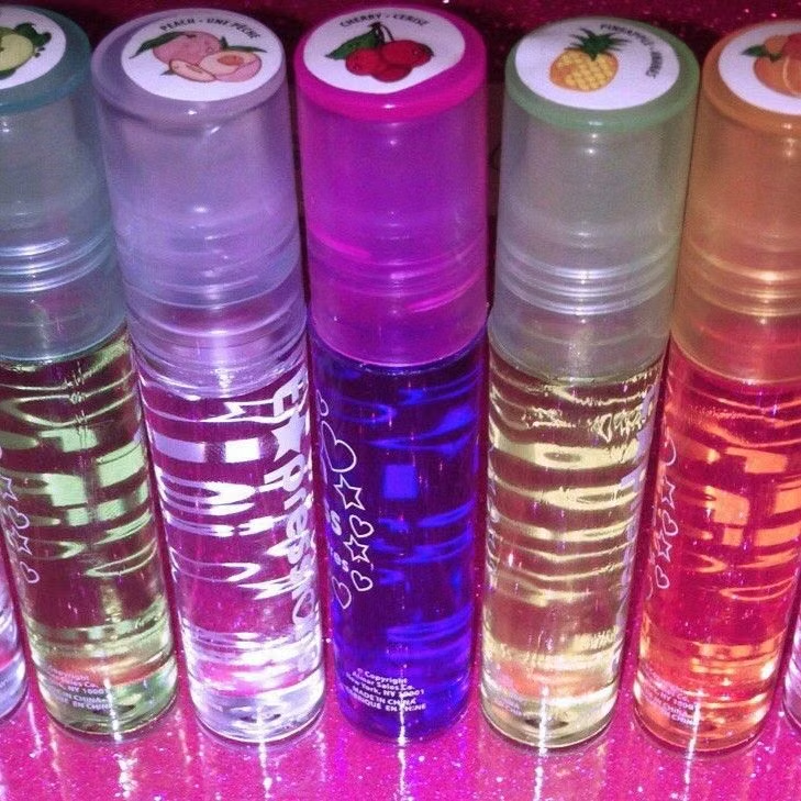
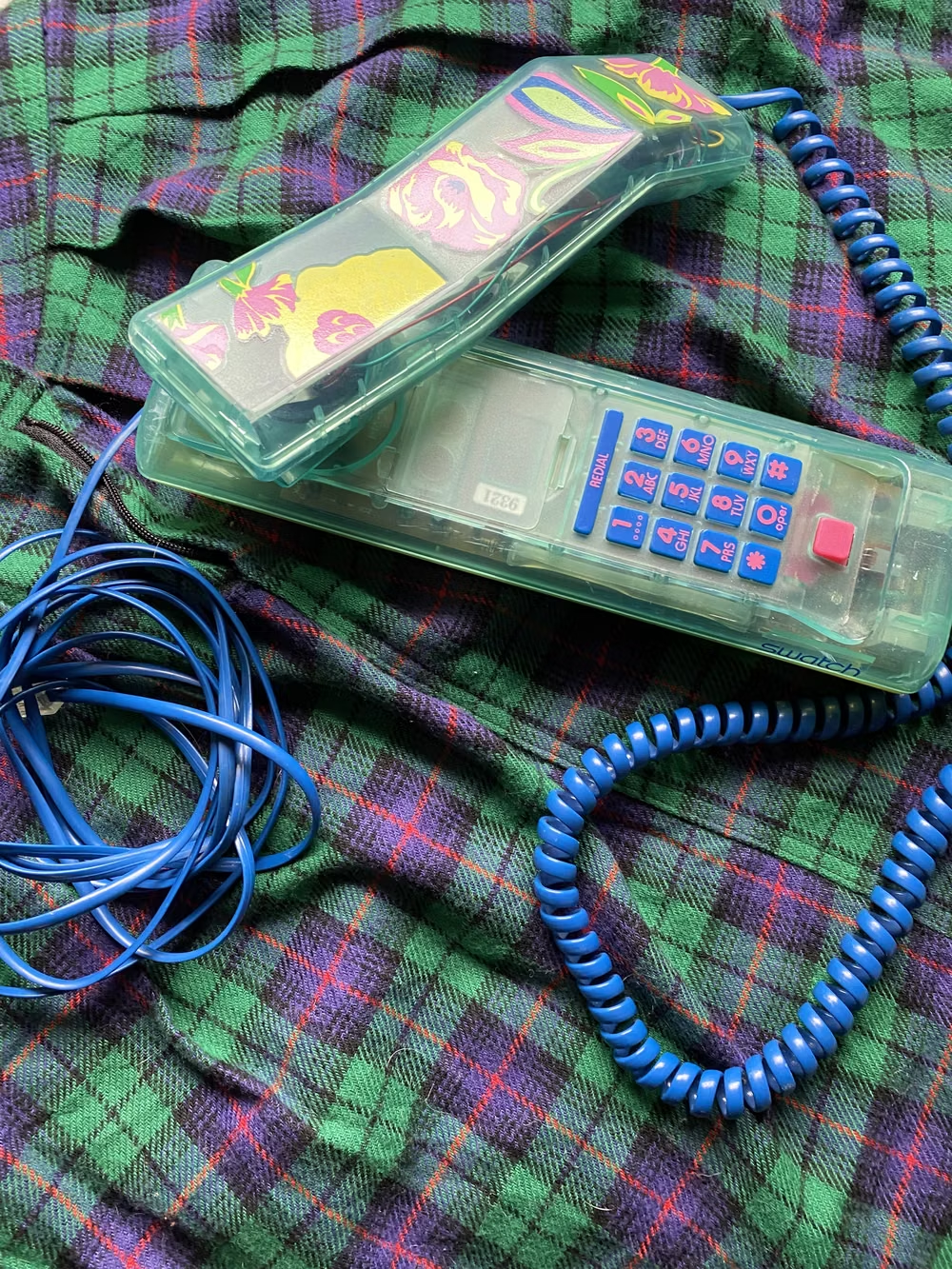
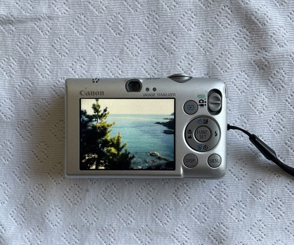
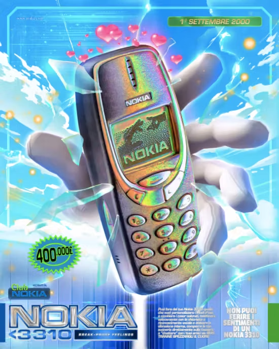
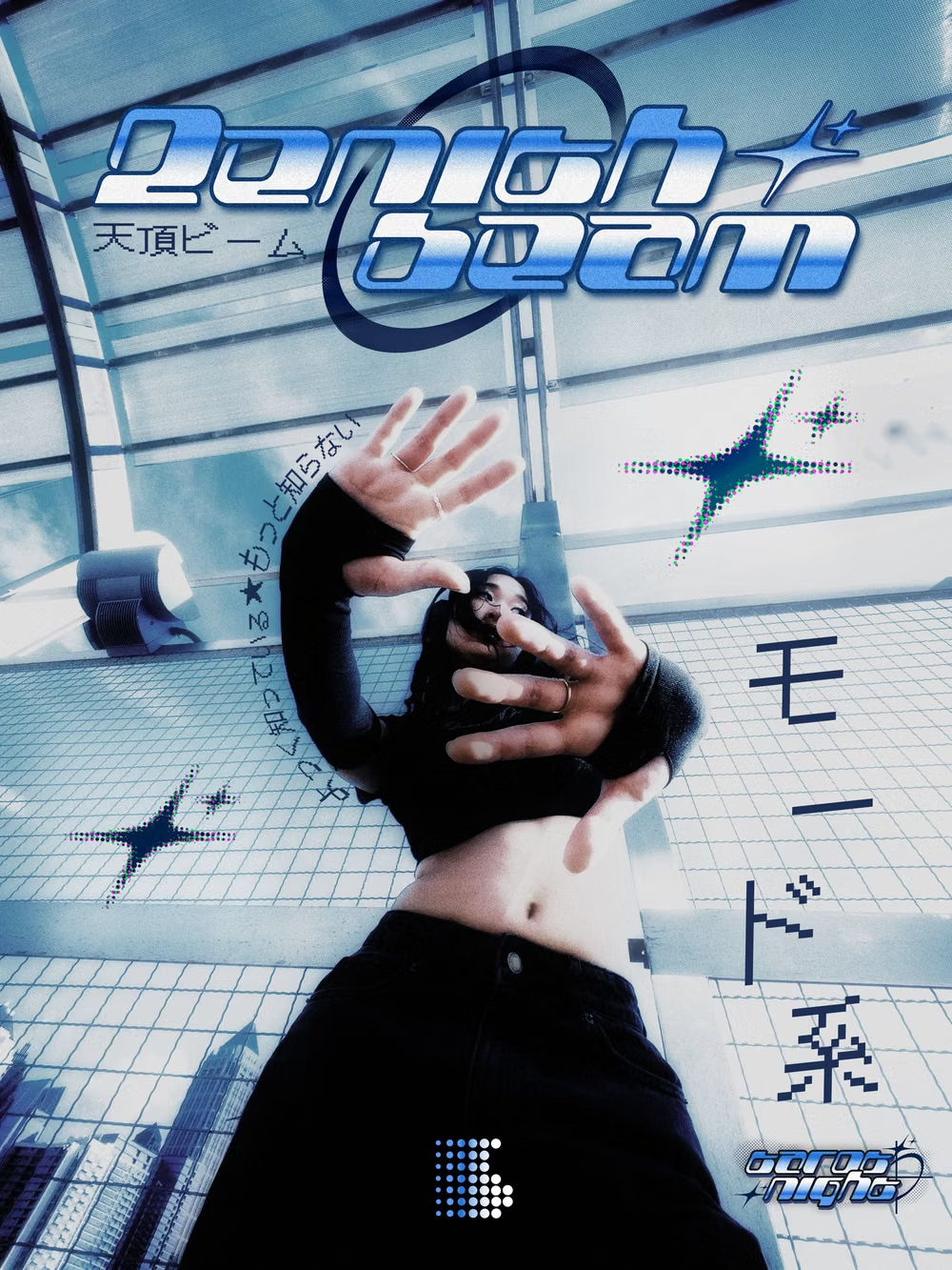
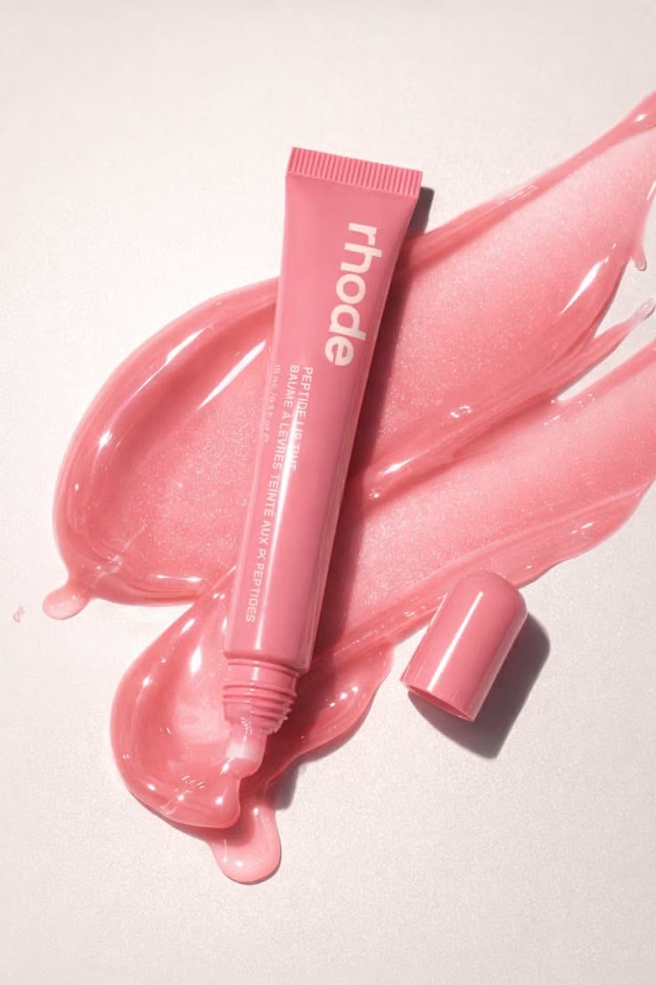
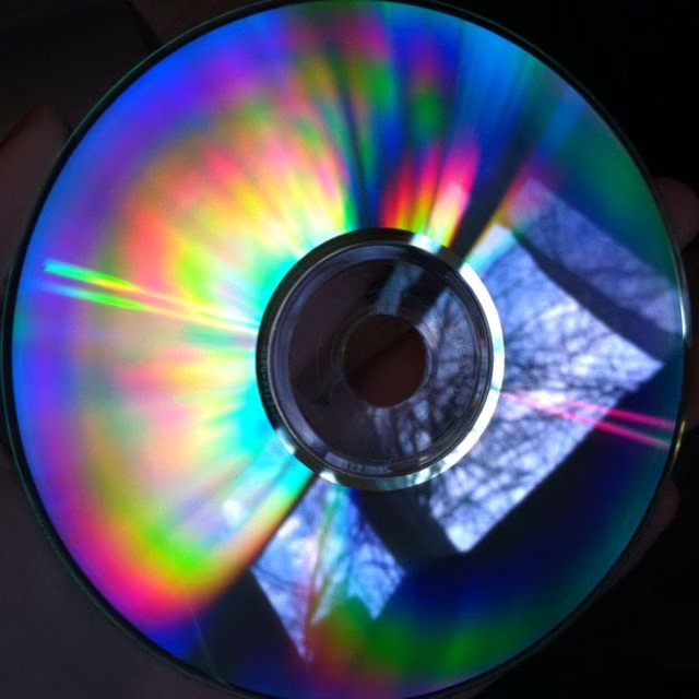
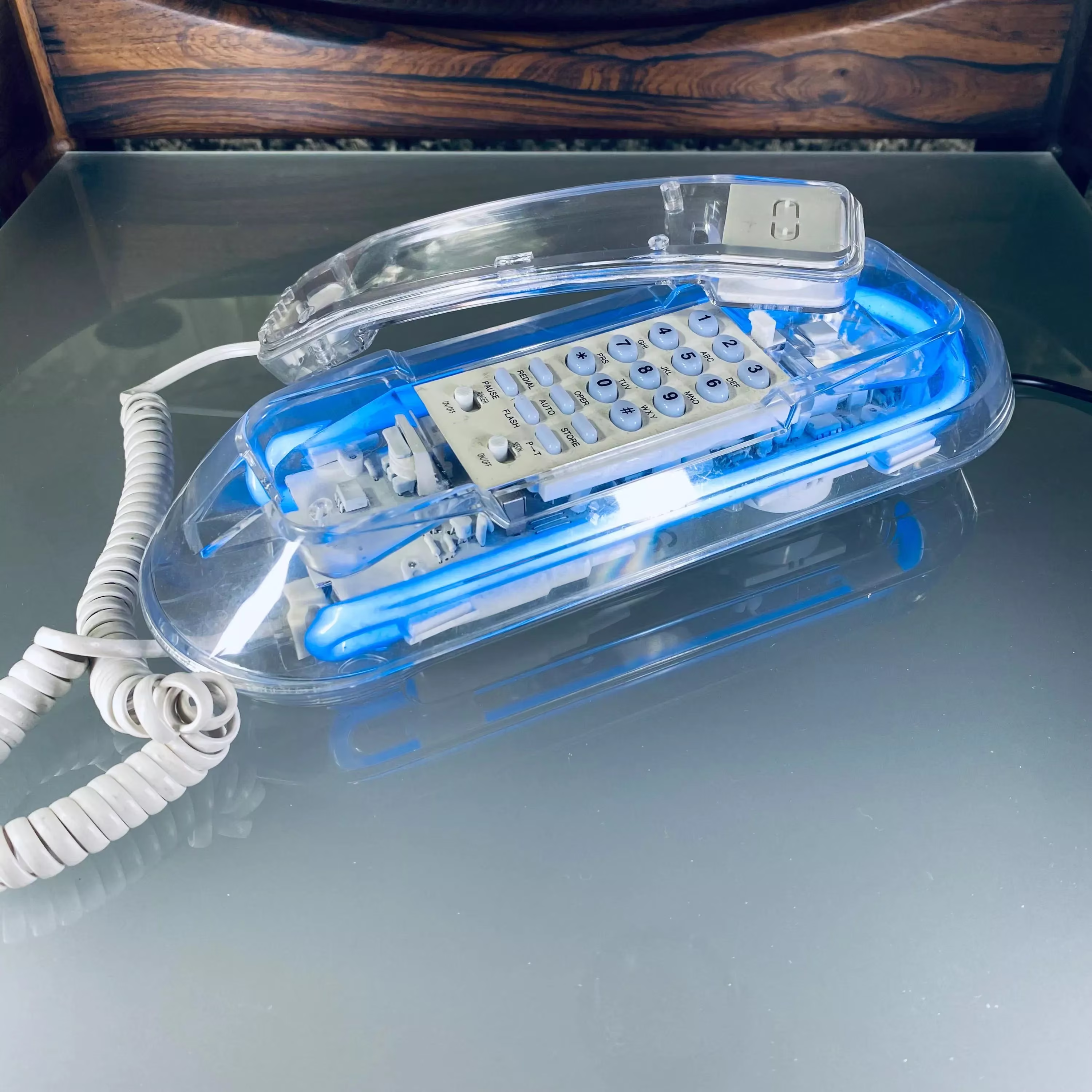
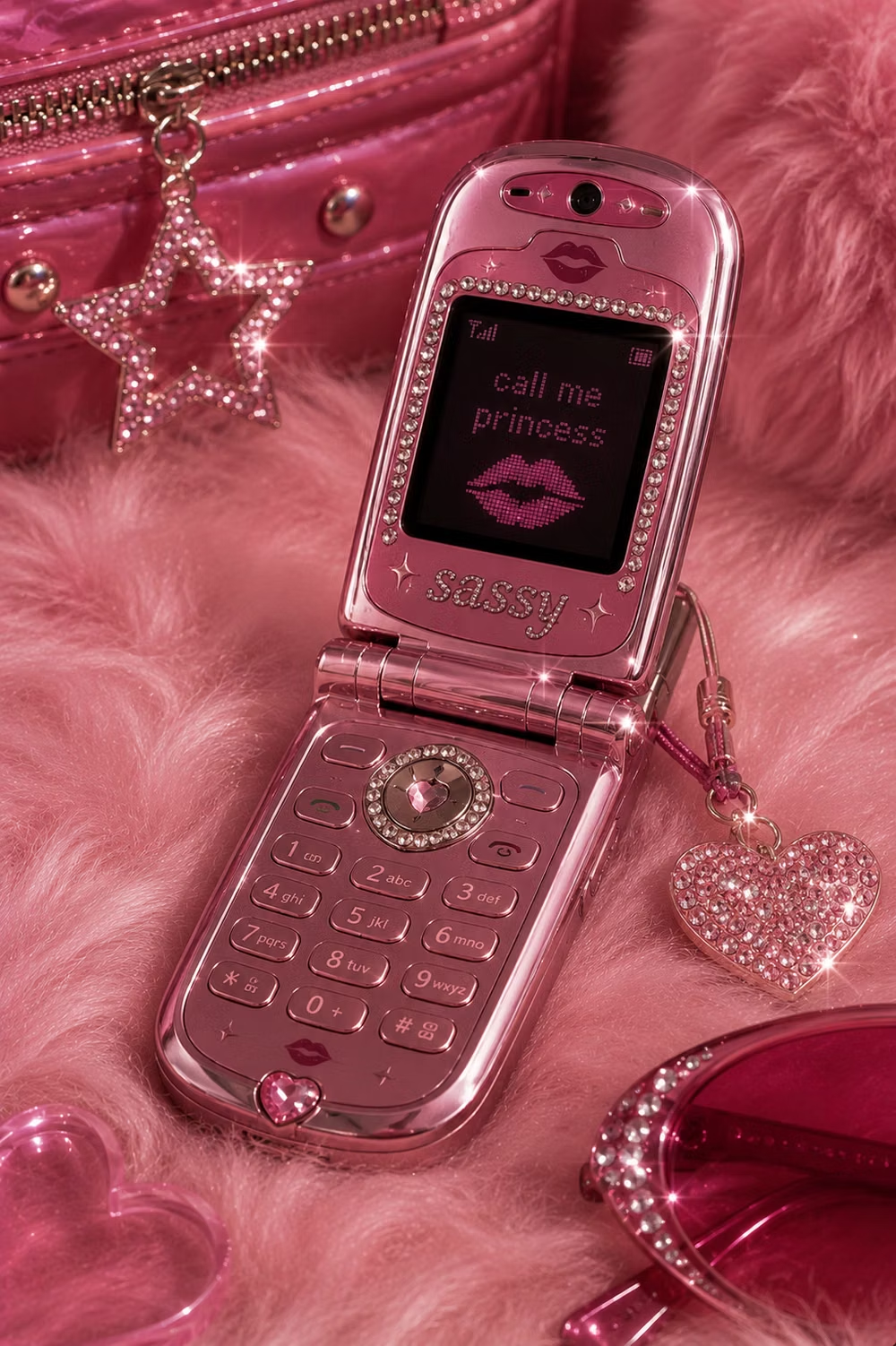
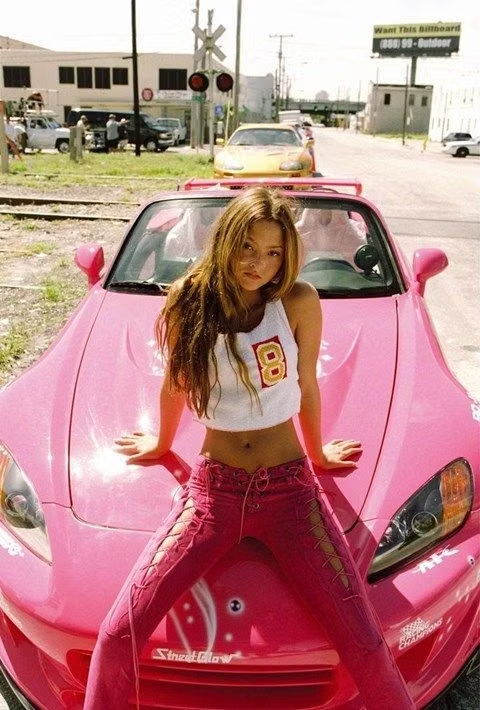
Moodboard and visual references
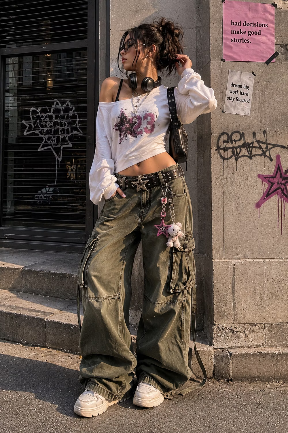
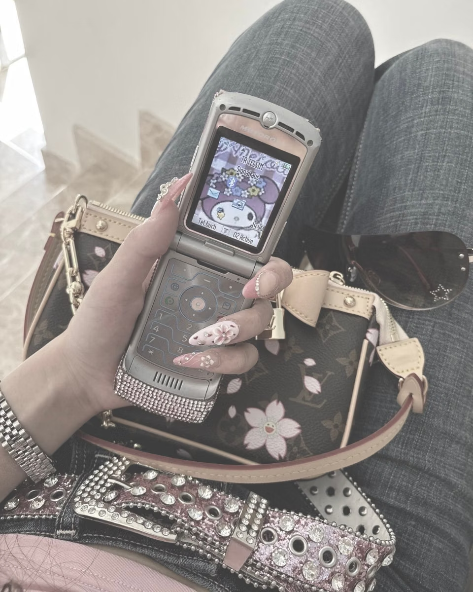
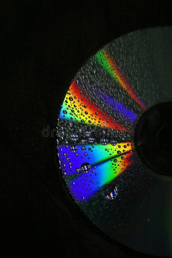
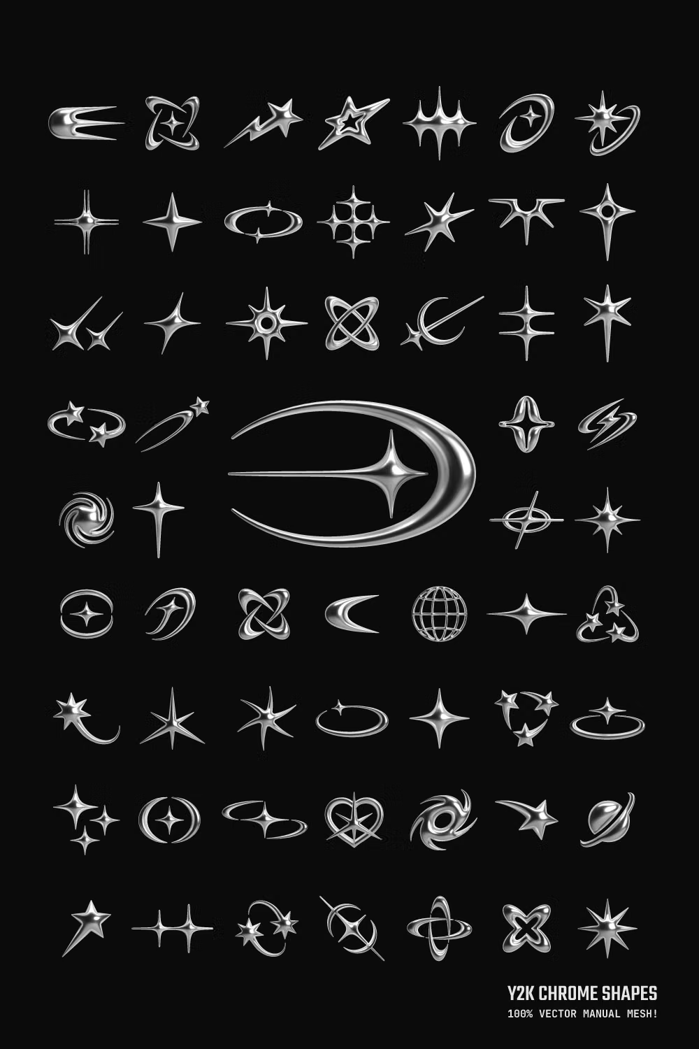
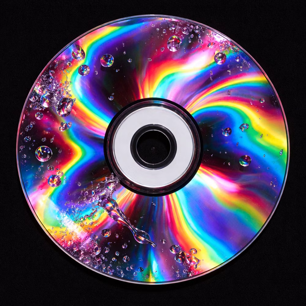
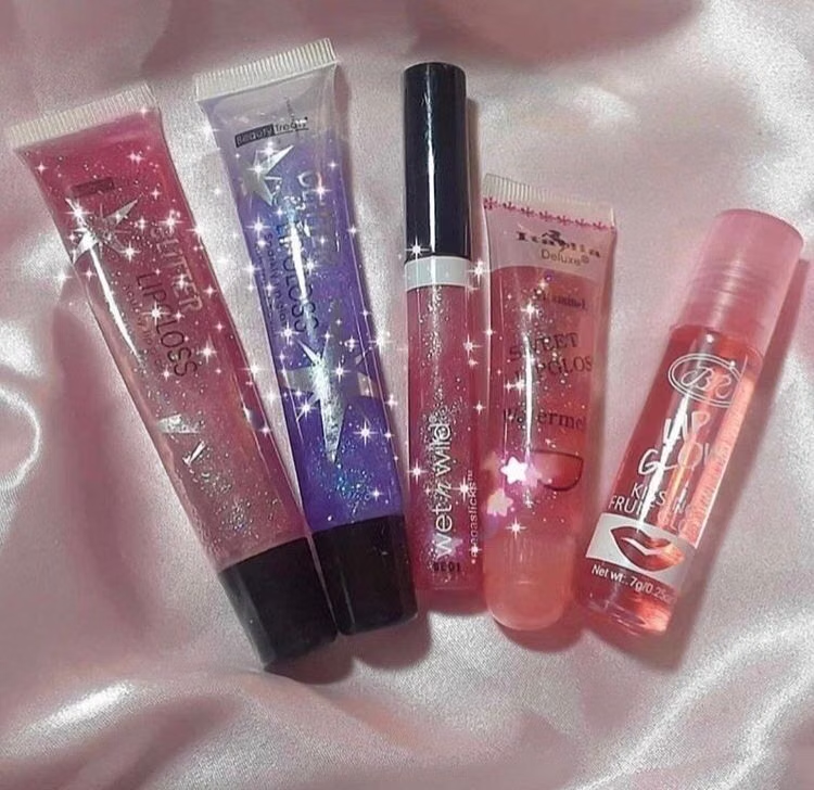
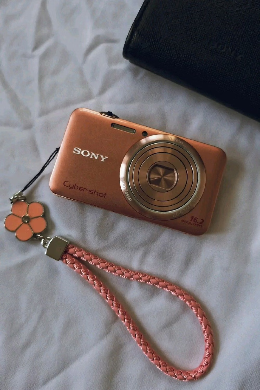
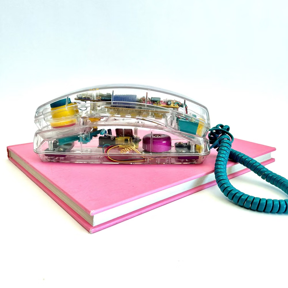
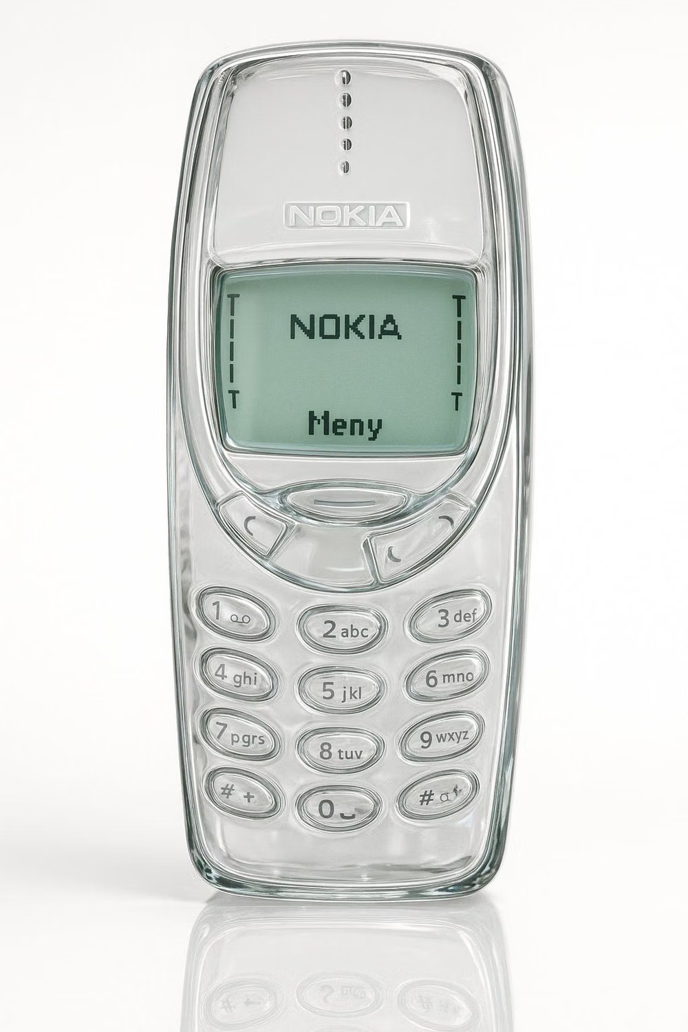
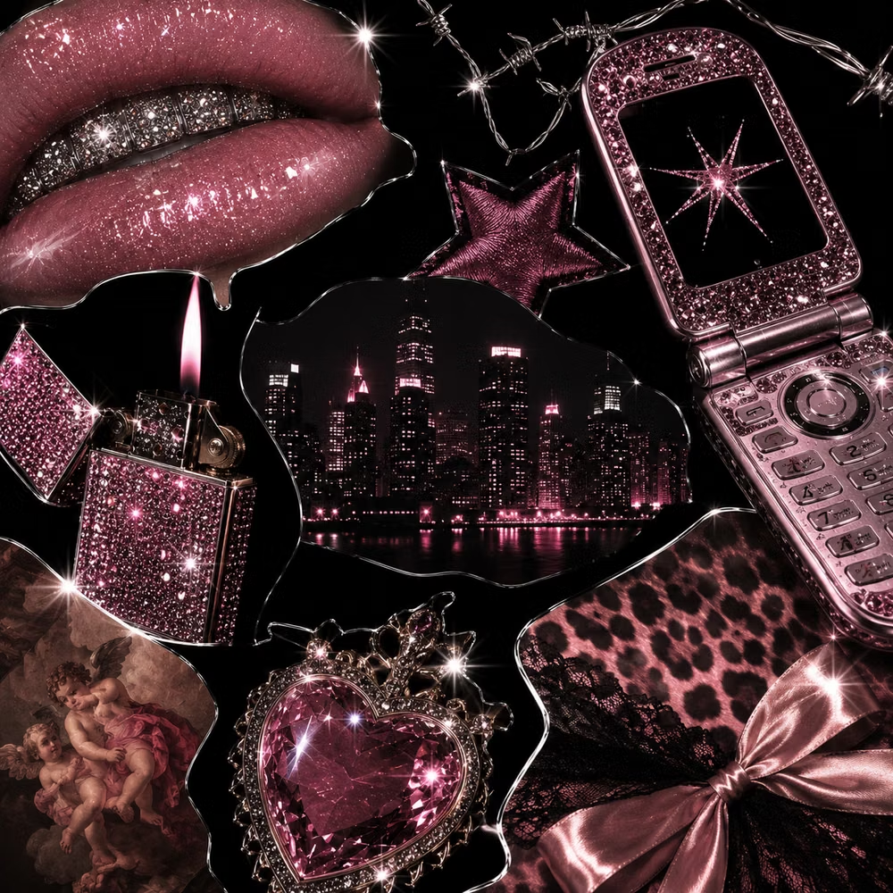
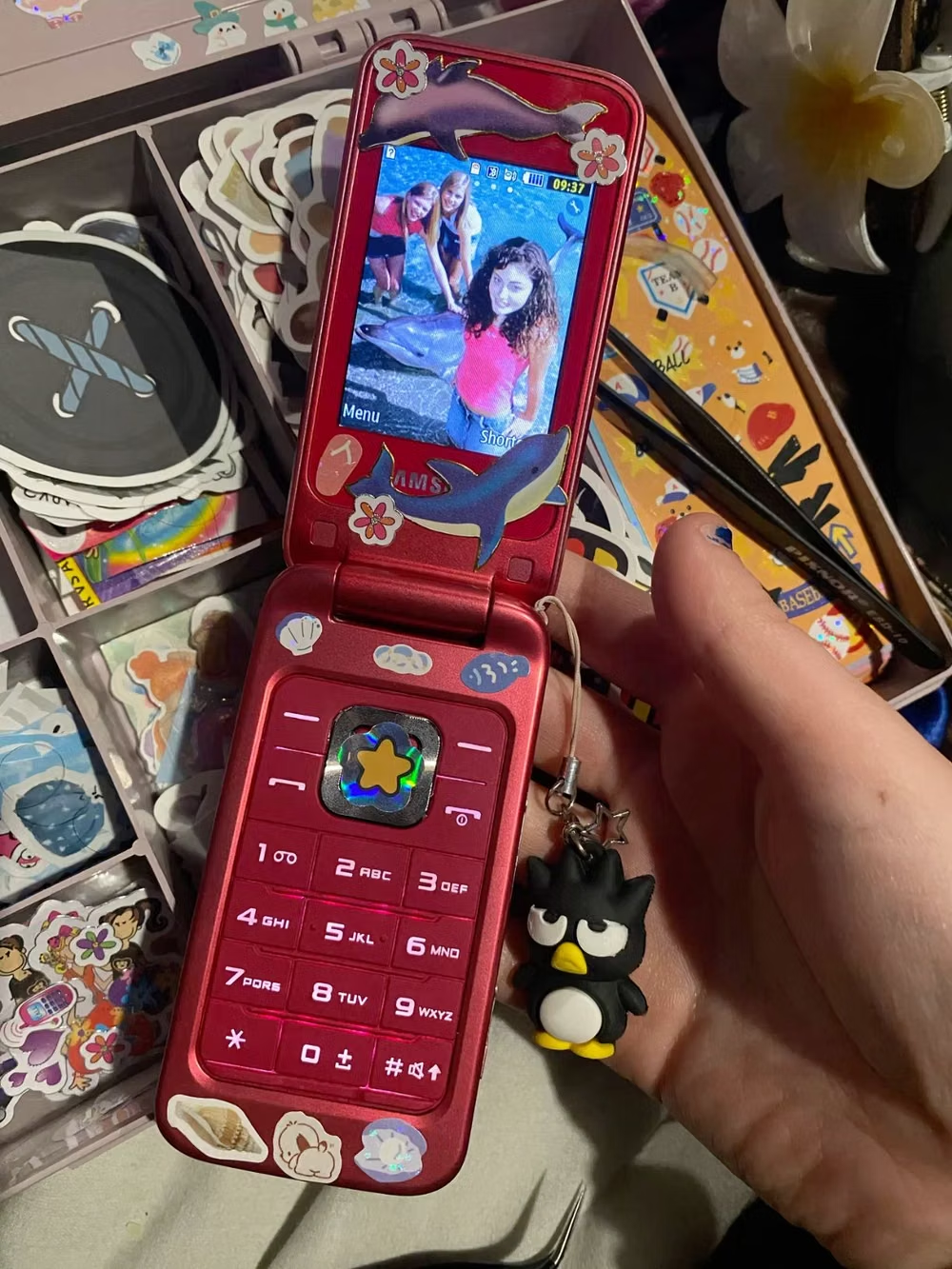
A visual study of the forms, inspirations, materials, colors, type, and cultural references associated with this UI design style.
Design principles and implementation
Use these principles to write a focused AI UI design prompt instead of asking for a vague visual treatment.
Color direction
Use silver, ice blue, hot pink, lime, white, and translucent plastic tones with metallic gradients and sharp glossy highlights. In a daisyUI theme, use ice blue or hot pink for `primary`, lime or cool silver for `secondary`, and set `base-100`, `base-200`, and `base-300` to glossy white, pale ice, and silver gray.
Imagery direction
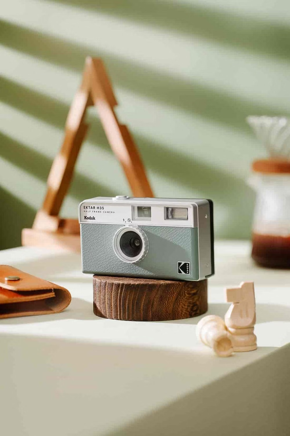
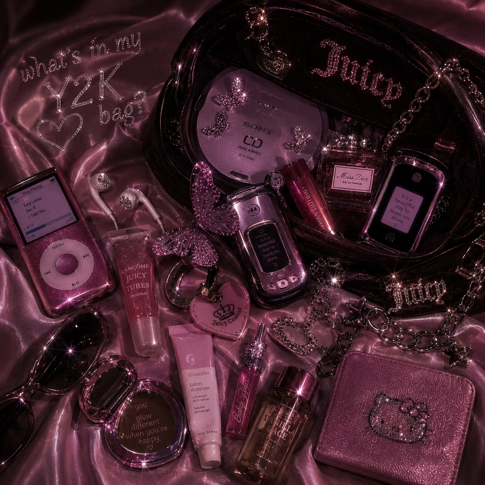
Choose flip phones, compact cameras, CDs, lip gloss, chrome objects, translucent electronics, lens flares, and optimistic early digital imagery.
Content density
Use medium density with many small collectible details, keeping major actions large and preventing chrome ornament from crowding labels.
Motion direction
Use loading shines, bubble floats, window pops, lens-flare sweeps, and springy device interactions with brisk glossy timing.
Shape language
Favor bubbles, capsules, chrome stars, rounded device shells, translucent tabs, and compact beveled windows. In daisyUI themes, set the `--radius-*` variables between `1rem` and `2rem`.
Typography rules
Pair bubble or techno display lettering with a compact clean sans or pixel accent, keeping body text crisp against metallic and translucent surfaces.
Suggested Typfaces
Audiowide
Fresh daisies glow in warm sunlight
Fresh daisies glow in warm sunlight
1 2 3 4 5 6 7 8 9 0
Michroma
Fresh daisies glow in warm sunlight
Fresh daisies glow in warm sunlight
1 2 3 4 5 6 7 8 9 0
Righteous
Fresh daisies glow in warm sunlight
Fresh daisies glow in warm sunlight
1 2 3 4 5 6 7 8 9 0
Syncopate
Fresh daisies glow in warm sunlight
Fresh daisies glow in warm sunlight
1 2 3 4 5 6 7 8 9 0
Zen Dots
Fresh daisies glow in warm sunlight
Fresh daisies glow in warm sunlight
1 2 3 4 5 6 7 8 9 0
Build a Y2K interface with daisyUI
The live example translates this direction into daisyUI components and semantic theme tokens.
To generate a full page in the same visual language, give the style name and the design rules above to Blueprint MCP.
Related UI design styles
Compare nearby visual languages that share typography, shapes, use cases, or signature elements.
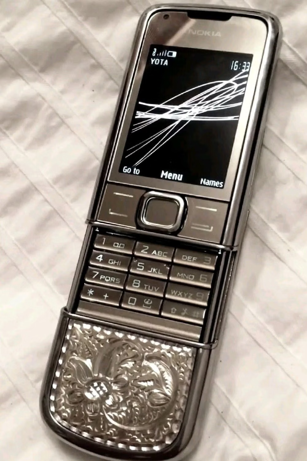
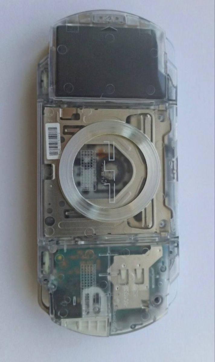
Cybercore UI design style
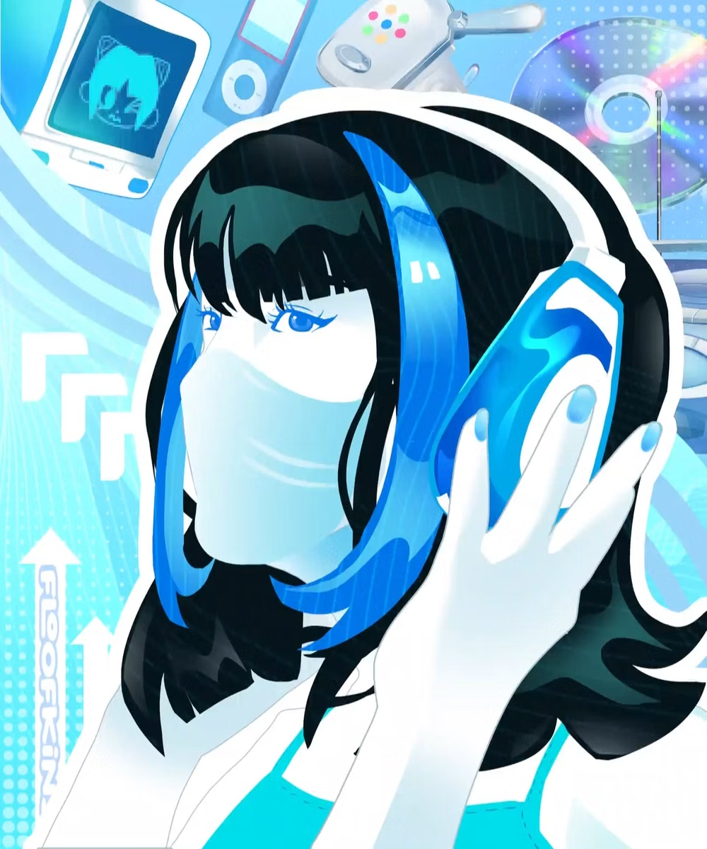
A 2020s nostalgic remix of late-1990s and early-2000s digital culture combines saturated blue and silver with retro anime, obsolete devices, legacy software, and ethereal celestial symbolism.
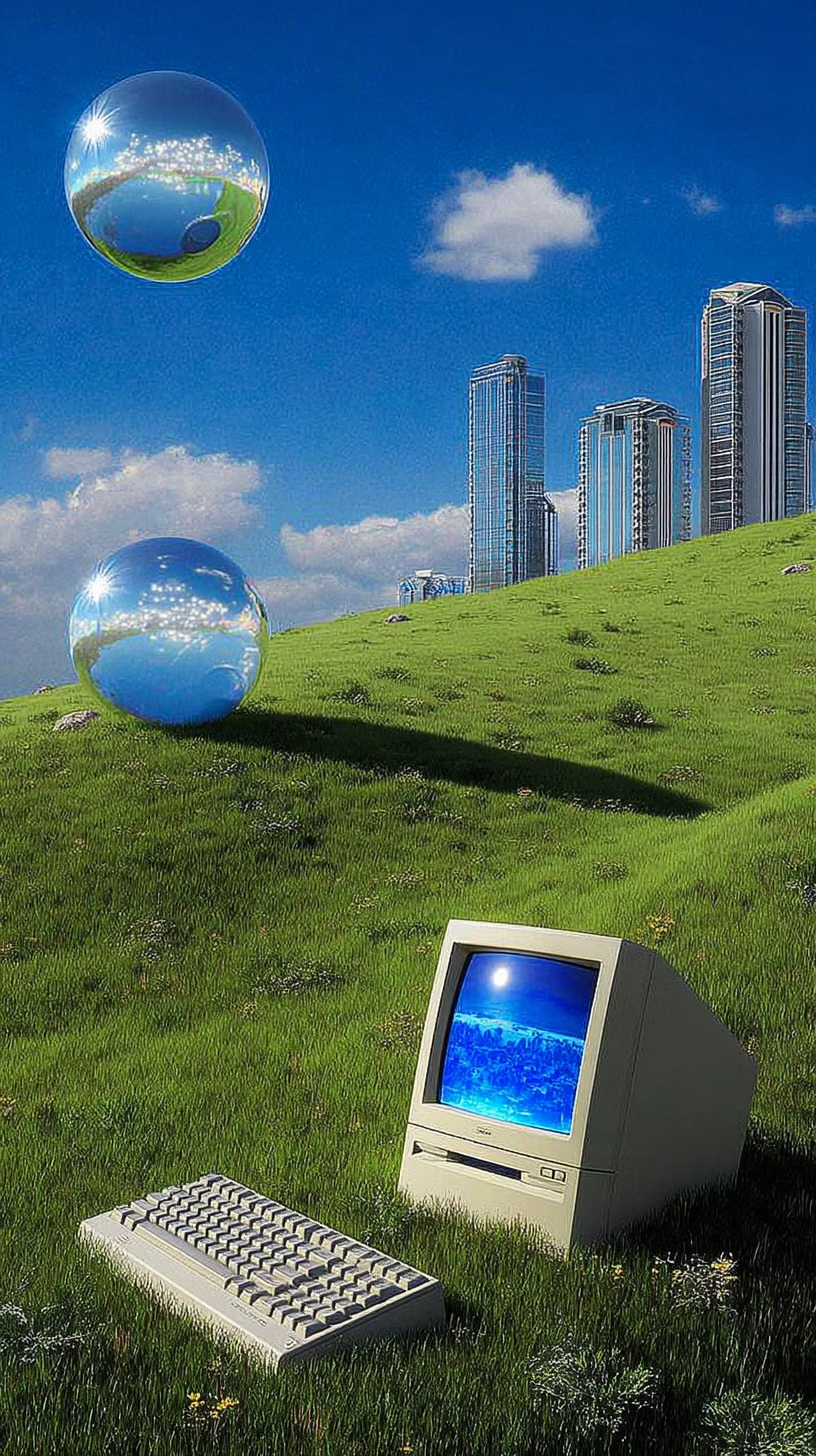
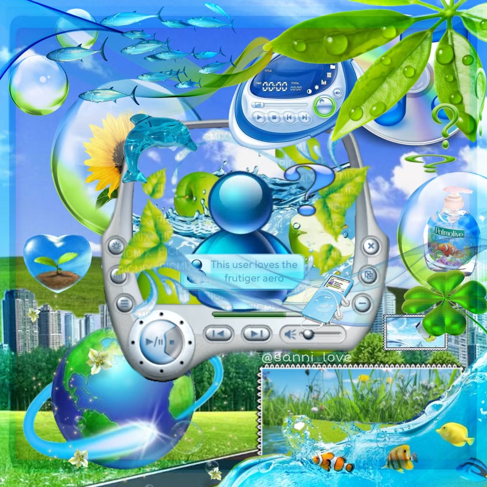
Frutiger Aero UI design style
Glossy blue-and-green visuals combine skeuomorphic interfaces, glassy controls, water, bubbles, open skies, nature, and optimistic technology.
Seapunk UI design style
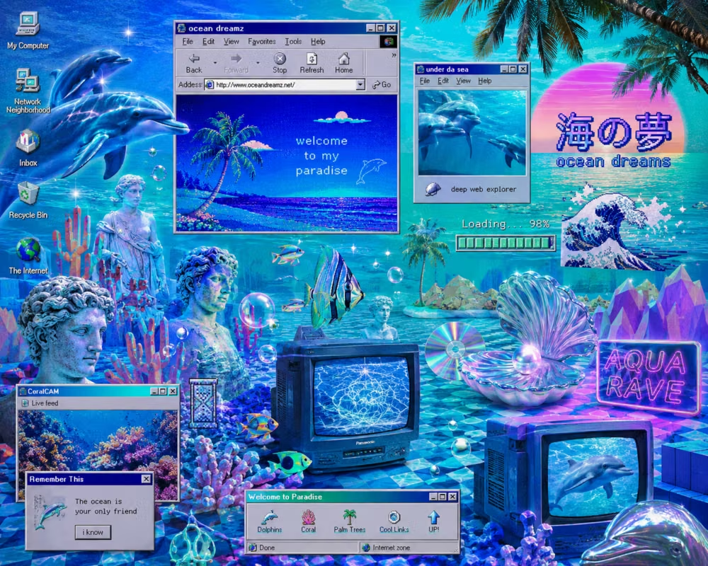
Turquoise water, dolphins, shells, early CGI, chrome, tropical graphics, and playful aquatic internet surrealism.