Glassmorphism UI design style
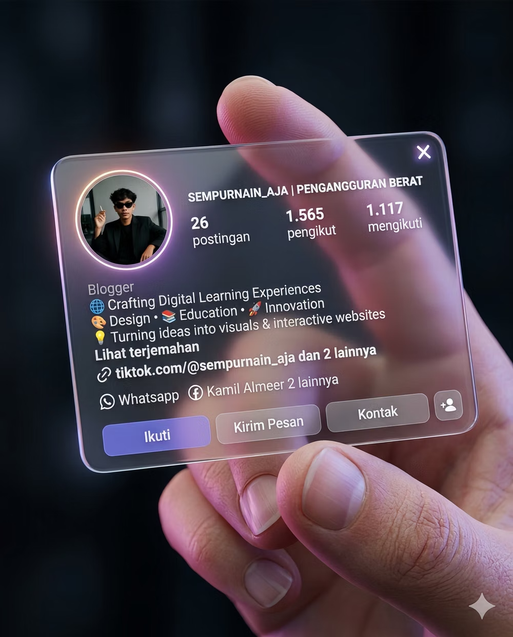
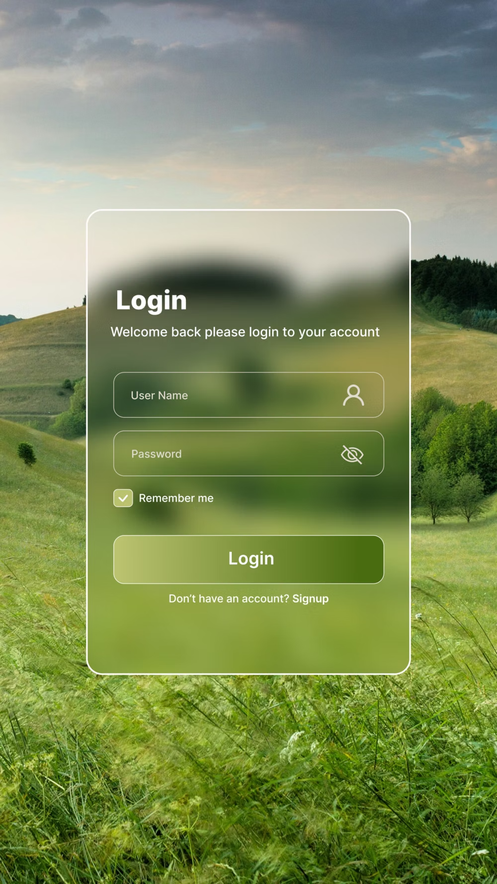
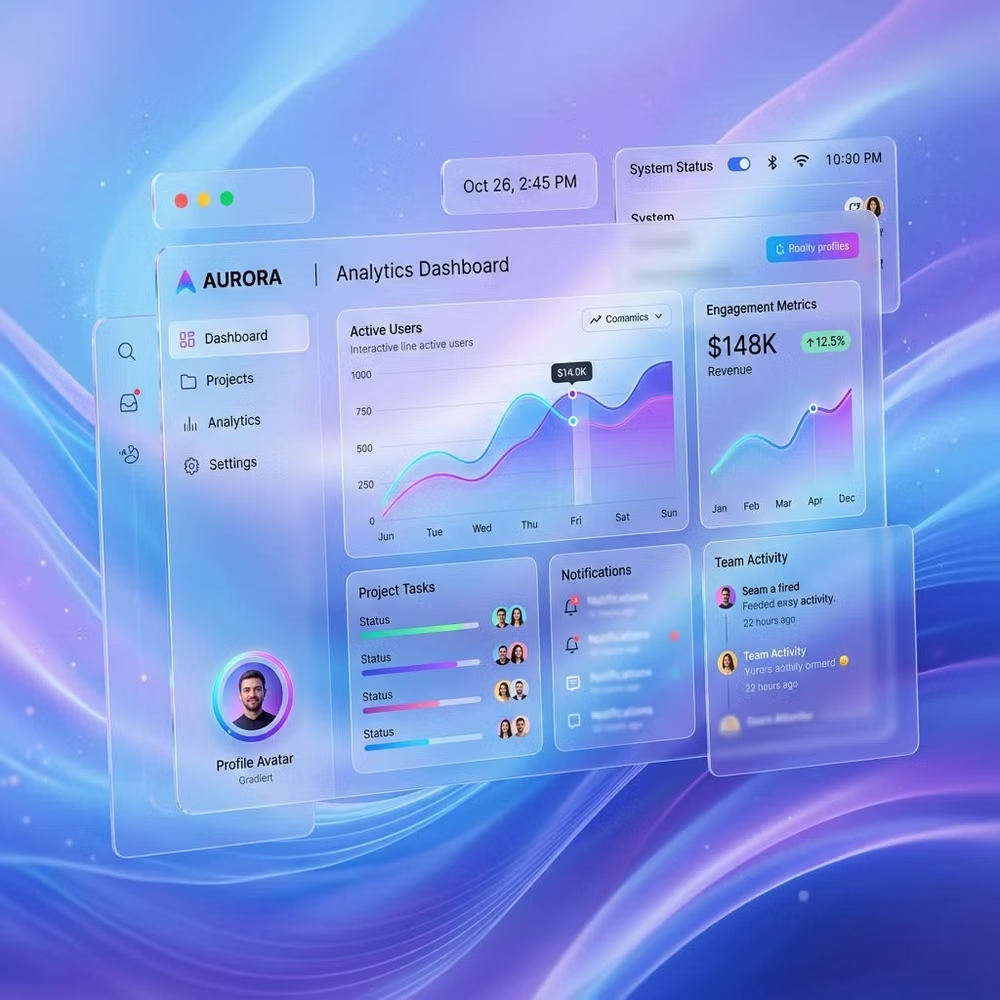
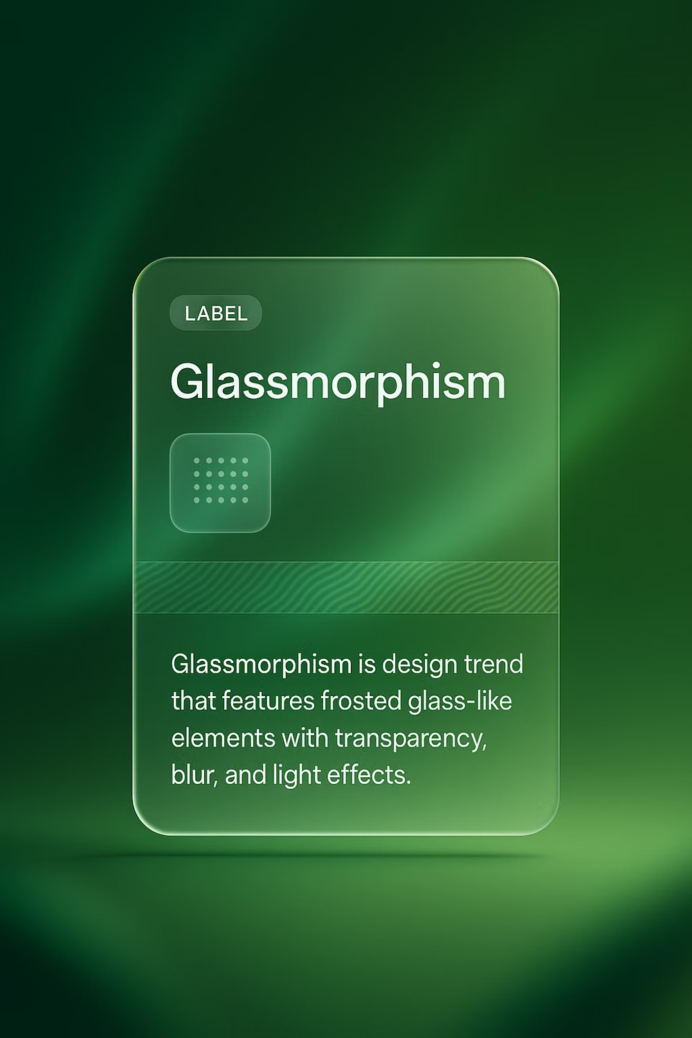
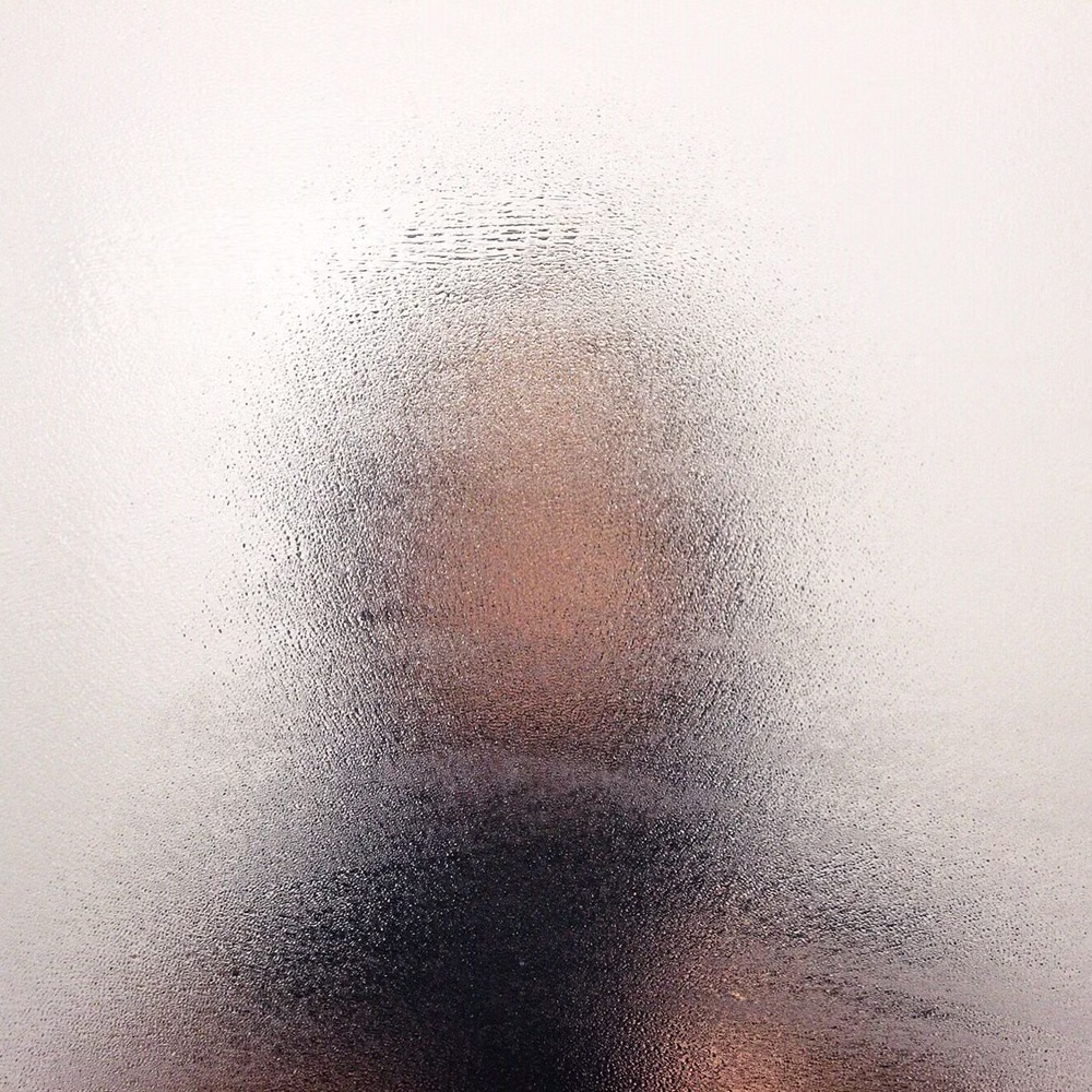
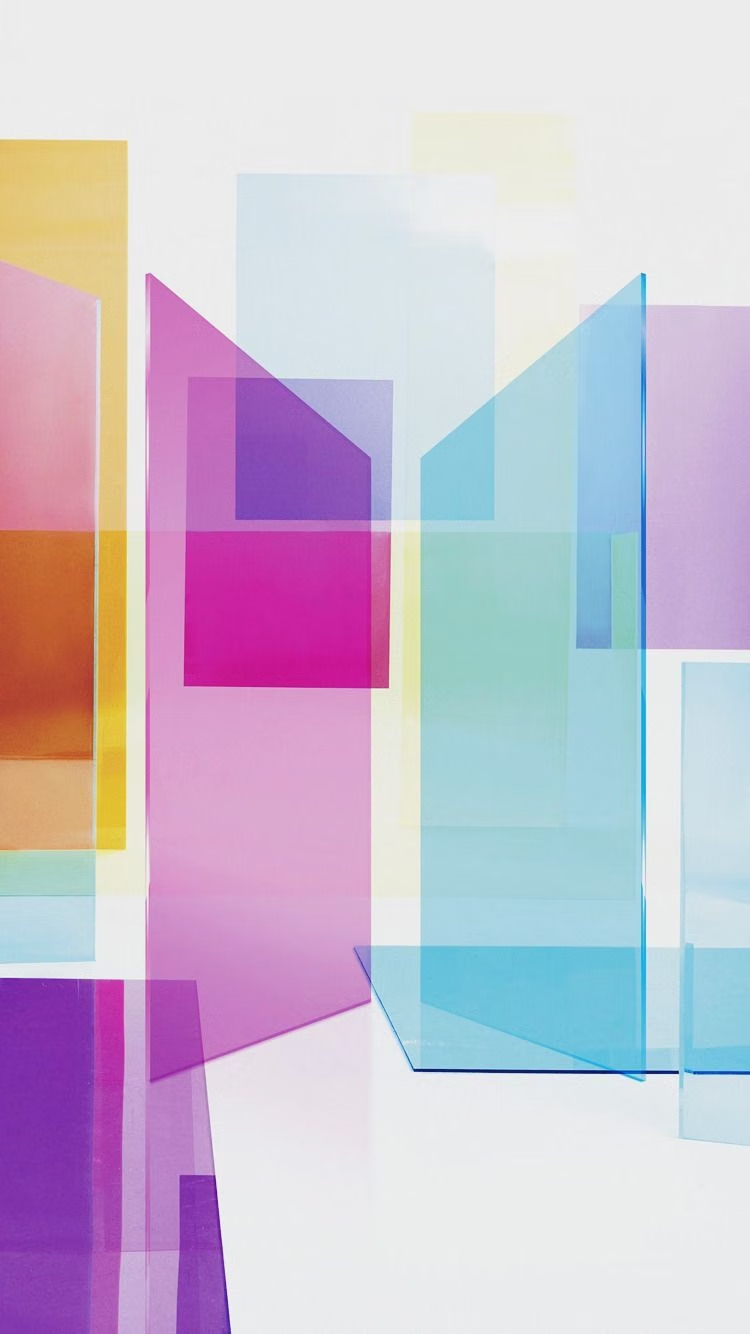
Translucent frosted panels, background blur, thin highlights, and layered depth.
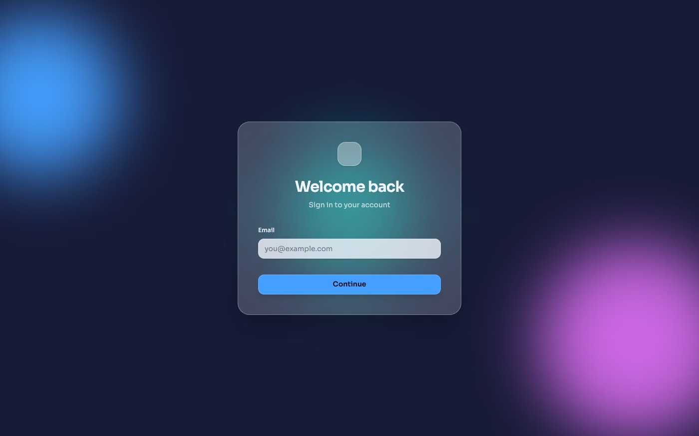
Design overview
- Signature elements
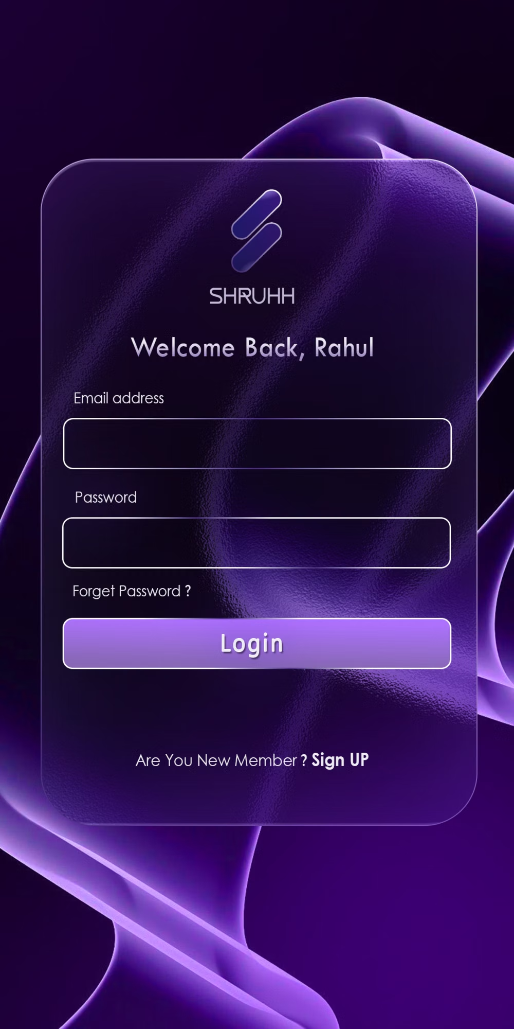
- frosted panels, background blur, translucent fills, thin light borders, layered depth, luminous gradients. In daisyUI themes, set `--depth: 1;`.
- Best suited to
- Premium dashboards, finance apps, media players, and navigation overlays.
- Layout principles
- Stack a few frosted planes over a visually rich backdrop, maintain obvious front-to-back order, and avoid nesting translucent cards inside one another.
History and origins
A fact-checked account of where this visual language came from, with links to the references used.
- Period
- Late 2020–early 2020s
- Origin
- Online UI design community, drawing on operating-system glass effects
Glassmorphism became a widely used trend label near the end of 2020, but translucent interface layers are older: Windows Vista’s Aero Glass and later Apple and Microsoft systems had already used blur, tint, and depth to separate surfaces. The 2020 wave packaged those precedents into a recognizable recipe of frosted panels, bright backgrounds, and fine borders.
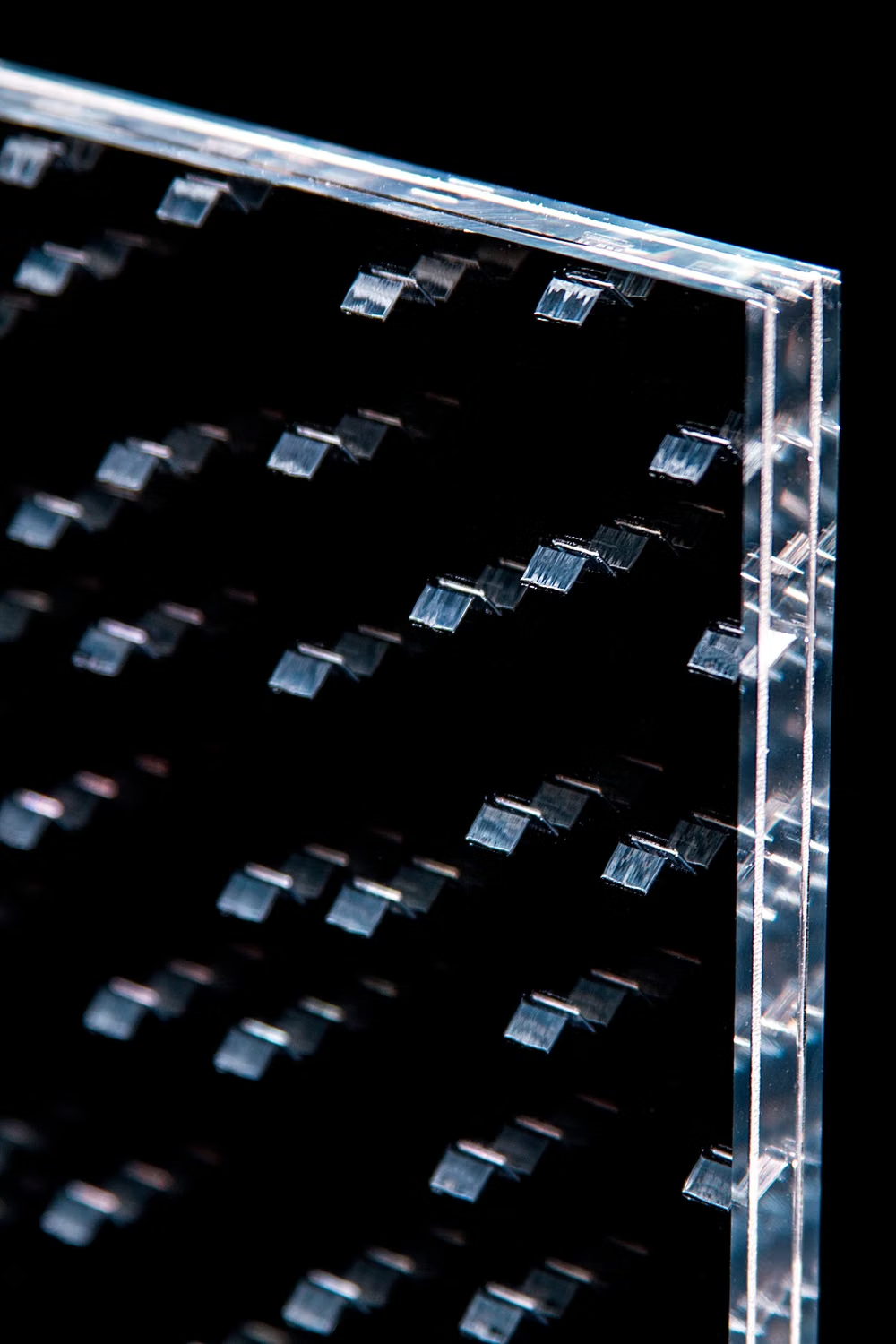
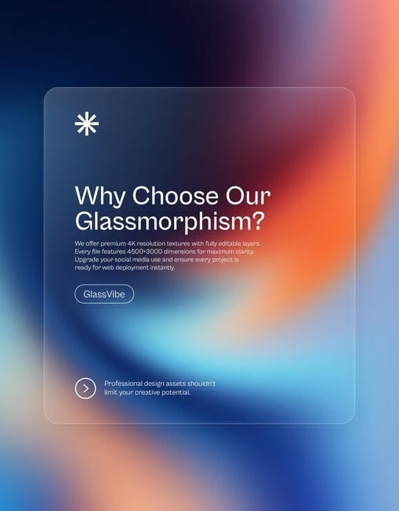
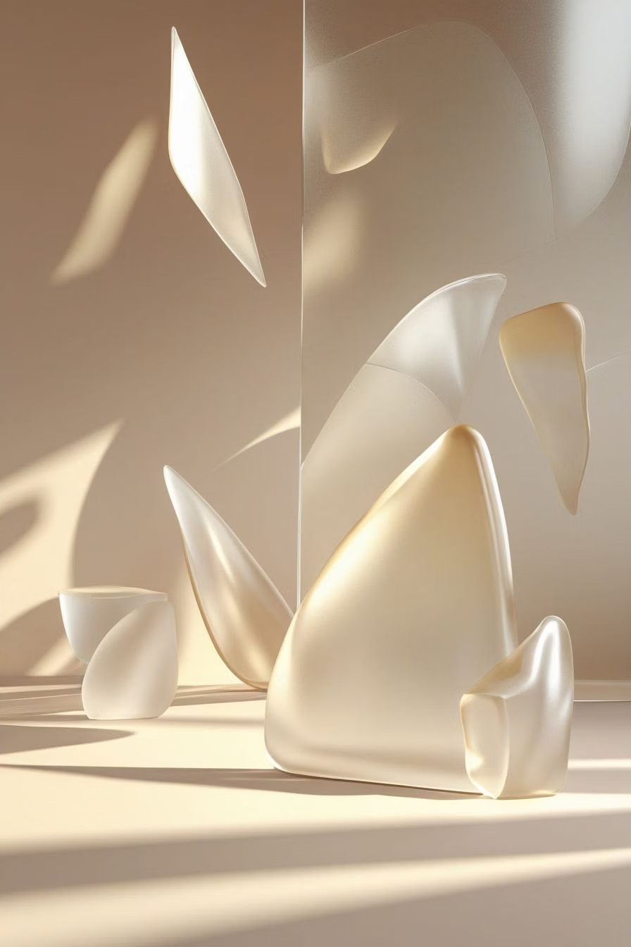
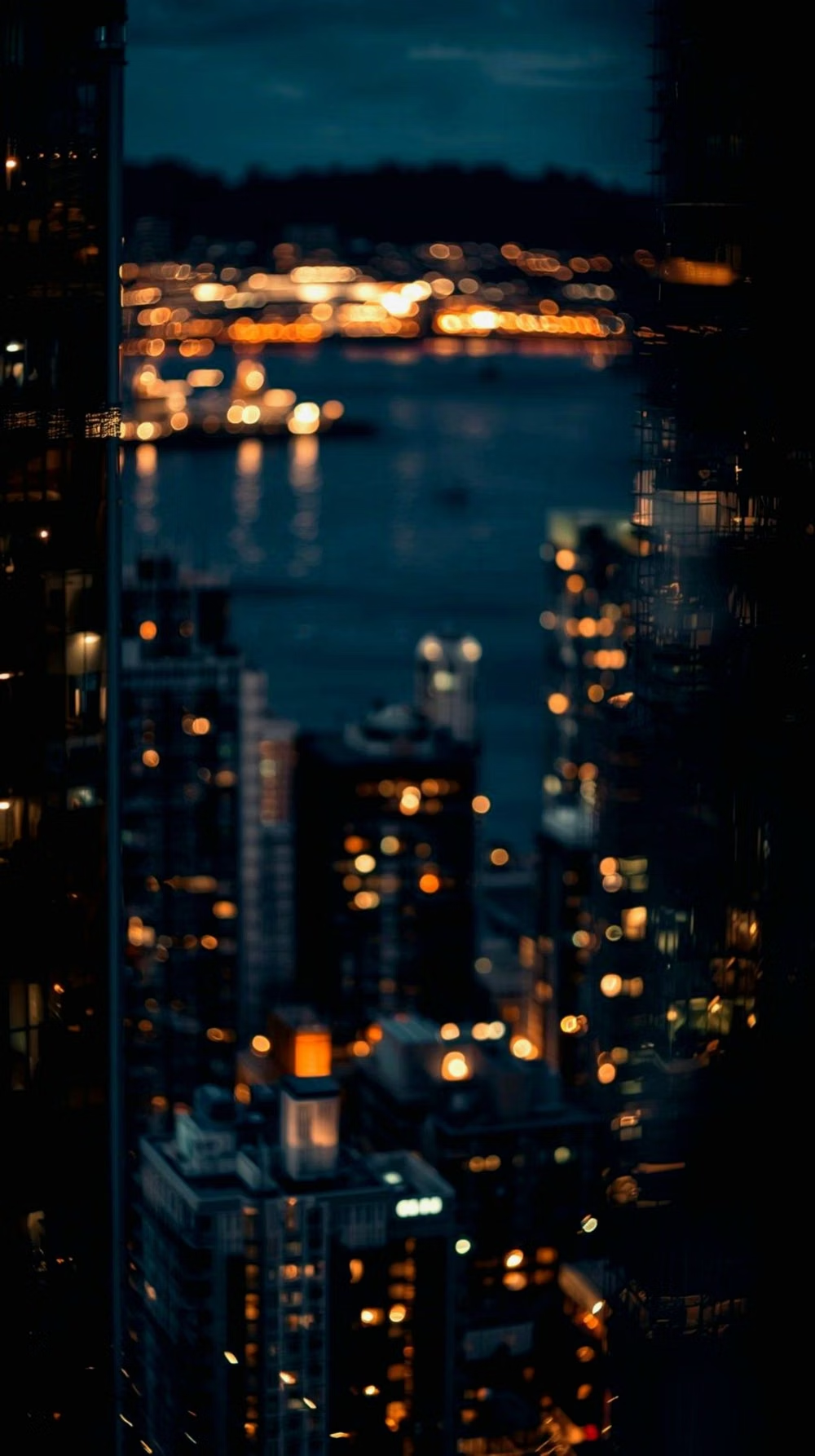
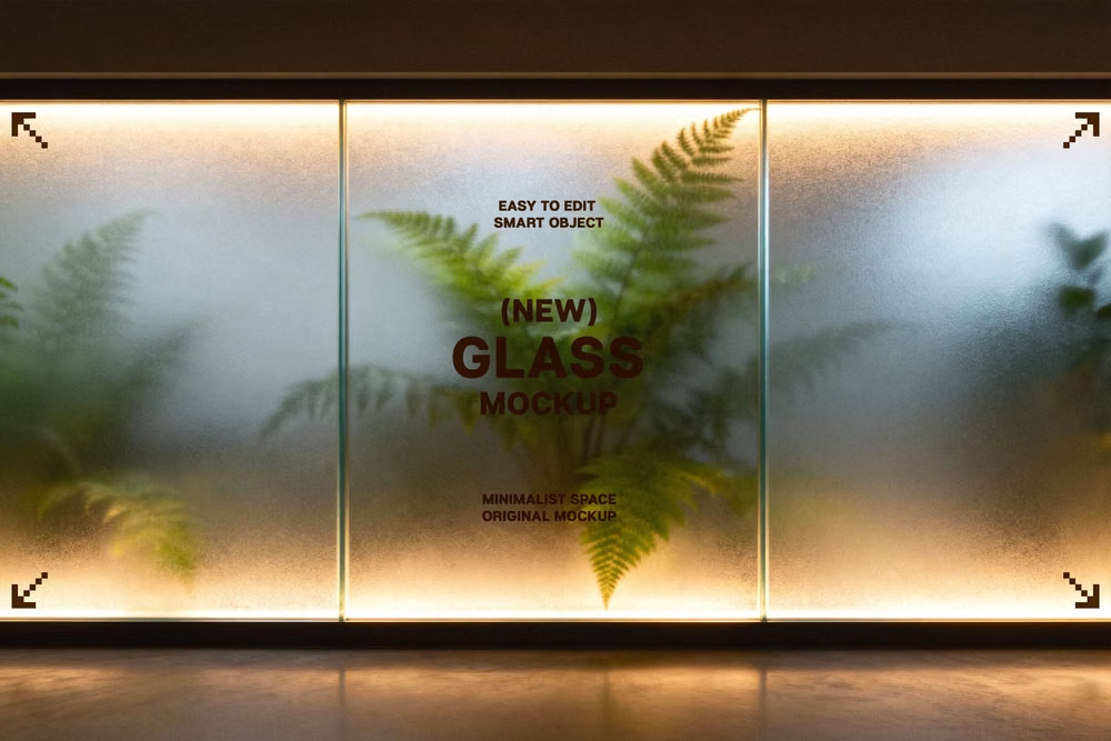
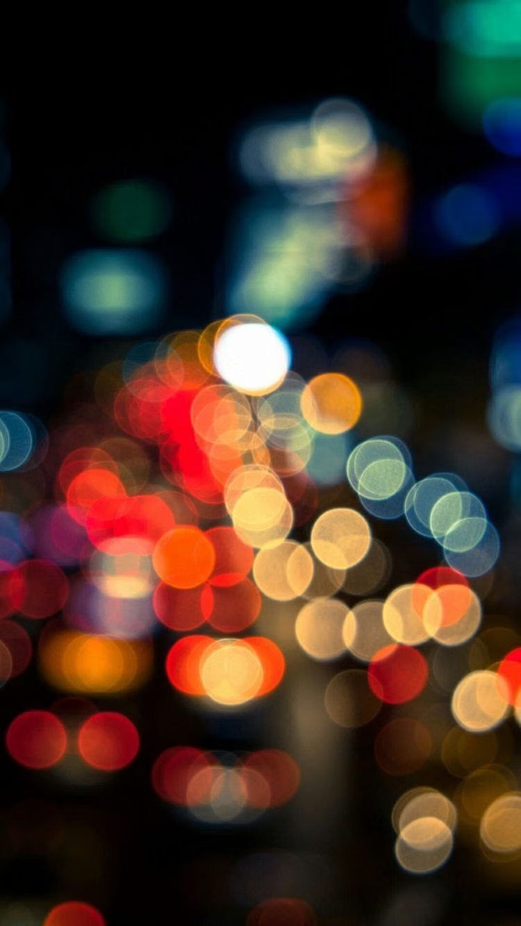
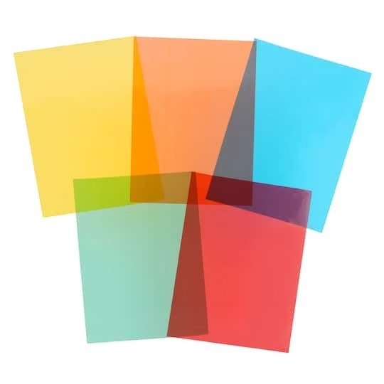
Moodboard and visual references
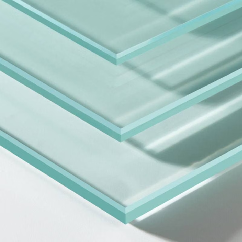
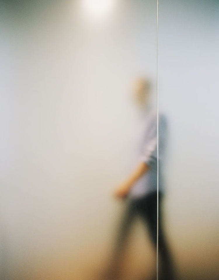
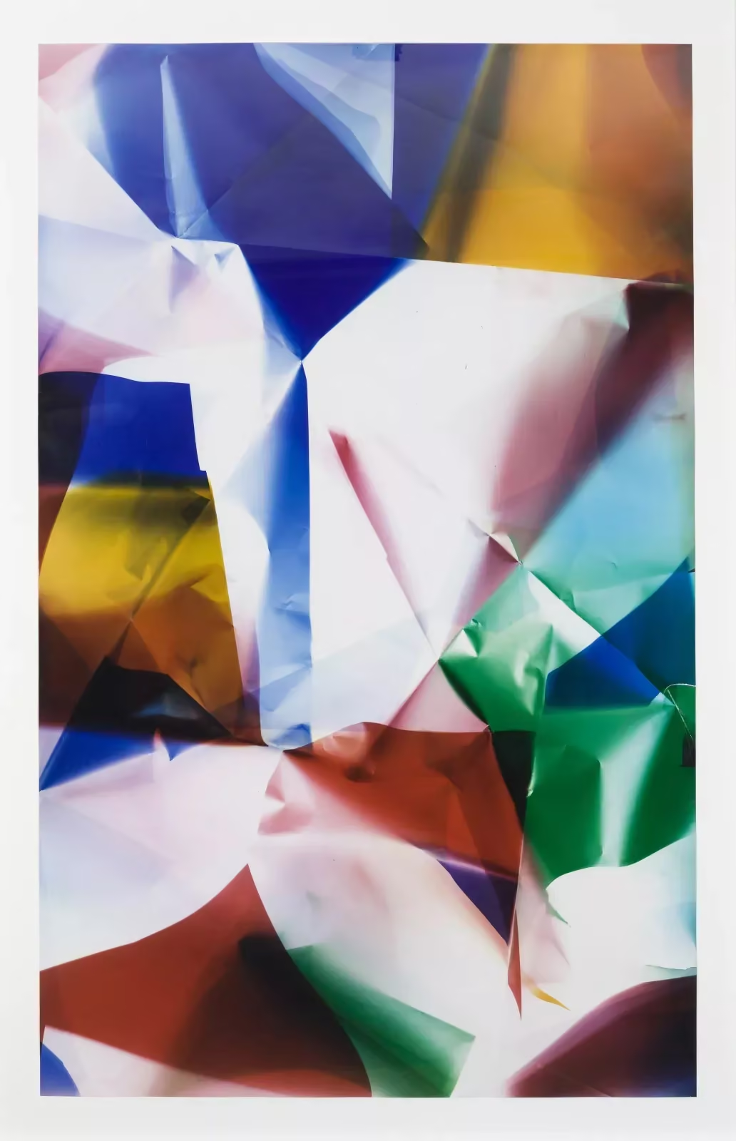
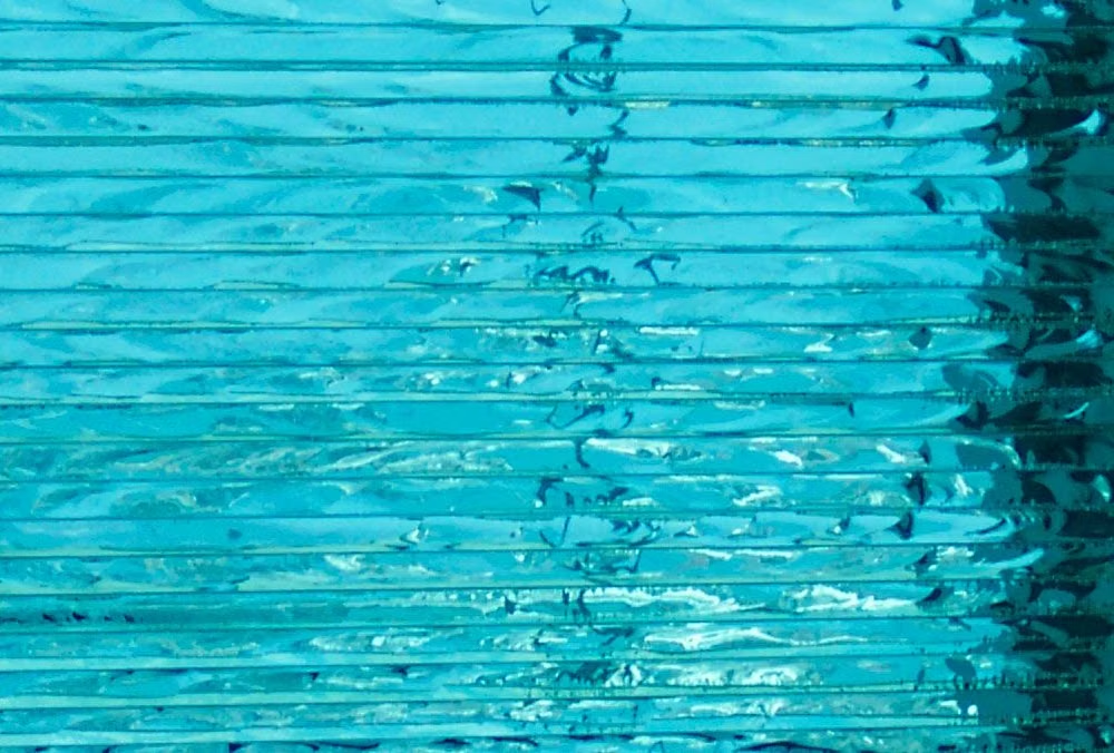
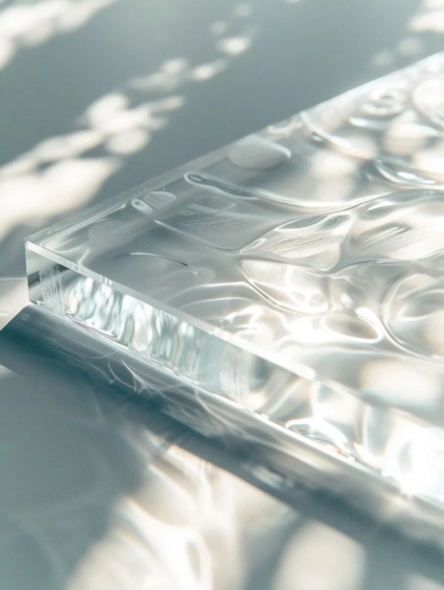
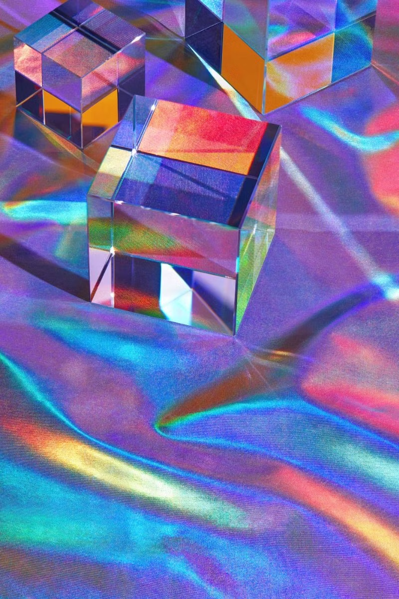
A visual study of the forms, inspirations, materials, colors, type, and cultural references associated with this UI design style.






Design principles and implementation
Use these principles to write a focused AI UI design prompt instead of asking for a vague visual treatment.
Color direction
Tint glass with cool or neutral translucency, use thin luminous borders, and place opaque contrast layers behind text whenever the backdrop becomes busy. In a daisyUI theme, use luminous cyan or violet for `primary`, a softer rose or blue for `secondary`, and choose opaque charcoal-to-black or pearl-to-gray steps for `base-100`, `base-200`, and `base-300` beneath the glass.
Imagery direction
Use atmospheric photography, soft-focus light, or broad gradients behind panels so blur creates depth without obscuring the subject.
Content density
Keep each glass panel moderately sparse, grouping only closely related metrics or controls so translucency never competes with dense reading.
Motion direction
Crossfade opacity and blur, slide panes on separate depth tracks, and add restrained pointer parallax without continuously drifting the background.
Shape language
Use medium to large radii, thin highlight strokes, and shallow floating shadows that make each pane read as a separate sheet. In daisyUI themes, set the `--radius-*` variables between `0.75rem` and `1.5rem`.
Typography rules
Choose a clean geometric sans-serif with firm weights, avoid translucent text, and test every label against the brightest and darkest backdrop regions.
Suggested Typfaces
Sora
Fresh daisies glow in warm sunlight
Fresh daisies glow in warm sunlight
1 2 3 4 5 6 7 8 9 0
Outfit
Fresh daisies glow in warm sunlight
Fresh daisies glow in warm sunlight
1 2 3 4 5 6 7 8 9 0
Manrope
Fresh daisies glow in warm sunlight
Fresh daisies glow in warm sunlight
1 2 3 4 5 6 7 8 9 0
Space Grotesk
Fresh daisies glow in warm sunlight
Fresh daisies glow in warm sunlight
1 2 3 4 5 6 7 8 9 0
Exo 2
Fresh daisies glow in warm sunlight
Fresh daisies glow in warm sunlight
1 2 3 4 5 6 7 8 9 0
Build a Glassmorphism interface with daisyUI
The live example translates this direction into daisyUI components and semantic theme tokens.
To generate a full page in the same visual language, give the style name and the design rules above to Blueprint MCP.
Related UI design styles
Compare nearby visual languages that share typography, shapes, use cases, or signature elements.
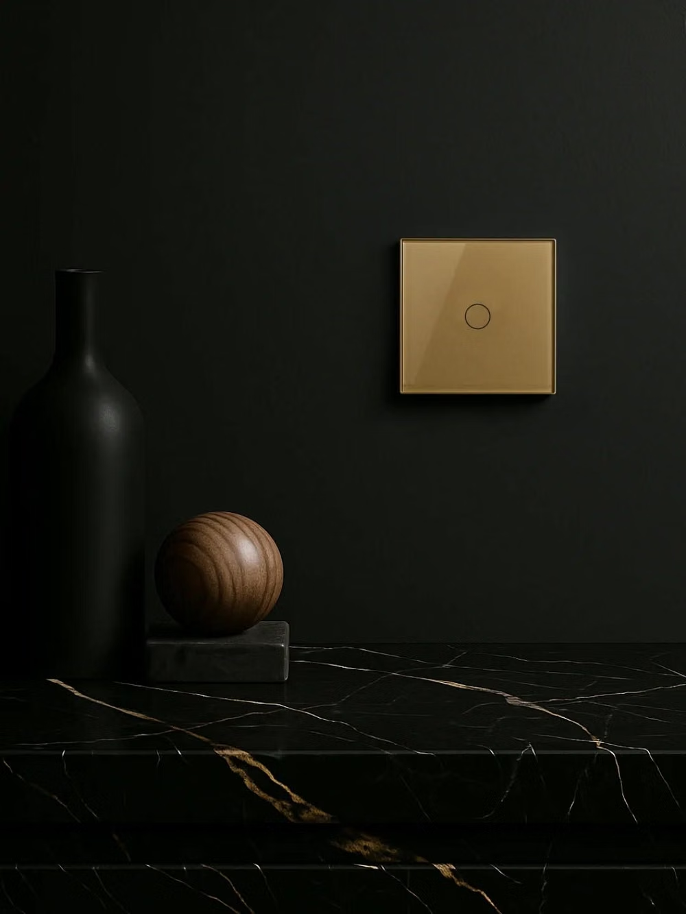
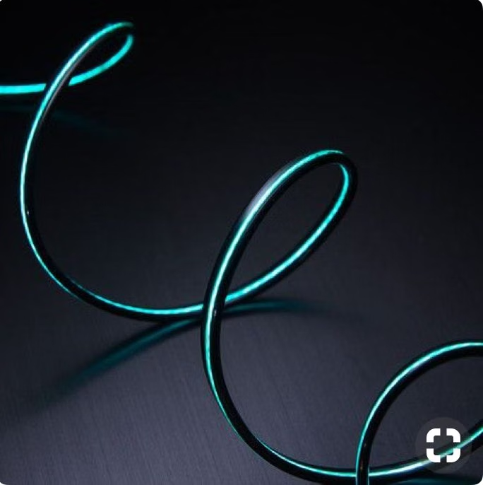
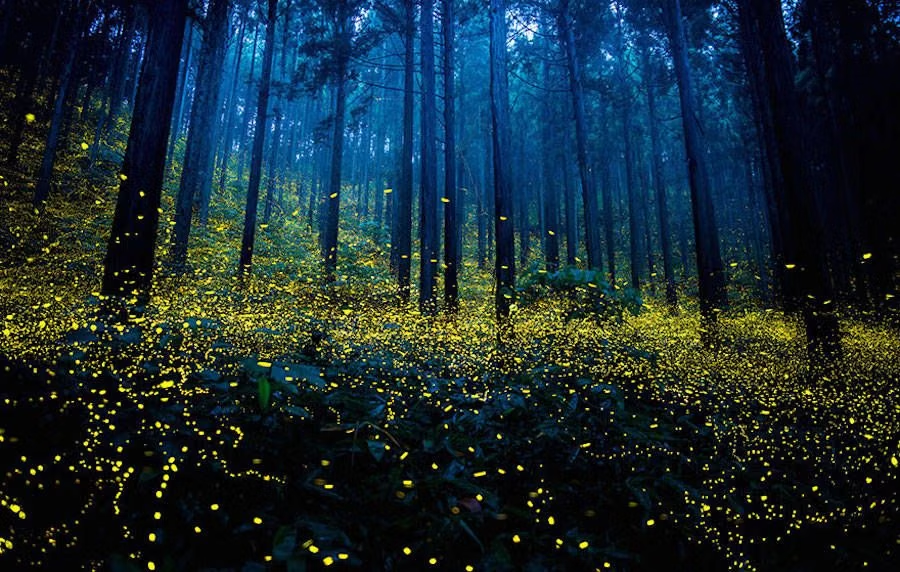
Luminous Eco-Skeuomorphism UI design style
A glossy, tactile interface style that combines early-2010s skeuomorphism with futuristic ecological-tech aesthetics. Controls resemble illuminated physical hardware, with intense inner glows, radiant edges, and soft light bloom making interactive elements appear electrically powered.
Clean UI design style
An engineered interface language pairs tightly controlled spacing, measured grids, layered neutral surfaces, and precise micro-details so dense information feels calm, airy, and aligned.
Fluent Design UI design style
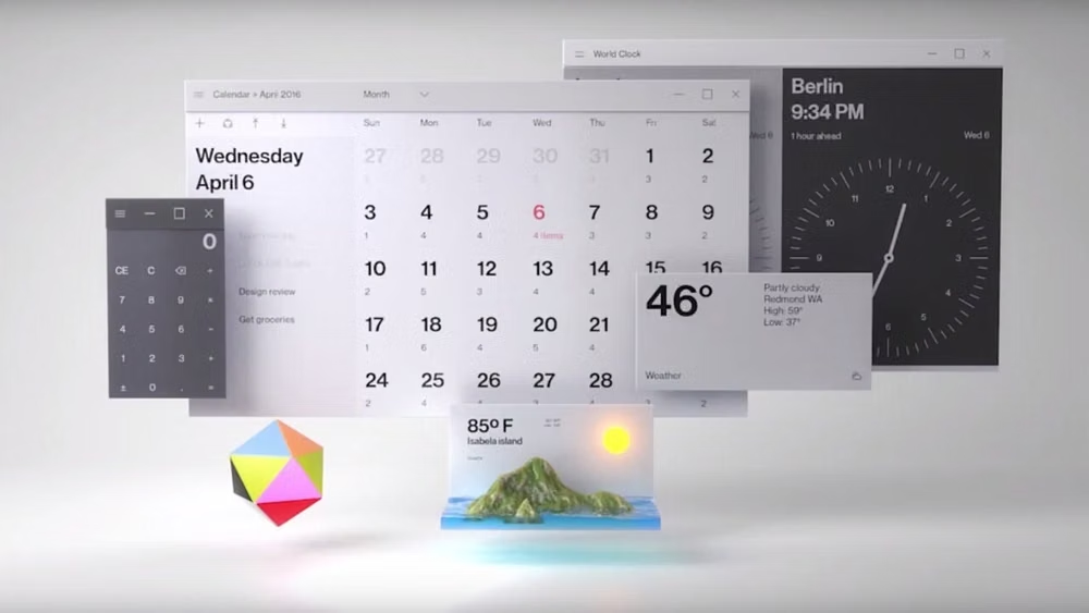
Layered surfaces, adaptable components, soft depth, light, motion, and restrained translucent materials.