Luminous Eco-Skeuomorphism UI design style
A glossy, tactile interface style that combines early-2010s skeuomorphism with futuristic ecological-tech aesthetics. Controls resemble illuminated physical hardware, with intense inner glows, radiant edges, and soft light bloom making interactive elements appear electrically powered.
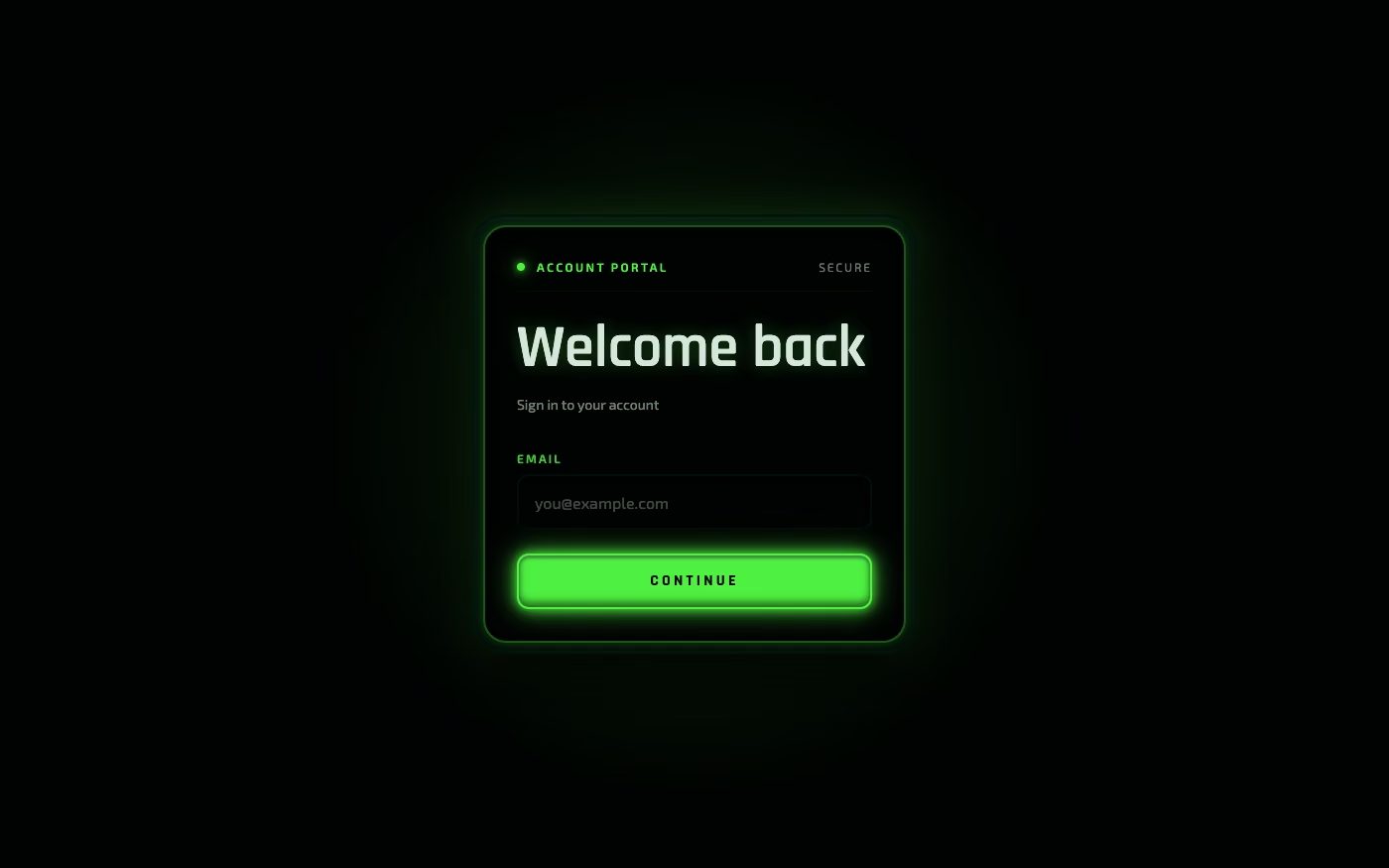
Design overview
- Signature elements
- strong inner and outer glow effects, luminous edge highlights, glossy surfaces, beveled frames, recessed tracks, illuminated controls, soft bloom halos, reflective gradients, embossed panels, hardware-inspired details. In daisyUI themes, set `--depth: 1;`.
- Best suited to
- Technology dashboards, media controls, gaming interfaces, environmental products, energy applications, retro-futuristic websites, and interfaces designed to feel powered or alive.
- Layout principles
- Arrange controls like a compact physical console, using aligned rows, grouped modules, and consistent spacing. Establish hierarchy through illumination intensity, dimensional depth, and control size rather than large empty areas.
History and origins
A fact-checked account of where this visual language came from, with links to the references used.
- Period
- Late 2010s–present
- Origin
- Contemporary environmental branding, game UI, and product visualization
Luminous Eco-Skeuomorphism is a contemporary composite label, not a documented historical movement. It combines simulated living materials and glowing ecological imagery with biophilic design, a field shaped by Erich Fromm’s 1960s use of “biophilia,” E. O. Wilson’s 1984 book, and Stephen Kellert’s later translation of the concept into designed environments.
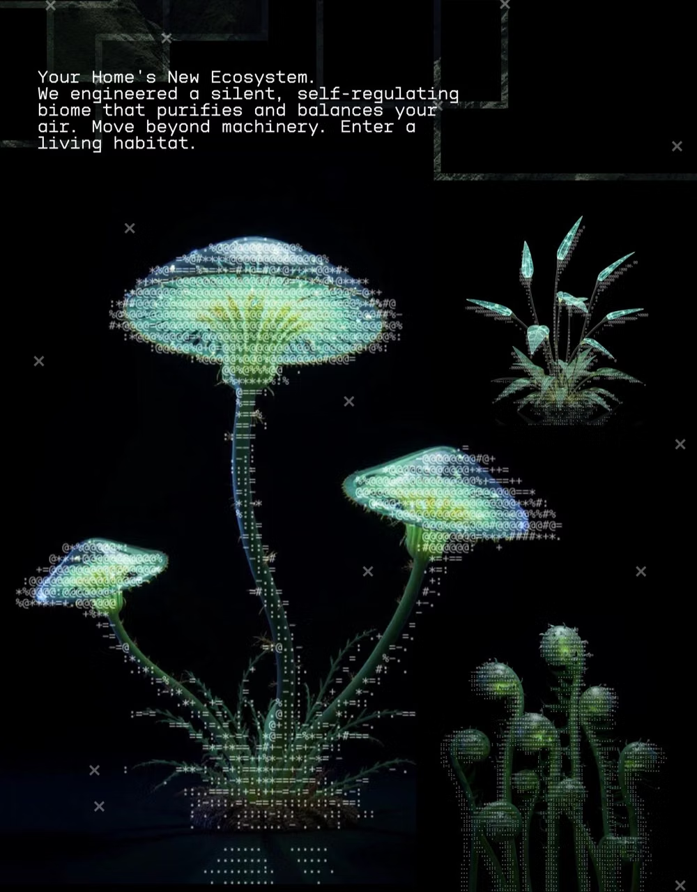
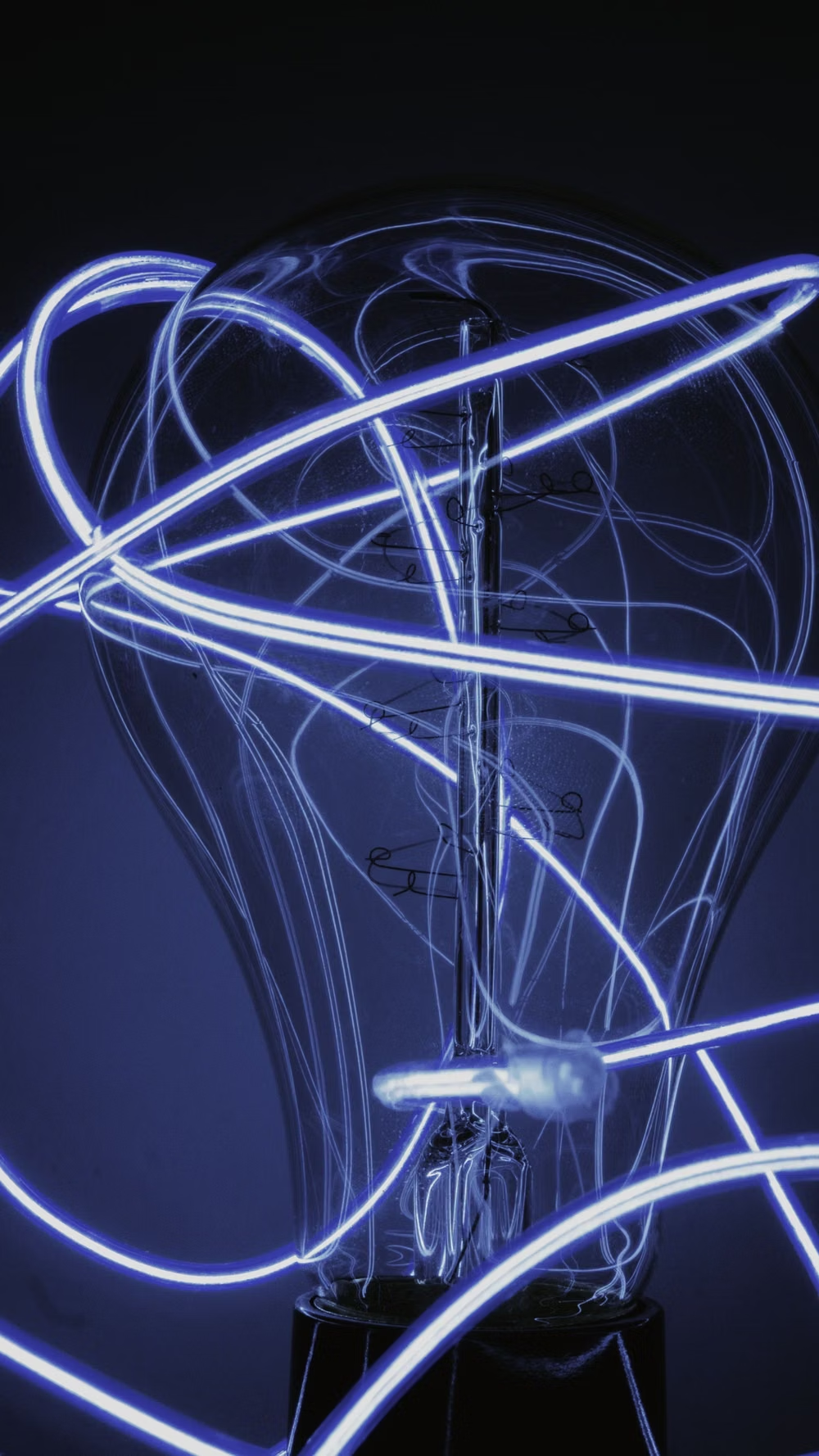
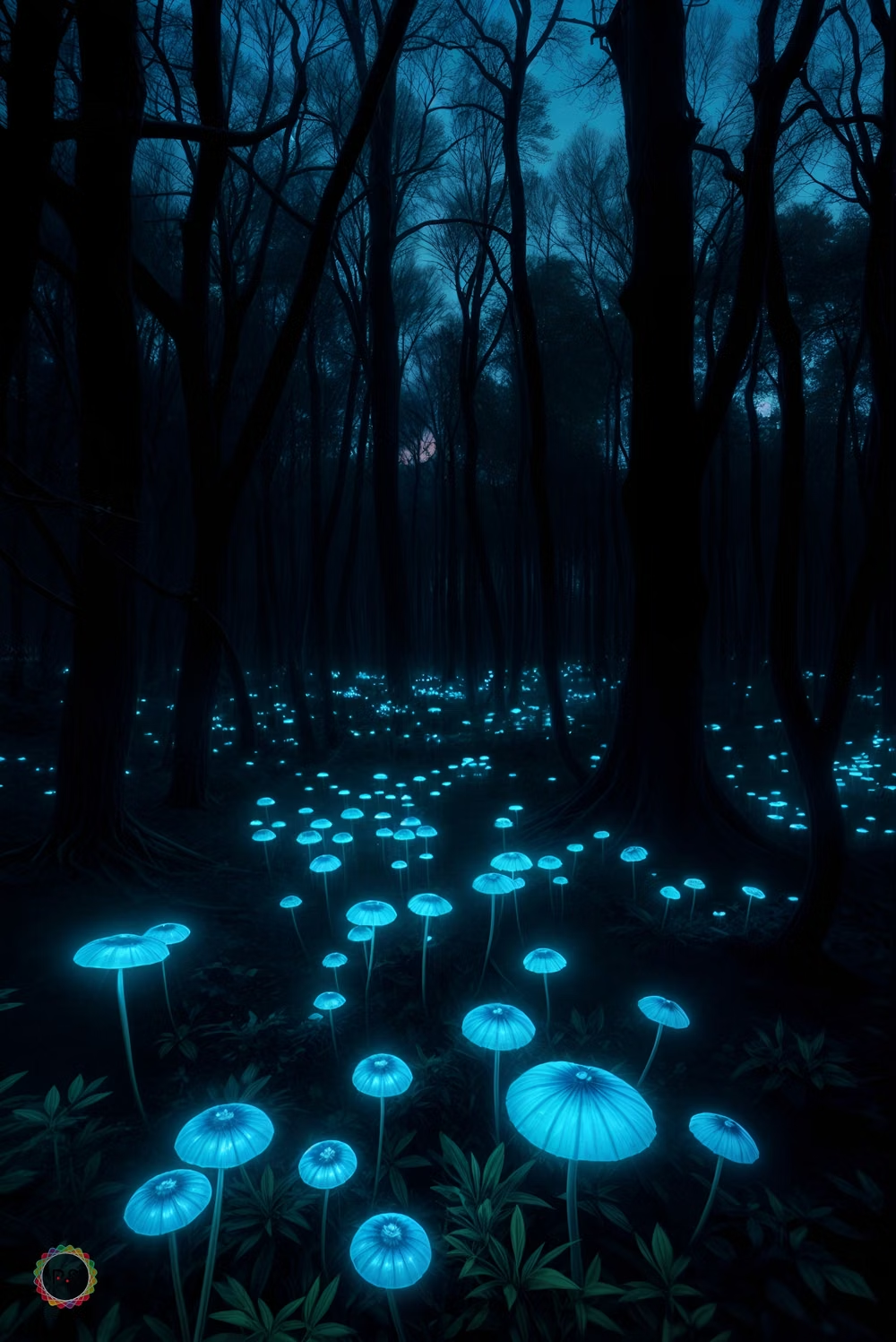
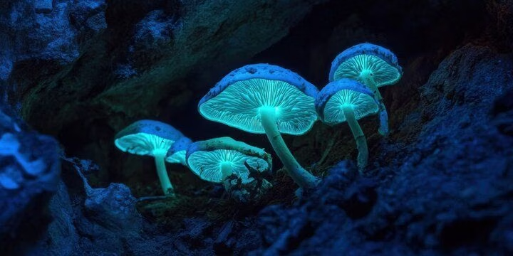
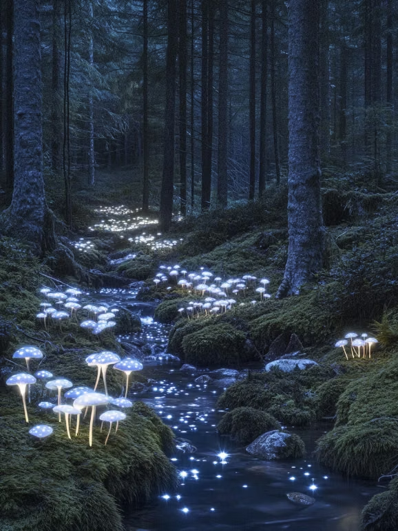
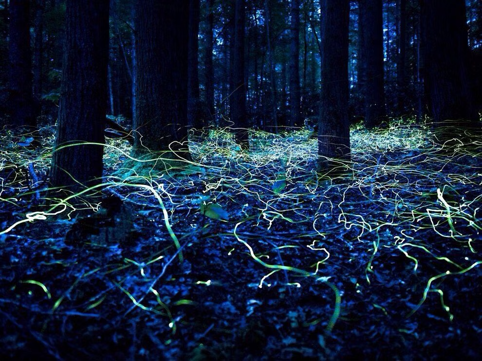
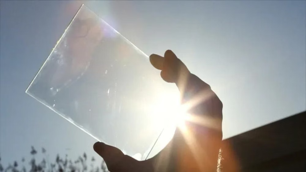
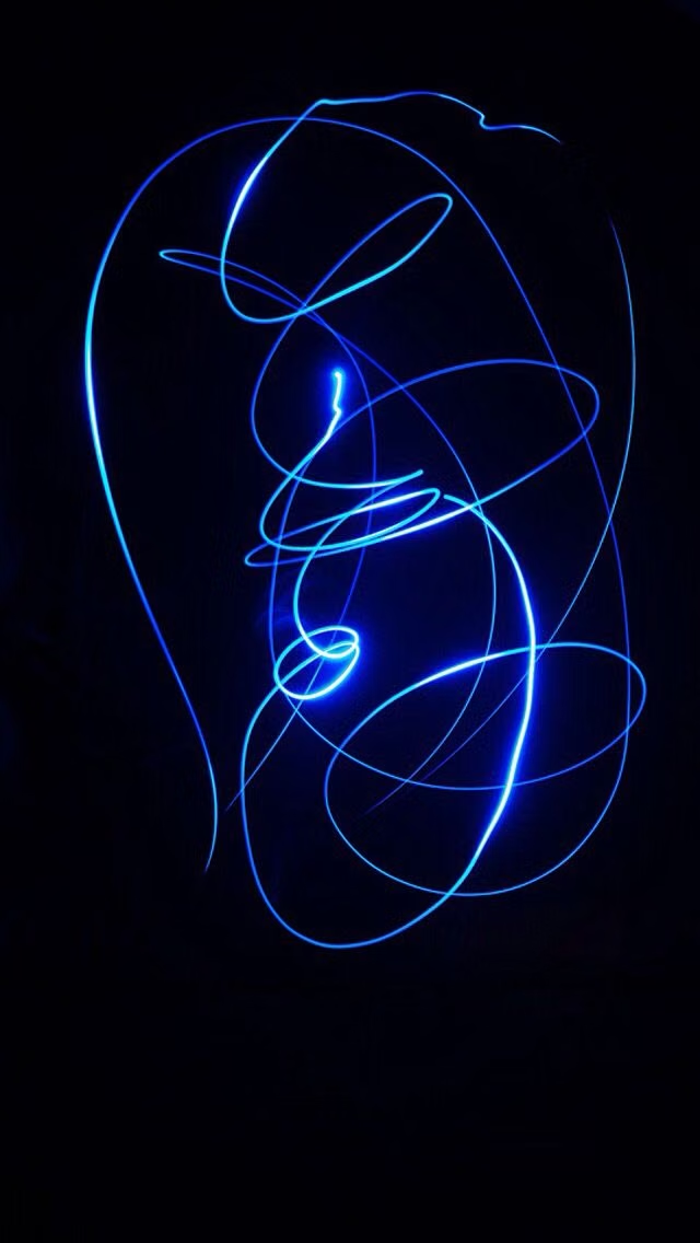
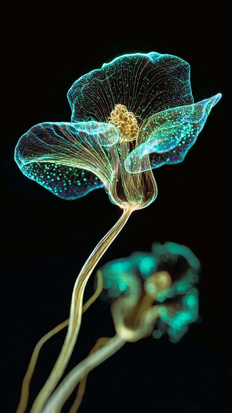
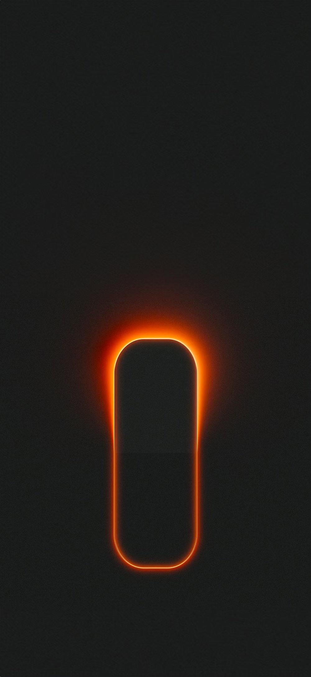
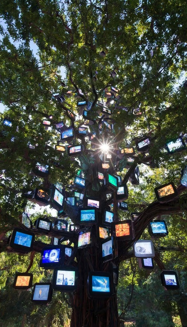
Moodboard and visual references
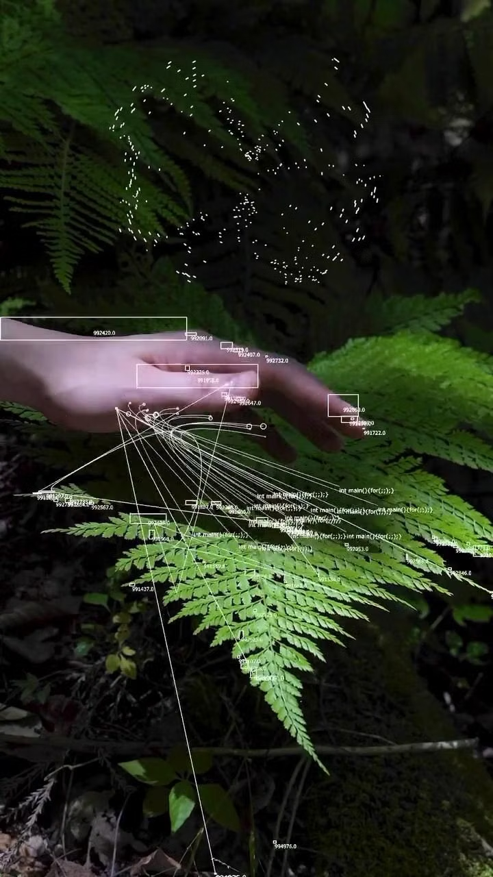
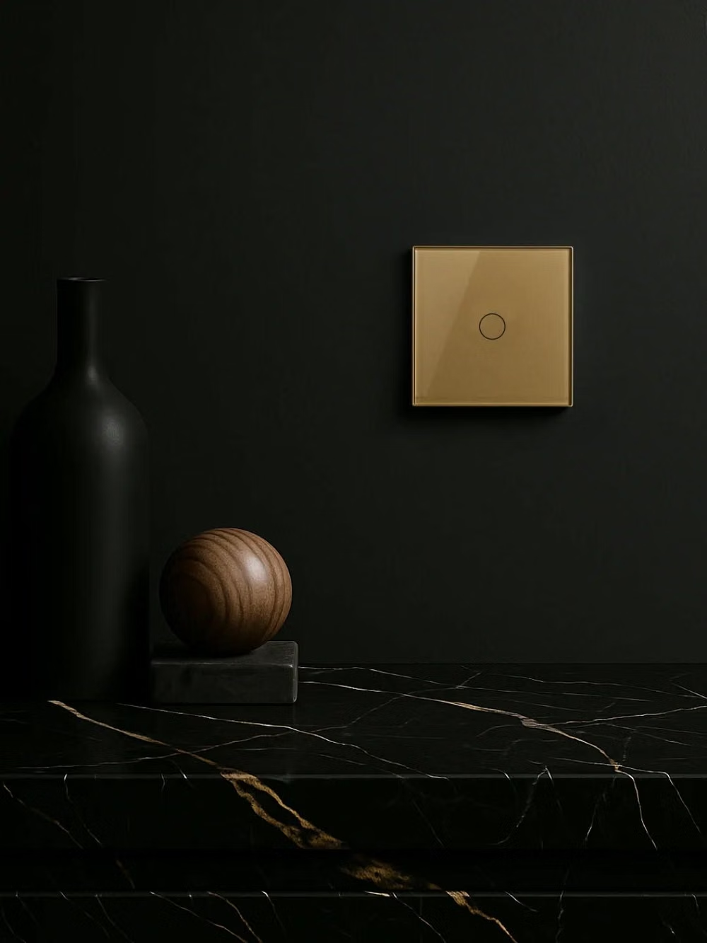
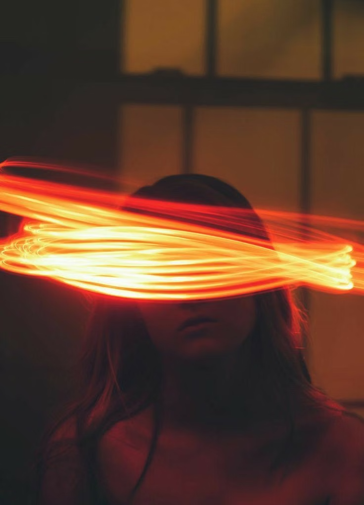
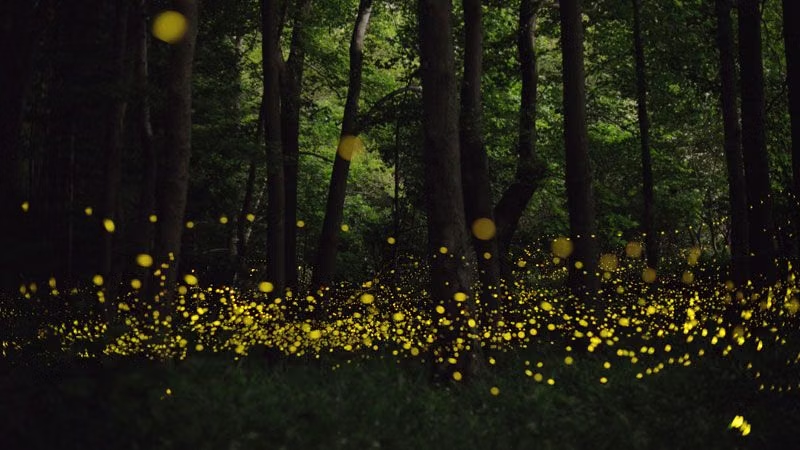
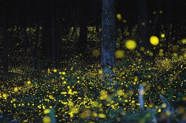
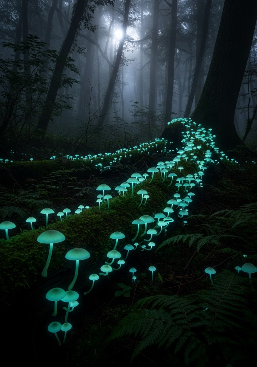
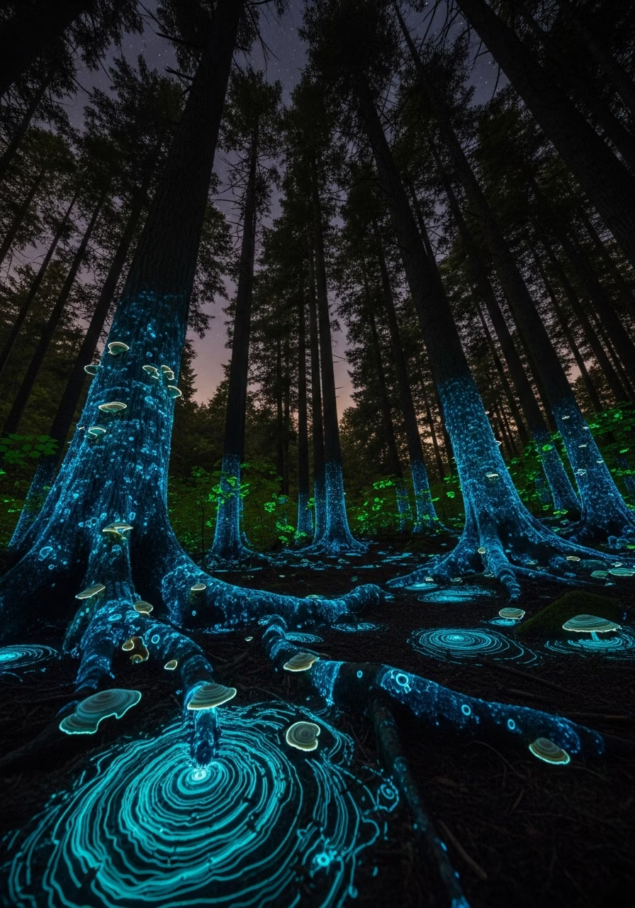
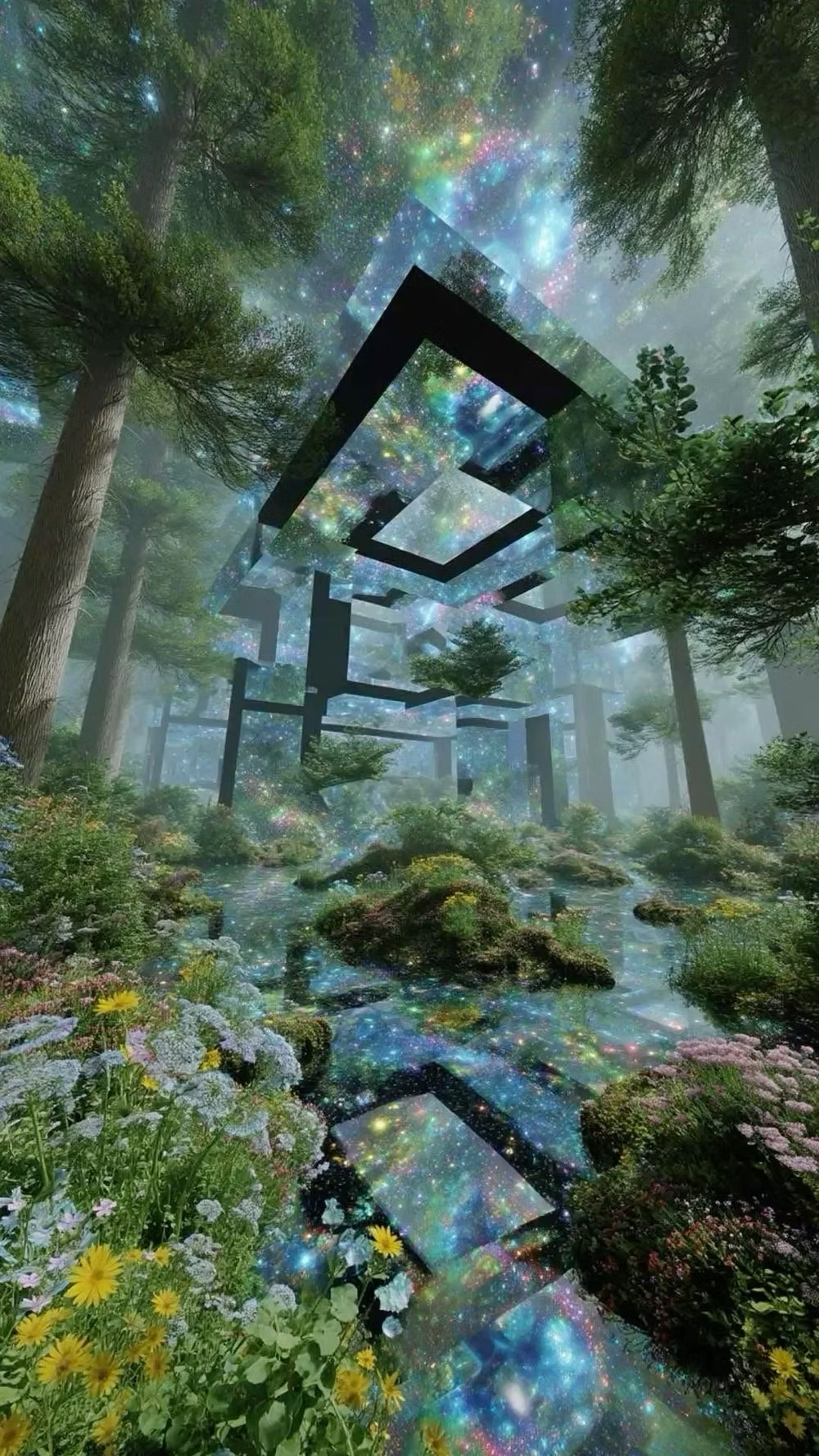
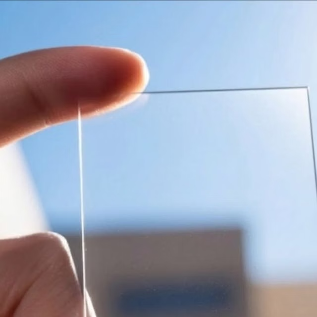
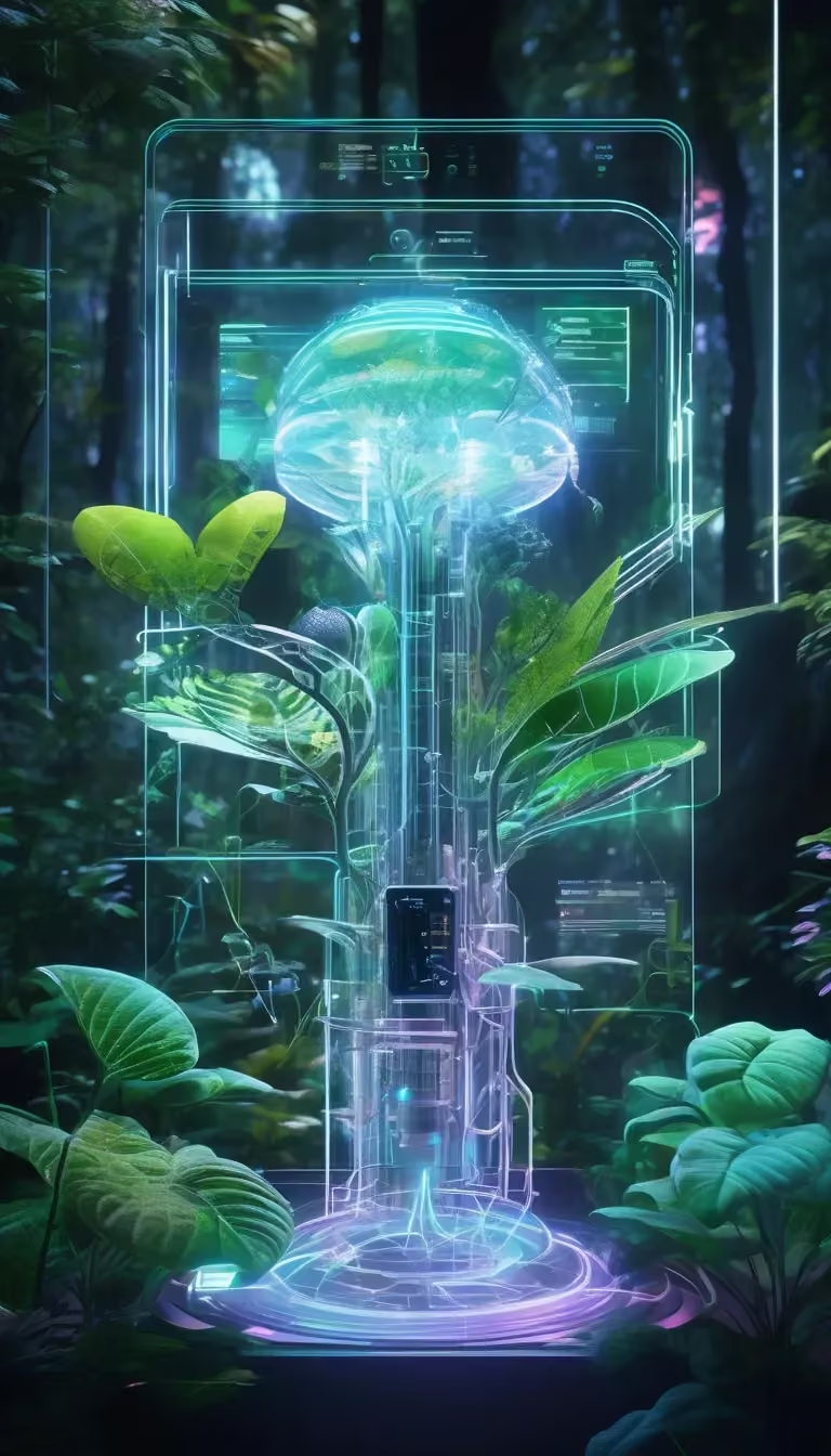
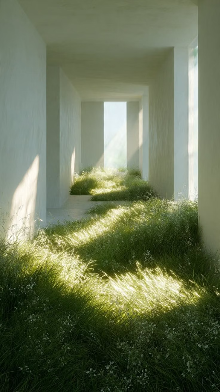
A visual study of the forms, inspirations, materials, colors, type, and cultural references associated with this UI design style.




Design principles and implementation
Use these principles to write a focused AI UI design prompt instead of asking for a vague visual treatment.
Color direction
Use a dark, low-luminance foundation with one dominant luminous accent. Build the accent through multiple brightness levels, from deep shadow to concentrated highlights, and reserve the strongest glow for active or important controls. In a daisyUI theme, use luminous eco green or cyan for `primary`, restrained teal or amber for `secondary`, and step `base-100`, `base-200`, and `base-300` through deep blue-gray, graphite, and near-black.
Imagery direction
Use close-up renderings of polished materials, illuminated hardware, energy indicators, glossy interfaces, and abstract light effects. Avoid flat illustration; imagery should reinforce physical depth and emitted light.
Content density
Medium to high, with many compact controls organized into clearly separated functional groups. Use the `*-sm` size variants for daisyUI components to preserve this compact working density.
Motion direction
Use gradual light pulses, glow intensification, illuminated sweeps, indicator flickers, slider movement, and soft bloom transitions. Active controls should appear to power on rather than simply change state.
Shape language
Rounded rectangles, pill-shaped controls, circular dials, inset tracks, thick beveled borders, layered frames, and softly chamfered mechanical forms. In daisyUI themes, set the `--radius-*` variables between `0.75rem` and `1.5rem`.
Typography rules
Use compact, highly legible sans-serif type with restrained sizing. Apply subtle illuminated edges or soft text glow to important labels, but keep body text comparatively neutral so the glowing controls remain dominant.
Suggested Typfaces
Rajdhani
Fresh daisies glow in warm sunlight
Fresh daisies glow in warm sunlight
1 2 3 4 5 6 7 8 9 0
Exo 2
Fresh daisies glow in warm sunlight
Fresh daisies glow in warm sunlight
1 2 3 4 5 6 7 8 9 0
Titillium Web
Fresh daisies glow in warm sunlight
Fresh daisies glow in warm sunlight
1 2 3 4 5 6 7 8 9 0
Ubuntu
Fresh daisies glow in warm sunlight
Fresh daisies glow in warm sunlight
1 2 3 4 5 6 7 8 9 0
Build a Luminous Eco-Skeuomorphism interface with daisyUI
The live example translates this direction into daisyUI components and semantic theme tokens.
To generate a full page in the same visual language, give the style name and the design rules above to Blueprint MCP.
Related UI design styles
Compare nearby visual languages that share typography, shapes, use cases, or signature elements.

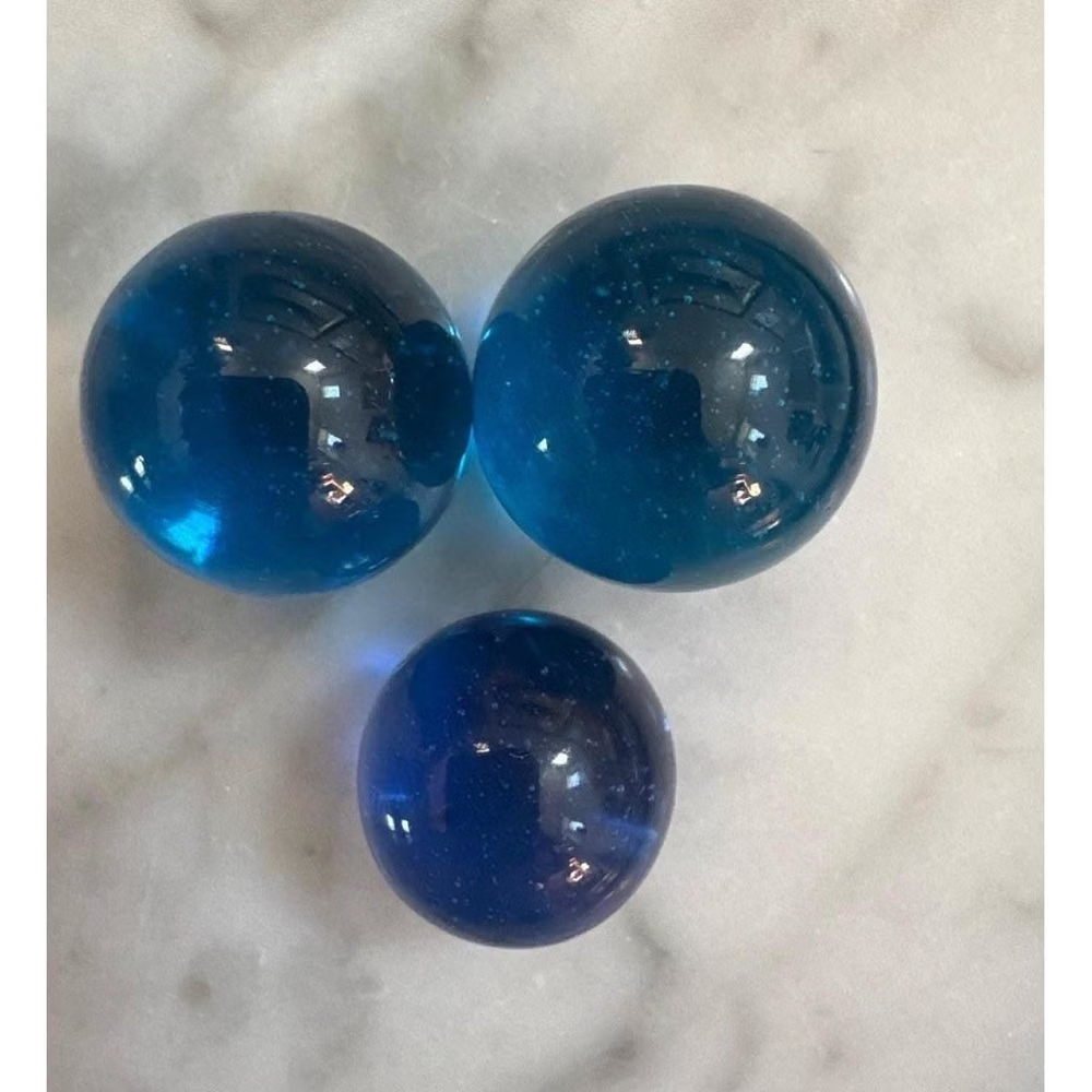
Aqua UI design style
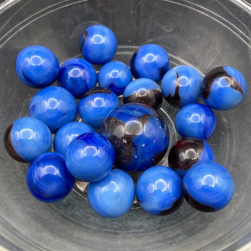
Glossy gel-like controls, candy colors, translucent highlights, pinstripes, and vivid dimensional icons.
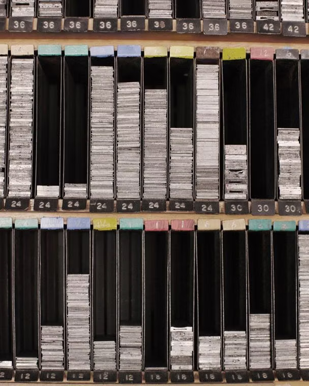
Clean UI design style
An engineered interface language pairs tightly controlled spacing, measured grids, layered neutral surfaces, and precise micro-details so dense information feels calm, airy, and aligned.
Neumorphism UI design style
Low-contrast monochromatic surfaces with controls that appear softly raised from or pressed into the background.