Swiss Style UI design style
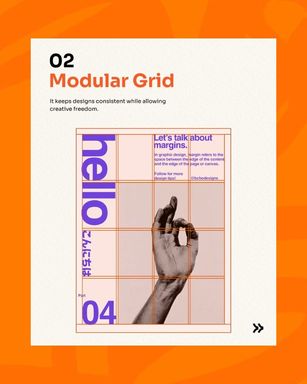
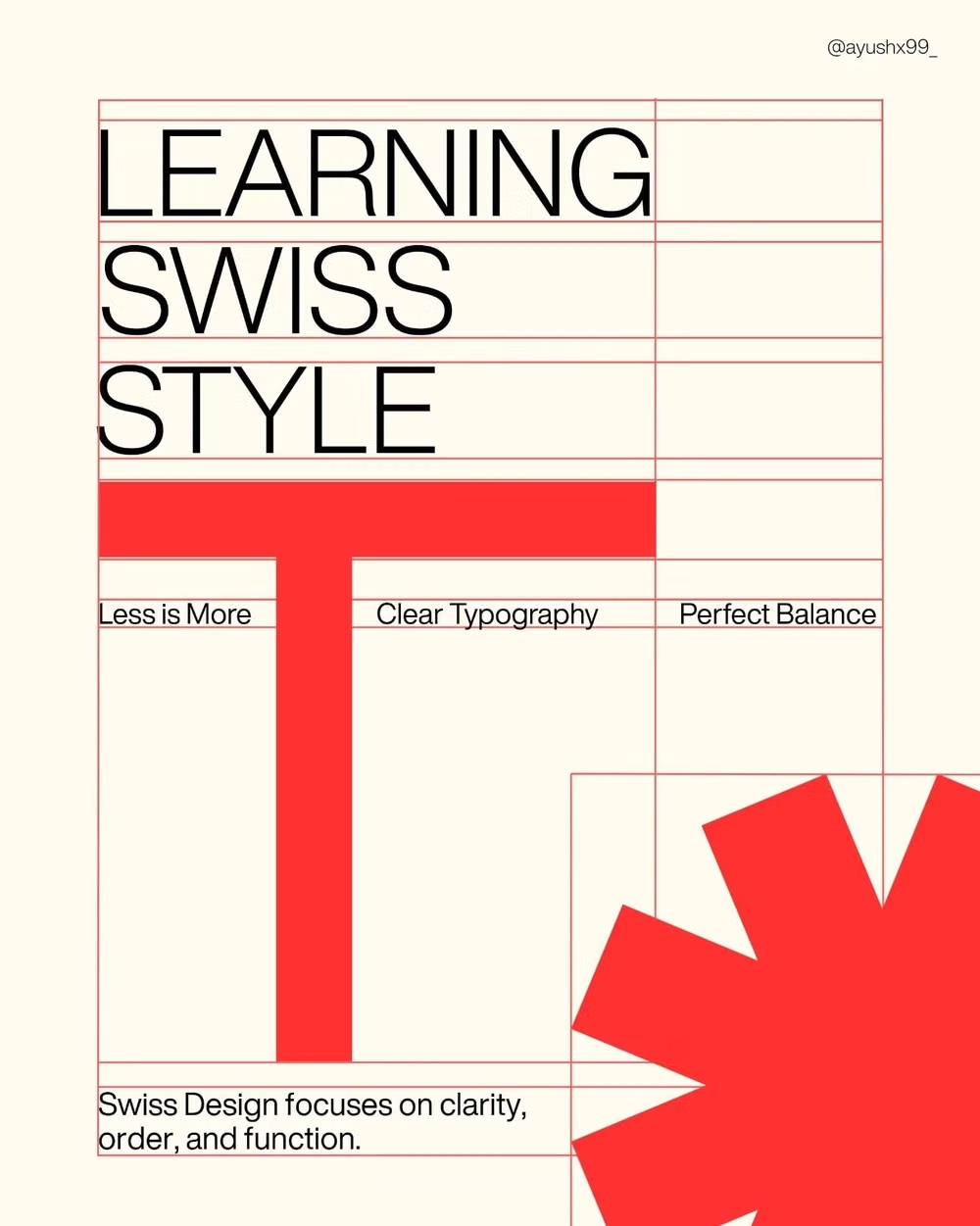
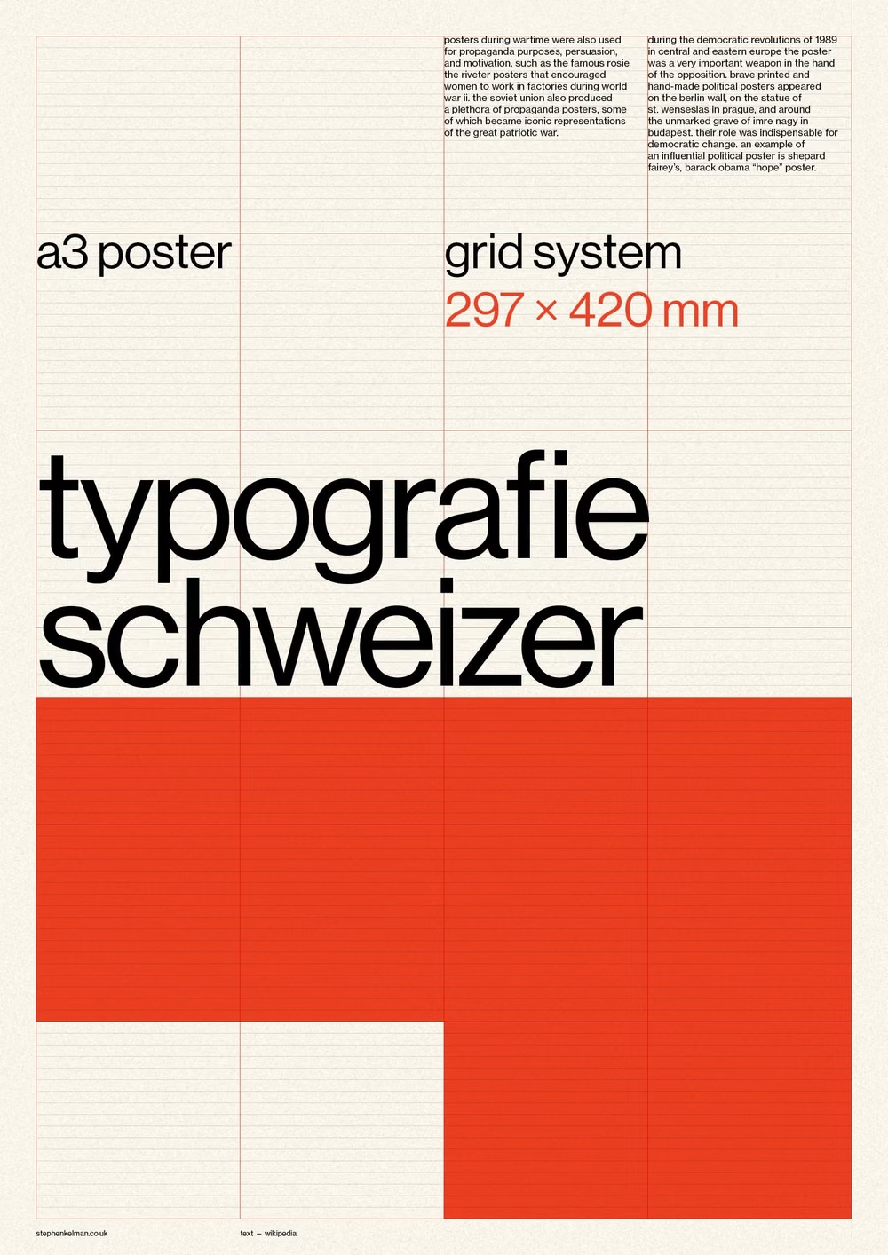
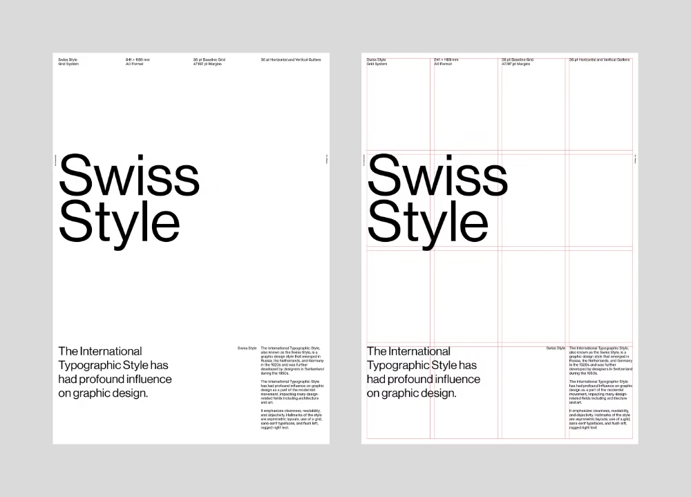
Strict grids, generous whitespace, sans-serif typography, asymmetry, and objective information hierarchy.
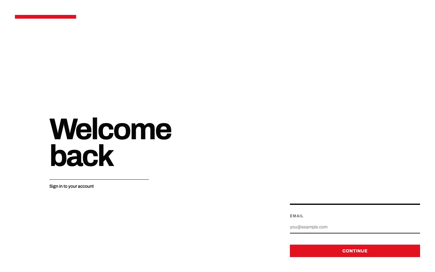
Design overview
- Signature elements
- modular grid, asymmetric layout, grotesque sans-serif, generous whitespace, objective hierarchy, flush-left alignment
- Best suited to
- Editorial products, documentation, portfolios, wayfinding, and information-heavy interfaces.
- Layout principles
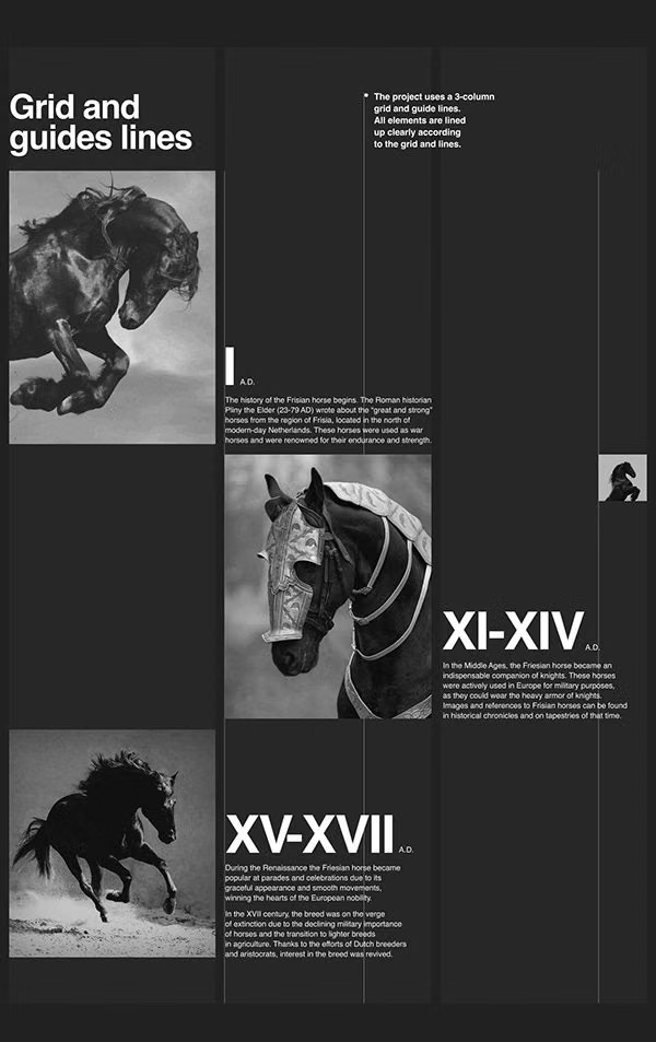
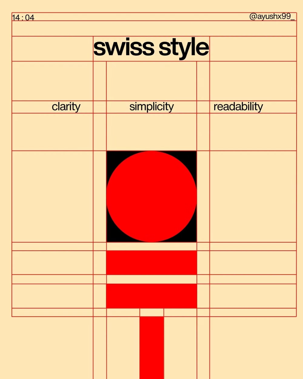
- Use a mathematically consistent modular grid, place text and image asymmetrically across columns, and align every element to shared vertical and horizontal anchors.
History and origins
A fact-checked account of where this visual language came from, with links to the references used.
- Period
- 1950s–1960s
- Origin
- Zurich and Basel, Switzerland
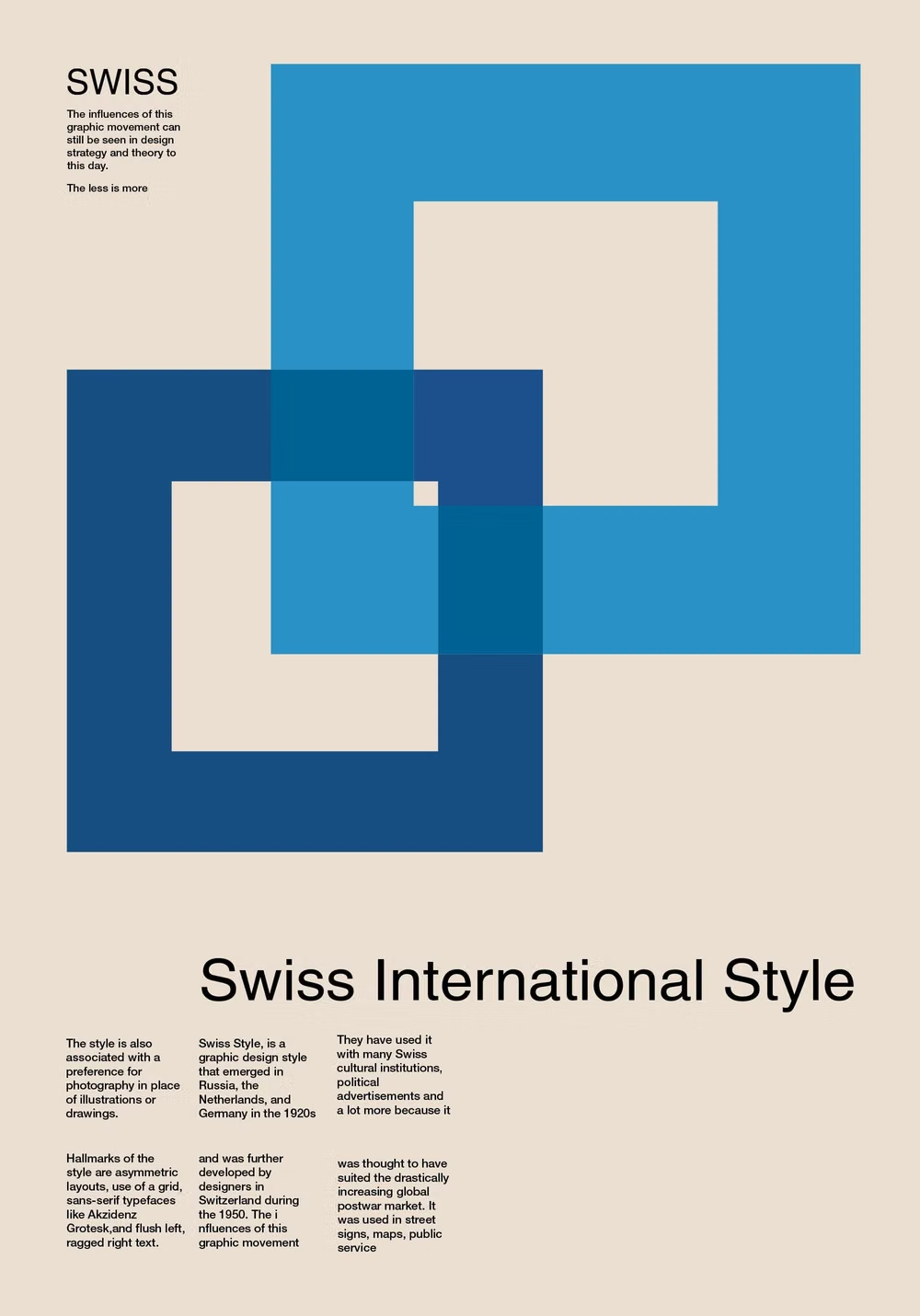
Swiss Style, also called the International Typographic Style, took recognizable form in Switzerland during the 1950s and spread internationally in the 1960s. Designers associated with Zurich and Basel developed asymmetric grids, sans-serif typography, photography, and objective information hierarchy; Helvetica and Univers became emblematic, though the movement was broader than either typeface.
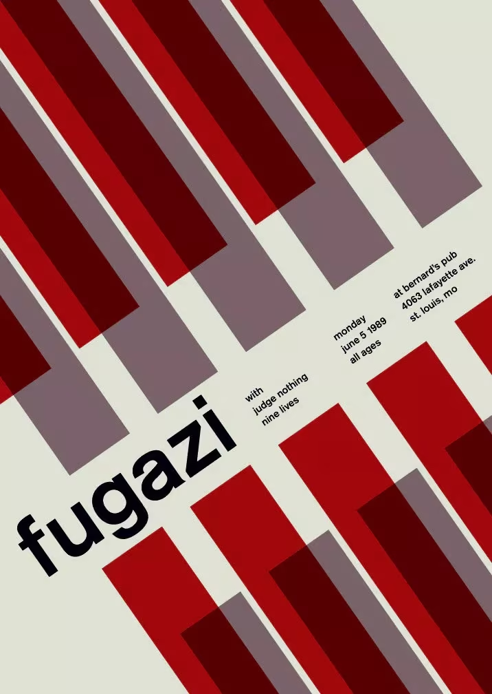
Moodboard and visual references
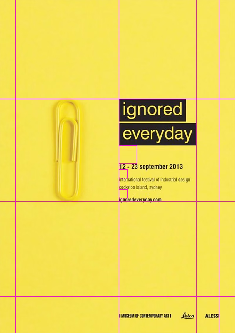
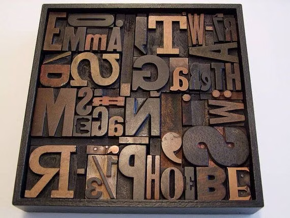
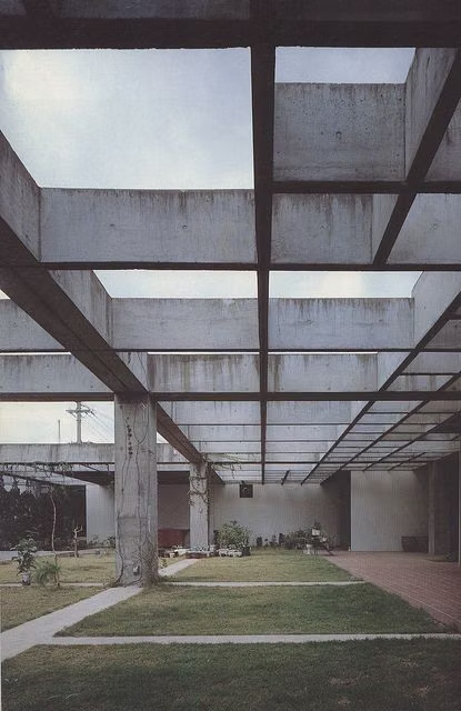
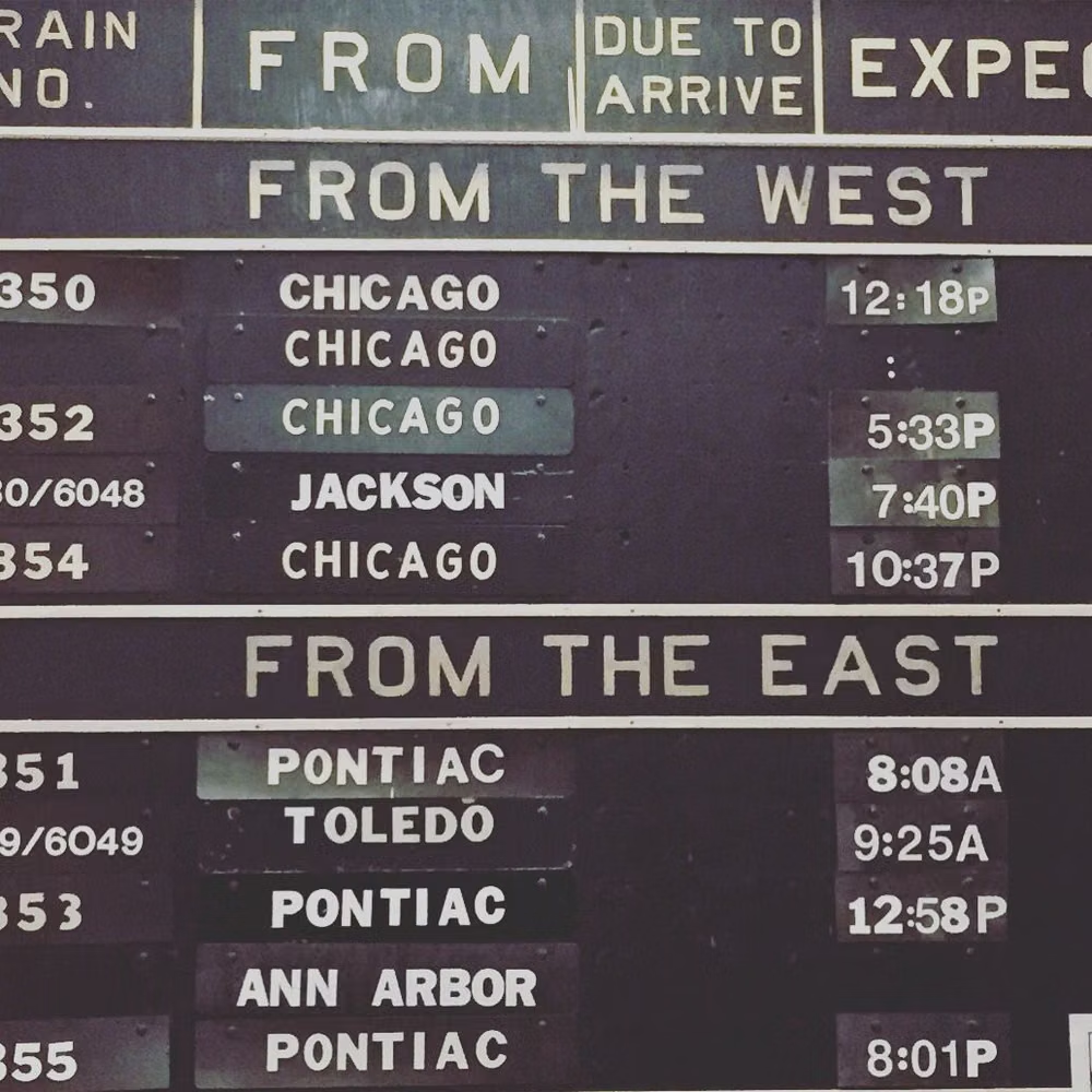
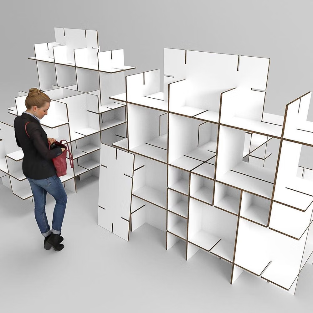
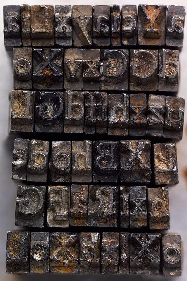
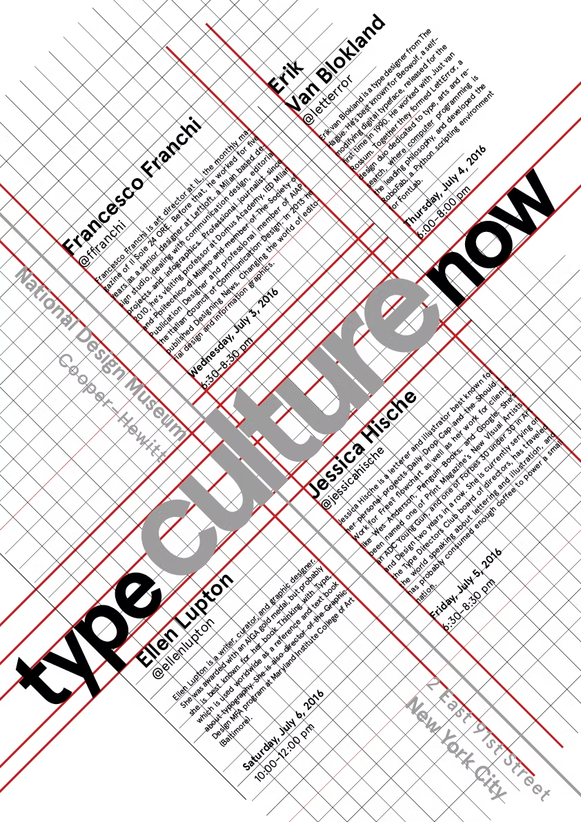
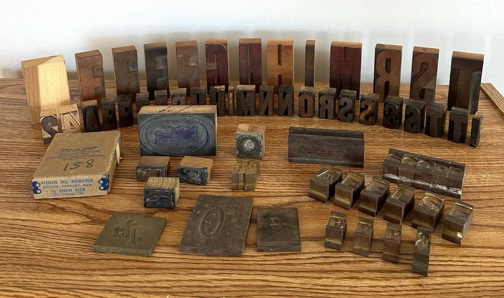
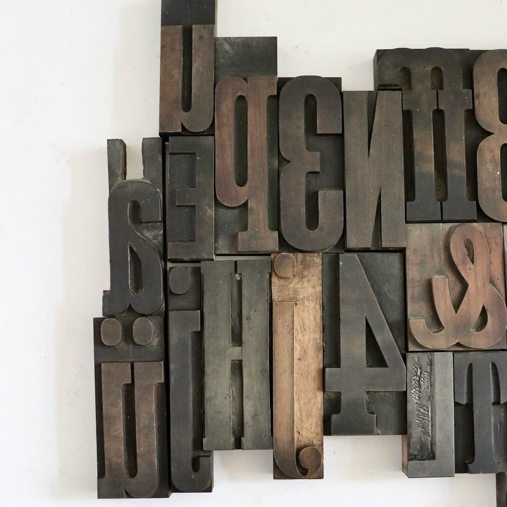
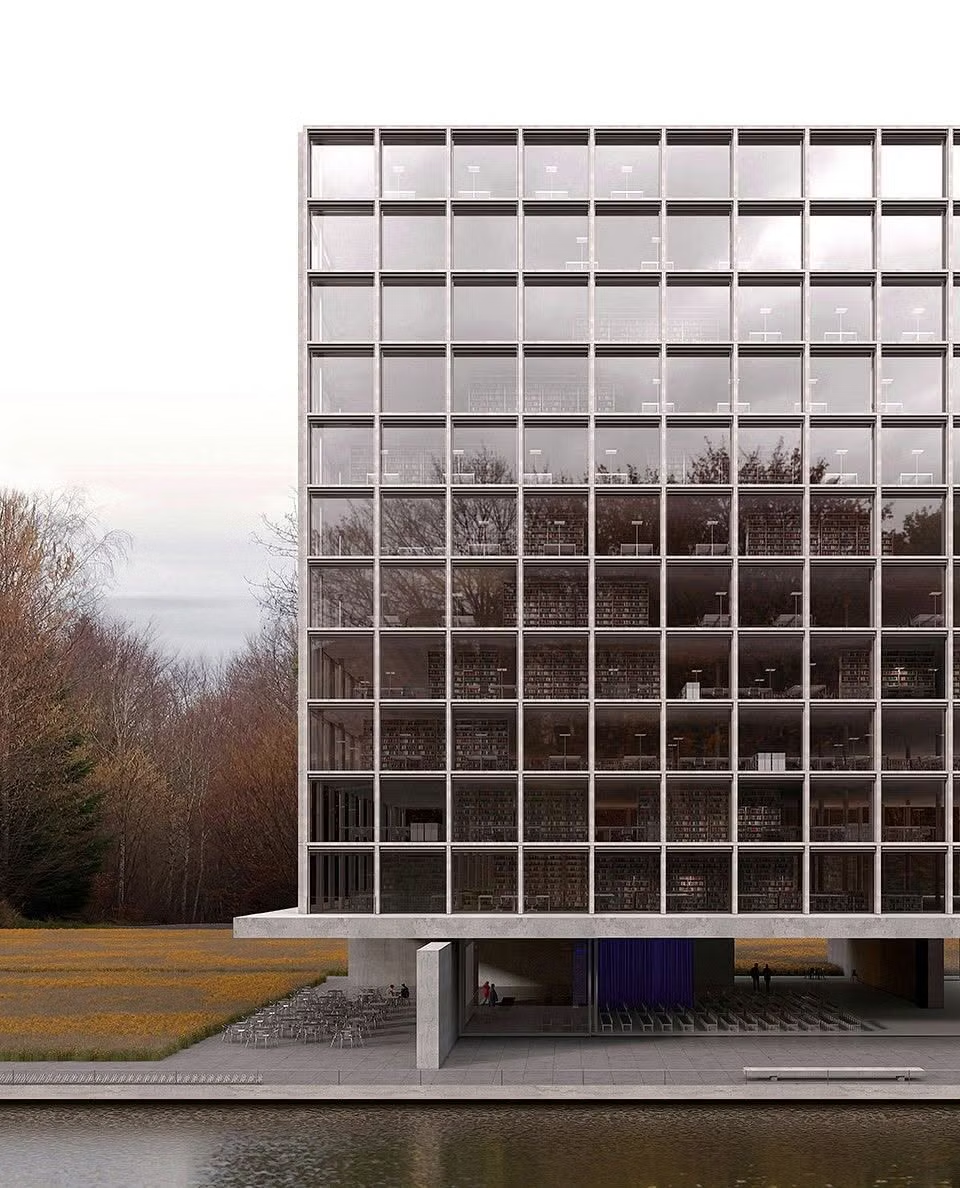
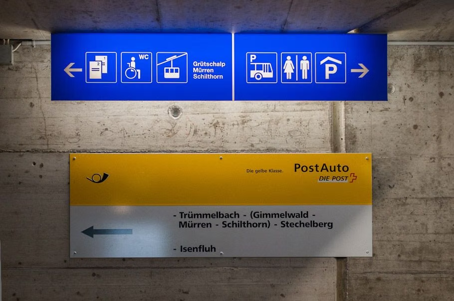
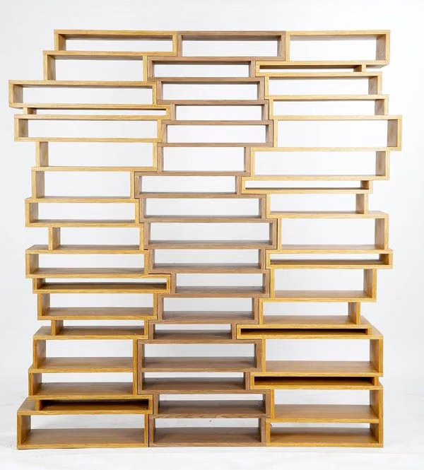
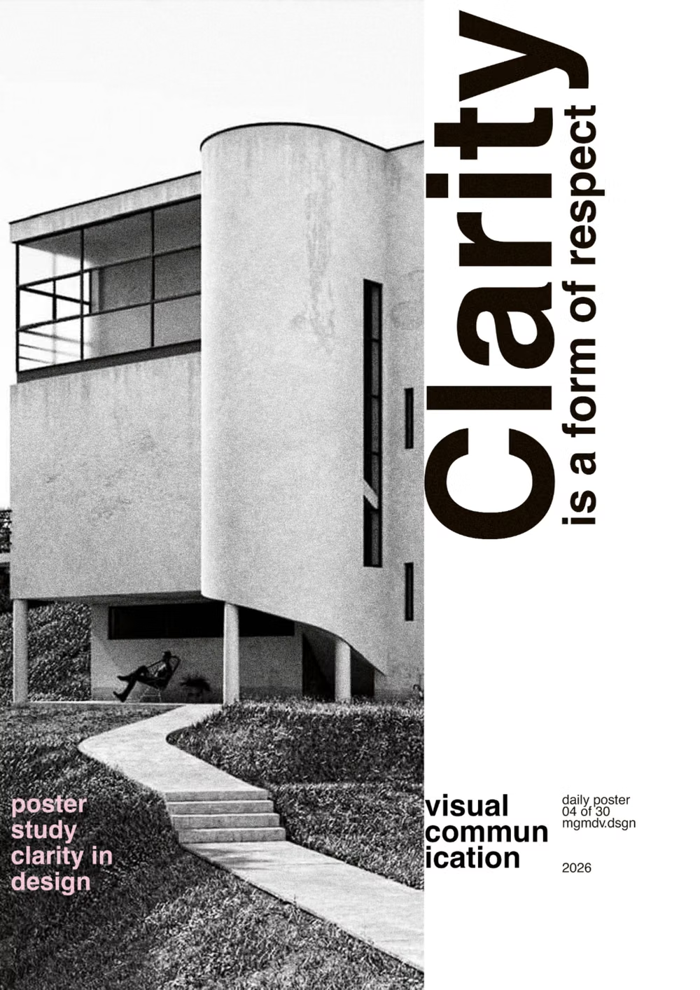
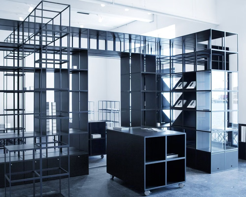
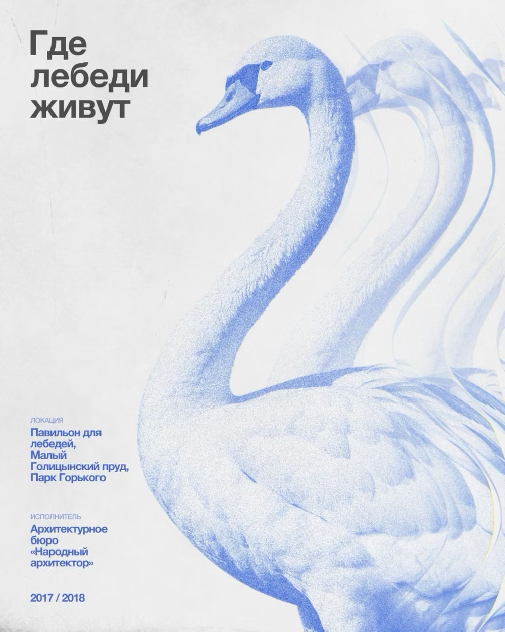
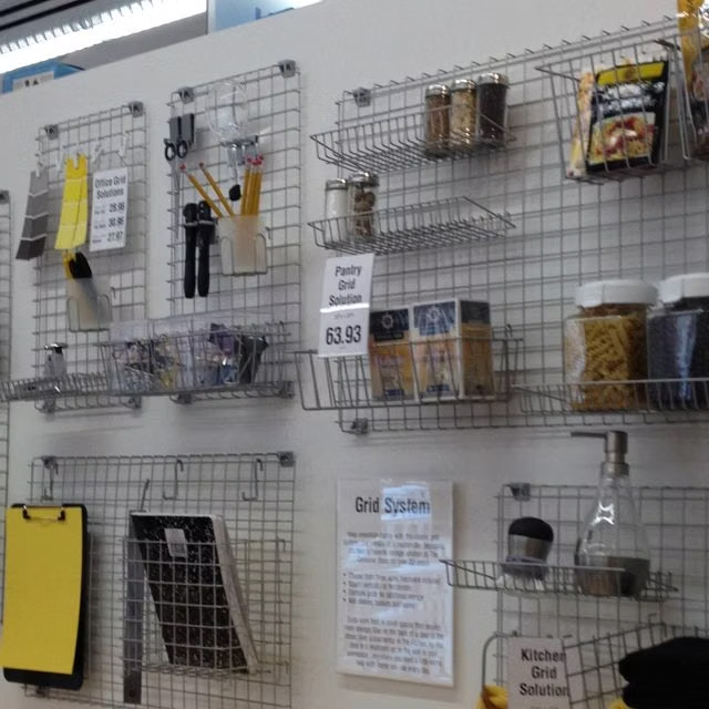
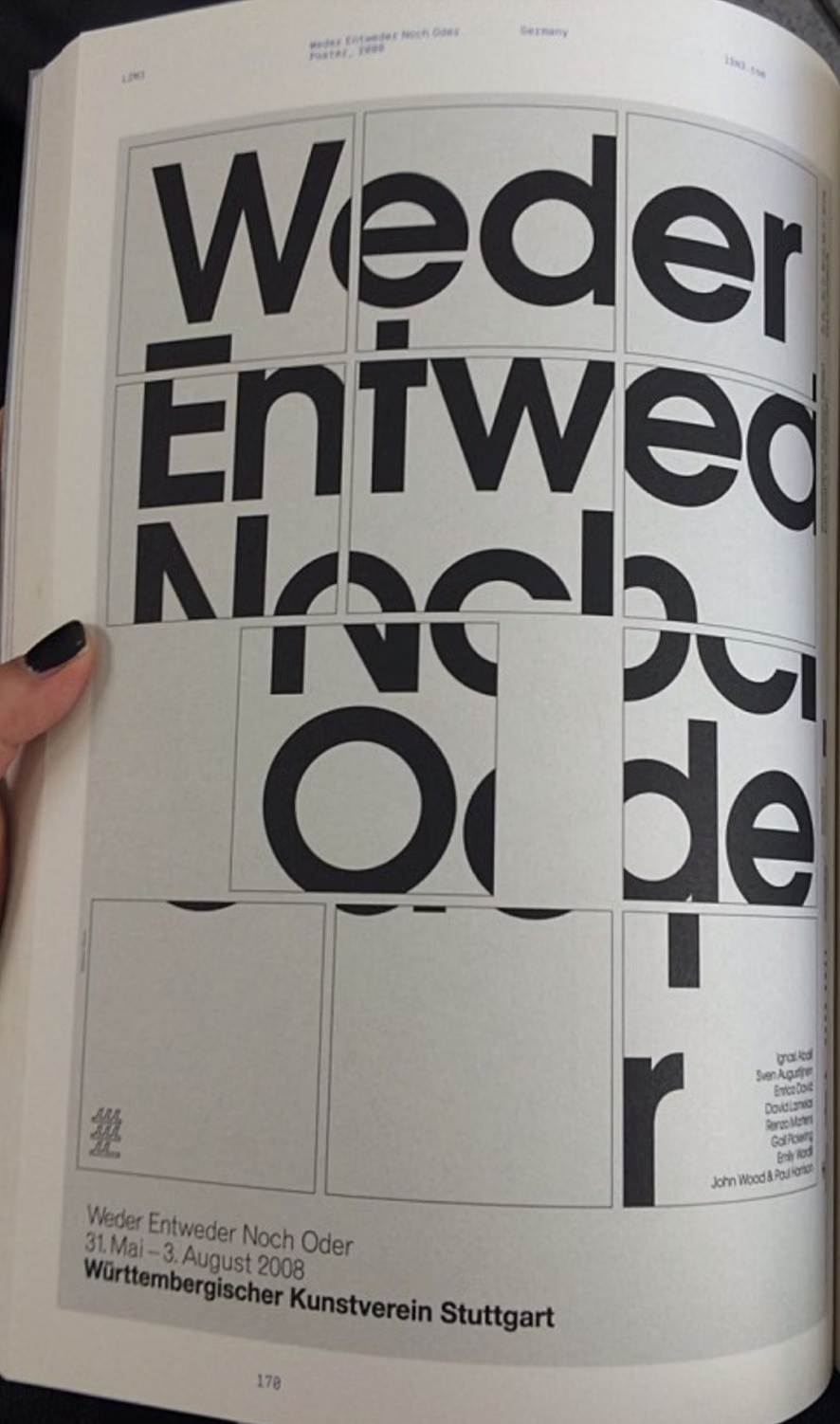
A visual study of the forms, inspirations, materials, colors, type, and cultural references associated with this UI design style.
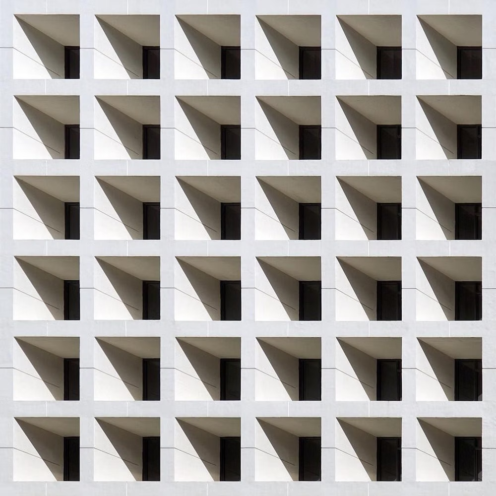

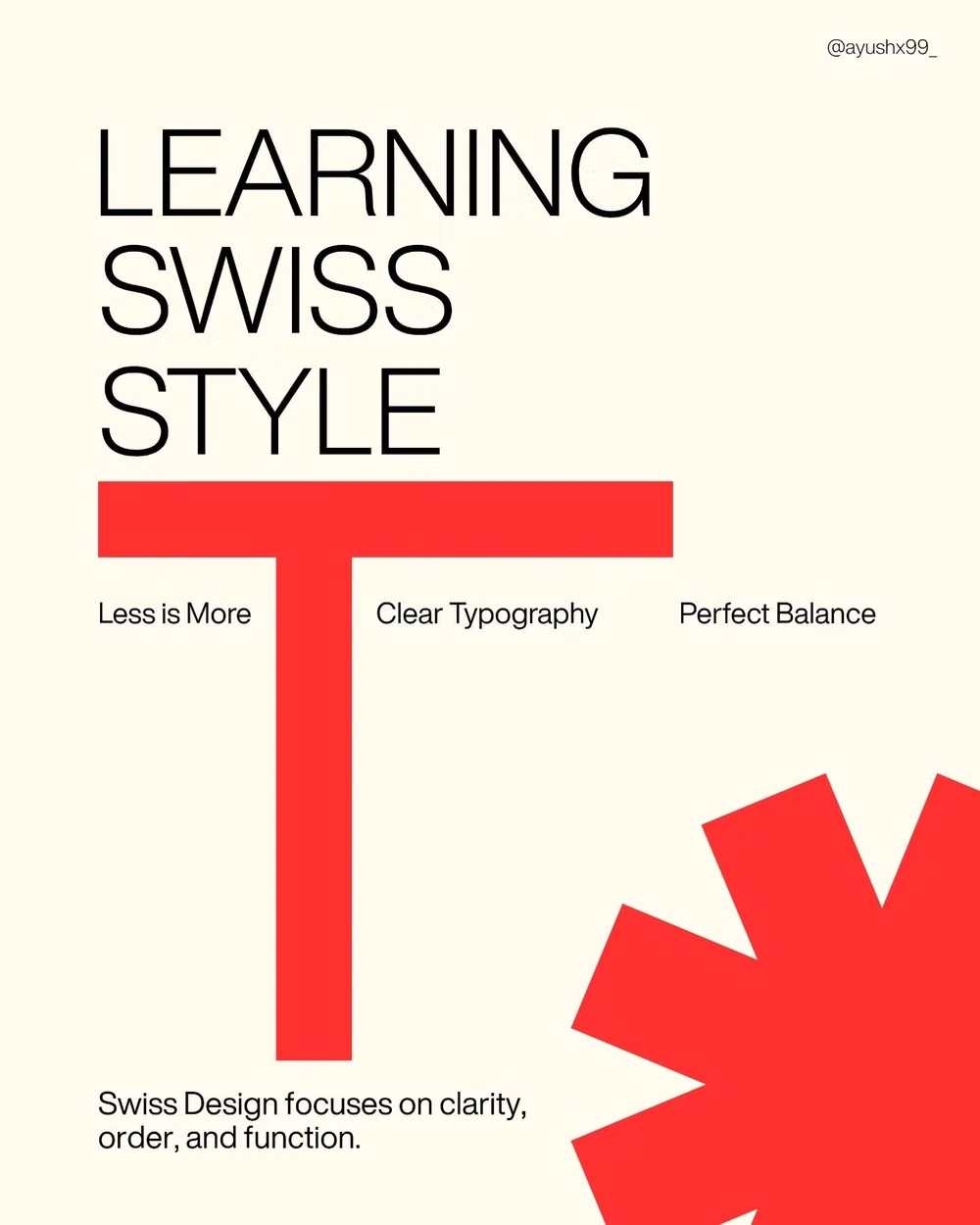
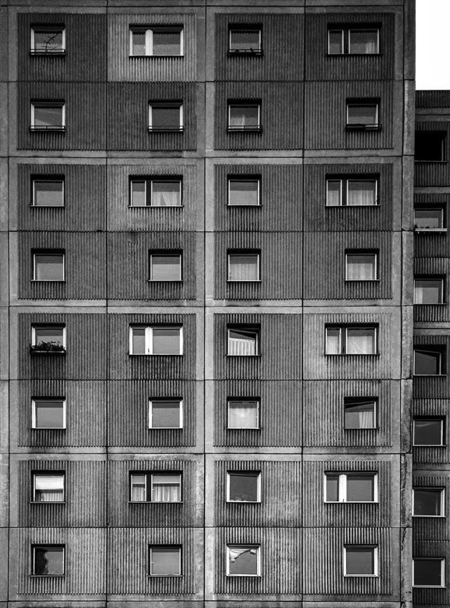

Design principles and implementation
Use these principles to write a focused AI UI design prompt instead of asking for a vague visual treatment.
Color direction
Work primarily in white, black, and gray with one direct accent such as signal red, cobalt, or yellow applied as information rather than decoration. In a daisyUI theme, use the single signal color for `primary`, neutral gray or black for `secondary`, and assign white, very light gray, and a firmer grid gray to `base-100`, `base-200`, and `base-300`.
Imagery direction
Choose documentary photography, diagrams, or objective product images, cropping them decisively to grid boundaries without ornamental framing.
Content density
Support medium to high information density while protecting large intentional voids that clarify section changes and priority.
Motion direction
Reveal content through linear grid-aligned wipes, precise slides, and immediate state changes with no elastic or ornamental motion.
Shape language
Use rules, bars, circles, and rectangles as functional alignment or labeling devices, keeping corners sharp and geometry exact. In daisyUI themes, set the `--radius-*` variables to `0` or `0.25rem`.
Typography rules
Set a grotesque sans-serif on a strict scale, align type flush left with a ragged right edge, and use weight, size, and spacing to express an objective hierarchy.
Suggested Typfaces
Archivo
Fresh daisies glow in warm sunlight
Fresh daisies glow in warm sunlight
1 2 3 4 5 6 7 8 9 0
Inter
Fresh daisies glow in warm sunlight
Fresh daisies glow in warm sunlight
1 2 3 4 5 6 7 8 9 0
Work Sans
Fresh daisies glow in warm sunlight
Fresh daisies glow in warm sunlight
1 2 3 4 5 6 7 8 9 0
Libre Franklin
Fresh daisies glow in warm sunlight
Fresh daisies glow in warm sunlight
1 2 3 4 5 6 7 8 9 0
IBM Plex Sans
Fresh daisies glow in warm sunlight
Fresh daisies glow in warm sunlight
1 2 3 4 5 6 7 8 9 0
Build a Swiss Style interface with daisyUI
The live example translates this direction into daisyUI components and semantic theme tokens.
To generate a full page in the same visual language, give the style name and the design rules above to Blueprint MCP.
Related UI design styles
Compare nearby visual languages that share typography, shapes, use cases, or signature elements.
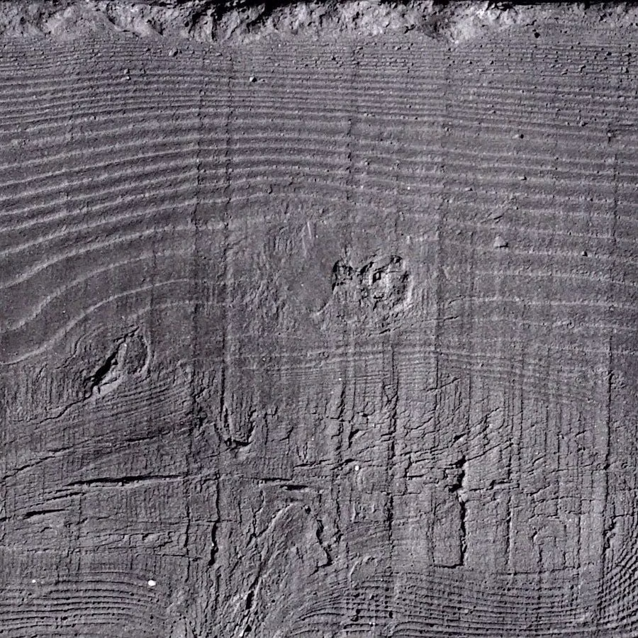
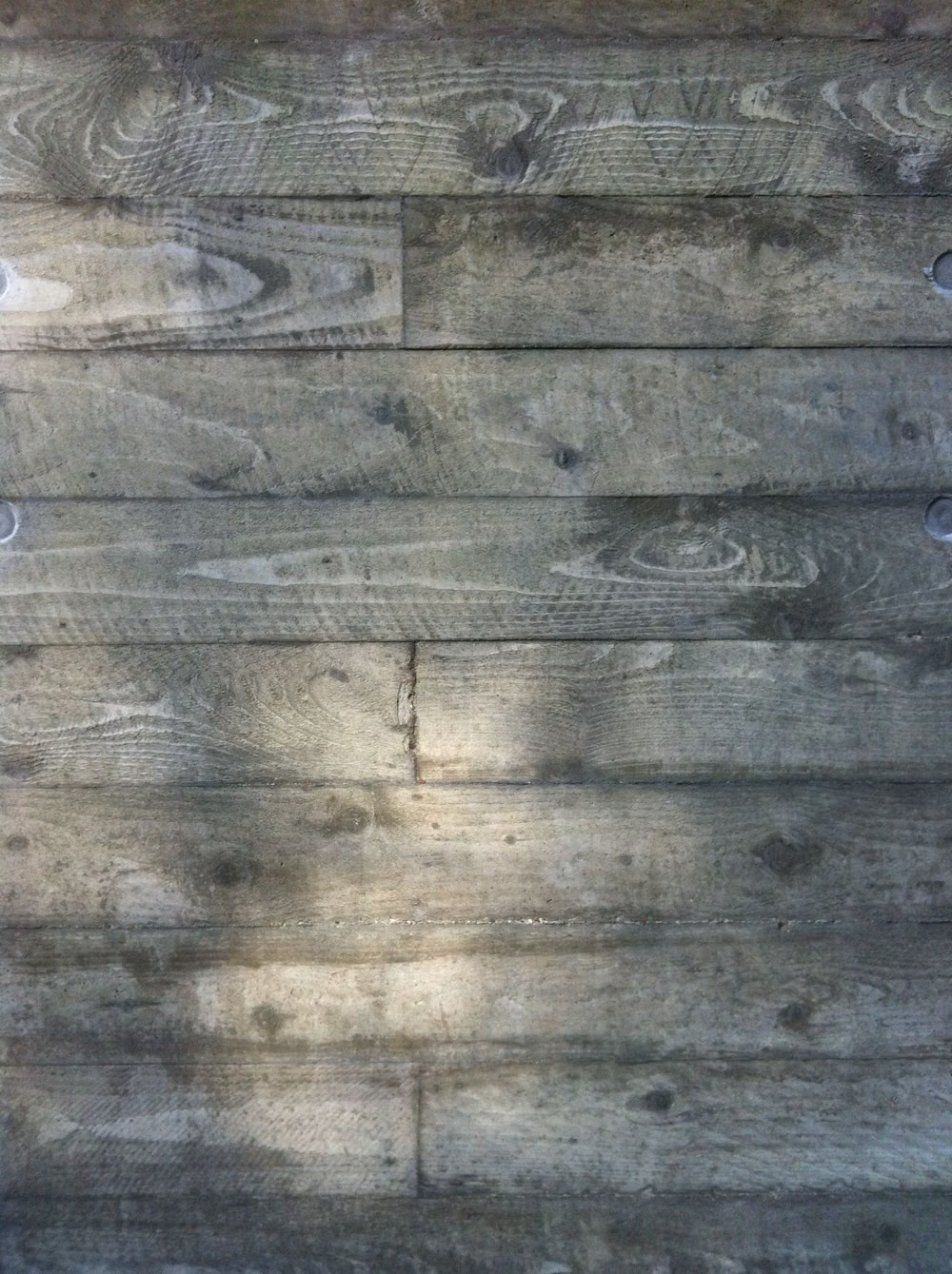
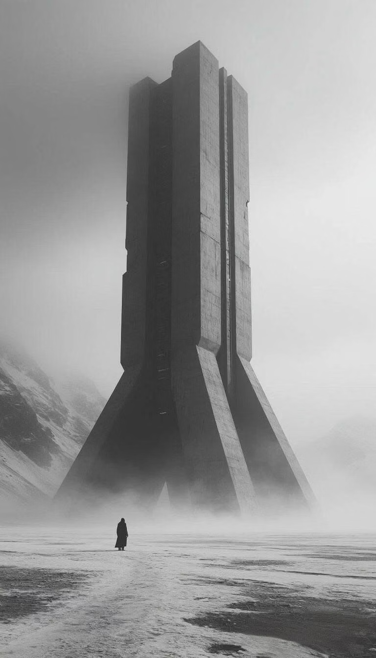
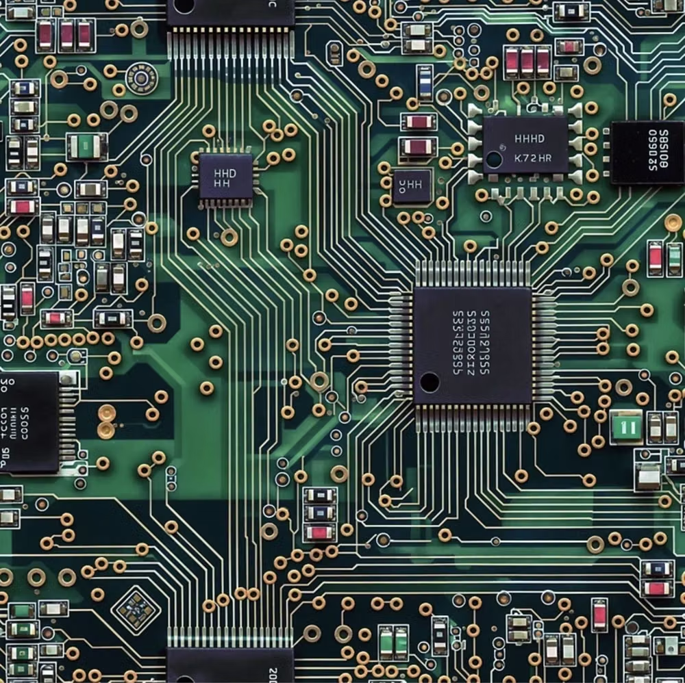
Brutalism UI design style
Raw typography, exposed structure, sharp edges, stark contrast, default-like controls, and intentionally unpolished layouts.
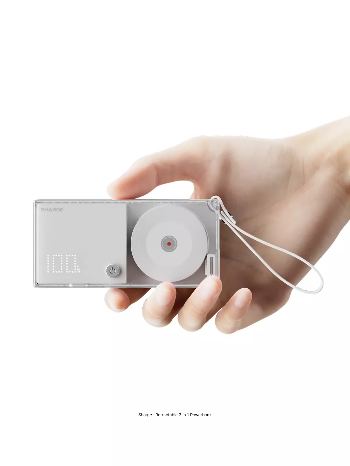
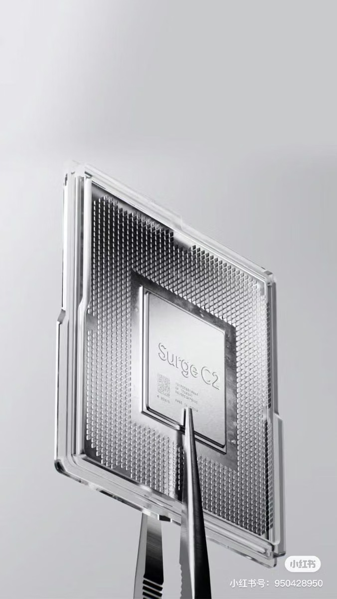
Cyberminimalism UI design style
Late-2010s hyper-minimal tech design reduces interfaces to black or white fields, large grotesque type, strict grids, sparse geometry, and an occasional controlled gradient or premium render.
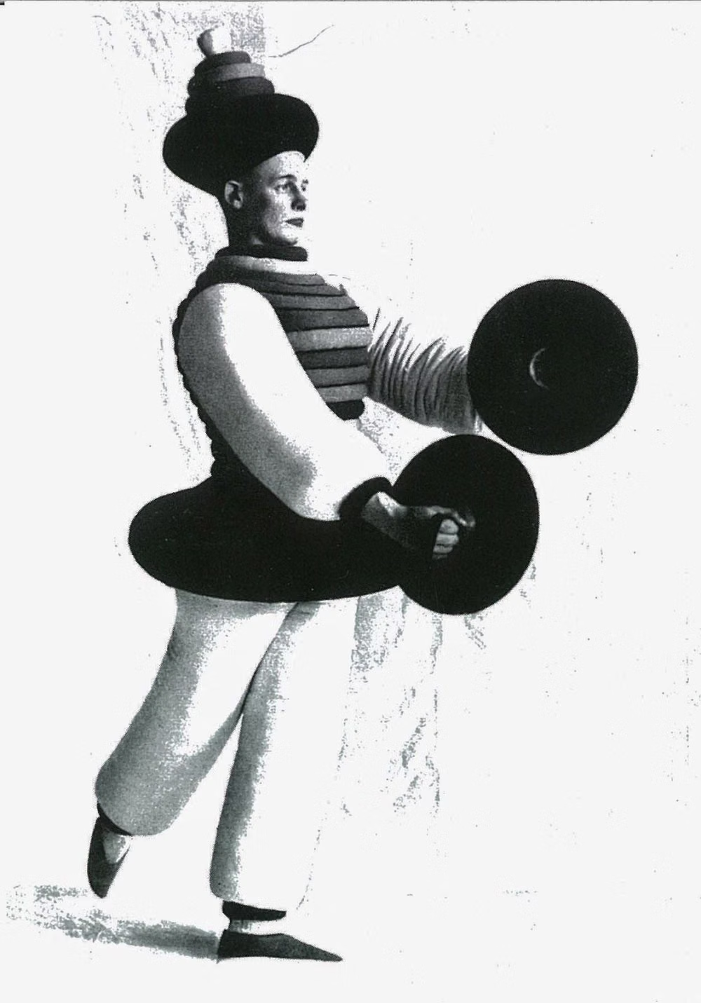
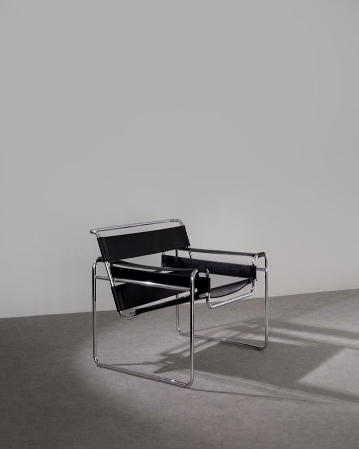

Bauhaus UI design style
Functional compositions use primary colors, geometric forms, strong typography, and visibly organized structure.