Material Design UI design style
Google’s adaptive design system combines clear interface hierarchy, personalized color, accessible components, generous rounded geometry, and responsive behavior. Also known as Material You, it evolves Material Design away from paper-like realism toward flexible digital surfaces, with newer expressive variants introducing stronger typography, contrasting shapes, and more energetic motion.
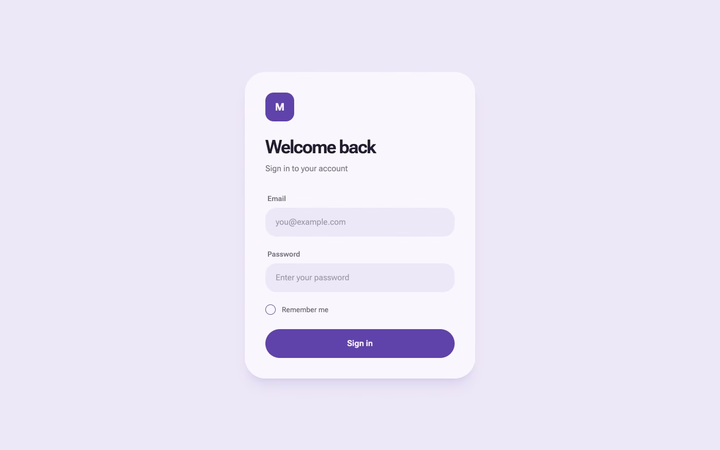
Design overview
- Signature elements
- dynamic color schemes, tonal surface hierarchy, large rounded containers, pill-shaped controls, prominent floating action buttons, segmented buttons, bottom navigation, adaptive component layouts, state layers, icon-led controls, contrasting shape families, oversized display typography, and spring-based transitions. In daisyUI themes, set `--depth: 1;`.
- Best suited to
- Android applications, Google-style products, cross-platform productivity tools, consumer services, dashboards, settings interfaces, and accessible applications that need a comprehensive component system.
- Layout principles
- Organize interfaces around responsive panes, containers, navigation regions, and predictable component patterns rather than decorative composition. Use spacing and surface roles to group related content, preserve strong touch targets, and adapt navigation or column structure as the available width changes. Keep primary actions prominent while allowing expressive screens to introduce controlled asymmetry, overlapping forms, or stronger visual emphasis.
History and origins
A fact-checked account of where this visual language came from, with links to the references used.
- Period
- 2012 research; public launch in 2014
- Origin
- Google, California
Google began the work that became Material Design around 2012 and unveiled the system at Google I/O in June 2014. Its original visual model treated the screen as layered, responsive sheets of paper governed by light, shadow, motion, and consistent cross-device behavior; later Material generations expanded well beyond that first paper metaphor.
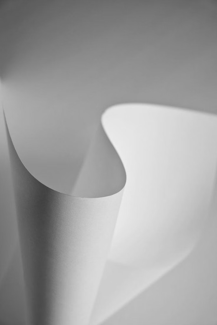
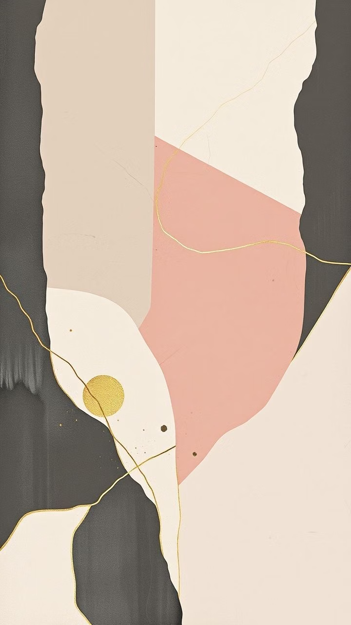
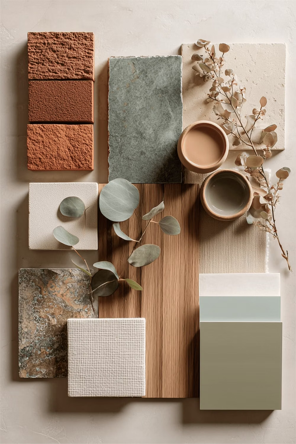
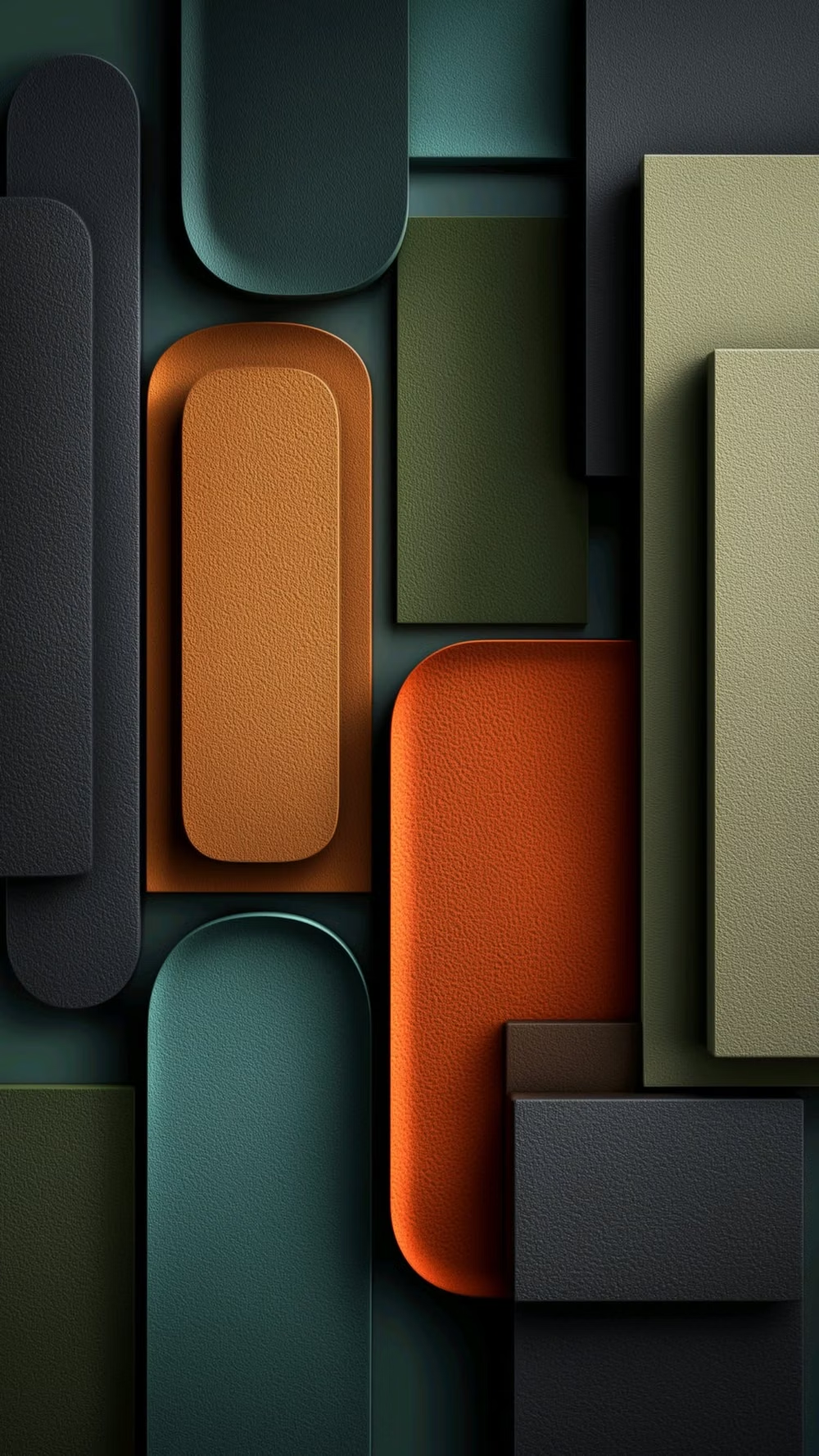
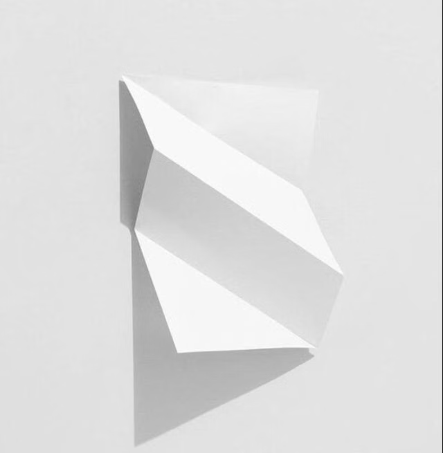
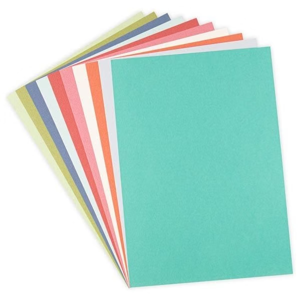
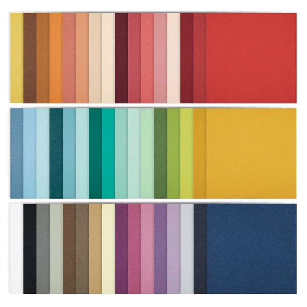
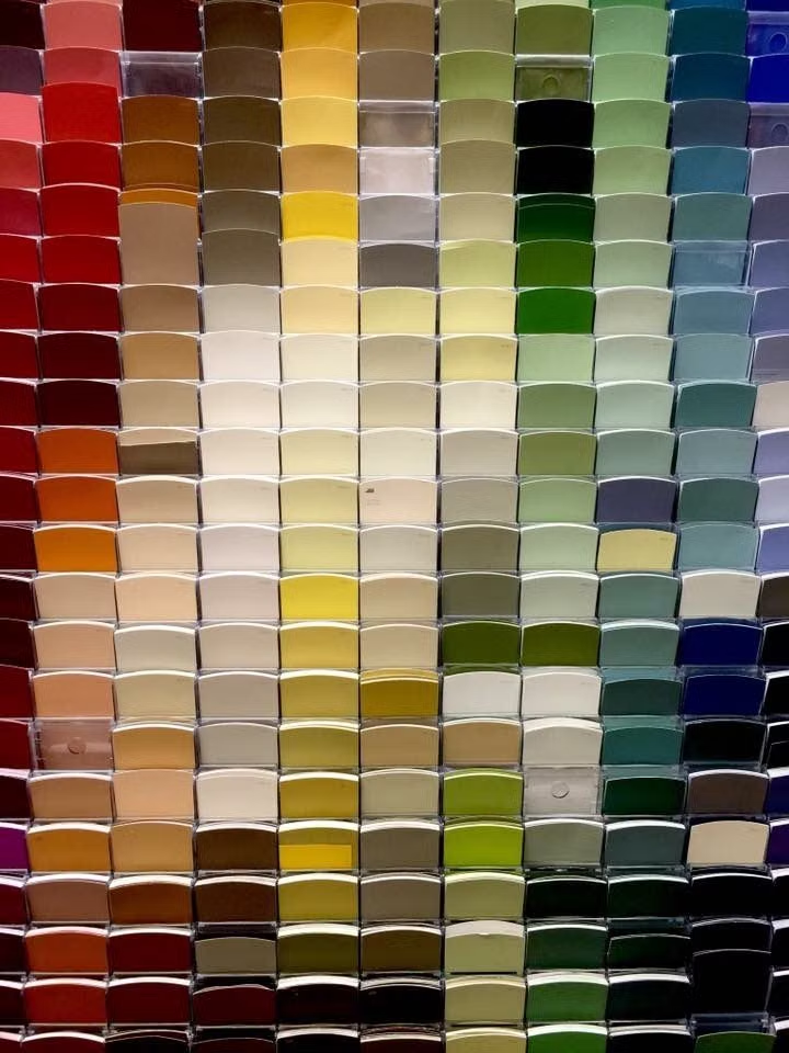
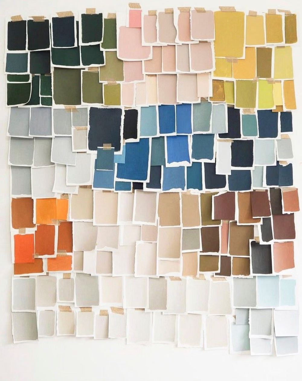
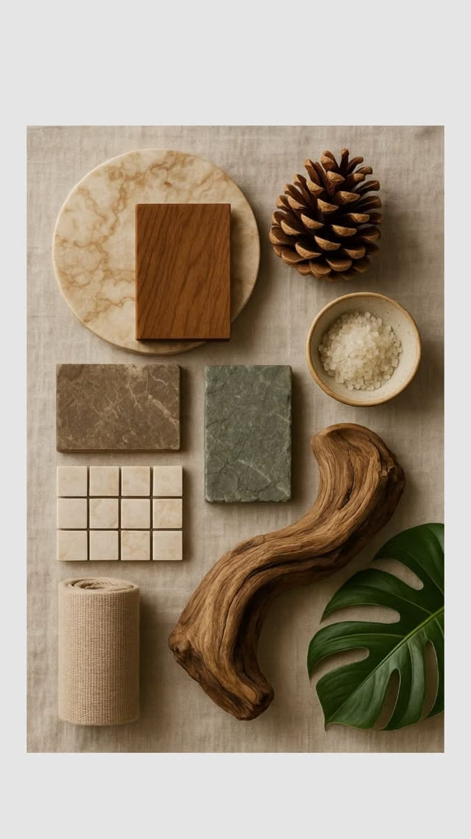
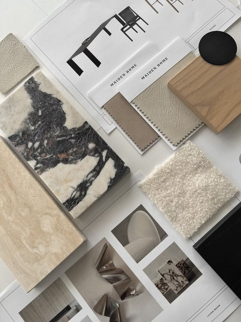
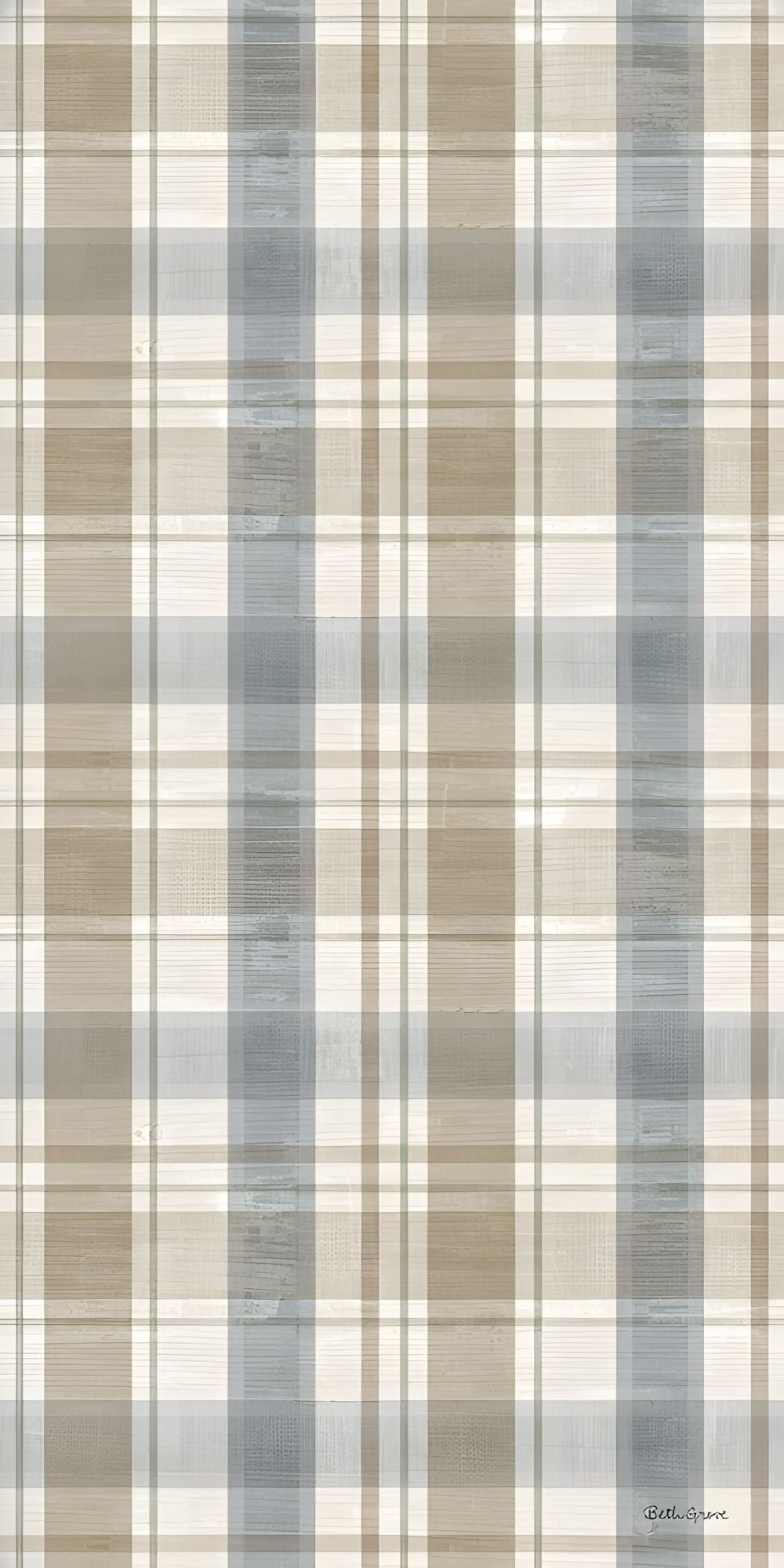
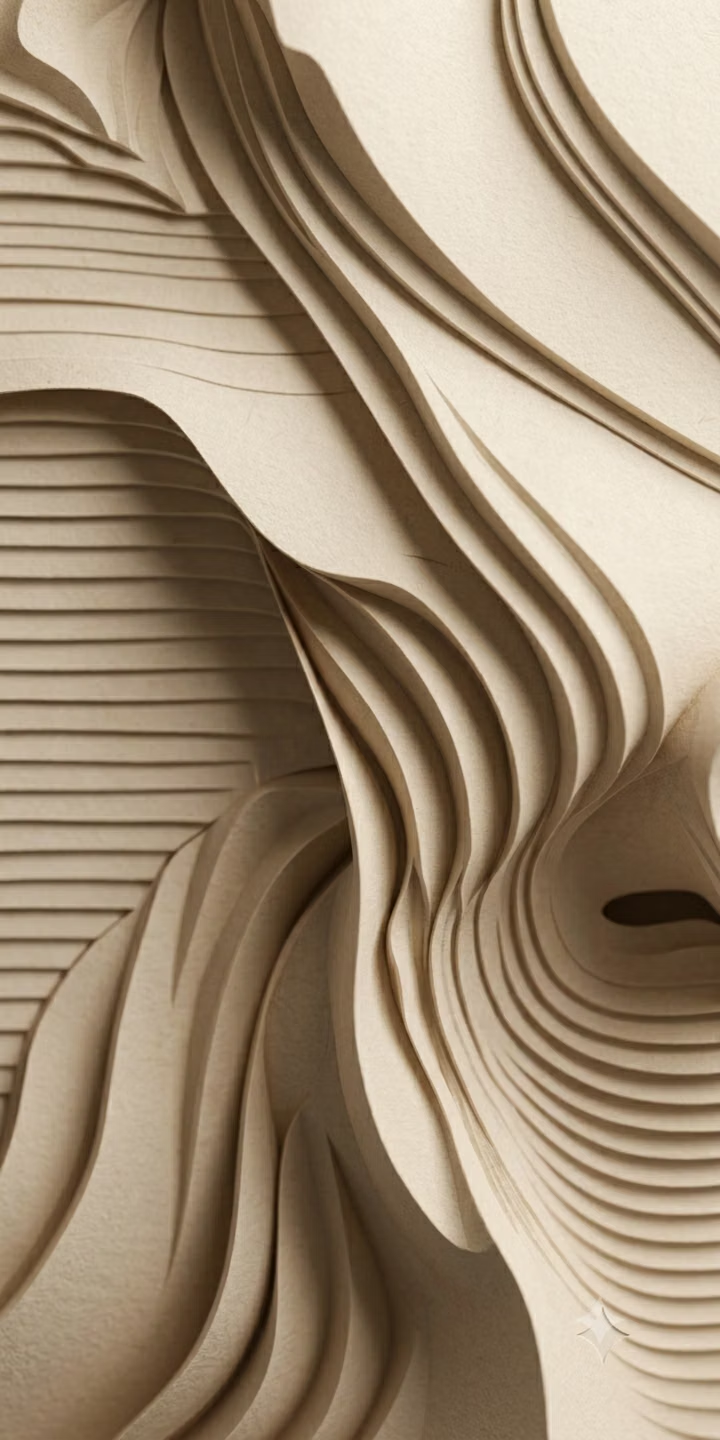
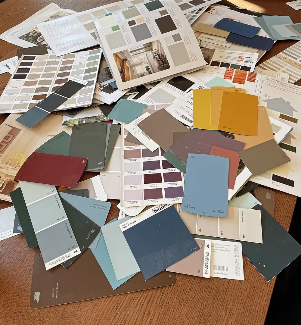
Moodboard and visual references
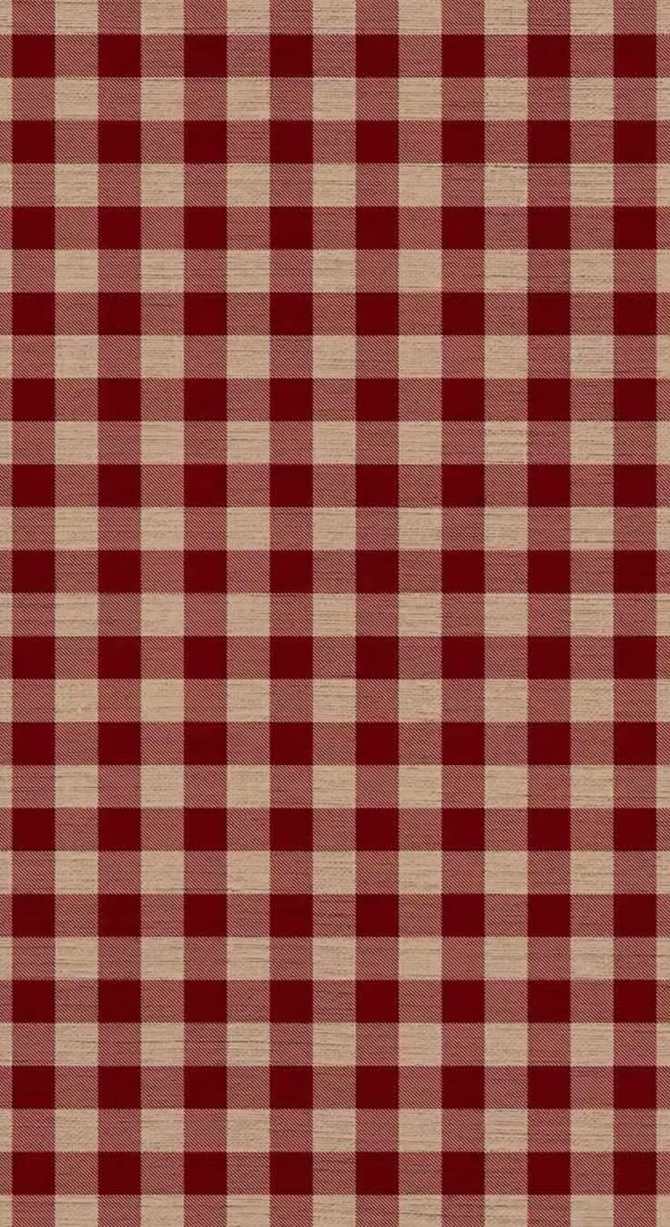
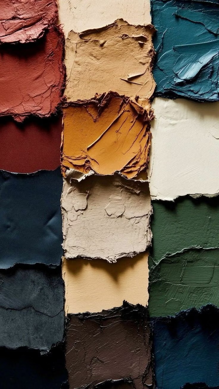
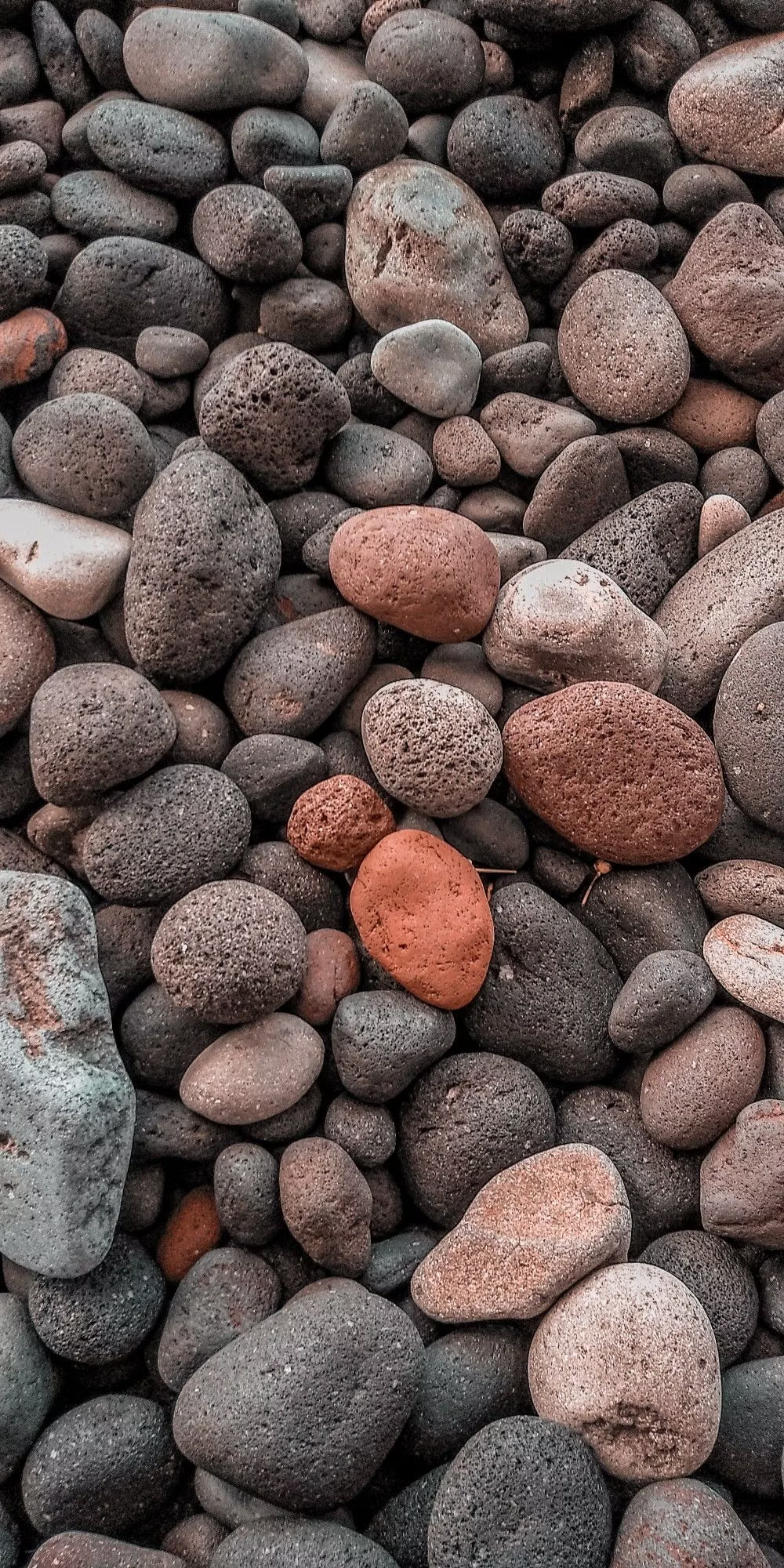
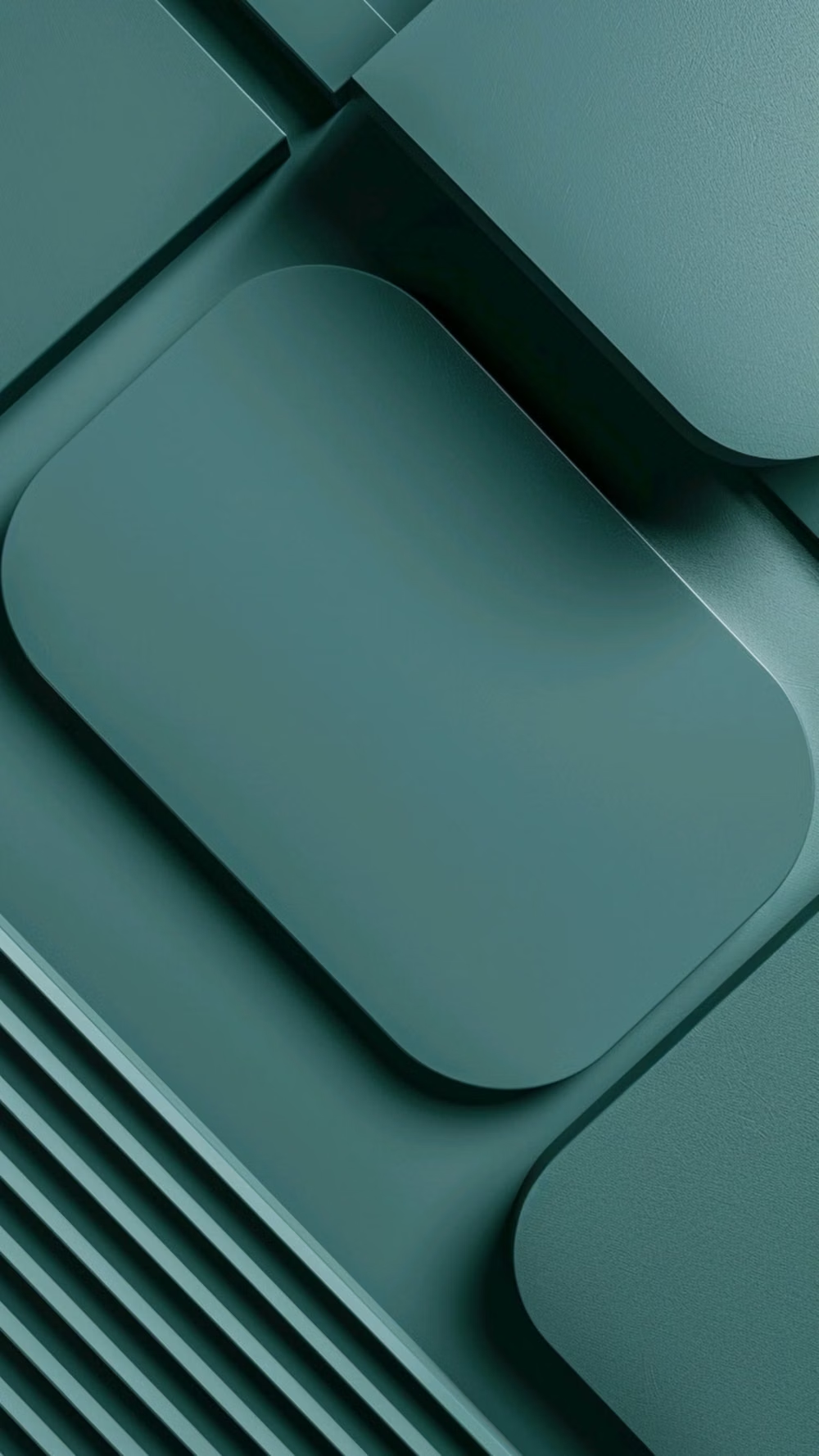
A visual study of the forms, inspirations, materials, colors, type, and cultural references associated with this UI design style.




Design principles and implementation
Use these principles to write a focused AI UI design prompt instead of asking for a vague visual treatment.
Color direction
Generate coordinated tonal palettes from one or more source colors, then assign semantic roles such as primary, secondary, tertiary, surface, container, outline, and error. Distinguish hierarchy primarily through tonal surface changes rather than heavy shadows; support user personalization, light and dark schemes, accessible contrast, and selectively stronger color relationships in expressive variants. In a daisyUI theme, map the main source-color family to `primary`, its lower-chroma companion to `secondary`, and use three progressively deeper source-tinted surface tones for `base-100`, `base-200`, and `base-300`.
Imagery direction
Use imagery inside clearly shaped, cropped, or edge-aligned containers that participate in the layout rather than appearing as detached decoration. Favor approachable photography, bold illustrations, product imagery, or simple graphic compositions; coordinate image crops with surrounding curves, typography, and tonal surfaces while preserving readable overlays and accessible contrast.
Content density
Favor medium density with comfortable spacing, large touch targets, and clearly separated interaction zones. Increase density for data-heavy or productivity contexts through compact component variants and responsive panes, but avoid shrinking controls or collapsing hierarchy merely to fit more content.
Motion direction
Use motion to explain navigation, state changes, container transformations, selection, and spatial relationships. Prefer shared-axis transitions, shape morphing, expanding containers, fading state layers, and spring-like movement with coordinated acceleration and deceleration; expressive variants may use greater overshoot, duration contrast, and rhythmic sequencing while routine interactions remain restrained.
Shape language
Build the interface from rounded rectangles, capsules, circles, and selectively contrasting geometric or organic silhouettes. Apply corner families systematically across components, using shape to communicate hierarchy, emphasis, grouping, and interaction state; combine highly rounded controls with sharper or more unusual containers when stronger expression is appropriate. In daisyUI themes, set the `--radius-*` variables between `0.75rem` and `1.5rem`.
Typography rules
Use a role-based type scale for display, headline, title, body, and label text, with each role defining size, weight, line height, and tracking. Maintain strong hierarchy and readable body text, use weight and scale rather than excessive decoration, align labels closely with their controls, and allow variable width, weight, or emphasized display styles for expressive moments.
Suggested Typfaces
Roboto
Fresh daisies glow in warm sunlight
Fresh daisies glow in warm sunlight
1 2 3 4 5 6 7 8 9 0
Roboto Flex
Fresh daisies glow in warm sunlight
Fresh daisies glow in warm sunlight
1 2 3 4 5 6 7 8 9 0
Noto Sans
Fresh daisies glow in warm sunlight
Fresh daisies glow in warm sunlight
1 2 3 4 5 6 7 8 9 0
Roboto Serif
Fresh daisies glow in warm sunlight
Fresh daisies glow in warm sunlight
1 2 3 4 5 6 7 8 9 0
Roboto Mono
Fresh daisies glow in warm sunlight
Fresh daisies glow in warm sunlight
1 2 3 4 5 6 7 8 9 0
Build a Material Design interface with daisyUI
The live example translates this direction into daisyUI components and semantic theme tokens.
To generate a full page in the same visual language, give the style name and the design rules above to Blueprint MCP.
Related UI design styles
Compare nearby visual languages that share typography, shapes, use cases, or signature elements.
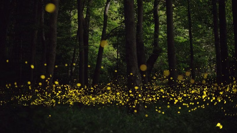
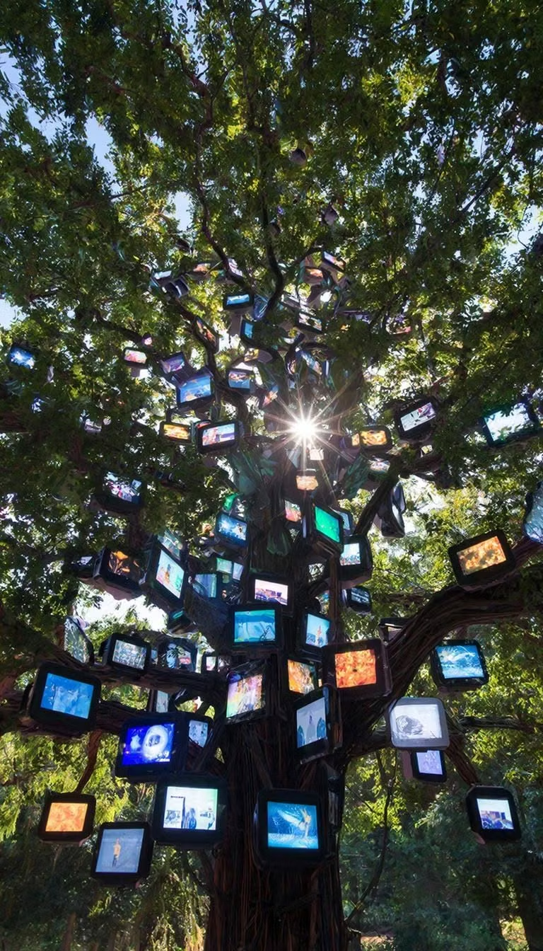

Luminous Eco-Skeuomorphism UI design style
A glossy, tactile interface style that combines early-2010s skeuomorphism with futuristic ecological-tech aesthetics. Controls resemble illuminated physical hardware, with intense inner glows, radiant edges, and soft light bloom making interactive elements appear electrically powered.
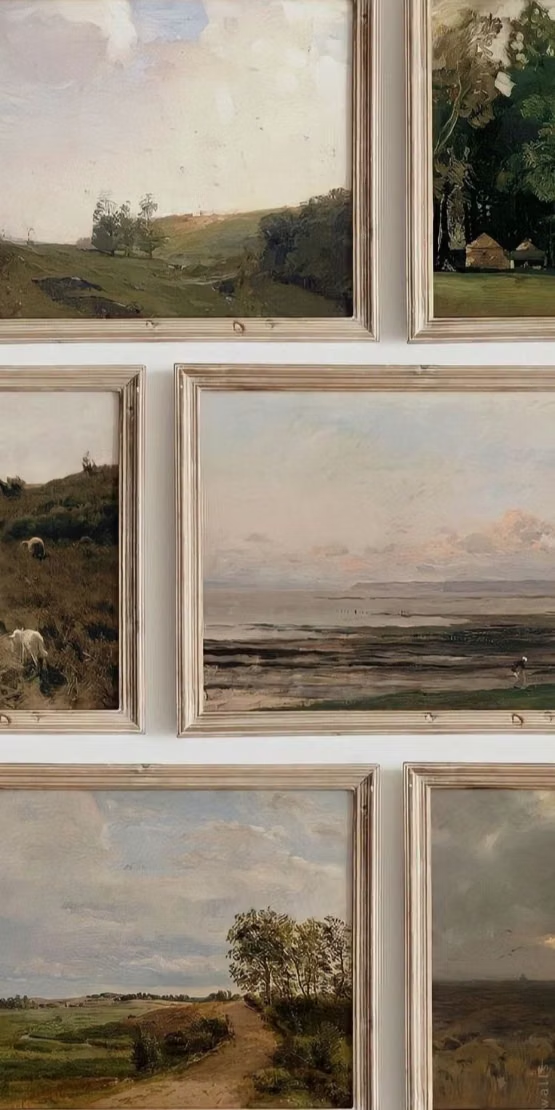
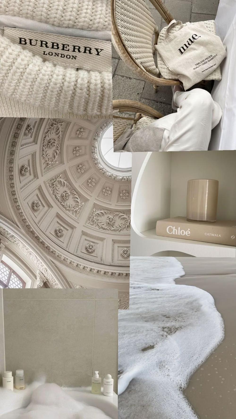
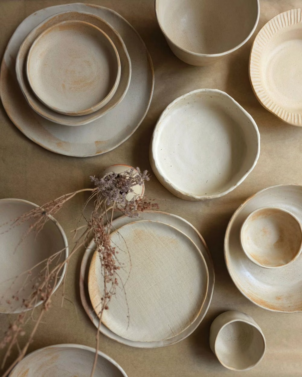
Millennial Beige UI design style
A calm tonal aesthetic layers cream, tan, sand, taupe, and greige with tactile natural details, soft contrast, and intentional empty space.

Clean UI design style
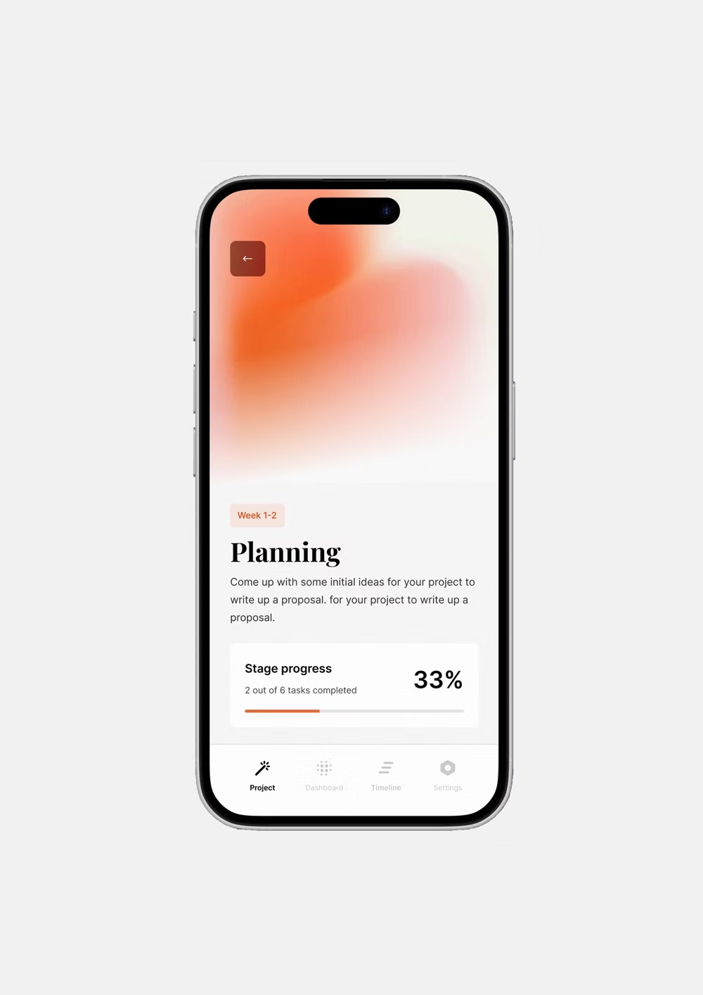
An engineered interface language pairs tightly controlled spacing, measured grids, layered neutral surfaces, and precise micro-details so dense information feels calm, airy, and aligned.