Memphis Design UI design style
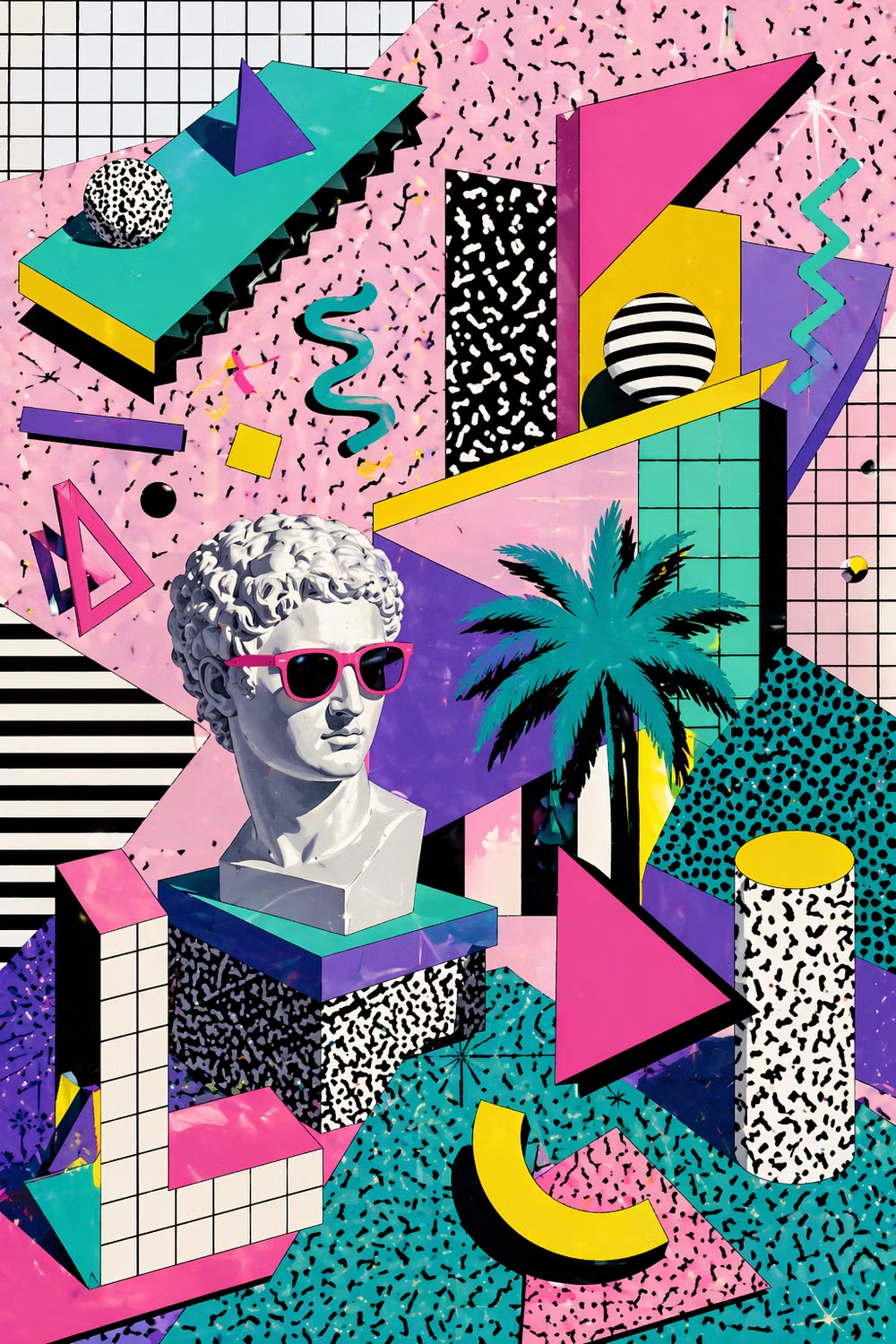
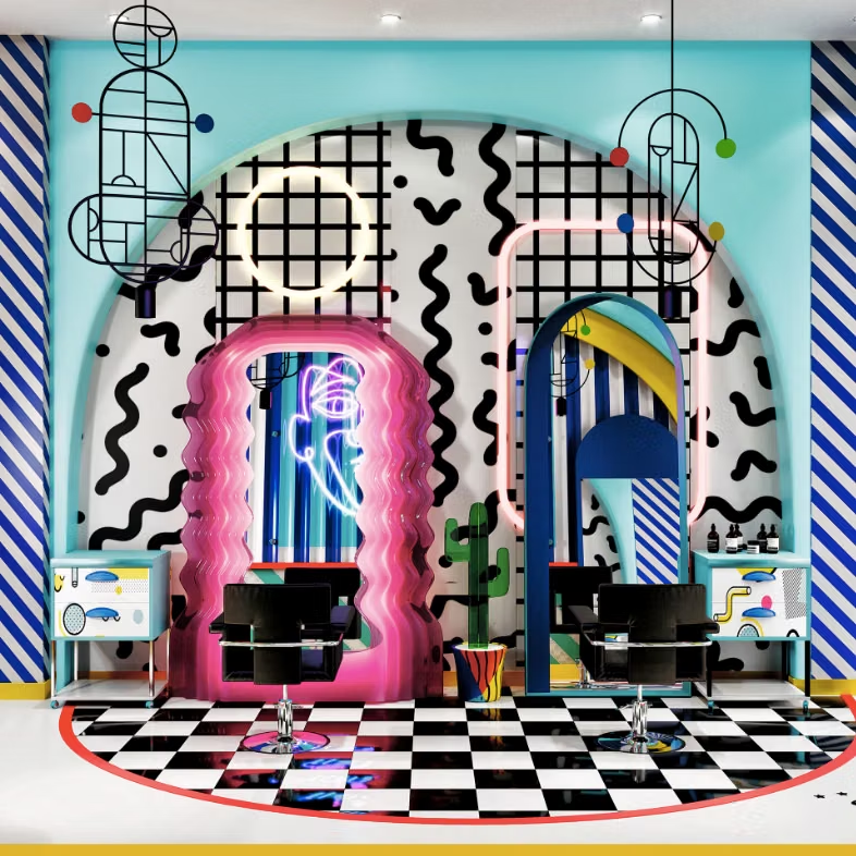
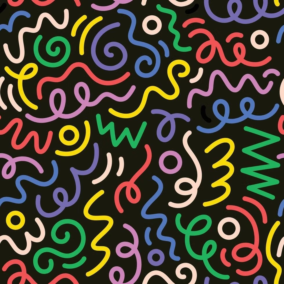
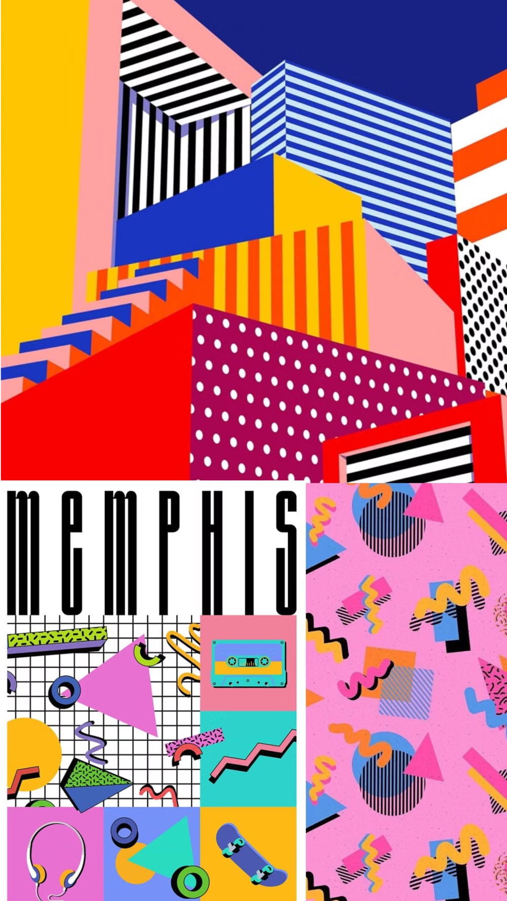
Bright geometric shapes, squiggles, dots, contrasting patterns, and playful visual imbalance evoke the 1980s Memphis Group.
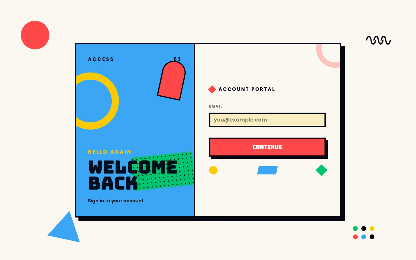
Design overview
- Signature elements
- squiggles, dots and terrazzo, bright geometric shapes, clashing patterns, black accents, playful asymmetry
- Best suited to
- Creative agencies, events, education, personal brands, and energetic landing pages.
- Layout principles
- Scatter bold modules asymmetrically across a clean field, balancing playful imbalance with a dependable content grid and generous outer margins.
History and origins
A fact-checked account of where this visual language came from, with links to the references used.
- Period
- Founded in 1981; most influential during the 1980s
- Origin
- Milan, Italy
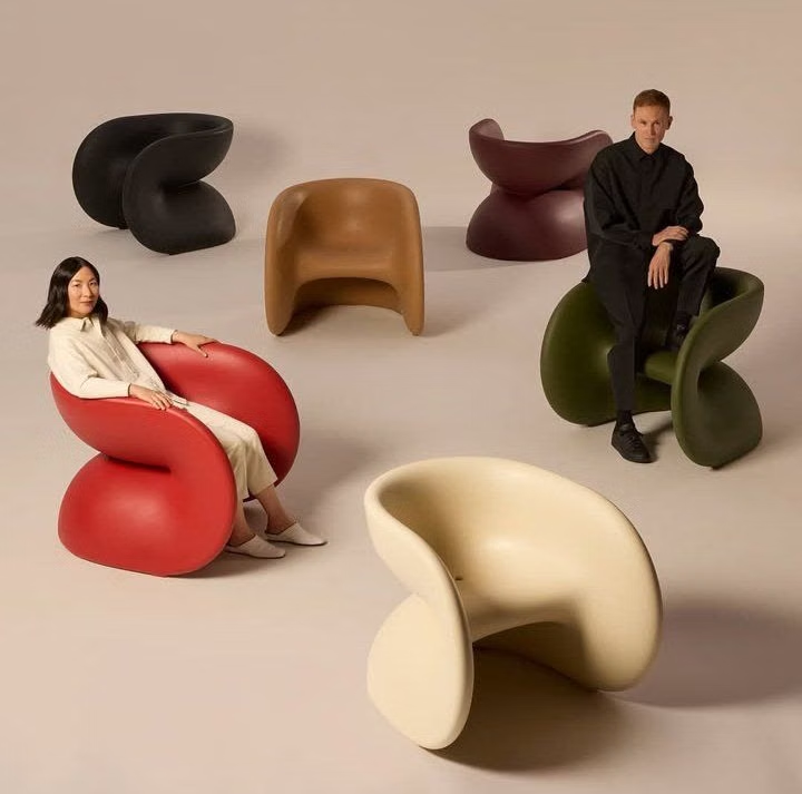
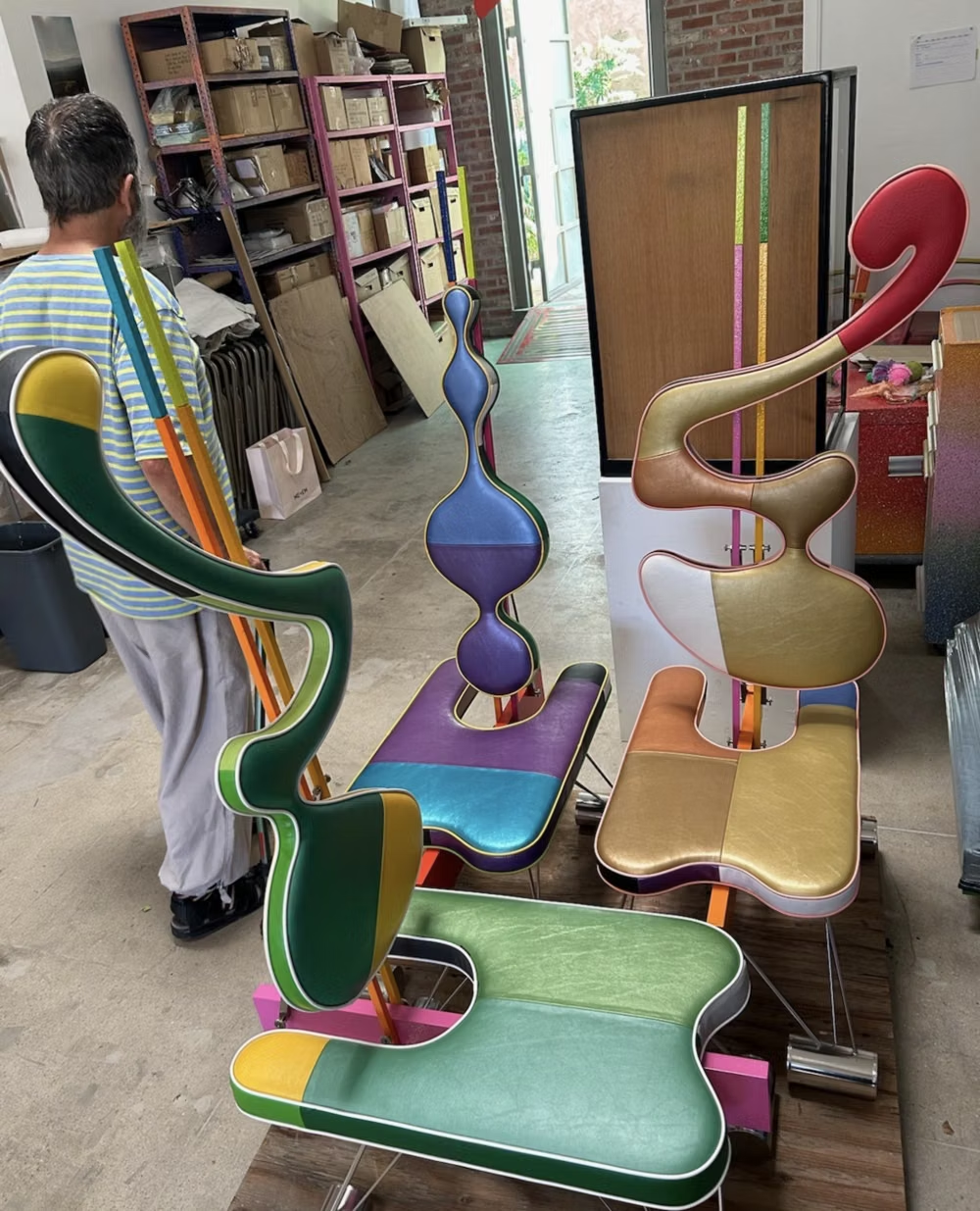
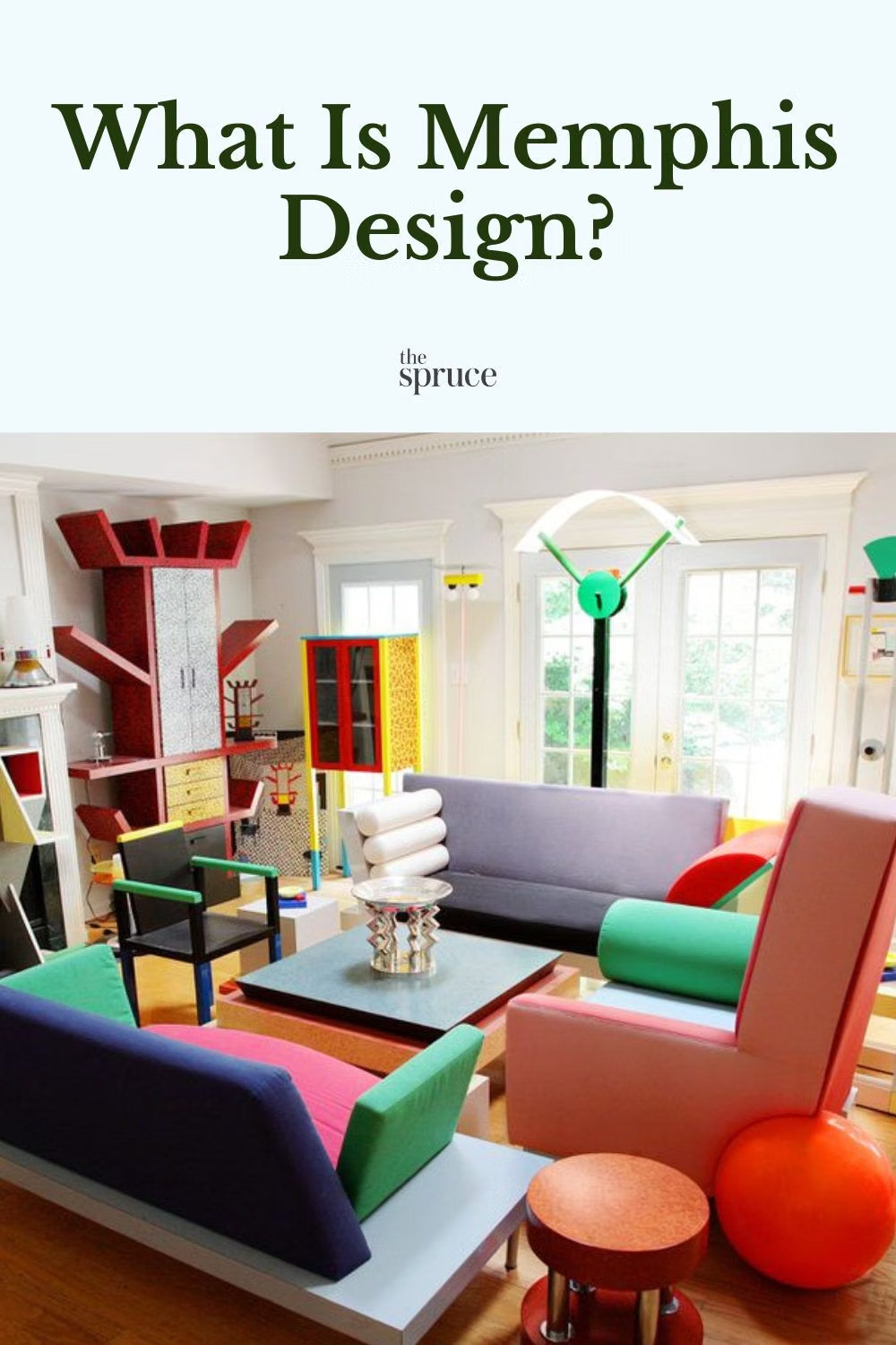
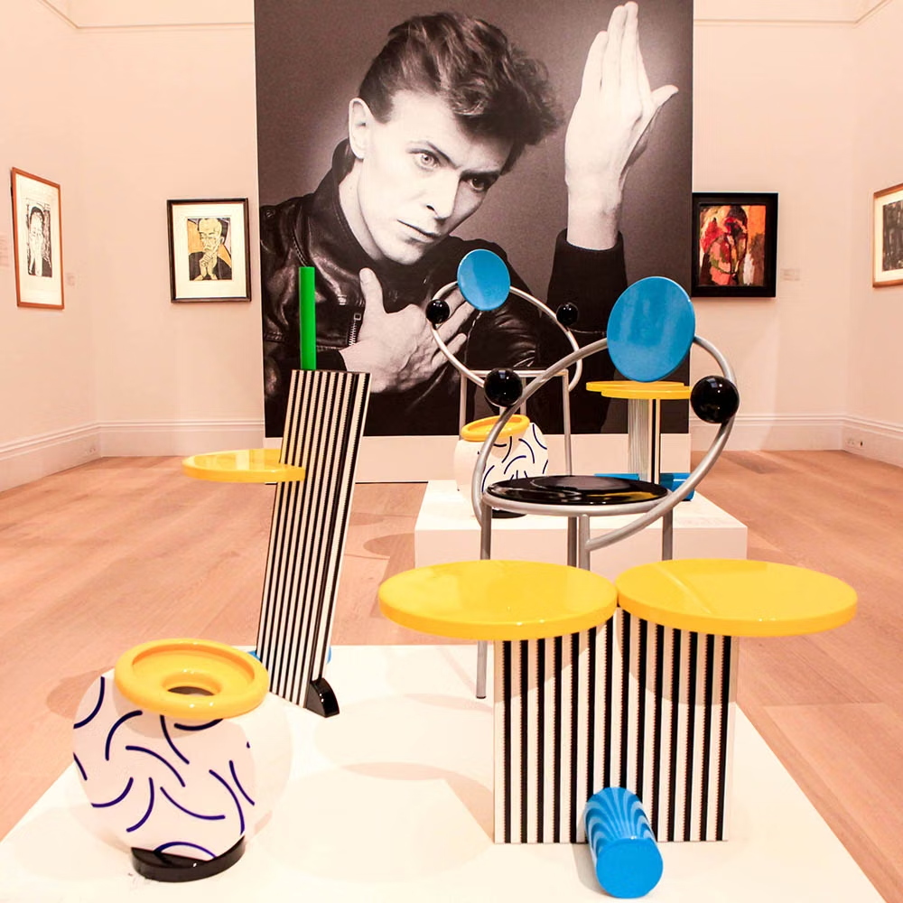
Ettore Sottsass gathered the designers who became the Memphis group in Milan, and their first exhibition opened on September 19, 1981. Laminates, clashing patterns, bright color, asymmetry, and deliberately unstable forms challenged sober modernist good taste; the original group was brief, but its imagery became one of the most recycled visual languages of the 1980s.
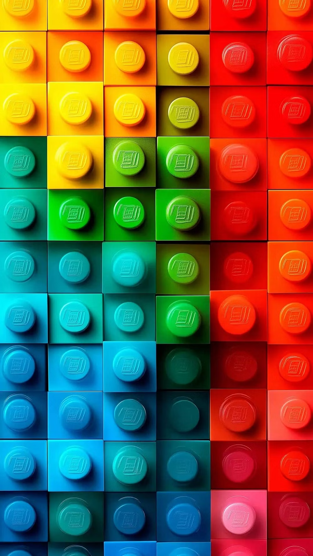
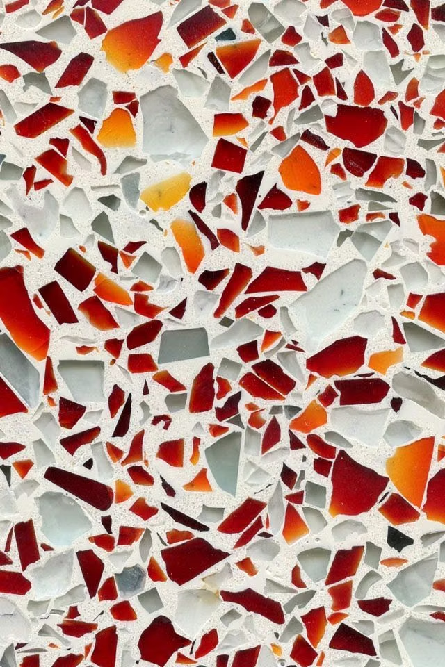
Moodboard and visual references
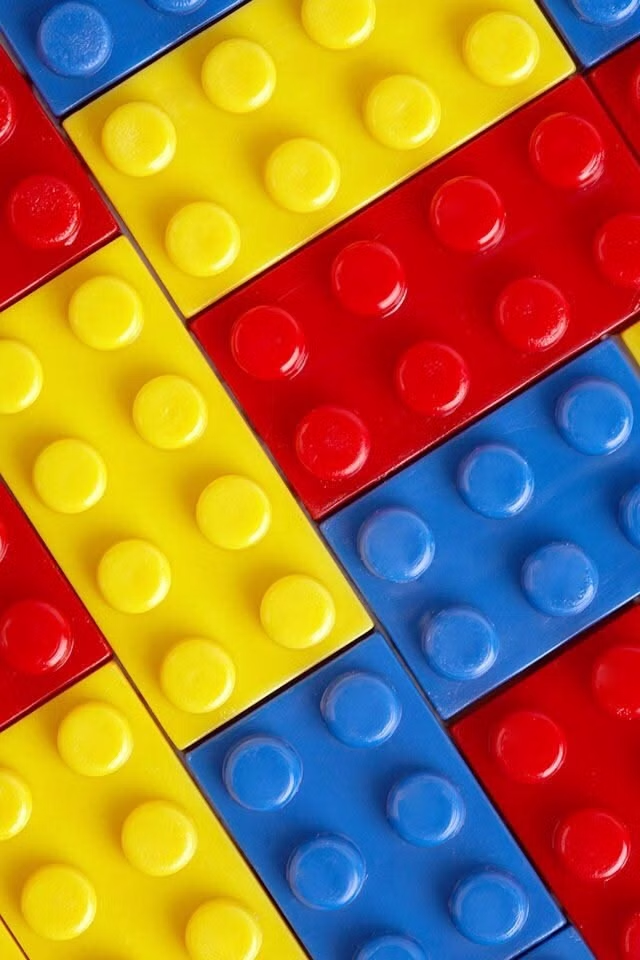
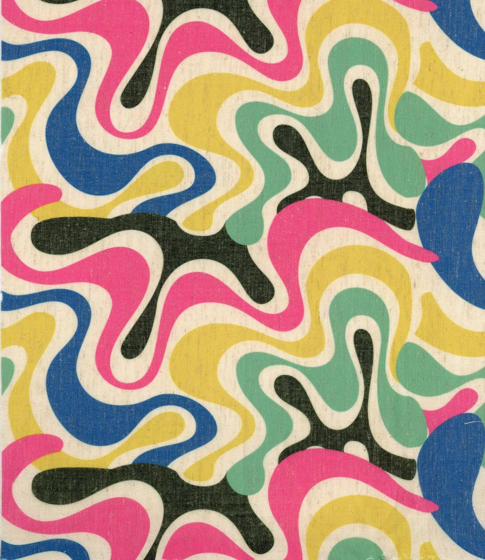
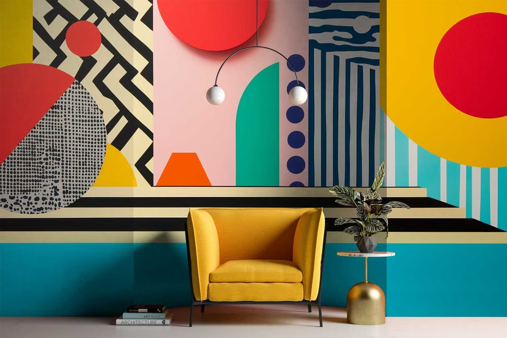
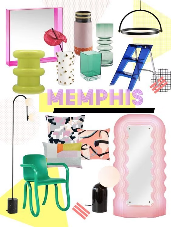
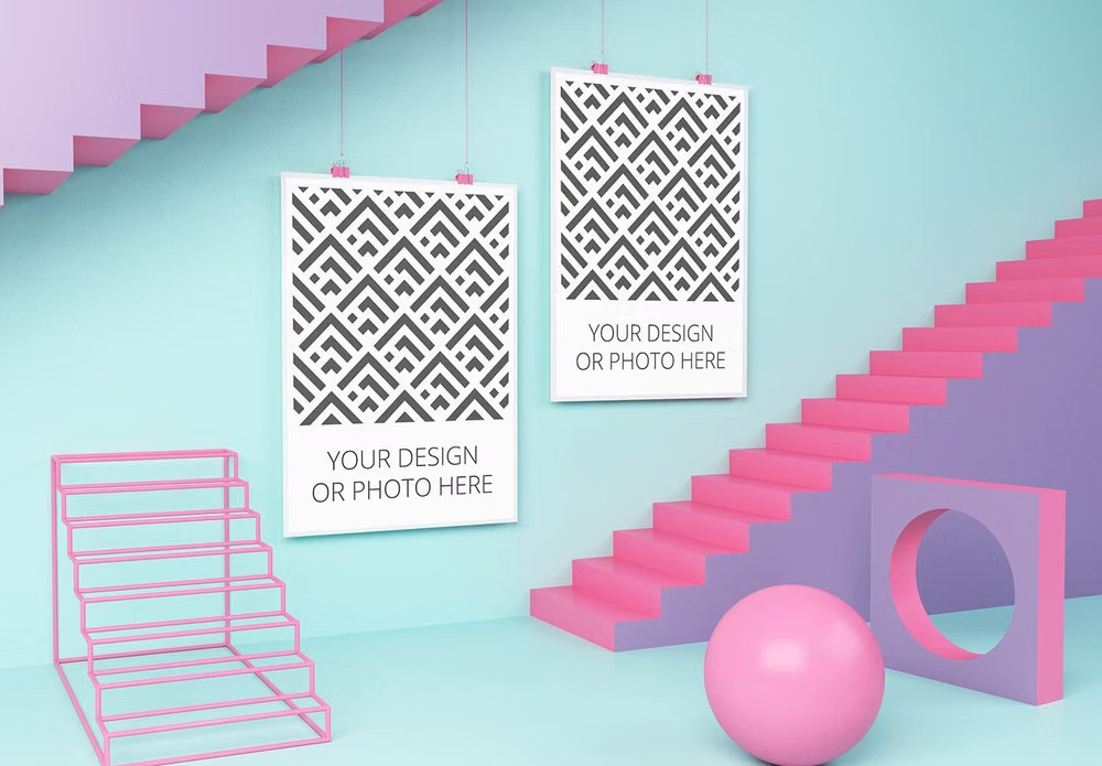
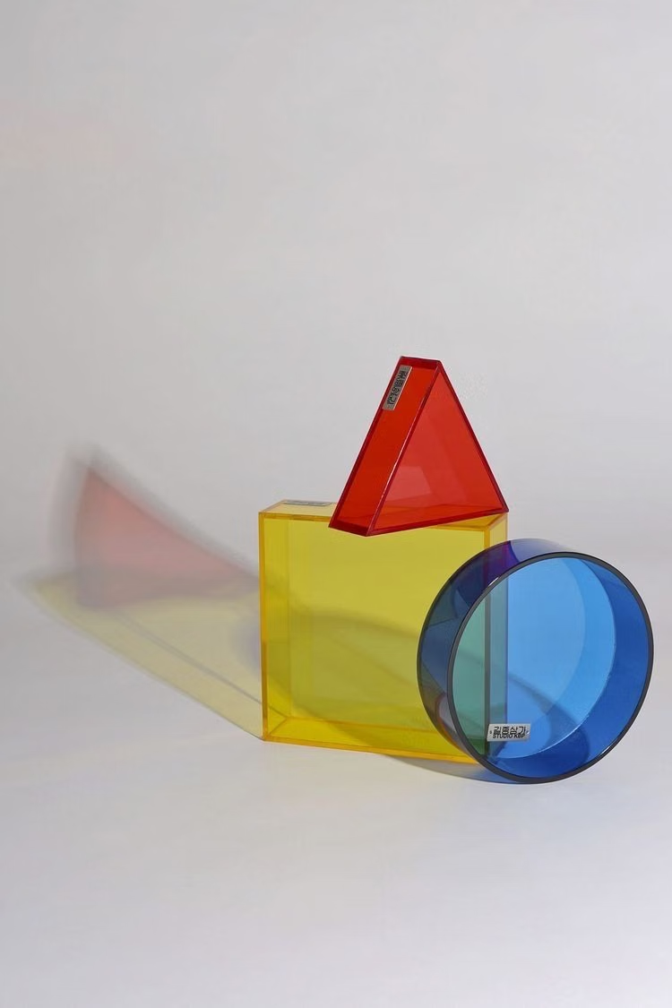
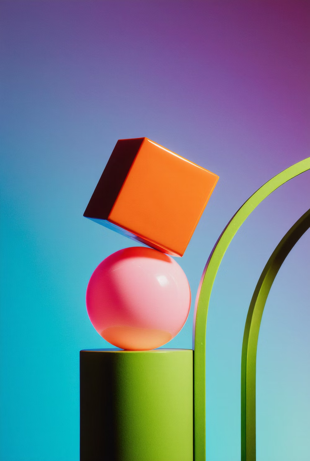
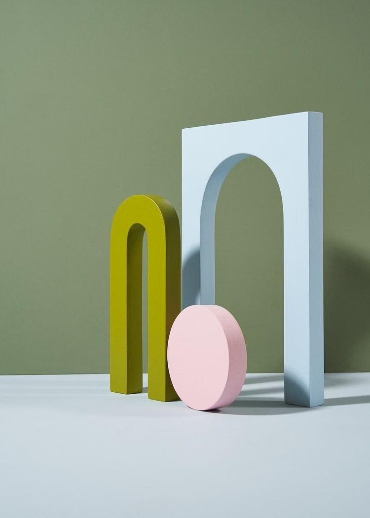
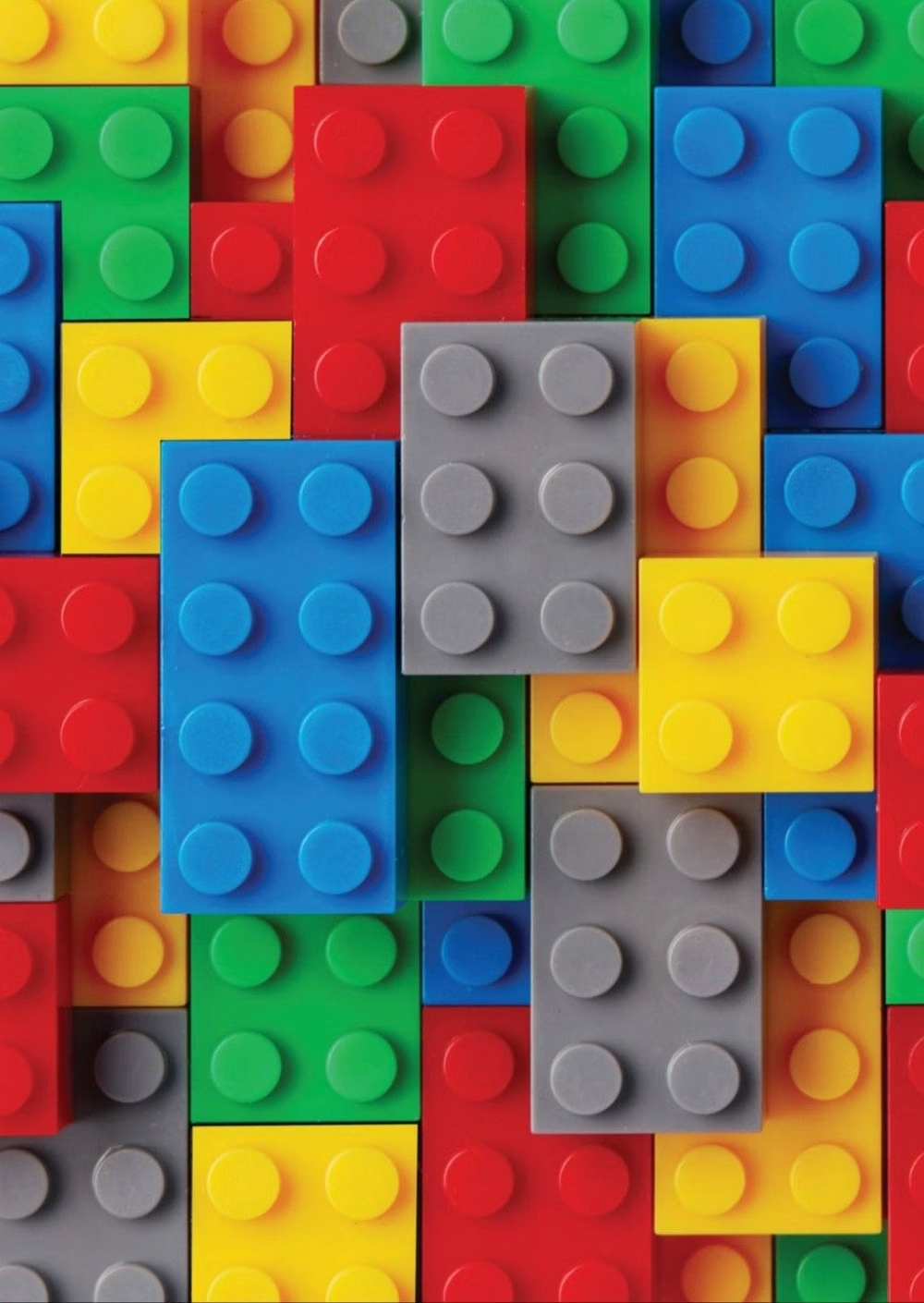
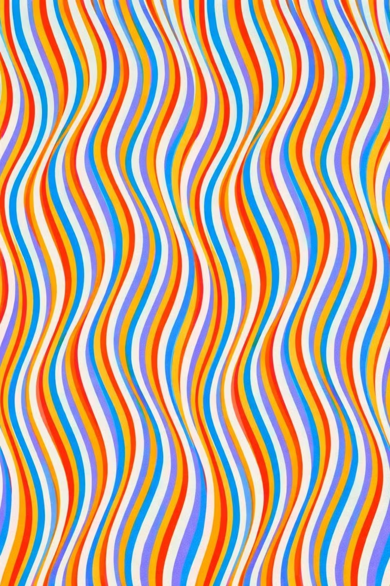
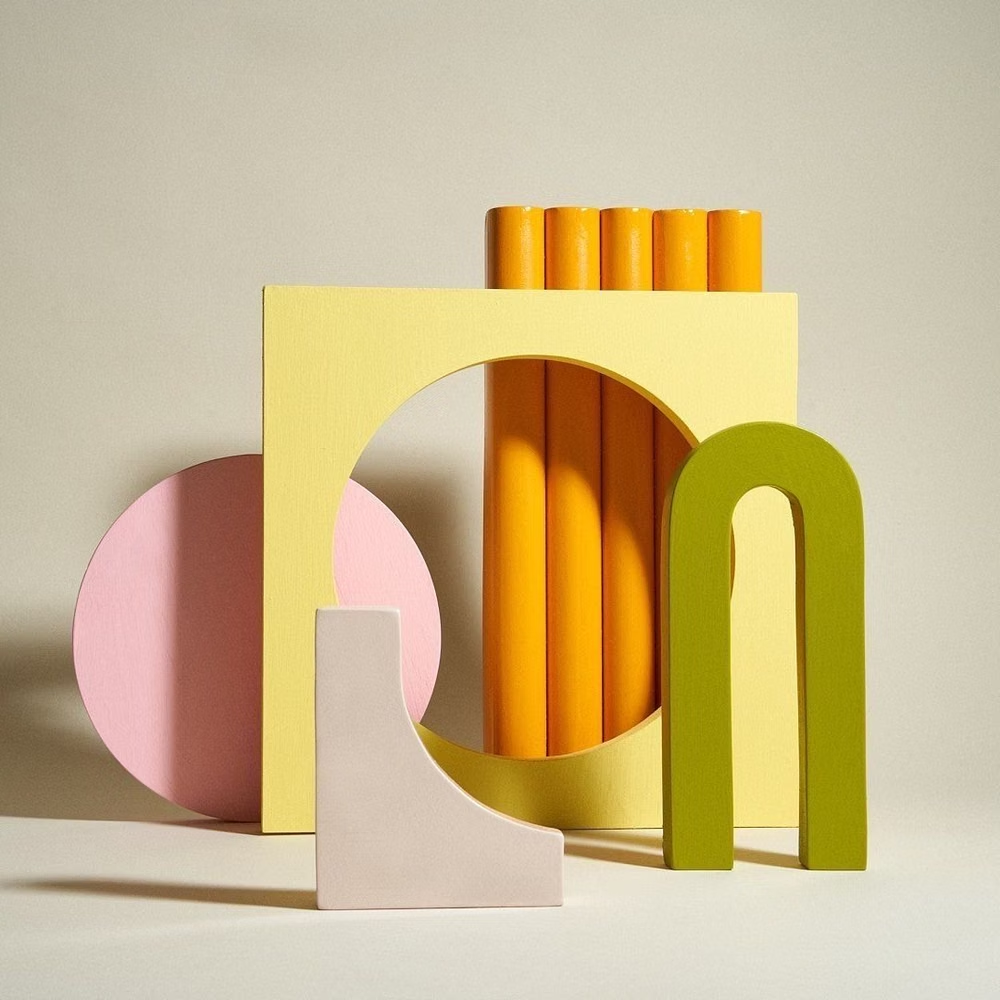
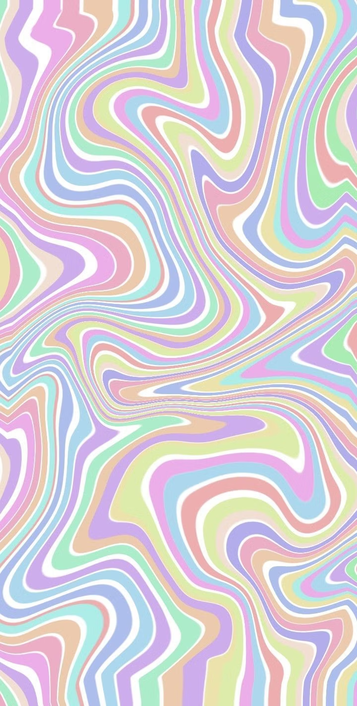
A visual study of the forms, inspirations, materials, colors, type, and cultural references associated with this UI design style.
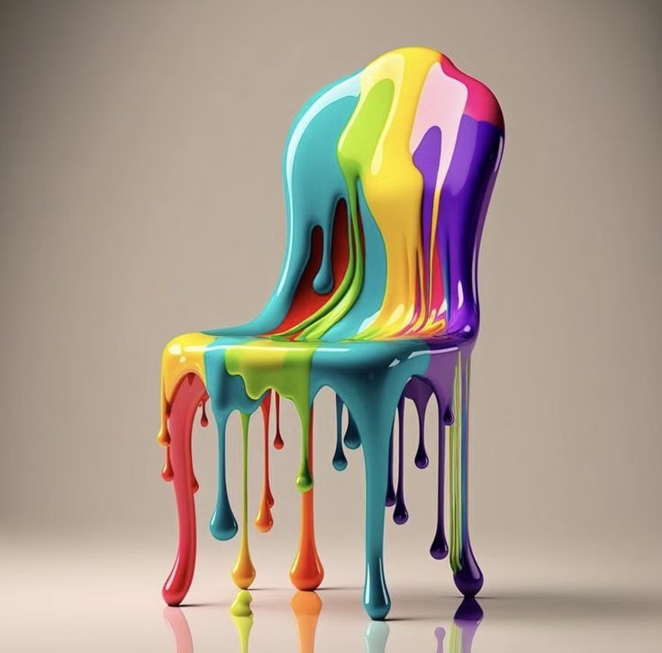
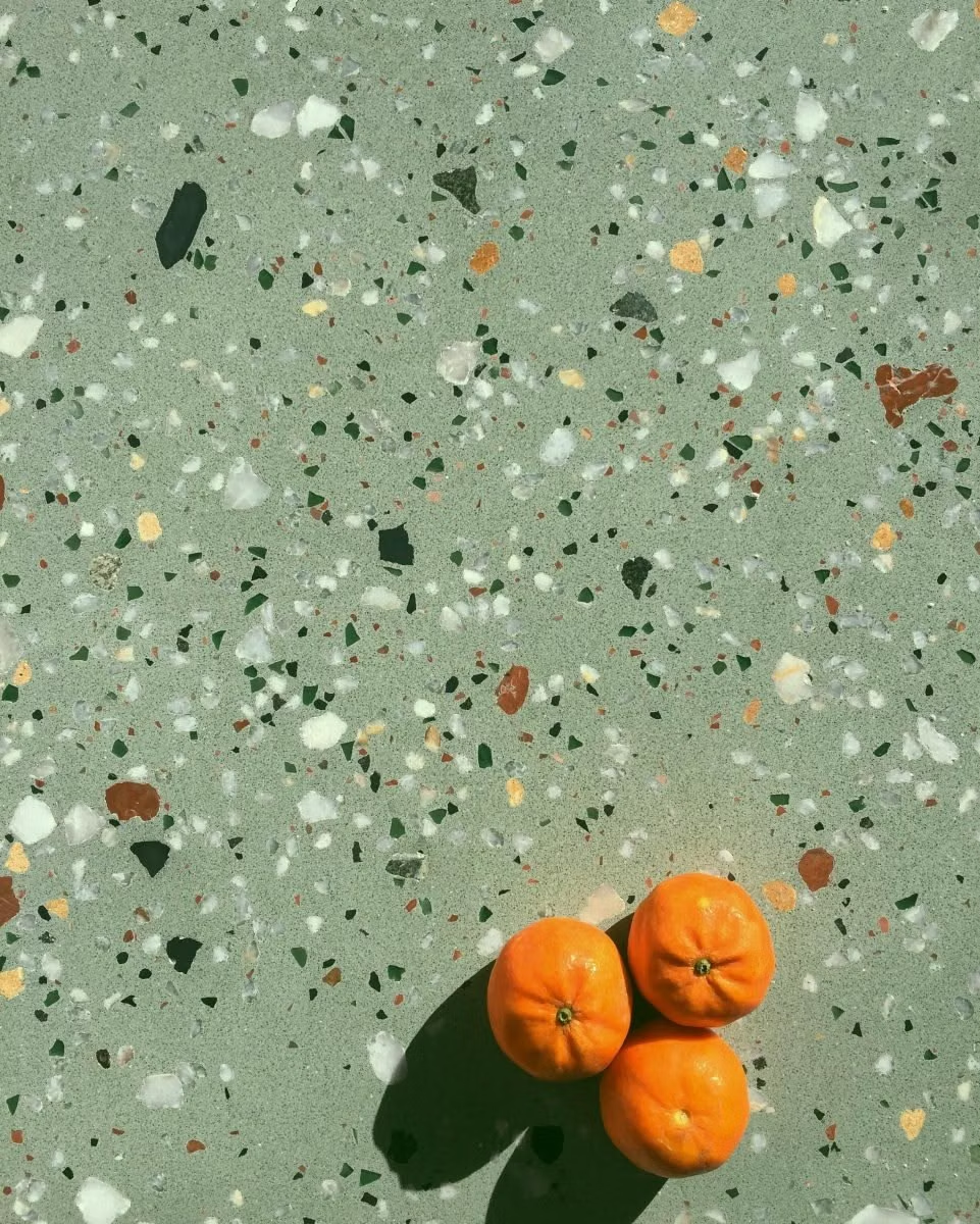
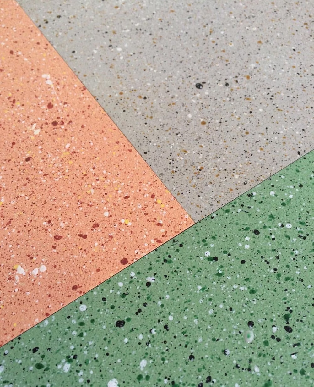

Design principles and implementation
Use these principles to write a focused AI UI design prompt instead of asking for a vague visual treatment.
Color direction
Use bright primary and pastel fields with strong black accents, repeating selected combinations so the pattern language feels designed rather than random. In a daisyUI theme, use cobalt or red for `primary`, yellow, pink, or lavender for `secondary`, and assign warm white, a pale pastel tint, and light neutral gray to `base-100`, `base-200`, and `base-300`.
Imagery direction
Favor abstract pattern, simple products, playful portrait cutouts, and stylized objects integrated with dots, squiggles, and terrazzo.
Content density
Keep content density medium and visual density lively, allowing plain regions around text to counter the surrounding patterns.
Motion direction
Bounce, rotate, and slide geometric pieces independently with quick playful timing, then lock them into a balanced static arrangement.
Shape language
Use squiggles, dots, triangles, arches, semicircles, terrazzo chips, and irregular grids with bold flat outlines. In daisyUI themes, set the `--radius-*` variables between `0.75rem` and `1.5rem`.
Typography rules
Choose a chunky geometric or rounded display face for short headings, paired with a simple sans-serif that remains calm amid the pattern.
Suggested Typfaces
Bungee
Fresh daisies glow in warm sunlight
Fresh daisies glow in warm sunlight
1 2 3 4 5 6 7 8 9 0
Fredoka
Fresh daisies glow in warm sunlight
Fresh daisies glow in warm sunlight
1 2 3 4 5 6 7 8 9 0
Righteous
Fresh daisies glow in warm sunlight
Fresh daisies glow in warm sunlight
1 2 3 4 5 6 7 8 9 0
Poppins
Fresh daisies glow in warm sunlight
Fresh daisies glow in warm sunlight
1 2 3 4 5 6 7 8 9 0
Rubik Mono One
Fresh daisies glow in warm sunlight
Fresh daisies glow in warm sunlight
1 2 3 4 5 6 7 8 9 0
Build a Memphis Design interface with daisyUI
The live example translates this direction into daisyUI components and semantic theme tokens.
To generate a full page in the same visual language, give the style name and the design rules above to Blueprint MCP.
Related UI design styles
Compare nearby visual languages that share typography, shapes, use cases, or signature elements.
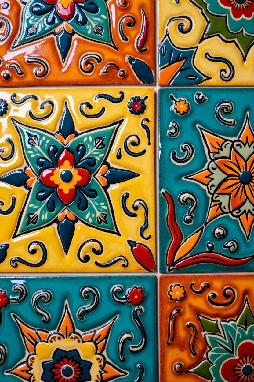
Dopamine Design UI design style
Joyful saturated colors, bold patterns, playful forms, and deliberately energetic combinations prioritize emotional uplift.
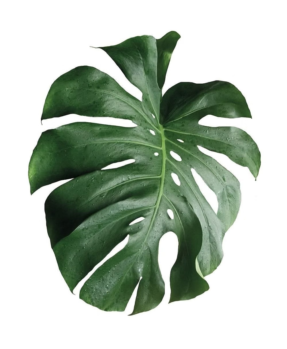
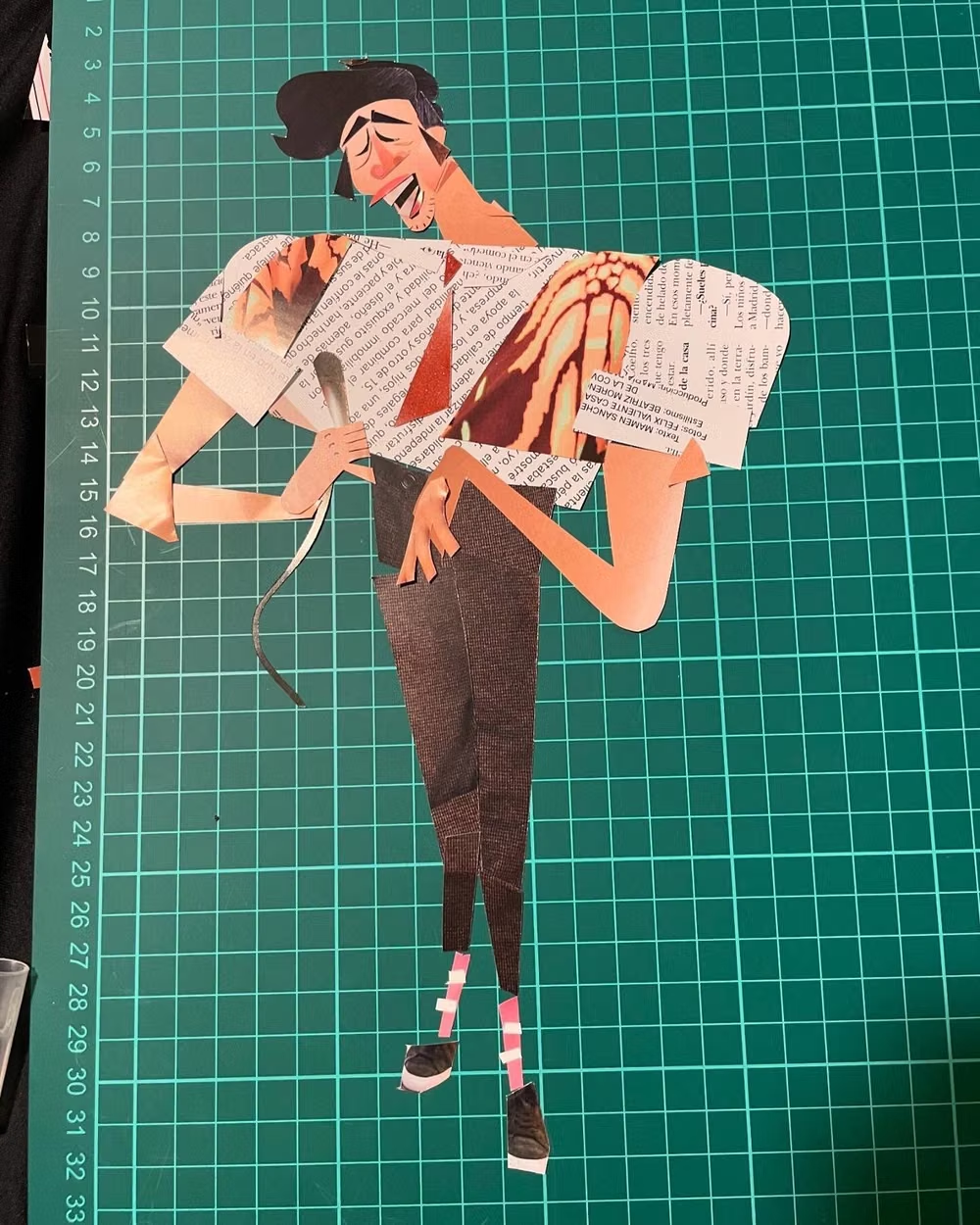
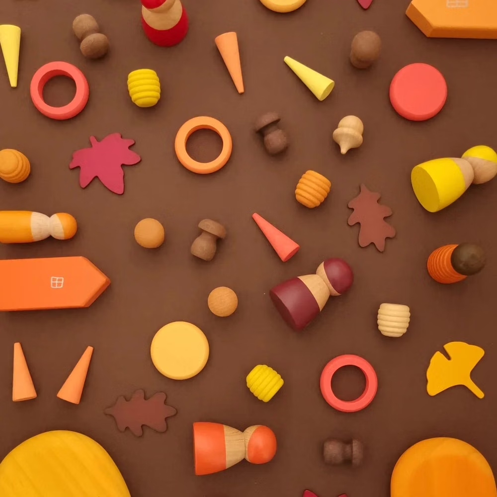
Corporate Memphis UI design style
Flat vector scenes with bright solid colors, geometric environments, and simplified people with exaggerated proportions.
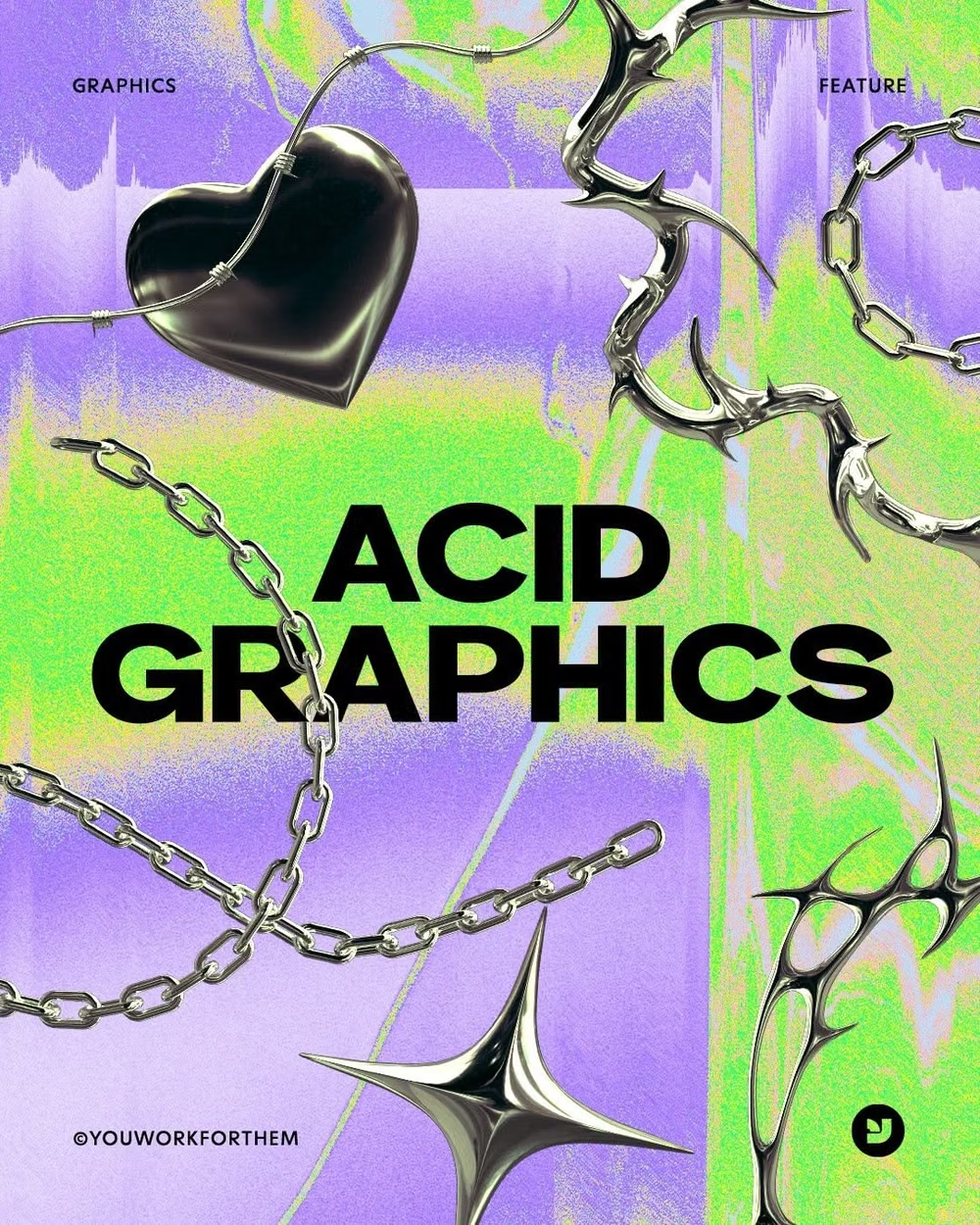
Acid Graphics UI design style
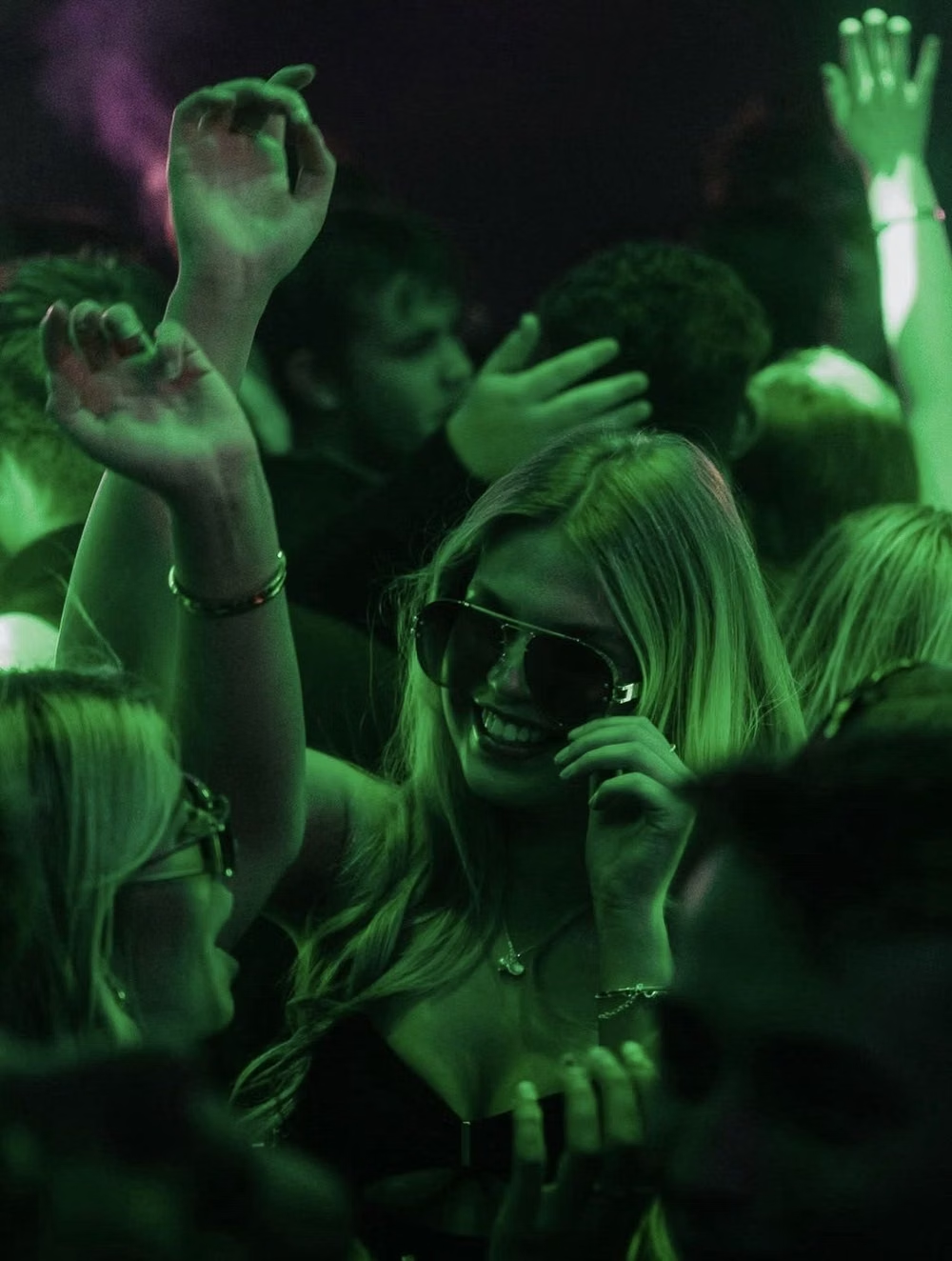
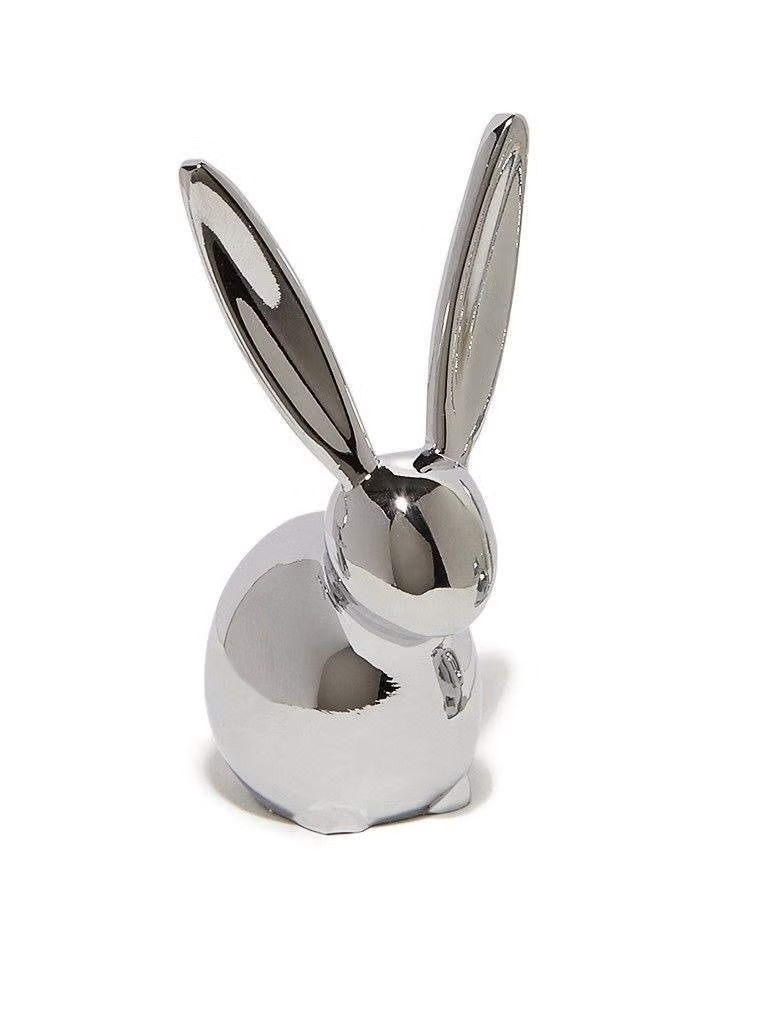
Fluorescent colors, warped typography, chrome details, distortion, dense layering, and underground rave energy.