Postmodern Eclecticism UI design style
Historical references, irony, ornament, clashing styles, playful symbolism, and deliberate rule-breaking reject strict modernism.
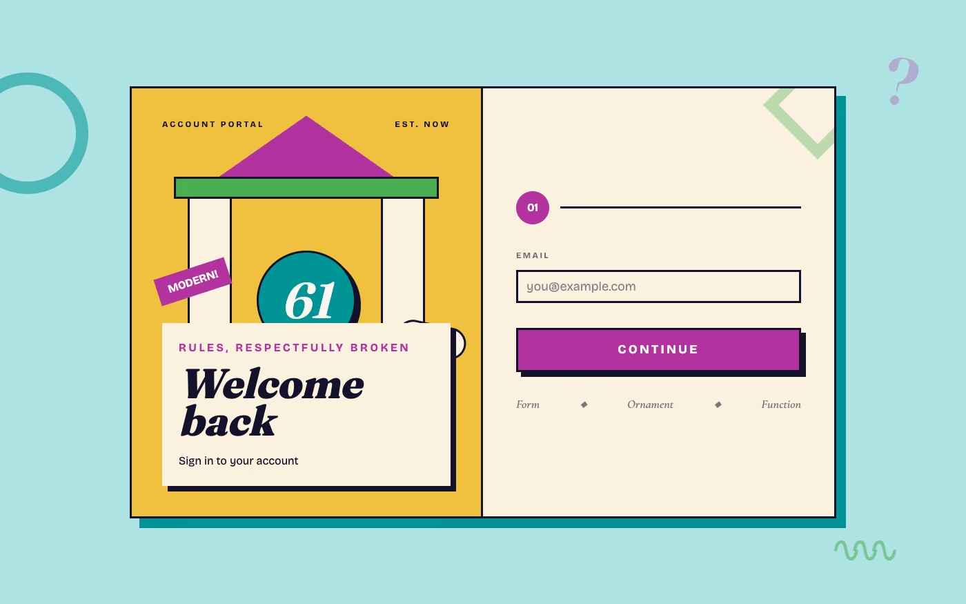
Design overview
- Signature elements
- mixed historical references, ironic ornament, clashing typefaces, playful geometry, broken conventions, symbolic decoration
- Best suited to
- Culture, architecture, fashion, entertainment, and expressive identity systems.
- Layout principles
- Quote classical grids, vernacular signs, and modern modules, then interrupt them with ironic scale shifts, layered ornament, or deliberately broken symmetry.
History and origins
A fact-checked account of where this visual language came from, with links to the references used.
- Period
- 1970s–1990s, dominant in many design fields during the 1980s
- Origin
- International architecture and design reacting against orthodox modernism
Postmodern design formed at the margins during the 1970s and became dominant in many fields in the 1980s. It rejected the idea of one universal modernist language, freely mixing historical quotation, irony, ornament, pop culture, color, and competing typefaces; digital eclecticism inherits that permission to combine codes rather than obey a single pure system.
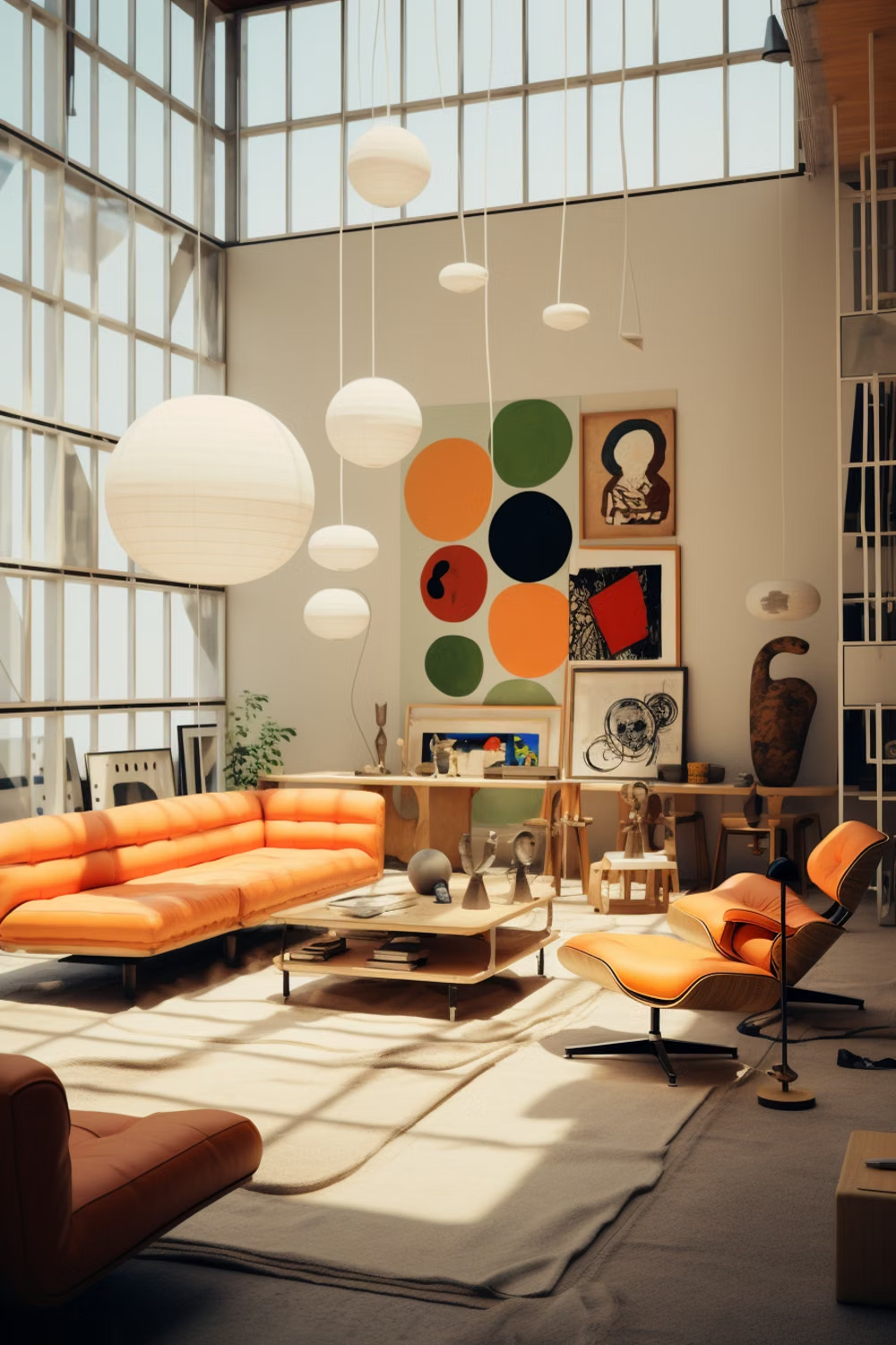
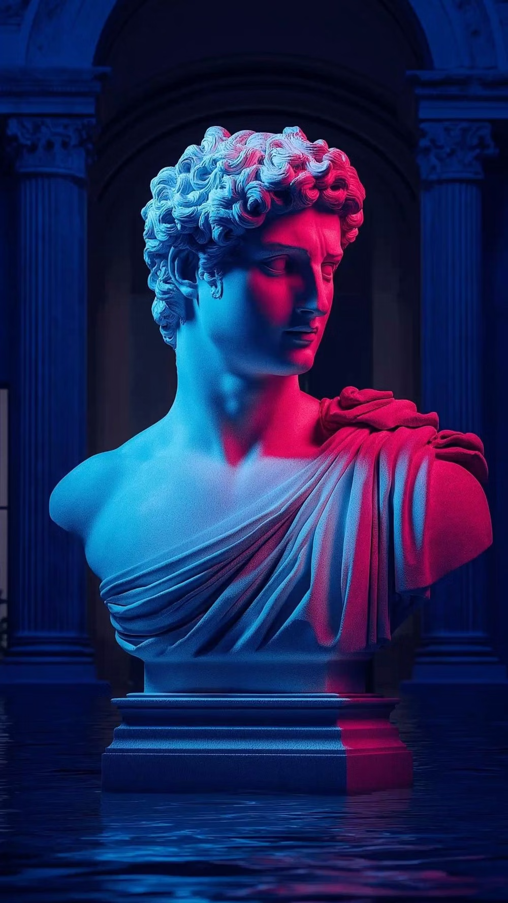
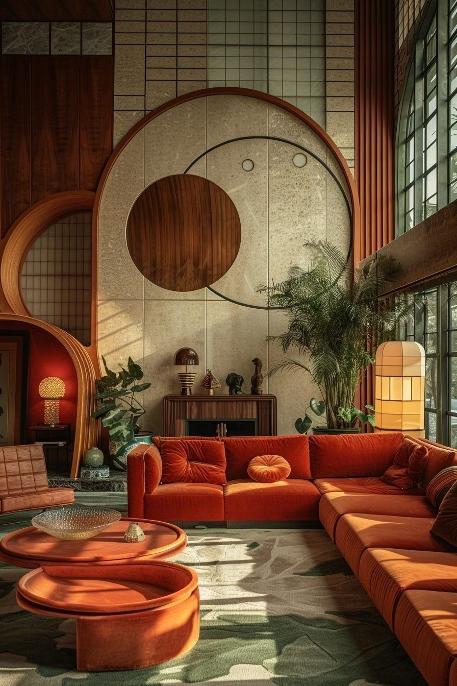
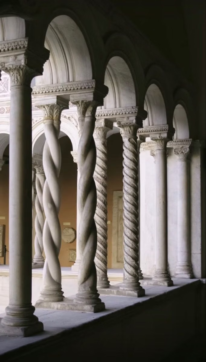
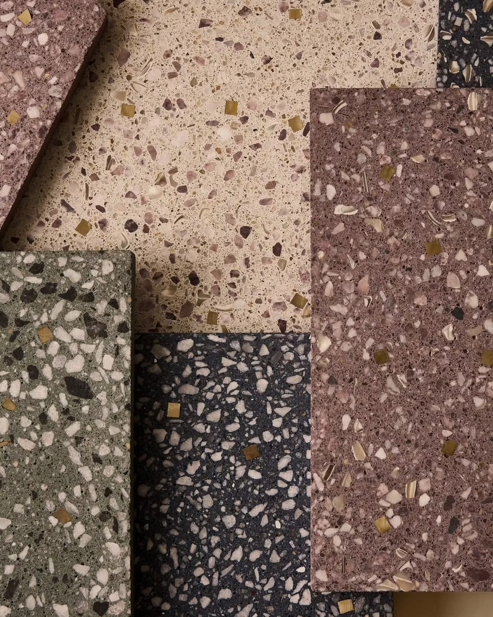
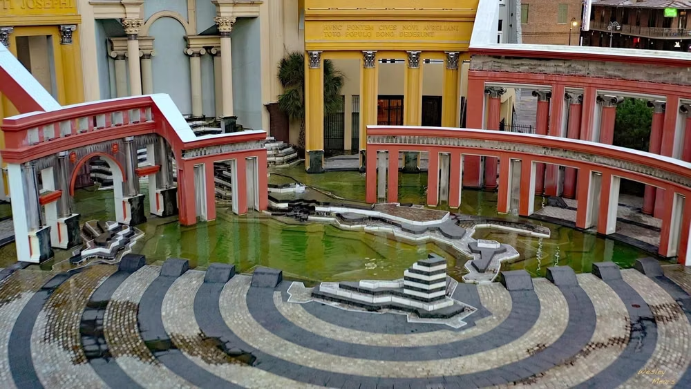
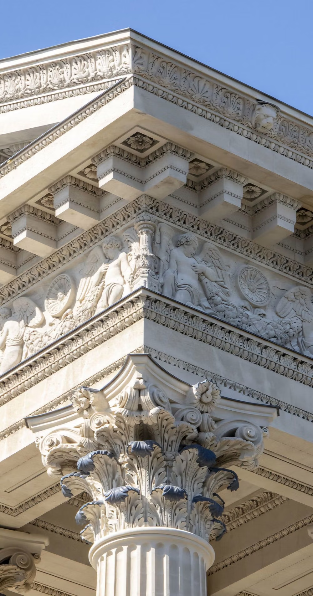
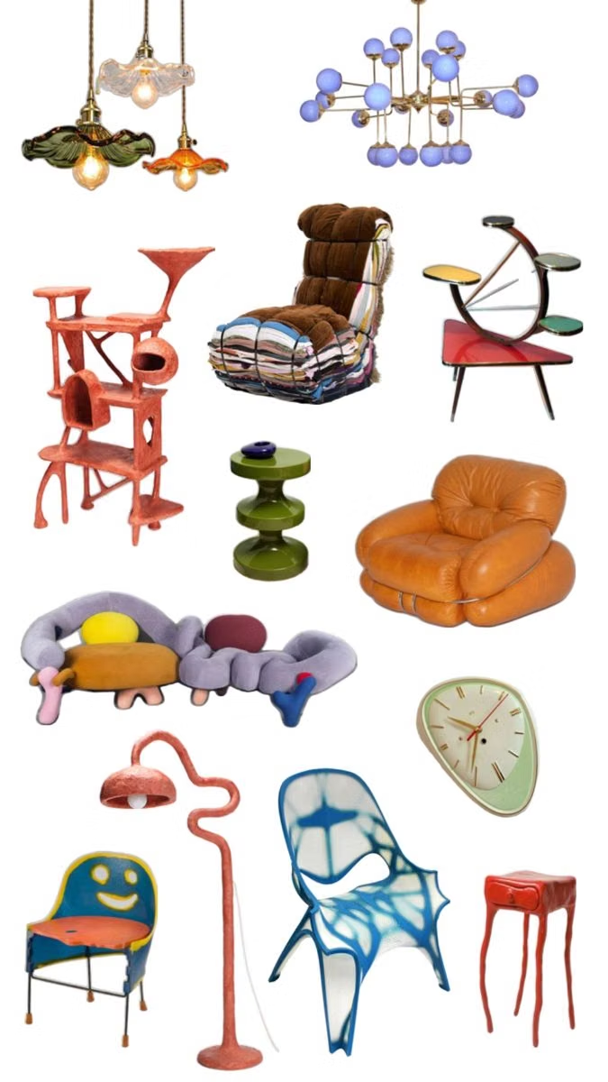
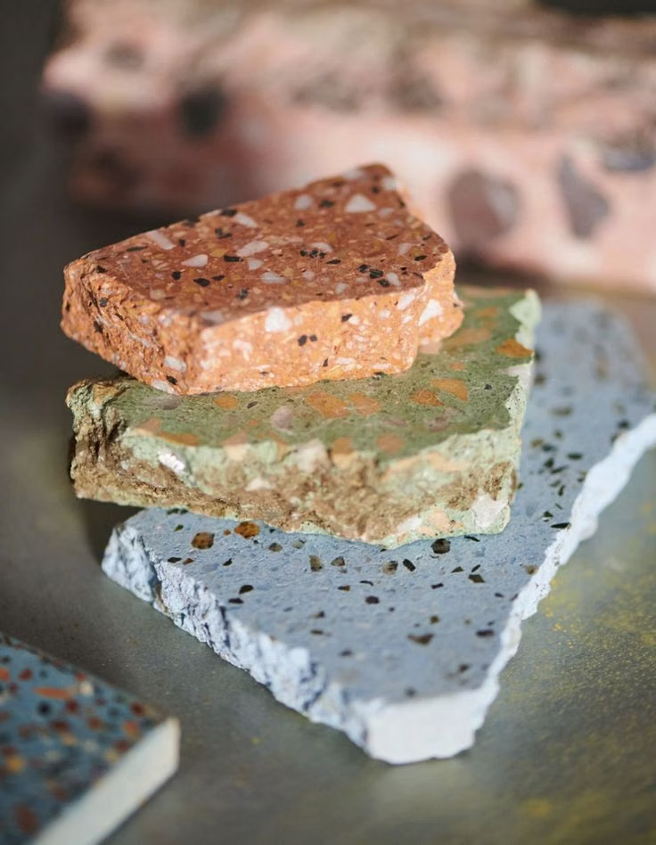
Moodboard and visual references
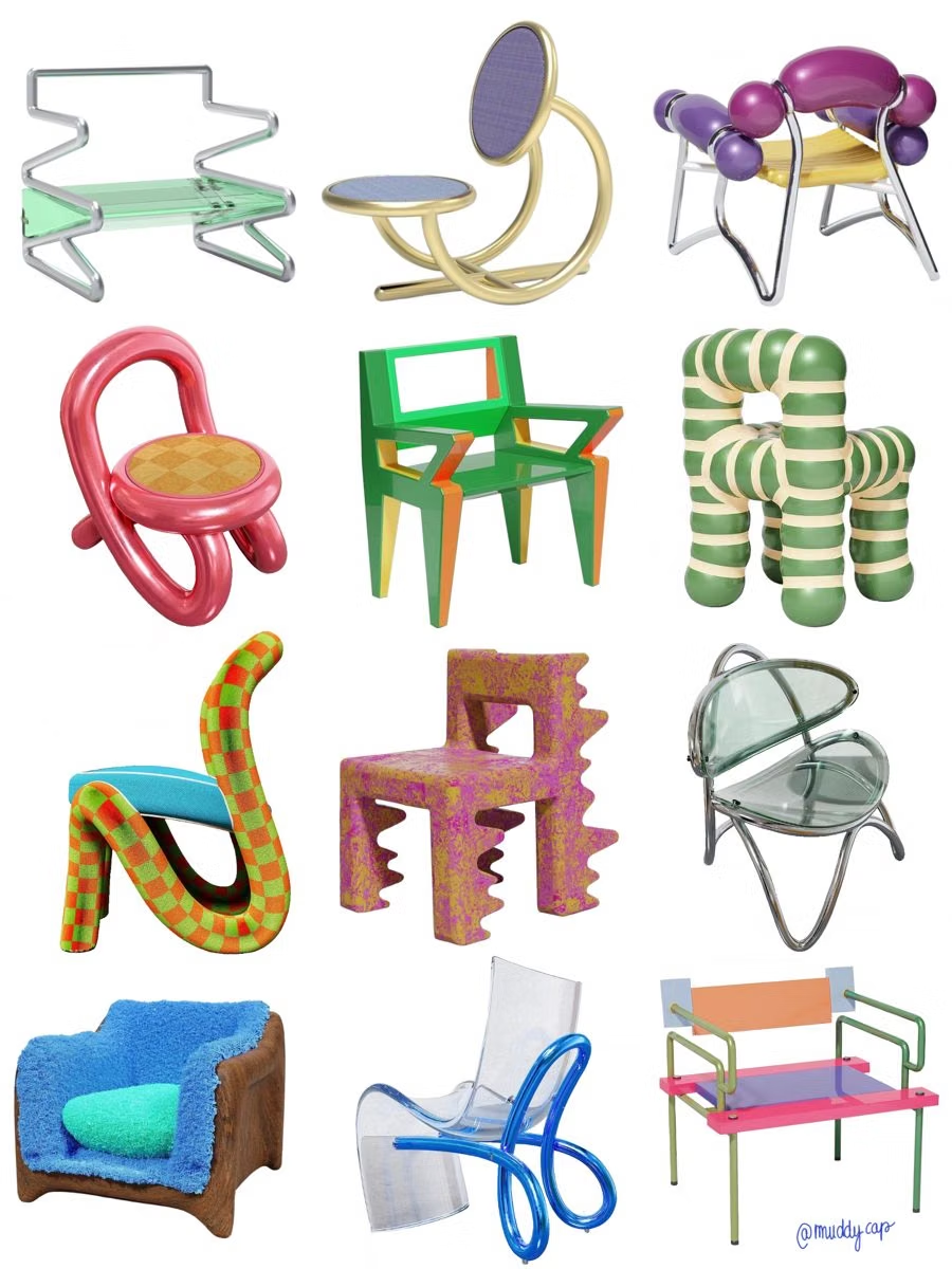
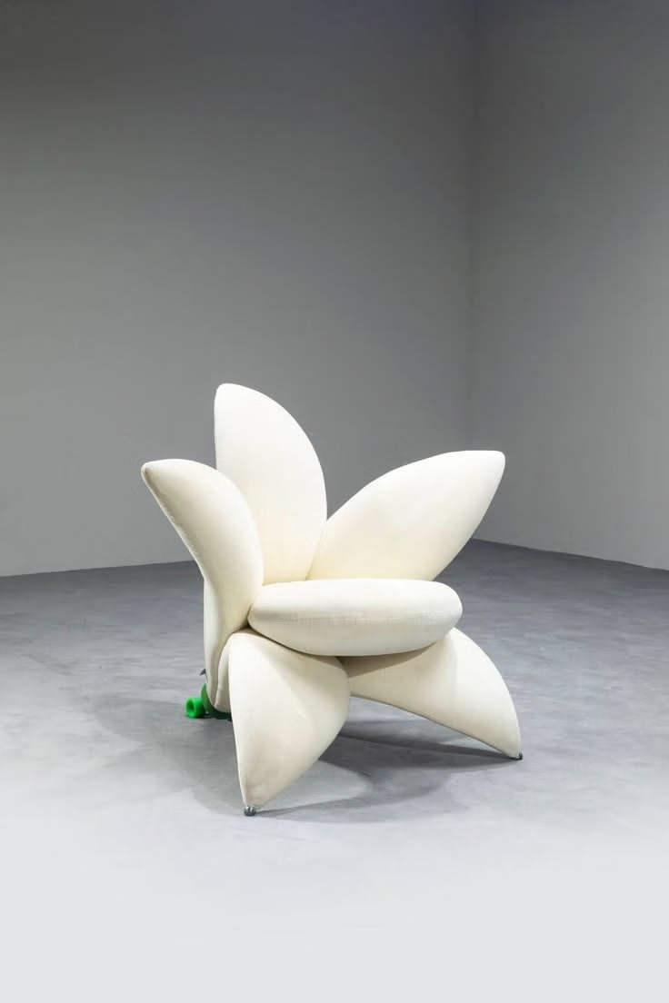
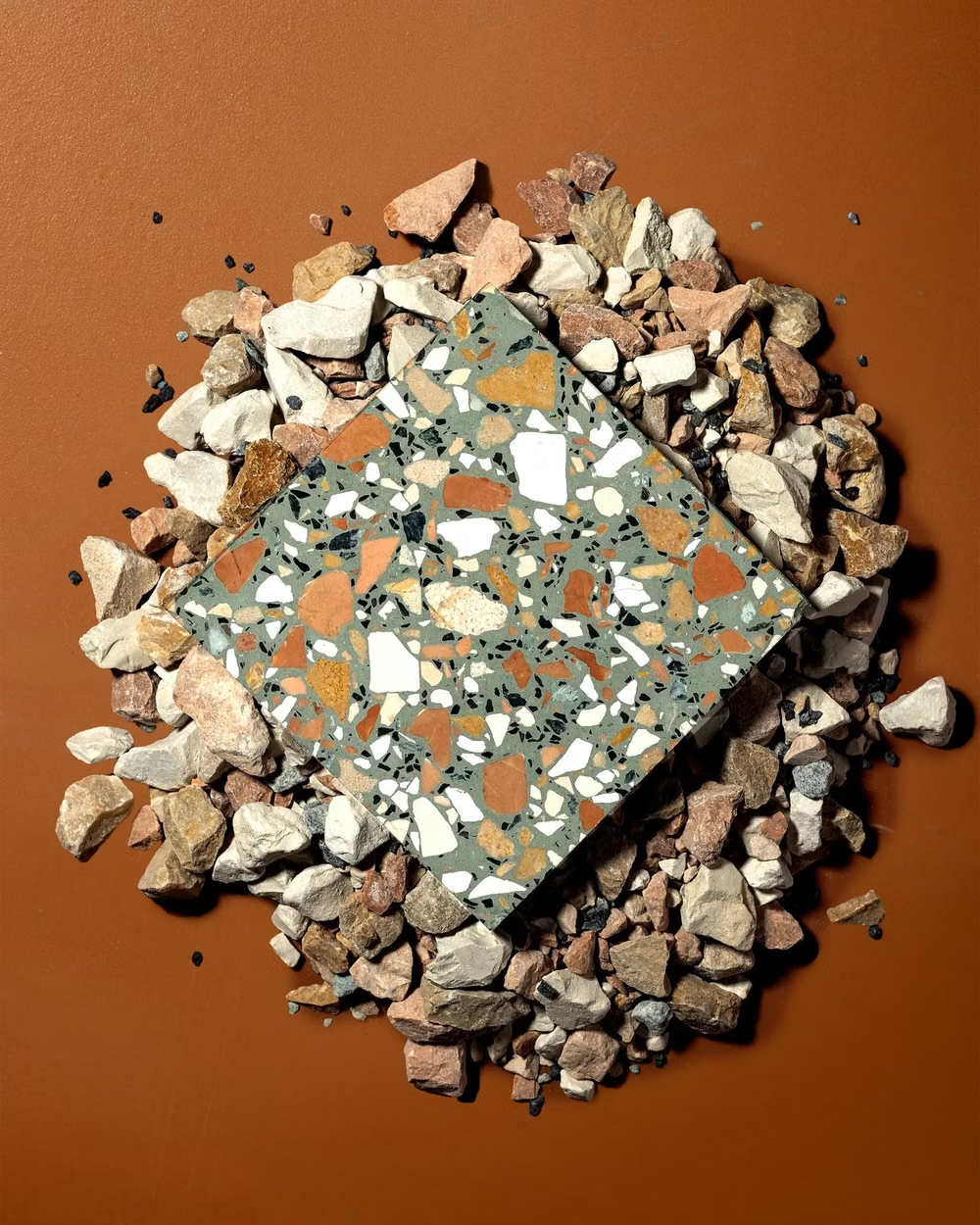
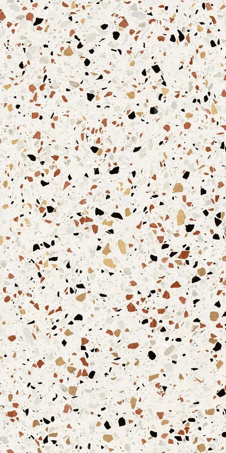
A visual study of the forms, inspirations, materials, colors, type, and cultural references associated with this UI design style.
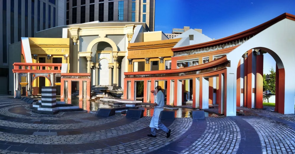
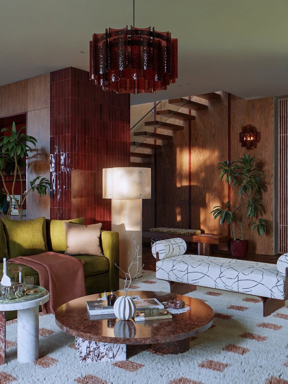
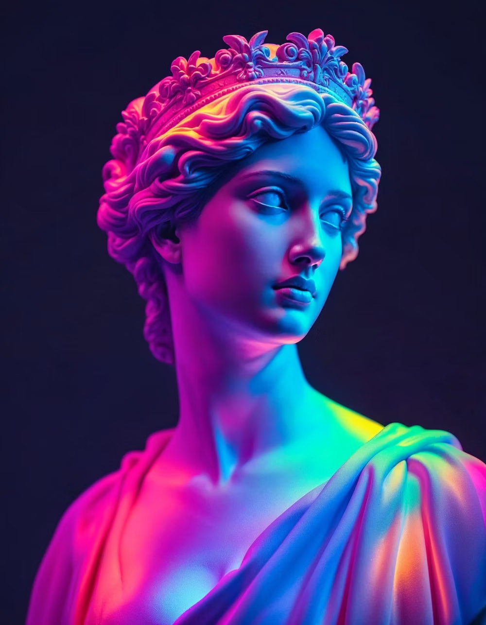
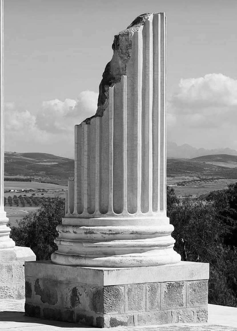
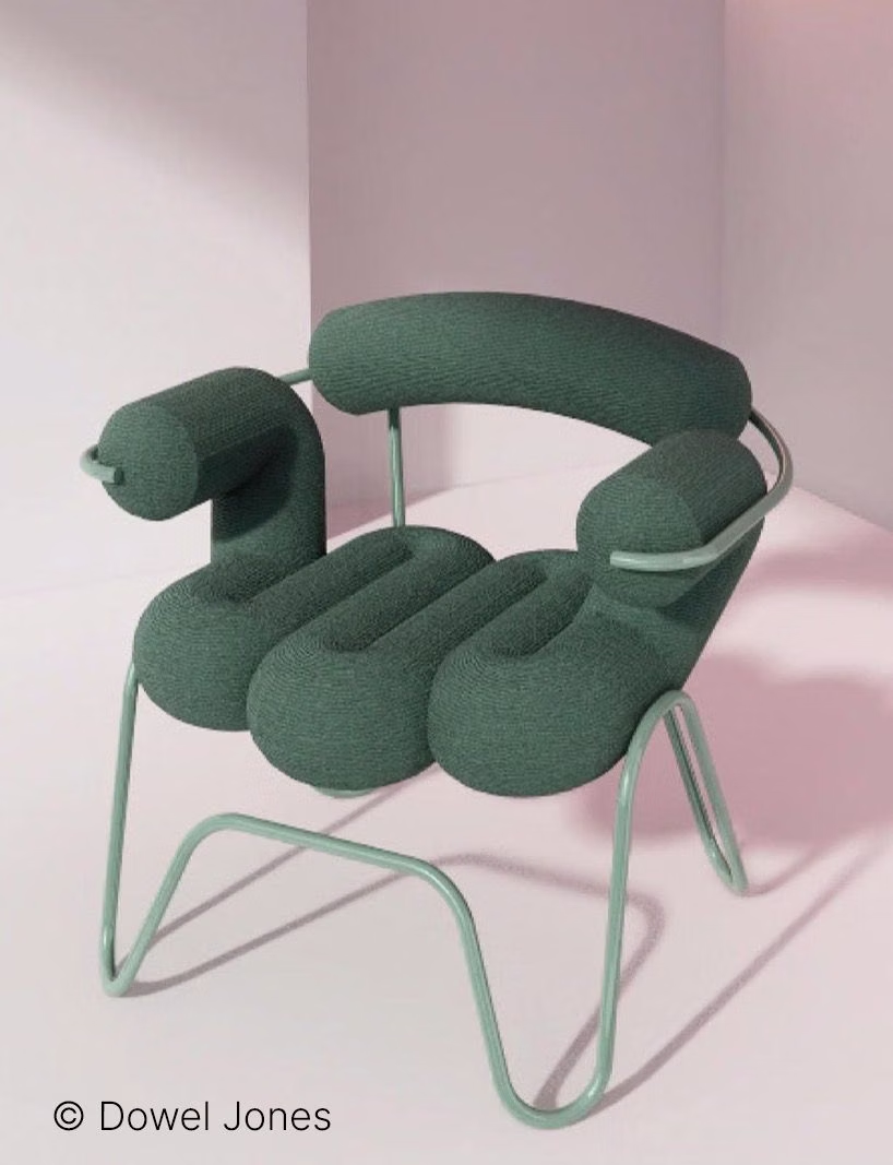
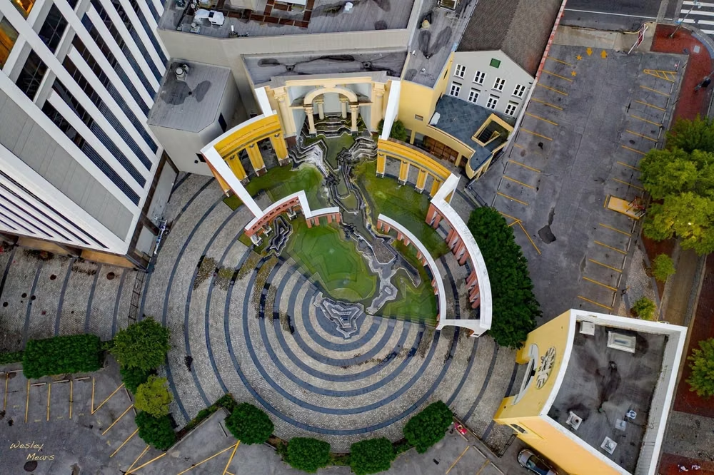
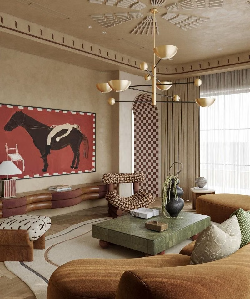
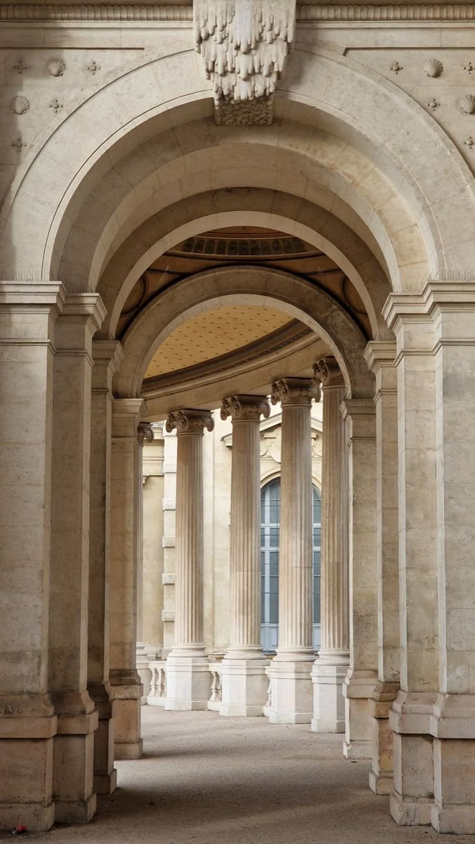
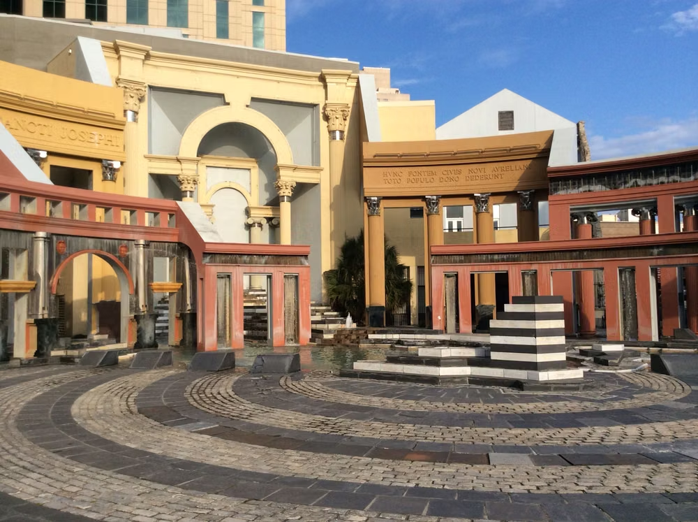
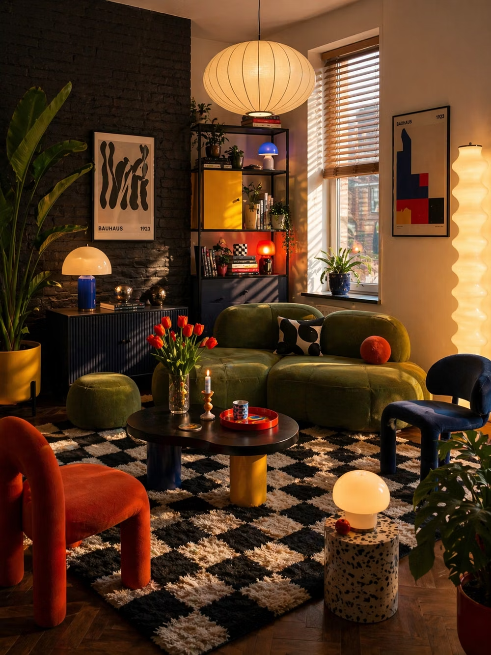
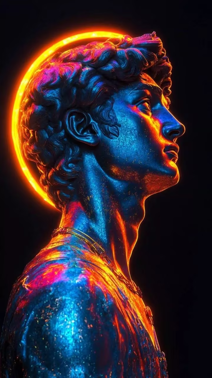
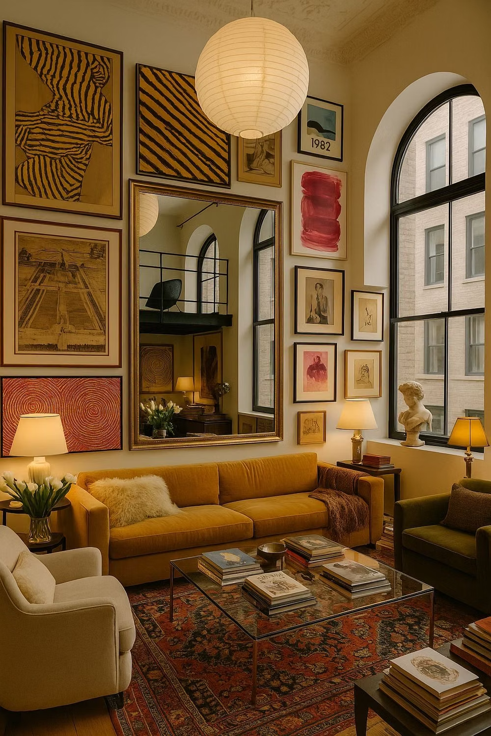
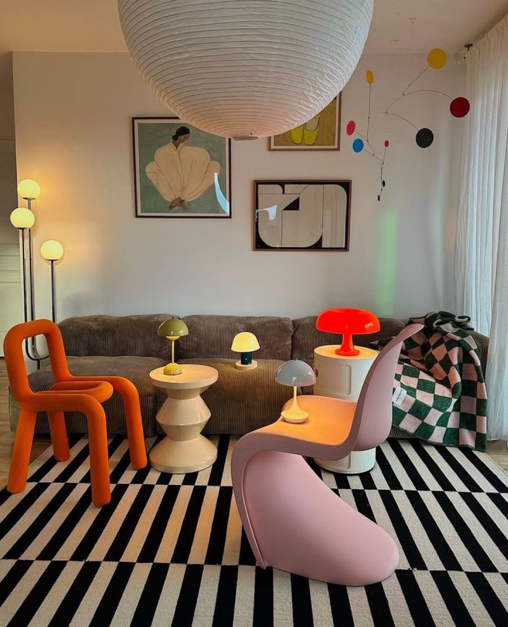
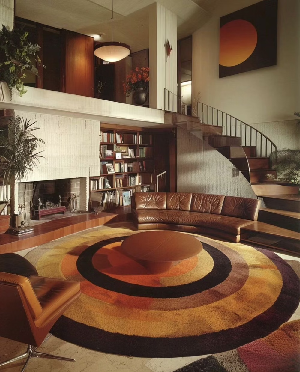
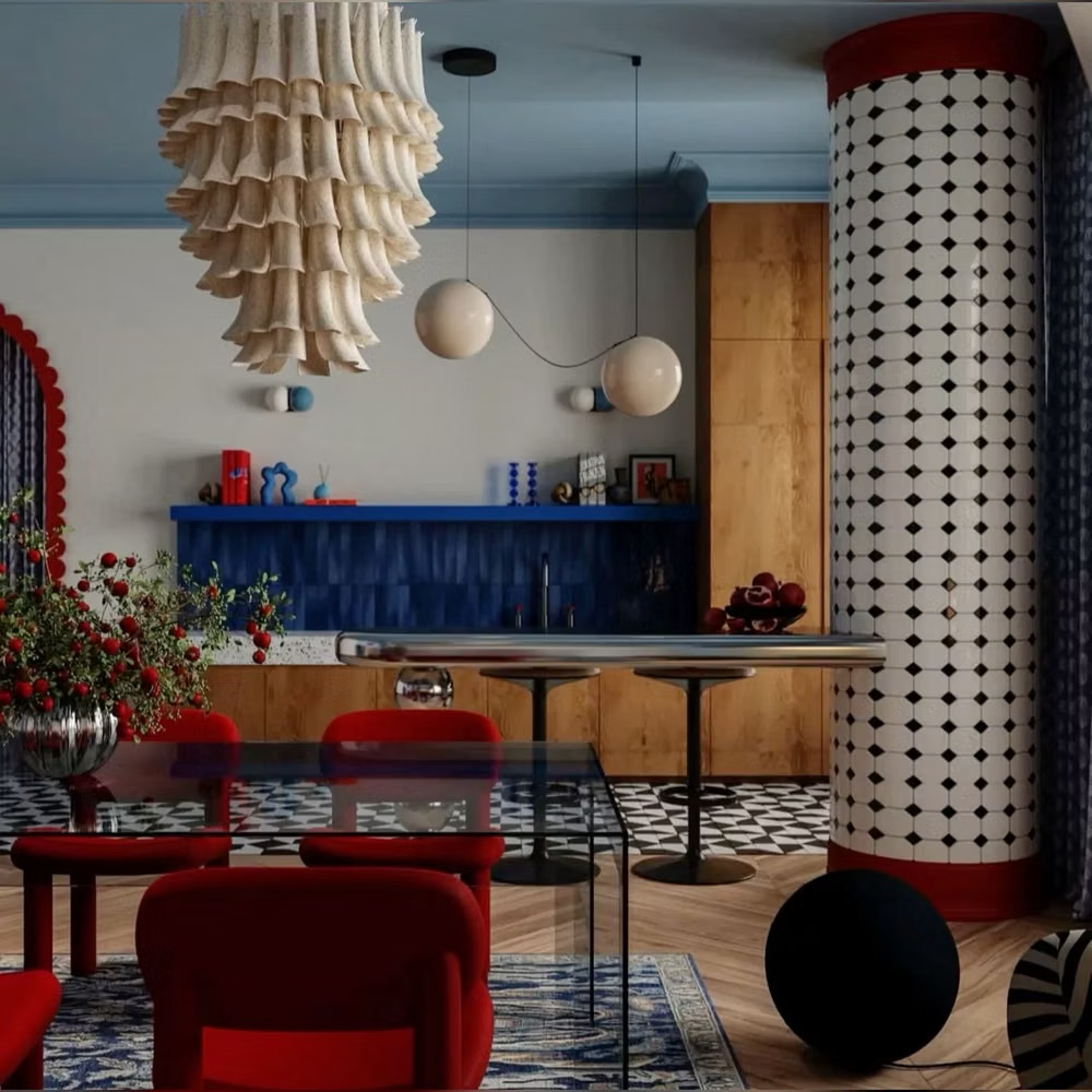
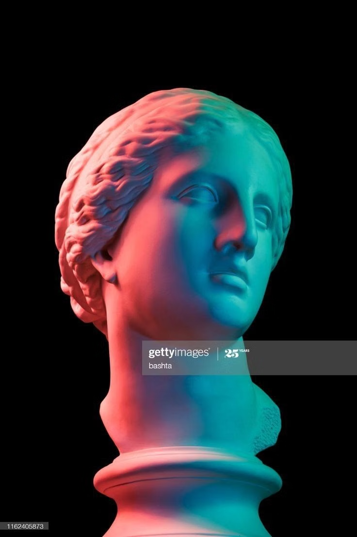
![Postmodern Eclecticism aesthetic - ДЛЯ ТЕХ, кому ЕСТЬ ЧТО СКАЗАТЬ МИРУ КОНЦЕПЦИИ для тех, кто хочет процветать со вкусом [TG@pervahumanTG] СОЗДАЁМ & ВОПЛОЩАЕМ уникальные концепции для творческих предпринимателей SMM PINTEREST INSTAGRAM TELEGRAM КРЕАТИВНЫЙ МАРКЕТИНГ | AI CONTENT КРЕАТИВНЫЙ КОНТЕНТ ВЕДЕНИЕ СОЦ СЕТЕЙ | ПРОДВИЖЕНИЕ YouTube | аутентичный блог | уникальный стиль | персональный брендинг | дикий трафик | первахьюман Pervahuman](../../moodboards/postmodern-eclecticism/10-postmodern-eclecticism.avif)
Design principles and implementation
Use these principles to write a focused AI UI design prompt instead of asking for a vague visual treatment.
Color direction
Build a sophisticated clash of historical and contemporary colors, repeating two or three bridge hues so the eclectic palette remains intentional. In a daisyUI theme, use the strongest repeated bridge hue for `primary`, its deliberately clashing era-counterpart for `secondary`, and keep `base-100`, `base-200`, and `base-300` in warm off-white, stone, and a grayed bridge tone.
Imagery direction
Mix archival references, decorative objects, pop symbols, architecture, illustration, and contemporary photography through a clear curatorial idea.
Content density
Use medium to high density with varied section voices, preserving a consistent information hierarchy beneath stylistic shifts.
Motion direction
Transition between visual references theatrically through flips, reveals, substitutions, and ornamental transformations rather than one universal motion language.
Shape language
Combine pediments, columns, squiggles, grids, medallions, and symbolic motifs into deliberate hybrids with playful proportion. In daisyUI themes, set the `--radius-*` variables between `0.75rem` and `1.5rem`.
Typography rules
Pair contrasting historical and contemporary display faces with one constant body family, limiting each section to a controlled typographic joke or reference.
Suggested Typfaces
Bricolage Grotesque
Fresh daisies glow in warm sunlight
Fresh daisies glow in warm sunlight
1 2 3 4 5 6 7 8 9 0
Syne
Fresh daisies glow in warm sunlight
Fresh daisies glow in warm sunlight
1 2 3 4 5 6 7 8 9 0
Fraunces
Fresh daisies glow in warm sunlight
Fresh daisies glow in warm sunlight
1 2 3 4 5 6 7 8 9 0
Righteous
Fresh daisies glow in warm sunlight
Fresh daisies glow in warm sunlight
1 2 3 4 5 6 7 8 9 0
Cormorant Garamond
Fresh daisies glow in warm sunlight
Fresh daisies glow in warm sunlight
1 2 3 4 5 6 7 8 9 0
Build a Postmodern Eclecticism interface with daisyUI
The live example translates this direction into daisyUI components and semantic theme tokens.
To generate a full page in the same visual language, give the style name and the design rules above to Blueprint MCP.
Related UI design styles
Compare nearby visual languages that share typography, shapes, use cases, or signature elements.
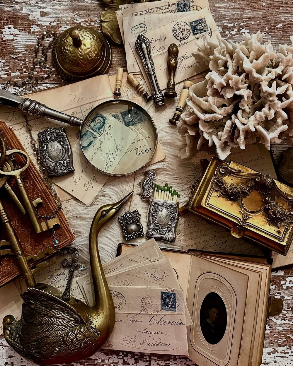
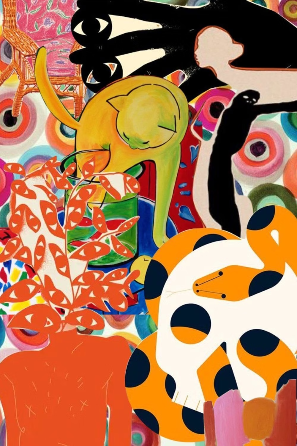
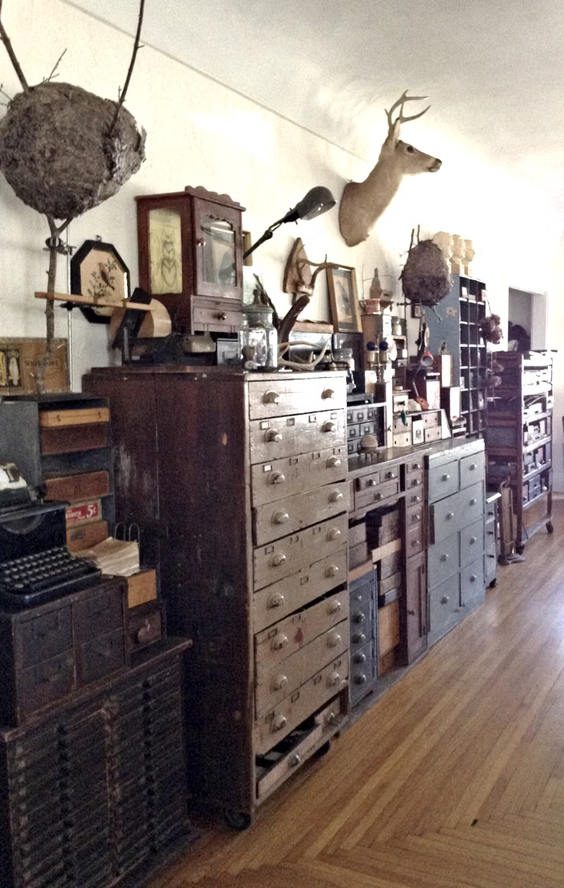
Maximalism UI design style
Dense compositions combine expressive typography, vivid color, layered imagery, pattern, and abundant decoration.
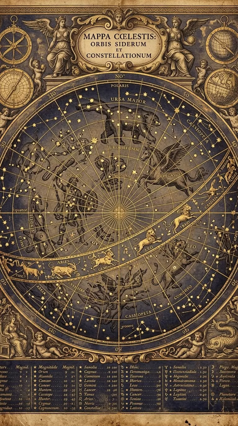
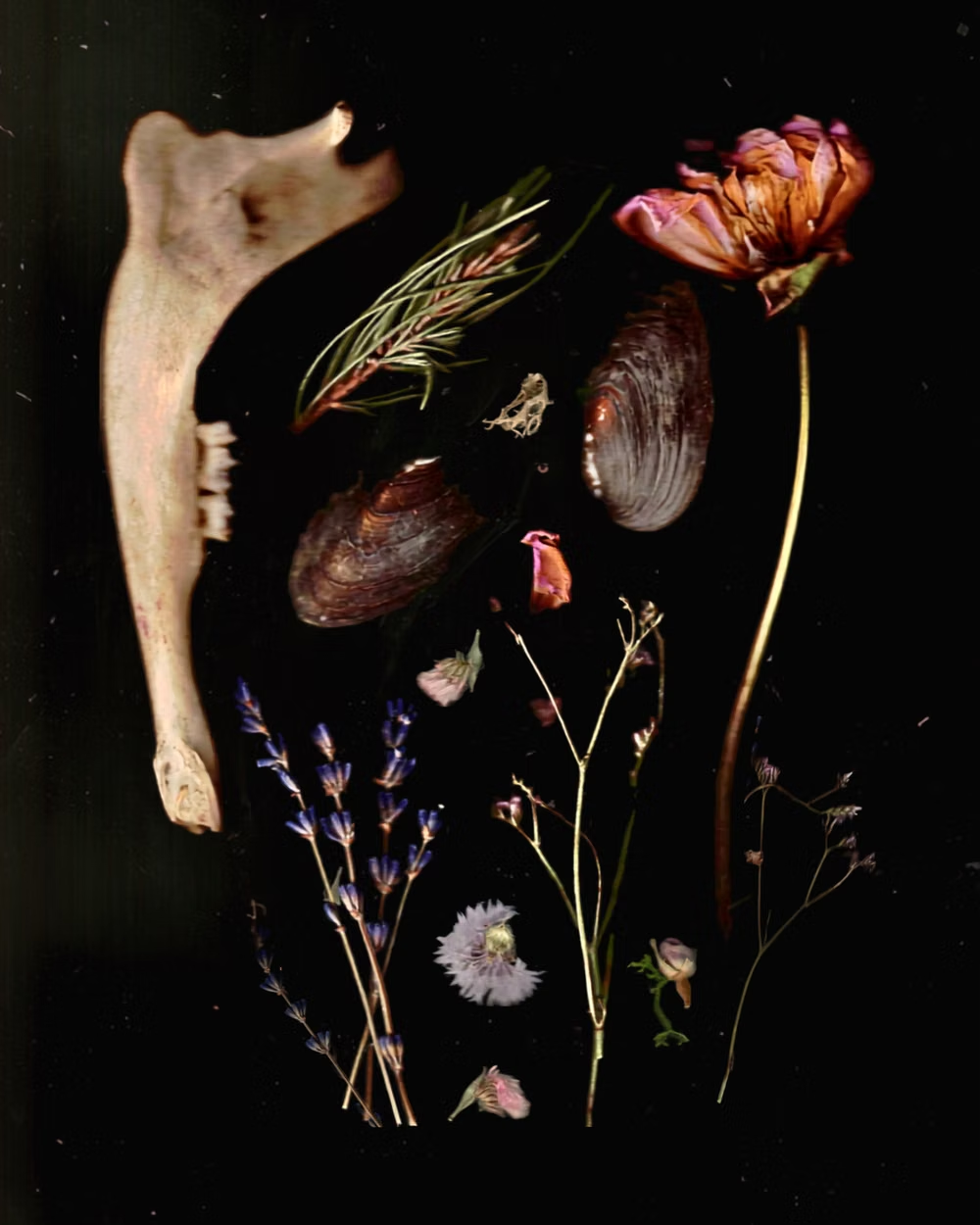
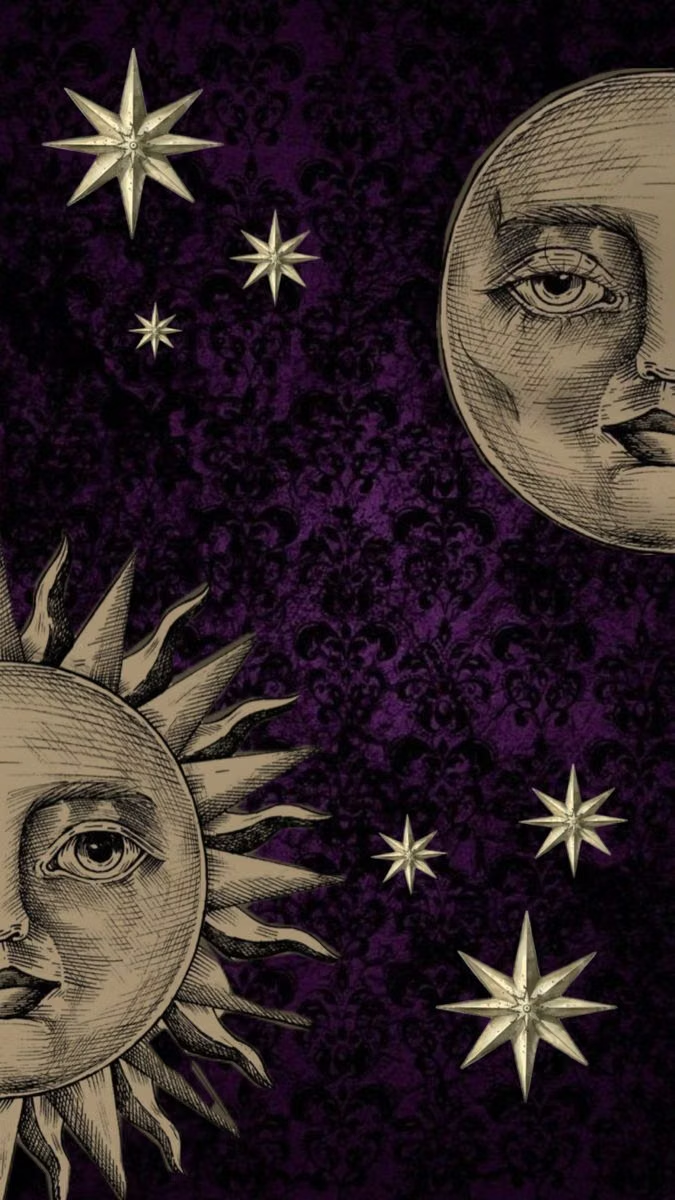
Whimsigothic UI design style
Celestial symbols, jewel tones, ornate curves, mystical illustration, and playful gothic motifs create theatrical enchantment.
Memphis Design UI design style
Bright geometric shapes, squiggles, dots, contrasting patterns, and playful visual imbalance evoke the 1980s Memphis Group.