Quiet Luxury UI design style
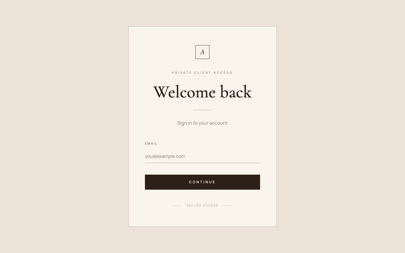
Restrained palettes, refined serif or neo-grotesque type, generous space, subtle motion, and meticulous premium detail.
Design overview
- Signature elements
- generous whitespace, muted neutrals, refined serif type, subtle hairlines, restrained motion, premium photography
- Best suited to
- Luxury commerce, hospitality, architecture, finance, beauty, and high-end professional services.
- Layout principles
- Use expansive margins, measured editorial alignment, and a small number of impeccably spaced modules, allowing product or service detail to unfold slowly.
History and origins
A fact-checked account of where this visual language came from, with links to the references used.
- Period
- Longstanding discreet-luxury lineage; trend label surged in 2023
- Origin
- European and American fashion discourse
Understated expensive materials and unbranded tailoring are much older than the phrase’s recent popularity. “Quiet luxury” became a dominant fashion and lifestyle label in 2023, amplified by runway coverage and television, then migrated into branding and UI as muted color, restrained typography, and material detail; it is a media trend category rather than a school with a single founder.
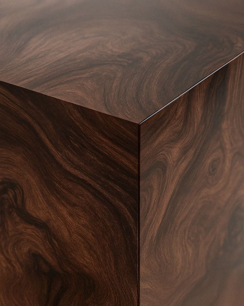
Moodboard and visual references
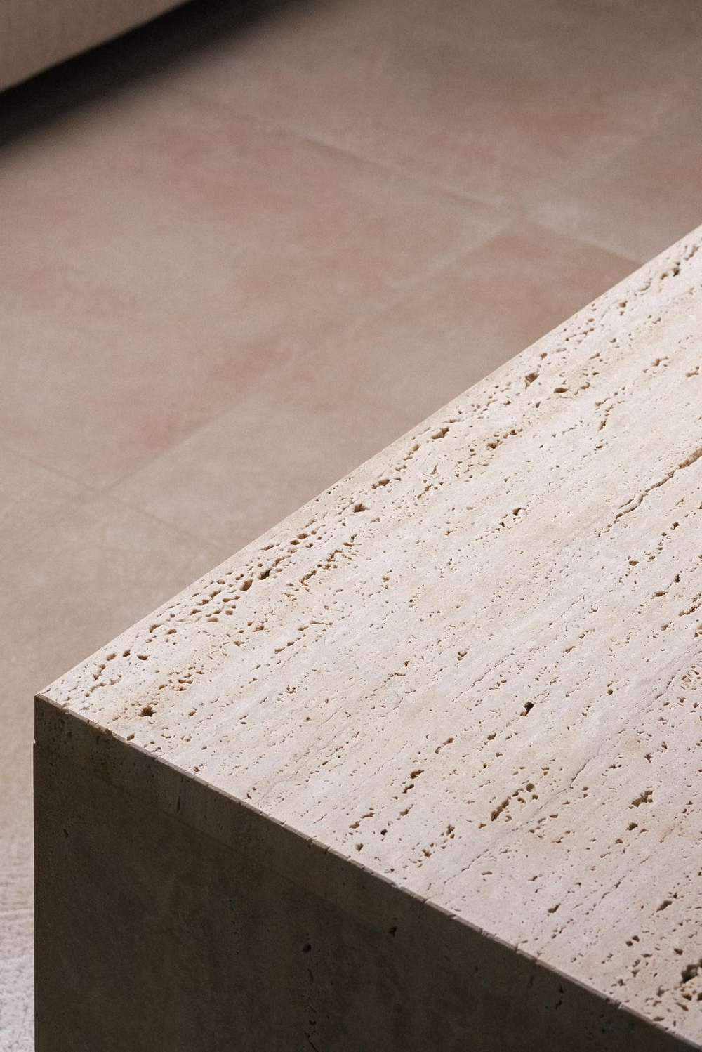
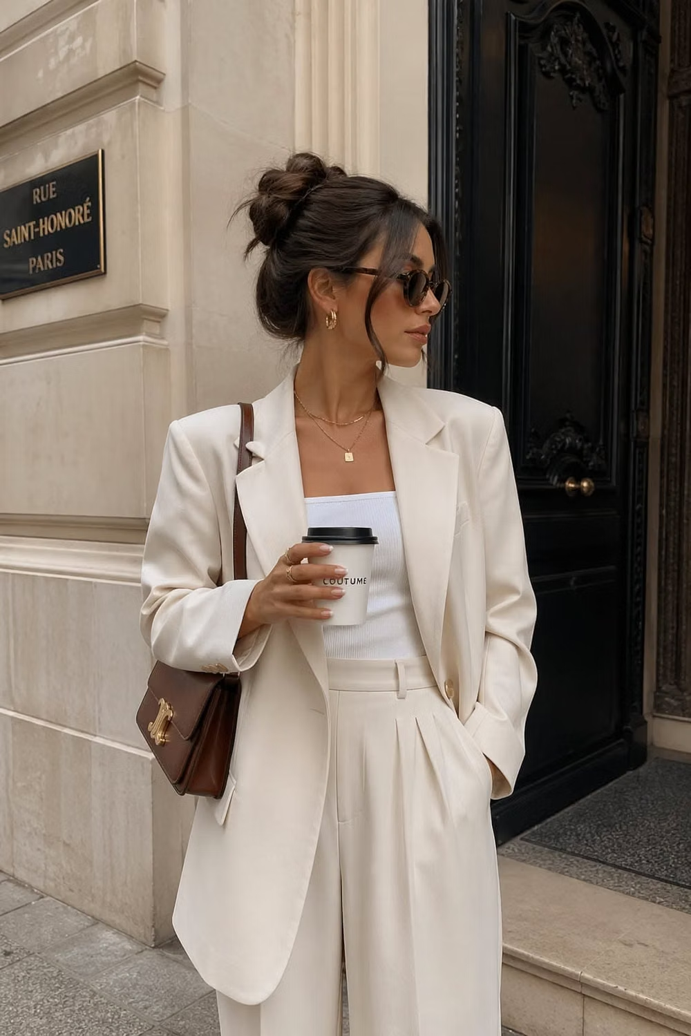
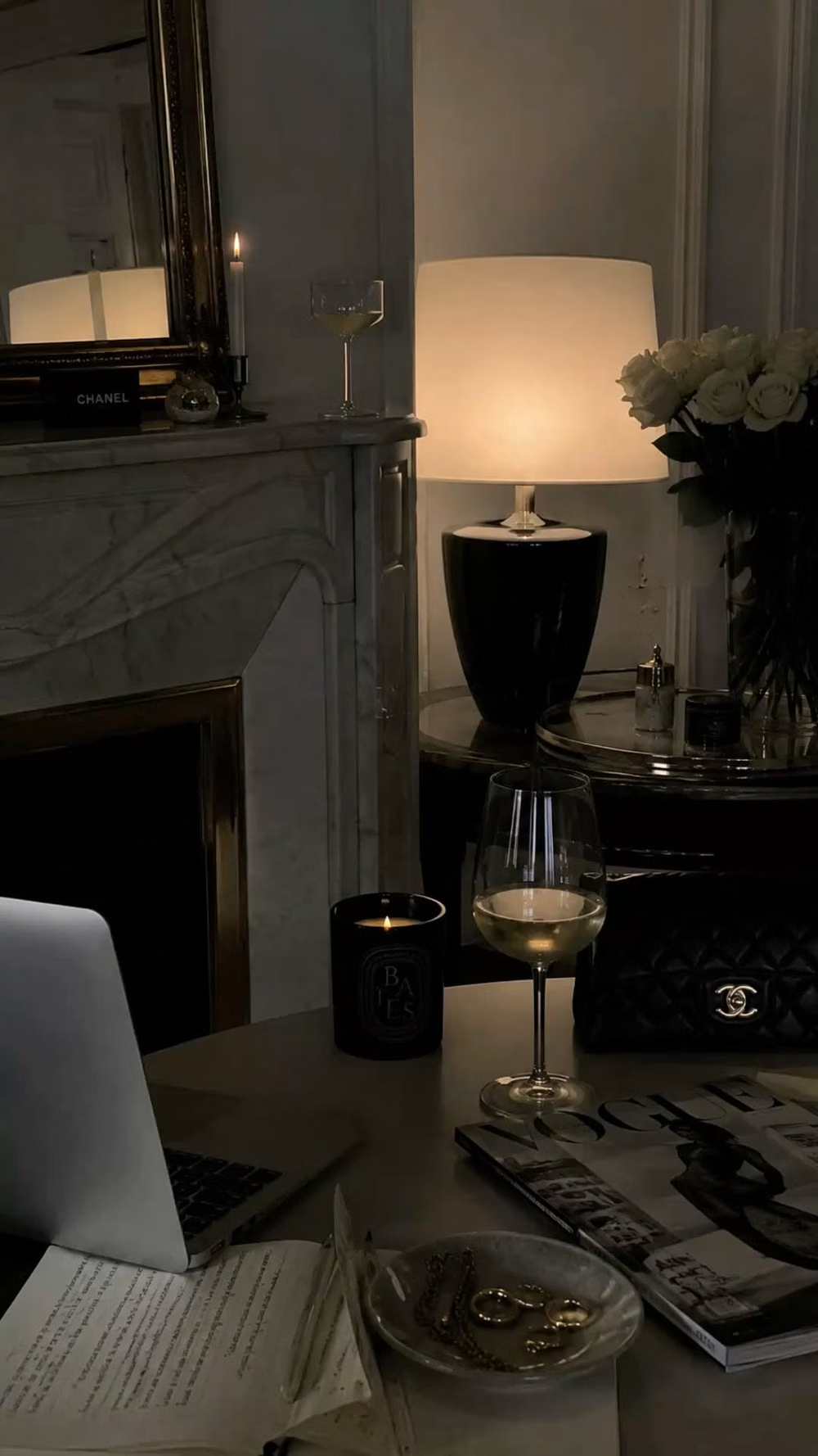
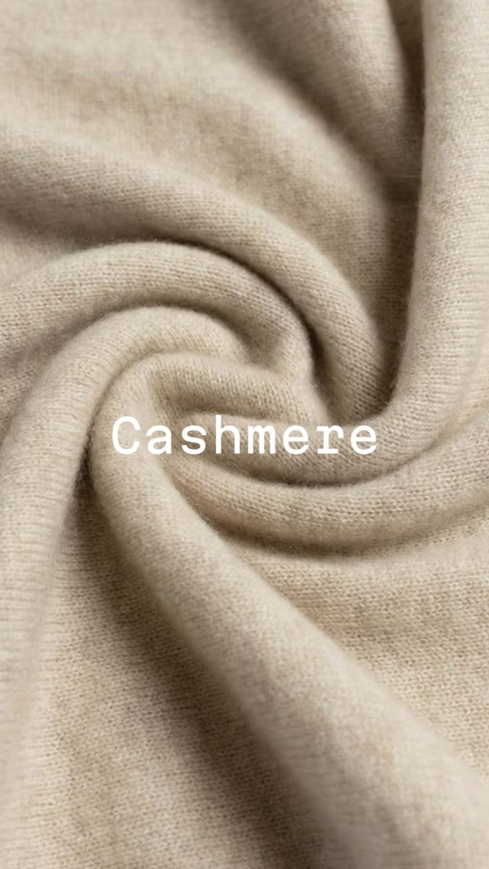
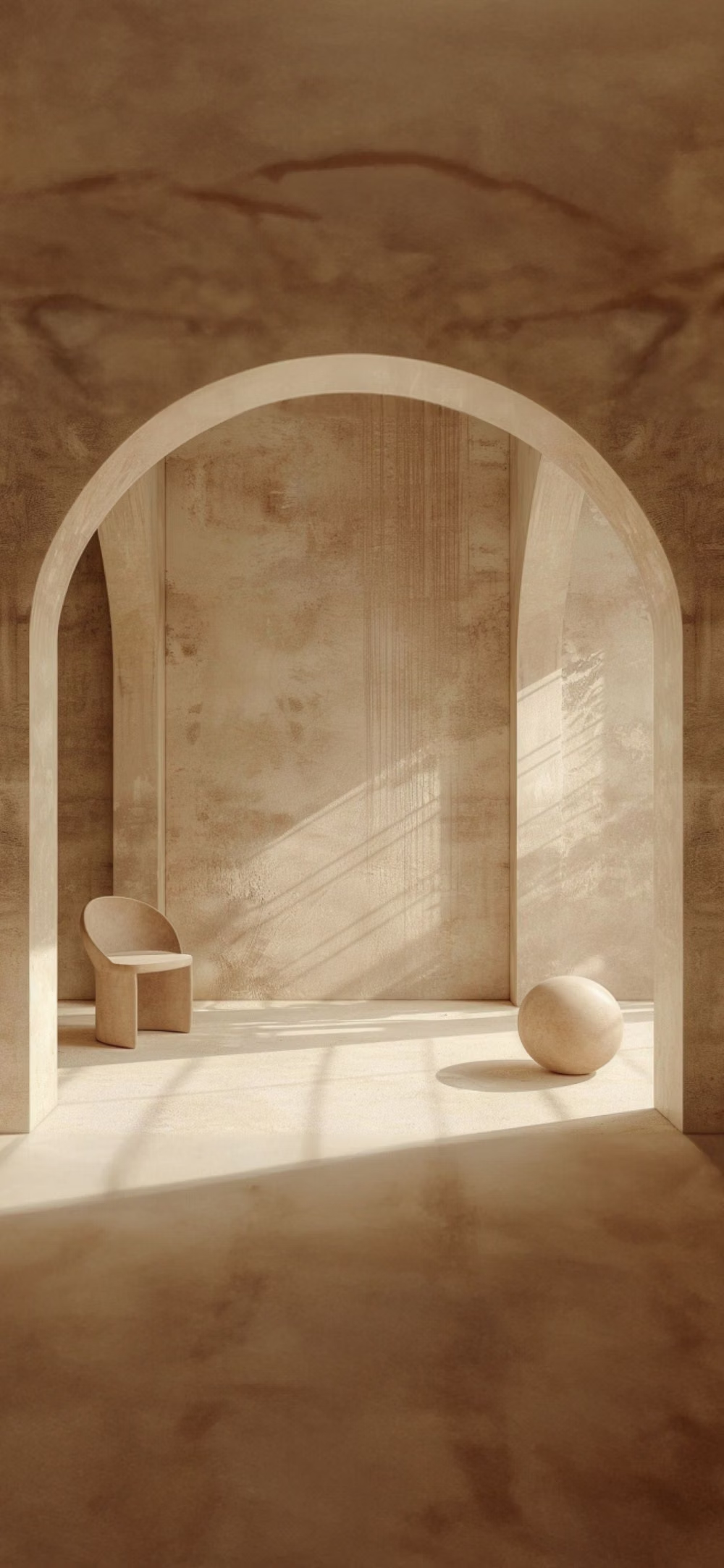
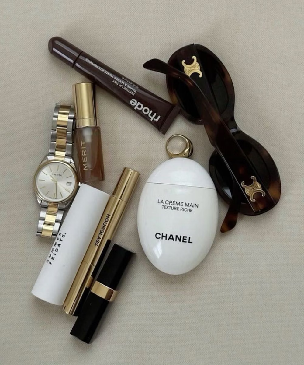
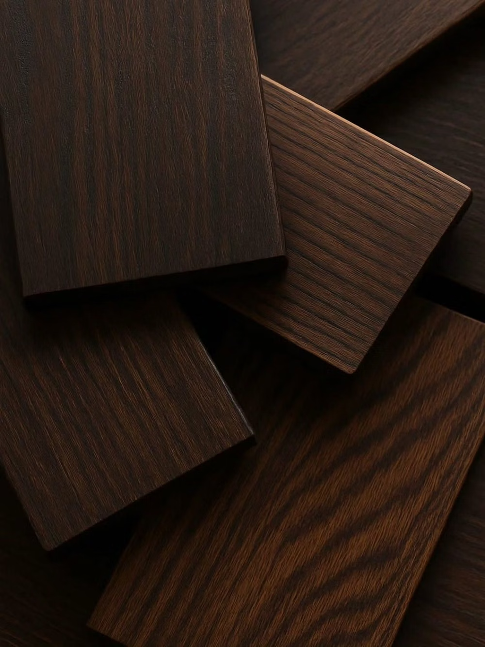
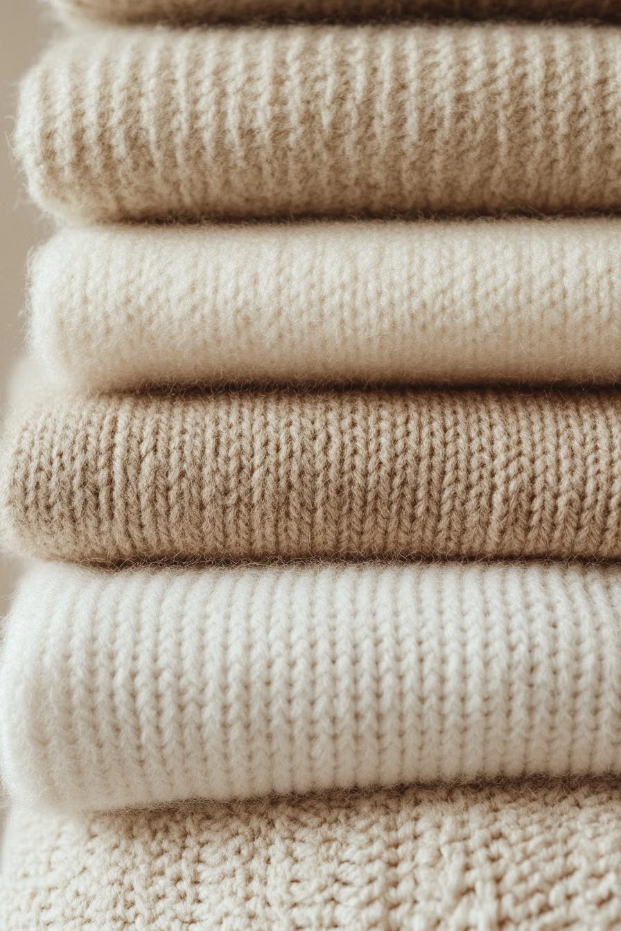
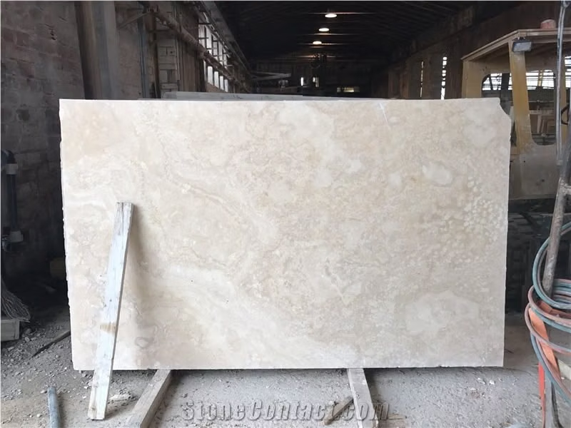
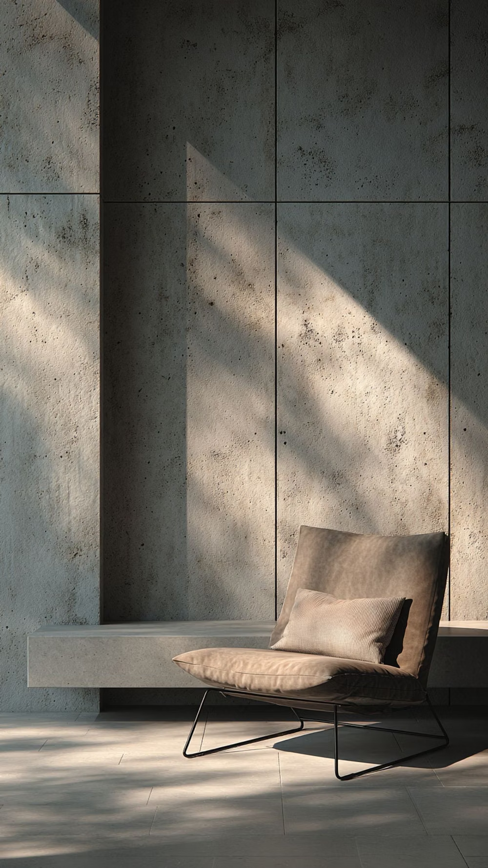
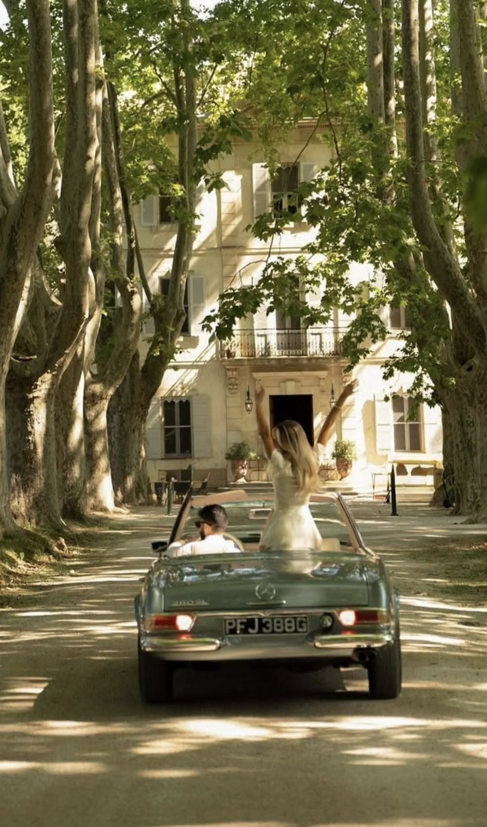
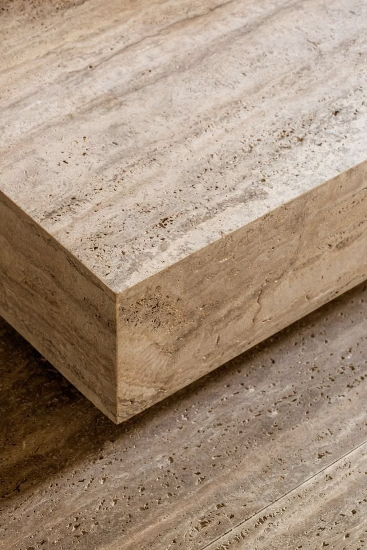
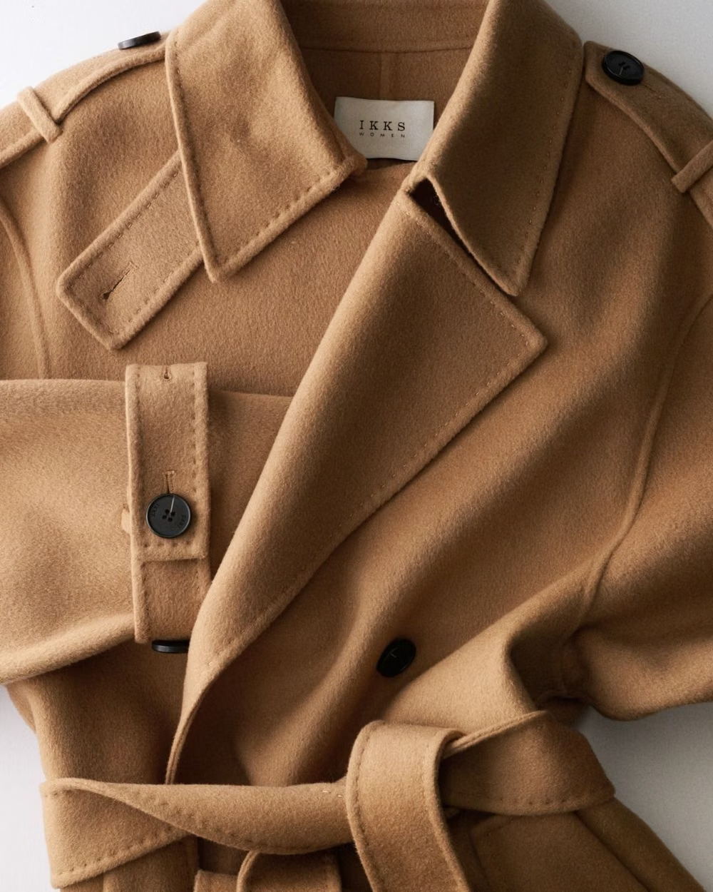
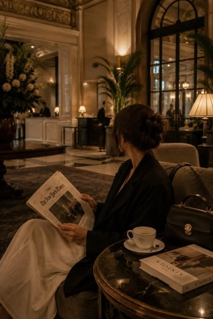
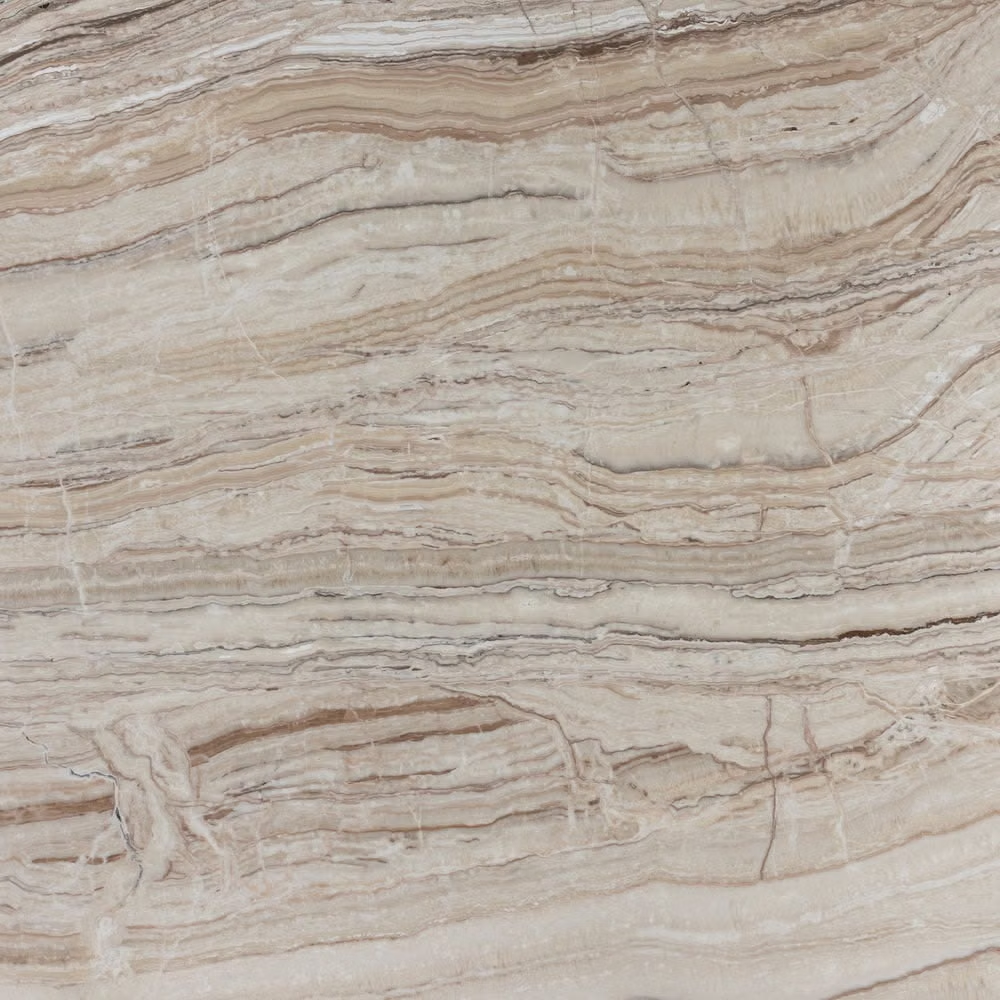
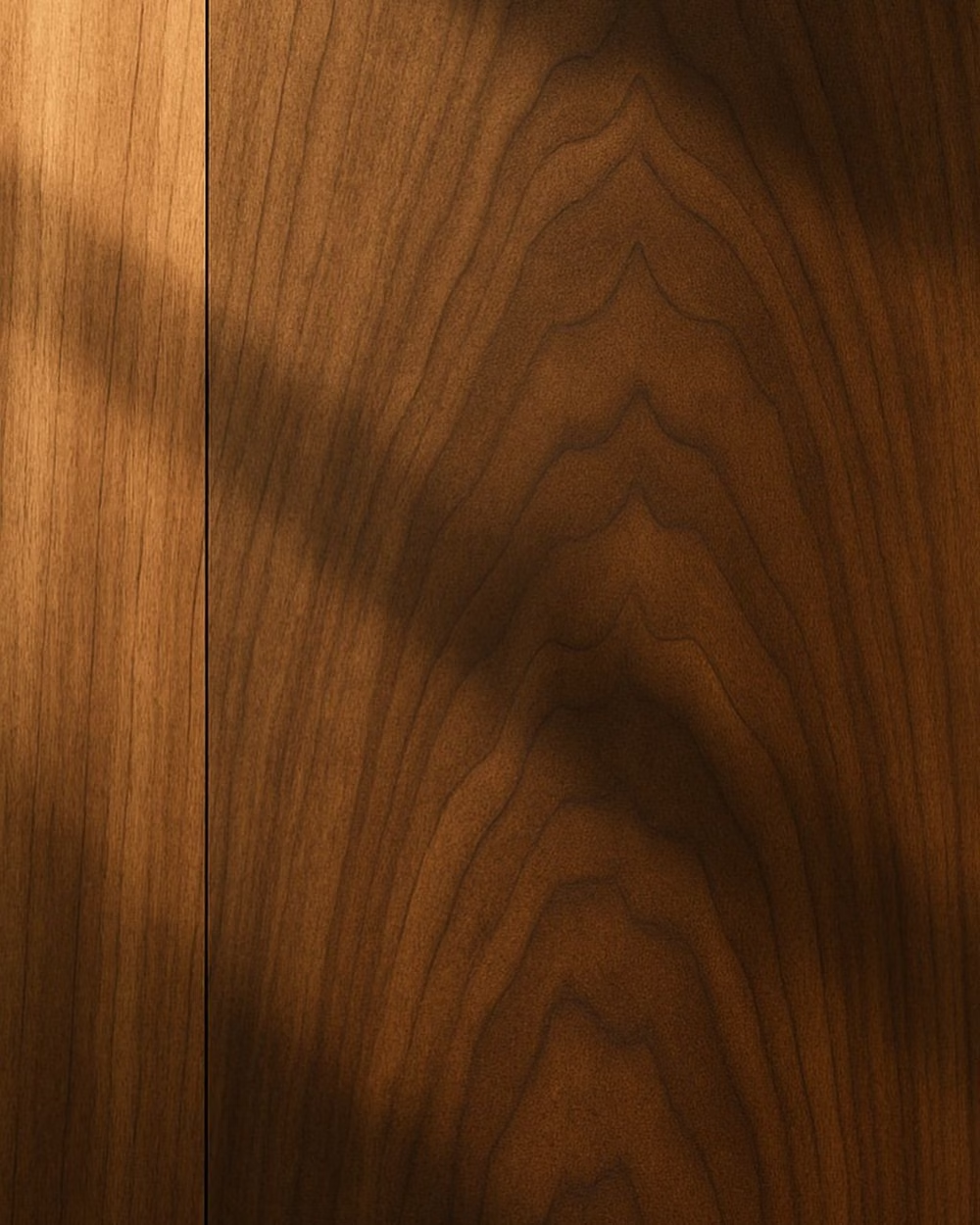
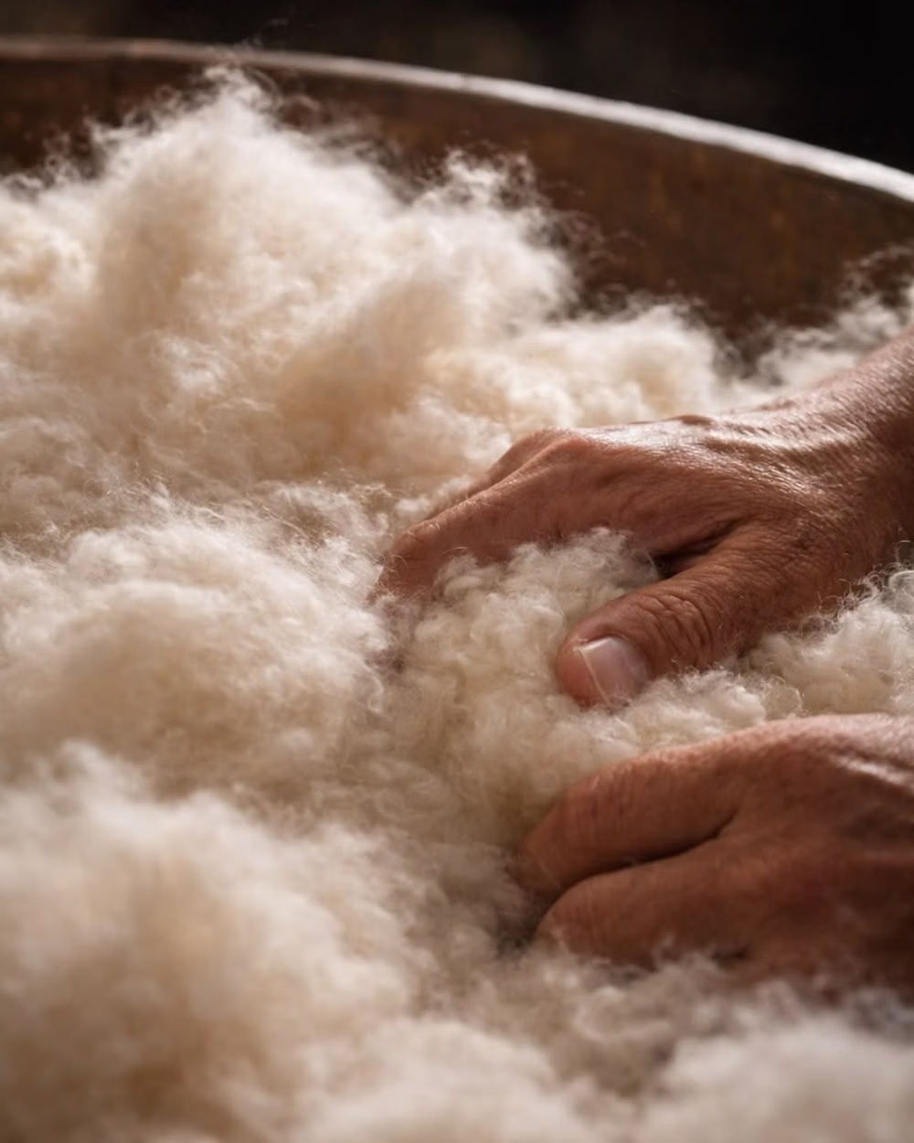
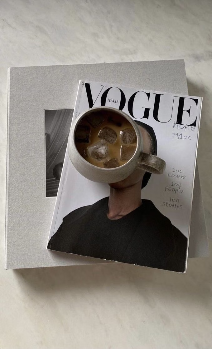
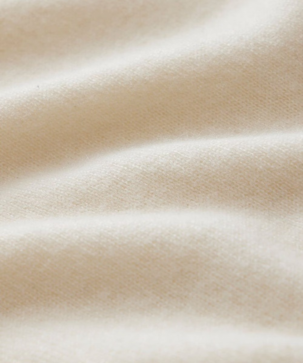
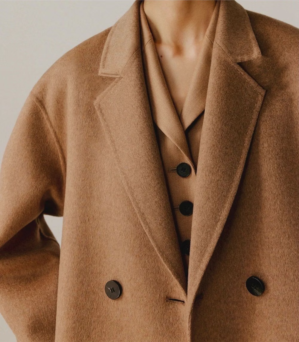
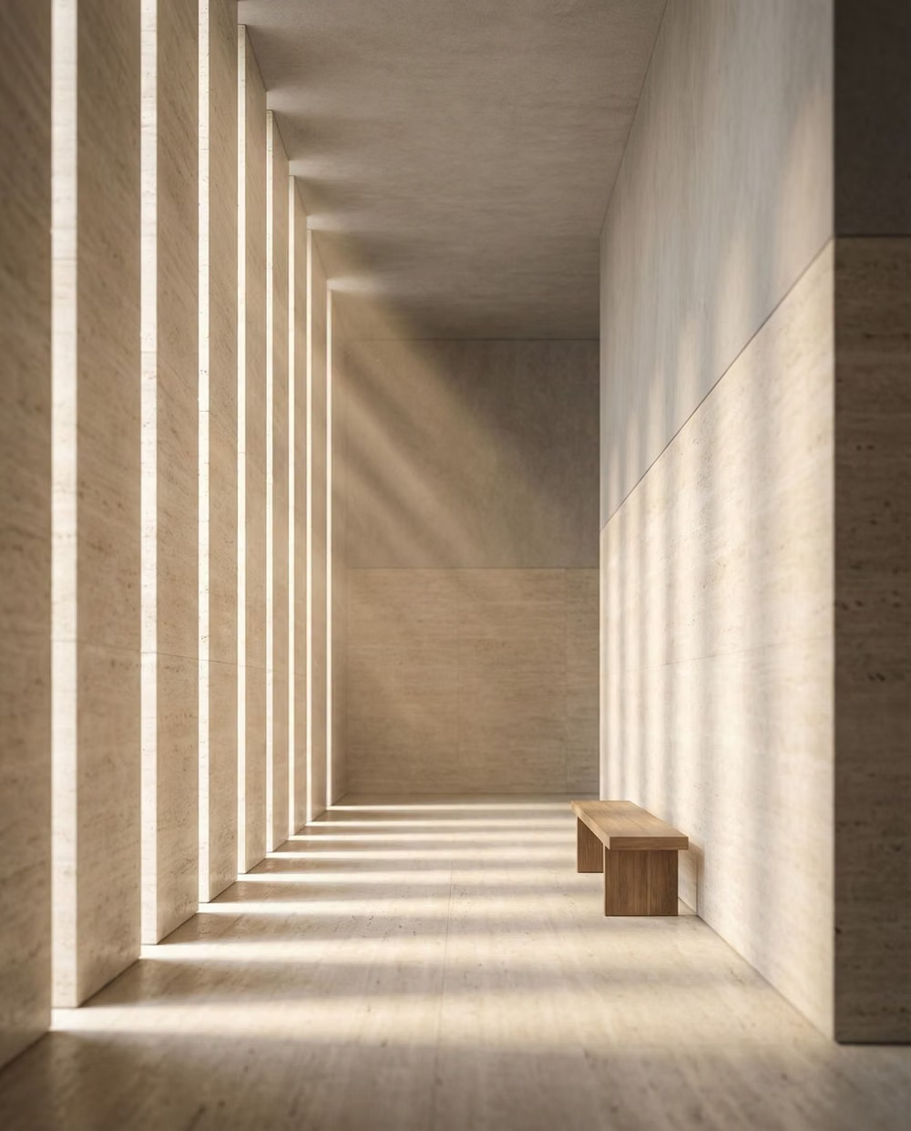
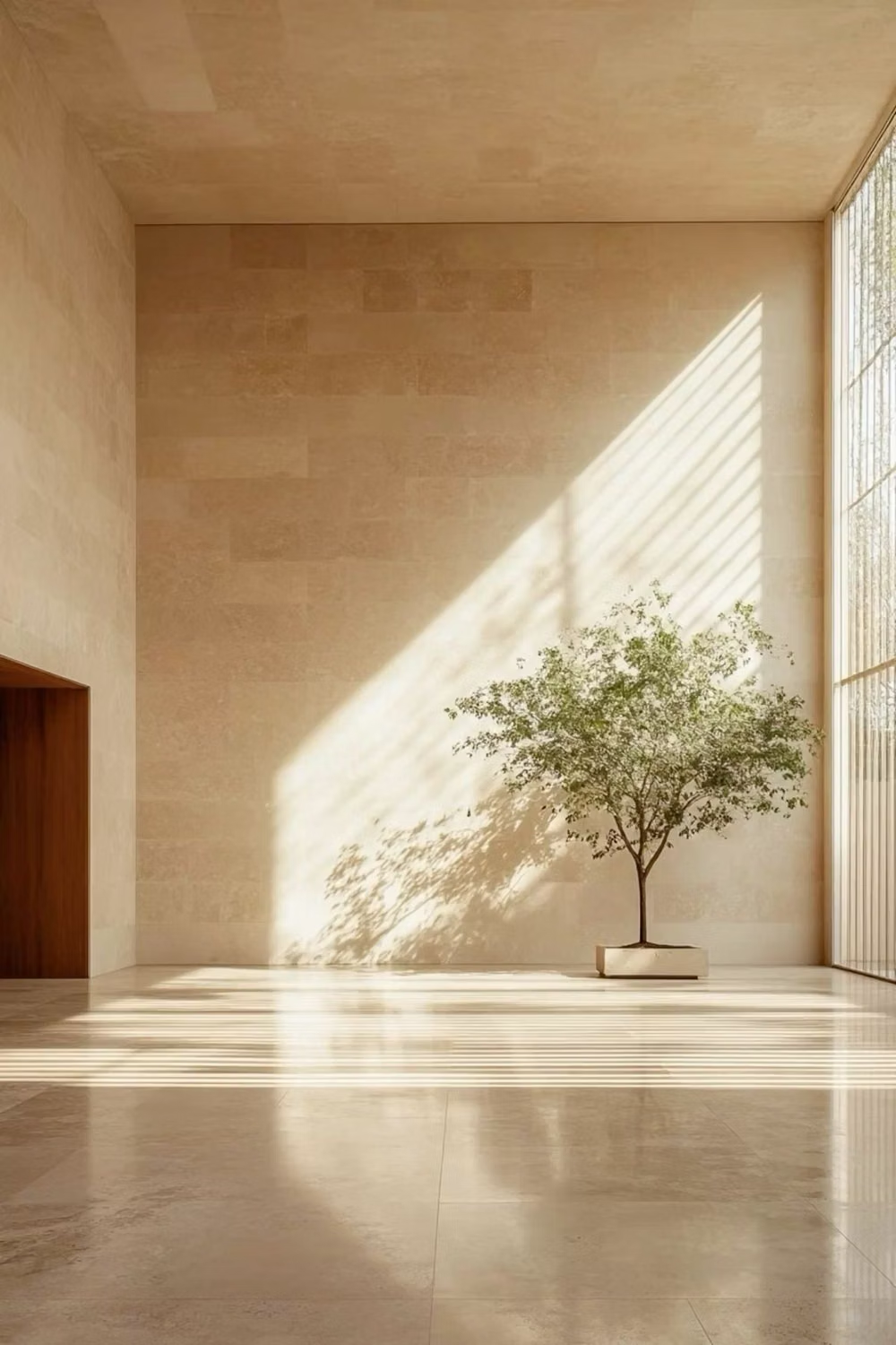
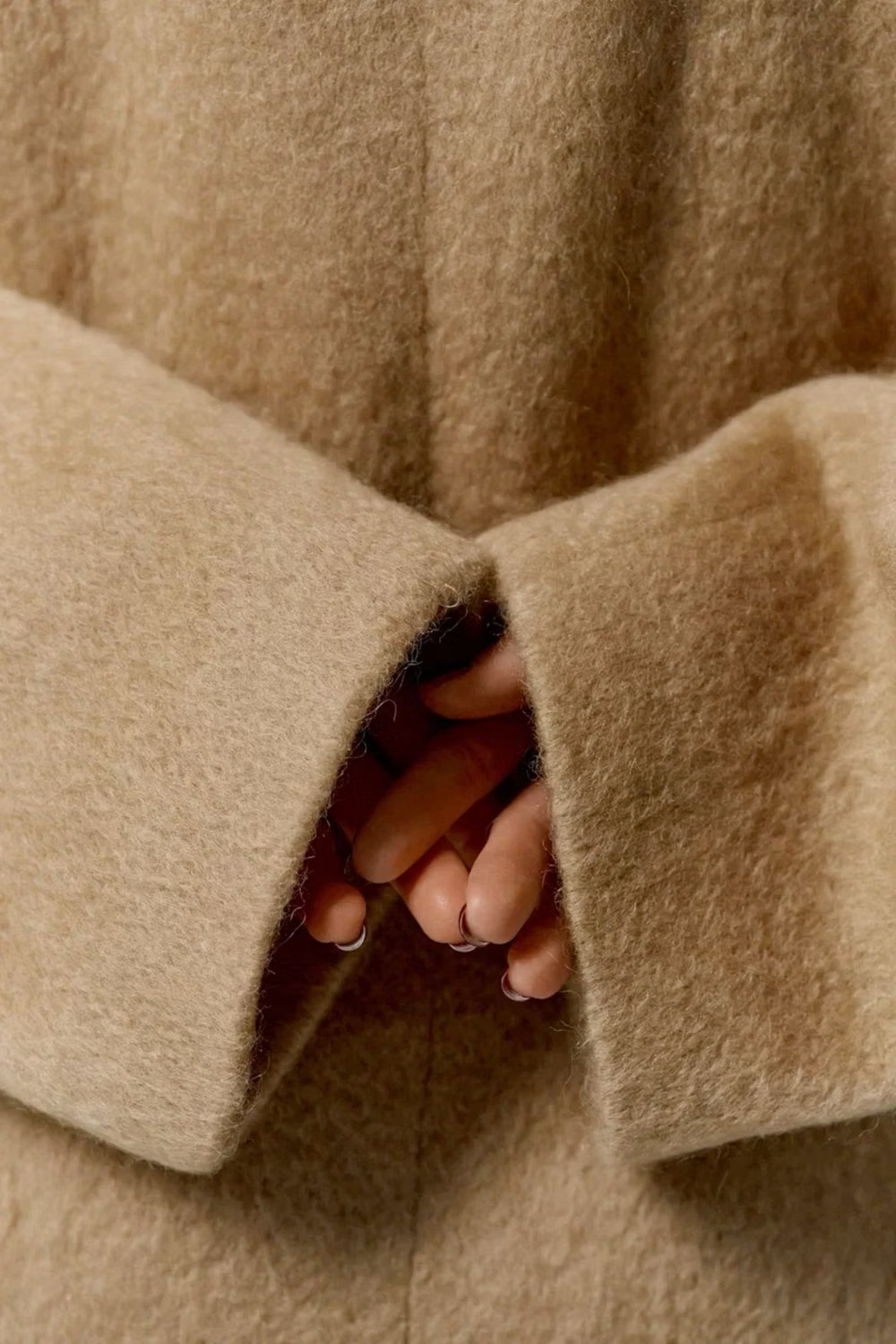
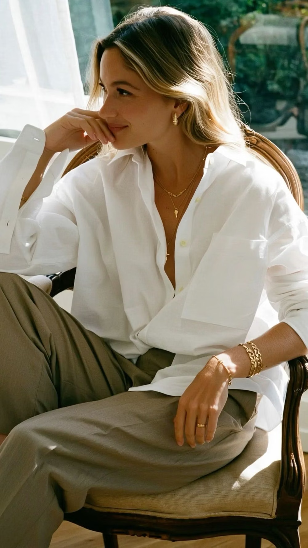
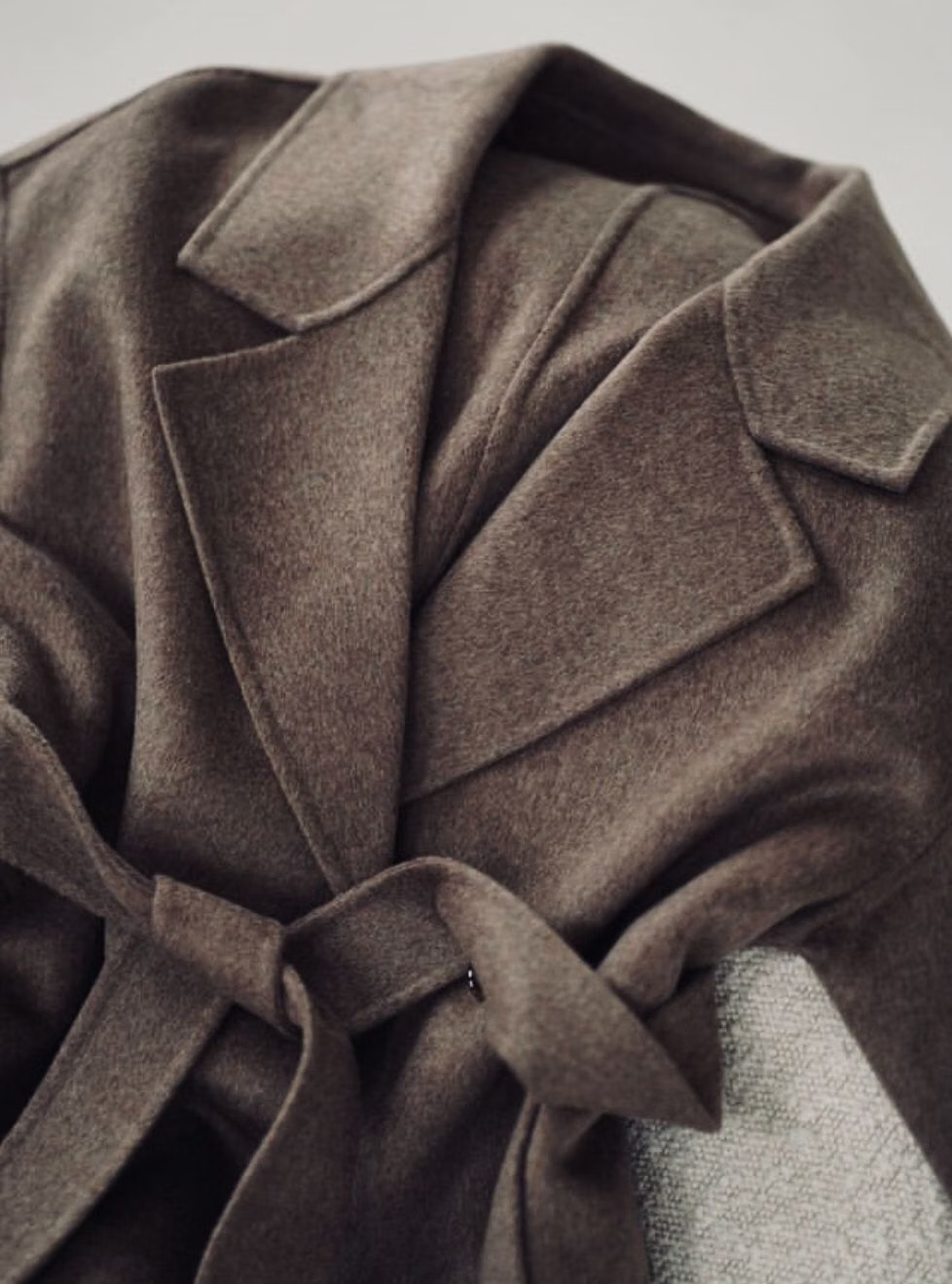
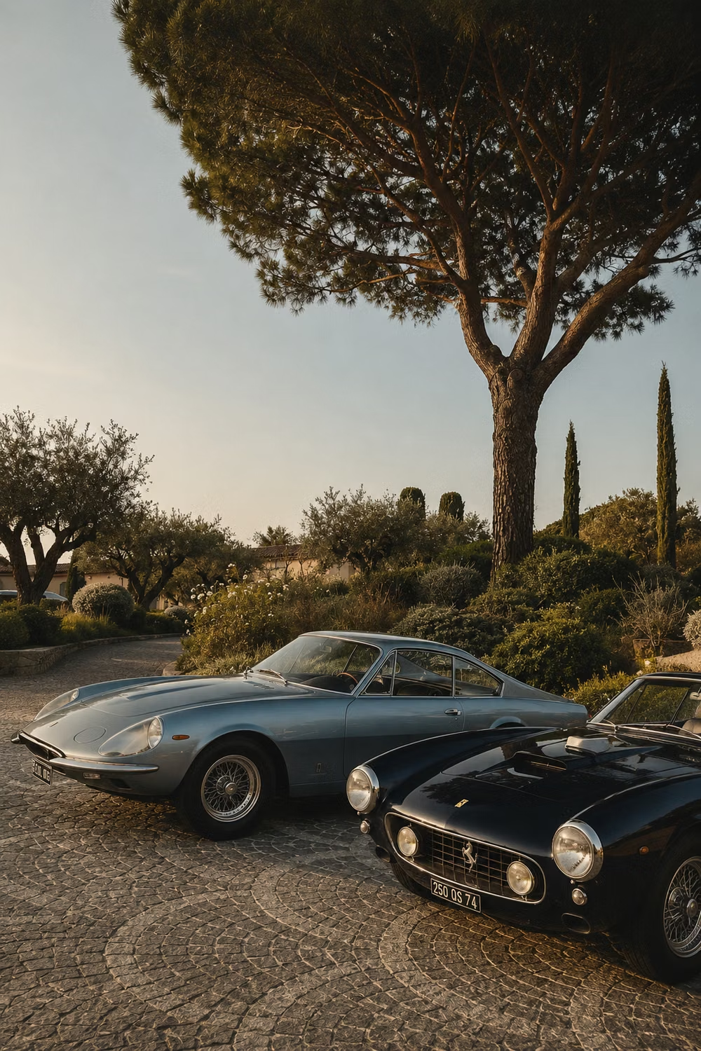
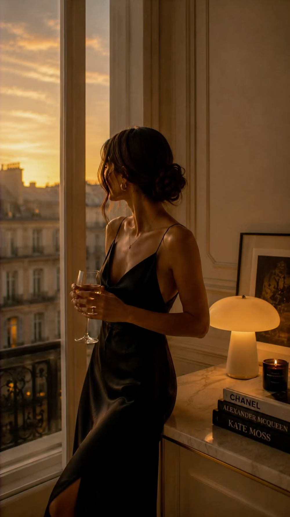
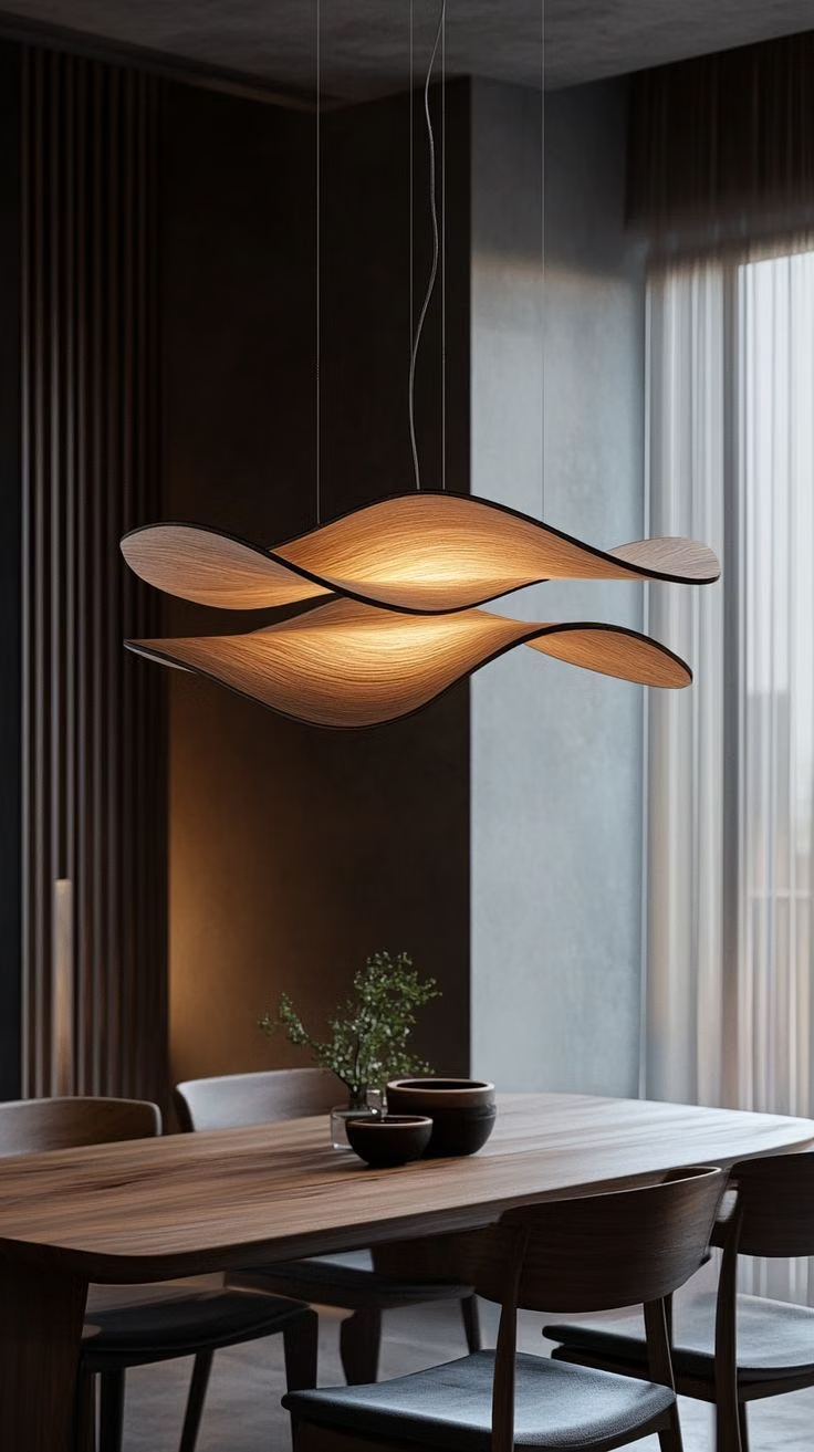
A visual study of the forms, inspirations, materials, colors, type, and cultural references associated with this UI design style.
Design principles and implementation
Use these principles to write a focused AI UI design prompt instead of asking for a vague visual treatment.
Color direction
Choose warm ivory, stone, taupe, ink, and deep brown or navy, adding metallic or brand color only as a fine controlled accent. In a daisyUI theme, use deep brown or navy for `primary`, muted brass or a low-chroma brand tone for `secondary`, and assign warm ivory, pale stone, and taupe to `base-100`, `base-200`, and `base-300`.
Imagery direction
Use high-resolution material studies, architectural space, restrained portraiture, and product photography with soft directional light and precise crops.
Content density
Keep density low, favor concise confident copy, and hide secondary specifications behind elegant progressive disclosure.
Motion direction
Use slow, short-distance fades, image dissolves, and precise hover responses with no bounce, spectacle, or continuous ambient movement.
Shape language
Favor refined rectangles, hairline borders, subtle insets, and small or absent radii; let material and spacing communicate value. In daisyUI themes, set the `--radius-*` variables to `0` or `0.25rem`.
Typography rules
Pair a refined serif or neo-grotesque display face with immaculate body typography, using careful tracking, restrained weights, and generous line spacing.
Suggested Typfaces
Cormorant Garamond
Fresh daisies glow in warm sunlight
Fresh daisies glow in warm sunlight
1 2 3 4 5 6 7 8 9 0
Bodoni Moda
Fresh daisies glow in warm sunlight
Fresh daisies glow in warm sunlight
1 2 3 4 5 6 7 8 9 0
Instrument Serif
Fresh daisies glow in warm sunlight
Fresh daisies glow in warm sunlight
1 2 3 4 5 6 7 8 9 0
DM Serif Display
Fresh daisies glow in warm sunlight
Fresh daisies glow in warm sunlight
1 2 3 4 5 6 7 8 9 0
Manrope
Fresh daisies glow in warm sunlight
Fresh daisies glow in warm sunlight
1 2 3 4 5 6 7 8 9 0
Build a Quiet Luxury interface with daisyUI
The live example translates this direction into daisyUI components and semantic theme tokens.
To generate a full page in the same visual language, give the style name and the design rules above to Blueprint MCP.
Related UI design styles
Compare nearby visual languages that share typography, shapes, use cases, or signature elements.
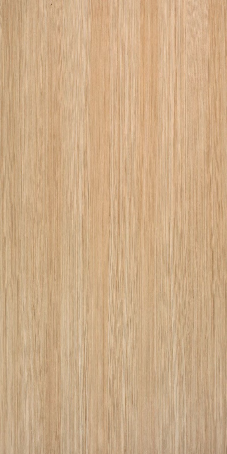
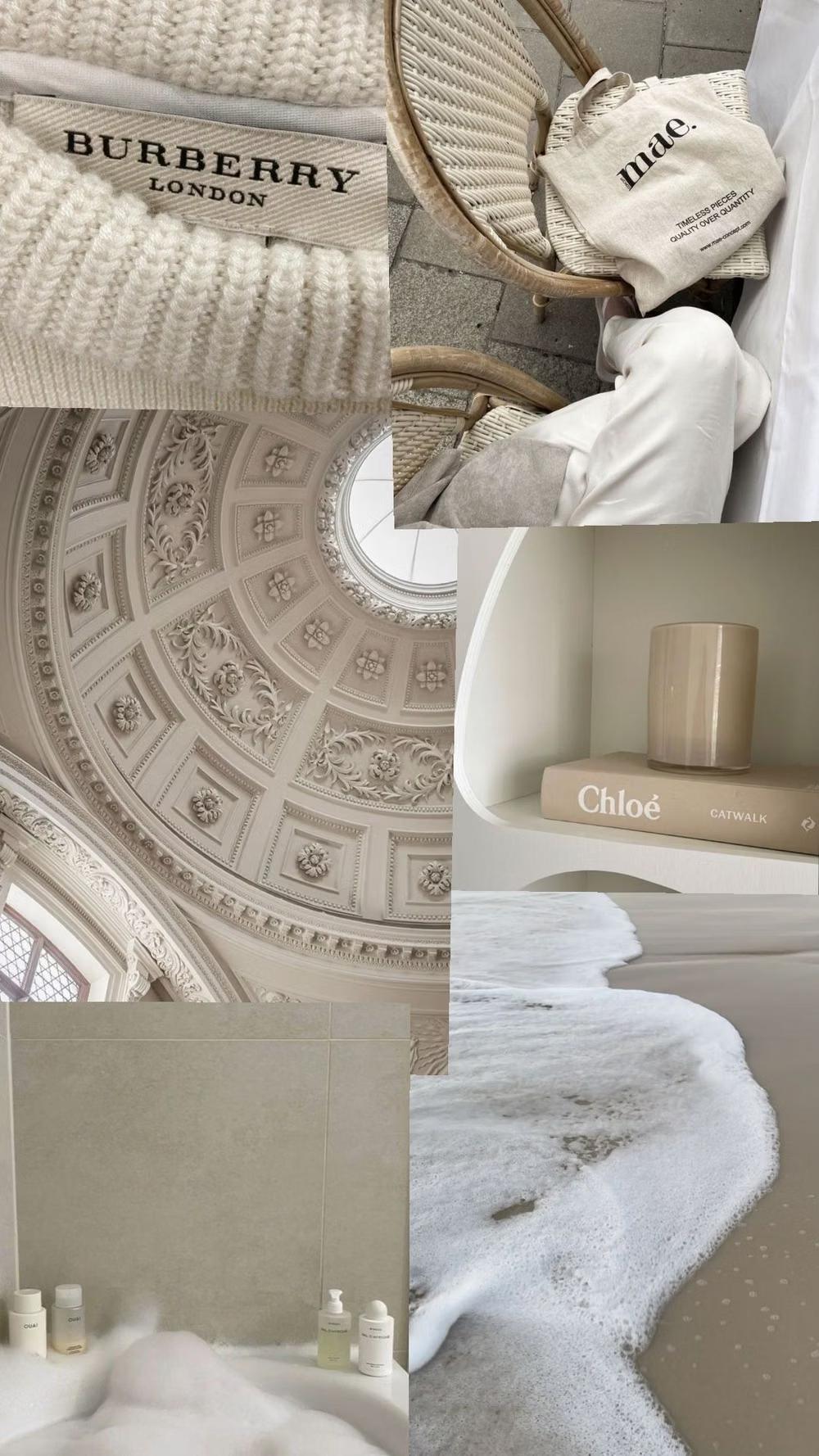
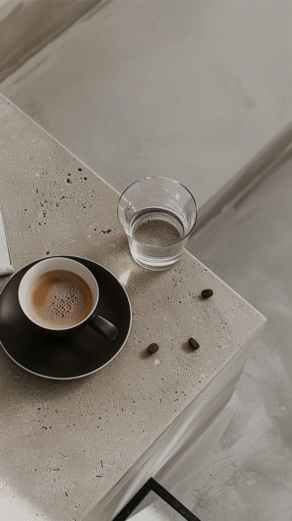
Millennial Beige UI design style
A calm tonal aesthetic layers cream, tan, sand, taupe, and greige with tactile natural details, soft contrast, and intentional empty space.

Scandinavian Modern UI design style
Functional simplicity, light palettes, warm natural materials, clean lines, and friendly human-centered restraint.
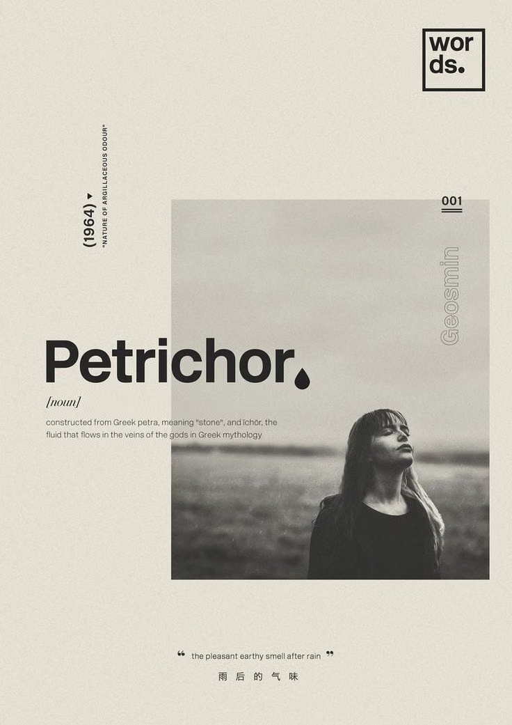
Editorial Design UI design style
Magazine-inspired layouts with dramatic typography, art-directed imagery, columns, captions, and deliberate pacing.