Editorial Design UI design style
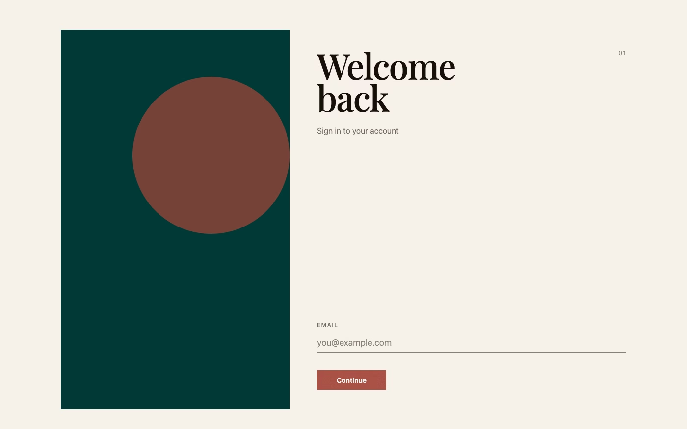
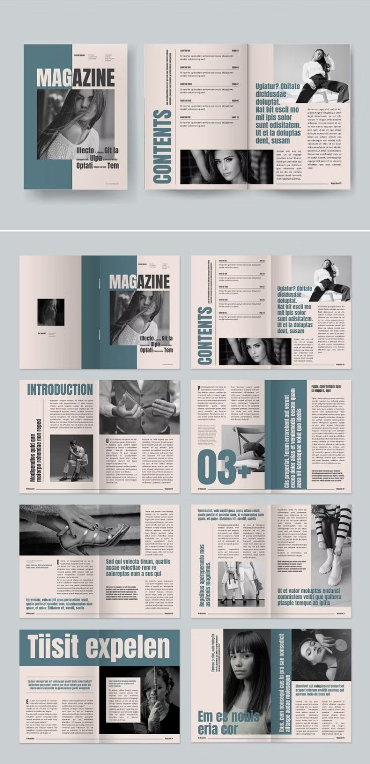
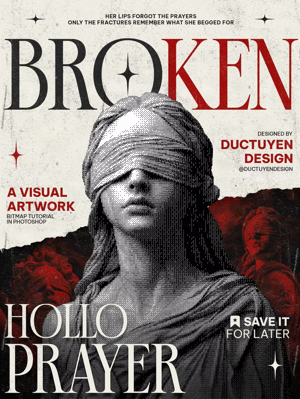
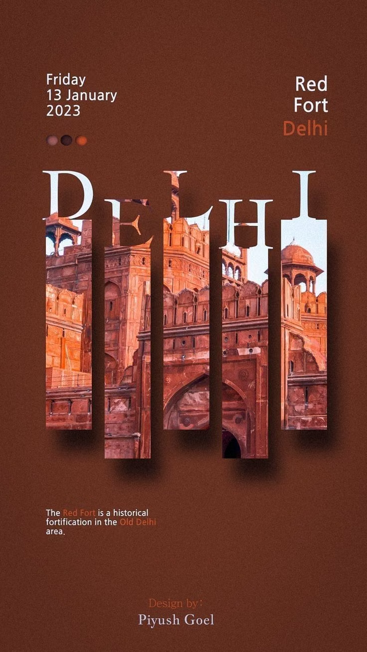
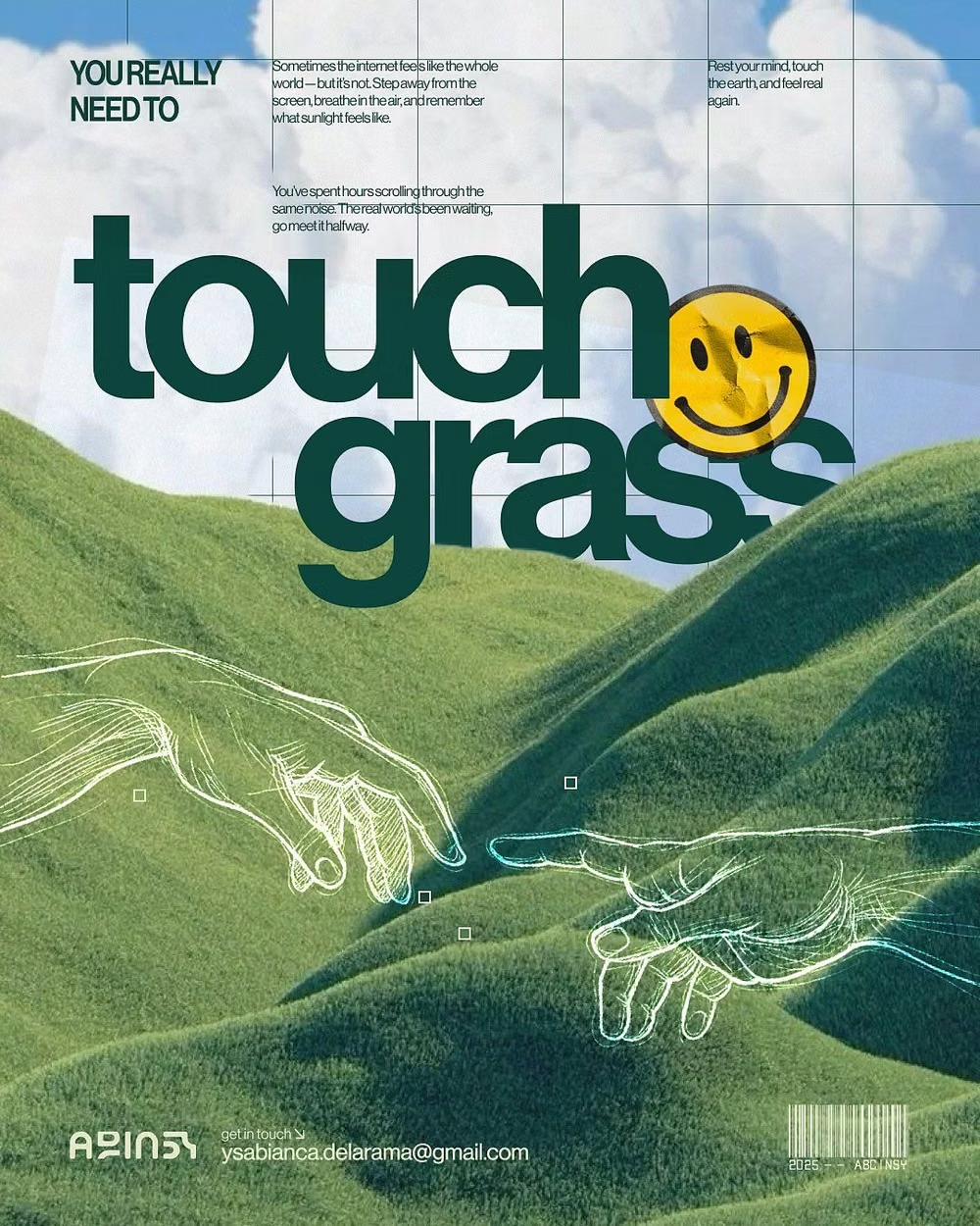
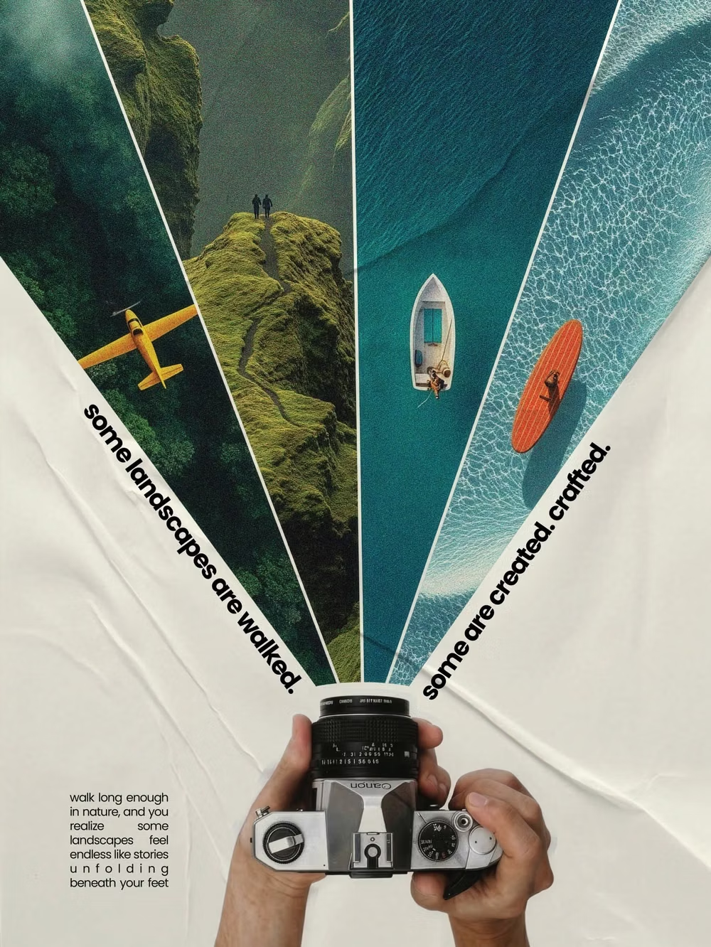
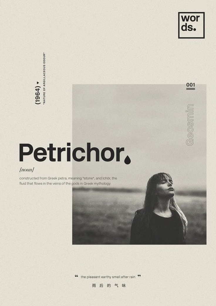
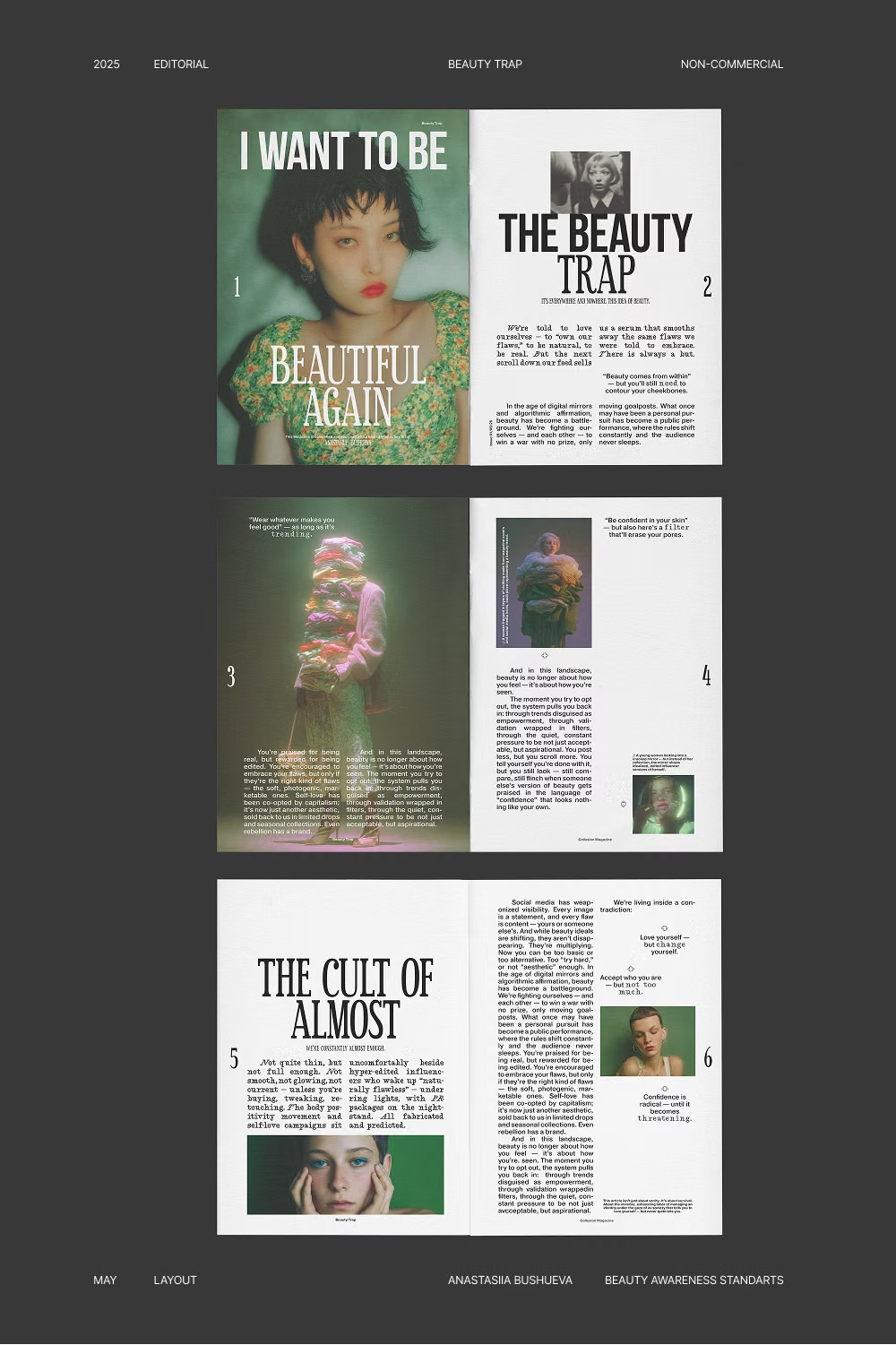
Magazine-inspired layouts with dramatic typography, art-directed imagery, columns, captions, and deliberate pacing.
Design overview
- Signature elements
- display serif headlines, multi-column grid, art-directed photography, pull quotes, captions, varied pacing
- Best suited to
- Publishing, fashion, portfolios, cultural institutions, and premium e-commerce.
- Layout principles
- Alternate multi-column reading pages, full-bleed visual spreads, pull quotes, and narrow caption rails to create magazine-like pacing across the experience.
History and origins
A fact-checked account of where this visual language came from, with links to the references used.
- Period
- Print lineage from early periodicals; digital adaptation since the 1990s
- Origin
- Newspaper, magazine, and book publishing across Europe and the Americas
Editorial design is a professional field rather than one visual movement. Its systems of columns, headlines, captions, sequence, and image hierarchy developed through books, newspapers, and magazines, then transferred to the web as publications learned to preserve editorial pacing across variable screens; modern digital versions often combine that lineage with Swiss grids and art-direction traditions.
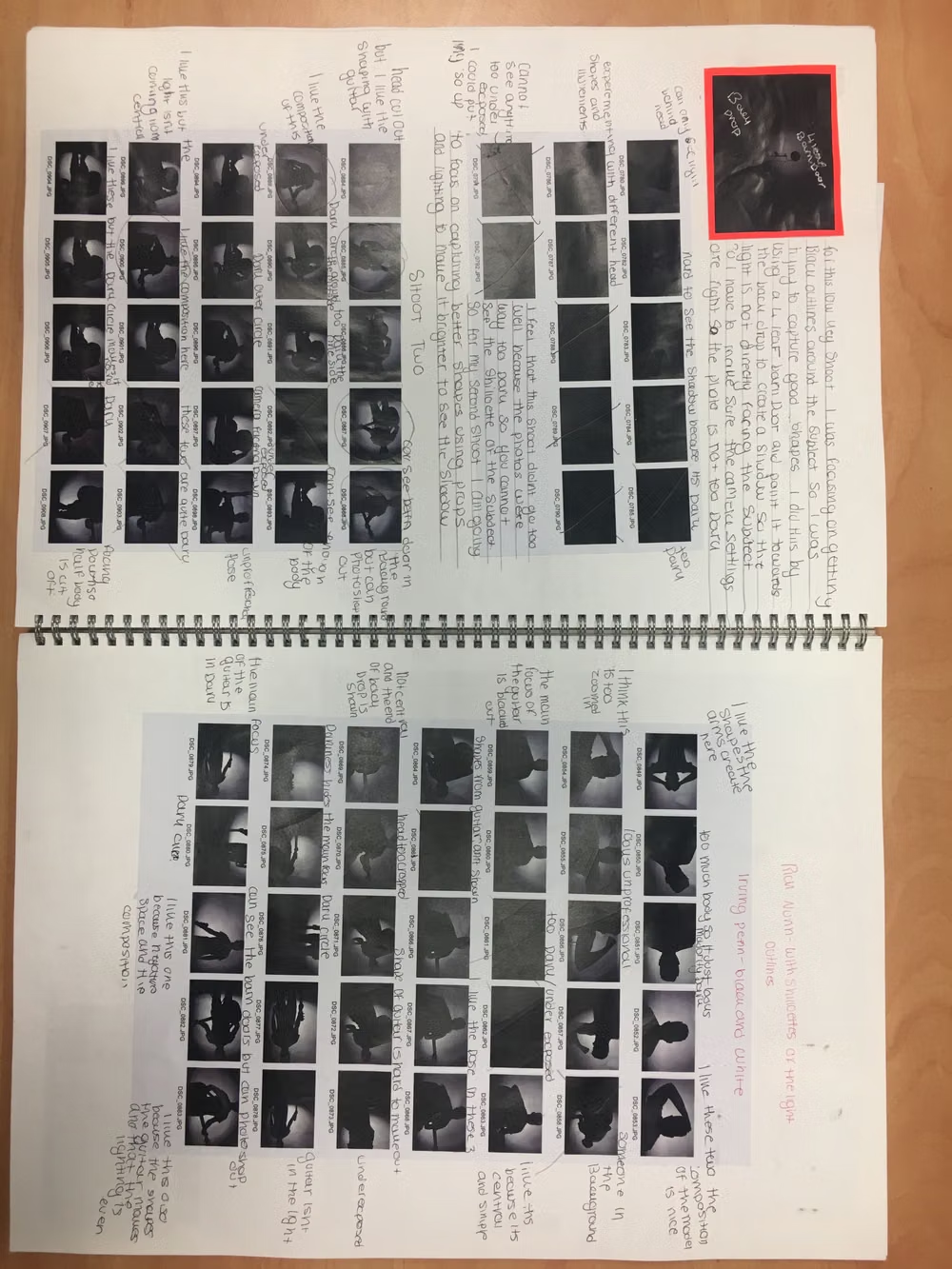
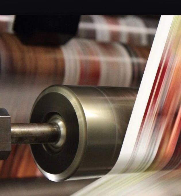
Moodboard and visual references
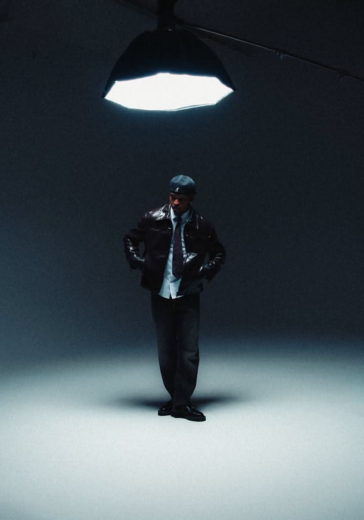
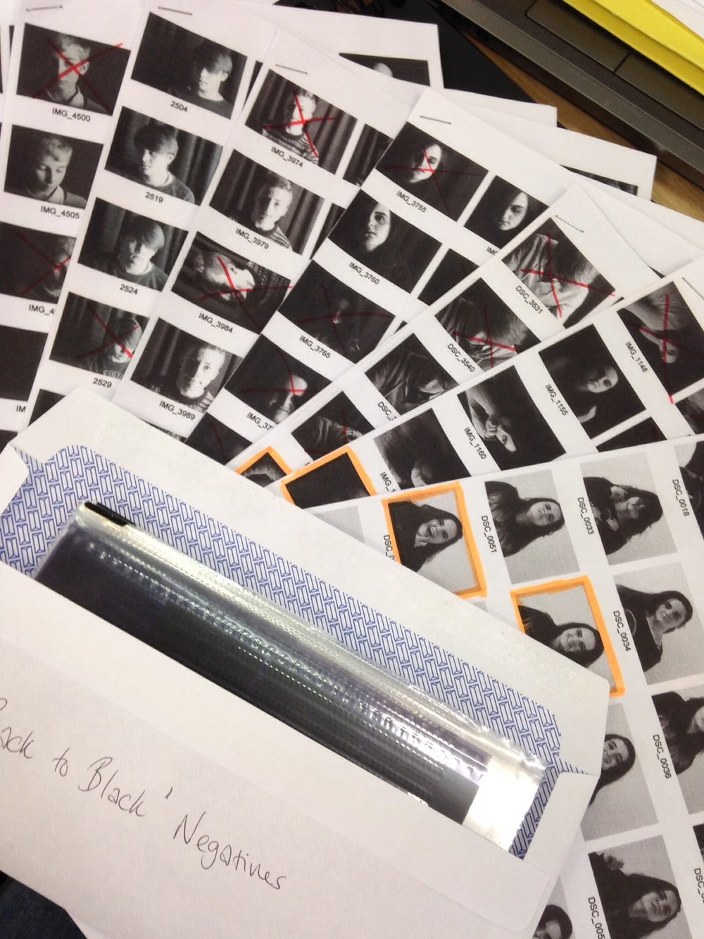
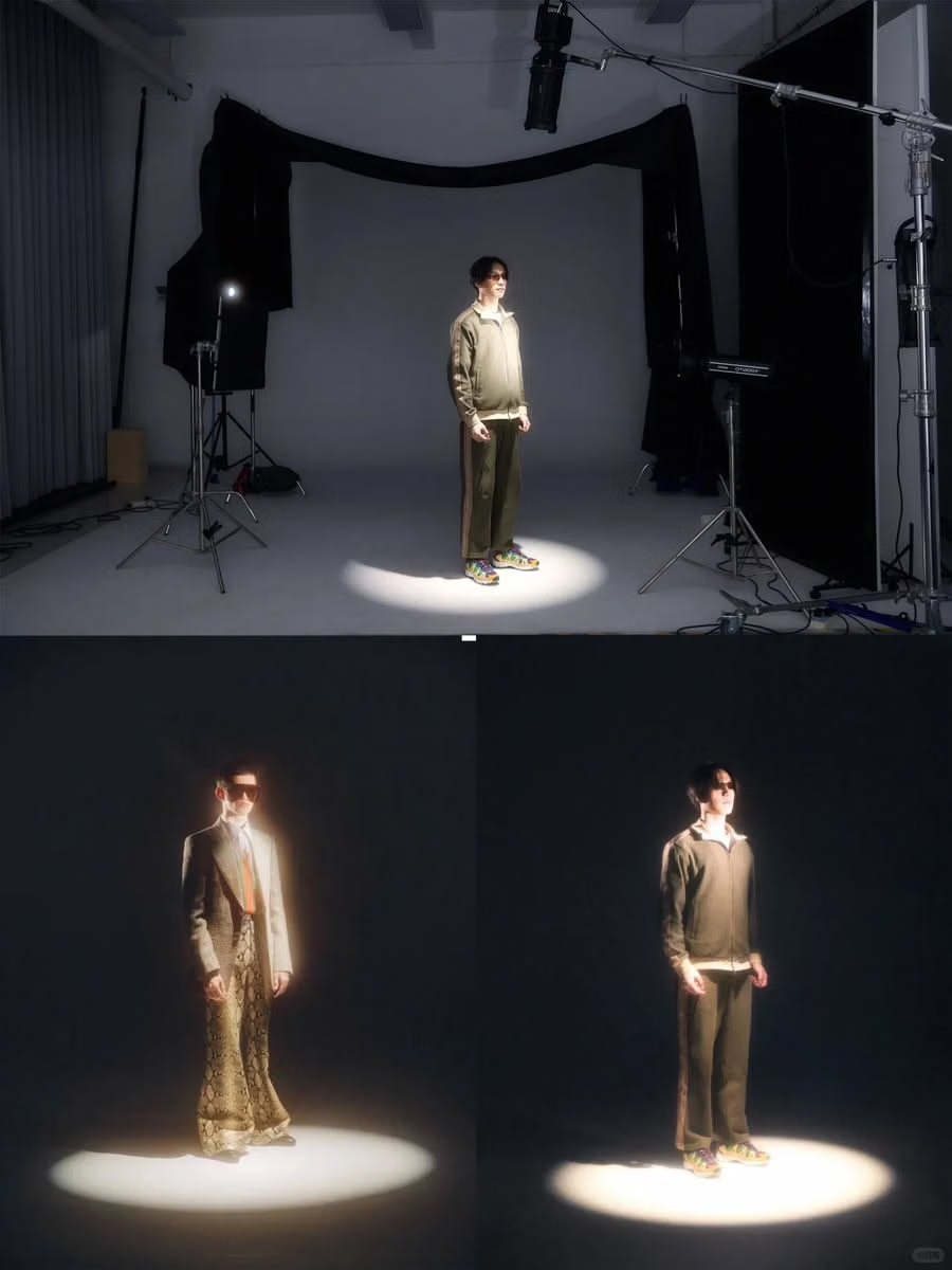
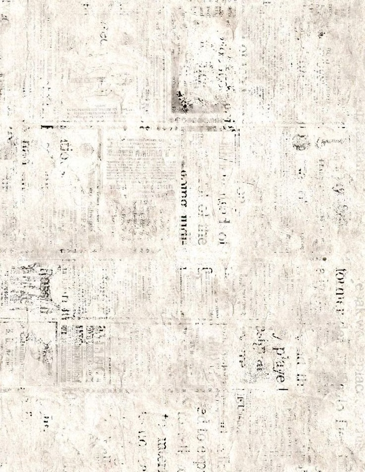
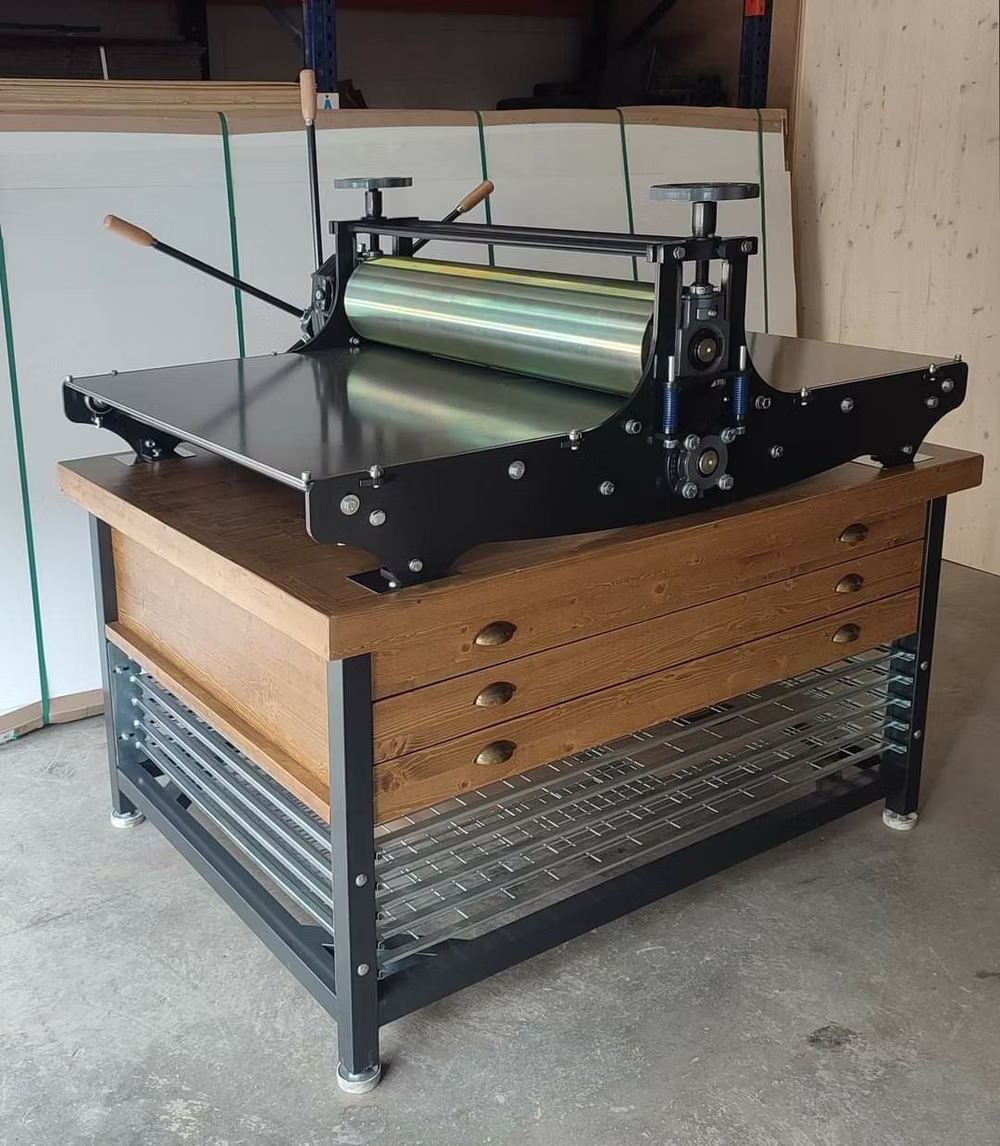
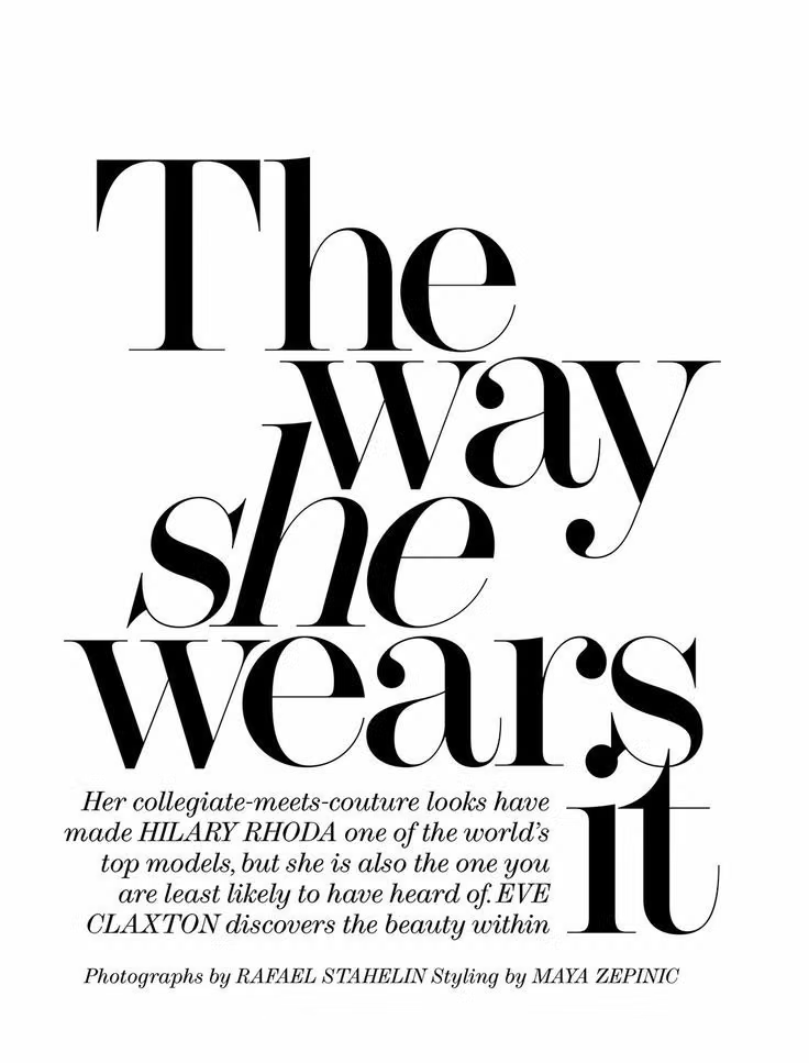
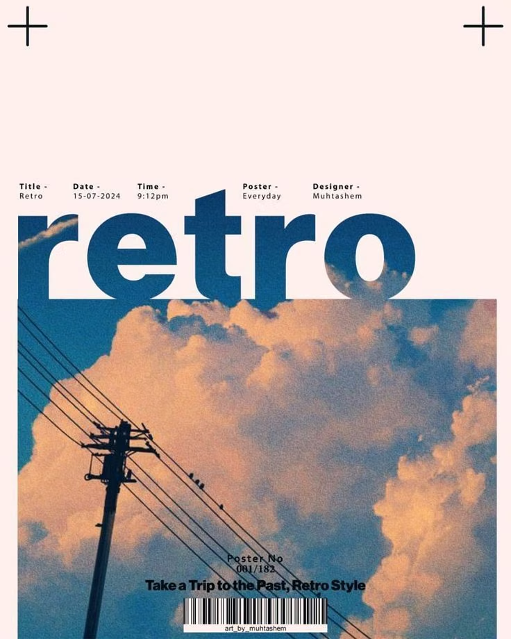
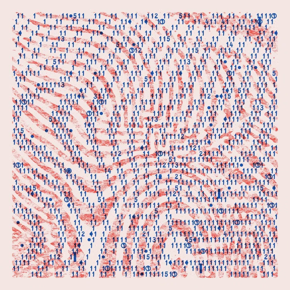
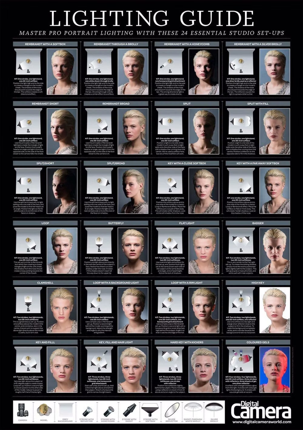
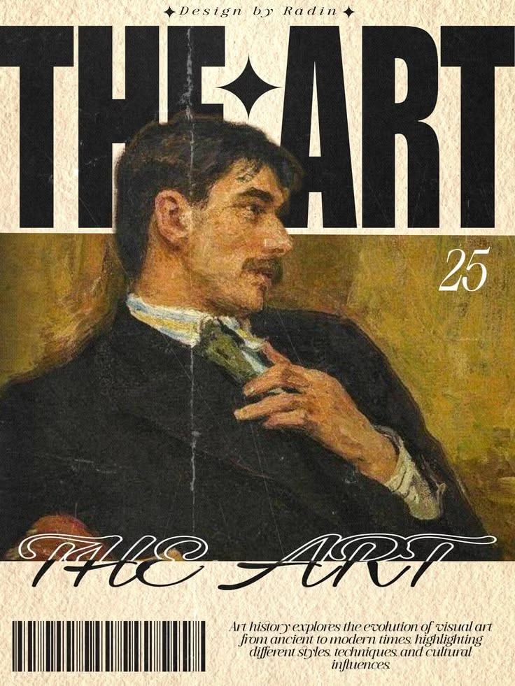
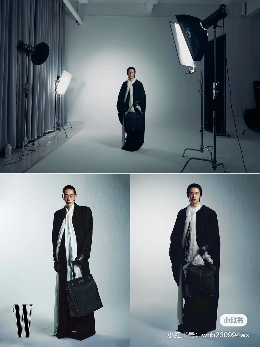
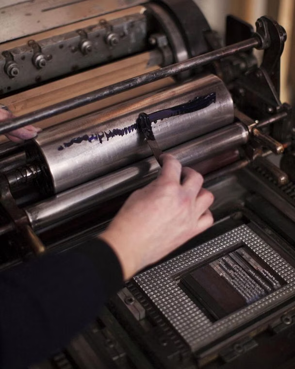
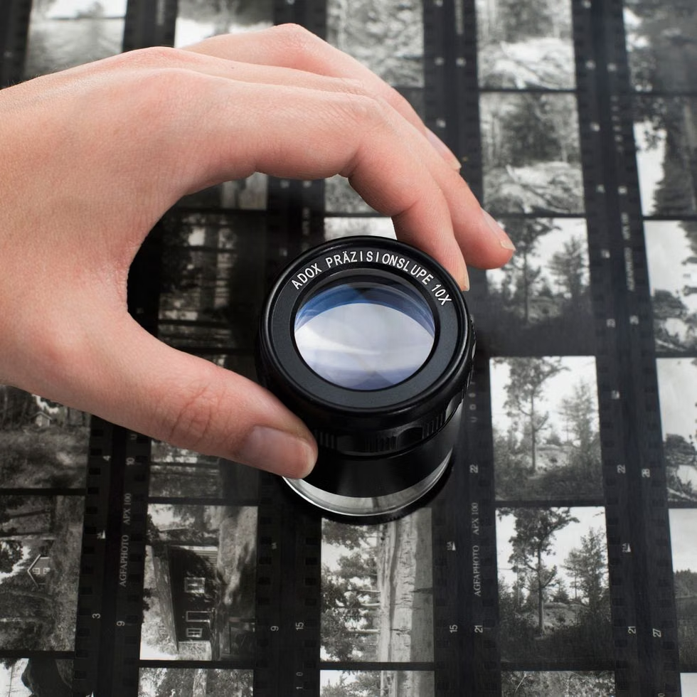
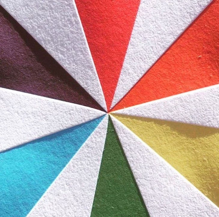
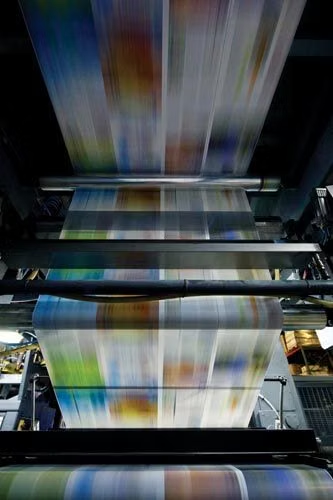
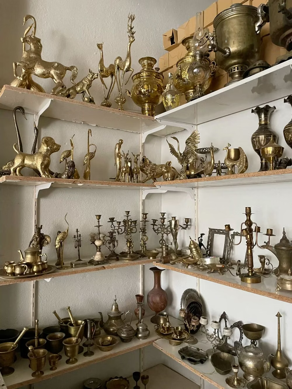
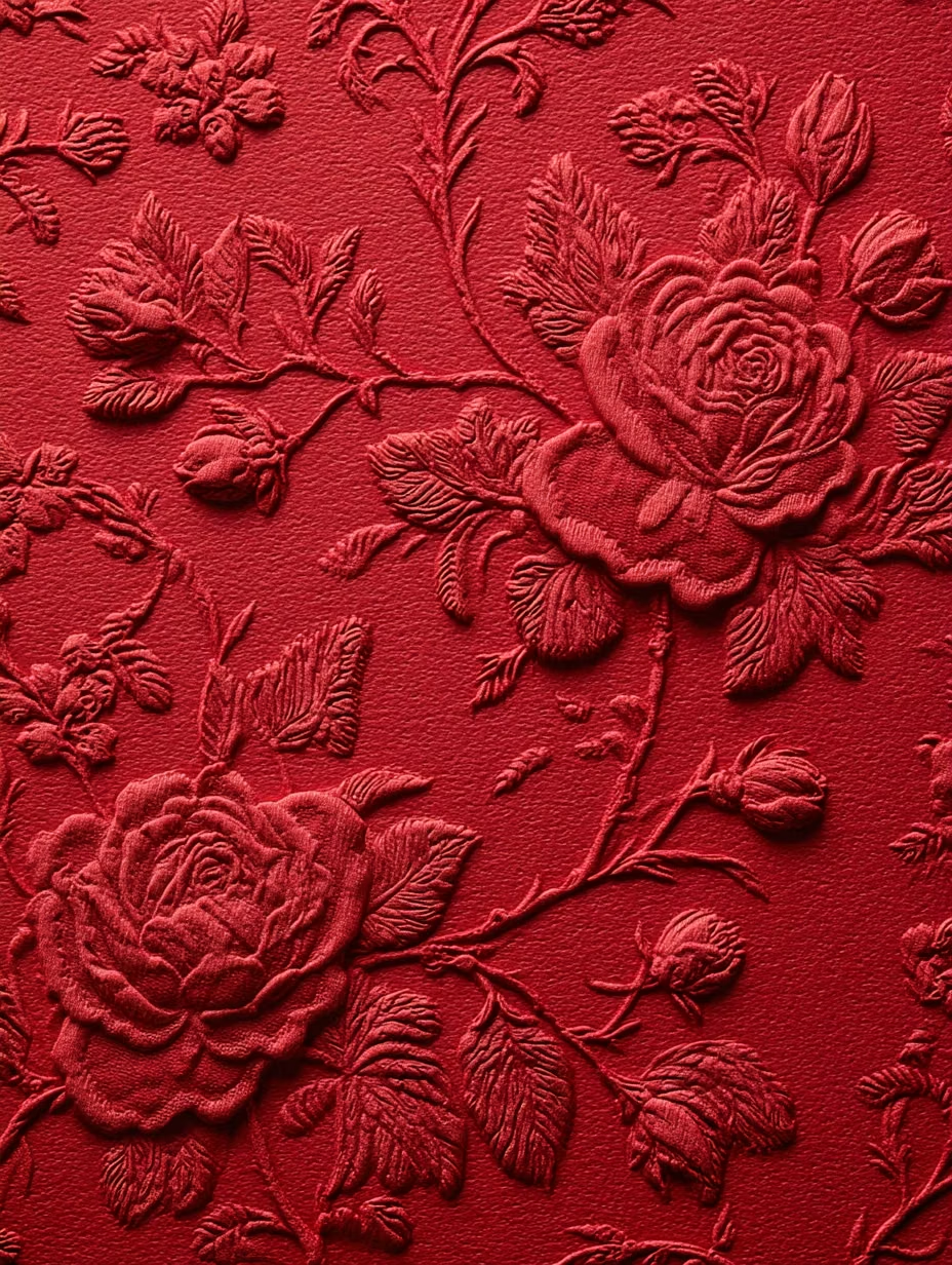
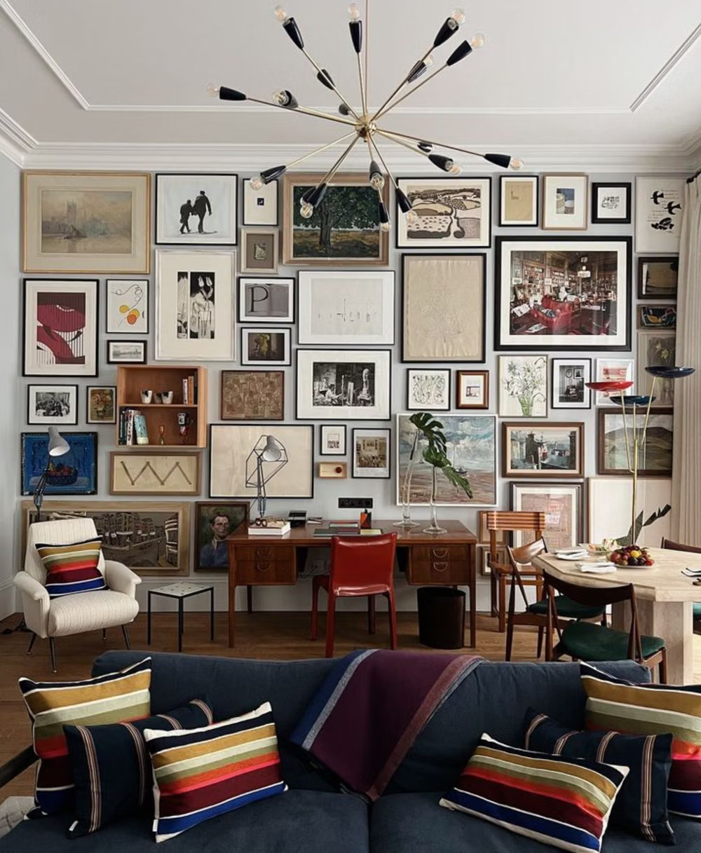
A visual study of the forms, inspirations, materials, colors, type, and cultural references associated with this UI design style.

Design principles and implementation
Use these principles to write a focused AI UI design prompt instead of asking for a vague visual treatment.
Color direction
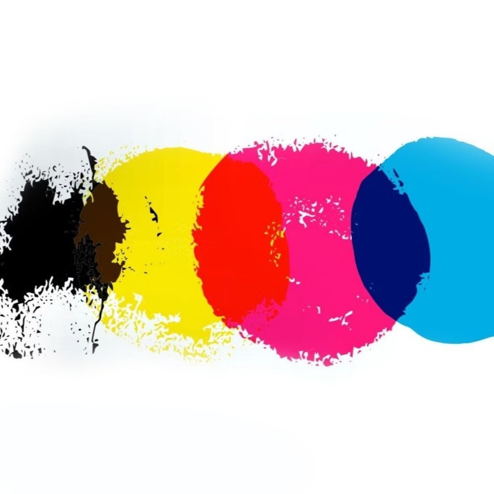
Start with paper and ink neutrals, then introduce one issue-like seasonal accent drawn from the lead photography or subject matter. In a daisyUI theme, use the issue's seasonal accent for `primary`, a quieter ink or photo-derived companion for `secondary`, and assign clean paper, warm off-white, and pale newsprint to `base-100`, `base-200`, and `base-300`.
Imagery direction
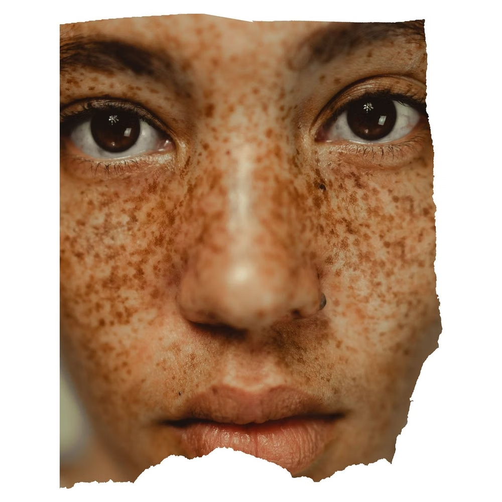
Commission or select art-directed photography with deliberate crops, captions, credits, sequencing, and occasional full-viewport impact.
Content density
Vary rhythm on purpose, moving from dense reading passages to sparse image-led pauses instead of giving every section equal weight.
Motion direction
Use scroll-linked crop reveals, page-like masks, caption entrances, and restrained crossfades that preserve the feeling of turning through a publication.
Shape language
Favor column boundaries, hairline rules, image frames, folio marks, and inset quotations over generic rounded cards. In daisyUI themes, set the `--radius-*` variables to `0` or `0.25rem`.
Typography rules
Pair a characterful display serif with a disciplined sans-serif, use a clear headline-deck-body-caption ladder, and tune line length and leading for sustained reading.
Suggested Typfaces
Playfair Display
Fresh daisies glow in warm sunlight
Fresh daisies glow in warm sunlight
1 2 3 4 5 6 7 8 9 0
Cormorant Garamond
Fresh daisies glow in warm sunlight
Fresh daisies glow in warm sunlight
1 2 3 4 5 6 7 8 9 0
Newsreader
Fresh daisies glow in warm sunlight
Fresh daisies glow in warm sunlight
1 2 3 4 5 6 7 8 9 0
DM Serif Display
Fresh daisies glow in warm sunlight
Fresh daisies glow in warm sunlight
1 2 3 4 5 6 7 8 9 0
Libre Baskerville
Fresh daisies glow in warm sunlight
Fresh daisies glow in warm sunlight
1 2 3 4 5 6 7 8 9 0
Build a Editorial Design interface with daisyUI
The live example translates this direction into daisyUI components and semantic theme tokens.
To generate a full page in the same visual language, give the style name and the design rules above to Blueprint MCP.
Related UI design styles
Compare nearby visual languages that share typography, shapes, use cases, or signature elements.
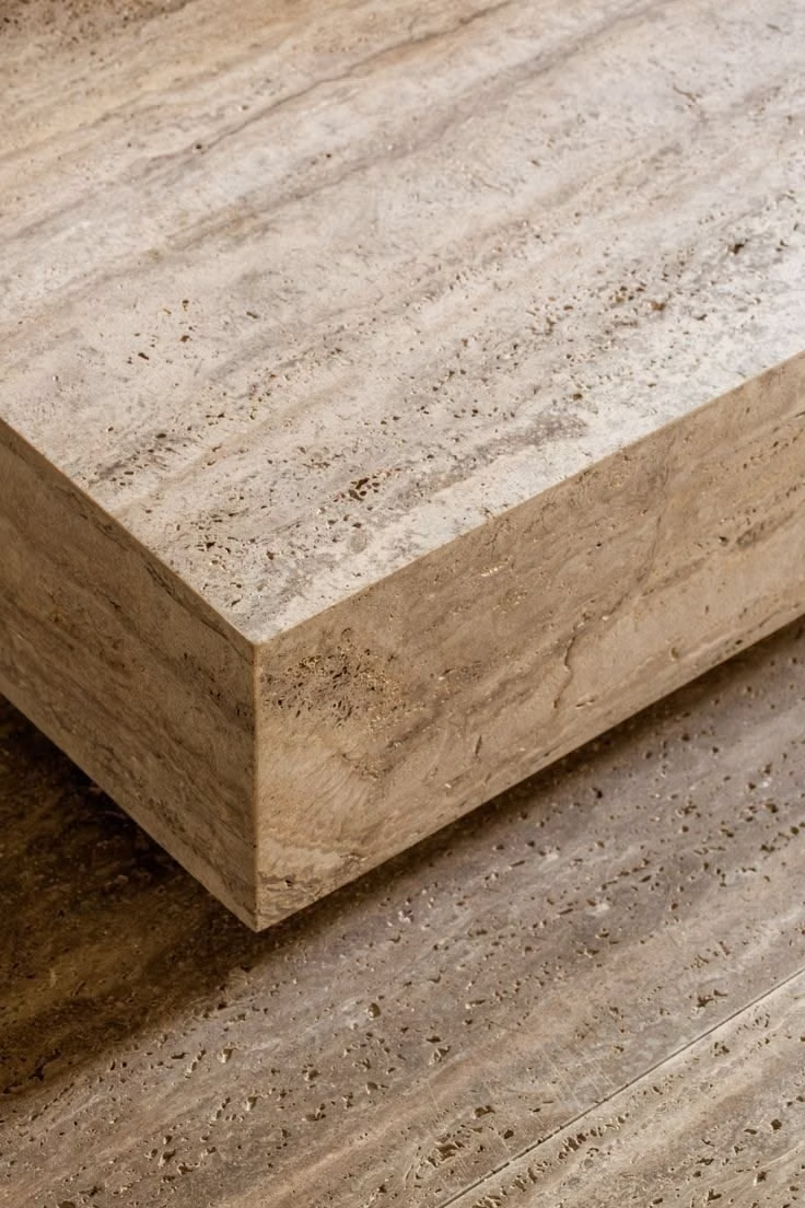
Quiet Luxury UI design style
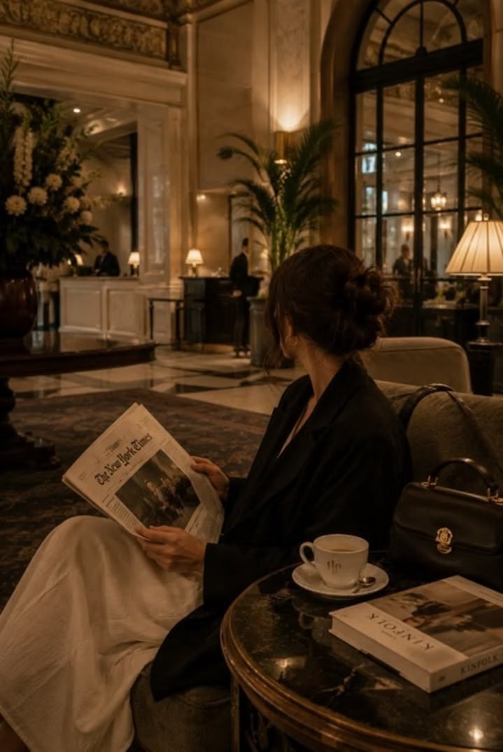
Restrained palettes, refined serif or neo-grotesque type, generous space, subtle motion, and meticulous premium detail.
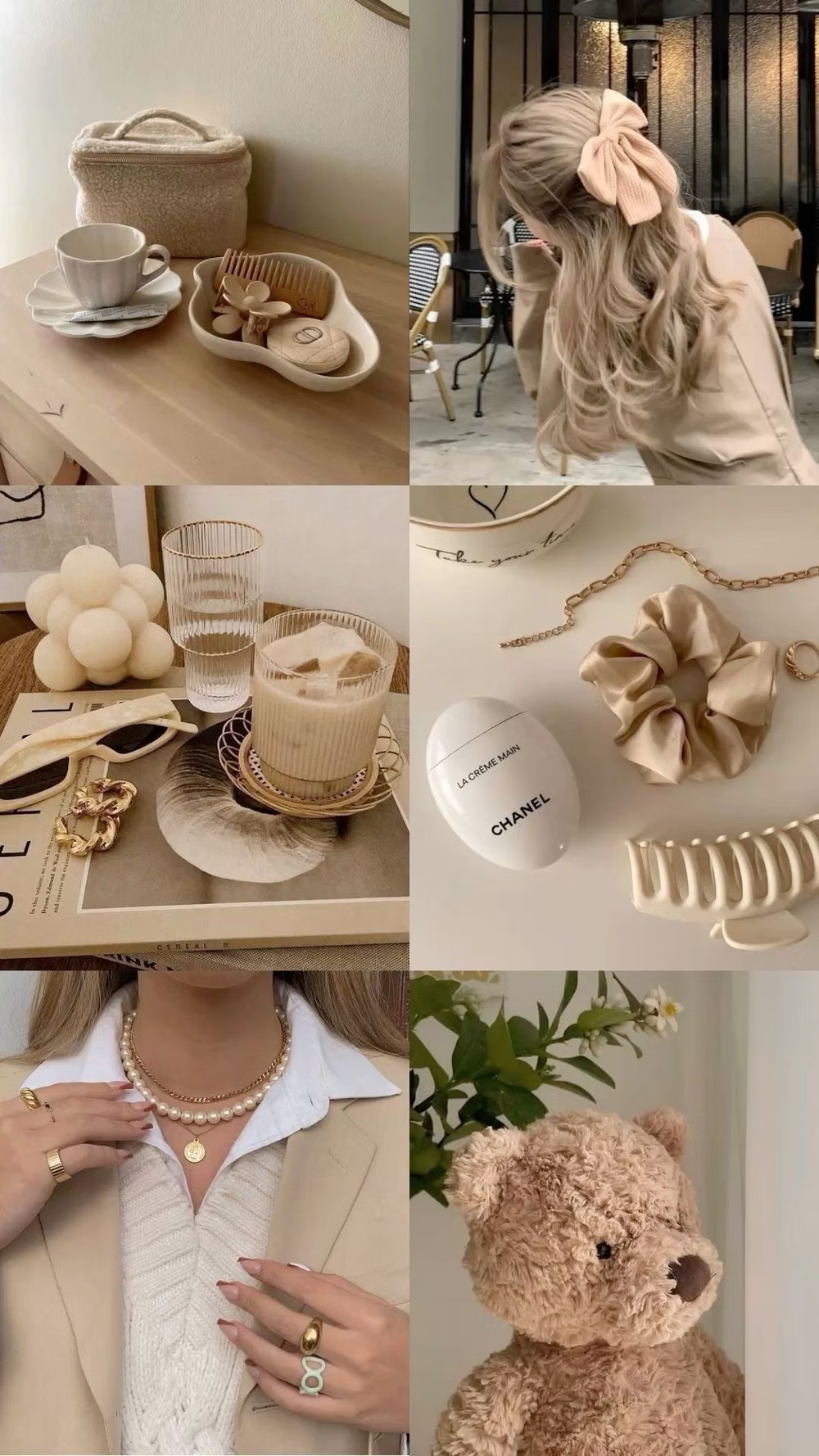
Millennial Beige UI design style
A calm tonal aesthetic layers cream, tan, sand, taupe, and greige with tactile natural details, soft contrast, and intentional empty space.
Maximalism UI design style
Dense compositions combine expressive typography, vivid color, layered imagery, pattern, and abundant decoration.