Web 1.0 / Webcore UI design style
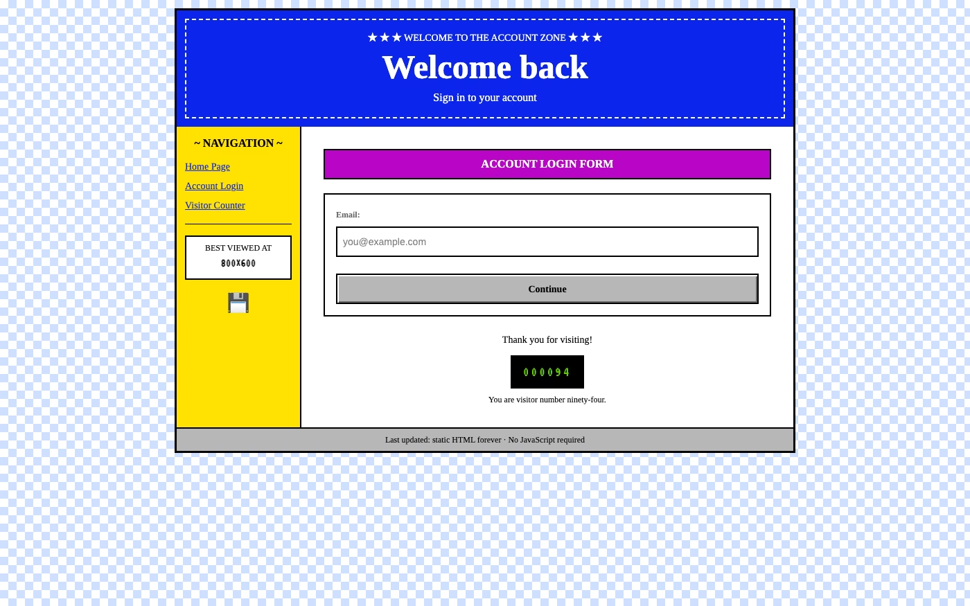
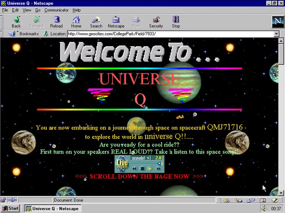
Browser-default typography, tiled backgrounds, beveled buttons, underlined links, animated GIFs, badges, counters, and visibly handmade pages.
Design overview
- Signature elements
- browser-default type, blue underlined links, tiled backgrounds, beveled buttons, animated GIFs, visitor counters. In daisyUI themes, set `--depth: 1;`.
- Best suited to
- Personal sites, art projects, developer communities, games, and nostalgic web experiences.
- Layout principles
- Use visible document flow, table-like framing, persistent side navigation, and stacked page sections that feel hand-assembled rather than app-shell polished.
History and origins
A fact-checked account of where this visual language came from, with links to the references used.
- Period
- 1991–late 1990s as a source period; later nostalgia label
- Origin
- Early World Wide Web communities
The first public web pages appeared after Tim Berners-Lee developed the World Wide Web at CERN and released its software more broadly in 1991. Early pages were shaped by limited HTML, slow networks, small displays, and hand-authored documents rather than a coordinated aesthetic; “Webcore” later turned tables, default links, badges, counters, tiled backgrounds, and GIFs into nostalgic style markers.
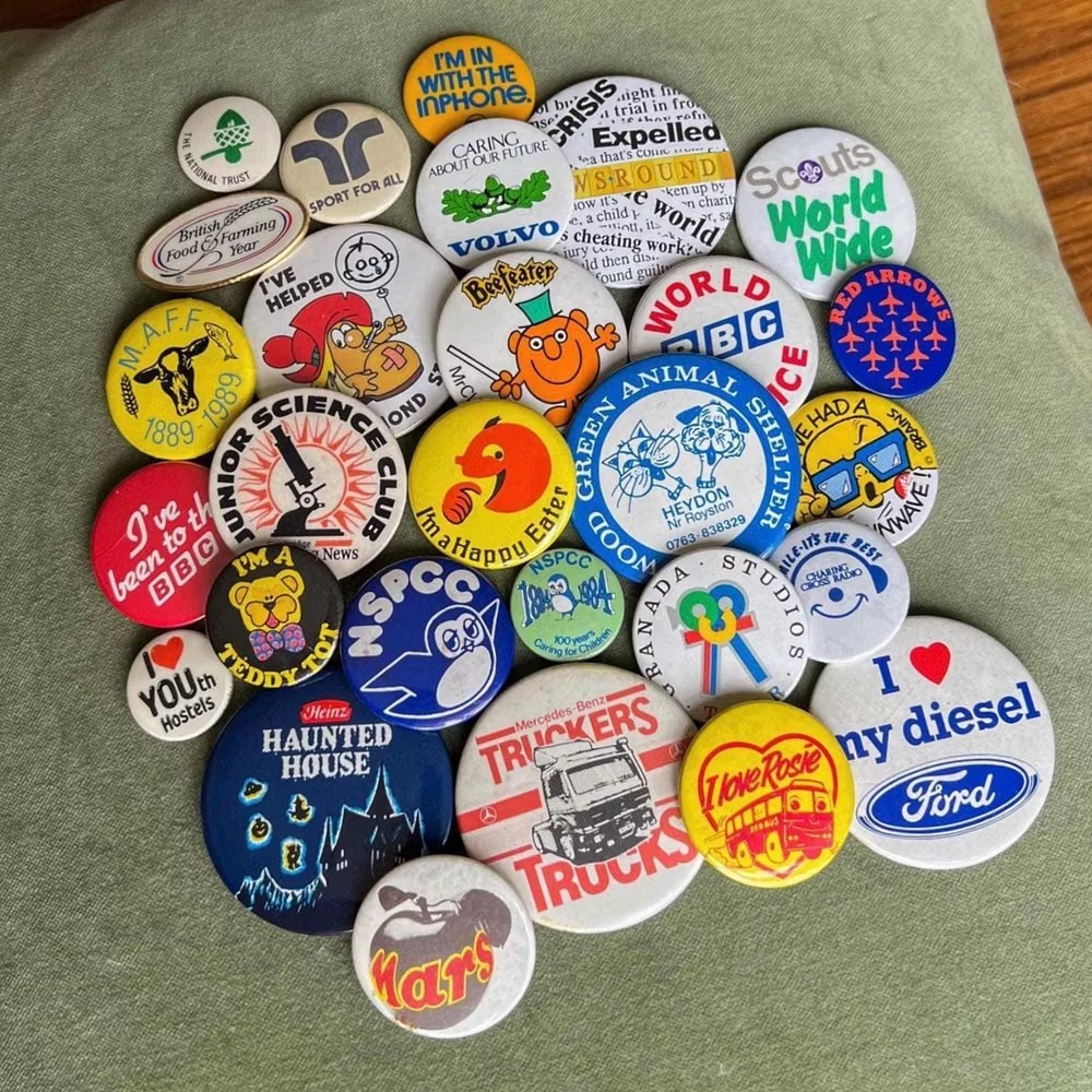
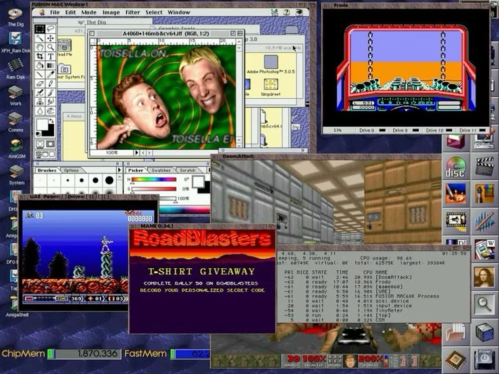
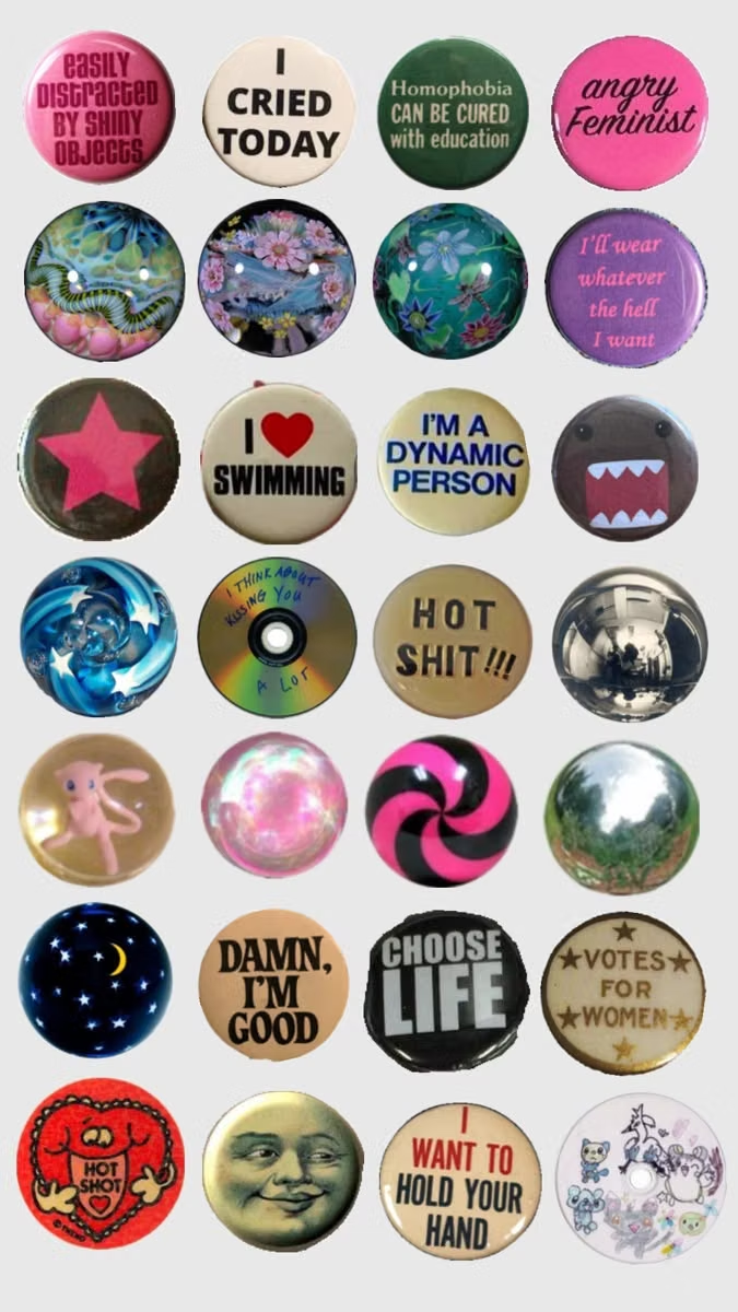
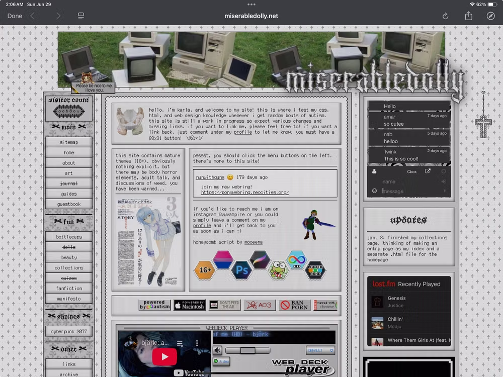
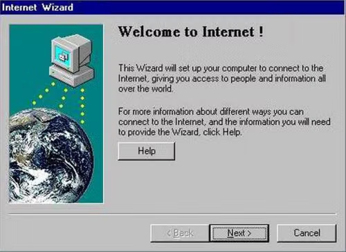
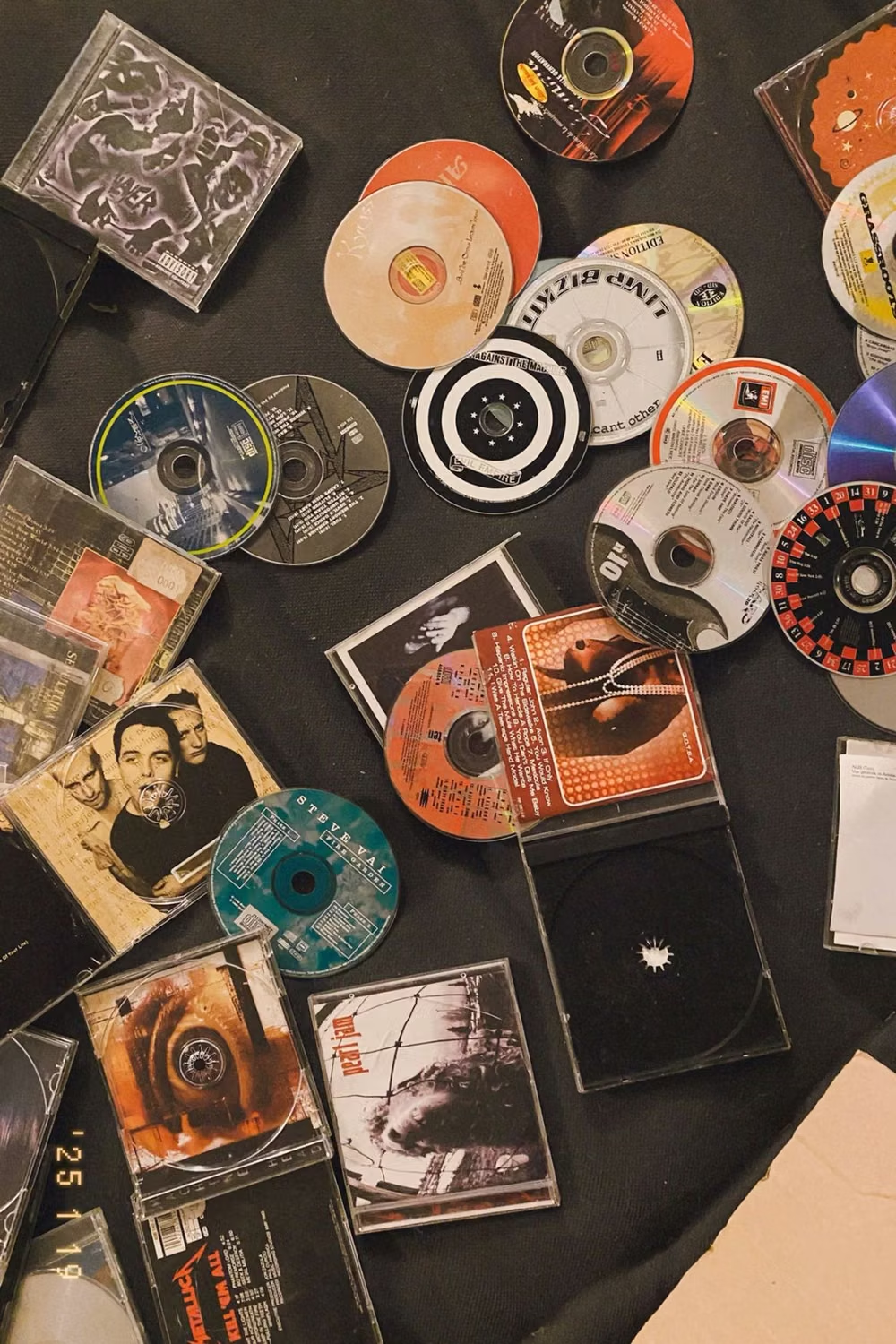
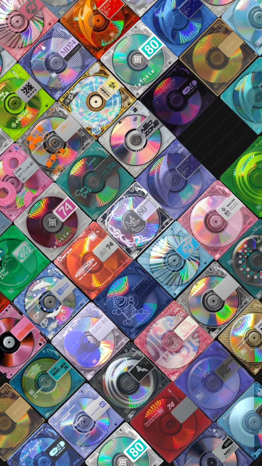
Moodboard and visual references
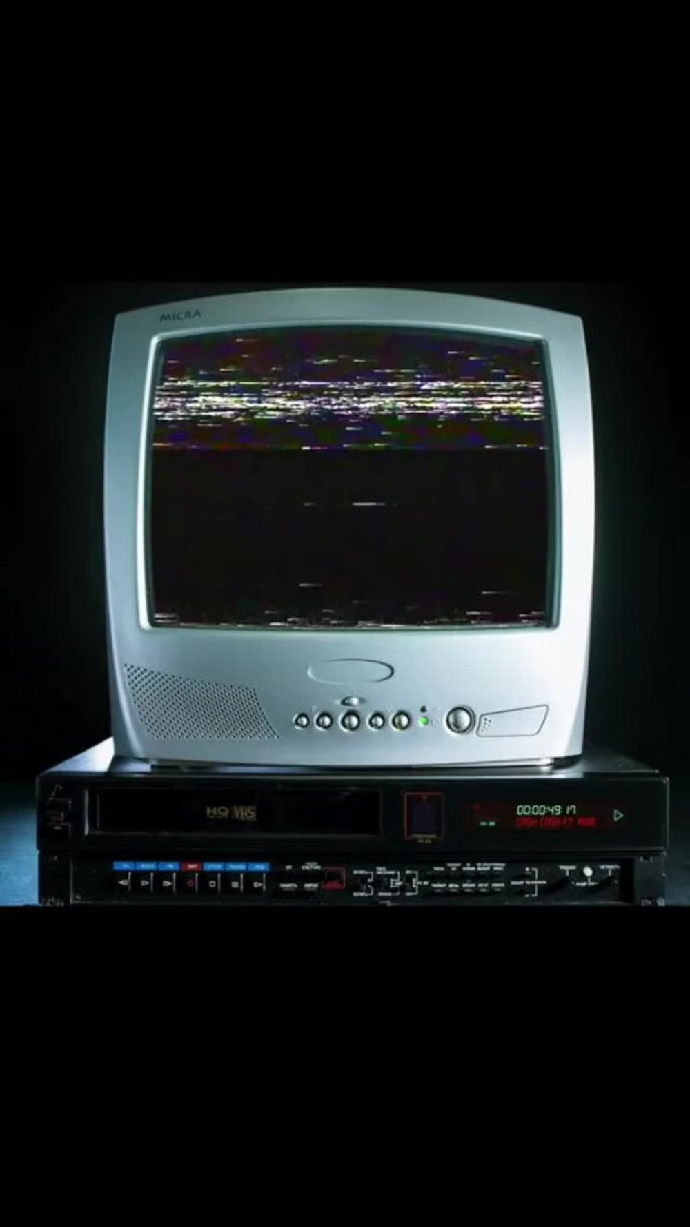
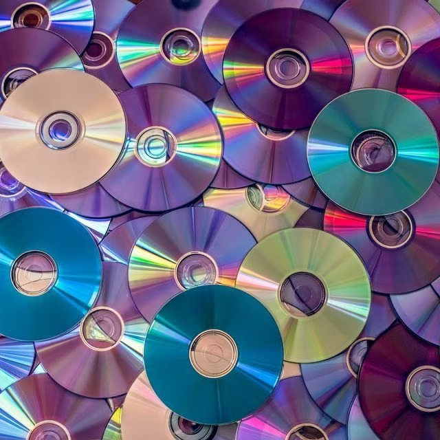
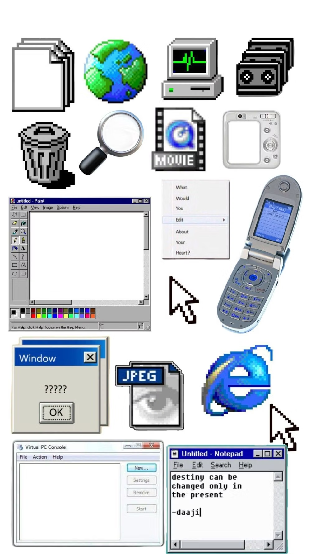
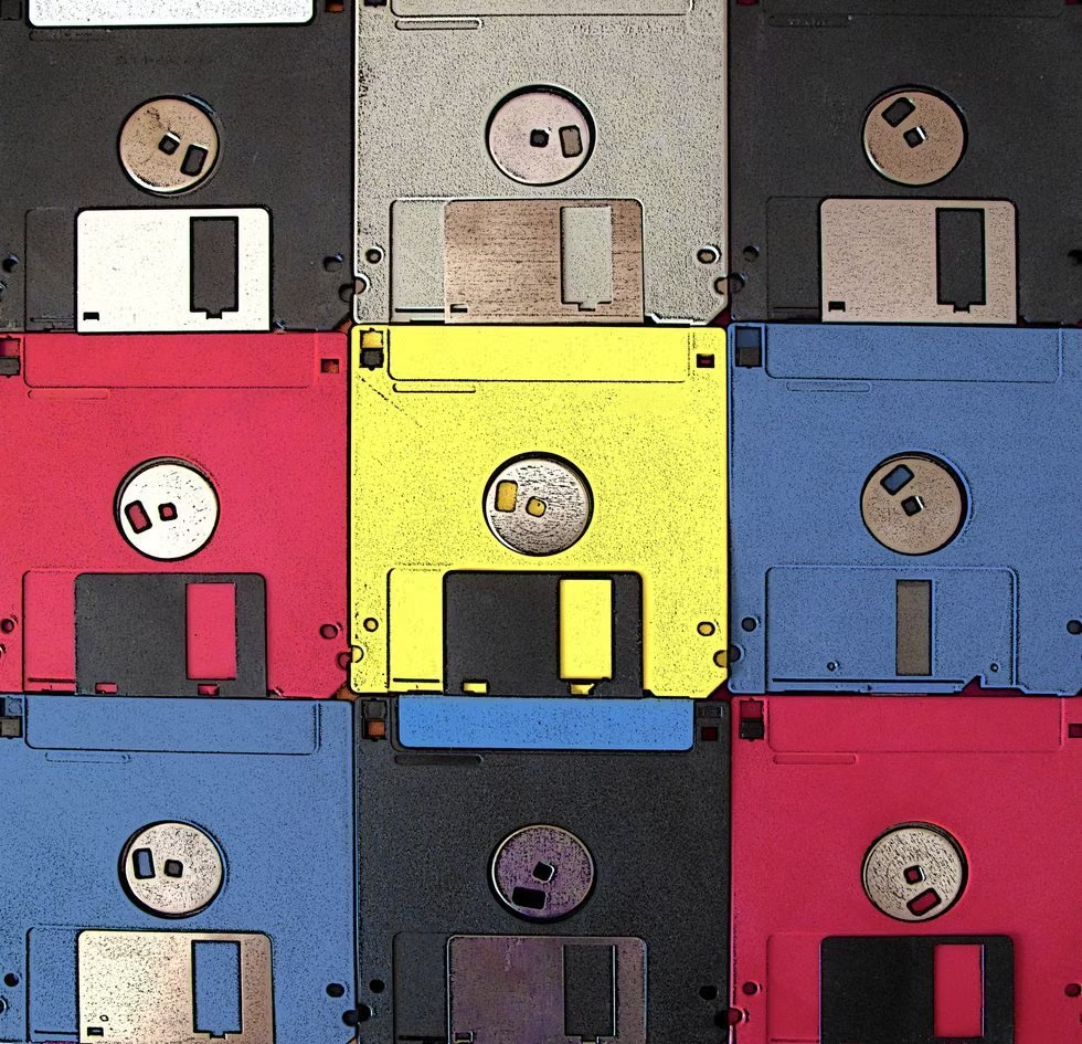
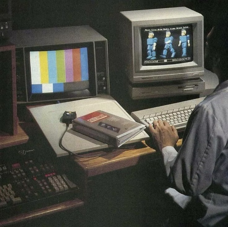
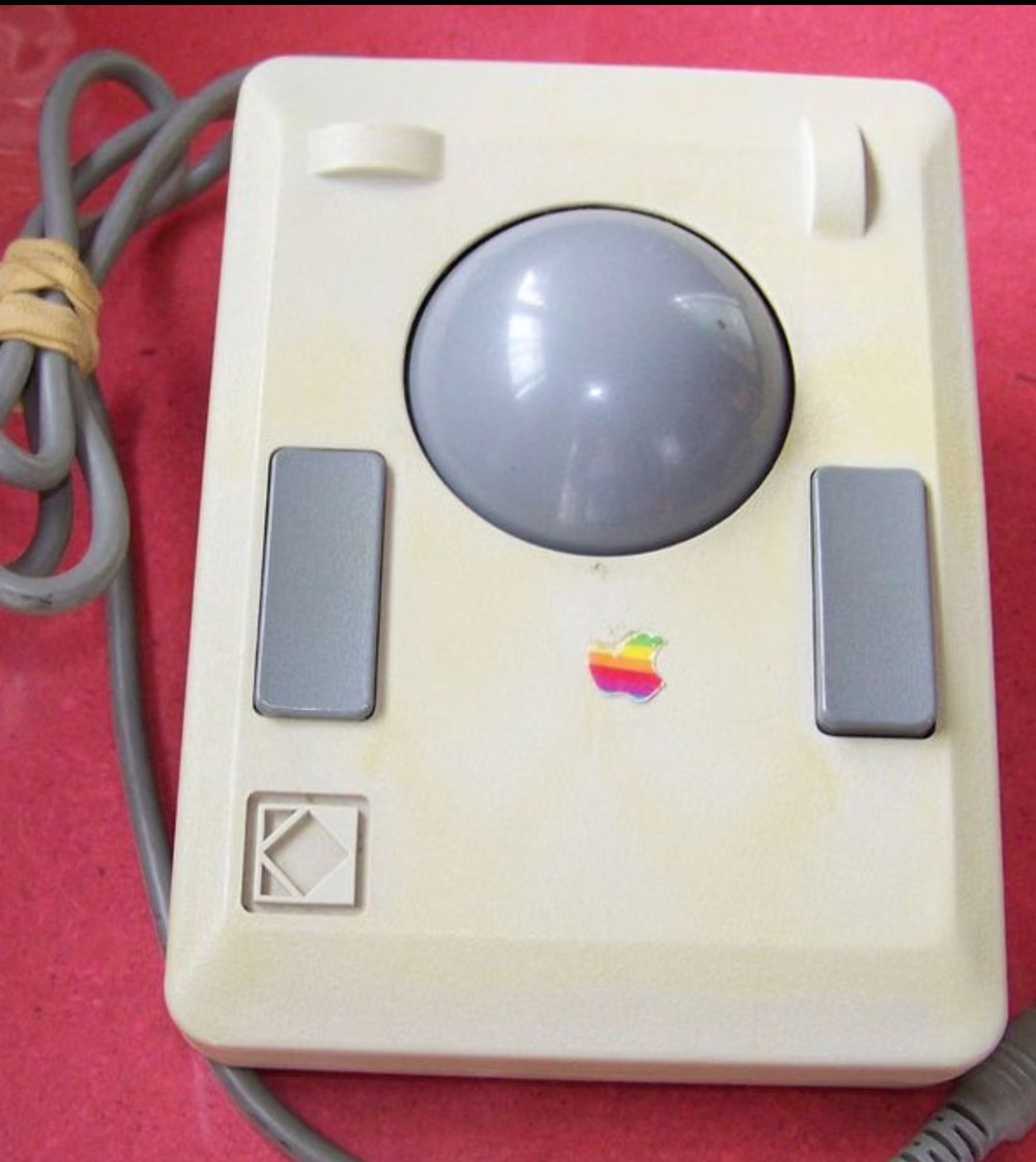
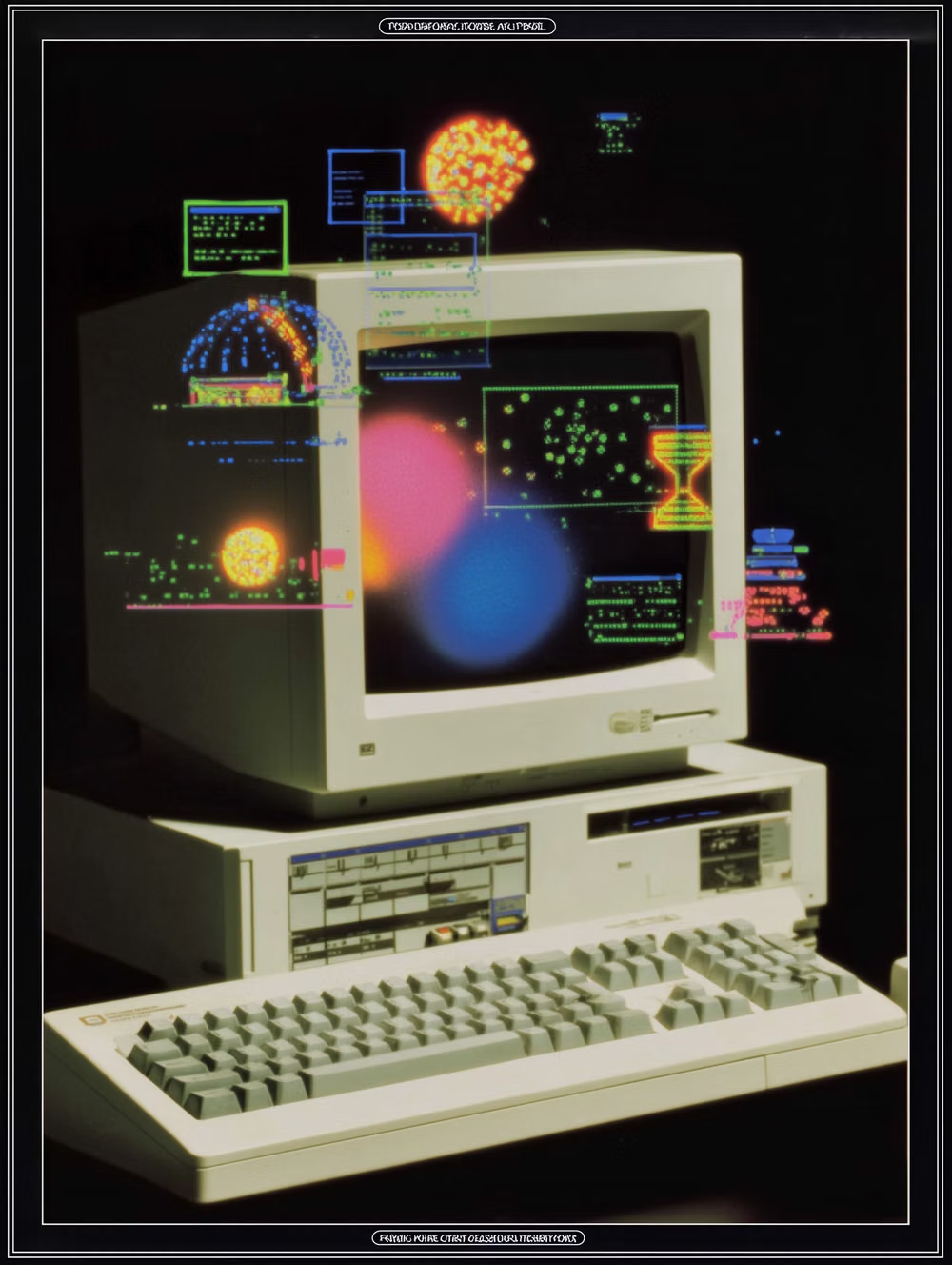
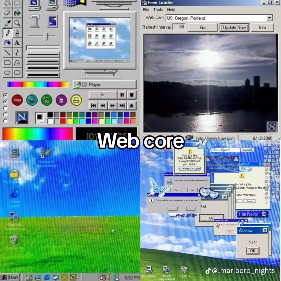
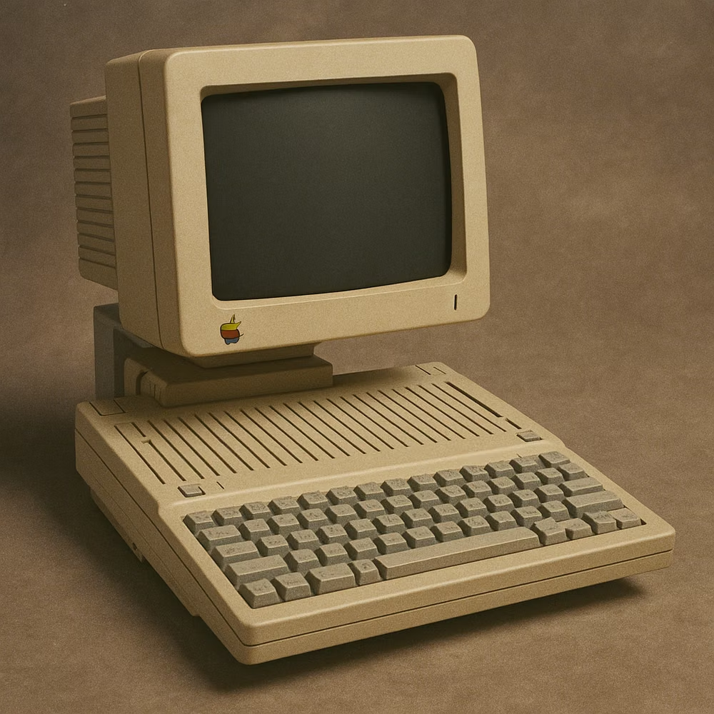
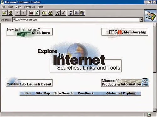
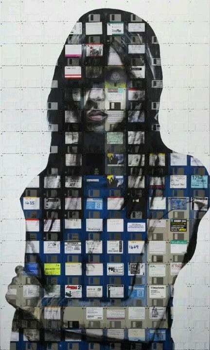
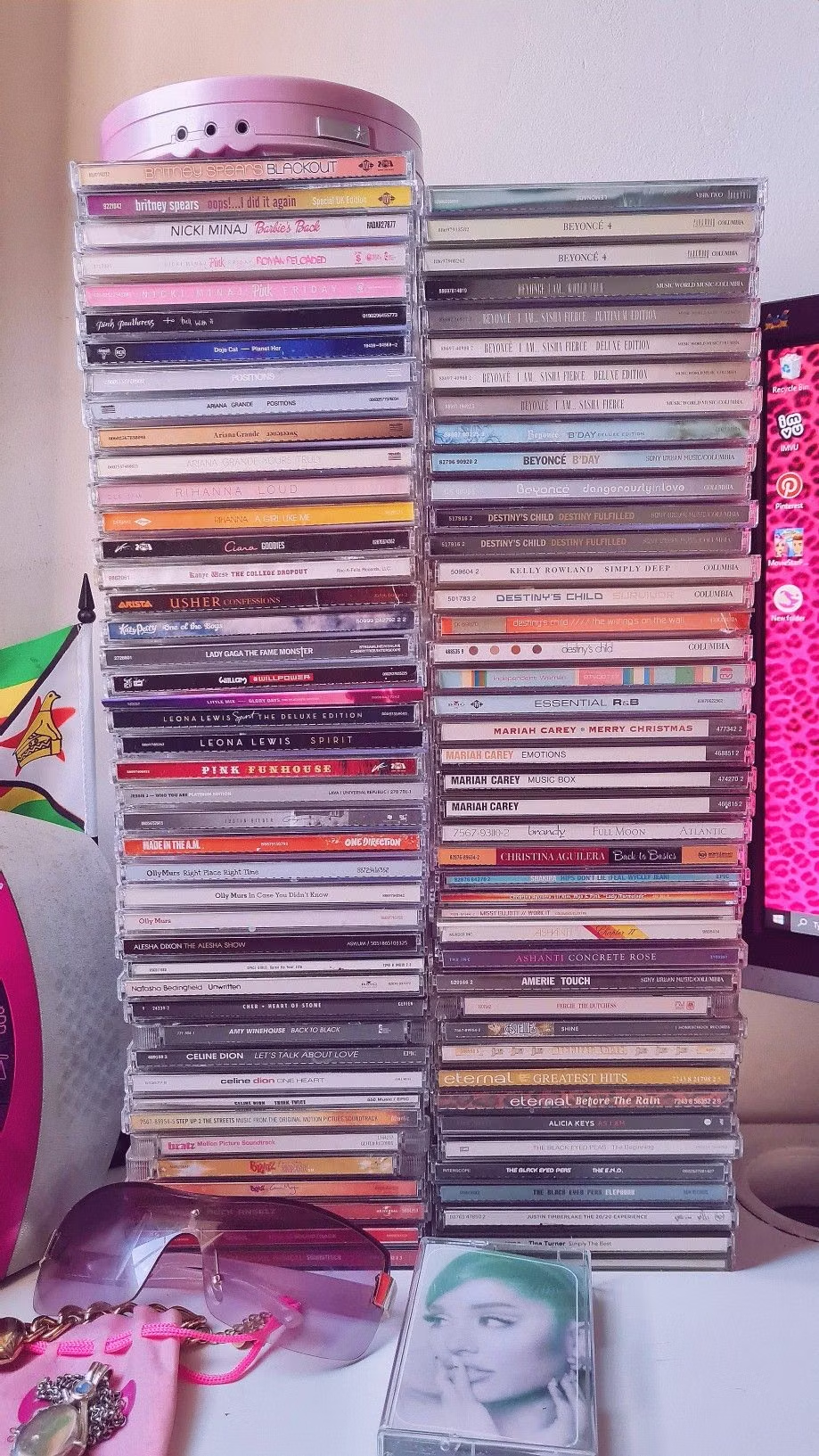
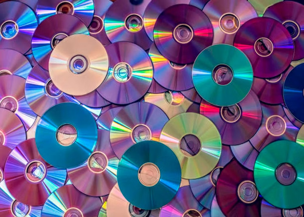
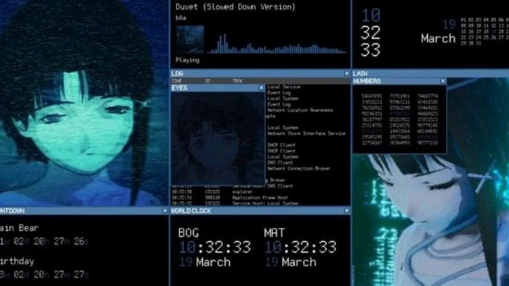
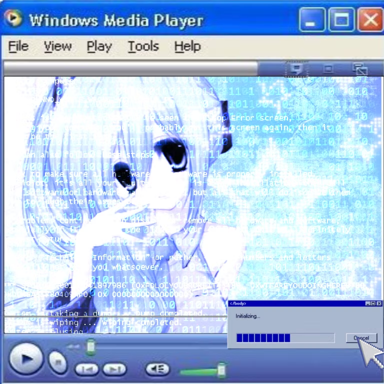
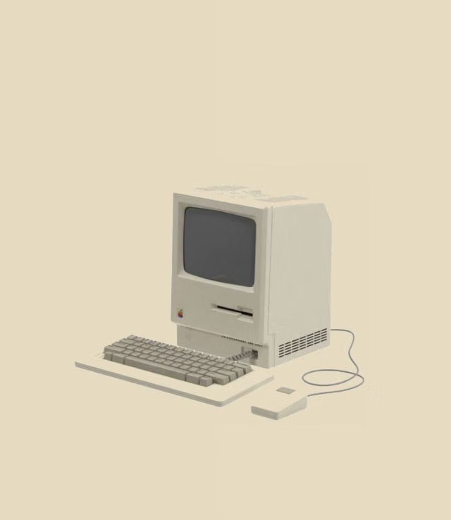
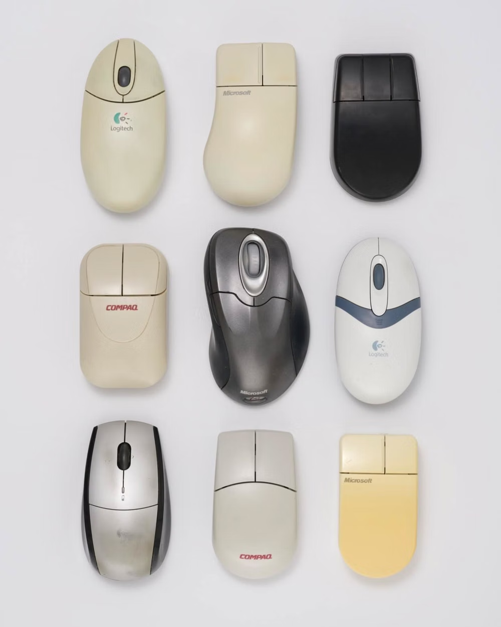
A visual study of the forms, inspirations, materials, colors, type, and cultural references associated with this UI design style.
Design principles and implementation
Use these principles to write a focused AI UI design prompt instead of asking for a vague visual treatment.
Color direction
Use the classic browser-safe palette, white or tiled grounds, blue underlined links, purple visited states, and direct high-contrast utility colors. In a daisyUI theme, use classic browser blue for `primary`, visited-link purple for `secondary`, and map white, light gray, and silver to `base-100`, `base-200`, and `base-300`.
Imagery direction
Choose animated GIFs, web badges, pixel dividers, counters, tiny icons, tiled textures, fan graphics, and plainly embedded photographs.
Content density
Embrace high link and artifact density with descriptive headings, lists, and visible grouping, while avoiding illegible novelty backgrounds behind text. Use the `*-sm` size variants for daisyUI components to preserve this compact working density.
Motion direction
Use small looping GIFs, marquees, blinking status marks, and simple hover swaps as nostalgic artifacts, not as the only way to convey information.
Shape language
Use beveled buttons, one-pixel table borders, horizontal rules, framed boxes, banner strips, and native form controls. In daisyUI themes, set the `--radius-*` variables to `0` or `0.25rem`.
Typography rules
Use browser-default serif, system sans, or monospace families, preserve obvious link styling, and limit decorative web fonts to banners or logos.
Suggested Typfaces
Tinos
Fresh daisies glow in warm sunlight
Fresh daisies glow in warm sunlight
1 2 3 4 5 6 7 8 9 0
Arimo
Fresh daisies glow in warm sunlight
Fresh daisies glow in warm sunlight
1 2 3 4 5 6 7 8 9 0
Cousine
Fresh daisies glow in warm sunlight
Fresh daisies glow in warm sunlight
1 2 3 4 5 6 7 8 9 0
Comic Neue
Fresh daisies glow in warm sunlight
Fresh daisies glow in warm sunlight
1 2 3 4 5 6 7 8 9 0
VT323
Fresh daisies glow in warm sunlight
Fresh daisies glow in warm sunlight
1 2 3 4 5 6 7 8 9 0
Build a Web 1.0 / Webcore interface with daisyUI
The live example translates this direction into daisyUI components and semantic theme tokens.
To generate a full page in the same visual language, give the style name and the design rules above to Blueprint MCP.
Related UI design styles
Compare nearby visual languages that share typography, shapes, use cases, or signature elements.
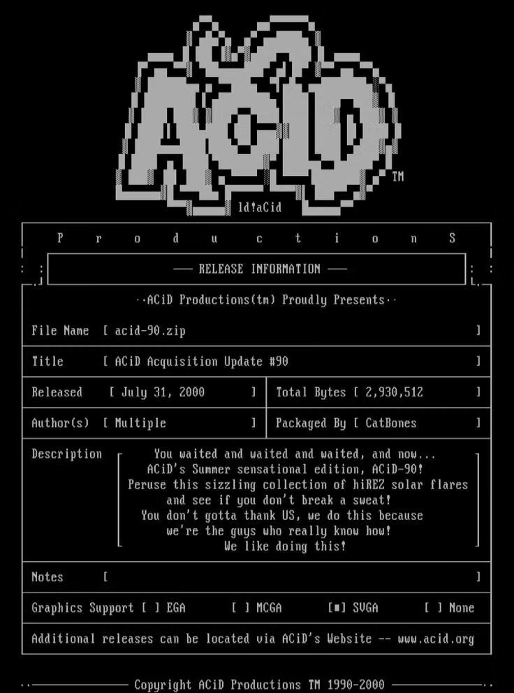
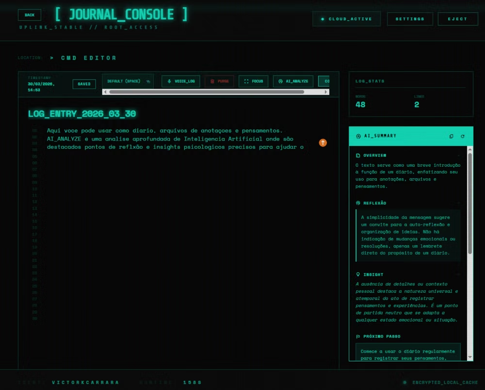
Terminal / CLI UI design style
Monospaced type, command prompts, phosphor-like color, cursor states, logs, and text-first interaction.
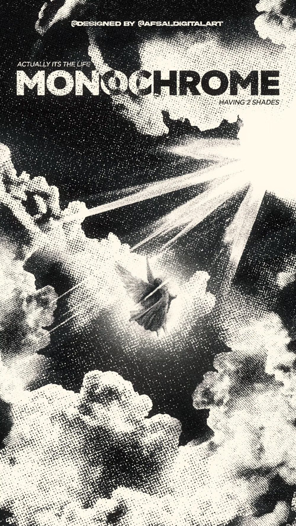
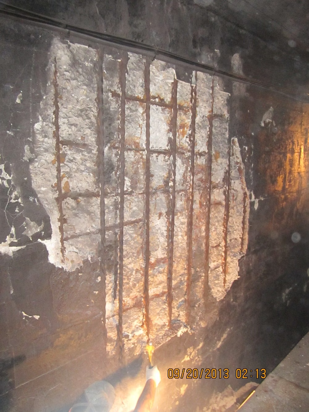
Brutalism UI design style
Raw typography, exposed structure, sharp edges, stark contrast, default-like controls, and intentionally unpolished layouts.
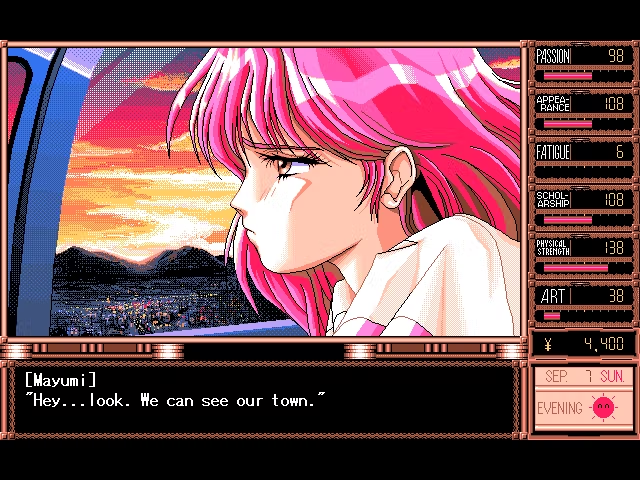
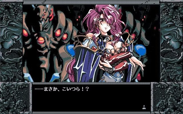
PC-98 UI design style
NEC PC-9800-era Japanese games pair relatively high-resolution 640×400 scenes with tightly limited color, meticulous dithering, detailed anime portraits, and compact visual-novel or adventure-game interfaces.