Spatial UI design style
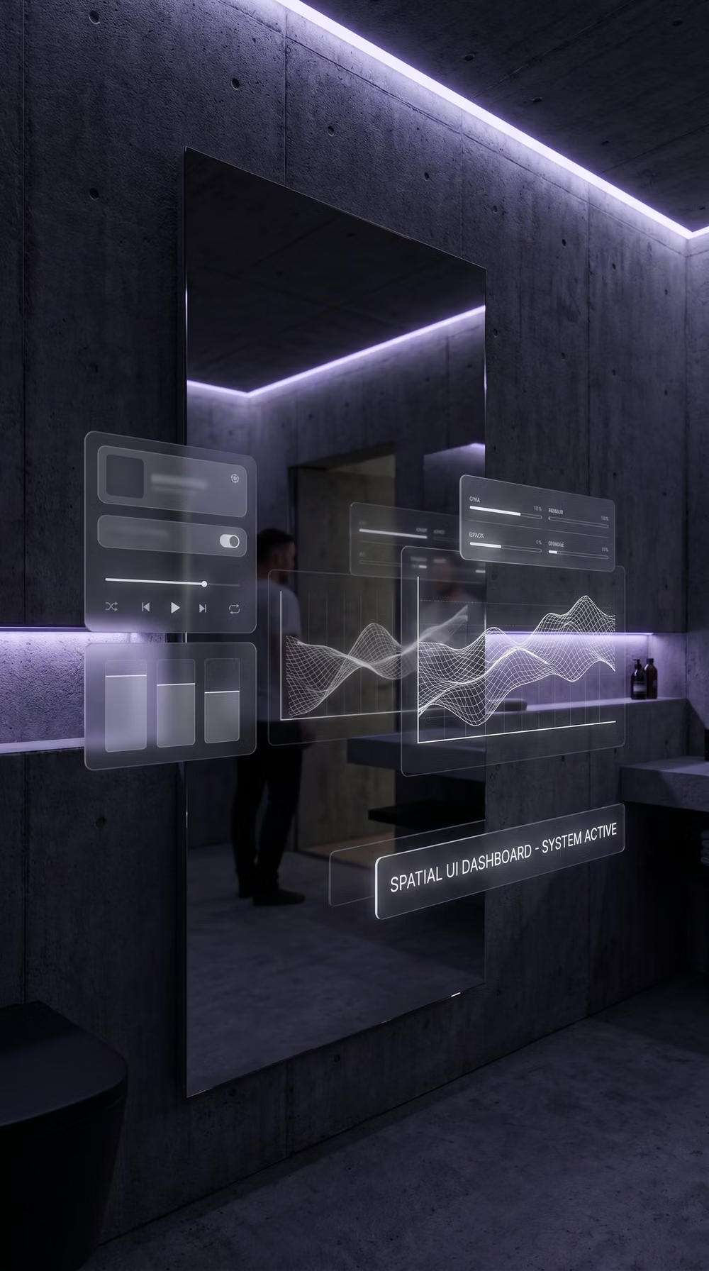
Depth-aware panels, volumetric hierarchy, gaze and gesture affordances, environmental anchoring, and restrained floating controls.
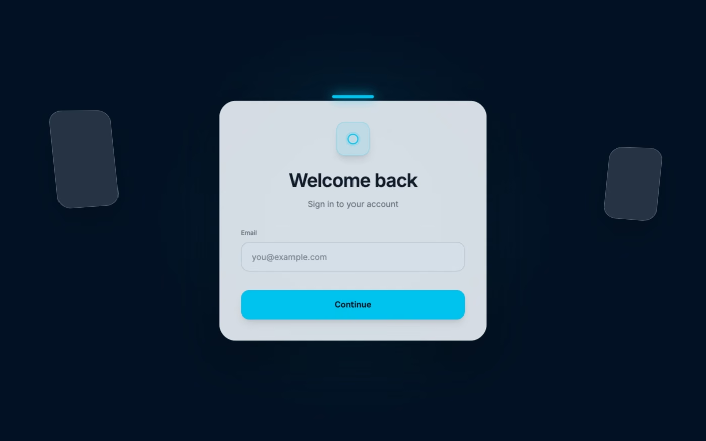
Design overview
- Signature elements
- floating panels, depth hierarchy, environmental anchoring, gaze affordances, gesture targets, volumetric spacing. In daisyUI themes, set `--depth: 1;`.
- Best suited to
- AR, VR, mixed reality, spatial computing, training, and immersive collaboration.
- Layout principles
- Anchor panels at comfortable depth along a gentle viewing arc, keep essential controls within easy gaze range, and avoid stacking content along the same sightline.
History and origins
A fact-checked account of where this visual language came from, with links to the references used.
- Period
- Research lineage from the early 2000s; consumer platform launch in 2023–2024
- Origin
- Human-computer interaction research and mixed-reality platforms
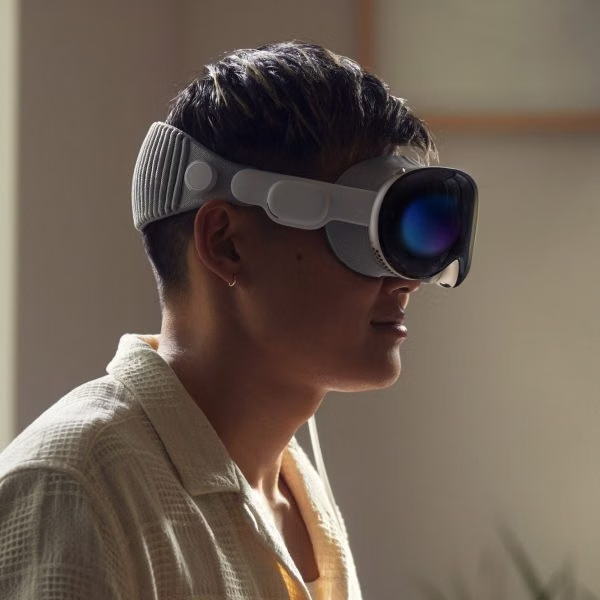
The phrase “spatial computing” predates the current headset cycle; researcher Simon Greenwold used it in an MIT thesis in 2003. Apple brought the term into mainstream consumer product language when it introduced Vision Pro in 2023, while its interface guidance formalized windows, volumes, immersive spaces, gaze, gesture, and depth for visionOS.
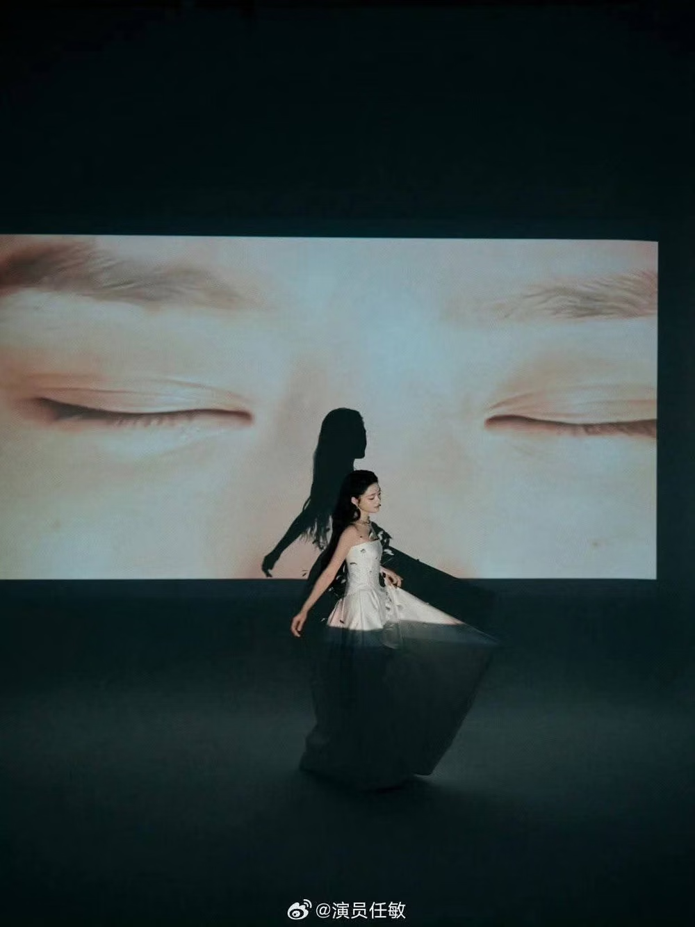
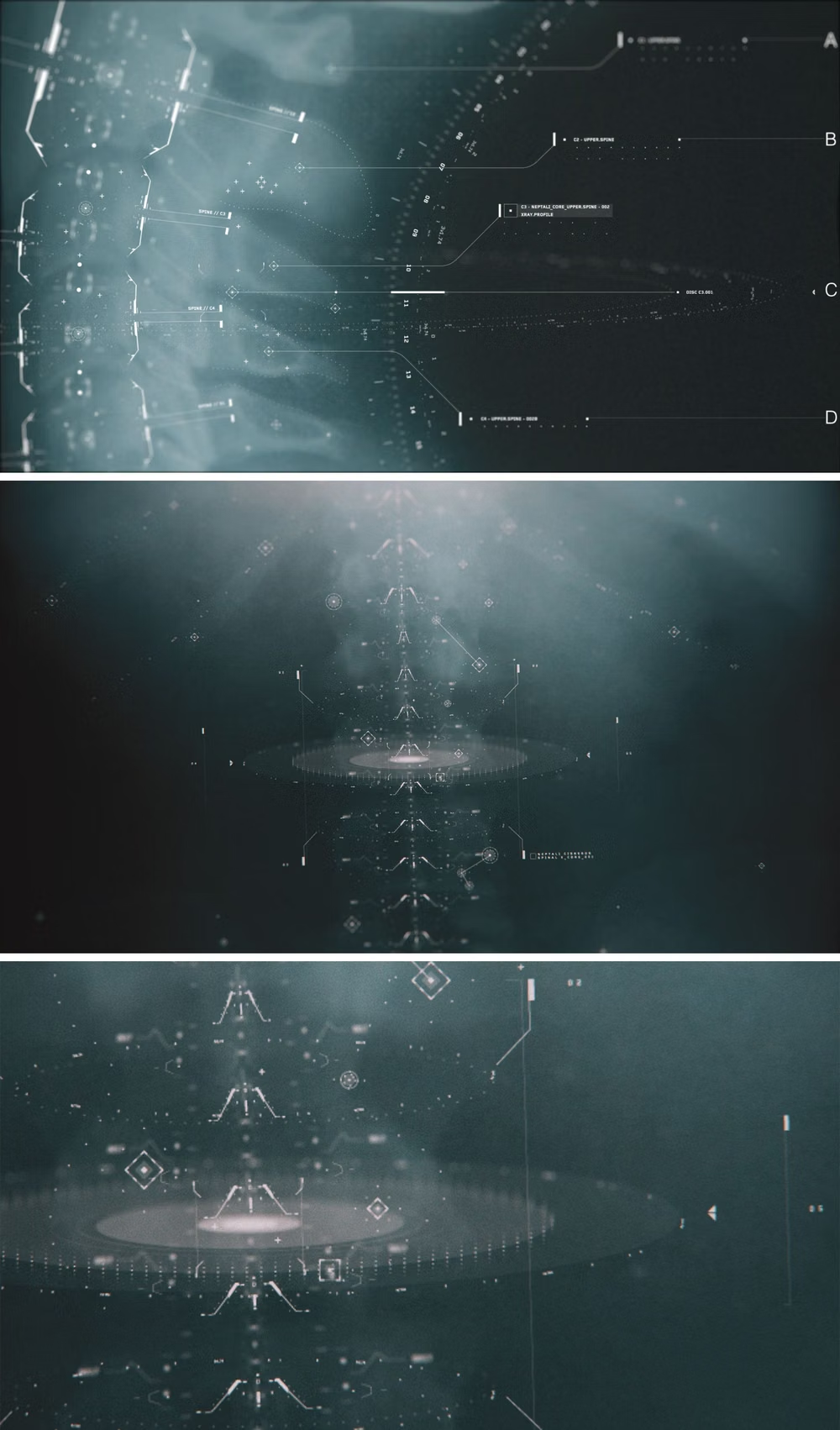
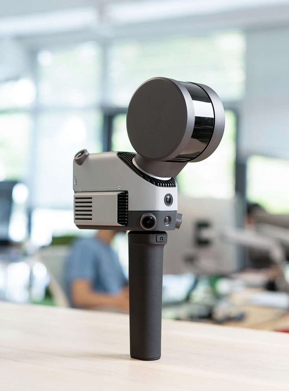
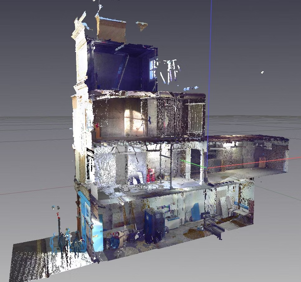
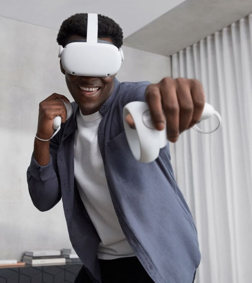
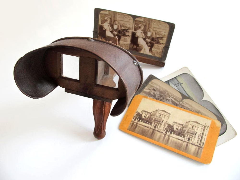
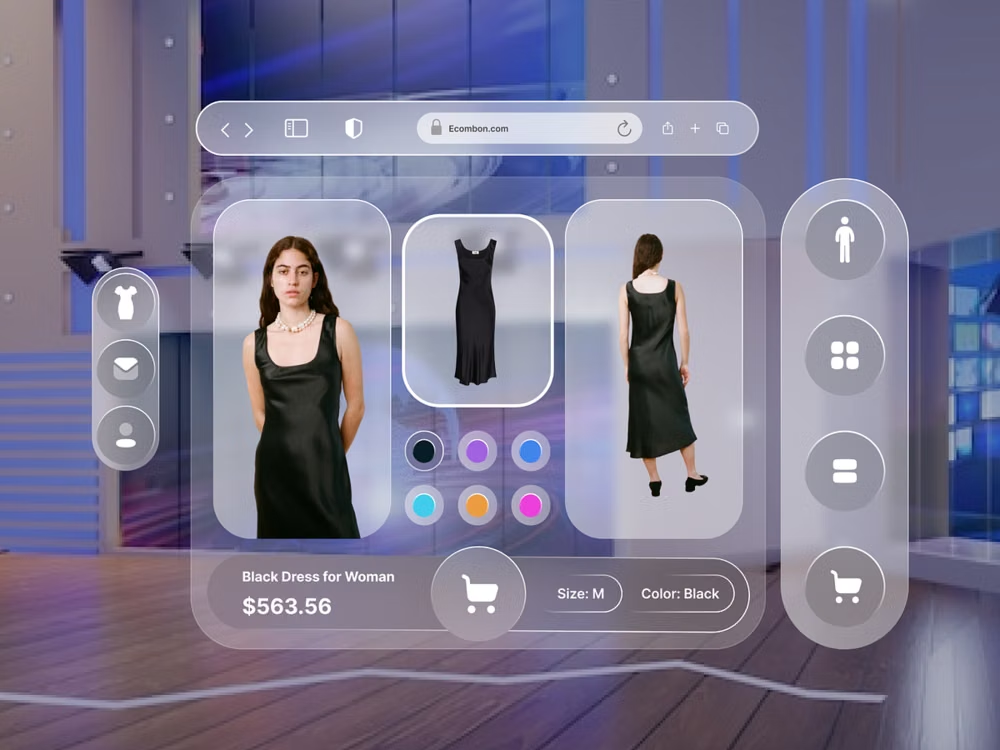
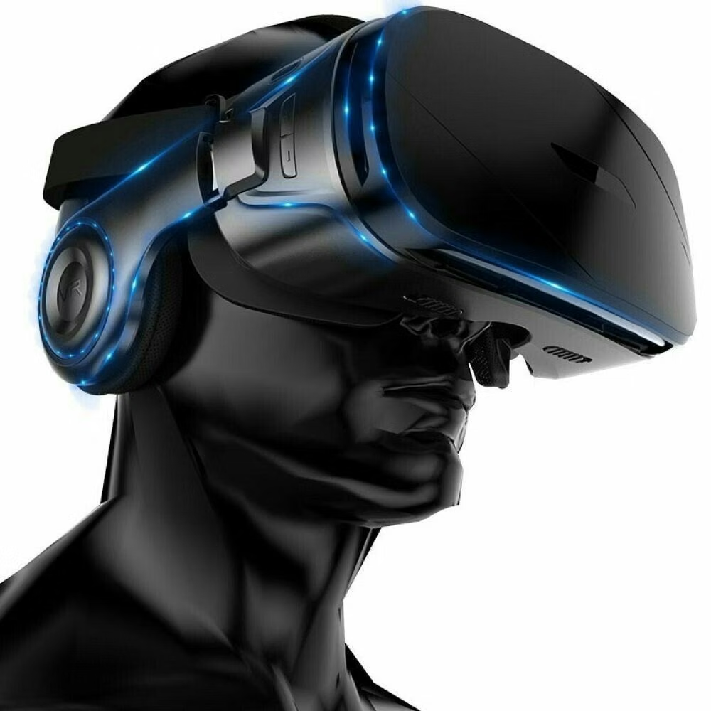
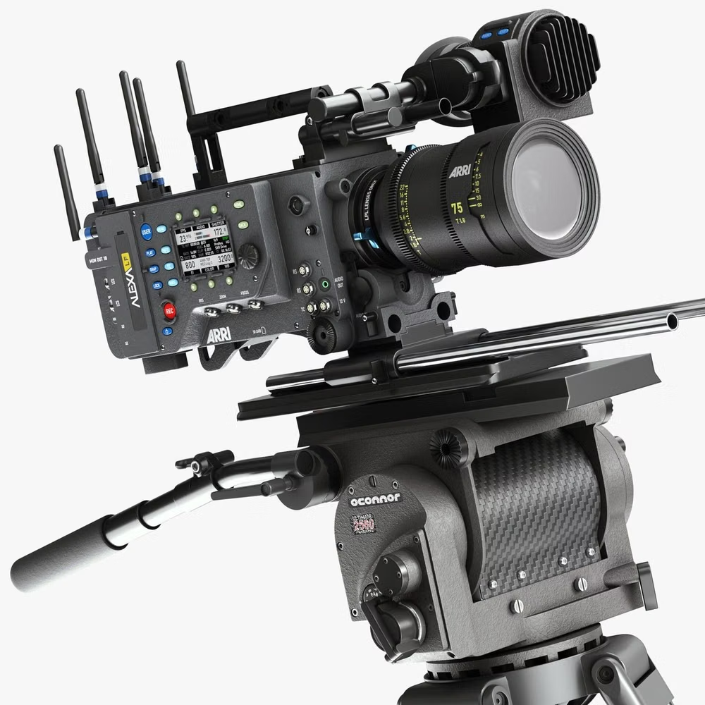
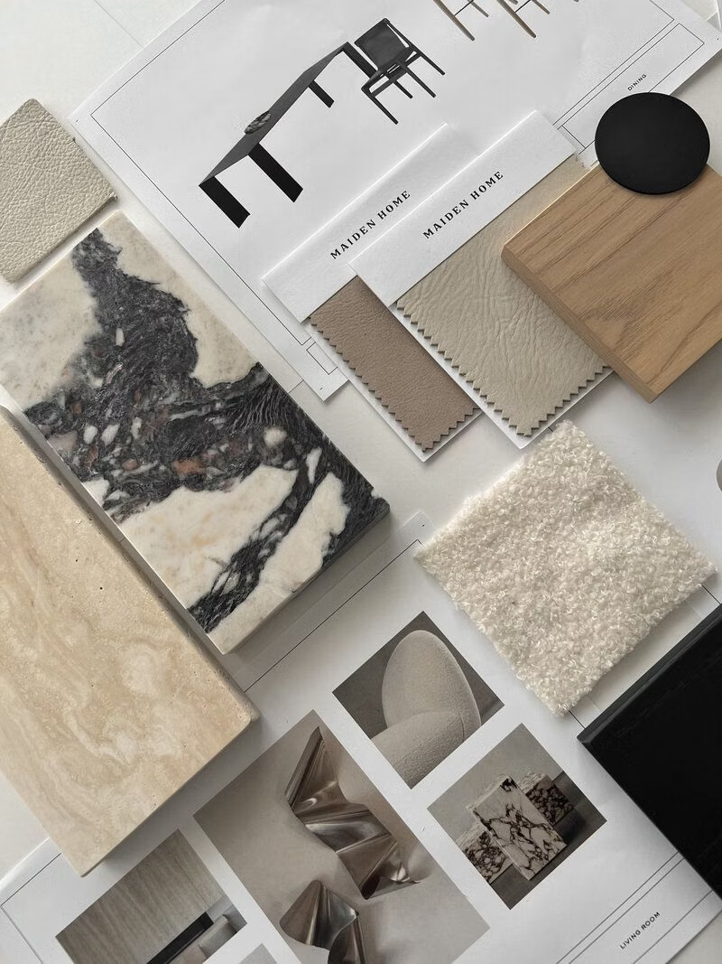
Moodboard and visual references
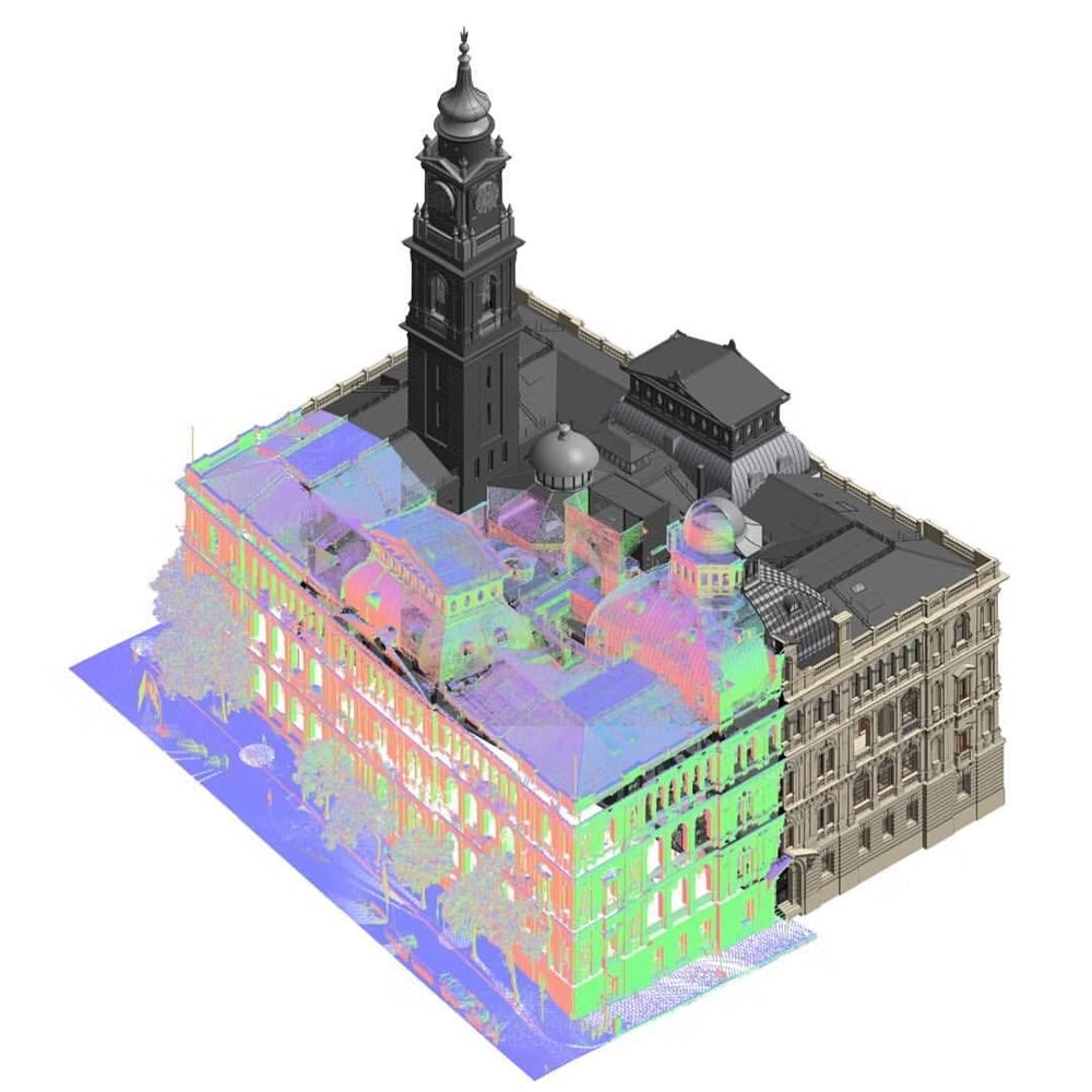
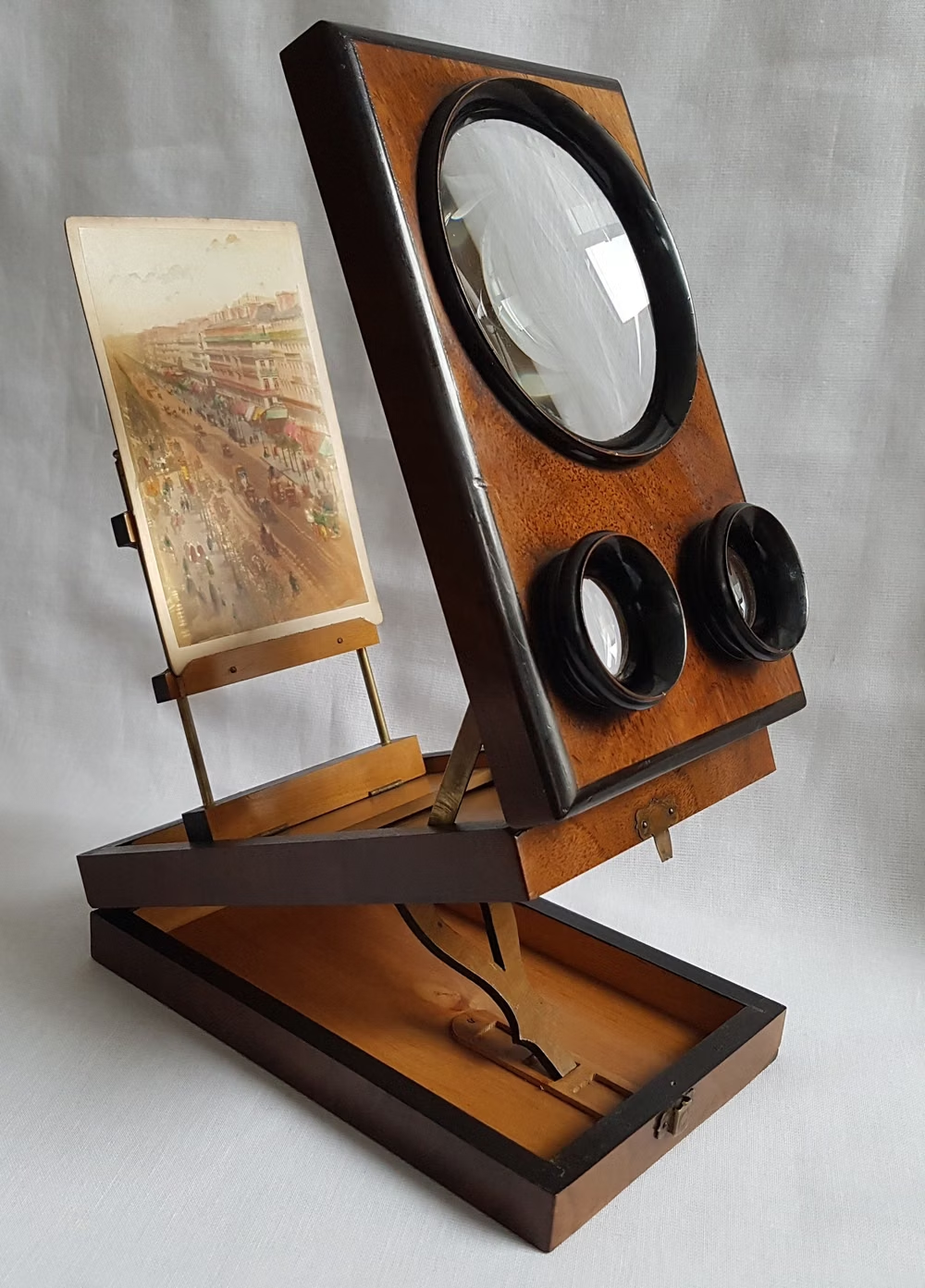
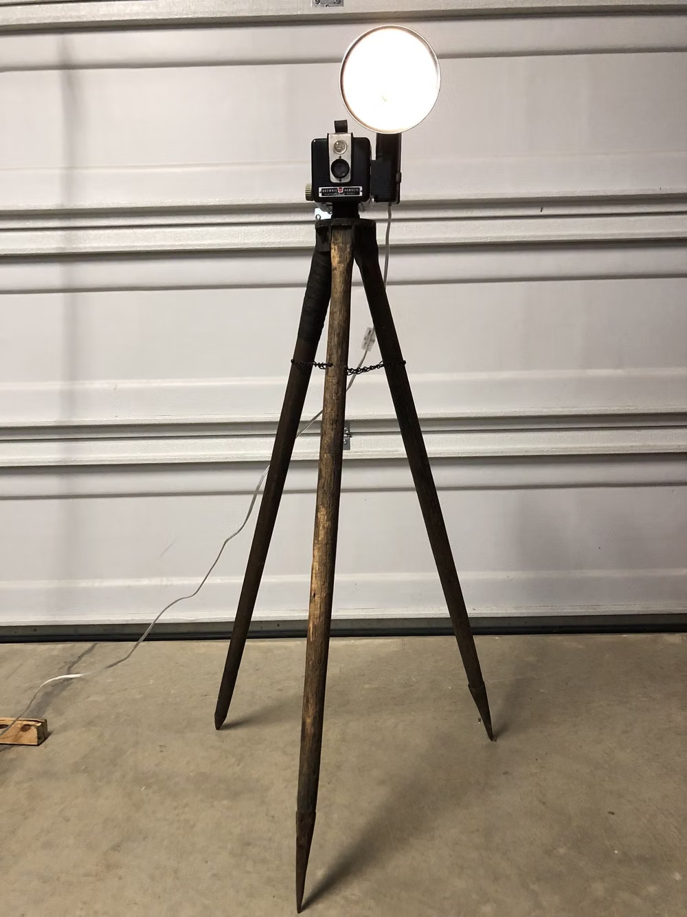
A visual study of the forms, inspirations, materials, colors, type, and cultural references associated with this UI design style.
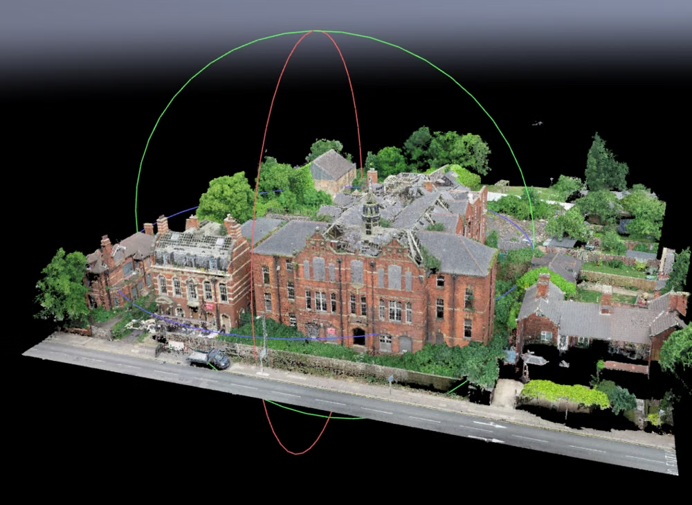
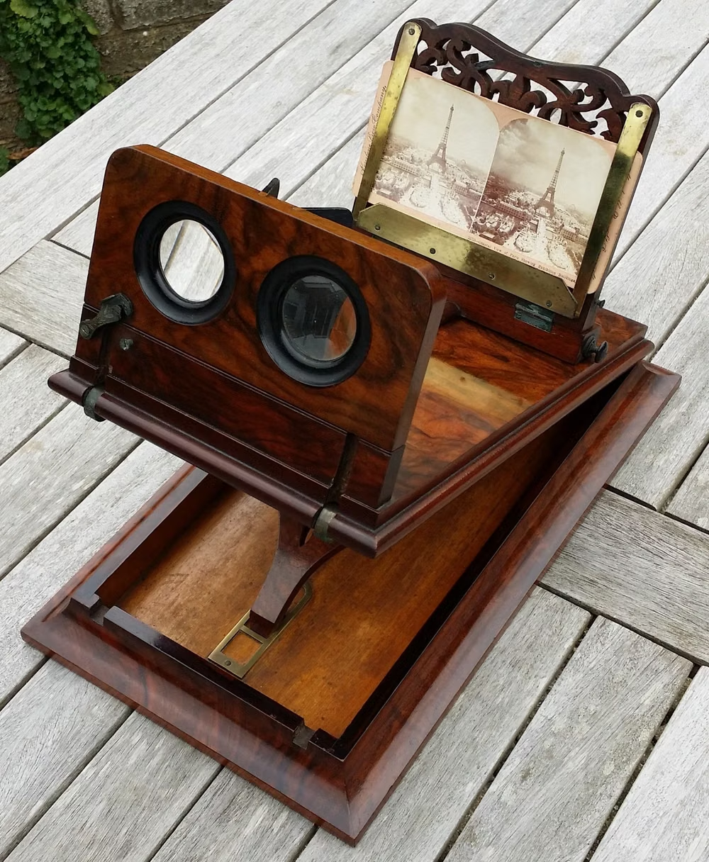
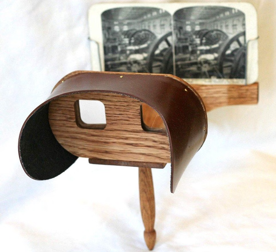
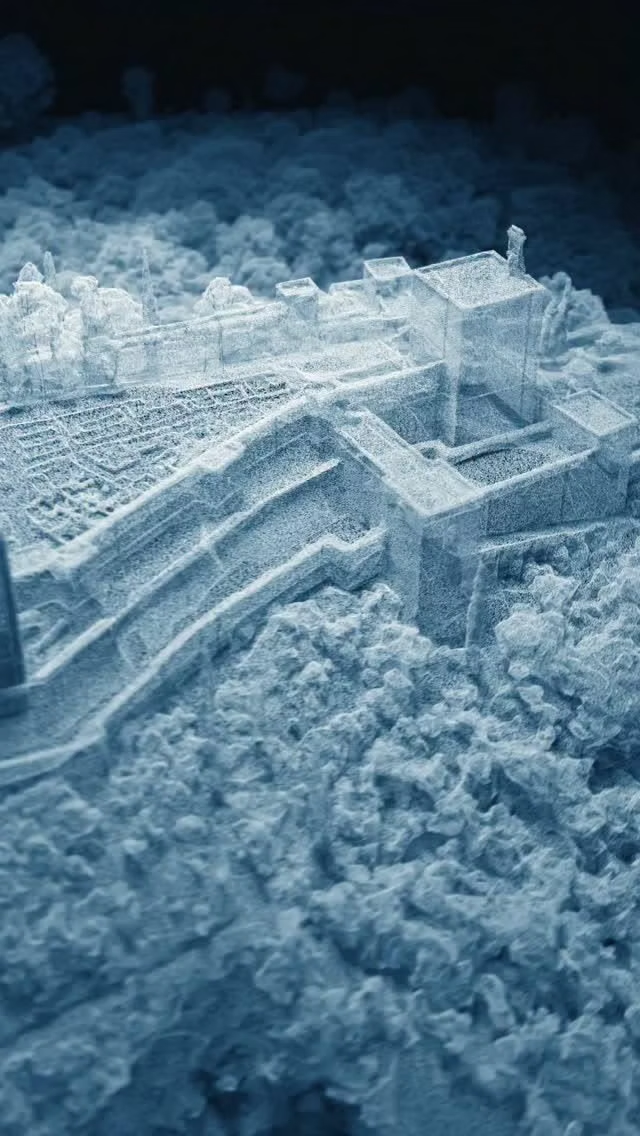

Design principles and implementation
Use these principles to write a focused AI UI design prompt instead of asking for a vague visual treatment.
Color direction
Use environment-aware neutral materials with luminous focus rings, adapting opacity and contrast as the real or rendered background changes. In a daisyUI theme, use luminous focus blue for `primary`, soft violet or teal for `secondary`, and define `base-100`, `base-200`, and `base-300` as adaptive neutral glass, smoke, and shadow tones with dependable text contrast.
Imagery direction
Use volumetric models, stereoscopic media, panoramic environments, and spatial annotations with clear scale and occlusion cues.
Content density
Keep each plane sparse, enlarge gesture and gaze targets, and distribute complex workflows across depth or progressive steps.
Motion direction
Move objects through depth with stable world anchoring, use gaze-responsive focus and gentle spring placement, and prevent camera-relative jitter.
Shape language
Use rounded floating plates, volumetric buttons, soft focus halos, and handles whose depth and orientation reveal how they can be manipulated. In daisyUI themes, set the `--radius-*` variables between `0.75rem` and `1.5rem`.
Typography rules
Choose a high-x-height sans-serif, size text for physical viewing angle rather than pixels, and avoid long paragraphs on distant or curved planes.
Suggested Typfaces
Inter
Fresh daisies glow in warm sunlight
Fresh daisies glow in warm sunlight
1 2 3 4 5 6 7 8 9 0
Sora
Fresh daisies glow in warm sunlight
Fresh daisies glow in warm sunlight
1 2 3 4 5 6 7 8 9 0
Manrope
Fresh daisies glow in warm sunlight
Fresh daisies glow in warm sunlight
1 2 3 4 5 6 7 8 9 0
Roboto Flex
Fresh daisies glow in warm sunlight
Fresh daisies glow in warm sunlight
1 2 3 4 5 6 7 8 9 0
Noto Sans
Fresh daisies glow in warm sunlight
Fresh daisies glow in warm sunlight
1 2 3 4 5 6 7 8 9 0
Build a Spatial UI interface with daisyUI
The live example translates this direction into daisyUI components and semantic theme tokens.
To generate a full page in the same visual language, give the style name and the design rules above to Blueprint MCP.
Related UI design styles
Compare nearby visual languages that share typography, shapes, use cases, or signature elements.
Material Design UI design style
Google’s adaptive design system combines clear interface hierarchy, personalized color, accessible components, generous rounded geometry, and responsive behavior. Also known as Material You, it evolves Material Design away from paper-like realism toward flexible digital surfaces, with newer expressive variants introducing stronger typography, contrasting shapes, and more energetic motion.
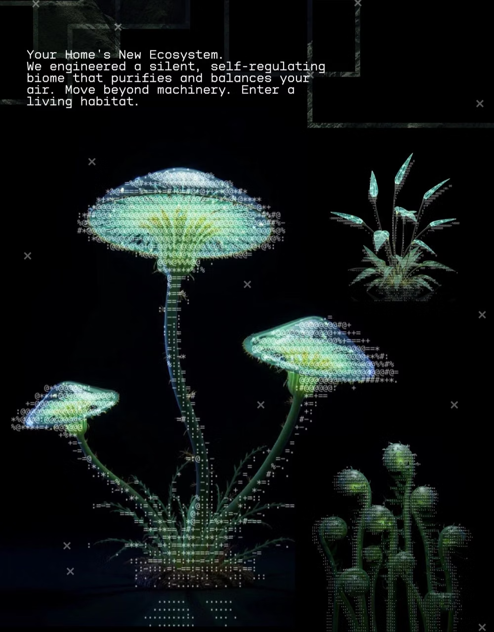
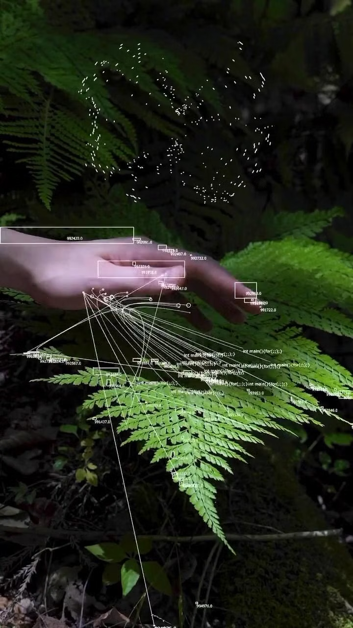
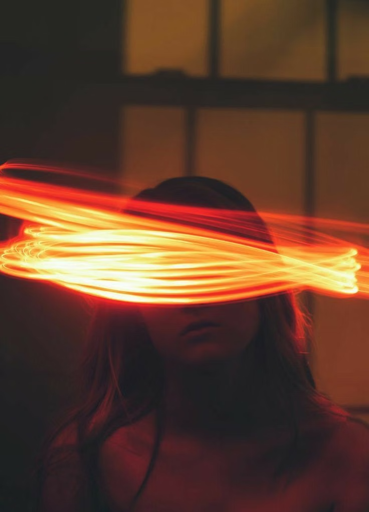
Luminous Eco-Skeuomorphism UI design style
A glossy, tactile interface style that combines early-2010s skeuomorphism with futuristic ecological-tech aesthetics. Controls resemble illuminated physical hardware, with intense inner glows, radiant edges, and soft light bloom making interactive elements appear electrically powered.

Mesh Gradient / Aurora UI design style
Atmospheric multi-point gradients blending luminous colors into soft clouds, glows, and color fields.